Grafana: [Feature request] Make alert threshold visibility in graphs optional
Hey 👋
For my use-cases I don't really need to see the thresholds of an alert in my graphs and they're pretty stark visually (red and the whole alertable area is tinted as well). That's why I was thinking that perhaps it would make sense to make it optional.
Maybe a checkbox "Show alert thresholds" in "Alert Config"? Or does "Display > Thresholds" make more sense for this?
 tomasv
All 40 comments
I think this makes sense. PR would be appreciated!
 bergquist
on 16 Jan 2017
bergquist
on 16 Jan 2017
Here's a case where it's especially distracting:
I have a system where I collect two temperature measurements. An alert happens if the first is >50°C or if the second is >70°C.

The diagram now shows a green heart to indicate that no alert situation is ongoing, but the second time series is in the red area:

This looks as if an alert should happen.
Being able to change the appearance or to disable the visual threshold would be greatly appreciated.
 dbrgn
on 11 Mar 2017
dbrgn
on 11 Mar 2017
The alert threshold really makes my graph look like nonsense, so it would be great to make the redness optional.
Really at this point it's just polluting my graph.
http://i.imgur.com/3x9oFjG.png
 inklit
on 13 Jun 2017
inklit
on 13 Jun 2017
+1
Until then my workarounds:
Alert thresholds are showing only for the 1st condition.
So in the 1st line I setup something that will never happen and where the limit is outside the panel, then I add a original condition in the 2nd row with an OR.
Other alternative - if you use only 1 axis:
Move everything to the right axes and set left axis limit to something that is out of the alert range (though a (right-y) will be shown every line in the legends)
 4szt4l
on 13 Dec 2017
4szt4l
on 13 Dec 2017
Any update on this issue?
 NotTheEconomist
on 27 Sep 2018
NotTheEconomist
on 27 Sep 2018
+1 to this. Right now I have a graph of server errors that alerts if the number of errors is greater than 0. The whole graph is shaded red so it'd be helpful to be able to disable this display.
 ArmedChef
on 12 Oct 2018
ArmedChef
on 12 Oct 2018
+1 for this feature. It was fine with the threshold features
 Eptis
on 19 Oct 2018
Eptis
on 19 Oct 2018
+1 also
 TheGoblinHero
on 6 Nov 2018
TheGoblinHero
on 6 Nov 2018
+1 here too. Right now I just have a dashboard that I never look at with alerts, but that seems stupid to me when it's all just repeats of existing panels.
 Grygon
on 13 Nov 2018
Grygon
on 13 Nov 2018
+1 here same as @ArmedChef
 HenGold
on 15 Nov 2018
HenGold
on 15 Nov 2018
+1
 pcamelo
on 29 Nov 2018
pcamelo
on 29 Nov 2018
+1 This would be a great feature.
 CameronJHall
on 9 Jan 2019
CameronJHall
on 9 Jan 2019
+1
 leonickel
on 10 Jan 2019
leonickel
on 10 Jan 2019
+1
 luchaninov
on 2 Feb 2019
luchaninov
on 2 Feb 2019
+1
 Asafb26
on 3 Feb 2019
Asafb26
on 3 Feb 2019
+1
 cdroot92
on 8 Feb 2019
cdroot92
on 8 Feb 2019
In general, the rule should be to not draw attention when no no attention is necessary, or at least allow disabling false positives (something draws attention, when actually everything is fine).
By the way, is this related to the issue where grafana keeps adding green markers to indicate alerts did not fire?
 pjschaafsma
on 18 Feb 2019
pjschaafsma
on 18 Feb 2019
Probably there could be three visibility options:
- visible as we see it now,
- enabled as mark (triangle or arrow) on y axis,
- hidden.
 randybb
on 13 Mar 2019
randybb
on 13 Mar 2019
randybb's suggestions are good. I'd also like to see this implemented, as like in dbrgn's example above I am using graphs with multiple sensors (having different ranges), so the display of the warning threshold is just adding visual pollution to the graph.
 pfeerick
on 3 Apr 2019
pfeerick
on 3 Apr 2019
+1
 blasco991
on 3 Apr 2019
blasco991
on 3 Apr 2019
It's also a bit weird that the thresholds are always drawn on the left axis, when the query driving the alert may be targeting the right axis. Example:
In this graph, the alert is configured as follows:
WHEN avg() OF query (B, 5m, now) IS ABOVE 60
In this case, B corresponds to the right axis. However, the threshold is drawn on the left axis. Not only is the threshold and color overlay distracting, it's not even an accurate representation of the threshold for the alert.
 aharbis
on 7 Apr 2019
aharbis
on 7 Apr 2019
@aharbis Maybe you should find/open another issue for that one as it is not directly related to this feature request.
 stieler-it
on 6 May 2019
stieler-it
on 6 May 2019
Alerts - such a great feature, yet enabling them for all charts, makes whole dashboard look like everything is on alert – red overlays on all charts. Hope this could be fixed until end of 2025. Sorry for sarcasm, this would require single checkbox to hide overlay (as there is already heart indicator near chart), yet issue is open for 2+ years :/
 darklow
on 8 May 2019
darklow
on 8 May 2019
+1
 JulesLa
on 26 Sep 2019
JulesLa
on 26 Sep 2019
+1
Just being able to turn off the fill would suit me.
 macaba
on 14 Oct 2019
macaba
on 14 Oct 2019
+1
 rguaitanele
on 26 Oct 2019
rguaitanele
on 26 Oct 2019
+1
 Marctraider
on 9 Nov 2019
Marctraider
on 9 Nov 2019
+1
 Samuel29
on 19 Nov 2019
Samuel29
on 19 Nov 2019
+1
 saxus
on 28 Nov 2019
saxus
on 28 Nov 2019
+1
 lukkigi
on 12 Dec 2019
lukkigi
on 12 Dec 2019
+1
 freedomwarrior
on 13 Dec 2019
freedomwarrior
on 13 Dec 2019
It would be nice to have an option like the 'toggle legend', a 'toggle alert' which remove all alert overlays (threshold and annotation) which in some case add to much noise in the graphic.
 sbarrier
on 14 Dec 2019
sbarrier
on 14 Dec 2019
It will be really helpful ! +1
 epigns
on 15 Jan 2020
epigns
on 15 Jan 2020
Wew, three years for something that simple and yet so damn important. I better figure out how to hack this myself than waiting for miracle, eh?
 RheaAyase
on 31 Jan 2020
RheaAyase
on 31 Jan 2020
+1
 AlexandreGuidin
on 4 Mar 2020
AlexandreGuidin
on 4 Mar 2020
Please..!! Why is this taking so long :(
 stingalleman
on 11 Mar 2020
stingalleman
on 11 Mar 2020
any updates on this issue?
 dan-bolsun
on 7 Apr 2020
dan-bolsun
on 7 Apr 2020
I would really also like this. For now, I have a separate dashboard with copies of the graphs I want alerts for that I never look at. This means I don't have green hearts on the regular dashboards, but it's still better than all the clutter.
 armageddon421
on 15 Apr 2020
armageddon421
on 15 Apr 2020
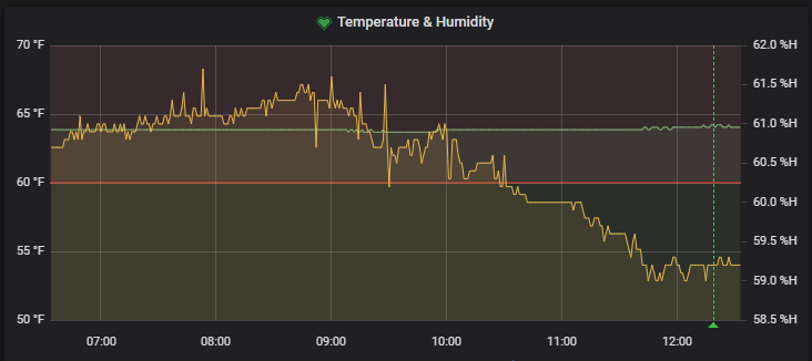
What about this? Seems to be working on my end. Can someone else test?
 ikkemaniac
on 23 May 2020
ikkemaniac
on 23 May 2020
Awesome, finally! Thank you all so much!
stingalleman
on 4 Aug 2020
Related issues
 KlavsKlavsen
·
3Comments
KlavsKlavsen
·
3Comments
 victorhooi
·
3Comments
victorhooi
·
3Comments
 kcajf
·
3Comments
kcajf
·
3Comments
 PaulKlumpp
·
3Comments
PaulKlumpp
·
3Comments
 royemmerich
·
3Comments
royemmerich
·
3Comments
Most helpful comment
Alerts - such a great feature, yet enabling them for all charts, makes whole dashboard look like everything is on alert – red overlays on all charts. Hope this could be fixed until end of 2025. Sorry for sarcasm, this would require single checkbox to hide overlay (as there is already heart indicator near chart), yet issue is open for 2+ years :/