Plots2: Explore how to present subscription stats
Currently the stats page https://publiclab.org/stats/subscriptions is being displayed as key-value pairs
- [x] Listing all tags and the number of subscribers in the right-hand list by @GettyOrawo
- [ ] Interactive display of the page
 cesswairimu
All 54 comments

How is this ?
 dewanhimanshu
on 17 Jan 2019
dewanhimanshu
on 17 Jan 2019
@dewanhimanshu thanks for your suggestion but if you look at https://publiclab.org/stats/subscriptions there are a bunch of tags and if we have a tag for each line the page will be so long. Don't you think so? Maybe you have another idea? Thanks
cesswairimu
on 19 Jan 2019
I have an idea on how to display these stats in a non-monotonous way and a bit more efficiently, but it may be different from the UI scheme of the site. Would you like to see a mockup @cesswairimu ?
 IshaGupta18
on 2 Feb 2019
IshaGupta18
on 2 Feb 2019
Great! yeah @IshaGupta18. Please post it
cesswairimu
on 2 Feb 2019
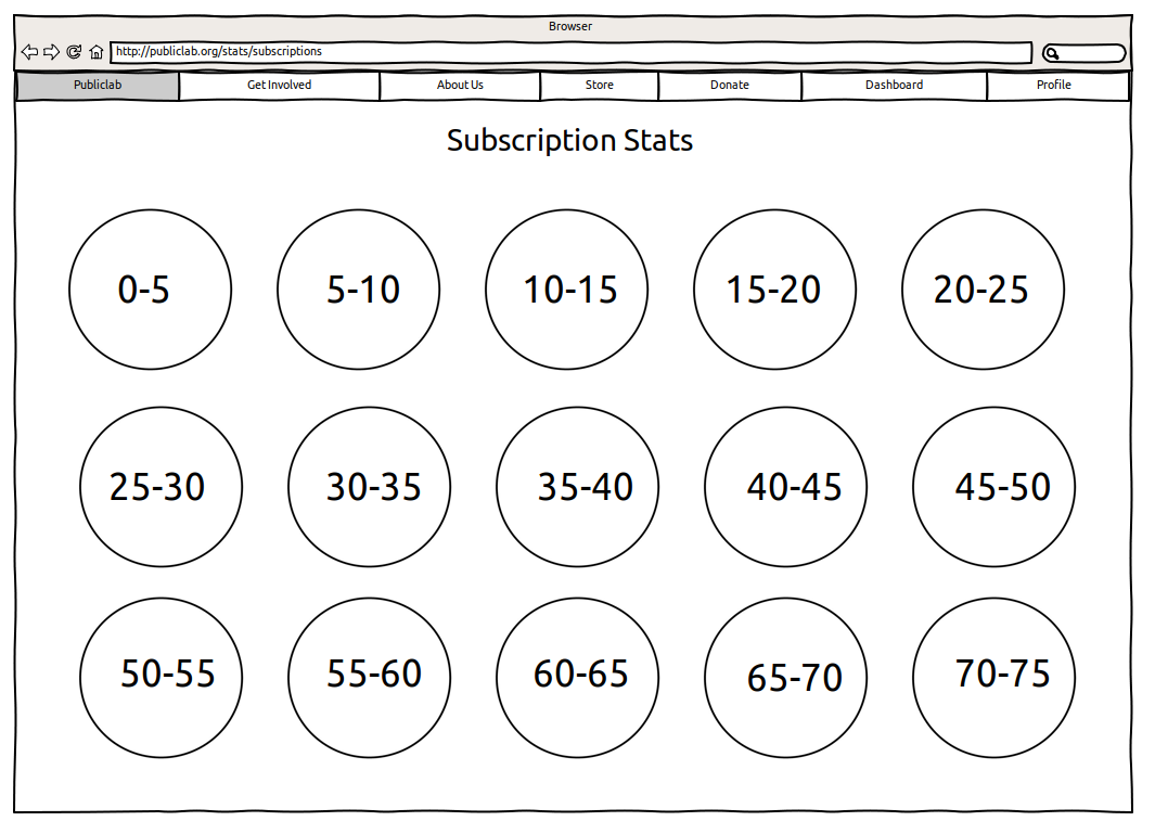
Okay, so since we don't want the length of the page to increase indefinitely, I thought of making groups of statistical values like: 0-5 , 5-10, 10-15 and so on (class size can be adjusted accordingly):
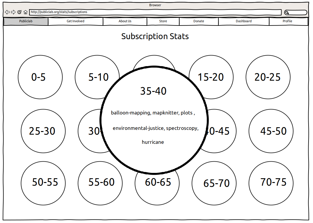
On clicking on a bubble, it will expand and show you the tags which have that statistical value:
On clicking on it again/ releasing it, it will restore it's original shape.
How does this look? I thought it might be a bit creative and playful and reduce the space. What do you think @cesswairimu ?
IshaGupta18
on 2 Feb 2019
Wow! @IshaGupta18 I love this idea its super creative and thanks for working on the mockups they look great. I believe the values are number of subscribers right?
Also maybe we can add specific tag values on pop-up something like balloon-mapping -1, mapknitter-2, might be useful for analysis purposes. What do u think?
cesswairimu
on 3 Feb 2019
Thanks a lot @cesswairimu ! Yes they are the number of subscribers, like in the JSON data, except I have made class intervals.
Yes I think adding balloon-mapping -1, mapknitter-2 would be great as it will be more informative for analysis!
IshaGupta18
on 3 Feb 2019
Awesome. would you be interested on implementing this?
cesswairimu
on 3 Feb 2019
Yes I would love to implement this! Also, I would suggest another similar mockup, probably with just some small changes that may improve the design!
IshaGupta18
on 3 Feb 2019
Great @IshaGupta18. Thanks
cesswairimu
on 3 Feb 2019
@jywarren I wanted you to just have a look at my design before I start implementing it, if in case there's something more I can implement here?
IshaGupta18
on 8 Feb 2019
This is very cool! So creative!
Just a few thoughts that might influence the design a bit:
- if this will be implemented using JavaScript, like for example p5js - https://p5js.org/ (could start with a demo at https://editor.p5js.org/), we could point it right at the JSON to use as a source
- that would mean we could develop it as a stand-alone JS visualization and preserve the original display of JSON at, say,
/stats/subscription.jsonor/stats/subscription/?format=json - maybe we should show by descending order so the most popular tags to follow are at the top?
- I do think that displaying some of the tagnames in the overall view would be great so there can be some way to "skim" the data. Any ideas? Maybe this means a slightly different layout?
- in lower popularity brackets, like 0-5, we might have a TON of tags. If there are too many to fit in the circle, what do we do?
I love the circle idea. What if we showed the tags next to the circles, and had a line of descending circles from large to small going down the page? Or another layout idea? Open to ideas!
 jywarren
on 8 Feb 2019
jywarren
on 8 Feb 2019
Thanks a lot @jywarren ! I think all the ideas are really good. Even I was about the mention the problem in point 5. To solve it, I was thinking of enlarging the bubble proportional to the number of tags in that interval.
However, I think this would solve the problem better:
We could show a few tags next to the circles (which will be in descending order of their size, going down the page), say 3 of them and then on clicking on the bubble,it would show all the tags. This way, we could skim through the page and keep the information intact.
How does this sound?
IshaGupta18
on 8 Feb 2019
great, shall we do another mockup before implementing? did you have an idea
of how you'd like to implement this, like, we could do circles using CSS
border-radius, or we could use p5js maybe? I do think that loading it from
the JSON address using something like
$.json('/stats/subscriptions.json').onComplete(function(response) { ... });
would be good. It'd require some small changes to the stats controller.
On Fri, Feb 8, 2019 at 12:54 PM Isha Gupta notifications@github.com wrote:
Thanks a lot @jywarren https://github.com/jywarren ! I think all the
ideas are really good. Even I was about the mention the problem in point 5.
To solve it, I was thinking of enlarging the bubble proportional to the
number of tags in that interval.However, I think this would solve the problem better:
We could show a few tags next to the circles (which will be in descending
order of their size, going down the page), say 3 of them and then on
clicking on the bubble,it would show all the tags. This way, we could skim
through the page and keep the information intact.How does this sound?
—
You are receiving this because you were mentioned.
Reply to this email directly, view it on GitHub
https://github.com/publiclab/plots2/issues/4603#issuecomment-461888974,
or mute the thread
https://github.com/notifications/unsubscribe-auth/AABfJ15nyiYVcP-FiwUF4vfBccV5SQQfks5vLbmogaJpZM4Z8bqv
.
jywarren
on 8 Feb 2019
Sure, we could do another mockup I think! I hadn't really thought about the implementation part, I was thinking of using CSS and normal JS, but if you think p5js would do good, we can go with that! I think we can retain the original JSON address and use JS to render this page.
IshaGupta18
on 8 Feb 2019
If we can use basic JS and CSS, let's try -- better than including a whole
new library. But if you're interested in trying p5js out, we could do
something there too...!
On Fri, Feb 8, 2019 at 1:18 PM Isha Gupta notifications@github.com wrote:
Sure, we could do another mockup I think! I hadn't really thought about
the implementation part, I was thinking of using CSS and normal JS, but if
you think p5js would do good, we can go with that! I think we can retain
the original JSON address and use JS to render this page.—
You are receiving this because you were mentioned.
Reply to this email directly, view it on GitHub
https://github.com/publiclab/plots2/issues/4603#issuecomment-461895999,
or mute the thread
https://github.com/notifications/unsubscribe-auth/AABfJ1K0MU_eBZJN35QyqnxC7EsI4kaBks5vLb8-gaJpZM4Z8bqv
.
jywarren
on 8 Feb 2019
Yes I think we could explore both and see which one is better for the display as well as the site! I would start working on this at a better pace once I get over with my mid semester exams! Thanks a lot!
IshaGupta18
on 8 Feb 2019
good luck with your exams!!
On Fri, Feb 8, 2019 at 1:32 PM Isha Gupta notifications@github.com wrote:
Yes I think we could explore both and see which one is better for the
display as well as the site! I would start working on this at a better pace
once I get over with my mid semester exams! Thanks a lot!—
You are receiving this because you were mentioned.
Reply to this email directly, view it on GitHub
https://github.com/publiclab/plots2/issues/4603#issuecomment-461900313,
or mute the thread
https://github.com/notifications/unsubscribe-auth/AABfJ-_qLbiGiTWACqsQ6EFlf3DD2OCyks5vLcKWgaJpZM4Z8bqv
.
jywarren
on 8 Feb 2019
Here's the updated design:

On clicking on the bubble (We could expand them proportional to the number of tags)

Let me know how this looks!
IshaGupta18
on 9 Feb 2019
Hello @IshaGupta18, how is this coming along? Anything I can help with? Thanks
cesswairimu
on 25 Feb 2019
Hey, @cesswairimu actually I didn't start with the work deliberately because I was waiting for @jywarren to approve the final design. Right now, I am having some important exams going on in college, so as soon as this idea is approved fully and those exams are finished, I'll start my work on this. I am so sorry for this delay, I didn't intend it.
IshaGupta18
on 25 Feb 2019
No worries @IshaGupta18, all the best in your exams. Thanks
cesswairimu
on 25 Feb 2019
This is super nice! I think we can implement this in pieces. We could start with a static design just listing all tags and the number of subscribers in the right-hand list, and later work on the interactive parts! How does that sound, to break it into smaller pieces to do one by one?
Hope your exams are going well Isha!
jywarren
on 5 Mar 2019
Yes that would be great! We could start with small PRs and start with the
one you suggested! Thanks a lot!
On Wed, Mar 6, 2019, 3:24 AM Jeffrey Warren notifications@github.com
wrote:
This is super nice! I think we can implement this in pieces. We could
start with a static design just listing all tags and the number of
subscribers in the right-hand list, and later work on the interactive
parts! How does that sound, to break it into smaller pieces to do one by
one?Hope your exams are going well Isha!
—
You are receiving this because you were mentioned.
Reply to this email directly, view it on GitHub
https://github.com/publiclab/plots2/issues/4603#issuecomment-469873165,
or mute the thread
https://github.com/notifications/unsubscribe-auth/Am54Z8i6cuukmNb_5zNrAfwJXj4Jskesks5vTueogaJpZM4Z8bqv
.
IshaGupta18
on 7 Mar 2019
@gettyorawo could you be interested of working on this? You could make a PR for static design just listing all tags and the number of subscribers in the right-hand list on /stats/subscriptions
cesswairimu
on 9 Mar 2019
Hey @cesswairimu I am so sorry for my inactivity on this one. @GettyOrawo could start with a small PR if they are interested and then maybe I could take on the interactive parts? This way we can work more efficiently. I am here to help in any case! Thanks a lot!
IshaGupta18
on 9 Mar 2019
Hey @cesswairimu and @IshaGupta18 sure I will take this up
 GettyOrawo
on 9 Mar 2019
GettyOrawo
on 9 Mar 2019
@GettyOrawo let me know if you need any help! You could actually divide it into even smaller PRs, like writing the logic for getting tags into each interval and then another PR for displaying it. This way, it will be easier for us to review. What do you think?
IshaGupta18
on 9 Mar 2019
No worries @IshaGupta18 yeah we will leave the interactive parts to you will create a checklist for this. Thanks
cesswairimu
on 9 Mar 2019
Thank you much @IshaGupta18 I will reach out whenever I'm stuck
GettyOrawo
on 9 Mar 2019
And good job on the designs. They are awesome!
GettyOrawo
on 9 Mar 2019
Hey @IshaGupta18 and @cesswairimu just to keep you on the loop I'm still figuring out the 2D physics engine and learning a few basics I need to set this up. I hope I am on the right track or should I begin with grouping the data first on a separate PR?
GettyOrawo
on 14 Mar 2019
Hey @GettyOrawo I believe you do not need to do that. What you would probably do is remove this line https://github.com/publiclab/plots2/blob/master/app/controllers/stats_controller.rb#L8 so that you can define how data would be displayed. The template is already created here https://github.com/publiclab/plots2/blob/master/app/views/stats/subscriptions.html.erb. @tags is a hash of pairs key being tag name and value subscriptions count. For a start we want to display this in a simple list maybe something similar to https://publiclab.org/tags but now with the first two items of that list. Thanks
cesswairimu
on 15 Mar 2019
Alright this makes perfect sense . Thank you @cesswairimu
GettyOrawo
on 15 Mar 2019
So sorry for missing on this. Yes, I believe this is what has to be done.
Try to keep it super simple in the beginning, just a couple of tag names on
one side of the page! Thanks a lot!
On Fri, Mar 15, 2019, 6:50 PM GettyOrawo notifications@github.com wrote:
Alright this makes perfect sense . Thank you @cesswairimu
https://github.com/cesswairimu—
You are receiving this because you were mentioned.
Reply to this email directly, view it on GitHub
https://github.com/publiclab/plots2/issues/4603#issuecomment-473283169,
or mute the thread
https://github.com/notifications/unsubscribe-auth/Am54ZyexnFJY3eTE9mj-9ZxHxlpPeD67ks5vW540gaJpZM4Z8bqv
.
IshaGupta18
on 15 Mar 2019
Hey @GettyOrawo ! How's the work going on in this one, just checking in to see if you need any help!
IshaGupta18
on 17 Mar 2019
Hey @IshaGupta18 I just put up a starting PR. I was able to group the stats in a simple table. I just hard-coded values into the empty @tags hash on the stats_controller, subscription action just so I'd be able to test cause in development, there are no subscriptions.
Next I need to write tests for the same just to make sure it'll work for all of them.

GettyOrawo
on 18 Mar 2019
Sorry @GettyOrawo I didn't give you enough direction given this is your first issue. Posting a few pointers here. Just saw your pull request..so @tags in the stats controller comes as hash so no need to do this .@tags = @tags.group_by{|k,v| v}.map{|k,v| {k => v.map{|x| x.join("-")}}} What we could do here is just remove this line https://github.com/publiclab/plots2/blob/master/app/controllers/stats_controller.rb#L8.
Then on view there is this awesome table class that you can use table inline-grid to style the table. So the view could have this code
<br>
    <table class="table inline-grid">
        <tr>
            <th> Tag </th>
            <th> Number of Subscribers </th>
        </tr>
        <% @tags.each do |tag, tag_count| %>
            <tr>
                <td> <%= tag %> </td>
                <td> <%= tag_count %></td>
            </tr>
        <% end %>
    </table>
Then I guess we should be good
cesswairimu
on 19 Mar 2019
As for testing we have seeded data for some tags e.g everything, blog, test...you could have a user subscribe to some of these tag and you should see some data on /stats/subscriptions. Usernames are admin, moderator and user. all passwords are password.
If that is not enough for testing you can push your branch to unstable by running this command git push -f https://github.com/publiclab/plots2.git HEAD:unstable just be sure to mention you are pushing to unstable on the gitter channel so as not to interfere with other people testing. The code should be available here http://unstable.publiclab.org/ after about 20 minutes.
Feel free to comment below incase you have any questions
Thanks
cesswairimu
on 19 Mar 2019
Oh yes, makes perfect sense.
This code will display names with their subscription numbers.
<br>
    <table class="table inline-grid">
        <tr>
            <th> Tag </th>
            <th> Number of Subscribers </th>
        </tr>
        <% @tags.each do |tag, tag_count| %>
            <tr>
                <td> <%= tag %> </td>
                <td> <%= tag_count %></td>
            </tr>
        <% end %>
    </table>
like:
| Tag | Number of Subscribers |
|---|---|
| ircam | 23 |
| quabec | 144 |
| led | 23 |
Although for the very ugly code on the controller:
@tags = @tags.group_by{|k,v| v}.map{|k,v| {k => v.map{|x| x.join("-")}}}
I was trying to group the stats into their common subscription numbers, for instance stats with 1 will be ["amanda-1", "grace-1"] stats with 43 will be ["cess-43", "isha-43"] so that all stats with common subscription numbers are together. It needs a lot of refactoring though: Here's how I was thinking of outputing them;
| Number of Subscribers | Tags |
|---|---|
| 1 |
|
| 43 |
|
| 2 |
|
Initially @tags is a hash with keys as tags and values as number of subscriptions of that tag.
My question: do I need this code embedded in my view or should it be in the controller action for me to be able to sort them in this way?
GettyOrawo
on 19 Mar 2019
Aha awesome! I see your display looks so much better :balloon: . We can refactor later. Thanks
cesswairimu
on 19 Mar 2019
Amazing work done here @GettyOrawo ! Feel free to ask for help! @cesswairimu once this is done, we'll start making groups like class intervals.
IshaGupta18
on 19 Mar 2019
Alright thank you guys, I'll update on progress.
GettyOrawo
on 19 Mar 2019
Hey @cesswairimu, @IshaGupta18 and @jywarren I have submitted where I'm at with this issue on the Pull Request below since I'm worried that I may be taking forever on it:
https://github.com/publiclab/plots2/pull/5224
I'm finding it a little time consuming to learn how to display the stats as the mockup specified. I've been over articles and tutorials on p2.js and matter.js. It's actually doable, but it'll take a lot more time than I assumed. Is it possible to merge this in and then in future I can craft the display better.
It's a liitle overwhelming since I'm struggling to meet the Outreachy application deadline yet this is my first issue. What do you guys feel about this?
This is what I have so far:

GettyOrawo
on 21 Mar 2019
Hey @GettyOrawo its looking great and yeah sure we can refine later...If you could just fix the codeclimate issues we should be good. Thanks so much for working on this.
cesswairimu
on 21 Mar 2019
Yes absolutely, this is amazing work! And don't worry about this too much
now, focus on your application, this is really good enough! Thanks a lot!
On Thu, Mar 21, 2019, 9:05 PM Cess notifications@github.com wrote:
Hey @GettyOrawo https://github.com/GettyOrawo its looking great and
yeah sure we can refine later...If you could just fix the codeclimate
issues we should be good. Thanks so much for working on this.—
You are receiving this because you were mentioned.
Reply to this email directly, view it on GitHub
https://github.com/publiclab/plots2/issues/4603#issuecomment-475279958,
or mute the thread
https://github.com/notifications/unsubscribe-auth/Am54Zw8RlXPdFHli6JdffNyk2CjxyeWNks5vY6aygaJpZM4Z8bqv
.
IshaGupta18
on 21 Mar 2019
Awesome Thank you so much. Let me get to fixing that.
GettyOrawo
on 21 Mar 2019
Alright all tests pass okay now. :slightly_smiling_face:
GettyOrawo
on 21 Mar 2019
@cesswairimu and @IshaGupta18 can I get another issue to work on? Or should I look for a bug to fix and create an issue?
GettyOrawo
on 21 Mar 2019
This is an EPIC first PR! Wow!!! Congratulations, and yes, we're always in support of doing an initial simple project and building complexity in follow-up PRs! Wow let me review now. Thank you!!!! and fantastic work to all!
jywarren
on 21 Mar 2019
Thank you @jywarren ! :smile:
GettyOrawo
on 22 Mar 2019
Hey @jywarren @cesswairimu there's still work left in this one to make the interactive bubbles. I would be following up with it soon. We can continue the work in the follow-up issue as well, but we should keep this one open for some while I think. What do you guys think? Thanks a lot and great work @GettyOrawo !
IshaGupta18
on 25 Mar 2019
Yep, great! Thank you @IshaGupta18!!!
On Mon, Mar 25, 2019 at 3:55 PM Isha Gupta notifications@github.com wrote:
Hey @jywarren https://github.com/jywarren @cesswairimu
https://github.com/cesswairimu there's still work left in this one to
make the interactive bubbles. I would be following up with it soon. We can
continue the work in the follow-up issue as well, but we should keep this
one open for some while I think. What do you guys think? Thanks a lot and
great work @GettyOrawo https://github.com/GettyOrawo !—
You are receiving this because you were mentioned.
Reply to this email directly, view it on GitHub
https://github.com/publiclab/plots2/issues/4603#issuecomment-476352685,
or mute the thread
https://github.com/notifications/unsubscribe-auth/AABfJ9Vf5E1FxwrysJH1AKDsjnUgsGBcks5vaSmOgaJpZM4Z8bqv
.
jywarren
on 25 Mar 2019
Closing this...we are at a better display and also same discussion going on here https://github.com/publiclab/plots2/issues/5260. Thanks all
cesswairimu
on 19 Oct 2019
Related issues
 keshavsethi
·
3Comments
keshavsethi
·
3Comments
 shapironick
·
3Comments
shapironick
·
3Comments
![first-timers[bot] picture](https://avatars.githubusercontent.com/in/4832?v=4&s=40) first-timers[bot]
·
3Comments
first-timers[bot]
·
3Comments
 milaaraujo
·
3Comments
keshavsethi
·
3Comments
milaaraujo
·
3Comments
keshavsethi
·
3Comments
Most helpful comment
Amazing work done here @GettyOrawo ! Feel free to ask for help! @cesswairimu once this is done, we'll start making groups like class intervals.