Vscode: Refreshing the VS Code product icon
The Icon Journey...Version 2
_⚠️ NOTE: Please read our updated response based on the feedback ⚠️_
The 2017 icon change showed how much passion and interest there in the iconography for VS Code, and we thank you for that feedback. There are still a few outstanding issues with current icon, and we’ve been spending time over the past few weeks looking at ways to resolve them. We wanted to share where we are and get your thoughts.
The current icon is hard to see on some customers taskbars as well as in some parts of the Windows UI like the file chooser dialog. The size of the VS Code shape itself, when wrapped within the Visual Studio Family ribbon (the “wall” on the right) makes the difference between Visual Studio and Visual Studio Code hard to spot, especially for some customers with color vision deficiency. Finally, some commented that the macOS version of the product icon looks out of place amongst other apps in the dock.
An opportunity to learn
As well as your feedback, there was also efforts going on inside Visual Studio and Visual Studio for Mac on aligning with iconography across Microsoft, being led by Windows and Office. You’ll have seen some of this in the latest product icons for Visual Studio (Windows) and Visual Studio for Mac as well as some of the recent Office icon updates. While this was not our main driver of change, it made sense to learn from the other work and leverage a similar style to solve some of the issues we were seeing.
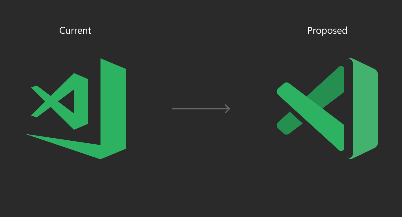
The proposed icons

_VS Code's current Windows icon (above left) and the proposed icon (above right)_
Making it easier to find
We are dropping the thick ribbon on the right side of the icon. This allows us to increase the size of the VS Code shape (the key identifier of difference) to a size where it’s now a lot simpler to glance across the taskbar and spot your favorite code editor.

_The proposed icons for the stable and Insiders builds of VS Code as well as Visual Studio 2019_
To make the icon more legible on a variety of backgrounds (from the desktop to the file chooser), we have added depth to the icon. This allows us to using lighting and shadows to create an overlapped effect, but also has the added advantage of lifting the icon up and off many flat colors it might encounter.

_An example of the proposed icon on some of the blues and greens that you can choose in Windows10._
Improving accessibility
To improve accessibility, we needed a something that is more than color, so taking inspiration from the other Visual Studio Preview builds, we have brought a “stencil” look to the Insiders version VS Code while keeping the familiar green.
_VS Code's current Insiders build icon (above left) and the proposed version (above right)_
Keeping a native macOS style icon
_⚠️ NOTE: Please read our updated response, we will not have a custom icon for the Mac, we will use the same icon across all platforms. ⚠️_
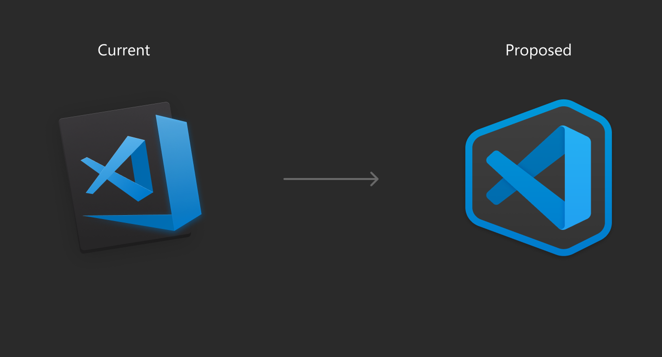
_VS Code's current macOS icon (above left) and the proposed icon (above right)_
We’ve kept a macOS style icon for Visual Studio Code on the Mac. We considered having the same icon across all three operating systems but decided to follow the native Mac style. What we also wanted to add to the macOS version was a stronger connection with the Windows icon which would strengthen the recognition between the two versions. Using the same shape, as well as stencil look to the Insiders build, allowed us to do that easily.

Whilst keeping the shape of the background the same for our macOS icons, we were conscious on making sure that VS Code was easy to identify next to Visual Studio for Mac so we’ve adopted a darker look for the shape. This lets you easily spot the difference if you have both installed (and next to each other) in your dock.
Let us know what you think
We would love to hear your feedback on these proposals So let us know what you think!
 misolori
All 282 comments
Love this idea!
 Barbapapazes
on 6 Apr 2019
Barbapapazes
on 6 Apr 2019
I think a color change is enough to differentiate Insider from Retail, does not have to be a different shape as well. Did you guys explore going into the same direction as the Office guys then? I thought everything across Microsoft has to follow the same scheme now?
 Stanzilla
on 6 Apr 2019
Stanzilla
on 6 Apr 2019
I think having the Insider icon have those cutouts opposed to the stable build makes it look too much like an X, especially a green X, i. e. Excel.
 pschfr
on 6 Apr 2019
pschfr
on 6 Apr 2019
Really nice icons. Its a good idea.
 RandyPJ
on 6 Apr 2019
RandyPJ
on 6 Apr 2019
A green X is Excel - the Excel logo never looked like that, but the Mandela Effect will be a thing. How about Orange for the insiders build?
That said, I like the shape, it's in-line with Visual Studio 2019 just like the current icon is like the VS 2017 one. Just no Green X please.
And maybe don't have a gap at all, in small sizes (e.g., Taskbar icon) it looks more like the icon is actually broken and is missing a column of pixels, the 3D look only works at bigger sizes for me.
 mstum
on 6 Apr 2019
mstum
on 6 Apr 2019
- I like the proposed look for both stable & insiders build specifically the macos one's.
- I love the 3d look of the icons.
- However in the insider build one the stencil dark band or border can be reduced in thickness, after all only an effect.
 Nosherwan
on 6 Apr 2019
Nosherwan
on 6 Apr 2019
I love blue icon of #code and the proposed one with blue, I think is good
 YednapNibas
on 6 Apr 2019
YednapNibas
on 6 Apr 2019
Nice ....👍
 Angusoft-India
on 6 Apr 2019
Angusoft-India
on 6 Apr 2019
Love the idea. Both look great but I'm a lil bit biased towards the stencil look. It will make code icon standout from a pile of icons in a glimpse. Time to spot the stencil icon is seemingly less compared to the other new icon.
 flexdinesh
on 6 Apr 2019
flexdinesh
on 6 Apr 2019
it's great, good job
 behnammodi
on 6 Apr 2019
behnammodi
on 6 Apr 2019
I like what you’ve done here overall. That being said, have you considered drawing from the new Microsoft Office, Skype, etc. logos? The brand consistency might be nice.
 gwardwell
on 6 Apr 2019
gwardwell
on 6 Apr 2019
The macOS icons are fire! I want them shipped in the next build. Tyvm
 jimmybrawn
on 6 Apr 2019
jimmybrawn
on 6 Apr 2019
I like the blue ones for Mac and PC
 tauheedul
on 6 Apr 2019
tauheedul
on 6 Apr 2019
I like the second proposal. 👌
 ahmadawais
on 6 Apr 2019
ahmadawais
on 6 Apr 2019
I've always wondered why the thick ribbon was there, made it look weird, these look a lot better, great idea!
 twisstosin
on 6 Apr 2019
twisstosin
on 6 Apr 2019
Most likely an oversight, but the Insiders icons in the Proposed and Windows 10 background presentations aren't rounded at the bottom part while they appear rounded in the mockups of the Win 10 taskbar and the macOS dock.

 rjt-rockx
on 6 Apr 2019
rjt-rockx
on 6 Apr 2019
macOS one looks super dope. Maybe thinner border but the proposed one still looks sweet.
 vinayakkulkarni
on 6 Apr 2019
vinayakkulkarni
on 6 Apr 2019
I love it
 ngohungphuc
on 6 Apr 2019
ngohungphuc
on 6 Apr 2019
Love the depth of the proposed icon! Just the right level of shadows and rounded corners.
However, I'd prefer the macOS icon without the outline — the same as the Windows one. The shape of the outline looks weird to me and doesn't seem to match the typical macOS icon style. I think the "inner" icon would stand beautifully on its own. 🙂
 mariusschulz
on 6 Apr 2019
mariusschulz
on 6 Apr 2019
Nice! I wouldn't mind having the Windows one on macOS as well — it's so beautiful! 😍
 karol-majewski
on 6 Apr 2019
karol-majewski
on 6 Apr 2019
I love the proposed blue icon!
 WaveHack
on 6 Apr 2019
WaveHack
on 6 Apr 2019
Looking good. I guess. Especially the blue ("stable") one. 😍
 vitalkanev
on 6 Apr 2019
vitalkanev
on 6 Apr 2019
Get rid of the cutout on green icon, make it same shape as the blue icon.
 avatsaev
on 6 Apr 2019
avatsaev
on 6 Apr 2019
I like the new icons, however, o do like the old macOS icon background. If you could find some way to incorporate it, that'd be nice it better fits with the system in that's sense
 andrewfluck
on 6 Apr 2019
andrewfluck
on 6 Apr 2019
Growing on me the more I look at them, really like the Mac icons!
 dswersky
on 6 Apr 2019
dswersky
on 6 Apr 2019
Get rid of the cutout on green icon, make it same shape as the blue icon.
@avatsaev For accessibility reasons, the icons shouldn’t solely differ in color. It’s easier to discern them if their shape is slightly different.
mariusschulz
on 6 Apr 2019
Its nice
 PolymathWhiz
on 6 Apr 2019
PolymathWhiz
on 6 Apr 2019
Loving them ♥
 lukeshiru
on 6 Apr 2019
lukeshiru
on 6 Apr 2019
Loving the new icon, but i would keep the same shape among normal and insider builds
 Negan1911
on 6 Apr 2019
Negan1911
on 6 Apr 2019
loving the new icon, specially the windows one
 amirrezaask
on 6 Apr 2019
amirrezaask
on 6 Apr 2019
The new icon in macOS like no better than the current one, somebody agree?
 chen86860
on 6 Apr 2019
chen86860
on 6 Apr 2019
The new macOS icons look like coffins to me 😢
 bmakuh
on 6 Apr 2019
bmakuh
on 6 Apr 2019
As a lot of folks already mentioned here and on Twitter, the green one with cutouts reminds Excel. Not a good choice.
@misolori Would love to know why VS Code's infinity is incomplete. To stress that VS Code is not as feature-rich as VS? Or is it a fish and not an infinity?
 rubo
on 6 Apr 2019
rubo
on 6 Apr 2019
what about to bing back the orange one for insiders?
 Emeryao
on 6 Apr 2019
Emeryao
on 6 Apr 2019
The green one looks like Excel, i prefere the blue ones
 Otman404
on 6 Apr 2019
Otman404
on 6 Apr 2019
It's a good idea, like the new ones!! 🤙🏻
 ruben69695
on 6 Apr 2019
ruben69695
on 6 Apr 2019
These are great looking logos. However, I beg to differ that they should be accepted.
Take any logo design pundit and ask them basic principles. Everyone of them would, among other things, say _"A great logo should be distinct and should work equally great in grayscale."_
_Proposed logos are too similar to Visual Studio. Also, they have somewhat similarity with old Excel's logo._
On a regular workday, it is very much possible to click the wrong icon. And for color-blind, they would look exactly the same throughout.
I am sure that people are working hard, looking at every aspect of impact of this change and would never be hiding behind (very) subtle distinctions sans the color in current versions.
PS: Here is what WCAG2.1 say about the use of Color.
 dhavalgshah
on 6 Apr 2019
dhavalgshah
on 6 Apr 2019
Remember that complaint about VS Code and VS icons looking too similar?
You're walking right back into that issue with the new VS Code and VS icons. It would help if there was a bit more difference between the two than just the tiny left edge being connected in one of them.
 Dan503
on 6 Apr 2019
Dan503
on 6 Apr 2019
As mentioned before, the Insider logo bottom right corner seems very off compared to the rest of the logo. I would suggest to round the corner of the hollow side, to be consistent with other corners but also with Visual Studio 2019 Preview

 rudyhuyn
on 7 Apr 2019
rudyhuyn
on 7 Apr 2019
About the Mac version, and since the icon has a dark background, it would be _consistent_ if a dark color theme is loaded by default.
And, at the same time, I am not supporting having different icons for different platforms
- cause you need to have _statistics_ that lots of users use VisualStudio + VSCode on their Mac (as far as I know, most use VSCode only).
- will make Mac users see two VSCode icons most of the time (marketplace, official and other websites as well).
 bluemix
on 7 Apr 2019
bluemix
on 7 Apr 2019
I really like the proposal here, it enters in an uniformisation of the brand visual studio, with colours you know which one you are using, even on macOS. Keep going team !
 kevinvavelin
on 7 Apr 2019
kevinvavelin
on 7 Apr 2019
I really dislike this new icon proposal which exists only to align with the release of VS 2019 (which is also ugly). This icon feel the warm up of older draft which have been put away.
What's make the current icon much more better, is the fact that it's monochrome in opposition of your proposal. And if you want to redesign the Mac icon, you don't need to rework the windows versions too.
Next point, if you really need to change the icon because of visual deficiency why don't you change completely the icon instead of only the shape of it ?
Having two REAL different icons between VS Code and VS19 will be much more appropriate instead of only make subtle changes that nobody take care about.
 Nagarian
on 7 Apr 2019
Nagarian
on 7 Apr 2019
I like them. The slight differences in shape are important for accessibility. Differing colour only is not enough.
 pogpog
on 7 Apr 2019
pogpog
on 7 Apr 2019
Hey @rudyhuyn & @rjt-rockx thanks for your eagle-eyed feedback! The issue actually came from my deft resizing of the icons for this GitHub post (you can see the corner is rounded in the VS Mac version) 🙄 I've updated the images in the main issue now. Keep the feedback coming! 👍
 jamiedawsonyoung
on 7 Apr 2019
jamiedawsonyoung
on 7 Apr 2019
The original VS icon is like an infinity sign, or a ribbon.
When the new green icon is evaluated on its own, I am not sure how to interpret it because it loses its 3d form. It does not really have a metaphor. It relies on HSL values that vary by 10% lightness to imply that this object is a truncated or modified version of some other 3d object. Is it a flat object? Is it a fish? You have to be looking at the original different icon to understand the reason behind the shading.
The place where the ribbons are cut has been rounded off. But the shading does not work because the angles used to cut the ribbons makes the object inexplicably flat. The angles at the cuts do not imply the 3d form of the original object and so it rotates the perspective to make a warped effect.
 Yzrsah
on 8 Apr 2019
Yzrsah
on 8 Apr 2019
Can someone explain the idea behind this software being “Visual Studio Code”? They’re not really similar under he hood, right? And their target purpose isn’t necessarily the same, especially since Visual Studio is now available for Mac. That being the case, why play homage to the Visual Studio logo at all? Why even play homage to the name? Why not an entirely new direction with the logo, or even going as far as changing the name to “Microsoft Code”?
gwardwell
on 8 Apr 2019
@gwardwell this is probably going to go tangent to the issue, but I think you are right. The "visual" aspect was in visual studio where devs could drop and drag and create stuff. vscode is more of an editor than that, so yes dropping the word "visual" makes sense 😄
Nosherwan
on 8 Apr 2019
Stellar work 👏
 jonbp
on 8 Apr 2019
jonbp
on 8 Apr 2019
I once suggested to drop "studio" and rename it to "Visual Code" which was rejected- #3611
 gulshan
on 8 Apr 2019
gulshan
on 8 Apr 2019
Hey @Stanzilla & @gwardwell thanks for the feedback on the alignment with other Microsoft products like Office 😃 We have actually been working with both Office and Windows on aligning across Microsoft on an icon style. Given the breadth of different products that need work together we have more guiding principles rather than trying to match each other exactly. The depth (and the subsequent lighting and shadows) we've introduced with this icon refresh is a step towards this alignment. I've updated the taskbar image with some new Office icons so you can see this more clearly.
jamiedawsonyoung
on 8 Apr 2019
I like the asymmetry of the Mac icons 👍
 orta
on 8 Apr 2019
orta
on 8 Apr 2019
Overall, I get what you're going for, and I think, in terms of consistency with Visual Studio, you're on the right track.
However, I agree with other comments here about the Preview icon style/color.
I think it's too much to have _both_ a different style _and_ color. If you want to denote the difference between the regular version and the insiders version, you should use _either_ a different color _or_ a different style.
While I personally like having a green icon for insiders, I would also be ok with the stenciled look which is blue. This is in keeping with the Visual Studio Preview vs. Release icons. But whatever you do, you should probably choose either color or style to differentiate the "flavors", but not both.
 fourpastmidnight
on 8 Apr 2019
fourpastmidnight
on 8 Apr 2019
The colors are nice and they pop out well, but I'm not a fan of these rounded corners MS trying to sneak in with the office icons and some parts of the settings app/start menu recently. I like the more angular style of Win10.
Leave the rounded corners to Apple.
 AlexAegis
on 8 Apr 2019
AlexAegis
on 8 Apr 2019
I really like the blue one. A lot. It kind of looks like a space ship, and as we all know, working with VSCode is... out of this world.
 Siraris
on 8 Apr 2019
Siraris
on 8 Apr 2019
This is still really bad for the color blind. They have to identify tiny difference in a tiny icon. I've spoken to people who CANNOT see the color differences.
 LoadLibraryEx
on 8 Apr 2019
LoadLibraryEx
on 8 Apr 2019
Can somebody explain why am I getting downvoted? This thread is supposed to be about discussion and feedback. Negative feedback is feedback too. Or the Apple comment is what made you think I'm just "trolling"?
Let me explain: I used Apple here as an example. They have a working ecosystem, and a consistent design language all across their products. Rounded corners are common and It looks good as a whole. (Another good example would be Bootstrap, or Primer)
But let's open VS Code. Or any other modern MS application, and what do we see?
Sharp corners everywhere.
Is that a problem? Hell no. It's another design direction and it's really good too. But please stay consistent. (The only rounded corners I could find in VS Code is the new search widget in the explorer sidebar.)
The icon should reflect the application. The previous icon did that. This one is not.
And this is true for the new office icons too, but that's another topic.
AlexAegis
on 8 Apr 2019
Nice one , better than the last icon , but I think the one for Mac better than that one in Windows, why?
 Ehab97
on 8 Apr 2019
Ehab97
on 8 Apr 2019
Really good idea!
 dskusuma
on 8 Apr 2019
dskusuma
on 8 Apr 2019
Please consider changing the icon so it looks different than Visual Studio 2019. It makes it very difficult to tell them apart, specially if you are color blind.
 asanjabi
on 8 Apr 2019
asanjabi
on 8 Apr 2019
I really like it
 CarlosHdz7
on 8 Apr 2019
CarlosHdz7
on 8 Apr 2019
I imagined it like this, old shape, new colors

AlexAegis
on 9 Apr 2019
@AlexAegis The angles you used at the cuts imply the meaning of the object, good work
Yzrsah
on 9 Apr 2019
@AlexAegis Could you please make a version of that with the alpha edge stroke?
Yzrsah
on 9 Apr 2019
Same icon every single OS, why make them different, why
 BlackV
on 9 Apr 2019
BlackV
on 9 Apr 2019
I like the new icon for Windoes, but I definitely don't like the new one for MacOS.
 juanesmendez
on 9 Apr 2019
juanesmendez
on 9 Apr 2019

The current icon for macOS seems to have native Mac style. But the proposed one...
 wendellhu95
on 9 Apr 2019
wendellhu95
on 9 Apr 2019
I wonder if some added textural elements might help to further distinguish the “Insiders” icon. For example, the Firefox Developer Edition icon adds a polygonal pattern to the globe. A textural treatment such as this for the Insiders icon might accentuate the “stencil” motif as well.
 kohlmannj
on 9 Apr 2019
kohlmannj
on 9 Apr 2019
Here's a quick hack with changed angles and inverted.


Yzrsah
on 9 Apr 2019
The shape is important as much as the color to differentiate with visual studio
Really I like the new shape
.
 ARemaity
on 9 Apr 2019
ARemaity
on 9 Apr 2019
I really like the new concept
 bolorundurovj
on 9 Apr 2019
bolorundurovj
on 9 Apr 2019
New proposed design looks pretty awesome.
However, for me, icon for macOS, especially that big background don't fit very well.
 nihadguluzade
on 9 Apr 2019
nihadguluzade
on 9 Apr 2019
Nice,very good-looking (except mac icon)
 vsTianhao
on 9 Apr 2019
vsTianhao
on 9 Apr 2019
Can Linux users get the regular icon instead of the Mac OS one, please?
 hho
on 9 Apr 2019
hho
on 9 Apr 2019
right
 roy-lau
on 9 Apr 2019
roy-lau
on 9 Apr 2019
Not a fan of the macos icons at all
 matt3224
on 9 Apr 2019
matt3224
on 9 Apr 2019
Hi @fourpastmidnight When we looked at the Insiders and Stable build icons together we knew we needed to use more than just colour to differentiate between them. This is so that the icons are more accessible for customers with color vision deficiency. We started with just the stencil approach but then added the green back from the current Insiders icon for familiarity. The combination of the colour and the stencil has created a bit of feedback around the similarity to the old Excel icon though 😁
jamiedawsonyoung
on 9 Apr 2019
Hey @AlexAegis I wanted to address some of the valuable feedback you've been adding to this thread, you're correct in saying this is a open forum for discussion and feedback, both negative and positive.
I think your point around how a product icon should reflect the ui of the product (or even the OS) is interesting but maybe limiting? Where I agree that Apple 'owned' the rounded corner for a long time, I'm not sure that's the case anymore (and I'm not sure that's how they'd like to be remembered either 😉) Similarly for Windows, I see many examples of less than sharp corners across all of our major products and I think that's okay too.
We try to design our products with the most appropriate ui for the task you're trying to complete as well as follow the platform we're designing for. How you round the edge in a ui can have a huge impact to the cohesive look of an application (or even OS) but we shouldn't limit ourselves, as that could limit what we deliver to you 😃
jamiedawsonyoung
on 9 Apr 2019
Looks cool! Can't wait to see it in my dock.
Reminded Taxi in Detroit game a bit

 flppv
on 9 Apr 2019
flppv
on 9 Apr 2019
@jamiedawsonyoung Ah, I see. Well, it was just a thought that color and style _might_ be too much. Either way, I do like the new logo design for Windows.
However, I also find the mock-up designs by @AlexAegis and @Yzrsah _very_ nice, too. I actually like them better than the current flat design. Nice work.
fourpastmidnight
on 9 Apr 2019
Really love the logos! Would love the Mac one to match the Windows one though. Not a fan of the border.
 bradleykenny
on 10 Apr 2019
bradleykenny
on 10 Apr 2019
Can't we just make the style consistent across every platform? Purple for Visual Studio, blue for Visual Studio Code and green for Insiders if fine, but please don't use a different icon style in macOS!
I would love to see something like this (as @mariusschulz already proposed)

You are writing, that you thought about using the same icons but decided against it to follow the native Mac style:
We’ve kept a macOS style icon for Visual Studio Code on the Mac. We considered having the same icon across all three operating systems but decided to follow the native Mac style.
I would argue, that the newly proposed Mac icon does not follow the native Mac style. It looks very unnatural in comparison to most other apps. The new Windows icon you proposed also fits perfectly to the Mac style. Without any macOS specific modifications
Take a look at the Visual Studio 2019 icon in my dock: It looks very unnatural there...

 robinmanuelthiel
on 10 Apr 2019
robinmanuelthiel
on 10 Apr 2019
Take a look at the Visual Studio 2019 icon in my dock: It looks very unnatural there...
@robinmanuelthiel So you say Sketch icon looks natural for example? Still it's nice and I love to have it in the dock :)
 ivansvlv
on 10 Apr 2019
ivansvlv
on 10 Apr 2019
Great icons. I like the colour and the differentiation (colour and style) between regular and insiders. However I agree with the feedback that the icon should be consistent across platforms, which seems the route that other MS products (namely Office) are taking. I would prefer to see the "Windows-style" icon used everywhere; no macOS-specific icon. It's unfortunate that Visual Studio 2019 did not already go this route.
 gbale
on 10 Apr 2019
gbale
on 10 Apr 2019
I think having the Insider icon have those cutouts opposed to the stable build makes it look too much like an X, especially a green X, i. e. Excel.
I think so too!!!
looks like Excel Icon...
 takanasun
on 11 Apr 2019
takanasun
on 11 Apr 2019
Amazing.
 ghost
on 12 Apr 2019
ghost
on 12 Apr 2019
Nice. When is this shipped?
 anhthang
on 14 Apr 2019
anhthang
on 14 Apr 2019
I think having the Insider icon have those cutouts opposed to the stable build makes it look too much like an X, especially a green X, i. e. Excel.
But it follows the Visual Studio style, so it's correct.
I prefer to see an X rather than having two software of the same family (Visual Studio) with different icon styles.

 JakubSteplowski
on 14 Apr 2019
JakubSteplowski
on 14 Apr 2019
Really love the icons.
 prasadmudedla
on 15 Apr 2019
prasadmudedla
on 15 Apr 2019
awesome
 ghost1372
on 16 Apr 2019
ghost1372
on 16 Apr 2019
Can Linux get the same icon as Windows, please?
 robertcalvert
on 16 Apr 2019
robertcalvert
on 16 Apr 2019
awesome!!
but ,I like more short width edge line.
Of course I think it is a very nice design.
takanasun
on 17 Apr 2019
Love the new icons overall! Just a small detail on the edges of the insider icon that is bothering me a little. Maybe it would be better to have them rounded instead of (crooked)?

 AdamJonsson
on 19 Apr 2019
AdamJonsson
on 19 Apr 2019
Great work! Really love the new logos and can't wait for them to be released! As many people have said above, I would also love for the Mac icon to match the Windows icon. Not a fan of the border!
 jletey
on 19 Apr 2019
jletey
on 19 Apr 2019
Love the proposals!
 NielsVerheijen
on 19 Apr 2019
NielsVerheijen
on 19 Apr 2019
I think a round icon for Mac os will look better, like the Safari icon since it looks more standardised.
 SethuSenthil
on 19 Apr 2019
SethuSenthil
on 19 Apr 2019
I'm not so sure that the whole Excel X thing would be much of a problem considering that the vast majority of VS Code insider users are highly computer literate? Then again I don't have much experience.
Also Mac icon = Windows icon? I actually think they'd fit in _more_ without the background, especially when you add in the Office icons.
But these new icons overall are just 🔥🔥🔥. Thanks so much MS!
 Elttob
on 29 Apr 2019
Elttob
on 29 Apr 2019
I really like these icons :) This is not merged in April iteration?
 turtuga
on 10 May 2019
turtuga
on 10 May 2019
 victor871129
on 13 May 2019
victor871129
on 13 May 2019
The new design looks nice, but it has me confused about something:
I always assumed that the icon was supposed to represent "infinity". At least, the Visual Studio ("Not Code") icon is clearly an infinity, and the VSCode icon appears to be based on the same idea. Although the leftmost fold of the infinity is hidden in the VSCode icon, I mentally pictured this as being "still there, just the same colour as the background", like it is camouflaged by reflecting light or something.
With the new design, it is harder to continue my mental fiction. Because of the rounded edges on the left side of the two crossing lines, it is much harder to imagine that fourth hidden side. The rounding ends say "this line stops here", it doesn't make sense to imagine them as "folded over" anymore
So I have to ask -- was it it ever supposed to represent infinity? I don't find any mention of infinity in this page at all. The 2017 redesign page says that "We iterated on the infinity logo for some time...until we landed on the current fish". So is it a fish, or infinity?
 uglycoyote
on 15 May 2019
uglycoyote
on 15 May 2019
Looks good
 ndedic
on 15 May 2019
ndedic
on 15 May 2019
Can't we just make the style consistent across every platform? Purple for Visual Studio, blue for Visual Studio Code and green for Insiders if fine, but please don't use a different icon style in macOS!
I would love to see something like this (as @mariusschulz already proposed)
You are writing, that you thought about using the same icons but decided against it to follow the native Mac style:
We’ve kept a macOS style icon for Visual Studio Code on the Mac. We considered having the same icon across all three operating systems but decided to follow the native Mac style.
I would argue, that the newly proposed Mac icon does _not_ follow the native Mac style. It looks very unnatural in comparison to most other apps. The new Windows icon you proposed also fits perfectly to the Mac style. Without any macOS specific modifications
Take a look at the Visual Studio 2019 icon in my dock: It looks very unnatural there...
Agree, it is also can be shaped inside a circle like the App Store icon.
 deus42
on 15 May 2019
deus42
on 15 May 2019
Do not like the outline on the Mac version. It looks way out of place and garish. The Windows version is fine, and should be the same version used across all 3 platforms.
 twlatl
on 15 May 2019
twlatl
on 15 May 2019
Mac Os icon looks the best, color and shape.
 BilalDendani
on 16 May 2019
BilalDendani
on 16 May 2019
quite disappointing this, the best one, didn't go into april update...
 regs01
on 17 May 2019
regs01
on 17 May 2019
My first reaction was, "here we go again". But instead, I really like the new icons! 👍
 sagebind
on 17 May 2019
sagebind
on 17 May 2019
I really love the blue icon, but i'd prefer the insider icon shape to be the same as the stable, i feel it ugly with that space.
 kowalski7cc
on 20 May 2019
kowalski7cc
on 20 May 2019
Responding to your feedback
Whilst a lot of you like the proposals for the new VS Code icon (thanks!), we did see some signals amongst the comments and tweets that we wanted to address, namely that the green Insiders icon looked like an old Excel icon, and that there were requests to have the same icon across Windows, Mac, and Linux.
Addressing the Excel feedback
The cutouts of the Insider build icon are there to allow you to easily distinguish between the Stable and Insiders builds if you have color vision deficiency. However, the strength of the vertical cuts we’ve made in the icon accentuates the “X” that is formed by the rest of the icon. To reduce this effect but hold onto our accessibility, we’ve reduced this space by 1px at its smallest size.
The green of the Insiders build icon is also a very similar hue to the Office Excel green, so we’ve shifted the hue away to make sure the combination of the green and the X don’t send the wrong signals when you’re looking for VS Code in your taskbar/dock.

_An example of the new thinner cuts to the Insiders build as well as a hue that isn't similar to Excel's green_
One icon for all platforms
In our initial proposition, we spoke about aligning with other macOS products in the Visual Studio family such as Visual Studio for Mac. While the need for a separate icon for Visual Studio for Mac is clear given the difference in the two products (Visual Studio and Visual Studio for Mac). Visual Studio Code is the same product across all the platforms so the need for this is less clear.

_The new VS Code Stable and Insiders builds in the Windows 10 taskbar_

_The new VS Code Stable and Insiders builds in the macOS dock_

_The new VS Code Stable and Insiders builds in the Ubuntu 18.04 dock_
Given this, we’ve decided to use the same product icons for VS Code across all the platforms.
Rollout Plan
We plan to update the icons next week. Insiders will be immediately available, and Stable will be available in early June. Thanks again for all the feedback, we really hope you like the new icons.
jamiedawsonyoung
on 23 May 2019
The new insiders icon looks much better IMO, the new hue of green is a huge improvement over the former and is very nice indeed. I think you've really nailed it this time. Also great to hear that the VSCode icons will be made identical across platforms!
I also think the Visual Studio for Mac icon fits the application beautifully, in terms of it being 'more complete', I think the icon conveys this nicely with its 'fuller' representation. Good work 👍🏼
Are you sticking with orange for the exploration build icon?
 dalDevelo
on 23 May 2019
dalDevelo
on 23 May 2019
Both new icons are absolutely gorgeous! Thank you for reaching out to the community, asking for feedback, and taking it into consideration. It really is much appreciated. 🙂
mariusschulz
on 23 May 2019
Are the cutouts of the Visual Studio Preview icon also being updated? Otherwise, this would be inconsistent.
 Studio384
on 23 May 2019
Studio384
on 23 May 2019
@Studio384 the Visual Studio Preview icons will also be updated
misolori
on 23 May 2019
I LOVE THEM SO MUCH. So much that all caps was required.
 burkeholland
on 23 May 2019
burkeholland
on 23 May 2019
I really like the change. I haven't had the Excel mix-up issue, but I think the new icon is an improvement.
 alvinashcraft
on 23 May 2019
alvinashcraft
on 23 May 2019
Great. Never thought I'd love _change_ this much,
 adebiyial
on 23 May 2019
adebiyial
on 23 May 2019
I like this change a lot as well. Looks really good!
 scottymcraig
on 23 May 2019
scottymcraig
on 23 May 2019
I really like new Insiders version with reduced gap, however would prefer darker color.
Would be great to have two colors of Insiders icon bundled into .exe file.
Never had problem to distinguish Excel and VS Code and darker color looks better for me.
 IllusionMH
on 23 May 2019
IllusionMH
on 23 May 2019
Will this be included in the next update?
vinayakkulkarni
on 23 May 2019
It's a nice change... and it makes all the difference. Great work.
 nuno-barreiro
on 23 May 2019
nuno-barreiro
on 23 May 2019
@vinayakkulkarni yes, the next stable version will have the updated icon and insiders will get it sooner (either tomorrow or Monday).
misolori
on 23 May 2019
I like the new style but maybe we have to talk about the green of the insiders icon
 evilbaschdi
on 23 May 2019
evilbaschdi
on 23 May 2019
@misolori I'm on an Exploration build, because of color compatibility issues that are resolved in Electron 4.x. Since the Exploration builds are orange, will you be producing an orange-tinted version of these for those builds?

 jdsimcoe
on 23 May 2019
jdsimcoe
on 23 May 2019
@jdsimcoe yes, we will be updating our exploration build icon as well.
misolori
on 23 May 2019
@misolori You guys rock. Love the new direction. Send my best to the whole design team.
jdsimcoe
on 23 May 2019
IMO proposed form is better than the current one, but color should not be blue. A color different from Visual Studio's icon color would be much better.
 cyberpunk2099
on 23 May 2019
cyberpunk2099
on 23 May 2019
I know this is a long shot but in terms of accessibility wouldn't be recommended to add a little bit more of distinction between insiders and stable? I am thinking about the colour blind people.
 Nepomuceno
on 23 May 2019
Nepomuceno
on 23 May 2019
This looks good. Blue one
 javkhalid
on 24 May 2019
javkhalid
on 24 May 2019
@Nepomuceno for improving accessibility we did add the "cut outs" and changed the hue so it's more noticeable for users who are color blind. Here's what that looks like in Deuteranopia:

misolori
on 24 May 2019
Just wanted to say that this icon is a _major_ improvement over the icon we have now.
The simple shape carries it and reads well outside the Microsoft ecosystem.
Icon styling
I think this icon feels a lot more at home, and on macOS particularly, though that does bring up other questions in my mind.
The app itself has very rectangular flat design with no rounded edges or shadows (excepting the command palette and dropdown menus), yet the icon is moving towards a more rounded-rectangle / Apple look with subtle 3d shading / depth cues.
If this is a signal that the design language of the app is now allowed to soften, I'm all for it. I think vscode in a way is much bigger than just being a reflection on Microsoft, but is the future of how many people will experience code & work in general.
I think the best "flat design" is actually a compromise between completely flat color and the fully-rendered design from the Steve Jobs era.
Insiders icon
The cuts seem strangely 2d to me in the context of an icon that has 3d styling. I sketched a version where it was a darker band painted on the ribbon, but it didn't look great either. I understand it's about accessibility, I just hope over time a more aesthetic compromise can be found. @andrewmundy I'm a little confused that your "before" doesn't match the mocks above.
Shading on corners
I think additional subtle lighting cues at the top and bottom of the ribbon's fold radius would help sell the 3d curve of the new icon. Maybe a dash of bounce lighting in the fold where the two sides are close together? A subtle bevel on the edges? There is a slight physical impossibility implied with the ends and perspective as well, not sure if intentional.
This is all just about subtle refinements, the design you have is good.
There is a meta-point here about design critique in the open. I appreciate you @misolori braving the comments sections and listening… there are a lot of sometimes conflicting perspectives but the design seems to be getting better as a result. (also continued conversation on twitter)
p.s. VSCode is the only Microsoft product I use but it's been amazing and really changed my opinion about y'all
 darknoon
on 24 May 2019
darknoon
on 24 May 2019
Where can I get an icls file to have a bite on this new cake? 😋
wendellhu95
on 24 May 2019
I really need the ico format of this new logo so I can change my local visual studio code program and enjoy it.
 Anduin2017
on 24 May 2019
Anduin2017
on 24 May 2019
Love the proposed icon, it's way more modern and fresh than the current one (still like it though)!
 dcorvasce
on 24 May 2019
dcorvasce
on 24 May 2019
For exploratory builds perhaps the icon can stay the same but instead of fill use the zig-zag pattern like in https://github.com/microsoft/vscode/issues/71827#issuecomment-495306980 (as in, instead of solid shape, the shape is filled with zig-zag lines as it's a "sketch").
Really like the new icons 👍
 msmolev
on 24 May 2019
msmolev
on 24 May 2019
I like the first design for macOS icon ( Keeping a native macOS style icon ) in the latest release of VS Code insiders you made the icon like the icon for windows, please change it to the first design you choose for the macOS.
I mean this icon:

 adel-bassiony
on 25 May 2019
adel-bassiony
on 25 May 2019
I love the “one icon” you landed on. I was never a fan on the border and background on the original Mac icon you proposed, and I’m really happy you chose to abandon that version for an icon that matches across all platforms.
gwardwell
on 25 May 2019
All good, but a very little more hue to both main and insiders are welcome
 tavrez
on 25 May 2019
tavrez
on 25 May 2019
IMO the icons are a bit too large. This is how it looks in my dock; it seems weird compared with the above and below icons. I also agree a bit more hue would look nicer.

 albireox
on 26 May 2019
albireox
on 26 May 2019
@albireox I think the color is great, but the size gets too close to the edge of the macOS dock.
jdsimcoe
on 26 May 2019
@albireox we’ve already got a fix for the icon size, should be updated in the next insiders release.
misolori
on 26 May 2019
I like the VS icon, but please don't bring back the inset shadows of Windows 8.
 SeanLedbetter
on 26 May 2019
SeanLedbetter
on 26 May 2019
I really appreciate the design thinking that went into this new icon, and I know some people will just never get behind a new thing no matter how good it is. That said, here's a few critiques:
The inconsistent use of inset shadows is discordant:

I find the rounded corners to have a more childish feel, the sharp corners of the previous icon felt more crisp and professional.
 macgyver
on 26 May 2019
macgyver
on 26 May 2019
Just throwing in my opinion - as @macgyver said, some people will always like the 'old', and I might be one of them.
I just find the icon a little too big (which I know is being fixed), but I'm constantly mixing it up with Excel now to the point of frustration. Perhaps it's muscle (eye?) memory but boy-oh-boy I'd rather a setting somewhere to keep the old one.
Is this a possibility?
EDIT: I 100% agree with Adel's comment above - the bordered green(er) one looks great. No confusion there.
 vSanjo
on 27 May 2019
vSanjo
on 27 May 2019
After weekend with new Insiders icon there are two observations:
- On W10 with dark OS theme gaps on insiders icon don't feel like intentional gaps to denote deconstructed logo but more like hard shadows on pseudo-3D shape.
May be bigger gaps will look more in place.
- Would be great to check how icon would look like in old hue. Current one looks really pale, desaturated, and doesn't feel like VS Code icon (insiders/stable) or other MS products.
Earlier I commented that that reduced gaps looks better, however checking on actual task bar on SP3 - doesn't look that good.
My concern regarding hue of Insiders icon was confirmed and I'd prefer at least to check how new shape with old hue would look like.
IllusionMH
on 27 May 2019
like an ugly fish, hmm... but i love it.
 geminiyellow
on 28 May 2019
geminiyellow
on 28 May 2019
The new icons looks great. However, on macOS something about the insider icon just makes it look... blurry? (for the lack of a better word) on the dock especially with lighter backgrounds.

I think it's missing some contrasting outlines and drop shadow
 weijiangan
on 28 May 2019
weijiangan
on 28 May 2019
It's great that the icon doesn't look oversized anymore!
wendellhu95
on 28 May 2019
As much as I mentioned that I love the new icon colour earlier in this thread, I have to admit that it doesn't look as great when it is on a partially-transparent backgrounds, whether light or dark.
I think it looks great on solid dark backgrounds, but defo needs some adjusting for better definition overall, both on lighter backgrounds, or where some transparency is being applied.
The new icons looks great. However, on macOS something about the insider icon just makes it look... blurry? (for the lack of a better word) on the dock especially with lighter backgrounds.
I think it's missing some contrasting outlines and drop shadow
dalDevelo
on 28 May 2019
Agreeing with @weijiangan and @dalDevelo, the new icons for Insiders just don't look good against a light background (in this case, the default MacOS Mohave background:

 jtsom
on 28 May 2019
jtsom
on 28 May 2019
I think that the insider icon lack contrast (at least on MacOS), as far as I can tell there is not a shadow that can make the icon "pop" as other icons especially in the application switcher (cmd+tab), it is also noticeable in the drawer as pointed by @weijiangan
For me personally I can't find the icon visually when put side by side other app icons when is over a white background. I am talking about speed in recognizing the icon.

 zanza00
on 28 May 2019
zanza00
on 28 May 2019
Thanks everyone for the feedback so far, we'll work on addressing the contrast issues for the Mac and Linux icons.
misolori
on 28 May 2019
@misolori there are contrast problems on W10 (especially when VS Code icon is active) too.
IllusionMH
on 28 May 2019
@IllusionMH can you post a screenshot?
misolori
on 28 May 2019

does't look very contrast when window is active and task bar icon is highlighted.
Not as bad as transparent Mac OS, but worse than before.
IllusionMH
on 28 May 2019
This shade of green seems to be a mistake in general. I preferred the original green version.
Studio384
on 28 May 2019
This looks great! But I prefer the original green as it seemed more saturated :D
 nadav-ram
on 28 May 2019
nadav-ram
on 28 May 2019
If the logo had a white circle (or maybe hexagon) background, accessibility problem could be solved once and for all.
cyberpunk2099
on 28 May 2019
The blue version looks like better and comfortable :)
Of course, if the current version could be reserved for alternative icons, it would be better more 👍
ghost
on 29 May 2019
I like this one more.
👇

The other one doesn't look great.
 elanandkumar
on 29 May 2019
elanandkumar
on 29 May 2019
To be honest. Yesterday I made some updates on my system and got a shock when I saw the new icon. I first didnt know what application that was (I am using elementaryOS 5 with a custom icon set that is basicly the macOS icons in nicer).
I LOVE the new icon I got with the update (VSCode overwrote the icon of my icon set to the new styled one).

I did some google searches but didnt find a high quality version of the green icon in blue.
Does someone have that? (PNG, Transparent, 1024x1024)
I for now extracted the blue logo from the latest windows stable build to replace the out of place macOS like icon. (Extracted the exe, copied the icon and selected it in the .desktop file)

I tricked around a bit, and this is what I got:

(Windows Styled)

(macOS Styled)

(@wyfang 's macOS Styled)
(All images are a bit small due to manual editing by a image editing noob)
Please make this change happen, the new logo is SO COOL. (And keep that seperaction between the front [right] and back [left] of the icon like it is now, it makes it 40% better)
 AtjonTV
on 29 May 2019
AtjonTV
on 29 May 2019
If I can, I want to use a round icon on my Mac, for example:

 wyfang
on 29 May 2019
wyfang
on 29 May 2019
Uhh.. did they revert the icons in a recent insiders build? I launched Code this morning, and the icon switched back to the original:
![]()
code-insiders --version
1.35.0-insider
6964233e81c68f5a5f34e7eb1da0836e1d539f14
x64
What do you think about keeping the tilted style on macOS together with the new icon?


 fwcd
on 29 May 2019
fwcd
on 29 May 2019
I have the same issue @jtsom !
Mine reverted back to the old logo on the very next insiders build after release. The new logo seems to still exist everywhere else within the insiders build. I have also noticed that in my applications folder the old logo shows up in the applications list, but when selecting the application in finder, the new logo is displayed in the next column (when using column view on macOS).
dalDevelo
on 29 May 2019
I followed this to clear out the icon caches - https://mjtsai.com/blog/2019/02/01/clearing-the-icon-services-cache-in-mojave/ and the new (hard to see) icon is back.
jtsom
on 29 May 2019
Is is possible to share files with possible icon designs in this thread (.ico for Windows (or several icons in .exe file), other formats for Mac and Linux)?
In this way insiders will be able to check how Insiders icon looks like in their system with new hue, old hue, and also check how Stable icon will look like.
IllusionMH
on 29 May 2019
You sometimes may encounter icon cache issue with the old one showing up on the Mac, @jtsom's link is a good alternate to clear the cache. You can also right-click on the application (in finder) > Get Info > and drag the preview image into the icon in the top left.
@AtjonTV the stable version will be updated in the next release (hopefully next week).
@fwcd we originally proposed a mac styled icon but after seeing the feedback we decided to use one icon across all platforms (see this update for more info).
misolori
on 29 May 2019
@misolori Did you consider something like @wyfang's proposal? It looks great IMO and it also follows the macOS icon guidelines.
 nblagoev
on 29 May 2019
nblagoev
on 29 May 2019
@nblagoev yes we did, that was one of our original concepts but felt the circle did not occupy the space efficiently with our logo. That's what lead us to the original proposed mac icon. In the end, after much discussions internally and from feedback from the community we decided to use a single icon on all platforms.
misolori
on 29 May 2019
@nblagoev not all people like when all icons in the system have same shape, as they are difficult to read when they look same.
This one is sleek, modern and distinctive.
regs01
on 29 May 2019
Not sure what happened, but someone just had this happen when their Insiders updated:

That's not a very helpful icon!
jtsom
on 29 May 2019
Not sure what happened, but someone just had this happen when their Insiders updated:
That's not a very helpful icon!
I didn't like the new outlook, so I went to find the old one, (the edgy one), had dropped it off in the vscode fodler, the new updated wiped it out of existence too... now I have to go find it again..
 simdimdim
on 29 May 2019
simdimdim
on 29 May 2019
Why doesn't macOS use the same icon as Windows? I think the borders are too ugly!!!
 longforus
on 30 May 2019
longforus
on 30 May 2019
@longforus please see our updated response, we will be using one icon on all platforms.
misolori
on 30 May 2019
Not sure what happened, but someone just had this happen when their Insiders updated:
That's not a very helpful icon!I didn't like the new outlook, so I went to find the old one, (the edgy one), had dropped it off in the vscode fodler, the new updated wiped it out of existence too... now I have to go find it again..
reboot the in safe mode
 andremacola
on 30 May 2019
andremacola
on 30 May 2019
@jtsom @simdimdim sorry, this appears to be a weird bug on Mojave (https://github.com/microsoft/vscode/issues/63068). Restarting the dock in terminal via killall Dock seems to fix it.
misolori
on 30 May 2019
@jtsom @simdimdim sorry, this appears to be a weird bug on Mojave (#63068). Restarting the dock in terminal via
killall Dockseems to fix it.
I had to reboot in safe mode.
andremacola
on 31 May 2019
@longforus please see our updated response, we will be using one icon on all platforms.
@misolori oh, I didn't notice it, one on all is very good. 👍
longforus
on 31 May 2019
Clearing Icon Cache for Stable icons
Depending on your platform, you may still see the earlier logo due to operating system caching of the application icon. Here are a few methods for the Mac that you can attempt to use to clear the cache:
Restart your dock via
killall Dockin the terminalRun these scripts in your terminal (which updates the timestamp of the icons):
sudo touch /Applications/Visual\ Studio\ Code.app;
sudo touch /Applications/Visual\ Studio\ Code.app/Contents/Info.plist;
sudo touch /Applications/Visual\ Studio\ Code.app/Contents/Resources/Code.icns;
killall Dock Finder
_Note: For Insiders and Explorations, simply append \ -\ Insiders or \ -\ Exploration to each version name reference._
- Force the IconService cache to be rebuilt using these steps
misolori
on 3 Jun 2019
🚀 We're shipping our Stable icons in the next release (later this week) and Insiders/Exploration builds are already using the icons. Closing this issue, 👏 thanks again to everyone who provided input!
misolori
on 3 Jun 2019
@misolori so there will be no changes to Insiders icon (on Windows)?
Could you please provide provide .ico file for new Insiders icon shape with old hue?
Change in hue just to distinguish Stable and Insiders looks overkill for me (I doubt that both stable and insiders are often used simultaneously + used by people who really need different hue) and I'd be glad to set up icon with old hue manually if you really think that this colors are must have.
IllusionMH
on 3 Jun 2019
@IllusionMH we'll be shipping what's in Insiders today, please see our comment about why we changed the hue (in case you missed it). One of the original goals of this re-design was to address the accessibility issues we had with the Insiders icon (we can't use color alone to distinguish meaning). Here's an example of how that was improved.
misolori
on 4 Jun 2019
@misolori I've followed this thread and know reasons, but I hoped that feedback after live Insiders icon release will be addressed too.
Anyway, I'm asking if you could share files with old hue, so users who would prefer old color with new shape will be able to set it only for themselves.
I don't have proper tools or skills, but I guess that this won't be hard for you with existing sources.
IllusionMH
on 4 Jun 2019
Could the proposed macOS icon be uploaded somewhere, I would much prefer this one over the cross-platform design
 adryd325
on 4 Jun 2019
adryd325
on 4 Jun 2019
Are these logos on Linux Mint as well?
I still see the old one.
 angelov-a
on 5 Jun 2019
angelov-a
on 5 Jun 2019
The difference between VSC and VS still seems minimal.. what about picking something completely different?
https://user-images.githubusercontent.com/6909617/55719383-08719880-59f6-11e9-9a2a-537441767e4b.png
 OlafvdSpek
on 5 Jun 2019
OlafvdSpek
on 5 Jun 2019
Hi @angelov-a!
I'm using Ubuntu and had the same problem (seeing the old icon after update), executing following command:
sudo update-icon-caches /usr/share/icons/*
and restarting the session after that (maybe just logout/login would also work) fixed my problem.
 xeptore
on 5 Jun 2019
xeptore
on 5 Jun 2019
Oof, I didn't see this until I updated my app to find a new icon on my Dock. I urge you to reconsider removing the old document-style tilt treatment. It's fine without the swoosh on the right side, but losing the tilt and document rectangle is a step backwards. It reminds me of this line from a recent post by the IconFactory, who have been designing super-high-quality icons for the Mac and others for decades:
[...] a Mac desktop icon, which should be similar to, but not the same as, your iOS icon. Utility applications typically get a round icon, while document-based applications get a perspective treatment.
The icon shouldn't be the same across platforms, it should be similar and recognizable but tailored to the platform. And as a "document-based application", VSCode should keep the "perspective" tilt. When I started using VSCode, that was one of the little touches that made me like the app! The new icon feels much less native.
 ruddzw
on 5 Jun 2019
ruddzw
on 5 Jun 2019
Hi @misolori!
i think adding my solution is helpful for Linux users (maybe only Ubuntu-ers!).
thank you
xeptore
on 5 Jun 2019
@xeptore,
Thanks for the reply.
Unfortunately it doesn't work on Mint.
angelov-a
on 5 Jun 2019
The issue, for me at least, on the Mac, with the Insiders icon isn't so much the shape, as it is the color/contrast. On the default Mojave desktop picture, the icon all but disappears:

jtsom
on 5 Jun 2019
The issue, for me at least, on the Mac, with the Insiders icon isn't so much the shape, as it is the color/contrast. On the default Mojave desktop picture, the icon all but disappears:
Windows 9x Background? 😄
andremacola
on 5 Jun 2019
Hahaha... no silly...

jtsom
on 5 Jun 2019
Hahaha, I was joking.
I think this problem will occur with almost any icon. It will depend the user os theme configuration. In your case when using the stable version with the blue icon, I think will be worse.
To avoid this kind of problem, all my backgrounds nowadays are black at the bottom. I had problem in the past with Spotify, Sublime (with gray background) and a bunch of other apps.
andremacola
on 5 Jun 2019
Can someone please explain to me why the stencil feature is applied to every part of the insiders icon except this one part? like, what is going on here, how is my brain supposed to parse this shape

macgyver
on 5 Jun 2019

That's a good question. I didn't see it at first either. I think it looks more parsable on a dark background that the cutout seems to imply an edge facing the viewer.
 fivetwelve
on 5 Jun 2019
fivetwelve
on 5 Jun 2019
@macgyver @fivetwelve the insiders icon is intended to match the preview icon for Visual Studio (Windows), where it's in a 3d space:

misolori
on 5 Jun 2019
I have the same issue as @jtsom . Most icons on macOS are "fuller". The new VS Code icon has too much transparent areas and it kind of gets lost... See my dock as an example (and this is irrespective of the background image)

 ItalyPaleAle
on 5 Jun 2019
ItalyPaleAle
on 5 Jun 2019
I see my dock icon got updated but not in my launchpad where it still shows the old one 😬.
could some one please let me know whether this is how it should be or am I missing something...!
 vamshikrishna01
on 6 Jun 2019
vamshikrishna01
on 6 Jun 2019
I'm using Manjaro Deepin, how am I supposed to clear my cache icon?
 MiguelMachado-dev
on 6 Jun 2019
MiguelMachado-dev
on 6 Jun 2019
Is there a way to switch back to the old logo on Mac? I love vscode but I get used to the old logo
 HaoyangFan96
on 6 Jun 2019
HaoyangFan96
on 6 Jun 2019
the new icon seems a bit too large on Windows.

 infinnie
on 6 Jun 2019
infinnie
on 6 Jun 2019
@HaoyangFan96
you can write a quick script to replace /Applications/Visual\ Studio\ Code.app/Contents/Resources/Code.icns or copy paste the icon in info view (⌘ + i) in the top left corner. Note that updates will reset this.
 impulse
on 6 Jun 2019
impulse
on 6 Jun 2019
@impulse
Thanks!
HaoyangFan96
on 6 Jun 2019
Previous one looked much better.
 motiejunas
on 6 Jun 2019
motiejunas
on 6 Jun 2019
beauty
 hunterlevesque
on 6 Jun 2019
hunterlevesque
on 6 Jun 2019
Beautiful! Where can I buy stickers! :)
 sebald
on 6 Jun 2019
sebald
on 6 Jun 2019
@infinnie
Well, for me the size is ideal. It's probably an optical effect to you when looking side by side with vs2017. vs2019 has same design. And then, it's system icons that are very small. Especially Start Menu icon. Had to change it to a bit larger.
regs01
on 6 Jun 2019
@regs01 the Start Menu icon used to be a lot larger and didn’t look good.
infinnie
on 6 Jun 2019
@macgyver @fivetwelve the insiders icon is intended to match the preview icon for Visual Studio (Windows), where it's in a 3d space:
oh interesting.. it makes sense visually on the Studio icon, but the VS Code one still doesn't mentally make a complete shape for me. Maybe because of the way the corners round off on the ends of the ribbon? the round edges make sense when the idea is that it represents a flat ribbon or tape that is wrapped around a circlular edge, but not as much sense as the ends of a flat ribbon with round corners.. I guess it's just weird to me that someone would carefully cut round corners onto this ribbon, but oh well!
macgyver
on 6 Jun 2019
@angelov-a, what about this?
sudo gtk-update-icon-cache --force /usr/share/icons/*
hope helps :)
xeptore
on 6 Jun 2019
@xeptore,
I've tried this as well to no avail.
angelov-a
on 6 Jun 2019
I have the same issue as @jtsom . Most icons on macOS are "fuller". The new VS Code icon has too much transparent areas and it kind of gets lost... See my dock as an example (and this is irrespective of the background image)
Agreed, but I thought the new icon was supposed to have a more "osx style" as stated by OP in the "Keeping a native macOS style icon" section.
 RandomPiche
on 6 Jun 2019
RandomPiche
on 6 Jun 2019
This is lovely work! Even nicer than the original imo, which I greatly missed when it was replaced a few years ago:

 gthomas-appfolio
on 6 Jun 2019
gthomas-appfolio
on 6 Jun 2019
@RandomPiche please see our updated response where we took the feedback from the community and used the same icon across all platforms.
misolori
on 6 Jun 2019
Slick new icon.

 jeffreyramia
on 6 Jun 2019
jeffreyramia
on 6 Jun 2019
Icon for Mac is not good...
 zcmgyu
on 6 Jun 2019
zcmgyu
on 6 Jun 2019
Nice job !!! Could someone please tell me where to download the icon for Windows in high resolution?
 B777-300
on 6 Jun 2019
B777-300
on 6 Jun 2019
Ico file in the commit https://github.com/rogeraabbccdd/vscode/commit/f2e4f31667dbe2e43256e9e2a23a159caf7876ef seems to have only one resolution: 64x64. I wonder if that might become an issue in some situations (blurred, less pretty icon). I'm not sure these are the actual files vscode is shipped with now. The previous icon I have - had multiple resolutions inside.
Correction: Code.exe contains the full set of resolutions, no issues there.
Why I found that:
I wanted to make an orange icon for myself. Single color blue was just bad, but now I just want to keep seeing the orange icon in my taskbar.
So I applied the hue from the old icon to the new one:


 KillyMXI
on 6 Jun 2019
KillyMXI
on 6 Jun 2019
Ico file in the commit rogeraabbccdd@f2e4f31 seems to have only one resolution: 64x64. I wonder it that might be an issue. I'm not sure these are the actual files vscode is shipped with now. The previous icon I have - had multiple resolutions inside.
Why I found that:
I wanted to make an orange icon for myself. Single color blue was just bad, but now I just want to keep seeing the orange icon in my taskbar.
So I applied the hue from the old icon to the new one:
Thanks anyway for your answer :-)
B777-300
on 6 Jun 2019
Lol. @B777-300, it's a pure coincidence my comment looks like an answer to yours.
The linked commit contains svg file(s). So it should be possible to make any resolution images for an icon, if needed.
KillyMXI
on 6 Jun 2019
Clearing Icon Cache for Stable icons
Depending on your platform, you may still see the earlier logo due to operating system caching of the application icon. Here are a few methods for the Mac that you can attempt to use to clear the cache:
- Restart your dock via
killall Dockin the terminal- Run these scripts in your terminal (which updates the timestamp of the icons):
sudo touch /Applications/Visual\ Studio\ Code.app;
sudo touch /Applications/Visual\ Studio\ Code.app/Contents/Info.plist;
sudo touch /Applications/Visual\ Studio\ Code.app/Contents/Resources/Code.icns;
killall Dock Finder
_Note: For Insiders and Explorations, simply append
\ -\ Insidersor\ -\ Explorationto each version name reference._
- Force the IconService cache to be rebuilt using these steps
Unsure if this works for Mojave, but I have Sierra and the only steps needed (no command/scripts, etc):
- right click on the Icon in Dock ->
Options->Show in Finder
Done

Hth...
 EdSF
on 6 Jun 2019
EdSF
on 6 Jun 2019
Is there a way to switch back to the old logo on Mac? I love vscode but I get used to the old logo
@HaoyangFan96 Yep: https://github.com/ashrafhadden/vscode-icons
 ashrafhadden
on 6 Jun 2019
ashrafhadden
on 6 Jun 2019
Unsure if this works for Mojave, but I have Sierra and the only steps needed (no command/scripts, etc):
- right click on the Icon in Dock ->
Options->Show in FinderDone
Yes works for Mojave as well. I just dragged it out of my doc and then added it back in and that updated it.
 thelonegrainger
on 6 Jun 2019
thelonegrainger
on 6 Jun 2019
I hope the Windows icon can be released as a file, so I can replace the Mac version with the Windows version.. I like the Windows version.
 Leedehai
on 6 Jun 2019
Leedehai
on 6 Jun 2019
@Leedehai not sure if you missed the updated response, but we're using the same icon across all platforms.
misolori
on 6 Jun 2019
I hope Visual Studio for Mac also get a new icon to match Visual Studio Code (similar to Windows icon), so it is truly the same icon across all platforms. Any plan on this?

 tsunheang
on 7 Jun 2019
tsunheang
on 7 Jun 2019
@tsunheang at this moment Visual Studio and Visual Studio for Mac are different...
While the need for a separate icon for Visual Studio for Mac is clear given the difference in the two products (Visual Studio and Visual Studio for Mac). Visual Studio Code is the same product across all the platforms so the need for this is less clear. -- full comment
Leedehai
on 7 Jun 2019
@xeptore, I've tried this as well to no avail.
I had success just doing (might just be a catch of having "Keep in dock" on):
- close vscode
- uncheck "Keep in dock"

- open vscode
- check "Keep in dock"
 Chris-Petty
on 7 Jun 2019
Chris-Petty
on 7 Jun 2019
With a darker background the contrast is acceptable, with a lighter one it's not so visible.

By the way, if you go with the Visual Studio for Mac icon shape I think it will be fine in every scenario.
 matpag
on 7 Jun 2019
matpag
on 7 Jun 2019
That malplaced black crooked square you used on the icon in ubuntu was a real eyesore. I'm glad you came to your senses and fixed the icon!
 anders-trustly
on 7 Jun 2019
anders-trustly
on 7 Jun 2019
I had an issue after installing the latest update that only my Start Menu tile wasn't updating on Windows with the new icon. Similar to the recommended fix for macOS, I employed a similar technique to "touch" the lnk file in PowerShell.
(Get-Item "$env:APPDATA\Microsoft\Windows\Start Menu\Programs\Visual Studio Code\Visual Studio Code.lnk").LastWriteTime = Get-Date
Love the new icon!
 smayes5
on 7 Jun 2019
smayes5
on 7 Jun 2019
Goodjob, new icons are so cool! I have a problem, background of startup icon of vs code in win 10 is always dark just like vs' one. How can I set personal background for app without source code?

 HolyChen
on 7 Jun 2019
HolyChen
on 7 Jun 2019
Yeah, I am also currently seeing the global logo on Mac:

Don't get me wrong, I like it. Just not sure if that is the intended appearance or if there is an issue...
 SanduRajapakse
on 7 Jun 2019
SanduRajapakse
on 7 Jun 2019
@SanduRajapakse please the updated response, we're using the same icon across all platforms.
misolori
on 7 Jun 2019
@misolori Must have missed that. Great! Thanks for the update!
SanduRajapakse
on 7 Jun 2019
How to show new icon in ubuntu?
 sanjayzzzhong
on 8 Jun 2019
sanjayzzzhong
on 8 Jun 2019
nice update....!
 Zagoshipda
on 8 Jun 2019
Zagoshipda
on 8 Jun 2019
Nice new Icon, just dont like it in my macOS hotbar, it looks off compared to all my other programms. Liked the old one way more :/
 Coronon
on 9 Jun 2019
Coronon
on 9 Jun 2019
The new icon looks off centered. When navigating to vscode, I find my eyes drawn to the smaller "x" then having to make the conscious decision to move it to the right (where the icon is bigger) before clicking.
Could we work on making the icon more centered or have the choice to switch to the older icon? Having a smaller surface area towards the middle of the icon is off-putting. Pls +1 if you experience the same.
Or maybe rotating the icon to look like a flask might help :)

 dedayosam
on 9 Jun 2019
dedayosam
on 9 Jun 2019
@HolyChen Perhaps you could edit Code.VisualElementsManifest.xml in the same folder as Code.exe.
infinnie
on 10 Jun 2019
@infinnie Thanks. I modified the background color in xml and reboot and switch the theme, But it does not work.
I find this in official docs :
BackgroundColor
Specifies the background color of the app tile. See the Remarks section for color names.
Note that the background color specified here also applies to these items:
- The button color in any app-owned dialog boxes
- The App Description page in the Microsoft Store
- Applies to Windows Phone: Choosing "transparent" causes the system accent color to be used.
It's seem that the file has nothing to do with background color in startup menu.
===========================
oh, I refresh the icon cache, it works. Thanks! My SS looks more and more like UWP app : )
HolyChen
on 10 Jun 2019
MacOS: you can just remove VS Code from the dock and re-add it to get the updated icon if you have dock icon caching issues...no need to to sudo commands 😄
 esthor
on 10 Jun 2019
esthor
on 10 Jun 2019
I love how fellow devs are (just as) passionate about their icons. I think designers sometimes underestimate how discerning we are about aesthetics. 😄
fivetwelve
on 10 Jun 2019
The new logo reminds me my old Word logo haha! Same kind of effect/shadow.

Why is the insider different? Why don't we use this one in blue for the stable version with the same kind of effect?
 alexmngn
on 10 Jun 2019
alexmngn
on 10 Jun 2019
@fivetwelve I hope this thread speaks for how much we value everyone's input and how passionate the community is around our design changes (you can also poke into this thread to see more). We're extremely thankful for the feedback, good or bad. 😄
@alexmngn please see this comment (and original post) regarding why Insiders needs to be different. We can't solely use color to differentiate otherwise color blind users won't be able see the difference.
misolori
on 10 Jun 2019

Not a great fan of the new Mac icon. The stubby "arms" lack the dynamism of the old icon and it gets lost in the dock being somewhat empty and imbalanced. The original proposal for the Mac icon has more weight to it so works better here.
 edwindwalker
on 11 Jun 2019
edwindwalker
on 11 Jun 2019
I got upset with the design of the new icon and I just wanted the design for the proposed icon (seen below).
So I made this from a random SVG of the Visual Studio for Mac icon and an SVG of the VS Code icon. I tried my best to re-create the proposed icon, keeping as close as possible to the original proposal. It's nowhere near perfect because the software I use for vector editing doesn't support some SVG features seen in the original icon, but I tried my best
For a preview of the icon and instructions on how to install it, you can view this comment by matpag
adryd325
on 11 Jun 2019
The new VSCode stable icon didn't get updated on my dell laptop running Fedora 30 (GNOME 3.32). I've restarted this laptop atleast twice since the vscode update but that didn't help. Like someone above said, I've tried clearing and force-rebuilding the icon cache but that didn't work either. Here's what I see:

Is anyone else facing this issue?
EDIT: it WORKED, all I had to do was to switch to the default icon pack via GNOME Tweak Tool, I previously had the Papirus-dark icon pack installed and enabled, and somehow it overrided the new vscode icon, but after setting the icon pack back to its default (Adwaita), it's working as expected.

EDIT 2: Not a great fan of this new icon :(
 cyfrost
on 11 Jun 2019
cyfrost
on 11 Jun 2019
@adryd325 Really thanks!!!
How to install on macOS:
Just go in application, find Visual Studio Code app, right click, show package content, open Contents folder then Resources folder and replace Code.icns icon with the one provided by adryd. (you can rename it instead of replacing it if you want to restore the old icon at some point)
Then just remove it from dock or restart it and it will show up.
Those are the results with different background colors and I think now it's a lot better then the current one:


matpag
on 11 Jun 2019
Just updated my vsc. Why did you choose a fish without the head as the logo?
 MilovanovM
on 11 Jun 2019
MilovanovM
on 11 Jun 2019
Why did you choose a fish without the head as the logo?
May I remind you something from the time when the previous icon was introduced:

So I'd say the fish is doing better now.
KillyMXI
on 11 Jun 2019
I know there are lovers and haters of the new icon.
I'm a lover. Nice, light and simple.
 drewcovi
on 11 Jun 2019
drewcovi
on 11 Jun 2019
I'm personally glad that I only use VS Code and not all the other ones, because, wow, these would all be confusing. Imho, a good example of how to make product suite icons is Adobe Creative Suite 6; they are all different colors and different letters, and you don't have to memorize which shape is which program (I have nine on my taskbar, and I have no problems differentiating between them), versus the Microsoft products where two or three of the icons have such similar (fish, infinity, X) icons and such similar (green, teal, aqua, blue) for such similar programs, that I'd get lost if I wasn't just using VS Code.
I like the new icon released, the aqua/teal fish by itself. But I also think having more than one or two icons of this nature, with constantly changing colors/shapes, would be a lot more hassle than benefit, to your power users.
Just my $0.02
 JoeCodesStuff
on 12 Jun 2019
JoeCodesStuff
on 12 Jun 2019
@JosephWeaver Icons in Microsoft Office Suite are also of different letters and different colors and have similar shapes. They are awesome.
infinnie
on 12 Jun 2019
How to show new icon in ubuntu?
Anyone care to show us how to show new Icon in Ubuntu?
 1baga
on 12 Jun 2019
1baga
on 12 Jun 2019
Most icons on macOS have a filled-in center. Because the new icon has a transparent hole in the middle, it looks out of place compared to other Mac apps. I agree with @matpag- @adryd325's implementation of the proposed icon looks consistently better across the board in the dock, the application switcher, in launchpad, and in the application folder. It also looks the same whether dark mode is on or off and regardless of the user's wallpaper color.
I understand the goal of having one icon across all platforms, but it's too bad that macOS visual design language has to suffer. I wasn't particularly fond of the old icon, but at least it looked like a Mac app.
 jessety
on 12 Jun 2019
jessety
on 12 Jun 2019
Clearing Icon Cache for Stable icons
Depending on your platform, you may still see the earlier logo due to operating system caching of the application icon. Here are a few methods for the Mac that you can attempt to use to clear the cache:
- Restart your dock via
killall Dockin the terminal- Run these scripts in your terminal (which updates the timestamp of the icons):
sudo touch /Applications/Visual\ Studio\ Code.app;
sudo touch /Applications/Visual\ Studio\ Code.app/Contents/Info.plist;
sudo touch /Applications/Visual\ Studio\ Code.app/Contents/Resources/Code.icns;
killall Dock Finder
_Note: For Insiders and Explorations, simply append
\ -\ Insidersor\ -\ Explorationto each version name reference._
- Force the IconService cache to be rebuilt using these steps
For Windows 10 you can just execute the following command in the run dialog (Win+R):
ie4uinit.exe -show
 jonaskohl
on 12 Jun 2019
jonaskohl
on 12 Jun 2019
_I haven't read through the entire thread so I hope I'm not repeating points made above._
Unfortunately I didn't realize this conversation was taking place until the change to the icon was actually pushed out — so I hope my feedback is still worth something — but as a Mac user I really don't like the new icon. I much prefer both the old icon or the new-but-rejected Mac icon. The new icon feels out of place on my Mac because it violates the following (empirical) rules that nearly all other (roughly 100) app icons on my Mac follow:
- Icons are either circular, upright rectangular, or tilted rectangular. In particular, document-centric apps (e.g., Pages, TextEdit, Notes, Mail), which VS Code is, are tilted rectangular. VS Code's icon is none of these shapes.
- Icons are simply connected — no holes. VS Code's icon has a hole in the middle.
- Icons are nearly convex: the outline has at most a few minor protrusions (the pens sticking out of the aforementioned document-centric apps, the "tails" of Messages.app, the squiggly outline of the stamp that is the Mail icon) but is otherwise convex. VS Code's icon has two prominent nonconvexities, further accentuated by the acute angles of the icon.
- When an icon uses a gradient to indicate the presence of a light source, that light source is above the icon. In contrast, VS Code's icon's light source is almost directly in front of it, as indicated by the darker regions closer to the "back" of the icon. The top-to-bottom gradient of the icon is too subtle.
- The icon is quite hard to see when using the transparent dock on certain backgrounds (see screenshots below). Most icons have a border that helps them stand out on any background, but VS Code's icon does not.


I think that it's more important for the icon to fit in on each individual system it's on than it is to have the same icon across all systems, especially because icons naturally interact with the system they're on, point 5 above being an example of this — Mac icons need to work well on a variety of backgrounds of varying saturation, whereas (I assume) Windows icons don't. The rejected Mac icon is certainly better than the new icon, but even the old Mac icon was fine, and in my opinion better than both new icons.
 rben01
on 12 Jun 2019
rben01
on 12 Jun 2019
The new icon looks off centered. When navigating to vscode, I find my eyes drawn to the smaller "x" then having to make the conscious decision to move it to the right (where the icon is bigger) before clicking.
Could we work on making the icon more centered or have the choice to switch to the older icon? Having a smaller surface area towards the middle of the icon is off-putting. Pls +1 if you experience the same.
Or maybe rotating the icon to look like a flask might help :)
It looks better if your dock is on the side.
 djlondon
on 13 Jun 2019
djlondon
on 13 Jun 2019
Most icons on macOS have a filled-in center. Because the new icon has a transparent hole in the middle, it looks out of place compared to other Mac apps. I agree with @matpag- @adryd325's implementation of the proposed icon looks consistently better across the board in the dock, the application switcher, in launchpad, and in the application folder. It also looks the same whether dark mode is on or off and regardless of the user's wallpaper color.
I understand the goal of having one icon across all platforms, but it's too bad that macOS visual design language has to suffer. I wasn't particularly fond of the old icon, but at least it looked like a Mac app.
I think it depends on what's behind the Dock, really. It would be nice if Apple kept with the last rendition of the 3D glass Dock from many years ago; it looks nicest on that.
 ErikHumphrey
on 13 Jun 2019
ErikHumphrey
on 13 Jun 2019
Im a bit late to the party, just like last time. Im really annoyed by the VS Code logo using similar colors to the VS 2019 logo (for colorblind people). I dont see any difference between the two and that makes switching between the two really difficult. I am currently creating my own builds with a pink VS Code logo to actually see the difference between the two.
Hopefully this can be taken in account next time there is a logo change?
 StefanJanssen95
on 13 Jun 2019
StefanJanssen95
on 13 Jun 2019
Im a bit late to the party, just like last time. Im really annoyed by the VS Code logo using similar colors to the VS 2019 logo (for colorblind people). I dont see any difference between the two and that makes switching between the two really difficult. I am currently creating my own builds with a pink VS Code logo to actually see the difference between the two.
Hopefully this can be taken in account next time there is a logo change?
Visual Studio's logo is an infinity symbol, whereas Visual Studio Code's is a fish.
ErikHumphrey
on 13 Jun 2019
I came here after seeing the Release Notes showing off the new logo to say the same thing as @StefanJanssen95. A large amount of people are red/green colorblind (the most common kind) and this icon is incredibly hard to tell apart from VS2019 (the little line on the left of the VS2019 icon is insignificant on a dark, small taskbar). Maybe a colorblind mode is appropriate, like in many other apps.
 SoftHippo
on 13 Jun 2019
SoftHippo
on 13 Jun 2019
Visual Studio's logo is an infinity symbol, whereas Visual Studio Code's is a fish.
wow, yes that is true but barely quickly recognizable.
StefanJanssen95
on 13 Jun 2019
Visual Studio's logo is an infinity symbol, whereas Visual Studio Code's is a fish.
wow, yes that is true but barely quickly recognizable.
Logic wise visual studio code is 75% of infinity
 selvarajblr93
on 14 Jun 2019
selvarajblr93
on 14 Jun 2019
@adryd325 Really thanks!!!
How to install on macOS:
Just go in application, find Visual Studio Code app, right click, show package content, open Contents folder then Resources folder and replaceCode.icnsicon with the one provided by adryd. (you can rename it instead of replacing it if you want to restore the old icon at some point)
Then just remove it from dock or restart it and it will show up.
Didn't worked for me. I mean, it kinda did, but not all the way. This is what I mean:
Click to expand image

I quit VSCode, removed from Dock and did killall Finder but it's still the same. Gonna try the sudo method. Btw, I'm on Mojave 10.14.5.
EDIT: Clearing the cache from jonaskohl's comment worked. Thank you and big thanks to @adryd325 for the macOS-friendly icon 👍
Oh, and just to be clear. That I'm using the @adryd325's icon, doesn't mean I don't appreciate all the time and effort put into the new design by the VSCode team! 😉
 matronator
on 14 Jun 2019
matronator
on 14 Jun 2019
Try killall Dock
On Fri, Jun 14, 2019 at 5:57 AM Matronator notifications@github.com wrote:
@adryd325 https://github.com/adryd325 Really thanks!!!
How to install on macOS:
Just go in application, find Visual Studio Code app, right click, show
package content, open Contents folder then Resources folder and replace
Code.icns icon with the one provided by adryd. (you can rename it instead
of replacing it if you want to restore the old icon at some point)
Then just remove it from dock or restart it and it will show up.Didn't worked for me. I mean, it kinda did, but not all the way. This is
what I mean:
Click to expand image[image: weird]
https://user-images.githubusercontent.com/5470780/59500776-6f01af80-8e9a-11e9-8d77-e922177403ea.pngI quit VSCode, removed from Dock and did killall Finder but it's still
the same. Gonna try the sudo method. Btw, I'm on Mojave 10.14.5.—
You are receiving this because you were mentioned.
Reply to this email directly, view it on GitHub
https://github.com/microsoft/vscode/issues/71827?email_source=notifications&email_token=ALOM2RA4NCHAPZ4Q6LSAQDDP2NTO3A5CNFSM4HD7G7SKYY3PNVWWK3TUL52HS4DFVREXG43VMVBW63LNMVXHJKTDN5WW2ZLOORPWSZGODXWKM5Q#issuecomment-502048374,
or mute the thread
https://github.com/notifications/unsubscribe-auth/ALOM2RAMG5QSNOIEQTZ2KQ3P2NTO3ANCNFSM4HD7G7SA
.
adryd325
on 14 Jun 2019
Try
killall Dock
…
@adryd325 Thanks, already fixed it (post edited, but it probably didn't show up in your mail notification) 😉
matronator
on 14 Jun 2019
You can also achieve something similar for just the .app by opening the new image or ICNS file with Preview, hitting Cmd+A, Cmd+C, then clicking the small icon of the Get Info window (below) and hitting Cmd+V to paste the new icon into the pool. Fastest way to change all your icons on macOS.
ErikHumphrey
on 14 Jun 2019
You can also achieve something similar for just the .app by opening the new image or ICNS file with Preview, hitting Cmd+A, Cmd+C, then clicking the small icon of the Get Info window (below) and hitting Cmd+V to paste the new icon into the pool. Fastest way to change all your icons on macOS.
👍 I've been doing that for folders, great feature. But you would still have to update the cache so the change would show up in Dock/Finder/Launchpad (or at least I had too).
matronator
on 14 Jun 2019
The easiest way to refresh the icon in the dock on MacOS:
- Pin VS Code to Dock (Keep in Dock).
- Quit VS Code if it is open.
- Unpin VS Code from dock (Remove from Dock).
- Open Applications in Finder and drag the app back to the dock.
 EvilTony
on 14 Jun 2019
EvilTony
on 14 Jun 2019
The easiest way to refresh the icon in the dock on MacOS:
- Pin VS Code to Dock (Keep in Dock).
- Quit VS Code if it is open.
- Unpin VS Code from dock (Remove from Dock).
- Open Applications in Finder and drag the app back to the dock.
Don't know why but this is exactly how I did it the first time and it didn't worked. I had to quit VSCode and follow instructions from a comment above.
sudo touch /Applications/Visual\ Studio\ Code.app;
sudo touch /Applications/Visual\ Studio\ Code.app/Contents/Info.plist;
sudo touch /Applications/Visual\ Studio\ Code.app/Contents/Resources/Code.icns;
killall Dock Finder
In my experience, quitting the application and restarting it (by clicking it in the Dock) almost always updates its icon, but whatever works. Logging out and back in or restarting is probably pretty fast nowadays, too.
ErikHumphrey
on 14 Jun 2019
Windows 10. Updated. Same icon.
 tr4g
on 14 Jun 2019
tr4g
on 14 Jun 2019
Windows 10. Updated. Same icon.
Same here. Windows 10, Updated VSCode, started the latest version, ran command
ie4uinit.exe -show
but still have the blue icon.
 jamilraichouni
on 15 Jun 2019
jamilraichouni
on 15 Jun 2019
How do I update the icon in windows 7?
 ricarditodev
on 16 Jun 2019
ricarditodev
on 16 Jun 2019
Why did you choose a fish without the head as the logo?
May I remind you something from the time when the previous icon was introduced:
So I'd say the fish is doing better now.
that's good
 Oopspw
on 19 Jun 2019
Oopspw
on 19 Jun 2019
Why did you choose a fish without the head as the logo?
May I remind you something from the time when the previous icon was introduced:
So I'd say the fish is doing better now.
As for a logo designer, the previous change stabbed me in hart, so I drew this cartoon to explain what's wrong with the icon as much as I could.
Today from technical point of view the icon looks great. Thanks for the change, now I can click on it without negative emotions. Hope the logo will become infinite ♾some day!
 alexanderby
on 21 Jun 2019
alexanderby
on 21 Jun 2019
Why did you choose a fish without the head as the logo?
May I remind you something from the time when the previous icon was introduced:
So I'd say the fish is doing better now.
As for a logo designer, the previous change stabbed me in hart, so I drew this cartoon to explain what's wrong with the icon as much as I could.
Today from technical point of view the icon looks great. Thanks for the change, now I can click on it without negative emotions. Hope the logo will become infinite ♾some day!
It used to be the Visual Studio icon.
infinnie
on 21 Jun 2019
@alexanderby Oh, nice to see the author of the image here. I had this picture saved, but couldn't remember where I got it from.
Thank you for making it.
KillyMXI
on 21 Jun 2019
Hah, that image came up on my Microsoft on-boarding this week - you're now famous @alexanderby 🎉
orta
on 21 Jun 2019
I hate the new icon so much that I am downgrading my VS Code version, and will be changing IDEs if it is not reverted, because I simply cannot stand to look at something so awful all day. Did anyone actually test this icon on a real machine before it was implemented, or just look at it in product presentations? I have a hard time believing that anyone who had seen it in a real world environment on a real Mac would ever let it out of the design room.
Quite frankly, this is the worst logo I have ever seen for any product anywhere. It has no regard for the Mac aesthetic that all my other icons follow. All the other icons in my dock are either rectangular or have some other visually appealing symmetry. This one is lopsided and totally out of place. Why did you have to change for the sake of change? This logo is just really, really bad.
I guess it was a nice run while it lasted.
 Kallaste
on 2 Jul 2019
Kallaste
on 2 Jul 2019
@Kallaste
Alright, I understand design is important, even when dealing with programming, but this is a severe overreaction. I suggest just replacing the icns file. Sure it's hacky and it's not a permanent solution (though you could chmod it to be read only) but as a developer, you can handle that.
As far as ditching vscode as an editor, if the icon was the only reason you chose it, please do so, of not, it's kind of rediculous to change editors only because of an icon. Something that is rarely part of the editors UI.
adryd325
on 2 Jul 2019
Related issues
 vsccarl
·
3Comments
vsccarl
·
3Comments
 borekb
·
3Comments
borekb
·
3Comments
 DovydasNavickas
·
3Comments
DovydasNavickas
·
3Comments
 ryan-wong
·
3Comments
ryan-wong
·
3Comments
 philipgiuliani
·
3Comments
philipgiuliani
·
3Comments
Most helpful comment
Responding to your feedback
Whilst a lot of you like the proposals for the new VS Code icon (thanks!), we did see some signals amongst the comments and tweets that we wanted to address, namely that the green Insiders icon looked like an old Excel icon, and that there were requests to have the same icon across Windows, Mac, and Linux.
Addressing the Excel feedback
The cutouts of the Insider build icon are there to allow you to easily distinguish between the Stable and Insiders builds if you have color vision deficiency. However, the strength of the vertical cuts we’ve made in the icon accentuates the “X” that is formed by the rest of the icon. To reduce this effect but hold onto our accessibility, we’ve reduced this space by 1px at its smallest size.
The green of the Insiders build icon is also a very similar hue to the Office Excel green, so we’ve shifted the hue away to make sure the combination of the green and the X don’t send the wrong signals when you’re looking for VS Code in your taskbar/dock.
_An example of the new thinner cuts to the Insiders build as well as a hue that isn't similar to Excel's green_
One icon for all platforms
In our initial proposition, we spoke about aligning with other macOS products in the Visual Studio family such as Visual Studio for Mac. While the need for a separate icon for Visual Studio for Mac is clear given the difference in the two products (Visual Studio and Visual Studio for Mac). Visual Studio Code is the same product across all the platforms so the need for this is less clear.
_The new VS Code Stable and Insiders builds in the Windows 10 taskbar_
_The new VS Code Stable and Insiders builds in the macOS dock_
_The new VS Code Stable and Insiders builds in the Ubuntu 18.04 dock_
Given this, we’ve decided to use the same product icons for VS Code across all the platforms.
Rollout Plan
We plan to update the icons next week. Insiders will be immediately available, and Stable will be available in early June. Thanks again for all the feedback, we really hope you like the new icons.