Website: Guides: Add Viewer Navigation to Reader Settings
The app doesn't show how any of the navigations work for Viewer Navigation.
What to add:
- Heading
- Short description
- An carousel containing images showing each navigation type with colors to visualize the tapping areas (manga page as background)
Invert tapping sections will have to be reworded
Notes on how each works:
Defaults: Works as it did before for all reading modes
Pager Default:
Visualization of default state without any inversion
+---+---+---+
| L | M | R |   R: Move Right
+---+---+---+
| L | M | R |   M: Menu
+---+---+---+
| L | M | R |   L: Move Left
+---+---+---+
Webtoon Default: Has the same tapping regions as L navigation
Edge:
Visualization of default state without any inversion
+---+---+---+
| N | M | N |   P: Previous
+---+---+---+
| N | M | N |   M: Menu
+---+---+---+
| N | P | N |   N: Next
+---+---+---+
Kindlish:
Visualization of default state without any inversion
+---+---+---+
| M | M | M |   P: Previous
+---+---+---+
| P | N | N |   M: Menu
+---+---+---+
| P | N | N |   N: Next
+---+---+---+
L:
Visualization of default state without any inversion
+---+---+---+
| P | P | P |   P: Previous
+---+---+---+
| P | M | N |   M: Menu
+---+---+---+
| N | N | N |   N: Next
+---+---+---+
EDIT: Explain the carousel part a bit clearer
 ghostbear
All 10 comments
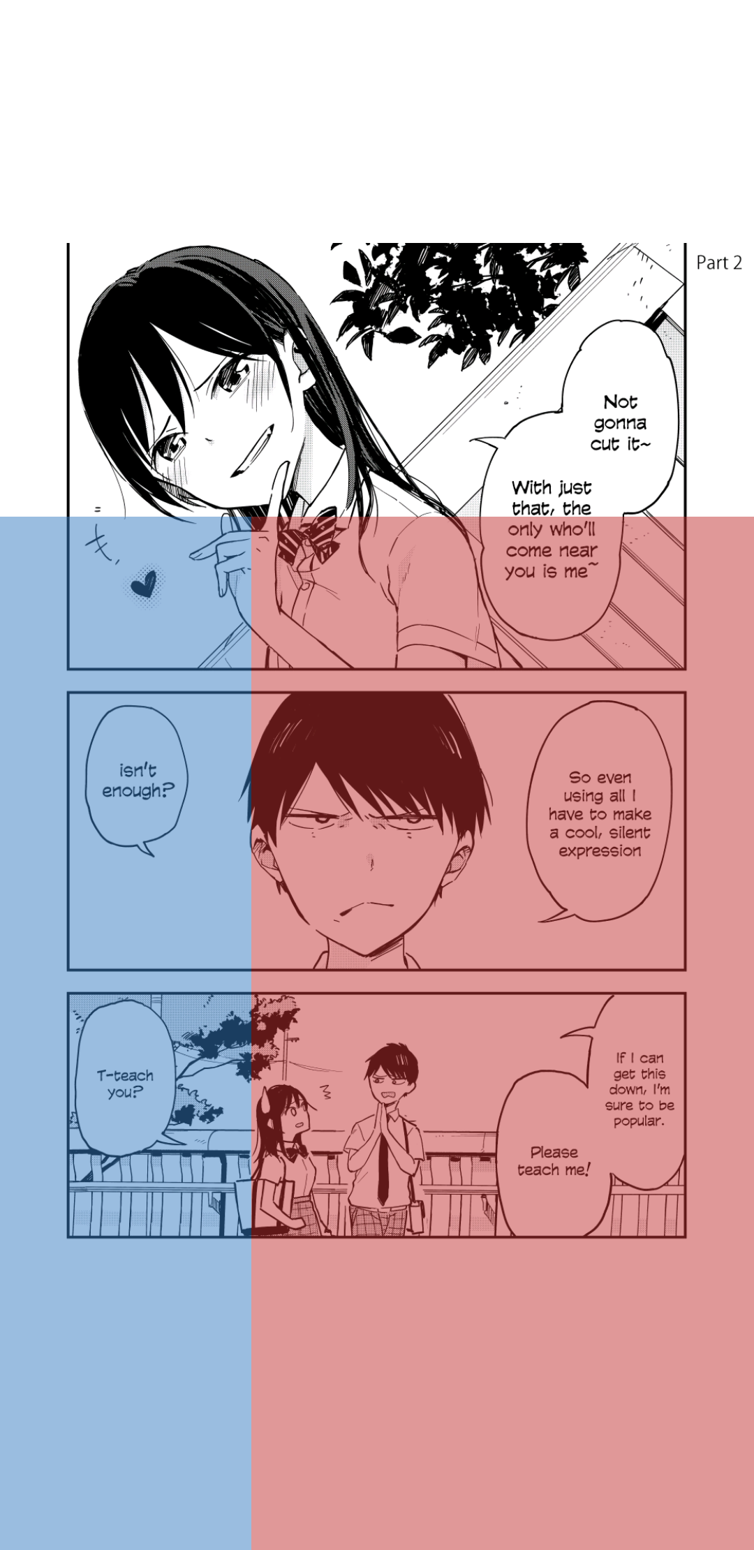
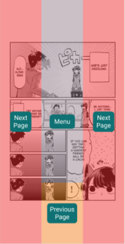
Maybe have pictures of a manga (like the one on the frontpage) and overlay colors to visualize?
 Soitora
on 13 Jan 2021
Soitora
on 13 Jan 2021
I looked into it a little bit and it's kinda odd to have two identical navigations in webtoon mode (default and L) while preventing ||| shaped navigation that available in pager. Not the right place to discuss it, but maybe at least hold it until it comes to stable
As for overlay for whoever will do it (edited since I was wrong about it):
+---+---+---+
|   |   |   | 1/3
+---+---+---+
|   |   |   | 1/3
+---+---+---+
|   |   |   | 1/3
+---+---+---+
|1/3|1/3|1/3|
 scb261
on 13 Jan 2021
scb261
on 13 Jan 2021
I looked into it a little bit and it's kinda odd to have two identical navigations in webtoon mode (default and L) while preventing ||| shaped navigation that available in pager. Not the right place to discuss it, but maybe at least hold it until it comes to stable
Default (Webtoon ) and L Navigation could be together in the carousel.
For Default (Pager), it would probably use different colors to indicate that it moves right and left instead of next and previous
Yes it would probably not get merged until the next stable release
If anyone asks how the different navigation types work until then link them here https://github.com/tachiyomiorg/website/issues/503#issue-785346504, the notes should somewhat explain how they work
ghostbear
on 13 Jan 2021
I made some images to visualize each navigation mode. If someone has any feedback it would be appreciated
| Pager | L |
|---|---|
| 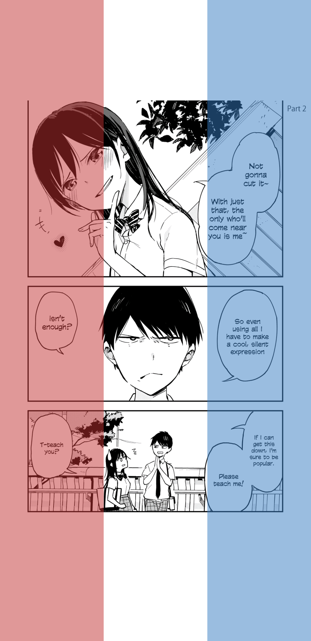 |
| 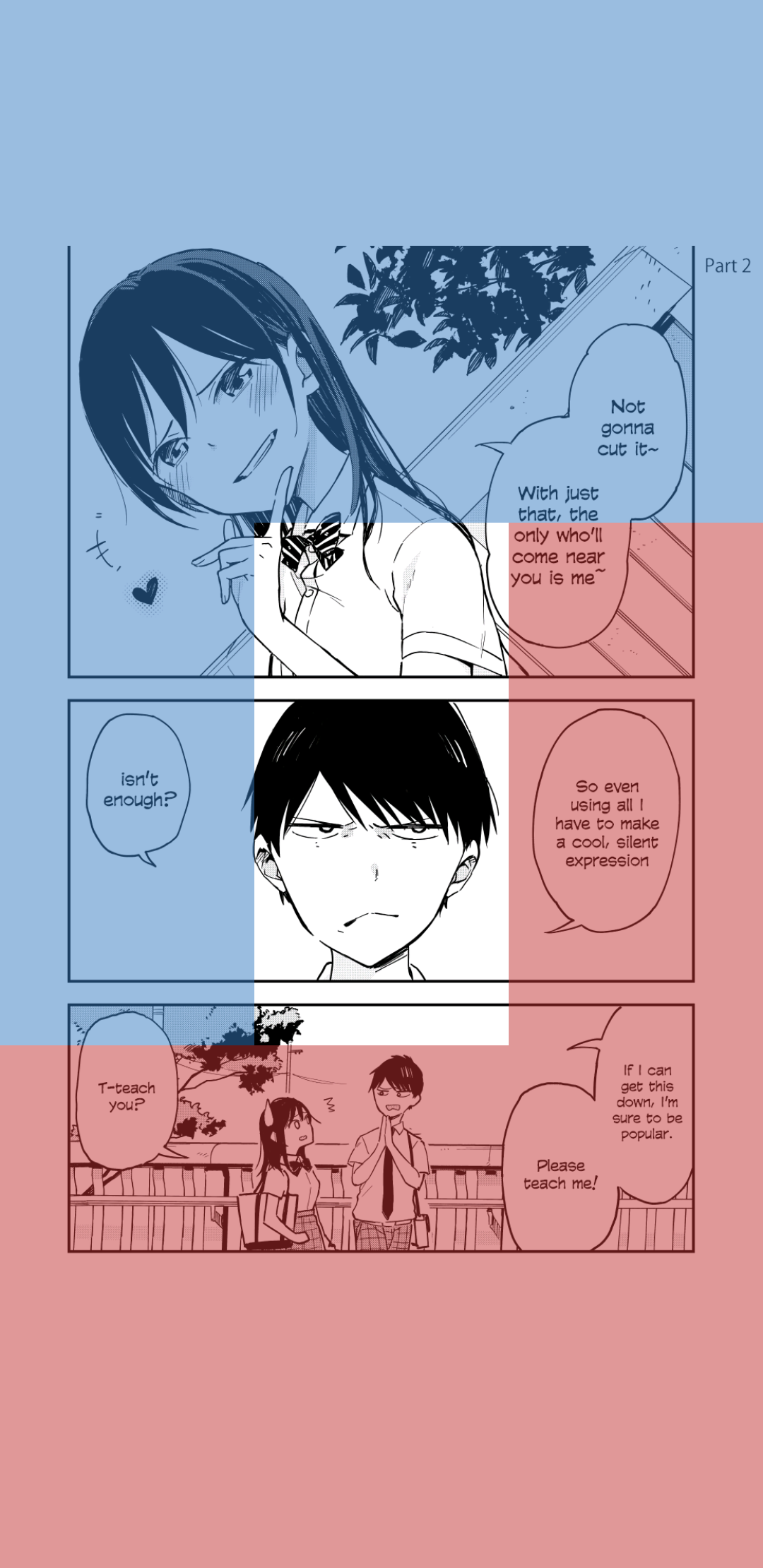 |
|
| This uses RIGHT and LEFT to navigate which none of the other have. This could use other colors to visualize that ||
| Kindlish | Edge |
|---|---|
|  |
|  |
|
Krita Project File: navigation_kirta.zip
ghostbear
on 6 Feb 2021
I assume the plan is to have a legend for the colours? At first glance it's hard to understand what they mean.
 arkon
on 6 Feb 2021
arkon
on 6 Feb 2021
I think ideally there would be 4 layouts * 4 invert modes = 16 images, since it isn't clear how inverting modes affect different layouts. And now that I think about it, reading mode also affect this (RTL vs LTR). So it's 32 images? Seems a bit too much tbh, not sure now if it's actually needed
Maybe some way to generate overlay on client side based on what they ticked?
scb261
on 6 Feb 2021
I assume the plan is to have a legend for the colours? At first glance it's hard to understand what they mean.
Yes a legend will be added, either integrated into the image or below as plain text
I think ideally there would be 4 layouts * 4 invert modes = 16 images, since it isn't clear how inverting modes affect different layouts. And now that I think about it, reading mode also affect this (RTL vs LTR). So it's 32 images? Seems a bit too much tbh, not sure now if it's actually needed
I think just having the images just display the default state would be better and not have an overflow of images. Then leave the inversions for the users imagination. But I see that not all users would understand how the inversion modes are applied. And for RTL and LTR there is only one navigation mode affected by it Pager (or Right to Left), and maybe different color would be better for it to illustrate that it different from the others
Maybe some way to generate overlay on client side based on what they ticked?
This could probably be added to the app by using the Rect instances from the navigation class, but that could be very complex to add. Similar thing could be added to the website but that would also be complex
ghostbear
on 6 Feb 2021
Representing the French flag smh 🦀
Soitora
on 6 Feb 2021
curche on Discord made some images to visualize the reading modes. Now the question is which one to use a legend or pills with text. I would say either the pills with Tachi color or the legend
| Moon+ variant | Moon+ variant with Tachi colors | With legend |
|---|---|---|
|  |
|  |
| 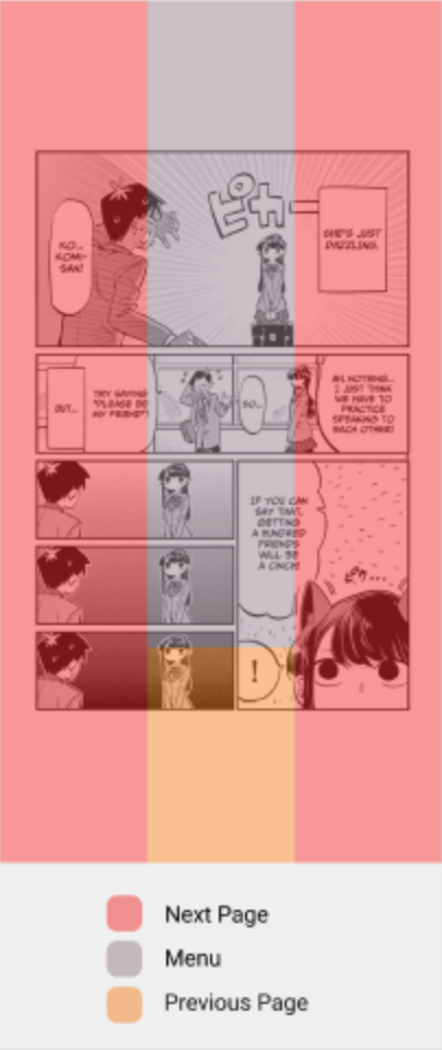 |
|
ghostbear
on 7 Feb 2021
Link to view the Figma Project
https://www.figma.com/file/PxHyXAuDebeTSj5IYaRcFR/tachi-reader-nav?node-id=0%3A1
Exported PNGs
ReaderNavGuideImages.zip
 curche
on 9 Feb 2021
curche
on 9 Feb 2021
Related issues
 specterflare
·
14Comments
specterflare
·
14Comments
 zppro
·
3Comments
zppro
·
3Comments
 no5no6
·
3Comments
no5no6
·
3Comments
 korylprince
·
3Comments
korylprince
·
3Comments
 chao-hua
·
3Comments
chao-hua
·
3Comments
Most helpful comment
Maybe have pictures of a manga (like the one on the frontpage) and overlay colors to visualize?