Axios: [Community Contest] A logo for Axios
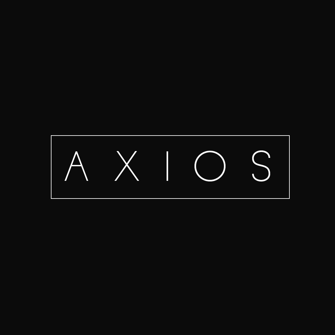
Axios has grown to become a popular library with over 3 million weekly downloads on npm. I think it's time axios has its own logo, just like many other major libraries out there. I've designed a concept for the logo, and I hope you guys like it.


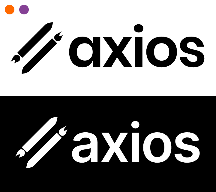
The logo is based on the concept of request and response. The first one is a square icon/profile picture. The second and third are full logos. These images are not full size, so if you do like them and plan to use them, I can send you the full sized files.
Edit: Should we count 👍 reactions to this parent comment as votes for this logo submission, or just people in favor of a new logo in general? I can make a a second comment for votes for this submission, or we can do a proper poll with strawpoll later when people are done submitting their ideas.
 richiksc
All 78 comments
The last one is pretty neat.. :1st_place_medal:
 Leomv55
on 22 May 2019
Leomv55
on 22 May 2019
The last one!
 pchaganti
on 22 May 2019
pchaganti
on 22 May 2019
Here is a Google Drive link to the full-size files of the last one and a square version for the GitHub organization icon:
https://drive.google.com/drive/folders/1MeVI0ThgZ99BFBBxYmboI1rVKjKR9U3o?usp=sharing
richiksc
on 22 May 2019
still no official logo ? 😕
I like the last one you made
 borisBelloc
on 7 Jun 2019
borisBelloc
on 7 Jun 2019
The last one is 🔥
 man0s
on 12 Feb 2020
man0s
on 12 Feb 2020
@richiksc do we have your express permission to use these? We would like to get branding up on the repo and some other places.
 jasonsaayman
on 28 Apr 2020
jasonsaayman
on 28 Apr 2020
@jasonsaayman Yes you have my permission. If there's any where contributors are listed, is it ok if I am mentioned?
richiksc
on 28 Apr 2020
Thanks @richiksc we will add something like this to the repo's readme or the new site we have in the pipeline. Can you tell me which font you used?
jasonsaayman
on 29 Apr 2020
I used D-DIN Regular from https://www.fontsquirrel.com/fonts/d-din, which is licensed under the SIL Open Font License v1.1.
richiksc
on 29 Apr 2020
Thanks :)
jasonsaayman
on 29 Apr 2020
Hey guys. Is this logo finalized or can I sumbit a design ?
 NotMoni
on 25 Jun 2020
NotMoni
on 25 Jun 2020
@NotMoni sure please submit one :)
jasonsaayman
on 25 Jun 2020
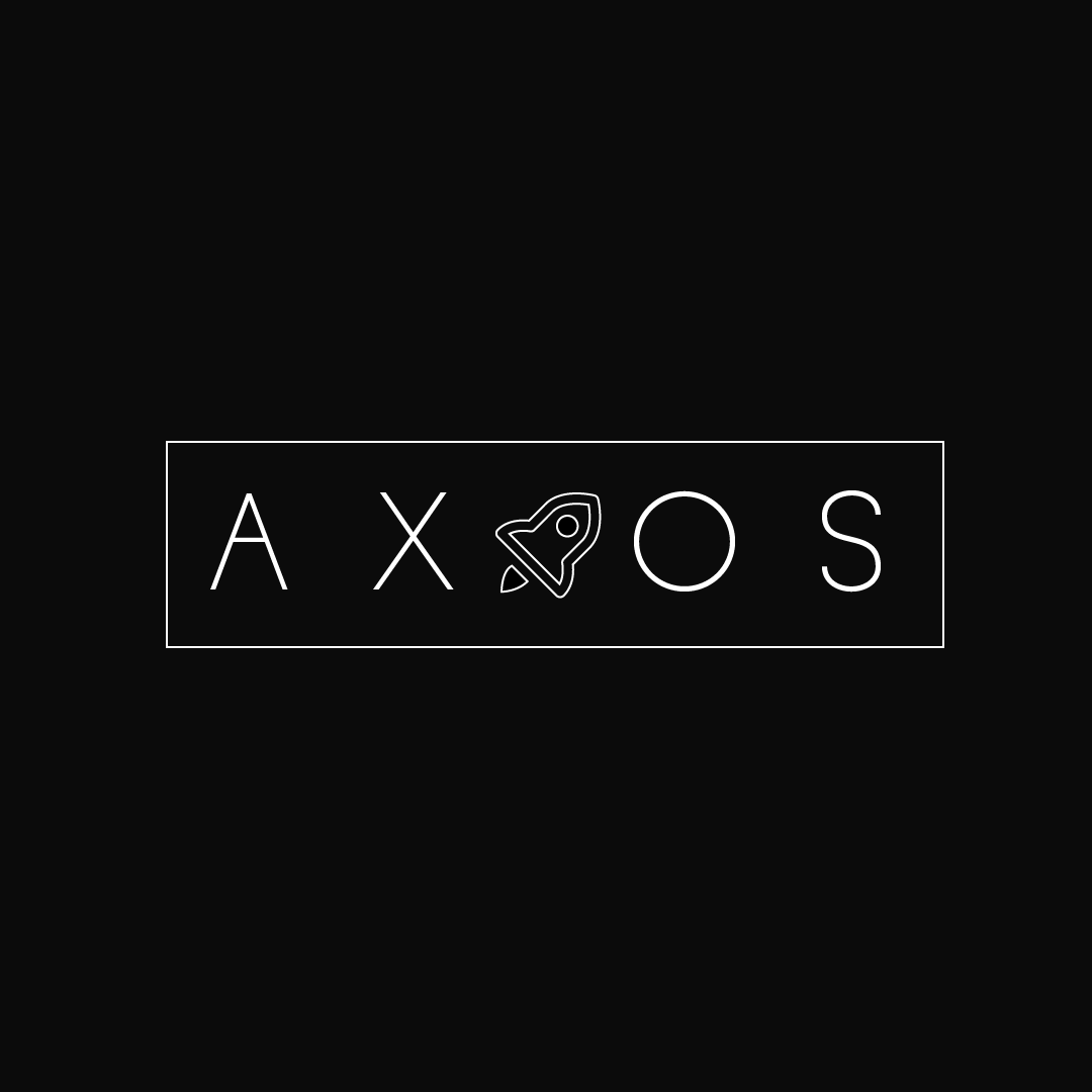
Here is my first sketch.
I am trying to make it very minimal...
I want to incorporate a rocket somewhere here, which symbolizes speed.
Any feedback will be appreciated.
NotMoni
on 25 Jun 2020
I like it. Can you give a version with the 'rocket' would be cool to see cause that would give a fuller idea of what it would look also if you had a icon with just the rocket which is square that would be awesome.
Exited to see what it looks like.
jasonsaayman
on 25 Jun 2020
@jasonsaayman I will make 3 designs.
1.) Just the rocket.
2.) replace the I in A X I O S with the 🚀
3.) Place the rocket with the name.
NotMoni
on 25 Jun 2020
Here is my first sketch.
I am trying to make it very minimal...
I want to incorporate a rocket somewhere here, which symbolizes speed.
Any feedback will be appreciated.
@jasonsaayman I will make 3 designs.
1.) Just the rocket.
2.) replace theIinA X I O Swith the
3.) Place the rocket with the name.
Maybe option 2 will make more sense than the other two.
Leomv55
on 25 Jun 2020
@jasonsaayman Should we make it an 'official' contest, open it up to community submissions for logos, and then hold a community vote to see which logo wins? I'd love to see more people's ideas for an axios logo.
richiksc
on 25 Jun 2020
Yep, that I am more inclined to do that.
NotMoni
on 25 Jun 2020
@jasonsaayman Should we make it an 'official' contest, open it up to community submissions for logos, and then hold a community vote to see which logo wins? I'd love to see more people's ideas for an Axios logo.
We should pin this issue and people submitted their design here.
NotMoni
on 25 Jun 2020
The picture with the most 👍 wins?
NotMoni
on 25 Jun 2020
Here is my first sketch.
I am trying to make it very minimal...
I want to incorporate a rocket somewhere here, which symbolizes speed.
Any feedback will be appreciated.
it make me think too much of VALVe logo 😥
![]()
borisBelloc
on 25 Jun 2020
Here is my first sketch.
I am trying to make it very minimal...
I want to incorporate a rocket somewhere here, which symbolizes speed.
Any feedback will be appreciated.it make me think too much of VALVe logo 😥
Wow. I didn't know a logo like that existed.
NotMoni
on 25 Jun 2020
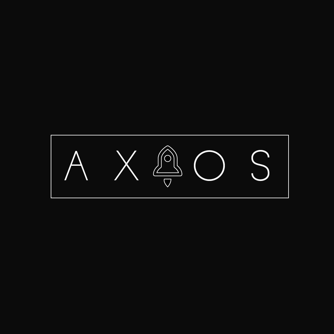
Here are the two versions.
I think I should make a better rocket.
* Rocket Straight Up *
NotMoni
on 25 Jun 2020
@jasonsaayman Should we make it an 'official' contest, open it up to community submissions for logos, and then hold a community vote to see which logo wins? I'd love to see more people's ideas for an axios logo.
Ok cool lets do this. Issue is pinned.
jasonsaayman
on 25 Jun 2020
@NotMoni apologies for the unsolicited feedback, but if you don't mind, I would try bringing down the crossbar of the uppercase 'A' more to open up the letter (I'm assuming the typeface is hand-drawn, but it might not be), and trying a single stroke instead of a double stroke on the rocket icon. And it might be just me, please, correct me if others don't experience the same thing, but it's hard to read it as 'Axios' with the rocket in the center replacing the I since the rocket doesn't really read as an 'I' that much (at least the current icon). You could try the rocket off to the side.
richiksc
on 25 Jun 2020
@richiksc Hey. Thanks for the feedback. Could you contact me on discord if you have it, 'I would love to talk to you about your and logo and some design stuff' ?
M O N I#1410
NotMoni
on 25 Jun 2020
the rocket is fun but i think people won't understand that it mean 'AXIOS"
borisBelloc
on 29 Jun 2020
I agree @borisBelloc, perhaps the rocket ought to be a slimmer tube, without the fins/skirt at the bottom
 sudomann
on 6 Jul 2020
sudomann
on 6 Jul 2020
I will work on that :D
NotMoni
on 7 Jul 2020
Both logos with rockets are beautifull, i suggest adding a related touch someting near to arrows or something explains data requests / responses.
Cheers !
 4o4forbidden
on 9 Jul 2020
4o4forbidden
on 9 Jul 2020
Sure, Mate. I just need a few more days and will have the update ready.
NotMoni
on 9 Jul 2020
@jasonsaayman Sorry, I gave you the wrong font. I actually used Bahnschrift which is a system installed font on Windows machines, however, I don't know the license for that. The design will probably work in D-DIN if Banschrift presents licensing issues.
Update: According to Microsoft the fonts included with Windows are licensed to be used commercially, including in logos and promotional materials.
richiksc
on 15 Jul 2020
You can replace the "I" in the B&W logo with the arrow from the first logo (but maybe a different color?):

 marsnebulasoup
on 15 Jul 2020
marsnebulasoup
on 15 Jul 2020
There is also this:
I used Mulish for the font.
Google fonts says:
You can use them freely in your products & projects - print or digital, commercial or otherwise. However, you can't sell the fonts on their own.
marsnebulasoup
on 15 Jul 2020
@marsnebulasoup I think the "I as arrows concept" could be interesting to explore further but for me, the second logo is really hard to read as "axios"
richiksc
on 15 Jul 2020
Yeah, I was thinking the request arrows would look better if they are closer together, but I just put this together quickly
marsnebulasoup
on 15 Jul 2020
Here's my take on the rocket idea:
There's two different typeface options: I used Poppins for the top one and Inter for the bottom one. You could keep the logo black and white or use the same purple color from my previous submission, but instead you could also use a shade of "hot orange" to tie in with the rocket flames and "speed."
richiksc
on 16 Jul 2020
I like the first font better than the second.I think that italics and streak lines on the rocket would further emphasize speed. I found this icon on flaticon and I'm thinking that two way "fire arrows" sort of like this could also work instead of the rockets, but vertically, instead of horizontally.

marsnebulasoup
on 16 Jul 2020
Maybe like this?

I didn't do a very good job with the streak lines, but you can see the point.
marsnebulasoup
on 16 Jul 2020
@madebyherzblut Can you send a link to download these https://github.com/axios/axios/issues/2130#issuecomment-659591555.
I would like to add them to the original axios logo I had.
NotMoni
on 17 Jul 2020
@marsnebulasoup In my humble opinion the streak lines make the logo too cluttered, and would be difficult to reproduce at smaller sizes. It might just be me, but I prefer keeping logos minimal and unadorned. I think the italics are a good idea though. Another thing we have to think about (and this includes my rocket submission) is the brand positioning of Axios. Is Axios "the fast http client for node" or is Axios "the node http client for humans." Axios is pretty performant, but I don't know how it compares to other "competitors" and whether the maintainers want to explicitly position it as fast/"the fastest." Many developers choose Axios because of its abstracted simple API that's easy to understand and use, and that it's also universal across Node and the browser.
I think we could all benefit from some "brandstorming" here - everyone feel free to chime in. What are the adjectives that best describe Axios?
Is Axios...
- Fast?
- Simple?
- Intuitive/developer-friendly/"human"?
- Powerful/feature-rich?
- Universal?
Please suggest your own adjectives as well... I think understanding Axios' "brand positioning" will help all of us submitting logos design a logo better suited to Axios.
richiksc
on 17 Jul 2020
I think that axios is better described by "the node http client for humans," rather than "the fast http client for node." The main reason for my choosing axios is that it is simple, easy to use, and has the ability to create custom instances with different parameters. This last one is especially useful, at least to me, because I can create an instance of axios with API headers and other parameters that would be tedious and confusing to rewrite over and over otherwise. Axios is intuitive; calling axios.get(url) or axios.post(url) seems natural, and I think when I first used it I didn't even have to look at the docs to see how to make a simple get request.
I agree with @richiksc that minimalistic logos are probably the best. I see many logos nowadays with just the first letter, like Vue for example, or an icon, then the name, like Bulma, or just an icon without the name, like React (although there are some versions of the logo with the name).
As for the structure of the logo, I think that the word axios would have to be written horizontally without being broken up, because there are five letters, so if you break it up, it will be an uneven split of letters.
Axios is fast, but as @richiksc said, simplicity and features are the main reason developers use axios, not because it is the fastest.
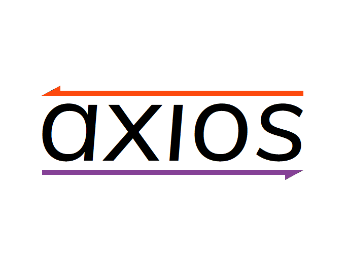
So, in my opinion, _simple_ and _intuitive_ are adjectives that describe axios well. And going by that, I thought up another logo design which is simple, as it only has three parts, and intuitive: the arrows symbolize, as @richiksc said, the "concept of request and response."

A color scheme besides B&W would look better, but that can be changed also. Going with the orange and purple theme, here is a variation of the B&W logo
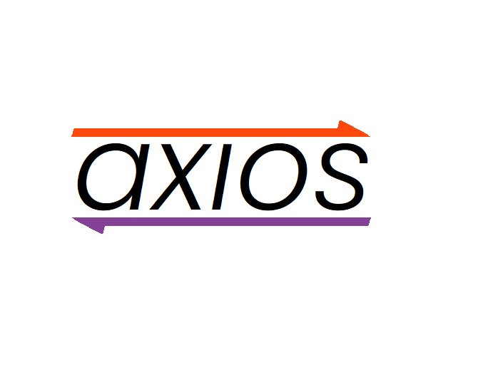
Also, slanting on the ends of the arrows make them fit in more:

I used Mulish as the font, but I think that Poppins Light 300 Italic would look better.
marsnebulasoup
on 17 Jul 2020
@marsnebulasoup I love your new logo idea and your reasoning behind it! I definitely agree, Axios is intuitive, easy to use, and powerful.
richiksc
on 17 Jul 2020
@NotMoni You referenced my comment but mentioned someone else, and I am not sure if that was a typo. Anyways, here are the arrow icons if that's what you wanted:
marsnebulasoup
on 17 Jul 2020
@richiksc Thanks! I think that axios needs to have its own theme colors, like Vue has green and grey, or Electron has dark grey and powder blue. Orange and purple are nice, but we should look into other options also.
marsnebulasoup
on 17 Jul 2020
@marsnebulasoup For sure! We don't even have to use orange and purple! I wasn't even originally suggesting using them together, but instead as two different options. I find that blue is used a lot in the tech/OSS world, so I was trying to think of some other colors that would work. If you don't mind, I have a couple ideas for tweaks you could make to your logo. One would be to match the slant angle of the arrows and the rear of the arrow head to the angle of the italics in the font. The other would be to match the thickness of the line of the arrow to the thickness of the "i". Again, these are just suggestions, the idea is looking great! I wonder if axios has enabled the GitHub discussions feature to discuss the logo and color schemes like you suggested.
richiksc
on 17 Jul 2020
Can we see the last logo with the poppins ?
https://github.com/axios/axios/issues/2130#issuecomment-659837110
NotMoni
on 17 Jul 2020
@NotMoni Sure! @richiksc I swapped the directions of the arrows because it was easier to slant them that way. Here is what I have:
I can't seem to get the arrows just right. 😠
I also was experimenting with this idea:

Let me know what you think
marsnebulasoup
on 17 Jul 2020
Also one-letter logos could work also because they are easier to read in smaller formats:


marsnebulasoup
on 20 Jul 2020
nice !
NotMoni
on 19 Sep 2020
Lol it's been like 2 months. I'd almost forgotten about this.
marsnebulasoup
on 19 Sep 2020
haha
NotMoni
on 19 Sep 2020

 9mm
on 22 Sep 2020
9mm
on 22 Sep 2020
I think we should think of a logo that will fit within a circle or square (or something with a 1x1 ratio), so it can be used in multiple formats without being cropped.
marsnebulasoup
on 22 Sep 2020
^
NotMoni
on 27 Sep 2020


Some variants.
 X7Becka
on 9 Oct 2020
X7Becka
on 9 Oct 2020
@X7Becka - Nice! But maybe the arrow in place of the "I" should be upward facing, because it kind of looks like a "j" now. Also, does it make sense to have the arrow _and_ loop? Maybe it'd be better to just stick with one.
I do like the second one though
marsnebulasoup
on 9 Oct 2020
@marsnebulasoup - something like that.
I guess colors should be another.


X7Becka
on 9 Oct 2020
@X7Becka - That looks better, IMHO, but for the first two, doesn't the "I" sort of look like a "1" now? 🙂
Maybe if you flip the "I" so that it's like you're looking at a mirror image of a "1" that'll fix this issue.
marsnebulasoup
on 9 Oct 2020
@marsnebulasoup - another four variants has arrived.


X7Becka
on 10 Oct 2020
@jasonsaayman Should we set a deadline for final submissions and then eventually hold a vote on strawpoll or something? How many maintainers are on the Axios team? Do you think they'll all be able to vote?
richiksc
on 11 Oct 2020
What if we have a contest that _anyone_ can participate in, not just maintainers, and announce it on the README, so it'll be seen by the most amount of people possible? I, myself, was wondering if axios had a logo, and that's how I found this very long thread, but I had to look for it. It's not obvious that axios is looking for a logo.
It'd seem to me that allowing submissions from anyone, then having everyone vote would be a good way to find a logo people will identify with easily.
marsnebulasoup
on 11 Oct 2020
@marsnebulasoup Sorry, I should have been more clear in my comment. I agree with you, we need to get as many votes as possible, and I agree that the vote should be open to the public. I just wanted to make sure that all of the maintainers voted as well.
richiksc
on 11 Oct 2020
@richiksc - Ah yes, that makes more sense. But I meant a contest that anyone can submit their logo ideas, not only to vote, because we here don't seem to have any bright ideas 😐, and it seems like we're stuck repeating various iterations of the "axios with the I as an arrow" idea, or some such. If we set some rules and accept submissions till a certain date, then have people vote on them, maybe we'll end up some better ideas.
marsnebulasoup
on 11 Oct 2020
Yes for sure. This issue was supposed to be a contest open to anyone but we
are just a few people all doing "axios with arrows".
On Sun, Oct 11, 2020 at 11:06 AM marsnebulasoup notifications@github.com
wrote:
@richiksc https://github.com/richiksc - Ah yes, that makes more sense.
But I meant a contest that anyone can submit their logo ideas, because we
here don't seem to have any bright ideas 😐, and it seems like we're
stuck repeating various iterations of the "axios with the I as an arrow"
idea, or some such. If we set some rules and accept submissions till a
certain date, then have people vote on them, maybe we'll end up some better
ideas.—
You are receiving this because you were mentioned.
Reply to this email directly, view it on GitHub
https://github.com/axios/axios/issues/2130#issuecomment-706727136, or
unsubscribe
https://github.com/notifications/unsubscribe-auth/ACEGRICTTJJYBZZHR2CM6RLSKHJZLANCNFSM4HLAZQXA
.
richiksc
on 11 Oct 2020
@richiksc I will work on something for us, this is a good time too since it's hacktober and more people are on GH. I will try to get to it tonight and set it up so that we can do a proper competition with a good voting system. Your question on maintainers, I think actively there is 3 maybe 4.
jasonsaayman
on 12 Oct 2020
Here's my take on the rocket idea:
There's two different typeface options: I used Poppins for the top one and Inter for the bottom one. You could keep the logo black and white or use the same purple color from my previous submission, but instead you could also use a shade of "hot orange" to tie in with the rocket flames and "speed."
@richiksc
- The rocket symbolizes the rocket speed right?. Can we symbolize the speed other than using rockets in logo . Like arrows shown in first post?
- The 'a' change is not making much an impact IMO .
Leomv55
on 12 Oct 2020
@Leomv55 - I'm not sure if speed is the right message to send, because, as mentioned above, axios isn't necessary the fastest, but rather, in my opinion, the easiest to use. I'm not sure how "ease-of-use" can be symbolized by an icon though.
marsnebulasoup
on 12 Oct 2020
Hey, here's my take on axios logo which represents minimalism and modernism.

share your thoughts on this. any criticism is appreciated.
 laxman-patel
on 19 Oct 2020
laxman-patel
on 19 Oct 2020
@laxman-patel - Nice! I especially like the arrows. But I'm thinking that since arrows are in a sort of rounded, shouldn't the text be in a similar style--just to maintain consistency?
Also, since the logo will be displayed in a 1×1 aspect ratio in some cases, how would that work? Would it just be the arrows?
marsnebulasoup
on 19 Oct 2020
@laxman-patel - Nice! I especially like the arrows. But I'm thinking that since arrows are in a sort of rounded, shouldn't the text be in a similar style--just to maintain consistency?
thanks, I will change the font to something more rounded and experiment with it.
Also, since the logo will be displayed in a 1×1 aspect ratio in some cases, how would that work? Would it just be the arrows?
yes. arrows only for small sizes.
laxman-patel
on 20 Oct 2020
@marsnebulasoup
We all are developers and kinda suck at logo design.
laxman-patel
on 20 Oct 2020
talents men
 Geek-JCY
on 28 Oct 2020
Geek-JCY
on 28 Oct 2020
Hi guys. Cool ideas. I felt the urge to also hand in a quick sketch. Let me know what you think!


 wowistudio
on 2 Nov 2020
wowistudio
on 2 Nov 2020
@wowistudio - Nice, finally some fresh takes on the arrows 👍. But what's with the nuxt part? Shouldn't the logo for axios focus on just axios?
marsnebulasoup
on 2 Nov 2020
@marsnebulasoup yeah agree. I'm not really into typography, so that's why I took the text of the current logo as an example :).
wowistudio
on 2 Nov 2020
Here are the two versions.
I think I should make a better rocket.
* Rocket Straight Up *
Maybe a higher font-weight? I like the logo/icon!
 dennisfrijlink
on 16 Nov 2020
dennisfrijlink
on 16 Nov 2020
love that! higher font-weight could help.
laxman-patel
on 1 Dec 2020
Related issues
 varmeh
·
3Comments
varmeh
·
3Comments
 Baoyx007
·
3Comments
Baoyx007
·
3Comments
 Spartano
·
3Comments
Spartano
·
3Comments
 Shu-Ji
·
3Comments
Shu-Ji
·
3Comments
 achingbrain
·
3Comments
achingbrain
·
3Comments
Most helpful comment
Hey, here's my take on axios logo which represents minimalism and modernism.
share your thoughts on this. any criticism is appreciated.