Now that we have official support for nesting as of https://github.com/WordPress/gutenberg/pull/3745, let's consider adding a Section block that can act as a generic block container.
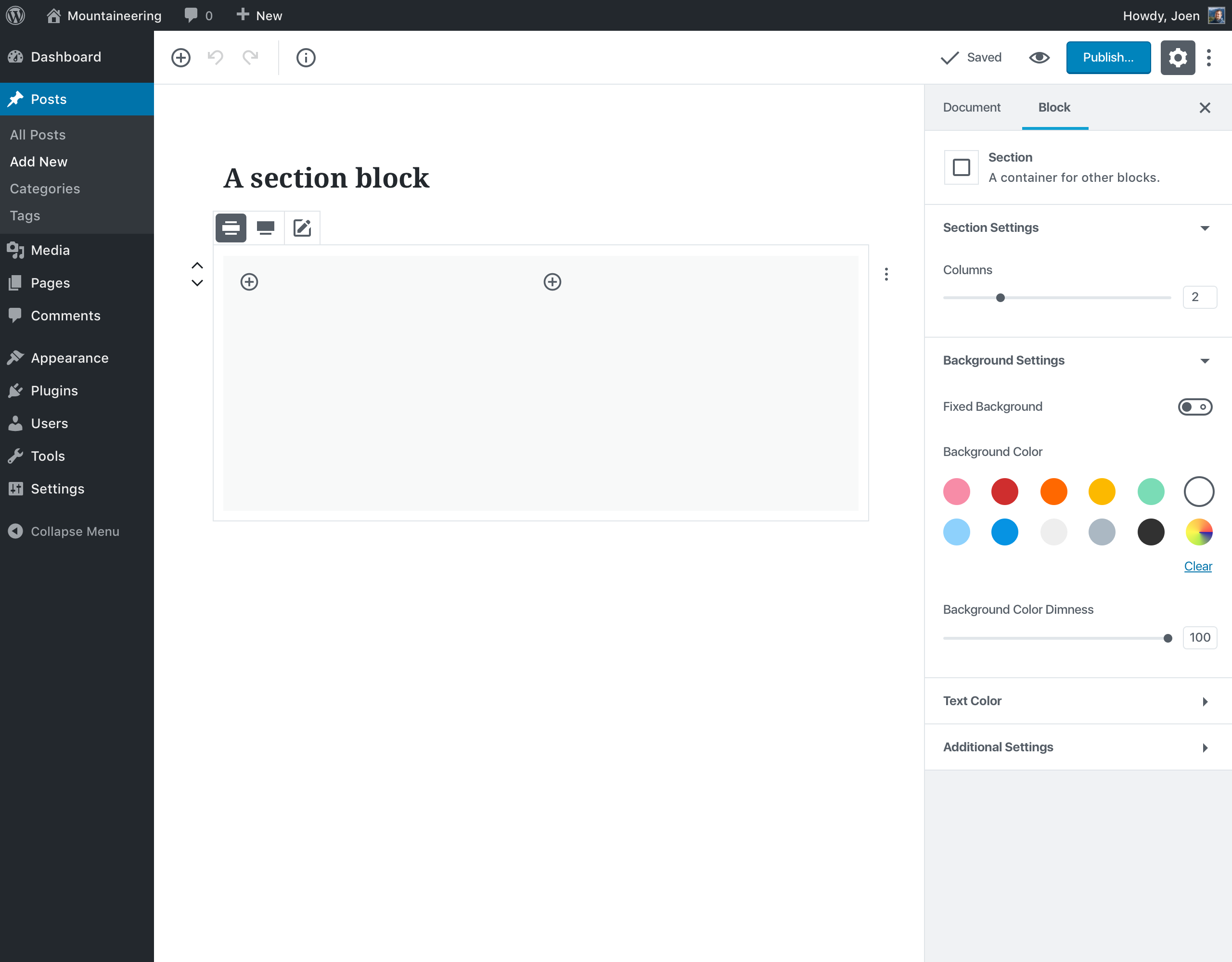
This block would have the following settings:
- Columns.
- Background image, color, and color dimness (so you can overlay transparent colors over your image), along with a fixed background toggle.
- Text color.
- Wide or Full-Width block alignment.
 melchoyce
All 169 comments
I really like this idea! I also like fact it has a background setting to it.
 karmatosed
on 6 Feb 2018
karmatosed
on 6 Feb 2018
Nice! What if the block allowed the three following 'advanced' settings:
- Define a class-name to be serialized onto the children
.child_class, .child_class_1 - Add an optional first child class
.child_class, .child_class_1, .child_class_first - Add an optional last child class
.child_class, .child_class_n, .child_class_last
:nth-child selectors may be able to compensate for the last two, but I think adding a class to all children could be useful in certain contexts.
 motleydev
on 7 Feb 2018
motleydev
on 7 Feb 2018
Love this idea. If background and text colors can be altered, it might make sense to add link colors as well.
 tomusborne
on 8 Feb 2018
tomusborne
on 8 Feb 2018
Excellent Idea. This will literally add much value to Gutenberg Editor.
 munirkamal
on 16 Feb 2018
munirkamal
on 16 Feb 2018
Much better than just the Columns block, which has a lot of issues. Cool!
 hedgefield
on 21 Feb 2018
hedgefield
on 21 Feb 2018
This is the first thing I set out to create when I saw that nesting was available. My version is similar except I envisioned that you would add the columns block into it.
Do you have code for this available?
 jvisick
on 21 Feb 2018
jvisick
on 21 Feb 2018
If this block has "columns", we should just update the "columns" block. But it's still possible to use a columns block inside a section block and keep the section block columnless.
 youknowriad
on 22 Feb 2018
youknowriad
on 22 Feb 2018
As long as you can't put column blocks inside column blocks 😉
hedgefield
on 22 Feb 2018
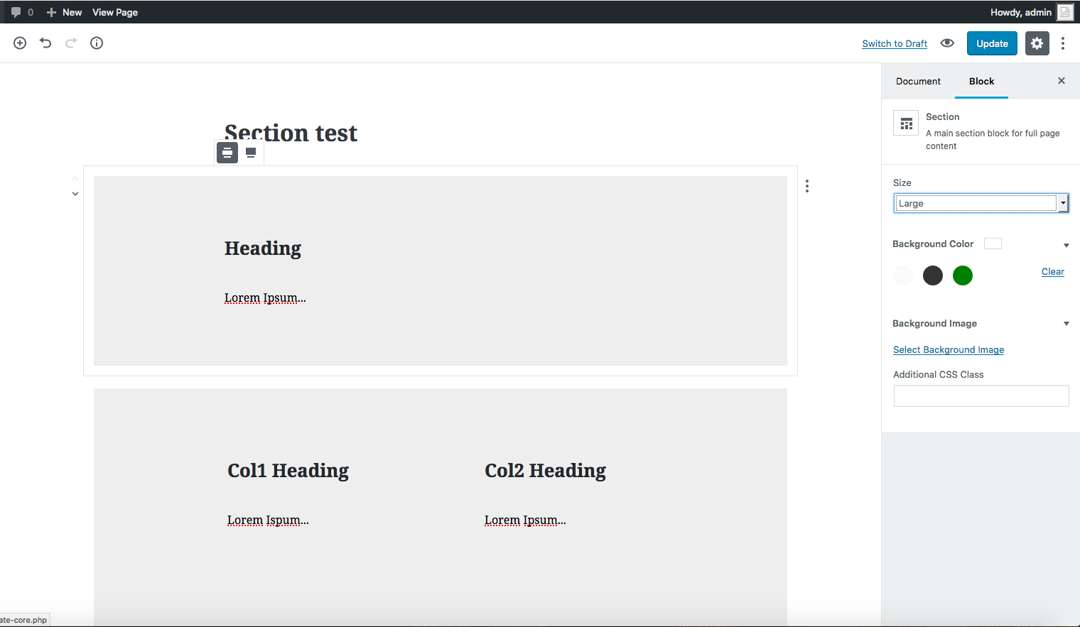
A lot of site pages are broken up into sections that has mixed content with multiple rows of columns and often columns nested inside larger ones. This is a quick example:
A section block that just acts like a bare wrapper I think would be the most flexible. (as would being able to nest column blocks!)
We've kicked off a new site project this week. Normally it would be built with with Advanced Custom Fields flexible content layouts but I'm going to see how far we can get using Gutenberg alone.
jvisick
on 23 Feb 2018
Yeah, I think multi-column sections like @jvisick's above example aren't uncommon. A container with background/text options that nests blocks would be the most flexible approach. Since we now have a functioning column block, we could even consider taking out the column option from this.
melchoyce
on 23 Feb 2018
It would be great if there is an inner-container (div) in this block which then contains all the child blocks. This container could then be styled with max-width and margin-left/right: auto to center the child blocks and have a full-width background.
 fabianpimminger
on 5 Mar 2018
fabianpimminger
on 5 Mar 2018
Having a fullwidth section with the content contained to a narrower layout is a common design pattern. I'm wondering if it would be best controlled by the nested blocks rather than baked into the parent section block?
jvisick
on 6 Mar 2018
I think a section block would be very useful for... well, sections on a page, and I agree that columns should be a separate block (like the one that exists now) that can be nested in a section block. I think this is something that, along with the Columns block, should be included in the version of Gutenberg that is merged into WordPress 5.0. If you look at existing page builder plugins, sections are used a lot, as are columns (obviously), so including them in the initial core release is essential in my opinion.
(I also think it is important that the columns block gets features like variable-width columns and responsive columns, both for the sake of the core experience as well as making it easier for existing page builders to re-base themselves off of Gutenberg, but that is a separate issue.)
 ZebulanStanphill
on 5 Apr 2018
ZebulanStanphill
on 5 Apr 2018
Having thought about it some more, I think it would make more sense to just have the Section and Columns block be the same thing. Just add the ability to have only one column in the Columns block instead of a minimum of two. Then add the background settings of this proposed Section block to the Columns block.
I think having a single Section/Columns block would reduce the amount of nesting you would have to do. Right now the proposed Section block is really nothing more than an area with a background and width options. Both of those could be added to the Columns block, and if the Columns block allowed for having just one column, it would make there no need for a Section block.
Additionally, if you want a full-width section with standard width content, this could be accomplished by either nesting another Section/Columns block into another one that is set to full-width. It could be done with a setting in the inspector to change the block content width independently of the width of the entire block.; this could also be added as visible resizing handles, similar to how Beaver Builder rows/columns work, or how the Image block works in Gutenberg.
As for what you would call this combined block, I think just keeping the name "Columns" works, since that is the most obvious function that people would be looking for. It should not be difficult to find the background settings in the inspector (and I imagine that would be where some people would look in the first place anyway if there was a separate Section block and they were not aware of it), and using the Columns block as a single-column container should not be hard to discover since the slider for changing the number of columns should make it pretty obvious how to do it... just drag it all the way to the left.
ZebulanStanphill
on 19 Apr 2018
I have changed my mind about merging the Section and Columns blocks. In order to get the most flexibility with columns, it would make the most sense to have each column be its own block: a Column block. This would allow for easily controlling the settings of an individual column, as well as dragging a column from one row to another. Of course, since columns go from left-to-right (and wrap in most layout systems), you would need their parent block to be one that inserted content in that horizontal direction and had wrapping (rather than the standard vertical direction) and this parent block would likely only allow Column blocks to be inserted into it. This block would be a Row. These 2 blocks would replace the Columns block. But they do not cover the situation where you want multiple rows (often with different numbers of columns inside them) to be in the same background/container, which is what the Section block would do. Of course, the Section block would be nothing more than a container with background, padding, and width options, and any block could be inserted into it. And for more complex layouts, Section blocks could be inserted into Column blocks.
See #6461.
ZebulanStanphill
on 27 Apr 2018
I actually think the minimum of 1 column idea is not a bad solution. In fact, if you use your inspector to change the "min" attribute of the slider to 1, and select one, it works pretty much as you would expect.
However, semantically a section block makes more sense anyways. The inner content (i.e. a max-width section within a full with section) could be achieved by nesting two sections -- a content width inside a full width.
The background-color idea is nice, but...maybe a little two specific. I think a more generic approach would be to just use custom classes on the section. The front-end CSS could catch that and any children directly.
 tmdesigned
on 7 May 2018
tmdesigned
on 7 May 2018
After some discussion in #6461, I have decided that my Row block + Column block idea is not the right way to go. A Layout block similar to the one in #5351 (comment) would probably be far less confusing and far more flexible. Whatever the case, there should definitely be a Section block, and I think it should definitely be added before the WordPress 5.0 release.
As for background color options, I think it makes perfect sense to have background options on a Section. Only having class options seems a bit restrictive. Often, the whole point of nesting in a Section block would be to have multiple things share a background. Additionally, I would prefer if other background options like background images and gradient backgrounds were implemented, as those are often desired instead of plain solid color backgrounds. Nested Section blocks would even allow for background colors to be applied to a single block, meaning that the background color options in the Paragraph block may no longer be necessary.
As for nesting Section blocks instead of having 2 separate width settings, I think that could work. The biggest concern I would have is over the amount of extra padding that would be added by nesting Section blocks, which leads into padding options.
I think it is essential that the Section block have the ability to customize the amount of padding it uses, or at least to remove the default padding. Of course, this raises questions of how you would select the Section block when another block is nested in it. I think this issue will be resolved by improvements like #6471 and the stuff being worked on in the try/alternate-hover-approach branch.
ZebulanStanphill
on 8 May 2018
:+1:
We really need a generic row/container block, especially with width settings.
Ideally I think other settings like "Background color" and "Text color" should live under some "extra" settings tab on every block (in addition to several other generally-applicable CSS settings).
As far as responsiveness, I think we should add a "Responsive" block.
 rchipka
on 9 May 2018
rchipka
on 9 May 2018
The problem with background color and text color is simply: where does it end? Already in this thread alone you have someone suggesting link color. Why not border color, thickness, and style? Padding, and margin make the most sense, to be honest. What about drop-shadow, background images, positioning options, and display modes? Font style and size, line-height and min-height? There are hundreds of CSS properties and which ones you need will vary on your design.
It should either be a class, which you can then use to style anything including descendent elements, or a filterable list of CSS properties so the theme div can hook in and add the ones he or she wants.
tmdesigned
on 9 May 2018
@tmdesigned It ends at feature-complete and intuitive WYSYWIG control over the style, formatting, and layout of a webpage. Isn't this the goal of Gutenberg?
Gutenberg is providing the world with a fresh, well-planned, cutting-edge, templatable, and extendable web content WYSYWIG... we should figure out how much we want to utilize that now or we'll miss the boat.
The idea in the end is to reduce the amount of work we're doing now, whether it's writing CSS, writing hacky CSS overrides, or doing repetitive content tasks.
Not everything can or should be defined with classes, especially if they're poorly targeted classes or non-overridable attributes.
Take a user-defined numerical setting for example. It would be a pain to define a class for each value and a block developer might be tempted to just inject the value directly into the style attribute.
If it exists as a block and it can have user-defined CSS styles applied to it, then there should ideally be a unified and standardized means for doing so, even if it's a panel of key/value pair text boxes.
If you'd like, you can read my suggested method for doing this in a way that addresses your concerns.
rchipka
on 9 May 2018
I read your suggestion for an API and it's not far off from what I was saying about an added hook to allow for key value pairs to be added.
However I think my original point is still valid. Like I said, there are hundreds of properties and while some are more common, such a list is going to grow quickly. We can go that route, and try to find a "good compromise" like with the TinyMCE features that were included vs removed in Classic. But there are a lot more properties in play here, so it would be a challenge.
But more importantly the idea to add direct block level styling breaks down when you zoom out a bit and don't just consider a single block. When you have multiple similar blocks, on one page or across pages, you're not going to want to re-enter all those values. You're going to want an abstraction...like a CSS class.
Allowing--or encouragjng--individual block level styling is not ideal because its not reusable. You're right to say that not everything should be abstracted into a class, but CSS developed for a reason and shouldn't be thrown to the wind so quickly.
tmdesigned
on 9 May 2018
@tmdesigned I appreciate your feedback. I think I understand the confusion so I'll try to clarify.
The goal isn't to eliminate or even reduce the amount of CSS classes.
The goal is, very specifically, to unify user-defined block styling settings into a single UI or at least a single API.
Web developers, block developers, theme developers will all still be writing CSS code to style blocks and blocks will still have classes, attributes, and IDs so that developers can style them.
They will have exactly the same classes that they do now and they'll have the exact same layout they do now.
BUT
The moment the block developer realizes that they have CSS property(ies) that could/should be configured by the user... that's when Gutenberg takes over and decides how those styles are injected (and potentially controlled).
This will result in a single common interface (for both developers and users) when it comes to non-programatically controlling common style-based configurations of web page content.
This gives both users and developers a single consistent means of viewing, adding, removing, modifying, and overriding block styles which, at the end of the day, all boil down to simple CSS properties.
Sorry to cause so much noise on this thread. We should probably move further discussion to the related issue.
Edit Note:
I forgot to address the point about abstraction.
The minute that the user needs to apply the exact same style to the exact same block twice is the exact moment that user-defined style settings should be abandoned for CSS classes (for that block).
In other words, user-defined style settings provide a consistent mechanism for the user to customize blocks to their liking, whether it's a unique one time thing (as it should be) or 100 times on every single page, and how you choose to structure it is still completely up to you.
rchipka
on 9 May 2018
I think we mostly agree. My suggestion in the first post was to have a hook to add/remove controls. I'm not against having block-level user customization of styles, it's just hard to pick "the ones that are worth having by default on a generic section block" without the list growing exponentially. Having a minimal few is fine, especially if allowing for the addition of other controls. In any case I'm surprised margin and padding wouldn't be more universally helpful than background-color for a section block.
FWIW, I like your idea of having generated classes be the output, so that it is still override-able w/o having to use !important.
tmdesigned
on 9 May 2018
@rchipka @tmdesigned I know this was over two weeks ago, but would you be interested in hashing out some more of those details in another issue? I think it would be beneficial to have more eyes on this convo.
melchoyce
on 25 May 2018
Took another look at this block based on the previous conversations.

Easiest way to share my ideas is through a prototype: https://wp.invisionapp.com/share/PQJPPAX4JZW
Some notes:
- Based on a quick poll: https://wordpress.slack.com/archives/C02QB2JS7/p1527283199000343 I've changed the name from _Section_ to _Container_.
- I've removed the column settings, since it's reasonable that folks will want to mix-and-match column layouts within a particular section, as illustrated by @jvisick.
- In addition to background color, I've added background image support. The settings are based on core's existing Background Image feature.
- Should we let folks nest a container block in a container block?
melchoyce
on 29 May 2018
@melchoyce Looks great!
One nice feature that I would like to see is a selection in the inspector to switch the HTML element of the block between <aside>, <div>, and <section>.
The ability to nest containers should definitely be allowed, in my opinion. Not only would it be useful in the context of having different colored areas within a single semantic section using the above-suggested HTML element suggestion, but it would also be useful in situations where you want to give a single block a background when it has no background color option itself.
Another nice feature would be gradient backgrounds, since those seem to be pretty popular in some designs.
ZebulanStanphill
on 29 May 2018
@melchoyce +1 for being able to nest containers.
@SuperGeniusZeb being able to change the HTML element has been on the back of my mind too. Maybe a dropdown for semantic element choices?
jvisick
on 29 May 2018
@jvisick Yeah, that was what I was thinking of. Beaver Builder and Elementor both have settings like that for their rows/sections.
ZebulanStanphill
on 29 May 2018
@melchoyce I think containers should be infinitely nestable. This will allow users to wrap a custom class (or custom CSS) around any block, including other containers.
There's no reason to add nesting limitations to a generic container block.
rchipka
on 29 May 2018
I understand the value of the semantic HTML elements, but I also wonder if there's a way to delegate that functionality to plugins somehow so it's available as an option for advanced users, but average users don't need to think about it. Because the minute you add that, you not only take responsibility for providing the functionality, but also the responsibility for educating users on the semantic implications… which are often highly situational.
 chrisvanpatten
on 29 May 2018
chrisvanpatten
on 29 May 2018
@chriskmnds Good point. I think this is the wrong place for setting container tags.
The container block should function as a generic container without semantic meaning.
Semantic meaning should be provided by (future) block template functionality, so that the <aside> content could be one part of a template and <section> another.
This way, users can organize content in containers however they want (at any depth level), without affecting semantic meaning.
rchipka
on 29 May 2018
I agree that being able to swap out HTML element seems a bit advanced for most folks, and probably doesn't belong as a base Gutenberg setting.
Semantic meaning should be provided by (future) block template functionality, so that the
<aside>content could be one part of a template and<section>another.
This would definitely be good to explore.
melchoyce
on 29 May 2018
I do not disagree with the points made for keeping the base UX simple but I would then ask where would you add <section>, <nav>, <header>, etc.. wrapping elements? A generic container block, which is essentially a wrapper element seems like a natural choice. That may be preferred than a duplicate block for each of these cases. The default can be a <div> and a user never has to touch the setting unless needed.
What if options for HTML elements functioned similar to the alignwide/full settings where an array of supported elements can be set from the theme or plugin?
jvisick
on 29 May 2018
@jvisick Ideally, these wrapping elements would be created with a page/post's "block layout template".
Using a block layout template, you could setup a bunch of default container blocks and provide a setting (in the code) for what the container block's generated tag name should be.
rchipka
on 29 May 2018
@rchipka I see where you are coming from in using layout templates that give users predefined areas to manage content. I am looking at this more from a perspective of using Gutenberg as a page builder for pages that are not defined and in which being able to set what type of HTML element is used from the editor would be helpful. I think both scenarios are important.
That said, I agree with @melchoyce that setting HTML elements is not necessary for an initial run of the container block but I think it is something worth exploring in the next 'page builder' phase.
jvisick
on 30 May 2018
Sections are essentially 1-column.. well, columns.
I'm noticing the 3.0.0 Columns (beta) block doesn't allow 1-column on its slider.
Not sure whether it'd be better to stick w/ only the Column block all around and combine these implementations. What's the downside?
 lkraav
on 5 Jun 2018
lkraav
on 5 Jun 2018
One thing that would be good to add is the toggle whether the container (section) should be full width or contained. If it's contained it should respect the content_width set in the theme (#5650), otherwise, it should be full width. I think the majority of page builders out there have this feature.
 dingo-d
on 7 Jun 2018
dingo-d
on 7 Jun 2018
Yup, that's included in the Quick Toolbar in my last mockup.
melchoyce
on 7 Jun 2018
@melchoyce Keep in mind there will be situations where the section/container block itself should be full-width, but the content inside the section/container block should not. How would this be handled?
ZebulanStanphill
on 8 Jun 2018
I figured by default, the container itself could become full-width, but any content within it that doesn't natively support full-width (like images/cover blocks) would still be constrained to the editor width.
melchoyce
on 8 Jun 2018
@melchoyce Assuming I understand you correctly, that means the width controls on the Container block would only affect the background of the container, and never the content? That makes sense. Thanks for clarifying. :+1:
ZebulanStanphill
on 8 Jun 2018
Yup, that's what I'm thinking!
melchoyce
on 8 Jun 2018
Not sure if it was discussed, but a section could be a "section" HTML element and also be an "article", "div", or something else, right? Would be nice to have it as selectable
This also might make the "row" block unnecessary, I think
 eddr
on 22 Jun 2018
eddr
on 22 Jun 2018
Implemented this in a plugin
var el = wp.element.createElement,
    registerBlockType = wp.blocks.registerBlockType,
    InnerBlocks = wp.editor.InnerBlocks;

registerBlockType( 'nbrummerstedt/section', {
    title: 'Section',
    icon: 'universal-access-alt',
    category: 'layout',
    attributes: {},
    edit: function( props ) {
        return el( 'section', {className: props.className},
            el( InnerBlocks )
        );
    },
    save: function( props ) {
        return el( 'section', {className: props.className },
            el( InnerBlocks.Content )
        );
    }
} );
 nbrummerstedt
on 24 Jun 2018
nbrummerstedt
on 24 Jun 2018
@eddr This was discussed: https://github.com/WordPress/gutenberg/issues/4900#issuecomment-392925877
I still think a dropdown to select the HTML tag used is a good idea. It feels like the easiest way to integrate semantic HTML elements like <aside> and <section> without creating a whole bunch of overly-similar blocks.
@nbrummerstedt Nice initial basic implementation, but the block is now called a Container block and should use a <div> as the element, though ideally (as mentioned above and in previous comments), you would be able to change the HTML element used from <div> to <section>, <aside>, and maybe even <article>.
Here is a revised version of your implementation:
( ( blocks, editor, element ) => {
    const el = element.createElement,
        { registerBlockType } = blocks,
        { InnerBlocks } = editor;

    registerBlockType( 'nbrummerstedt/container', {
        title: 'Container',
        icon: 'universal-access-alt',
        category: 'layout',
        attributes: {},
        edit: ( props ) => {
            return el( 'div', {className: props.className},
                el( InnerBlocks )
            );
        },
        save: ( props ) => {
            return el( 'div', {className: props.className },
                el( InnerBlocks.Content )
            );
        }
    } );
} )( window.wp.blocks, window.wp.editor, window.wp.element );
Why was this removed from the WordPress 5.0 milestone, @mtias? This seems like something that should probably make it into the initial release, simply because of how useful and simple it is. A lot of blocks have no background settings because it was assumed that you would use the Container block for that. It is not even that hard to implement this block, is it? I do not see why this should be pushed back to a post-WordPress 5.0 release.
On another note, I was recently checking out Oxygen and was impressed by its flexbox-based layout system. What if the Container block implemented some of these features? I bet it could be really powerful and provide an alternative way to have layouts other than the Columns block... maybe it could even make the Columns block unnecessary?
https://oxygenbuilder.com/documentation/visual-editing/layout-spacing/
https://oxygenbuilder.com/documentation/visual-editing/responsive-controls/
I highly recommend checking this out. Actually, I recommend just taking a big look at Oxygen entirely. It is very different from all the other page builder plugins, and I think there is a lot of good ideas there that Gutenberg could use.
ZebulanStanphill
on 12 Jul 2018
I definitely agree, this should be in 5.0 release, you need a container to avoid any hacky solutions using columns block.
dingo-d
on 12 Jul 2018
I also think that this block must be available soon than later. Many WordPress development agencies are waiting for this block before building with Gutenberg.
 ericvalois
on 12 Jul 2018
ericvalois
on 12 Jul 2018
@dingo-d and @ericvalois Yeah, I have refrained from using Gutenberg for anything but blog posts precisely because of the lack of 3 things: responsive columns, non-equal width columns, and a Container block.
To elaborate on what I said earlier about the Container block adopting things that Oxygen does, I think the Container block could have an option to change the flow direction of its nested blocks from the default vertical to horizontal. There could also be vertical and horizontal alignment options like the ones that Oxygen has. These would be really powerful – especially if combined with the ability to change these options responsively like most page builder plugins allow.
Of course, there is the notable issue that a Container block using Flexbox-based alignment/layout would not allow for float-aligned blocks to be nested directly in it. But I think there is a simple solution to that: add the ability to have a Container use either standard CSS display: block layout or Flexbox layout. The standard display: block mode would be the default, since that is what the root document would use. Enabling the flexbox display mode would make all the neat alignment options appear in the inspector. Also, you obviously would want to give the 2 layout modes a different name in the inspector to make it more user-friendly. I am not sure what you would call them, though. Maybe “Standard” and “Flexible”?
Allowing Container blocks to use either the mode that supports floats or the mode with the better alignment/layout options would be really useful. You could nest Container blocks to use both kinds of layout where necessary. Add this to the other abilities that the Container block could have (background options, ability to choose HTML tag for added semantic meaning without having to resort to Custom HTML blocks, etc.) and the Container block would end up being one of the most important and useful blocks in core WordPress.
Notably, if the Container block having two layout modes sounds like too many features (and I do not really think it would be a problem), then there could just be two separate blocks:
- a standard Container block that supports floats but does not have all the advanced alignment/layout options
- an Advanced Container (or Advanced Layout or Flexible Layout or whatever you call it) block that uses Flexbox layout and provides all the neat options
I recommend checking out this Oxygen documentation video to see how its layout system works. It is really impressive:
https://www.youtube.com/watch?v=NnSfR-YFcQI
I think there is a lot of potential here to make Gutenberg very powerful. Of course, for an initial implementation I would only expect the Container block to have background options, the ability to change the HTML element used, and the option to make the Container be full-width (but not the content inside it). Maybe even just the background options.
Actually, just having a Container block that does not even have any options is still useful, because it makes it easier to style a group of blocks via CSS.
ZebulanStanphill
on 12 Jul 2018
It's is important to think about Gutenberg not just as in stopping after 5.0. This is a really useful block and will be explored, but for phase one, focusing on editing it isn't really needed. When the project expands out beyond simple editing into layout there is no doubt a solution is needed there. Nobody is saying this won't be created it is a matter of prioritising what is editor and what then takes into phase two.
karmatosed
on 12 Jul 2018
But the thing is, the majority of people are using Gutenberg for layout purposes, not for writing posts.
People are accustomed to writing posts like a word document, so they are disabling the Gutenberg on the Post pages.
dingo-d
on 13 Jul 2018
But the thing is, the majority of people are using Gutenberg for layout purposes, not for writing posts.
Which data source are you basing this assumption on?
lkraav
on 13 Jul 2018
I've talked to several people during WCEU in Belgrade, they are all agreeing that they find it odd to write posts with Gutenberg and therefore they are disabling it on Posts.
dingo-d
on 13 Jul 2018
In contrast to what @dingo-d has seen, I only use Gutenberg for posts. I actually find the experience for post-making a lot nicer in Gutenberg than in the Classic Editor. Partially because of the more modular nature and contextual controls, and partially because there are no more annoying invisible <p> tags inserted everywhere. That always annoyed me.
I need a Container block (even one without any options) and a decent Columns block (or some other layout block) in order to use Gutenberg for even page building. It looks like the Columns block will be getting some kind of basic responsiveness (see #6048), so that means it is just the lack of a Container block that is blocking me from using Gutenberg in more contexts.
I know the Container block will obviously be added at some point (probably no later than WordPress 5.1), but I strongly believe that it should be added before WordPress 5.0 goes out. Even in the context of writing posts, a Container could be useful for something like an <aside> (if it had the HTML element selection dropdown feature) for added semantics. Right now, if you want to wrap anything in another HTML element for added semantics, you have to use the Custom HTML block, which means you can not take advantage of the features of the Paragraph block for any paragraphs in that Custom HTML block, or any features of the Image block for any images in that Custom HTML block, and etc.
@karmatosed
Nobody is saying this won't be created it is a matter of prioritising what is editor and what then takes into phase two.
In my opinion, the Container block is absolutely something that belongs in phase one.
What I find kind of weird is that the Columns block looks like it will make it into WordPress 5.0 (possibly still with that “(Beta)” label, yet the Container block may not? If the focus right now is supposed to be on writing posts, then why has a Columns block been added but no Container block? The Container block, in my opinion, is far more useful in the context of posts than the Columns block. And of course, it also has a lot of benefits in the context of page building as well.
If the Container block does not make it into WordPress 5.0, that means it will not come out until 5.1, which delays it from being usable by most people for months. I want Gutenberg to succeed, and I feel that there is no reason to withhold the release of something basic like a Container block until WordPress 5.1. For the sake of good first impressions, I would even recommend it being added before the WordPress 4.9.8 callout.
I do not expect it to have all the features people have suggested; its mere existence is enough to solve a lot of common use-cases that are currently not covered except through a rather hacky solution of using a Columns block with the Columns slider manually set to 1. And then, just having one option like background color options would make it a whole lot more useful.
ZebulanStanphill
on 13 Jul 2018
I agree this is a cool and useful block, but it has always been more about phase 2 of the project and we really need to focus or we won't ever ship. We built the nested block infrastructure because it was important to get the abstractions right, and to allow people to build their custom layout blocks so an actual core block like this is less critical. The focus is on getting the nested and child UI right in general (using _Columns_ as the guinea pig).
This issue has also been open for grabs for five months now and there hasn't been any solid implementation proposals that include things like colors, widths, direction of blocks vs nesting columns, overlap with cover image, etc. As it stands, we can't prioritize it over other general purpose work we need to do, and the impending "try" notice in WordPress. That doesn't mean that it won't make the cut, specially if someone wants to put forward suggestions in code.
Also, the biggest issue for me is that it's not clear — visible just from the conversation here — what the ideal user experience should be to commit to an implementation. Things like exposing html tags seems overtly complex and unintuitive for a regular user. The very notion of a container is something that needs broader testing to see if it's the best layout abstraction, which, again, was supposed to be something to figure out in the next focus phase. There are also some unknowns in how such a block would cascade styles down to arbitrary blocks within — it's relatively straightforward to account for core blocks, but not any arbitrary block.
At the same time, a developer wanting to offer a custom block should have an easy time putting it together (like the snippet shown above) with whatever tag they want by using InnerBlocks and gather user feedback. So there's less pressure on core having such a block (and having to maintain it). All that said, anyone should feel free to make a suggestion via PR and to help with user testing it. I'd be ok with adding it to the plugin as "experimental" with the notion that it might be pulled away for 5.0.
@SuperGeniusZeb Oxygen is pretty cool! Should definitely be looked at for some of these explorations.
 mtias
on 13 Jul 2018
mtias
on 13 Jul 2018
Out of curiosity, what happens if themes and plugins add their own Section blocks, and the user deactivates the plugin or changes themes? Is there some sort of fallback in place? Or does the user lose their content?
tomusborne
on 13 Jul 2018
@tomusborne There is an issue about that kind of situation: #7811.
ZebulanStanphill
on 13 Jul 2018
Ah! I didn't know this was discussed here. So I also made a plugin as I needed this.
 marcusig
on 23 Jul 2018
marcusig
on 23 Jul 2018
I've been watching this thread and appreciate all the thought going into it. I've recently released a container block in the Atomic Blocks plugin that has margins, paddings, container width, and background image and color options. I hope this is helpful and can hold us over until a core block arrives at a later date!
 mikemcalister
on 25 Jul 2018
mikemcalister
on 25 Jul 2018
Following this issue.. I've created a block "Container" which allow to choose the structure of the columns, and other options.
If it can help top improve the "Columns" block, or create a new one in core, it's here : https://github.com/MarieComet/WP-container-block/
 MarieComet
on 20 Aug 2018
MarieComet
on 20 Aug 2018
@MarieComet That is neat, but I think your block should be split into 2 different blocks. The first should be a Columns block with all the column-based structure layout options. The second would be a Container block that has background options and layout options that are not column-based, such as the ability to use flex to layout children horizontally rather than vertically and align and justify them using options that correspond to CSS Flex properties.
You could probably also use the Container block to replace the individual Column blocks, though there might be some options you would want to have on a Column that do not make sense on a Section.
I've come to realize that the future of making layouts with HTML and CSS is not to always use columns like most page builders, but to also make use of CSS Flex and Grid to display content using less <div>s in the markup and have more flexible and cleaner styling. I am mainly inspired by what Oxygen is doing. I talked about Oxygen in this comment.
ZebulanStanphill
on 20 Aug 2018
This issue isn't about replacing the columns block right now. It's important to keep focus on what this issue is about, a section block.
karmatosed
on 20 Aug 2018
@karmatosed @melchoyce Speaking of which, shouldn't this issue be renamed? We stopped calling it "Section" and switched to "Container" to avoid confusion with <section> elements.
ZebulanStanphill
on 20 Aug 2018
The name hasn't been decided, so we are all good leaving as is for a little bit.
karmatosed
on 20 Aug 2018
At the moment I am trying to implement a theme together with the Gutenberg editor.
The layout of the website have different areas with different backgrounds, which contain several items like paragraphs or lists. This is for layout purposes and for navigation purposes. The section/container blocks should work as anchors / should have unique CSS IDs.
I can not finish this theme without "hacking into Gutenberg" by creating own blocks. It could be done with this one as core block instead. I would not use the Gutenberg editor just for plain text and simple layouts - my future layout / design should be done together with the theme and the block system of Gutenberg.
I really hope, that this topic will be given a higher priority.
 dionysous
on 30 Aug 2018
dionysous
on 30 Aug 2018
I'm using 3rd-party container blocks all over the place (e.g. Atomic Blocks), in combination with the Columns block. They've been super useful and my most popular block. I find it strange that it would be considered later in the future or as an add-on; needs to be in core.
Otherwise I'd just manually build the containers in HTML view, however that's annoying/inefficient because the HTML view is an extra menu click away. There's a keyboard shortcut for HTML view... shift + option + cmd + M... yeesh. And it doesn't even toggle back-and-forth. Hitting the shortcut again does nothing. To get back to WYSIWYG view you need to go through the menus. A big chunky toggle switch in the main toolbar would be grand.
 TheMangoTrain
on 1 Sep 2018
TheMangoTrain
on 1 Sep 2018
Has anyone catalogued / is maintaining a list of implementation currently in the wild? I think it'd also need some kind of a parameter matrix of "things done right, and wrong". For example specifying hardcoded units (px) for associated paddings / margins (wrong), when units should probably be a choice left to the user (right), etc.
https://editorblockswp.com/library/ has some in the catalogue, but in order to nudge this issue forward, it seems like something specific to Sections / Containers needs to happen.
lkraav
on 19 Sep 2018
In my opinion, a basic Container block would have at least the following options:
- background image
- background color
- ability to overlay background color on image and control opacity
- padding and margin options for all 4 directions, with the ability to switch the units used individually for each value
- support for float left, float right, wide, and full alignments
- ability to control maximum width of contained blocks somehow
- ability to choose html element used by container
Additionally, I would prefer to also have the following:
- CSS flex layout options: ability to set content flow direction from top-bottom to left-right, right-left, and bottom-top; and ability to set vertical and horizontal alignment of content
- of course, using flex options is incompatible with float alignments, so the block would have to have at least 2 layout modes: standard and flex, or else there would have to be a separate Flex Container block
- font size and color options to set the defaults for the content in the container and avoid having to set it for every contained block individually
ZebulanStanphill
on 19 Sep 2018
Felix Arntz just published a blog post concerning his section block implementation.
i like the responsive background image.
https://felix-arntz.me/blog/building-a-reusable-gutenberg-section-block/
In the past weeks i have been experimenting with the implementation of Marc Lacroix, which works ok, but seems to break in gutenberg 3.9.0 https://github.com/marcusig/gutenberg-section-block
 mourique
on 3 Oct 2018
mourique
on 3 Oct 2018
I've been thinking about this one for some time. The fact so many implementations have emerged for it means it's quite valuable and it's probably better for core to offer a consistent mechanism to avoid fragmentation. My main worry is around the complexity of a "section" block to a user.
I propose starting very simple, with just a container (a single InnerBlocks area), wide and full alignments, and a setting for background color (no image, etc — we have "Cover" for that).
We don't have much time to do it if we want it in 5.0.
mtias
on 12 Oct 2018
@mtias If exposing a Container block to the end user is a concern, then perhaps every block should just have a Container or Container Settings by default.
Then we don't have to worry about teaching the end user that they need to wrap something in a container in order for it to have certain things like a background image.
I think this is actually a good idea because then people who want to extend or wrap arbitrary blocks will have a clear place to do so, and end users will be familiar with it because it's on every block.
Perhaps "Container Settings" could be a tab next to "Block Settings". This would be an (extensible) place for developers to drop in (or filter out) stuff like background image settings, width settings, etc.
This would also give developers a place to put more complex settings that are can be applied to pretty much any block, like responsive/breakpoint controls.
rchipka
on 12 Oct 2018
@rchipka Technically most blocks are wrapped with a parent div and the kind of block-level settings you are describing are what blocks are capable of now.
The power of a container doesn't exactly lie in a single block, rather it enables you to add other blocks inside of the container, creating more complex layouts, sections, and page structure.
mikemcalister
on 12 Oct 2018
@mikemcalister Good point, the end user would still need a way visually grouping/organizing the block tree.
I think the philosophy remains the same though. If the editor had a tree-style block grouping mechanism (i.e. without a "Container Block" interface), then the "Container Settings" for any child block would mirror the settings of that group (i.e. that level in the tree).
Again, the only point of this idea is to reduce the number of steps involved for the end user, and therefore also reduce the learning curve and increase discoverability.
rchipka
on 12 Oct 2018
I think the main issue is that currently Gutenberg is very limited to standard post/page content. Without a Section/Container block we have no way to allow users to build front pages with full width sections (with background solid/gradient color or full width background image) with all sorts of content inside (hopefully via nested blocks).
A section/container block would be perfect here. Even a basic one that could be extended with more controls by themes/plugins. I'd love to get some more alignment settings in there as well. We're already doing something with CMB to have a pseudo-page builder right on pages, but really hope Gutenberg can make this all more flexible for everyone.
 JiveDig
on 12 Oct 2018
JiveDig
on 12 Oct 2018
@JiveDig I don't think anyone, including the Gutenberg team, is opposed to some sort of block container mechanism.
The main hesitation from the Gutenberg team (in this case and many others) is to keep the core interface down to a Squarespace level of complexity from a UI/UX standpoint.
In order to get this implemented in core, it seems the primary issue is finding a way that this can be represented without putting an extra burden on the end users.
Although, in my opinion, it doesn't seem like a big deal, a "Container Block" does place a small burden on the end user by requiring knowledge of its purpose and its usage.
That's why I proposed the concept of "grouping" as a more approachable analogy to "containers" for end users.
The end user wouldn't think in terms of wrapping blocks in containers and would instead think in terms of grouping blocks together, which seems more intuitive.
This way, the end user doesn't need to know anything ahead of time in order to group together blocks and apply settings to that group.
Of course, these "groups" would function exactly like a Container block internally, it's just a more integrated and intuitive front end interface.
rchipka
on 12 Oct 2018
@rchipka A very easy way to approach that would be the ability to select one or more blocks and click a "Move selected block(s) into Container block" option in the "more" menu. This way blocks don't need an _additional_ settings panel.
chrisvanpatten
on 12 Oct 2018
Yes, a section block should be in core. Rendering a simple div in the HTML is sufficient. But since there are literally hundreds of attributes that could be offered, I strongly suggest instead that the two attributes that should be offered are CLASS and ID (with ID being the least critical). That way the elements can be styled in CSS where they should be.
--
Wes Modes
A Secret History of American River People
http://peoplesriverhistory.us
Sent from my Apple ][e
On Oct 12, 2018, at 8:09 AM, Matias Ventura notifications@github.com wrote:
I've been thinking about this one for some time. The fact so many implementations have emerged for it means it's quite valuable and it's probably better for core to offer a consistent mechanism to avoid fragmentation. My main worry is around the complexity of a "section" block to a user.
I propose starting very simple, with just a container and a setting for background color (no image, etc — we have "Cover" for that).
We don't have much time to do it if we want it in 5.0.
—
You are receiving this because you are subscribed to this thread.
Reply to this email directly, view it on GitHub, or mute the thread.
 wmodes
on 12 Oct 2018
wmodes
on 12 Oct 2018
Again every block should have the ability to set its class attribute. Regardless of type.
--
Wes Modes
A Secret History of American River People
http://peoplesriverhistory.us
Sent from my Apple ][e
On Oct 12, 2018, at 8:40 AM, Robbie Chipka notifications@github.com wrote:
@mtias If exposing a Container block to the end user is a concern, then perhaps every block should just have a Container or Container Settings by default.
Then we don't have to worry about teaching the end user that they need to wrap something in a container on order for it to have certain things like a background image.
I think this is actually a good idea because then people who want to extend or wrap arbitrary blocks will have a clear place to do so, and end users will be familiar with it because it's on every block.
Perhaps "Container Settings" could be a tab next to "Block Settings". This would be an (extensible) place for developers to drop in (or filter out) stuff like background image settings, width settings, etc.
This would also give developers a place to put more complex settings that are can be applied to pretty much any block, like responsive/breakpoint controls.
—
You are receiving this because you are subscribed to this thread.
Reply to this email directly, view it on GitHub, or mute the thread.
wmodes
on 12 Oct 2018
I don’t oppose the grouping method (as long as I could assign class attributes), though it would be delightful if there was ALSO a container block if you wanted to build that way.
--
Wes Modes
A Secret History of American River People
http://peoplesriverhistory.us
Sent from my Apple ][e
On Oct 12, 2018, at 10:50 AM, Chris Van Patten notifications@github.com wrote:
@rchipka A very easy way to approach that would be the ability to select one or more blocks and click a "Move selected block(s) into Container block" option in the "more" menu. This way blocks don't need an additional settings panel.
—
You are receiving this because you are subscribed to this thread.
Reply to this email directly, view it on GitHub, or mute the thread.
wmodes
on 12 Oct 2018
@chrisvanpatten I agree, however this solution does not adequately address @mtias's original concern of exposing the concept of a Container or Section to the end user.
The issue, as raised by @mtias, is not about the logistics of putting blocks into a container, but rather intuitively presenting that interface to the end user (without exposing additional block types).
rchipka
on 12 Oct 2018
The "how we get blocks into a container" discussion is necessary. However, i don't necessarily see it being overly complex to a user. Many users won't use it, or at least won't use it outside of their home page. Many of our clients and theme customers express their websites wants/needs in visual terms fitting for a Section block. They say things like, "I want a big full width {bar/area/section/block/panel/span} with a pretty image" followed by, "and {insert content requests here} in that section". They visually understand the section itself (the container) is separate from the content inside it.
Granted, how to do it via the UI needs to get worked out, but hopefully my above point makes sense.
JiveDig
on 12 Oct 2018
@chrisvanpatten My previous statement is based solely on the semantics of the block types.
The only reason I'm arguing semantics here is on behalf of @mtias, as there was an issue raised with the complexity exposing these semantics in the first place.
I like your suggestion, but if I'm following my analogy, perhaps I'd change the semantics "Group selected block(s)".
rchipka
on 12 Oct 2018
@rchipka that’s not how I interpreted his comment - I took it to mean that the proposed block would need to be simple, but would still need to be itself a block (if it is to be an InnerBlocks area, that has to be enclosed in a block). Perhaps there’s a way to hide it from the inserter and only have container blocks created by selecting multiple blocks and providing a “place in container” option but based on my understanding of the system that would still mean a dedicated block.
That said I am more than happy to be wrong :)
chrisvanpatten
on 12 Oct 2018
@JiveDig I very much agree....
However, the Gutenberg team seems to be highly sensitive to exposing these things to the end user in Gutenberg core.
This is my only basis for raising these arguments and presenting these ideas.
Again, if it were me, we'd just have the damn container block.
rchipka
on 12 Oct 2018
I don't think a container block really even makes sense, as it would clutter the UI. I would rather see something like the "Section Break" marker you see inline on Microsoft Word. Adding a section break would offer some style options in the inspector like a classname for the section, background color, text color, drop shadow, whatever it is that stylistically defines your section. It could be inserted like any block and moved around like any block.
 rwrobe
on 12 Oct 2018
rwrobe
on 12 Oct 2018
@rwrobe That idea doesn't work for nested containers.
ZebulanStanphill
on 12 Oct 2018
I'm currently building a site with Gutenberg and have made heavy use of a modified version of marcusig's section block. This is what I've learned based on the experience:
"Section" is the best name for the block. Its meaning is clear to developers and end users, and it avoids complicating the markup/options by logically using the <section> block.
The only context menu options needed are alignnormal/wide/full (and in fact I only use alignfull). The alignment does not affect the inner blocks, which stay within normal alignment unless they have their own alignment options. The primary use case has been creating an alignfull background color that contains a normal-aligned text block -- a very common design pattern that's not currently possible.
The only sidebar block settings needed are Background Color and Background Image (with associated fixed/opacity options). Any additional customization can be handled with the custom CSS class. (Including the Background Image option also has the side effect of turning this into a much more useful version of the Cover Block.) (But: if @mtias is right that avoiding that conversation by only including the Background Color option would get this out the door faster, then I'm all for it.)
Usability has been simple. Easier than Columns, which have been around for a while now. The only potential issue is that when the section is first added, focus is switched to a paragraph inside the section, so it can be hard to tell that the section was just added until you mouseover it. One possible solution for that is to default to a light gray background color.
 mikedance
on 12 Oct 2018
mikedance
on 12 Oct 2018
@ZebulanStanphill Are you talking about columns? I could see "section" blocks doing the job for vertically separated content-- there could even be a toggle for inheriting styles from the previous section, which sort of allows you to "nest" style variations inside of a section.
Horizontal composition, like in columns, seems necessarily more difficult due to the way Gutenberg builds the page from top to bottom in full-width blocks.
rwrobe
on 12 Oct 2018
@mikedance I think that is exactly what is needed. A background image option would be important though IMO. Maybe this block could replace the Cover Block then, though the naming may not be conducive for people that _only_ want a background image with basic text over it. Though there is some overlap in functionality, but it would take away a large percentage of use-cases for the Section block without adding bg image support.
JiveDig
on 12 Oct 2018
@rwrobe It should be noted that you can have horizontally-laid-out blocks. The Column (note the lack of "s") blocks are just that. The Columns block lays them out horizontally. The UI could probably be improved in some areas, but blocks are not limited to being full-width or vertically-laid-out.
@mikedance
"Section" is the best name for the block. Its meaning is clear to developers and end users, and it avoids complicating the markup/options by logically using the
block.
Because the <section> element has semantics attached to it, it would be best if you could choose to use a <div> rather than a <section>, since in many cases you want to wrap several blocks, but they are not semantically part of a section. In fact, it would be even better if you could also choose to use elements like <aside> or <header>, the latter being particularly useful for adding semantics to headings-with-backgrounds in page building.
On another note, I think having background image options available for a Container block would be quite useful. Of course, the overlap with the Cover block concept becomes quite apparent. If you make the Cover block more flexible, it basically turns into a Container block anyway, so perhaps the Cover block concept does not need to exist? A Container block could do pretty much everything it does. The Cover concept could just be a Reusable Block template.
ZebulanStanphill
on 12 Oct 2018
@ZebulanStanphill I concur. That an advanced configuration that allows you to select whether it is a section, header, aside, or div (default) would be useful. Yes, most users might not use that option, but it is an option that supports good web dev.
wmodes
on 12 Oct 2018
How can a theme integrate? Can a theme add "variations" to a block, in this case
the section block and the user can directly pick one from a ilst and see the resulting styles applied?
Also it may be very helpful to add a filter or hook to section block for letting
a theme add wrapper and other elements that are sometimes required for styling.
 strarsis
on 15 Oct 2018
strarsis
on 15 Oct 2018
@ZebulanStanphill @wmodes I doubt including an option to select the containing element would ever get past the core devs. It's an overcomplication. From a certain point of view the <section> element is as semantic as it can possibly be because the user is already defining it as a "Section" by virtue of creating the block. It's up to them to use it responsibly, just like headings. But if it would avoid the semantics argument, I don't have issue with using <div>.
mikedance
on 15 Oct 2018
@mikedance Agreed, we should probably just use <div>. If semantic layout is a concern then it would be best handled as an extension to the container block.
rchipka
on 15 Oct 2018
@strarsis Themes can use the existing block styles API to add styles to blocks. (The core Button and Quote block include multiple style variants by default.) Unfortunately, I can't find any documentation on this functionality. (There are multiple issues tracking the current lack of docs: https://github.com/WordPress/gutenberg/milestone/500 )
@mikedance
From a certain point of view the
element is as semantic as it can possibly be because the user is already defining it as a "Section" by virtue of creating the block.
I think I get what you are saying, but I disagree. In many cases, a Container block would be used simply to add a background color to a couple or even just one block that does not have its own background (or other styling) options. A List block wrapped in a Container to give it a background color and highlight it does not mean the List is in its own section.
But yeah, <div> is the most neutral choice since it has no semantic meaning. If there will never be an option in core to change the HTML element, then <div> is the best choice.
The main reason I want the ability to choose the HTML tag is because it allows you to more easily create semantic pages and posts without having to resort to the Custom HTML block or plugins that add custom blocks. If you want to use a <section> tag in Gutenberg right now, you end up having to put everything in that section in a Custom HTML block, losing the visual editing capabilities for things like Paragraphs, Lists, etc. that you would have otherwise. Perhaps the tag switcher could be shown under the Advanced group in the inspector?
ZebulanStanphill
on 15 Oct 2018
@strarsis @ZebulanStanphill
You can find docs for adding Block Styles in handbook under extensibility https://wordpress.org/gutenberg/handbook/extensibility/extending-blocks/#block-style-variations
 ajitbohra
on 15 Oct 2018
ajitbohra
on 15 Oct 2018
@ajitbohra Thanks! I checked that page several times but I kept missing that section somehow. :laughing:
ZebulanStanphill
on 15 Oct 2018
@ajitbohra: Thanks! Is there a demo for Gutenberg block style variations btw.?
strarsis
on 18 Oct 2018
@strarsis
Yes, check core button and quote block
https://github.com/WordPress/gutenberg/tree/master/packages/block-library/src/button
https://github.com/WordPress/gutenberg/tree/master/packages/block-library/src/quote
ajitbohra
on 18 Oct 2018
@strarsis The pullquote, table, and separator blocks also have style variations:
https://github.com/WordPress/gutenberg/tree/master/packages/block-library/src/pullquote
https://github.com/WordPress/gutenberg/tree/master/packages/block-library/src/separator
https://github.com/WordPress/gutenberg/tree/master/packages/block-library/src/table
ZebulanStanphill
on 18 Oct 2018
I would really like to see some of organisational block created. The current issues with Columns is that creating a single columned block to group content (say, for the purposes of shared background color, video or image) is unintuitive. I would, ideally, like to see the editor reach the stage where it was capable of creating content such as this almost strictly within the editor.
 DancingPigeon
on 25 Oct 2018
DancingPigeon
on 25 Oct 2018
Moving this tentatively for a 5.1 release so we have a bit more time in defining how this block should be presented.
mtias
on 1 Nov 2018
While I'm thinking about it... since there is overlap between this and the Cover block, what if the Cover block was more of a "configuration" in that when you add that block it really adds a preconfigured Section bock with a Heading or Text/Paragraph block nested inside of it?
JiveDig
on 1 Nov 2018
@JiveDig
what if the Cover block was more of a "configuration" in that when you add that block it really adds a preconfigured Section bock with a Heading or Text/Paragraph block nested inside of it?
That sounds a lot like a Reusable block being inserted as a standalone block to me. Perhaps core could include several Reusable block templates by default like that. The UI would have to be improved to make inserting a Reusable block as a standalone easier. See #8403.
ZebulanStanphill
on 1 Nov 2018
Will there be a fork for testing the new section/container block? I'm interested in playing with it and helping to test it.
 timnicholson
on 26 Nov 2018
timnicholson
on 26 Nov 2018
A container/section block is very useful, I had to use the
Advanced Gutenberg Blocks Container Block for now.
And it is important to make the section/container block easily visible and selectable.
strarsis
on 26 Nov 2018
In part commenting to note that a section block would be incredibly useful to template development.
We've just created a custom section block in lieu of this being in core and had spotted an issue where block attributes weren't updating if the block remained the same but the attributes were changing.
This has been resolved in PR #12406 (above)
 eddhurst
on 29 Nov 2018
eddhurst
on 29 Nov 2018
Is the section block still considered for 5.1 (targeted for February 21, 2019) or later?
 dianeco
on 22 Dec 2018
dianeco
on 22 Dec 2018
I've written a section block plugin, which I have used on a couple of projects and hope to release as something more generic to the plugin repository. It allows background colors and images or video to be set, as well as a class defined by theme to format the items contained within the innerblocks area.
In my use cases, it was easier for the client to have predefined (optional) title and description fields above an innerblocks area where they could stack up "items", which, in my use case, were pseudo-widgets I created with another block type. But this could just as easily be simple nested sections, where the first section block contained a heading, paragraph and then another section block, which in turn contained the items...
Sections mean gutenberg _must_ be able to properly deal with sections having their display set to flex and properly rendering the immediate children's flex properties.
I render my sections in JS but the code has a number of what I consider to be hacks. Rendering them in PHP would be a piece of cake...except sending down innerblocks content to PHP is still unsolved, isn't it?
Columns, as implemented by the columns block, is a completely unworkable solution because it requires manual curation of the columns, which is not a mobile-friendly thing and makes adding or removing another item in a set a huge and frustrating hassle.
"Columns" in a section is simply a flex-basis declaration and could, and should, just as easily be rows, and is not actual containers for items, but simply a definition for how they flow. Please do not mar the concept of sections with something akin to columns as the container(s) for items within.
Properties set in a section should be easily discovered by blocks contained within that section. I should be able to create a block type which can respond in smart ways to choices made in the parent, if it has a parent. As it is, it's difficult to discover anything about a parent's attributes without writing what seems like 1400 lines of code.
Blocks are nested because the parent/child context of those blocks is essential to how they're displayed and edited. Pretending the context doesn't exist is idealism at its worst.
Nested blocks should be able to reference parent attributes easily, and by default. If your goal is to not have blocks rendered server-side except on rare occasions, that passing of context information _has to happen_, otherwise render() is going to be a wasteland of return null as new and useful but complicated blocks appear.
 rogerlos
on 2 Jan 2019
rogerlos
on 2 Jan 2019
(I think the columns block would be more useful if it implemented the [still experimental] CSS columns property. It would essentially be a special type of section, taking all of the items within it and flowing them via column properties defined in the inspector: column-width, column-count, column-rule, etc.)
rogerlos
on 2 Jan 2019
is there any release date for this block type(Add Block: Section)?
 JQOz
on 15 Jan 2019
JQOz
on 15 Jan 2019
@JQOz No. This issue is on the roadmap for the next mayor versions, but there no open pull request people are working on. If you have ideas or features for this block, you can start adding them here.
 Soean
on 15 Jan 2019
Soean
on 15 Jan 2019
Hi,
I think about it not only once. A section should be a full-width container. Can we just add a gutter to the container inside a section and keep them working like add_theme_support('alignwide') or not.
For a case:
We have many different sections. Some of them are alive in a container. Some are not. But all of them needs a single container.
The Gutenberg column blocks are too nesting class and don't help much. It should follow a grid structure and using parent > child class to keep them working.
When I do a https://www.luminasolar.com/ development, I must wrap them inside a template key to keep a structure.
 khoipro
on 16 Jan 2019
khoipro
on 16 Jan 2019
I suggest that as part of the strategy for page layout that some thought goes into providing a hook/API for third party theme and plugin developers of page builders to add their own interfaces and bells and whistles.
Following this item on WPTavern it seems that users are starting to see an issue with standardisation and lock in to specific blocks for layout returning to the old chestnut of a problem that has been an issue for many years: change theme or page builder and the layout disappears or in the case of the new block editor, apparently, code that can't altered because it set in stone.
Having a common standard layout which CoBlocks, Kadence (or whatever you're having yourself) can override, would solve this. Change plugin or theme and at least your content would still retain the same basic layout.
 irishetcher
on 17 Jan 2019
irishetcher
on 17 Jan 2019
This is basically the only missing feature that makes me keep elementor around on my sites...
 aristath
on 17 Jan 2019
aristath
on 17 Jan 2019
Following this item on WPTavern it seems that users are starting to see an issue with standardisation and lock in to specific blocks for layout returning to the old chestnut of a problem that has been an issue for many years: change theme or page builder and the layout disappears or in the case of the new block editor, apparently, code that can't altered because it set in stone.
Having a common standard layout which CoBlocks, Kadence (or whatever you're having yourself) can override, would solve this. Change plugin or theme and at least your content would still retain the same basic layout.
Yes, yes, yes! I believe that a flexible section block is the single biggest missing feature from Gutenberg. I'm glad to hear its planned for a future release, but disappointed that no one is working on it right now. Without this, users still can't layout common page formats and theme developers still need to resort to proprietary techniques to get it to where a user can actually build a reasonably common page layout.
The section block MUST be in core Gutenberg (and configurable and extensible by themes) in order to finally solve the problems of being able to lay out more complex pages and still be able to switch themes.
Sure, as a theme designer I'm going to add my own color palette, control margins and padding to match my themes, format images to match, and all of those kinds of theme-specific "design" things... but a user should be able to switch to any WordPress theme and at least have their content preserved, in essentially the same layout (grouped sections, columns, etc.), and be editable as a Gutenberg Block (not having to switch to Custom HTML block).
timnicholson
on 28 Jan 2019
I have a section block plugin which I have an early-ish version of working, and hope to update later this week and submit it to the repository. It allows infinite nesting of the block (I mean, within reason, I suppose). The plugin also allows themes or plugins to define their own section styles if they want, which can then be chosen by the user. I plan to include just a few default styles, which can be disabled by themes, if desired.
Inspector Panels
- _Background._ My plugin allows setting the background color and/or image if desired, with controls for image placement, blending, desaturation and even overlaying a color.
- _Dimensions, Padding, Margins._ By default, the sections auto-height to contents and obey the full, wide and center alignments, with left and right at 45%. That said, I'll be adding controls to allow a specified width and/or height, padding around the InnerBlocks and margin around the block. _But see below for issues with Gutenberg._
- _Columns...and Rows._ After a lot of experimentation using flex, CSS _grid_ for the immediate children is the best method to use if you're after a column-based layout. Using grid is a toggle; otherwise the children are just normal blocks. (Honestly, while rows are doable, they add a lot of complexity to the editing interface which might best be handled by adding a new section below the one you're working on when you need to start a new row.) Grid is superior to flex--even if you're just doing columns--because flex _requires_ a specific, non-percentage height to be set on either the container or the child items, which removes a lot of flexibility.
Mobile
One issue with any section plugin using grid is what happens to the grid at defined mobile breakpoints. Users (or theme authors) should be able to define when a section goes from displaying 3 items across to 2 items across to 1 item across.
The breakpoints need to be able to be defined by the theme and don't really feel like they belong on the block themselves, as it adds yet another big set of inspector choices, and you probably want your breakpoints to be consistent across posts and pages. But when using the grid option, the block needs to know about breakpoints, and needs to allow the user (or theme) to specify how the section layout adapts to them.
I'm sure there is an elegant way to do this, but in the short term for expediency's sake, I'm simply allowing the block to "learn" about breakpoints via config and then using a comma-separated list of values for the defined breakpoints (imagine a screenshot here):
Columns:        3,2,1,1
Column 1 width: 70%,50%
Etc. (Obviously single columns are 100% and don't need to specified).
Theme and Plugin Considerations
A theme (or plugin) can define a section, with all of its attributes, and hide all of those attributes from the user, saving them from possible confusion, or the theme can expose only those things they want the user to be able to modify (for example, the actual background image chosen). Themes or plugins are also free to add flourishes using their stylesheet to specify section types...indeed, in theory, could ignore all my inspector boxes, hide all inspector panels from the user, and style things entirely with their sheet. However, that removes the possibility for users to survive a theme-move with their sections intact.
User Considerations
Assuming the theme has played nice and used the various paths available within my block to define a section and its attributes "properly", if the theme is changed all of those attributes survive, and if the theme heretofore hid them from the user, they're exposed. This is because the top choice in the "pre-styled section" selector is "custom", which allows the user to modify everything, and which is what the block will default to if the previously chosen style is no longer available. All of the settings the theme made which were NOT direct stylesheet choices will still be there.
This does not guarantee that your section survives in a way which looks good (you may have had a theme which had a super-wide layout and move to one with a narrow layout, so a six-column section may no longer be the best choice...but it will still be there intact. Users can save that layout as a re-usable block.
When choosing section styles, if you go from a pre-defined section to custom, the pre-defined section's inspector attributes follow, so it's a way for users to modify a pre-defined section without having to modify that section's definition in the theme or plugin.
Gutenberg Issues
So, Gutenberg does the following poorly:
- Blocks which need to be butted together vertically, which you can image sections sometimes need to be.
- Any sort of call to display something as flex or grid. Because of the div soup of the editor, you have to unset your CSS call to
gridorflexon the innerblocks wrapper and reset it on one of the editor blocks. - Left align and right align. I lodged a bug about this, but because Gutenberg does not limit the float of a left or right block to only the immediate child of the block having the data attribute of left or right (or center), all subsequent nested blocks are floated left or right.
- Adding new blocks is often a complete mystery where they'll be inserted...you think you're at the bottom of your section, wanting a new internal block, and instead the editor will insert one at the bottom of your document
- The Gutenberg drag/drop model for moving blocks doesn't work reliably with blocks which can have horizontal position
Trying it Out
I'll post a link in this thread when I drop a version on github I think is worth looking at, if anyone is interested. I've spent a couple of months on this, and it's probably still not great, but it's something.
rogerlos
on 28 Jan 2019
I should add that I strongly believe that things like font faces, heading sizes, etc are not things the section block should have any say about directly. The inspector attributes I am setting feel to me like the basics needed to preserve the "big-picture" attributes of a section from theme to theme, or to prevent the removal of a plugin from completely borking a site's appearance.
rogerlos
on 28 Jan 2019
@rogerlos You should consider taking a look at Kadence Blocks. They seem to be handling the flexbox-based columns pretty well.
I should add that I strongly believe that things like font faces, heading sizes, etc are not things the section block should have any say about directly.
I completely agree with this. The one exception would be a section-level "font color" setting. This is necessary because a site whose fonts are primarily dark will not contrast enough within a section that has a dark background image/overlay.
rchipka
on 28 Jan 2019

Here's a demo of how Kadence's Row Layout block reuses the "Align Modes" in the block toolbar to allow for three different inner-content widths, adjustable column widths, adjustable top/bottom row margins, as well as background and text color settings.
These "content section max-width" settings are nearly the only globally repeating (and therefore theme-defined) patterns that a section block needs to account for (other than globally inherited component restrictions, like allowed font colors, column gutter sizes, etc.)
Coming from web agency experience, there are no more than three different content section widths in any design I've received. Anything outside of these three widths tends to be a content-specific variation that intentionally breaks away from the theme's design patterns in a non-repeating way.
A good section block will direct users towards theme-defined defaults (following the patterns of the original design), but occasionally allow them to break away from those patterns in a reasonable manner.
In order to enforce a consistent and predictable layout across all screen sizes, no "text-oriented" blocks are allowed at the root level in our setup.
All non-image/embed blocks must be contained in a "section" (Kadence Row Layout) at the root level, which enforces our theme's content section widths, while still allowing fully customizable rows with any number of columns as well as full width background options, etc.
rchipka
on 28 Jan 2019
Container elements should also allow layer-elements for stacking (z-index).
This allows e.g. a video element or slider as background or a parallax effect.
strarsis
on 28 Jan 2019
@strarsis Good idea.
Ideally, a section block would use z-index to provide a togglable foreground/background editing mode.
This way the section block itself doesn't reinvent the background image/overlay stuff, which is all available on the built-in Cover Image block.
The background content would be unconstrained by width and therefore theme developers should have the ability to define which blocks can go into a section background. The foreground content's width would be restricted to a certain number of max widths provided by the theme.
Should the user need to stray away from a default width given a specific bit of content, they could choose a section with the next-largest width and pad the sides accordingly.
Instances where foreground content needs to visually break outside of a section's max-width should be registered as a Style Variation that adjusts a negative margin on that specific block.
The reason for this is that, while users will be pretty safe adjusting padding values, we definitely don't want negative margins to be something user-defined.
Allowing the definition negative margins in-editor would be a mess when responding to different screen sizes, content section side paddings, gutter widths at certain breakpoints, etc. and therefore should be tightly coupled with the theme/code and exposed as higher-level abstractions to the end user.
rchipka
on 28 Jan 2019
Concerning developer control: There is the Mesh plugin which provides "hard" containers,
which should be forced by the theme.
A theme must sometimes constraint the available areas, like only the upper left corner of the whole page.
Gutenberg should provide a mechanism for themes to set these "hard" containers inside its page editor.
strarsis
on 28 Jan 2019
@strarsis In my opinion, anything that happens outside of the_content() area has no business inside of the Gutenberg editor.
These "areas" are a part of the page template and not the page content and should be handled elsewhere.
Page Content vs. Page Template(/Layout)
The content/sections inside the editor should assume that the surrounding layout doesn't exist (while editing), and instead be equipped to respond appropriately when placed inside a particular layout (on the front end).
An element is part of a page template (and not page content), if:
- the element defines or depends on the structuring, boundaries, or positioning of
the_content()area as a whole, and - the element is part of a repeating pattern (i.e. could potentially be seen at two or more permalinks)
Some experience-based background
Repeating template/layout elements are usually specific to a custom post type and include content heros, content sidebars, and content footers.
In every single case, I've found that the content within these layout elements is sufficiently derived from information located in custom fields, taxonomies, or other settings located at the post level and not the block level.
And, in every single case, I've reinforced my belief that it would be an incredible undertaking to ever bulk-modify or restyle these sections had they been implemented as blocks within the Gutenberg editor.
So finally
The definition (and eventual implementation) of a Section should only extend far enough to handle the needs of the theme's design patterns as they regard to the_content().
Anything that falls under "template" and not "content" should be handled outside of any Section block and outside of the Gutenberg editor (for now).
I want Gutenberg to be able to do templating inline with content just as much as everyone else, but we don't seem to be there yet, and we should definitely nail down this Section block before we can handle templating appropriately.
rchipka
on 28 Jan 2019
A couple of days ago I wanted to create a basic layout and needed this. So I started by installing plugin A, tried it, was buggy. Uninstalled, found plugin B, installed, tried its section block, it was baaad. Next plugin C buggy, plugin D called it a container and it was meh. Next plugin E, F.........
I can assure you the current Gutenberg "ecosystem" is very, very frustrating if you want to create a page and write content.
The fact that people here keep saying "look at plugin X", "if you want this feature install plugin Y" etc is a clear indication that people need this. They don't _want_ it, they need it. Right now there's a dozen plugins all with their own implementation of a container/section/whatever-you-wanna-call-it.
I'm not saying that Gutenberg should add every feature under the sun, but this is a basic one. It needs to be there. It doesn't need to have every conceivable option, but the basics should be there and devs can extend if needed.
We're reaching a point where there will be 20 different implementations for a basic container and none of them work like they should (personal opinion of course).
aristath
on 29 Jan 2019
As an easy alternative i simply used a columns block and set the number of columns to 1(the slider is limited between 2 and 6, but you can enter 1 in the input field). After that you need to fix CSS in the admin:
//Allow single columns
add_action('admin_head', 'gutenberg_allow_single_columns');
function gutenberg_allow_single_columns() {
    ?>
    <style type="text/css">
    @media (min-width: 600px) {
        .wp-block-columns.has-1-columns > .editor-inner-blocks > .editor-block-list__layout > [data-type="core/column"] {
            flex-basis: 100% !important;
            flex-grow: 0; } }
    </style>
    <?php
}
And of course you need to set the same in your frontend too, but thats a theme issue. I think allowing a single column layout would be enough for a basic container option, which is usually needed for styling purposes anyway. Anything else(like setting a background, z-index, parallax etc...) should be done with plugins imo.
 passatgt
on 29 Jan 2019
passatgt
on 29 Jan 2019
And please add a means for the theme (developers) to control how many and what wrappers are used.
Some designs just need more than one element. Currently I have to use another plugin for a container element and then parse the whole content using a PHP parser for wrapping the container contents into extra wrapper elements for styling.
strarsis
on 30 Jan 2019
@strarsis This is definitely something that should have been done from the start.
In order to do any decent styling of the post content, each root-level child must be placed in a consistent row/section.
For example, without wrapping each row, it's difficult and hacky to do sections of differing widths (especially full width sections).
I considered the PHP parsing option as well, but realized that it doesn't give the content editor any control over what type of section a particular piece of content is in.
Instead, in our setup, we force all instances of the Gutenberg editor to only allow a single Container block at the root level for any post/page/post type.
The root container block enforces a limited subset of blocks that can be added within.
In order to add any text or non-full-width blocks you are required to first insert a Kadence Row Layout, which in this case acts as our main section wrapper element.
rchipka
on 30 Jan 2019
A simple extendable container block is all that should be required within core. Extending this block in regards to styling should be left to plugin / theme developers. It should also provide a fallback transform state for developers wishing to build their own container blocks.
All existing 3rd party plugins providing containers / sections / rows i have tested are subject to a significant issue in regards to content lock-in. Upon deactivation of these plugins, inner block content is no longer accessible from within the editor and converting them strips out the HTML. Something users should be fully aware of.
See:
https://github.com/WordPress/gutenberg/issues/13391#issue-401130412
 diggeddy
on 30 Jan 2019
diggeddy
on 30 Jan 2019
Ok. I've tested Gutengerg, it's good, but yes, it definitely lacks the Section thing.
To be true, a lot of blocks have their container to which we can add a css class and they style. But, the main content is written without a container, so nor any class, and thus we can't style it. And since the main content is written in the same stage as all the other blocks, this makes extremely difficult to box it differently from the others.
In other words, I'm going to revert back to classic and wait until you'll give us Sections.
Thank you, regards.
 stratboy
on 31 Jan 2019
stratboy
on 31 Jan 2019
Yeah, that's absolutely right. I think it's even more important than all the other blocks currently being developed. @youknowriad Can't you give it more priority?
 SchneiderSam
on 31 Jan 2019
SchneiderSam
on 31 Jan 2019
It's already on the phase 2 scope https://github.com/WordPress/gutenberg/issues/13113 if someone is willing to give a go, please do.
youknowriad
on 31 Jan 2019
@youknowriad I'm afraid I'm not a developer. But I remember that the development was already in progress. Shortly before the release of Wordpress 5 there was a PR that was already very advanced. There were still details to be clarified, but it was almost ready. Unfortunately I can't find the PR anymore. Does anyone have an idea where that is?
SchneiderSam
on 31 Jan 2019
Yes, don't worry I understand.
Here's the PR. https://github.com/WordPress/gutenberg/pull/10562
I wanted to clarify that It's an open source project and it's based on volunteering. I can give a global direction, ask for help but not assign people. People tend to think otherwise.
I reiterate that if there are developers that want to see this happening more quickly and want to help, they are welcome to the weekly meetings in the Core Slack #core-editor channel (and meetings) and discuss/collaborate/ask for help.
youknowriad
on 31 Jan 2019
Ahhh yes that's it! Great! You have an overview!!!
Yes, that's true and it shouldn't be a reproach. What I simply asked myself: are there no important and even more important tasks? If 50 people need an RSS block, but 1000 need a container block, it would make sense to focus the whole thing more specifically. The container block is nothing exotic now. I think this is the _basis for every design_.
Please don't misunderstand: you're doing a great job. And you as Phase 2 Leader are doing a first-class job. It's all about the question of focusing. I'll toast that at the next slack chat... ;-)
Many thanks again!
SchneiderSam
on 31 Jan 2019
Thanks and happy to clarify. I give them personally the same importance. An intermediary step for phase 2 is to use blocks in the widgets screen. So even if people are not asking for an RSS block, once the widgets screen (which is an important step for phase 2) is going to use blocks, if people don't find the RSS widget they are used to use, they'll complain about it.
Both these two tasks are "medium" tasks in terms of complexity, they are important feature wise, but they are not important framework-wise. My personal high-priority at the moment is the framework things that would enable phase 2 goals (blocks in the widgets screen, editor outside of post_content) as these conteptual issues are important to experiment and clarify sooner rather than later.
youknowriad
on 31 Jan 2019
Ok. I've tested Gutengerg, it's good, but yes, it definitely lacks the Section thing.
To be true, a lot of blocks have their container to which we can add a css class and they style. But, the main content is written without a container, so nor any class, and thus we can't style it. And since the main content is written in the same stage as all the other blocks, this makes extremely difficult to box it differently from the others.In other words, I'm going to revert back to classic and wait until you'll give us Sections.
Thank you, regards.
This is the stance I am taking on this and other shortcomings of the new block editor until it shapes up. Hopefully this will happen as there are some nice aspects to the new editor.
irishetcher
on 31 Jan 2019
A section block would be awesome, what can I do to help though I lack backend development skills.
 Warkman
on 1 Feb 2019
Warkman
on 1 Feb 2019
There's loads of block plugins now, but the only block from them I want is a section or container block so I'd love to see one added.
 BinaryMoon
on 1 Feb 2019
BinaryMoon
on 1 Feb 2019
WordPress core needs to include its own implementation of a section, row, columns layout structure for the block editor, something that is standard and one that can be used by all third party plugins, themes and page builders. An API should be provided, as I have mentioned many times before, so that these can add their own interfaces, bells and whistles. Turn off any of these third party solutions and your page structure remains intact.
As it is there are third party solutions for sections/rows coming from all directions but, once you start mixing in native core blocks and third party blocks, you start to see many inconsistencies and blocks crashing and needing to be resolved. Not that I want to criticise the efforts of those who provide these solutions for layout, they are filling in a much needed feature. Many of them are good but something is not quite right about the overall experience.
I am all for keeping the core block editor simple, allowing third parties to add extra functionality and sophistication, but it really needs to be tightened up, else getting some traction on its acceptance is just not going to be achieved very easily.
irishetcher
on 1 Feb 2019
The big question here is who takes care of it. Aren't there a few developers who have the time and energy to do it?
SchneiderSam
on 1 Feb 2019
Yes, yes, yes! I believe that a flexible section block is the single biggest missing feature from Gutenberg.
I can't even believe it doesn't exist yet...
An alternative would be to allow the columns block to have only one column and also allow setting background colors to columns. TA-DA: section block.
 webdados
on 1 Feb 2019
webdados
on 1 Feb 2019
Well, if it helps anybody: We wrote a section Block for our projects some time ago. I'm sure it can be prettified at some points, but it could be a good starting point:
 impuls-wa
on 4 Feb 2019
impuls-wa
on 4 Feb 2019
I'm going to put my hand up to work on this. I'll be able to make a start on it from the middle of next week
@chrisvanpatten - it looks like you made really good progress on this before, just wanted to check you're ok with me taking this on?
I've used some container blocks from plugins. I think the main requirements are supporting wide and full alignment, floats, and controls for changing the background of the container. Aiming to ship that in a first version will provide a good basis for further improvements.
 talldan
on 5 Feb 2019
talldan
on 5 Feb 2019
I think the first improvement is adding more wrapper outside of any block.
For example:
<div class="wp-block-paragraph">
  <div class="wp-block-paragraph__container">
    <InnerContent />
  </div>
</div>
Right now, many of elements are insert directly, prevent us to apply styling to make a wrapper.
<ol>
  <li></li>
</ol>
Can be add wrapper to that:
<div class="wp-block-listing">
  <div class="wp-block-listing__container">
    <ol>
      <li></li>
    </ol>
  </div>
</div>
Then we can apply container set to keep them matching:
// Example
#content > * > * {
  max-width: 1280px;
  padding: 0 20px;
}
@talldan would you mind casting your eye over this issue - it would be good to get your input with the need for a Core Container block to provide a 'fall back' state for 3rd party container blocks.
https://github.com/WordPress/gutenberg/issues/13391#issue-401130412
diggeddy
on 7 Feb 2019
Section blocks would be awesome, but please make it semantic mark-up only! Keeping things in semantic HTML structure would create the most agnostic code base.
<section>, <article>, <header> is way better <div class="wp-section"> or whatever.
 coreysyms
on 15 Feb 2019
coreysyms
on 15 Feb 2019
@talldan Sorry I missed your comment, but I am 100% okay with you taking this on 🙌 I'm sure you'll rock it!
chrisvanpatten
on 16 Feb 2019
It would also be great to be able to use the focal point of the text & media block #10925. Of course this only makes sense if you have an image background.
A great thing, which, by the way, a lot of page builders also have. Or at least something like that:

SchneiderSam
on 16 Feb 2019
Agreed a focal point picker would be great here. It works really well in the cover block!
With that in mind, I've updated my earlier mockups for a section block. It acts purely as a container element with an adjustable background color and image.
Preview:

melchoyce
on 18 Feb 2019
Some additional notes:
- I think we should launch it without background image to start, only background/text color. Once we push that out, we can build in background image next. This gets it out fast, using existing patterns, and should still cover a huge number of use-cases.
- Once we merge the first version, we could potentially deprecate background and text color from the text block. Instead, we could have inline color options/highlight options in the paragraph block. This seems to be an overall better pattern for paragraph.
- This block wouldn't contain any responsive settings, since it would always just be a container. The content inside of the container (like a column block) would provide the responsive behavior.
melchoyce
on 19 Feb 2019
I agree, the background image can be added using css if needed for the time being :+1:
dingo-d
on 20 Feb 2019
Once we merge the first version, we could potentially deprecate background and text color from the text block. Instead, we could have inline color options/highlight options in the paragraph block. This seems to be an overall better pattern for paragraph.
One of the reasons to consider the section block the right place for block level colors is that otherwise we have to answer why the list, heading, and other basic text blocks don't have those color options. And since those are split at the block level, you'd never be able to have a background image that spanned all of those continuously, whereas a section block fixes that.
The way to deprecate these colors could potentially be to just remove the UI for it, but let existing blocks remain styled as the are.
 jasmussen
on 20 Feb 2019
jasmussen
on 20 Feb 2019
Nice! Would be useful to have small/medium/large classes for vertical padding.
 perandre
on 26 Feb 2019
perandre
on 26 Feb 2019
Nice! Would be useful to have small/medium/large classes for vertical padding.
This dips into theme / framework-level, and I'm not sure if core has a place for anything like https://cdn.vaadin.com/vaadin-lumo-styles/1.4.1/demo/sizing-and-spacing.html
lkraav
on 26 Feb 2019
I think we should launch it without background image to start
Couldn't agree more. Get a v1 out and then v2 can add the more complex functionality.
This block wouldn't contain any responsive settings
Agreed - this Block should be as simple and unopinionated as possible.
I think we should merge this PR if possible.
 getdave
on 27 Feb 2019
getdave
on 27 Feb 2019
I took a whack at something like this... released as a plugin:
 willdelphia
on 8 Mar 2019
willdelphia
on 8 Mar 2019
Please, no more plugins that will leave people depending on it. Just release the damned block already.
webdados
on 8 Mar 2019
@webdados I second this.
Not to diminish anyone's work, but we really need this to be built-in at some level.
Especially in a world where there's this issue.
Should an adequate solution be found for #13391, then the existence of countless container block implementations would probably be fine.
rchipka
on 8 Mar 2019
Until the new block builder cracks having a standard foundation for layout elements (containers, sections, rows columns) that third party plugins can extend, then it is at nothing and perpetuates the mess of switching on and off third party blocks, themes, builders (those trying to address the layout issue) and ending up losing content and page layout.
irishetcher
on 8 Mar 2019
When can we expect this feature?
 S-Simon
on 18 Apr 2019
S-Simon
on 18 Apr 2019
Should already be in the latest version:
https://github.com/WordPress/gutenberg/releases/tag/v5.5.0
 ksere
on 18 Apr 2019
ksere
on 18 Apr 2019
@ksere: I missed that probably because the changelog for v5.5.0 of the plugin is empty.
strarsis
on 19 Apr 2019
Really digging the implementation on this so far. I understand it was just released in 5.5, but I'm wondering when we might expect additions for background images (and their positioning), background colour opacity, etc. Is this something we should expect before late 2019, or are we talking more long-term than that?
 nathansnelgrove
on 15 May 2019
nathansnelgrove
on 15 May 2019
@nathansnelgrove Thanks for the feedback. There are definitely some improvements coming to the group block, here are two already in progress:
- Adding an inner container to make styling easier - https://github.com/WordPress/gutenberg/pull/15210
- Adding editor options for grouping/ungrouping a selection of blocks - https://github.com/WordPress/gutenberg/pull/14908
I haven't seen the issues you mentioned about background images and opacity being tracked anywhere, it might be worth creating a separate issue for that if you have time as this issue is now closed.
talldan
on 15 May 2019
Background images/colors/opacity are from the original proposal — I'll make a new issue for them.
melchoyce
on 15 May 2019
I've just installed WordPress 5.2.4, and I can't find any "Section" or "Group" block. What's going on here?
 patrikhuber
on 15 Oct 2019
patrikhuber
on 15 Oct 2019
@patrikhuber: This will be included in WordPress 5.3 which is currently planned to be released on November 12.
 noisysocks
on 15 Oct 2019
noisysocks
on 15 Oct 2019
@noisysocks I see, thanks a lot!
patrikhuber
on 15 Oct 2019
Related issues
 maddisondesigns
·
3Comments
jasmussen
·
3Comments
maddisondesigns
·
3Comments
jasmussen
·
3Comments
 JohnPixle
·
3Comments
JohnPixle
·
3Comments
 davidsword
·
3Comments
davidsword
·
3Comments
 wpalchemist
·
3Comments
wpalchemist
·
3Comments
Most helpful comment
I'm going to put my hand up to work on this. I'll be able to make a start on it from the middle of next week
@chrisvanpatten - it looks like you made really good progress on this before, just wanted to check you're ok with me taking this on?
I've used some container blocks from plugins. I think the main requirements are supporting wide and full alignment, floats, and controls for changing the background of the container. Aiming to ship that in a first version will provide a good basis for further improvements.