Gutenberg: Enhancement: images handling
This is a "mini-proposal" on how to handle images in the editor and the front-end (follow-up from #4914).
Currently:
- Images are inserted in the editor at full size, i.e. we force the user to download 2MB-5MB files in most cases.
- When the user saves the post without changing image source from the inspector, it is possible that front-end visitors will have to also download the huge files. WP adds proper
srcsetattribute, but thesizesattribute is pretty useless as it only refers to the full size image file:sizes="(max-width: 6000px) 100vw, 6000px".
To fix this in the editor:
- Always insert the "large" size (1024px) images . If it doesn't exist (if the uploaded image is smaller), insert the "full" size.
- Add
srcsetattribute that will also list 2x large size (so images are retina ready). This is a new size and will have to be added to the default WP sizes, see below. - Add another attribute to the
tag for Gutenberg images so we can recognize them easily in PHP. This is necessary as we will have to calculate the front-end
srcsetandsizes attributes a bit differently. Ideally that should have the attachment ID, something likedata-wp-attachment-id="1234". Then perhaps we will be able to drop the "old" way of passing the ID,class="wp-image-1234". - Special handling of the width="123" attribute. In HTML 5.0 is has to be in pixels, but since the width of the editor is different than the width of the theme, the results would often be unexpected. This impacts mostly images that are resized when the user drags the corners or when image dimensions are set directly (see #4914). We will need better solution for these cases, perhaps recalculating the number when displaying the image on the front-end according to the theme's width.
To fix this for the front-end:
- Add new default size 2x large, 2048px max width or height.
- Add some logic when processing
<img>tags and addingsrcset, etc. that will produce usablesizesattribute. It will depend on the new data-* attribute and take into account theme's width when calculating sizes. If we are going to recalculate hard-coded width attributes (see above), this can be done here and the values used in both attributes. Alternatively we can set the width in percentage (HTML 4.0 style) in the editor, then replace them with pixels at this point.
Implementing all of the above will ensure all images are always "retina ready" both in the editor and on the site. It will also improve handling on the front-end and optimize image loading there.
This will also affect other enhancements, mostly #4914. Also, as described in #6131 the themes will be able to add more precise sizes attributes for the different images.
 azaozz
All 91 comments
Pinging @noisysocks and @iseulde for the editor changes. I can add the core changes.
For the editor the changes (as I see them) would be:
- Add a
data-wp-attachment-id="1234"attribute to all<img>tags. - Always insert the "large" size image.
- Add
srcsetattribute with the medium, large and xlarge sizes (we'll add the xlarge image size to the default sizes shortly). - Add
sizesattribute suitable for the image width in the editor. - On saving, perhaps remove both the
srcsetandsizesas they would probably be different when displaying. Alternatively we can override them in the display filter. - When setting any pixel values for image dimensions, base them off the editor width. It won't make sense to have images wider than what is visible in the editor.
TODO: consider what would be the best way to pass percentage width to the front-end.
azaozz
on 14 Apr 2018
Thanks for writing this up, @azaozz! Happy to help with the necessary editor changes. They sound good to me.
Alternatively we can set the width in percentage (HTML 4.0 style) in the editor, then replace them with pixels at this point.
My hesitation with this is that if a third party (e.g. plugin, RSS reader, API consumer) uses the post_content without processing it then they won't have valid HTML5 markup. "Honouring HTML" is one of Gutenberg's requirements.
Thinking out loud: could we use Gutenberg metadata to accomplish some of this, e.g. to store the attachment ID and percentage width?
<!-- wp:image {"attachmentId":123,"horizontalScale":0.25} -->
<img src="https://example.com/image.jpg" width="600" height="500" />
<!-- /wp:image -->
 noisysocks
on 16 Apr 2018
noisysocks
on 16 Apr 2018
Yeah, images are "dynamic blocks" (that's how they are treated in the classic editor too). They are the best kind of dynamic blocks as they have the "fallback markup" right in there, and are processed on the
front-end to enhance them.
Having that fallback markup makes images work "everywhere" even when the "display filters" haven't been run (this would actually leave the content without paragraphs, so don't think any plugin would do it).
We can certainly add the data we need to pass to the front-end to the blocks meta, however thinking we will need the same data in the <img> tags too. One reason is that parsing blocks on display is slow and we will get bigger chunks of HTML instead of the actual img tag (the figure with the caption, etc.). Another is that (perhaps) not all images will be in separate blocks, thinking about images in blockquotes, table cells, etc. Yet another reason is that if the post is edited in any other editor the blocks may be badly mangled, but the <img> tags will "survive" and stay intact (as long as we use standard HTML).
At the end this boils down to:
- Which is easier, faster, simpler, more readable/understandable: parsing the block and then processing the chunk of HTML (that may contain several elements), or parsing the
<img>tags as we currently do. - Can we guarantee that all images used in the editor will always be in
wp:imageblocks. That includes pasted images, images in table cells, quotes, and any other blocks and tags combinations plugins may come up with.
Imho we should use both the block meta and the img tag attributes, then (one day) we will be able to choose which to use when parsing the content on display.
azaozz
on 16 Apr 2018
@azaozz This is a well thought out proposal. I am not fully grasping why we don't use existing theme-declared image sizes though. Is there a prior discussion around this?
Currently a percentage field is exposed but I wasn't able to determine whether this does anything at present on the frontend. https://github.com/WordPress/gutenberg/blob/master/blocks/library/image/block.js#L266
The percentage approach is nice but it breaks backwards compatibility with the theme API.
 davisshaver
on 19 Apr 2018
davisshaver
on 19 Apr 2018
why we don't use existing theme-declared image sizes...
We do :) We use all available sizes (that have the same w / h ratio) when adding the srcset attribute on the front-end. Then the browser decides which image file to use.
azaozz
on 19 Apr 2018
@azaozz I believe that would function a bit differently than current behavior. Image sizes can also be used to deliver styles, not just the image crop to use. I also think that existing lazy load plugins expect the src value to be the "right" size so I'm not sure we can rely totally on srcset.
Edit: This would be the image_size_names_choose filter I think.
davisshaver
on 20 Apr 2018
@davisshaver I've gone through several lazy load plugins in the past week. Many of them look for existing src and srcset attributes and simply replace them with other markup in PHP using a the_content filter. The challenge here is how to get core to generate the correct srcset and sizes attributes as well as physical images in the first place.
 mor10
on 21 Apr 2018
mor10
on 21 Apr 2018
There are several issues related to responsive images that will have overlapping solutions. I propose we consolidate everything into this issue to avoid further fracturing of the discussion. Here's an incomplete list:
Related issues:
- #5674 Gallery images are not responsive
- #4505 Add 'has-wide-support' classes and mechanisms
- #4342 Content displays incorrectly when switching themes
- #6131 Allow theme to control sizes attribute for wide/full images
Core tickets:
mor10
on 21 Apr 2018
Regarding this, in @azaozz proposal:
Add new default size 2x large, 2048px max width or height
Has there been consideration of bumping up the current default pixel sizes of "thumbnail", "medium", and "large", which were originally defined in 2008? Maybe with Gutenberg it's the perfect moment of increasing them x2.
Otherwise, the terms "medium" and "large" will lose their semantic meaning.
 ms-studio
on 21 Apr 2018
ms-studio
on 21 Apr 2018
Also related: #5650 content_width and new block widths
Same core issue cause: new content width paradigm makes things that used to be standard not work as expected and introduces need for rethink of how core works.
mor10
on 3 May 2018
/update/image-block is a "work in progress" :) Please test.
Changes:
- Add
srcsetandsizesinside the editor. - Always insert the
largeimage size, orfullif large doesn't exist. - Show a
Defaultimage size, aThumbnail, plus any sizes adder by plugins and themes. - Add
data-wp-attachment-idandata-wp-percent-widthto the img tag. Will be used on the front-end to properly setsrcsetandsizes, and also imgwidthandheightwhere missing. - Improve setting/resetting the image dimensions.
- Add
srcsetto the attachment data from the API and to the data in the media modal.
TODO:
- Add the front-end code that will handle the new img tag attributes.
- Fix removing focus from the image (and hiding the resize handles) when the caption is focused.
- Try to fix resizing by dragging. Currently dragging the corners left or right doesn't do anything, only dragging up or down resizes the image (and is chunky).
azaozz
on 11 Jun 2018
@azaozz this is looking really great so far. Nice work!
A few things I've noticed while testing this out:
First, editor width is probably not going to match the intended display width on the front end, so saving the sizes attribute based on the editor attribute is probably the wrong approach and causes the image to be constrained to the editor width, rather than the content container in the theme. We either need to make use of the content_width value set by the theme on the front end, or continue to set sizes on the front end, rather than saving it to the image markup (which, I'm sure you won't be surprised to hear I still think is a bad idea).
The latter would be my suggestion. Here we can now take advantage of the block parser in WordPress to implement a much better responsive image solution, rather than a filter on the_content. Currently, the block is saving duplicate attribute data to the image block's comment delimiter and to the markup. We could continue to save srcset and sizes as block attributes without adding them to the markup. We can then continue using them in the editable component as you have now, and make them available to the block parser. We could also clean up several of the other duplicates in the process by declaring a source for attributes we're saving to the markup.
I 💖 the changes to the size dropdown here. I'm curious if you've thought about how this could be extended to allow for custom crop sizes, i.e. add_image_size() options to be included here so someone could create a set of hard cropped options for an image.
A bug that I ran into was inserting an image, setting the source type to thumbnail, saving a draft, and then refreshing the page. In that case, the block parser responds with the classic "This block appears to have been modified externally" error. Seems it's expecting only src and alt attributes and is choking on the extra attributes on the markup.
There's still some weirdness with right/left aligned images. I wonder if in these cases we should explicitly resize to a percentage of the editor width and update the sizes attribute to match?
I was surprised by the choice to add a specific srcset value to each size returned by the REST API and by wp_prepare_attachment_for_js but it's a clever approach that I hadn't ever considered. We should open a ticket in core for this so we can discuss the pros/cons to explicitly adding this data to those responses rather than leaving this in a filter once Gutenberg lands. One small note, I'm seen some notices in the REST filter that sometimes $response->data['media_type'] does not exist, and is throwing notices, which is weird because it should always be defined. Something fun to dig into.
I'm going to leave this for now and continue testing. Bravo, sir.
 joemcgill
on 15 Jun 2018
joemcgill
on 15 Jun 2018
@joemcgill thanks for having a look!
First, editor width is probably not going to match the intended display width on the front end
Right. This is the reason to add the data-wp-percent-width attribute to the img tag. Then we will be able to recalculate the width on the front-end and "match" what the user sees in the editor. This also makes it compatible with editing on a phone, and also supports wide and full widths when set in the theme (we should get the themes to add these and start using them on the front-end).
...saving the sizes attribute based on the editor attribute is probably the wrong approach
Yep, it is intended to be overridden on the front. Was thinking if we should keep it in the image tag as a "fallback" in case something goes wrong. However thinking to leave the srcset in the tag as the chance for it to change after the post is published is very small (it will be filterable on the front-end of course). It's no good to have only srcset and no sizes, as far as I see the browser seems to download the largest image possible (probably another fallback) :)
we can now take advantage of the block parser in WordPress...
Possibly but that is going to be pretty slow. For now running the block parser on the front-end is not something we can do.
Currently, the block is saving duplicate attribute data to the image block's comment delimiter and to the markup.
That's how block properties work. Alternatively we can "extract" the image blocks with some regex and parse the HTML in them looking for the image tag. Still... parsing even a bit of HTML with regex seems like something we should avoid. So for now thinking to add all needed context from the editor in the actual img tag.
I'm curious if you've thought about how this could be extended to allow for custom crop sizes (the size dropdown)
This should work at present. Only sizes that match the original image ratio are removed from the drop-down, the rest (plus the thumbnail) are shown. So all custom crops added by themes and plugins are in it.
A bug that I ran into was inserting an image, setting the source type to thumbnail, saving a draft, and then refreshing the page.
Uh, will check that again. Thought I caught all of these.. This also prompted me to look at block validation, and why blocks fail so often (for example after the user adds another attribute). Thinking we will need some more general fixes there too, but that's for another issue.
There's still some weirdness with right/left aligned images. I wonder if in these cases we should explicitly resize to a percentage of the editor width and update the sizes attribute to match?
Yeah, thinking the previous behaviour was better there. We should probably go back to setting right/left aligned images to 50% width. Can also change sizes if we are keeping that attribute i the img tag.
I was surprised by the choice to add a specific srcset value to each size returned by the REST API and by wp_prepare_attachment_for_js
Tested several approaches there but this seems to work best. At the point when adding the srcset the image meta is already cached so it adds a negligible overhead when loading the data for the media library and the API. That way we also match the "proper" srcset that will be used on the front-end.
We should open a ticket in core for this...
Yeah, once Gutenberg is merged, this should go to the proper functions.
I'm seen some notices in the REST filter that sometimes $response->data['media_type'] does not exist
Hmm, we should probably open a core trac ticket for that. It should always be present.
I'm going to look into adding the front-end code that uses the new attributes next. Then we will have a good start to tweaking all this :)
azaozz
on 18 Jun 2018
I had a chat with @azaozz at WCEU contributor day and want to share my thoughts with everyone in an effort to move this forward.
__Context:__ Front-end (theme / plugin territory)
__Assumptions:__ The proposal put forward by @azaozz re: setting a data-wp-percent-width attribute with the displayed width relative to the available space.
Proposal
The challenge I'm interested in, as I've stipulated before (#6131), is how theme and plugin developers can control the sizes attribute on the front-end of the site based on varying factors including but not limited to different layouts (sidebar(s) or not, other factors) without having to manually rewrite the entire sizes attribute for every condition as in this example.
Consider the following scenarios, a through i:
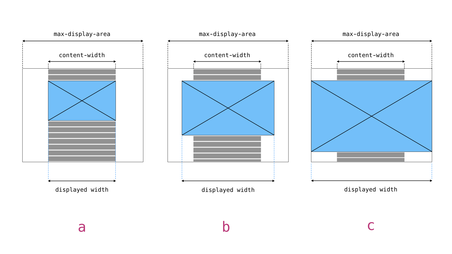
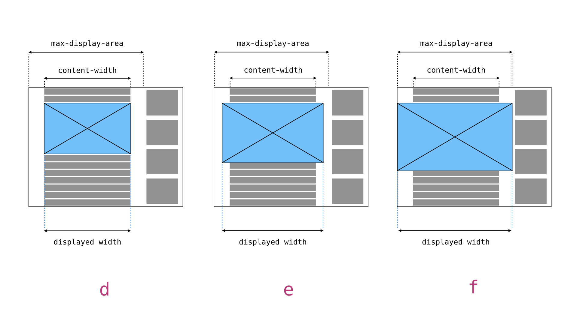
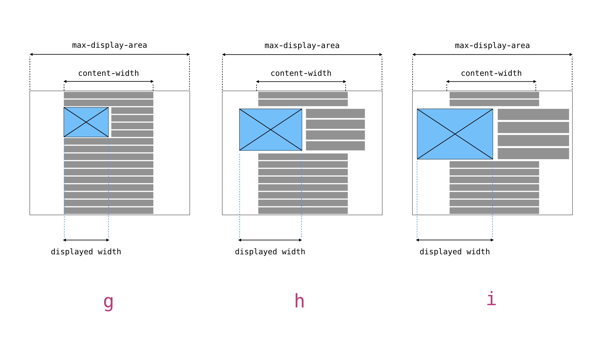
Historically, we've known two things about any image displayed: The physical width of the image file, and the $content_width as defined by the theme. We then used these two parameters to figure out the sizes attribute.
Gutenberg introduces not only the alignwide and alignfull widths, but also the ability to make various elements wide or full including but not limited to columns etc. As a result there are a myriad of possible display widths within any one theme in addition to the regular challenges posed by responsive web design.
These examples show there are _two constants_ which can be easily defined by the theme developer (and by extension plugin developers):
$content_width- the maximum width of the content when it is not displayed asalignwideoralignfull.$max_display_area- the maximum available space available to be filled if content is set toalignfull.
There is also one third assumption we can make:
- An element set to
alignwidewill take up the full$content_widthplus half of the available space between$content_widthand$max_display_area, and can be calculated as
$content_width + ( $max_display_area - $content_width ) / 2
In other words, if WordPress knows the $content_width and $max_display_area values, it can calculate accurately the space inside which content is displayed and from there determine on the fly what the sizes attribute of a displayed image is based on how it is displayed, including the new data-wp-percent-width introduced by @azaozz.
Practical application
The theme developer defines two values:
$content_widthdeclaring the maximum _content_ width (as in the width of content if noalignwideoralignfullis applied) for any display condition.$max_display_areadeclaring the maximum available width for any display condition.
Both these values will be variable depending on conditions so neither can be a global the way $content_width is today (unless I'm misunderstanding how $content_width currently works).
For images displayed without alignwide or alignfull, the $content_width variable (and custom width data-attribute if available) is sufficient to determine the sizes attribute: The displayed size will never be wider than $content_width or some percentage of $content-width defined by the data-attribute. This will be significantly simpler to set up for theme developers than the current methodology btw.
For images displayed in an alignwide or alignfull context, we need to use the $max_display_area value. It _could_ make sense to define this variable as an array of some sort pairing viewport widths and available display areas. This array can, in combination with the data-attribute, be turned into sizes attributes generated on the fly.
So for the examples above a theme would declare something like:
// In this theme there is a fixed maximum content width of 720px.
$content_width = 720px;
if ( is_active_sidebar( 'sidebar-1' ) {
$max_display_area = [
'min-width: 48em' => 'calc( 100vw - 30em), // sidebar is 30em wide.
'fallback' => '100vw',
];
} else {
$max_display_area = [
'fallback' => '100vw',
];
}
Assuming for d, e, and f, the breakpoint where the sidebar appears is at 48em and for g, h, and i, the data-wp-percent-width attribute is 50%, the resulting sizes attributes for examples at the top of this comment would be as follows :
/**
* a: Image width is equal to $content_width area.
*/
sizes="(min-width: $content_width) $content_width, fallback"
sizes="(min-width: 720px) 720px, 100vw"
/**
* b: Image width is 50% of the available space between $content_width and $max_display_area.
*/
sizes="(min-width: $content_width) calc(($max_display_area - $content_width) / 2), fallback"
sizes="(min-width: 720px) calc((100vw - 720px) / 2), 100vw"
/**
* c: Image width is equal to fallback.
*/
sizes="fallback"
sizes="100vw"
/**
* d: Image widths is equal to $content_width area.
*/
sizes="(min-width: $content_width) $content_width, fallback"
sizes="(min-width: 720px) 720px, 100vw"
/**
*e: Image width is $content_width plus 50% of the available space between $content_width and $max_display_area.
*/
sizes="(min-width: $content_width) calc(($max_display_area - $content_width) / 2), fallback"
sizes="(min-width: 720px) calc((100vw - 30em) - 720px) / 2, 100vw"
/**
* f: Image width is equal to $max_display_area.
*/
sizes="$max_display_area, fallback"
sizes="(min-width: 48em) calc(100vw - 30em), 100vw"
/**
* g: Image width is 50% of $content_width.
*/
sizes="(min-width: $content_width) calc($max_display_area * (data-wp-percent-width / 100)), calc(fallback * (data-image-width / 100))"
sizes="(min-width: 720px) calc(720px * .5), calc(100vw * .5)"
/**
* h: Image width is 50% of $content_width plus 50% of the available space between $content_width and $max_display_area.
*/
sizes="(min-width: $content_width) calc((($max_display_area - $content_width) / 2) * (data-wp-percent-width / 100)), calc( fallback * (data-image-width / 100))"
sizes="(min-width: 720px) calc(((100vw - 720px) / 2) * .5), calc(100vw * .5)"
/**
* i: Image width is equal to 50% of fallback.
*/
sizes="calc(fallback * (data-wp-percent-width / 100))"
sizes="calc(100vw * .5)"
Thanks @mor10, very nicely put :)
Yes, to properly process and display images on the front-end we need couple of bits of data: some context from the editor on how the image was used exactly, and some data from the theme on how the image will be displayed.
I have couple of small suggestions/clarifications.
$content_width- the maximum width of the content when it is not displayed as alignwide or alignfull.
$max_display_area- the maximum available space available to be filled if content is set to alignfull.
I'm (still) thinking we should let the theme (be able to) specify all three widths: content/main column, wide and full. That way we won't be forcing anything on the themes. Some may want a bit wider or narrower alignwide images. Using half of the difference between content_width and full for the wide may be a fallback, in case the theme is outdated, perhaps?
So these should be something like:
$content_width$alignwide_widthalignfull_width
(Technically they can also be in an associative array so we don't "litter" the globals space too much. Having that array will also signal that the theme supports this.)
Another important distinction is that we will expect these new widths to be "contextual". I.e. they should be set by the current template before it starts to output the HTML, (and perhaps reset at the end). This is critical for generating more precise sizes attributes for all images.
Gutenberg introduces not only the
alignwideandalignfullwidths, but also the ability to make various elementswideorfull.
Don't think we need to be concerned about that re: images. If a block is set to full, it wouldn't make sense to have an alignfull image in it. It will be exactly the same as "normal" image. Same for wide blocks.
azaozz
on 26 Jun 2018
Having all three widths specified makes sense, and the associative array would indeed make it cleaner. The only question is how to modify that with conditions... I guess the theme dev would just modify the array?
Don't think we need to be concerned about that re: images. If a block is set to
full, it wouldn't make sense to have analignfullimage in it. It will be exactly the same as "normal" image. Same forwideblocks.
If you look at the examples in my comment you'll see we have to account for these. If someone has a very large screen and a block is set to alignfull with a 50% image inside, that image could be substantially larger than the content width. sizes attributes have to describe the actual display width of an image, and anything placed within a alignwide or alignfull context will have different widths than otherwise.
mor10
on 26 Jun 2018
Hello @mor10, in your example, shouldn't the sizes for 'b' be:
sizes="(min-width: $content_width) calc($content_width + ($max_display_area - $content_width) / 2), fallback"
?
 alialaa
on 20 Jul 2018
alialaa
on 20 Jul 2018
@alialaa The math might well be wonky. It was provides as a prototypical example only.
mor10
on 23 Jul 2018
@azaozz Where are we with this? I just tested Gutenberg 3.3 with the official Gutenberg Starter Theme and as far as I can tell the current blocks are all using the full image size for everything. This causes a significant performance hit when the plugin is activated.
mor10
on 23 Jul 2018
@mor10 I'm trying to implement something that's very similar to the code provided by you (the wp_calculate_image_sizes filter), except I'm trying to achieve this for a bigger theme which has a lot more layouts variations. The biggest issue up until now is to implement a robust generator of sizes attribute for every place an image may appear in the theme. The biggest problems are:
- fluid vs. fixed width layout
- Grid system (in percents from the container)
- Grid gap
- Sidebar presence/absence
- Multiple media query breakpoints
What I managed to implement already is some PHP logic that accepts a set of parameters and outputs an array of sizes, with width descriptors and media queries. My goal is to cover the most common bootstrap layouts, they are super widely used
For the context, here are the breakpoints (with slightly modified media queries) that are used to generate these numbers.
The valid parameters for the thing are:
bootstrap_class: can be very long, accepts what bootstrap accepts, this is actually parsed and used to generate multiple media queriesgutters: true | false. Put the30pxgutters into calculation or not. This amount is configurablefluid: true | false. Non-fluid layouts are the hardest, they havemax-widthin pixels
Here are some test cases that actually pass, in JSON format (each entry is a test case, first object is the input to my logic, and the second is the output):
[
[
{"bootstrap_class": "col-md-12", "gutters": true, "fluid": true},
[{"media_query": false, "image_size": "calc(100vw - 30px)"}]
],
[
{"bootstrap_class": "col-sm-12", "gutters": true, "fluid": true},
[{"media_query": false, "image_size": "calc(100vw - 30px)"}]
],
[
{"bootstrap_class": "col-xs-6", "gutters": true, "fluid": true},
[{"media_query": false, "image_size": "calc(50vw - 30px)"}]
],
[
{"bootstrap_class": "col-xs-8", "gutters": true, "fluid": true},
[{"media_query": false, "image_size": "calc(66.6667vw - 30px)"}]
],
[
{"bootstrap_class": "col-xs-5", "gutters": true, "fluid": true},
[{"media_query": false, "image_size": "calc(41.6667vw - 30px)"}]
],
[
{"bootstrap_class": "col-xs-9", "gutters": true, "fluid": true},
[{"media_query": false, "image_size": "calc(75vw - 30px)"}]
],
[
{
"bootstrap_class": "col-xs-10 col-sm-3 col-md-7 col-lg-11 col-xl-5",
"gutters": true,
"fluid": true
},
[
{"media_query": "1300px", "image_size": "calc(41.6667vw - 30px)"},
{"media_query": "1000px", "image_size": "calc(91.6667vw - 30px)"},
{"media_query": "690px", "image_size": "calc(58.3333vw - 30px)"},
{"media_query": "480px", "image_size": "calc(25vw - 30px)"},
{"media_query": false, "image_size": "calc(83.3333vw - 30px)"}
]
]
]
After getting the output, it can be assembled easily into a proper sizes attribute ready to be inserted in HTML.
For example, here's what the output should be for a very complicated col-xs-10 col-sm-3 col-md-7 col-lg-11 col-xl-5 image should be:
[
{
"bootstrap_class": "col-xs-10 col-sm-3 col-md-7 col-lg-11 col-xl-5",
"gutters": true,
"fluid": true
},
[
{"media_query": "1300px", "image_size": "calc(41.6667vw - 30px)"},
{"media_query": "1000px", "image_size": "calc(91.6667vw - 30px)"},
{"media_query": "690px", "image_size": "calc(58.3333vw - 30px)"},
{"media_query": "480px", "image_size": "calc(25vw - 30px)"},
{"media_query": false, "image_size": "calc(83.3333vw - 30px)"}
]
],
Which in final assembled HTML would look like that:
<div class="container-fluid">
<div class="row">
<div class="col-xs-10 col-sm-3 col-md-7 col-lg-11 col-xl-5">
<img
srcset="..."
sizes="
(min-width: 1300px) calc(41.6667vw - 30px),
(min-width: 1000px) calc(91.6667vw - 30px),
(min-width: 690px) calc(58.3333vw - 30px),
(min-width: 480px) calc(25vw - 30px),
calc(83.3333vw - 30px),
"
>
</div>
</div>
</div>
Now test cases for the non fluid layouts are much more complicated and harder to follow.
Also, sometimes the bootstrap_class is not enough and we need to be able to express the image width in raw percentages.
If interested, I can hop into a more detailed chat somewhere else about this thing, I'm really interested into moving it forward properly, there are still lots of problems that I face 🙂
 andreiglingeanu
on 2 Aug 2018
andreiglingeanu
on 2 Aug 2018
8593 has added srcset and sizes attributes to individual gallery images, but the sizes attribute still acts as if each image takes up the full content width of the view which is rarely the case.
Related: #1450
mor10
on 8 Aug 2018
Where are we with this?
Looking at it atm, was afk for a while. Hope will have an updated, "workable" branch in a few days.
azaozz
on 9 Aug 2018
Updated the image block branch: https://github.com/WordPress/gutenberg/tree/update/image-block. Quite a few changes since the last update, all new/needed functionality is there, please test!
@joemcgill @getsource @mor10 thinking of making a pr tomorrow, reviews of the branch appreciated :)
azaozz
on 16 Oct 2018
Updated the branch again. Almost ready, just needs more testing :)
azaozz
on 19 Oct 2018
Adding this to the WP 5.0 milestone because it's quite important that we don't introduce performance regressions with images inserted into post content and I don't want to forget to review the updates here.
joemcgill
on 25 Oct 2018
We should remember that these performance problems are not only with images that are integrated via HTML tag (image and gallery block) but also with the cover-image block, where images are inserted via css as a background image.
The solution via srcset will not work for this blocks.
 derweili
on 26 Oct 2018
derweili
on 26 Oct 2018
Twenty Nineteen now provides a concrete testing ground for this issue. See https://github.com/WordPress/twentynineteen/issues/50#issuecomment-434120505 for further details.
mor10
on 30 Oct 2018
@azaozz Running the referenced branch using Twenty Nineteen, my inserted image gets the following markup:
<img
src="http://gutenberg.local:8888/wp-content/uploads/2011/07/michelle_049-1024x768.jpg"
alt="Big Sur"
width="640"
height="480"
srcset="http://gutenberg.local:8888/wp-content/uploads/2011/07/michelle_049-1024x768.jpg 1024w, http://gutenberg.local:8888/wp-content/uploads/2011/07/michelle_049-300x225.jpg 300w, http://gutenberg.local:8888/wp-content/uploads/2011/07/michelle_049-768x576.jpg 768w, http://gutenberg.local:8888/wp-content/uploads/2011/07/michelle_049.jpg 1600w"
sizes="(max-width: 640px) 100vw, 640px">
It looks like the max width is set to match the content_width global set in the theme.
What new markup (if any) should I add to the theme to test the new functionality?
mor10
on 30 Oct 2018
@mor10 right, it is using the $content_width PHP global. That is a fallback of the newly introduced $block_width global which should contain three values: default, wide and full, see: https://github.com/WordPress/gutenberg/blob/update/image-block/packages/block-library/src/image/index.php#L26 (note that these widths work more like max-width, just like the (old) $content_width ).
To test, perhaps follow the example from the phpdoc in the image block:
/**
* Get the expected block width from the global $block_width array.
*
* The global $block_width array is expectd to be set by the theme for each block container.
* It should contain three values: default, wide and full, in pixels.
* - The `default` value should be the expected block width (similarly to $content_width).
* - The `wide` value is optional and is used when the block alignment is set to `wide`.
* - Similarly the `full` value is optional and used then the alignment is set to `full`.
* If `wide` and `full` are not set, the `default` value is used instead.
*
* Example:
* $GLOBALS['block_width'] = array(
* 'default' => 640,
* 'wide' => 800,
* 'full' => 1024,
* );
*
* In addition the $block_width array should be set contextually for each block container.
* For example: in the main content column the `default` width will be something like 640(px),
* but for a sidebar it would be something like 250.
If you are looking to set more precise sizes attribute, the best way would still be to use the https://developer.wordpress.org/reference/hooks/wp_calculate_image_sizes/ filter. Looked at adding something "easier" for themes but setting the proper sizes is highly contextual and greatly depends on the styling (columns, breakpoints, margins, padding, etc.). There isn't an "easy way" there, best to leave full control to the theme (i.e. utilize the filter).
azaozz
on 30 Oct 2018
Why is this value in pixels? Many (probably most) themes will not use pixel values for the widths. Twenty Nineteen is but one example. It should be possible to define the widths using any width value. For example, full-width images will in most cases be 100vw.
mor10
on 30 Oct 2018
Also why is it getting set as a global, vs an add_theme_support option or through a filter?
It would be super helpful to see this branch opened as a PR, even if it's marked as WIP or with the "In Progress" label. Makes it easier to review the code, discuss it, etc. ☺️
 chrisvanpatten
on 30 Oct 2018
chrisvanpatten
on 30 Oct 2018
Why is this value in pixels
Because the image (file) size is in pixels and because we need to set the <img> tag's width and height attributes (best practice). A value of 100vw is used by default in the sizes attribute, but the theme should also pass the acceptable max-width even for an "align full" image block.
There probably are themes that will decide that site visitors should download 3-4MB images as long as the site looks good on a 2560px screen. Others will be more pragmatic and limit that to somewhat more "sane" value.
BTW, for this to work well we need another larger size generated by default for all uploaded images.
azaozz
on 30 Oct 2018
why is it getting set as a global, vs an add_theme_support option or through a filter
The idea is for this global to be "contextual", i.e. to have different values for different "templates". There are several ways to do this, but a PHP global or firing a WP action seem easiest to use.
azaozz
on 30 Oct 2018
@azaozz See https://github.com/WordPress/twentynineteen/pull/411. We talked about a way to detect whether the current image was displayed as regular, alignwide, or alignfull from within wp_calculate_image_sizes a while back. I believe one idea was to add a data attribute inside the <img> element. Without this contextual information I don't see how I can provide correct sizes attributes for the three layout options. Ideas welcome.
mor10
on 30 Oct 2018
Without this contextual information...
Right. This information is in the $block_attributes array. It is being passed to the (new) render_block_core_image_tag_attributes filter (may need a better name...). Once that's merged to Gutenberg and core, I think we will be able to pass the block attributes to both wp_calculate_image_srcset and wp_calculate_image_sizes filters.
azaozz
on 30 Oct 2018
Where are you on that? Can I test it currently?
mor10
on 30 Oct 2018
Not yet as it modifies core files. Can add it as a "hack" :)
Needs to pass $block_attributes when calling wp_calculate_image_srcset() and wp_calculate_image_sizes(), see https://github.com/WordPress/gutenberg/blob/update/image-block/packages/block-library/src/image/index.php#L210 and https://github.com/WordPress/gutenberg/blob/update/image-block/packages/block-library/src/image/index.php#L213. Then pass the same to the filters in these functions in /wp-includes/media.php.
Thanks for testing!
azaozz
on 30 Oct 2018
Are there core tickets I can pile into to get this on track? GB and Twenty Nineteen can't release unless this is resolved imo.
mor10
on 30 Oct 2018
@azaozz I had a chance to do some testing of the branch yesterday (sorry for the delay). I want to do a lot more, but wanted to leave the following feedback:
First, I'll again reiterate that I am strongly against the idea of saving srcset and sizes attributes to image markup in the database. The markup in the database should be immutable and as future proof as possible. From a pure content perspective, the basic img tag with a single src should remain, and srcset and sizes is an implementation detail that is best handled on the front end. srcset attributes can and should change whenever additional image sizes are generated for attachments (after switching themes, or adding new image sizes to an existing theme, etc.).
Gutenberg already formats images markup in a way that supports our current responsive image solution via the front end filter so I think the focus should be improving the filters available for themes to modify the sizes attribute based on attributes of the block containing the image (e.g., alignment, gallery columns, etc).
Additional notes:
I noticed that in the editor, Chrome is now downloading two versions of every image (this doesn't happen on the master branch). The second is on account of the switching of the src attribute of the image component in fetchImageSize() which is called during componentDidMount. This negates any benefit that comes from adding srcset and sizes to the component.
On full-width images, the max-width is getting capped at 1024px which breaks the preview. This doesn't happen in master.
I'll continue testing and adding notes, but also echo @chrisvanpatten that it would be helpful to be able to review this as a PR. Thanks!
joemcgill
on 31 Oct 2018
@joemcgill thanks for testing! :)
I'll again reiterate that I am strongly against the idea of saving srcset and sizes attributes to image markup in the database... srcset attributes can and should change whenever additional image sizes are generated for attachments (after switching themes, or adding new image sizes to an existing theme, etc.).
This is something we looked at few years ago when implementing srcset and sizes. In theory that sounds somewhat possible, however in practice that happens so rarely that it should be left for plugins to handle. It also breaks generation of srcset and sizes when the content is exported from one WP site and imported in another as attachment IDs change (but URLs don't change).
However in this case the srcset and sizes attributes are purely for the editor's sake. They are always regenerated on the front-end, see https://github.com/WordPress/gutenberg/blob/update/image-block/packages/block-library/src/image/index.php#L244.
Still think we should open a core ticket for WP 5.1+ to look into reusing the srcset attribute as that fixes imported content. The default sizes attribute is theme agnostic, but thinking it should always be regenerated and filtered on the front-end.
Gutenberg already formats images markup in a way that supports our current responsive image solution via the front end filter
Not quite :) Currently Gutenberg "forces" the full-size images both in the editor and on the front-end. It's true that a srcset attribute is added to <img> tags, but look at the default sizes attribute there. It's "borked" :)
I think the focus should be improving the filters available for themes to modify the sizes attribute...
Absolutely agree. This adds few new filters that help there, but most importantly we should pass the block_attributes to the wp_calculate_image_sizes filter (also to wp_calculate_image_srcset to match).
In addition after the last update there is quite a bit of editor-related data passed in these block attributes. That allows for proper scaling of images on the front-end, resetting of width and height (and ensuring these are always present, best practice), and generally gives a lot more options to the theme when rendering the image block.
I noticed that in the editor, Chrome is now downloading two versions of every image
This only happens for freshly uploaded images. As the image is added as "preview" while uploading, we need to change the src to point to the "large" size after there is an attachment post. Also, inside the editor the benefit of having srcset is to load and display "retina" images. There are no speed benefits as the editor content (HTML) is loaded long after the page has finished loading.
On full-width images, the max-width is getting capped at 1024px which breaks the preview. This doesn't happen in master.
Right. The alternative here is to always download 2-4MB or sometimes larger images. That is unacceptable, even if only in the editor. To fix this limitation we need to generate another image subsize by default, larger than "large". This was discussed many times in Slack, and there is a core ticket that's pretty "old". We should definitely look into doing that soon.
I'll continue testing and adding notes
Yes please! :)
Thinking of making a PR tonight, seems most edge cases in handling images are accounted for.
azaozz
on 1 Nov 2018
However in this case the srcset and sizes attributes are purely for the editor's sake.
If that's the case, then it definitely doesn't make sense to save those attributes to the saved markup in the database.
Not quite :) Currently Gutenberg "forces" the full-size images both in the editor and on the front-end. It's true that a srcset attribute is added to
tags, but look at the default sizes attribute there. It's "borked" :)
Ah right, helpful distinction here is that the width attribute of the image is being saved incorrectly, because we're no longer constraining the image size to content_width.
This only happens for freshly uploaded images.
I don't believe this is true. I can save a post, refresh the editor, and still see the double download happening.
Right. The alternative here is to always download 2-4MB or sometimes larger images. That is unacceptable, even if only in the editor.
Sorry, I don't think I was clear here. What I'm seeing is the image width being limited in CSS by the inline style on the wrapping div in the editor. Here's some screenshots to help:
Full size image in the editor not spanning the full width – https://cloudup.com/cHob4kcjLrN
Markup of the above in the inspector – https://cloudup.com/cIVWetqpSoF
joemcgill
on 1 Nov 2018
The scope of this ticket is very large, but there are a few bits that are crucial for WP 5.0. Can we break down the specific issues that would be regressions? As I see it, this includes:
- [ ] Keep full size images from loading on the front end.
- [ ] Save a more appropriate
widthtoimgelements in post content (best practice, but also relevant for calculating a defaultsizesattribute for responsive images).
High priority, enhancements:
- [ ] Provide a way to filter
sizeson the front end based on image alignments (#6131). - [x] Keep full size images from being loaded in the editor.
Enhancements (nice to have):
- [ ] Improve image loading performance in the editor (e.g., via responsive images)
- [ ] Improve handling of manually resized image widths between the editor and front end.
- [ ] Add an additional generated image size for 2x large (We need to evaluate the impact on image generation here. This is related to https://core.trac.wordpress.org/ticket/37840 which is blocked by https://core.trac.wordpress.org/ticket/40439)
Anything I'm missing?
joemcgill
on 1 Nov 2018
Provided an example over in Twenty Nineteen repo of why this is a blocker for the theme and for Gutenberg in general. The performance hit currently incurred by Gutenberg is significant: https://github.com/WordPress/twentynineteen/issues/50#issuecomment-436829300
mor10
on 8 Nov 2018
From my testing, responsive images are still not resolved in 5.0 RC1. wp_calculate_image_sizes does not have a block properties attribute, and render_block_core_image_tag_attributes from #11973 has not been merged.
Not to put too fine a point on it, but this means all images not manually resized within the editor and aligned alignnone, alignwide, and alignfull in RC1 are broken because their sizes attributes are incorrect.
To test, activate Twenty Nineteen, upload a large image (1200px or wider) into a post, align it none, alignwide, or alignfull, and check the output sizes attribute. You'll find that regardless of the displayed width or the intrinsic width of the image, the value is:
sizes="(max-width: 1024px) 100vw, 1024px"
This means for any situation in which the image is displayed wider than 1024px (so pretty much all instances where a laptop / desktop display is in use), the browser will load a 1024px wide source image and stretch it causing blur.
What's the plan to get this merged. What can I do to help?
mor10
on 23 Nov 2018
Related:
mor10
on 24 Nov 2018
A request has been made for a test to show current and corrected behavior, so I've built them both:
The two posts linked below show the current output from core and a corrected version respectively. Note the detailed instructions on how to test this. Responsive images are a core browser feature and browsers work very hard to make the functionality invisible. Forcing visibility requires being rather heavy handed in your testing.
Take special note of the following: Responsive images are impacted by display density. When you do testing, make sure you test for both 1x and 2x displays. This can be done using the mobile preview in your browser dev tools.
- Demo 1: Auto-generated sizes provided by core https://gutenberg.mor10.com/image-test-current/
- Demo 2: Same content with corrected sizes attributes https://gutenberg.mor10.com/responsive-images-demo-corrected-code/
mor10
on 29 Nov 2018
Thank you all for putting so much thought and care into this. I see two tangled concerns that should be separated to move forwards.
- Avoid glaring breakage in 5.0 (like loading huge images).
- Rethink how WordPress handles the media space in a world of flexible viewing experiences.
For the first, there needs to be a clear identification of any pending issues and agreement on what "broken" means. Specially around newly introduced features that don't carry any expectation from before (wide images, cover block, etc). My understanding is the main obstacle of loading too big a source is solved by defaulting to "large".
For the second, I very much believe we need to _devote a whole cycle_ to media as we are carrying issues from a time when things were simpler. Now media exists in a world where the rudimentary assets we have in core are not enough — a plethora of devices accessing the web with different expectations, pixel densities, screen sizes, etc. This cannot be solved entirely by WordPress alone and would need participation from other groups — like hosting services and bandwidth management, browsers, web standard groups, etc. It is also unreasonable to expect to fix it all at the same time we are doing 5.0.
When we look at how WordPress manages assets by default, it's evident the variations it creates are not enough to power the wide range of devices, viewing conditions, and performance expectations. In the upper scale, we are dealing with 1024px or full-size on a regular install. This is not enough. There is a huge gap between "source" and "large" that makes almost any attempt at responsive images or hi-dpi support something of a losing battle. We need to have better segmentation of media assets without overloading servers for this to scale and match the quality expectations.
This is only further complicated by the fact these options are configurable by the user, themes, and plugins, so assumptions around what "large" would accommodate cannot go too far.
Being able to deliver the right image for the right context is crucial.
Ideally, the user doesn't have to intervene at all to make their creations look good and be performant.
However, our current standing proposal is not looking flexible enough at a technical or user experience level to fulfill this, while adding considerable overhead and complexity:
- Scaling to other non
wp:imageblocks remains unsolved. - Unorthodox server implementation (likely needs something like #10108) that adds complexity.
- Overhead in reproducing image markup _ad hoc_ (server vs client), clashing with potential extensions and fidelity client side.
- Unclarity in expected UX around percentage sizes.
- Too much responsibility on the theme side.
- More importantly, unclarity in overlap with phase 2 conditions and requirements.
In introducing this code and expectations (for themes, etc) we'll be creating a complicated web of requirements and missing the chance to take a more holistic approach to the problem. I believe this would be better done with time and in conjunction with phase 2, as the expectations of where a block lives and the user interactions will augment considerably.
Themes would no longer be able to merely say what widths they care about for the content, as blocks will be placed anywhere on a page. Blocks may be moved between block areas, too, so widths should always be contextual and controlled by the immediate InnerBlocks root. This includes things like columns within the main content area, but also areas outside the content itself. Any API we develop here needs to consider these expectations, as otherwise we'll be creating a web of legacy code that will be hard to untangle effectively.
What I see becoming a more robust and future-proof API is to attach media width responsibilities to each block container, of which post_content is just one. It could look like something like this:
innerBlocks( 'post-content', sizes: {
    default: 600,
    wide: 1000,
    full: 100vw,
}
This both specifies a default max-width and the _availability_ of a wide alignment for the blocks under that root. As soon as you create another root (like columns), the context changes.
Which would allow us to also do:
innerBlocks( 'sidebar', sizes: {
    default: 300,
    wide: false,
    full: false
} )
and so on.
This should be paired with intrinsic responsive images handling, and more importantly, with better segmentation for asset creation or some sort of dynamic handling, if at all viable.
 mtias
on 29 Nov 2018
mtias
on 29 Nov 2018
Thanks @mtias,
I'm in full agreement with both the need to avoid breakages in 5.0, and the need to do a more high level focus on Media in WordPress to address these issues.
Regarding the former, I'm unsure that we've entirely addressed the issues that I outlined as necessary in https://github.com/WordPress/gutenberg/issues/6177#issuecomment-435091640, specifically:
Save a more appropriate
widthtoimgelements in post content (best practice, but also relevant for calculating a defaultsizesattribute for responsive images).
If we can confirm that has been addressed, I would be comfortable with everything else being handled in 5.0.x releases, and beyond.
On the latter—rethinking media handling has been a hope of mine for some time, and is one of the reasons we had initial discussions about some of these high level problems during the community summit meetings during WCEU 2017 when Gutenberg was just getting kicked off. I look forward to resuming those conversations once the WP 5.0 release cycle has ended.
joemcgill
on 29 Nov 2018
Completely agreed with @joemcgill above ^
I would love to work together in the sort of high-level effort you're talking about, and it's something we've been talking about and wanting to work on for quite some time.
 getsource
on 29 Nov 2018
getsource
on 29 Nov 2018
Count me in. I think we (WordPress) are in a position to not only solve this for ourselves but create new models for media handling that helps the web as a whole. We could get involvement from browsers, hosts, CDNs, and standards bodies and use WP as the distribution channel for new best practices.
What we have encountered here is the absolute hard edge of the RICG responsive images spec. We now have a test case for what works and what doesn't work. This puts us in a unique position to move the work forward.
mor10
on 29 Nov 2018
@joemcgill Can you clarify this:
Save a more appropriate width to img elements in post content (best practice, but also relevant for calculating a default sizes attribute for responsive images).
What makes a "more appropriate" width? Just trying to understand the parameters of that particular item as I'm not sure I do now :)
chrisvanpatten
on 29 Nov 2018
To the intrinsic size / jank question, this is now relevant:
https://www.chromestatus.com/feature/4704436815396864
https://codepen.io/eeeps/pen/qLKwEZ
mor10
on 9 Jan 2019
Disappointing thread to read; as I can't see any progress that has been made. The solution at the moment, is to mearly upload the images at the exact size needed and either double up the size or ignore retina — is there any progress that will make it's way into wordpress? At the moment, I don't want to give clients the ability to have a 30mb page because they're unable to resize efficiently and I'm unable to force the images to correlate to the design and performance
 yratof
on 22 Jan 2019
yratof
on 22 Jan 2019
@yratof yeah, agree the progress here has been slower than intended. However, after a lot of discussions here (in the Gutenberg repo) and in Slack, we've decided there is no point adding marginal fixes that "somewhat" improve one thing or another. The scope of this was reduced many times.
Best way forward is to take a hard look at how WP handles media and in particular images, and fix and improve all the underlying problems. Please see Matias' comment above. If you (or anybody else) wants to get involved into that work, I'm hopping we can "formally" launch it as soon as WP 5.1 is ready/released. Until then please think about what would you want to get fixed/improved, and how images in WP should "work", preferably with some code examples :)
azaozz
on 22 Jan 2019
Just to say how much I would love this.... Currently my blog is 350mb on the home page..... Its just fucking nuts
 hutber
on 21 Feb 2019
hutber
on 21 Feb 2019
Is this the appropriate thread to ask if the Gutenberg Gallery Block can have a image size selector added so the images can be scaled down medium sized images instead of scaled down full-size images?
 MarkRH
on 23 Feb 2019
MarkRH
on 23 Feb 2019
Today I found myself doing this:
// onDomReady
document.querySelectorAll('.wp-block-gallery.columns-2 figure img')
  .forEach(x => {
    x.setAttribute('sizes', '(max-width: 781px) 50vw, 344px');
  });
...which one could parametrize with $content_width and .columns-N. And roll a plugin. I hope it won't come to that :) ...and I'll remember to disable this once it lands in core.
EDIT: JavaScript code worked once, accidentally, I guess. You'd have to inject the sizes attribute at PHP level, somewhere, ideally between Gutenberg markup and the_content filter. Ugh.
EDIT2: So I implemented the PHP solution with DOMDocument & Xpath. Seems to work & I will use it in production. Obviously very error-prone, would not recommend.
 bikubi
on 13 Mar 2019
bikubi
on 13 Mar 2019
Just to say how much I would love this.... Currently my blog is 350mb on the home page..... Its just fucking nuts
As a temporary measure, I'd manually scale your images to a much smaller size, compress them, then limit your blog to like 4 posts or something. Because you're going to kills someones data when they view your blog lol
yratof
on 13 Mar 2019
FYI intrinsicsize is now a thing: https://github.com/WICG/intrinsicsize-attribute
mor10
on 22 Mar 2019
/update/image-block is a "work in progress" :) Please test.
- Always insert the
largeimage size, orfullif large doesn't exist.
How about : always insert all image sizes options from get_intermediate_image_sizes(); ?
What is the added value to preventing access to certain images sizes ?
add a filter to be able to enable some image sizes, or enable typing your custom image size to use.
for now my choices are "thumbnail, medium, fullsize" which is a RIDICULOUS choice for a production feature shipped to 30% of internets websites (wordpress).
users are all loading 5mb image sizes instead of 500ko.
I'm not even sure if it's possible for me to filter the block to add lazysizes ?
 rsepierre
on 16 May 2019
rsepierre
on 16 May 2019
Hi.
I am no expert on Wordpress but i thought:
'at least a simple gallery feature is at hand'.
Well...
Is there a set point in time when the size pulldown (to show 'small' = 'thumbnails' images on the page and link to the bigger image (''large')?
I mean, i'm talking about 5.2.2 and it is June 2019.
What are the alternatives besides paid plugins?
I am really sick of disabling Gutenberg. The fourth site i try, the first that held WITH Gutenberg (up to now, but not for long and it's gone and the columns will be ACFs). This is, i don't know, i am relatively new to WP (at least the more in depth kind of it) and this is not making anyone happy.
 ararename
on 19 Jun 2019
ararename
on 19 Jun 2019
Ok, for me https://github.com/klihelp/Kli-Gutenberg-Gallery works. Thanks for that !!
ararename
on 19 Jun 2019
There shouldn't be a need to add a plugin to handle images after gutenberg @ararename :(
yratof
on 20 Jun 2019
Well, then why is this thread here?
And it's about a setting for the gallery, not about images.
ararename
on 20 Jun 2019
There shouldn't be a need to add a plugin to handle images after gutenberg @ararename :(
Yes but image block, gallery block, media-text block are all bad in how they handle image size. I don't get how they got to production. How can you fail at taking image sizes into account in 2017-2019 when entirely rebuilding from scratch the most used features of the most used CMS in the world ? When the classic editor was just about ready to handle every image size just fine.
This is aweful. I'm torn appart having to choose between making my own responsive image/gallery/media-text block while not being able to benefit from any native wordpress blocks future updates or sticking with the failing ones hoping gutenberg will get better while customers downloads 4k images on their mobile or 500px images on their 4k monitor
rsepierre
on 20 Jun 2019
That is what i thought when i discovered it: why does something in this state get into a 'productive' version distributed by the thousands?
As a result: Gutenberg gets disabled by thousands and thousands as a last chance to get stuff done in time (well, not in time).
If i hadn't found the plugin 'Kli-Gutenberg-Gallery-master' useful and working i'd have had to invest days just for something that the core should deliver but does not.
This is alpha state, not production.
ararename
on 20 Jun 2019
Hi all! 👋
Is there progress being made on this? Has the conversation moved away from this ticket?
I'd like to follow along and get involved if I can to help move this forward. 😄
 keithdevon
on 11 Sep 2019
keithdevon
on 11 Sep 2019
Hey Keith, i might be able to get back to you about this some time next week. Believe it or not, i cannot reach the backend of the wordpress install i had that trouble with and i don't have the time to install a complete local version from my backups.
From what i remember using 'simplest-gallery' PLUS 'fancybox-for-wordpress' plugins together AND setting the image width of the images in question (the thumbs, for which i created a custom images size in functions.php) to a 100% width and the height to auto (this overwrites inline html width-/height-attributes, if any) satisfied my needs. Let me know if this already helped you. Will be away until at least Tuesday, though.
ararename
on 12 Sep 2019
any progress?
 andrewio
on 15 Oct 2019
andrewio
on 15 Oct 2019
Is this being worked on? Or tracked somewhere else?
 danielkusper
on 3 Dec 2019
danielkusper
on 3 Dec 2019
@mtias @azaozz - Is it time to start adding image size selectors to every block that uses images? Image sizes haven't been totally addressed with 5.0 or 5.1 and the image block already has a selector.
Maybe the Cover Block can get a selector next (#19223)?
We built a multisite to Tulane University faculty. Full-size images of cover blocks are our largest resource suck.
 bbertucc
on 18 Dec 2019
bbertucc
on 18 Dec 2019
Is there any update about it ?
I want to serve gallery images as a thumbnail. Default gallery block using full size of images and scale it using CSS.
 ShareTextures
on 27 Dec 2019
ShareTextures
on 27 Dec 2019
@ararename> Ok, for me https://github.com/klihelp/Kli-Gutenberg-Gallery works. Thanks for that !!
Can you explain how to use it? How did it work for you? Did you change all old post galleries with another gallery plugin shortcode? or plugin automatically doing it itself?
I actually installed the plugin and didn't manage it
ShareTextures
on 27 Dec 2019
@ShareTextures
It was a new Installation, i do not remember if it was important to keep an order when installing the plugins, but this is what i have installed:
- FancyBox for WordPress, Version 3.2.2, from Colorlib
- Klip - Gutenberg Gallery, Version 1.0.0, from Klipolis
- Simplest Gallery, Version 4.4
And after uploading images into the gallery it just worked. Actually i had forgotten about any shortcodes Klip - Gutenberg Gallery uses and i am _not_ using _any_.
I had nearly forgotten after the topic was closed but i had this text ready then:
I am not into the topic as such but i said to be posting my 'solution' for a image gallery fed by a Gutenberg gallery block (that is, for the frontend, the backend has full size but that did was of no concern as i know for sure the editors do have enought bandwidth and the job was not paid in a way that could make me investigate more than necessary - anyway, i suppose some time will come when Wordpress 5 works as it had been expected when 5.0 came out).
First, if i remember this right, the 'images as thumbnails in the gallery element'-problem went away after some upgrade from 5.1.* to 5.2.*.
For a working gallery i had to have installed
- Klip-Gutenberg Gallery
- Simplest Gallery
- FancyBox for WordPress
I will not go and test what went wrong with which one missing, it felt like guessing anyway, but with any one of these missing something broke.
And somewhere along the way i had to do
.fancyboxforwp img {width: 100% !important; height: auto !important;}
And i had to put the lines (the part where $(".fancybox").fancybox is initialized) 133 to 157 (approx) in comments to not have some Js-error in the browser.
_Yes, this sounds insane._
But i checked back an it still works (fe, not backend, as already said).
Hope you will succeed somehow, cheers
Frank
ararename
on 27 Dec 2019
One more thought:
I have set, in my functions.php:
add_image_size('thumbnail', 152, 152, true);
So i explicitely had set a size for thumbnails, maybe this also affects the overall outcome.
And i have been using Regenerate thumbnails Plugin quite a few times, maybe this also affects the overall outcome. Just guessing wildly and checking connected stuff...
ararename
on 27 Dec 2019
@ararename Thanks for fast reply. My website already have 500+ post. So it will not work for me :(
I will wait to next update of Wordpress Gutenberg.
ShareTextures
on 27 Dec 2019
@azaozz Is there any update about it? All I want to know how to use the thumbnail link of images in my gallery instead of full images.
ShareTextures
on 3 Jan 2020
What's the status of this, particularly vis-a-vis Responsive Cover Blocks in Gutenberg. Those are becoming a bit of a performance headache for me.
 changeling
on 7 Jan 2020
changeling
on 7 Jan 2020
Responsive Cover Images
In order to propose a path for responsive cover images, I have been trying to understand how CSS image-set works https://developer.mozilla.org/en-US/docs/Web/CSS/image-set and making some tests.
The first two sections introduce image-set and src-set/sizes as mechanisms for responsive images. The last section concludes and discusses the path forward for responsive cover images.
Image-set
Image-set property seems very different from the srcset attribute. Image-set does not support setting multiple image sizes; it supports setting multiple image resolutions ( dpi's/density). It seems that the different image sizes automatically generated by WordPress all have a 72DPI.
Image-set property makes the browser download the best image depending on some conditions. Some examples of conditions are:
- The screen pixels per inch.
- Choose to download a lower dpi image when the connection is very slow.
- Download a better image when sending something to a printer.
The viewport size does not seem to affect which image is chosen by the image-set.
Src-set & sizes
Srcset allows us to provide a list of different image sizes (resolutions are also supported although rarely used), and the sizes attribute provides a media query like syntax to choose the size the image is displayed. When the browser knows the width of the image, it downloads the closest size from the srcset.
WordPress uses the following sizes attribute "(max-width: $width px) 100vw, $width px" where $width is the image file width, that means if viewport is smaller than $width use the viewport size as the image size if the viewport is larger than $width use $width as the image width.
The WordPress srcset and sizes attribute pairs ensure that on a screen whose width is x amount of pixels, we don't download images whose width is greater than x.
The path forward
The cover block adds images as CSS background, so at first, the image-set property seems a good fit to allow the browser to choose one image file from a set of available files depending on the device.
But when we say "Responsive Cover Image", I think we mean if the device viewport is small, we should download a small image if the device viewport is big we should download an image with a bigger size.
Image-set does not seem to allow this behavior; it enables one to download an image with a higher dpi if the pixel density of the device is hight (e.g., retina display) and an image with low dpi if the pixel density of the screen is small.
A mobile phone and a computer screen may have the same pixel density, so it seems using image-set, both devices will download the same image (provided network speed and other variables are the same). We don't desire this behavior, I think we want to download a "smaller" image on the mobile phone.
Another challenge to image-set use is that it seems all the image files we generate on WordPress have the same amount of DPI.
After this exploration, it seems the image-set is not a good fit for responsive cover images. The path forward seems to be making cover image use an image element with the normal src-set & sizes attributes set by WordPress and then with CSS make that image look like a background (as we do for videos). There are some challenges in that path, too, mainly with the parallax. I'm not sure if it is possible with a normal image element, but it seems we should give it a try.
If I missed something, or you have additional information that may be useful, please leave a comment.
 jorgefilipecosta
on 15 Jan 2020
jorgefilipecosta
on 15 Jan 2020
Great thoughts, @jorgefilipecosta. I have created #19909 just now, which aims to explore how any block can receive responsive edits. Can you have a look to see if your idea of responsive cover images could leverage that interface?
 jasmussen
on 27 Jan 2020
jasmussen
on 27 Jan 2020
If FLIF or JPEG-XR could be widely enough supported already... 🐱
It is possible to combine image-set with normal media queries using some loops,
this would result in large amounts of CSS. Sure, gzip would probably squish it, but it is also complexity like all the overridden media queries stacked in the Developer Tools.
For now I use an <img with srcset and sizes and position it absolutely behind the content.
Using this approach I don't have to handle the hidpi/retina part and just provide some rules for the sizes. - But this would have to be adjusted separately to the stylesheet.
Currently the cover image is placed as CSS background image in its full, original size, no resizing, no server-side compression or optimizations whatsoever. This is very bad for the load times for UX, when a separate, scaled-down variant has to be uploaded and used for the cover block instead.
 strarsis
on 1 Mar 2020
strarsis
on 1 Mar 2020
Is there already an update for this?
I just added a gallery to my site and now my page size is a whopping 25MB because the gallery doesn't load thumbnails but the full images.
 yethibault
on 30 Apr 2020
yethibault
on 30 Apr 2020
Hello @azaozz and others.
Can we get a status update for this issue?
It seems there is a lot of things going on in this issue. It is important to break it part into smaller issues that are easier to handle.
Thanks.
 paaljoachim
on 28 May 2020
paaljoachim
on 28 May 2020
Is there any way to fix the galleri problem? I mean linking to the media file? Currently some of my images have valid links to full width, but most of them linking to large format (1024x).
 CNK001
on 1 Oct 2020
CNK001
on 1 Oct 2020
Hey @CNK001
See if you are able to locate an issue that is related. I did a search for media label issues: https://github.com/WordPress/gutenberg/labels/%5BFeature%5D%20Media
If your not able to locate one then open a new issue.
paaljoachim
on 1 Oct 2020
I just had a support request for a user needing more advanced image handling.
 kspilarski
on 10 Nov 2020
kspilarski
on 10 Nov 2020
After one of the last Wordpress Autoupdates my solution went down the drain like ...
Backend and frontend comletely fucked up. I have to start anew.
Did anyone find a solution to the problem that galleries do not show thumbnails but full size images?
I would be so thankful because this is getting on my nerves for more than a year now - and I'm kind of pis... to have to investigate deeply into this topic again.
Any help really appreciated, thank you and: have a nice day :-)
ararename
on 12 Nov 2020
Hey @ararename
Gallery is being reworked to use inner blocks. For more information check out this Pull Request.
https://github.com/WordPress/gutenberg/pull/25940
paaljoachim
on 12 Nov 2020
@paaljoachim Thank you for the quick reply! Gonna check :-)
ararename
on 12 Nov 2020
@ararename you can use the PhotoPress plug-in in the meantime. It has a core gallery transform.
 padams
on 12 Nov 2020
padams
on 12 Nov 2020
Thanks @padams for another option. I thought i will get to it today but it will take me some days to return to this topic. Will report back how it went.
ararename
on 13 Nov 2020
Related issues
jasmussen
·
3Comments
 youknowriad
·
3Comments
youknowriad
·
3Comments
 mhenrylucero
·
3Comments
mhenrylucero
·
3Comments
 aduth
·
3Comments
aduth
·
3Comments
 hedgefield
·
3Comments
hedgefield
·
3Comments
Most helpful comment
Thank you all for putting so much thought and care into this. I see two tangled concerns that should be separated to move forwards.
For the first, there needs to be a clear identification of any pending issues and agreement on what "broken" means. Specially around newly introduced features that don't carry any expectation from before (wide images, cover block, etc). My understanding is the main obstacle of loading too big a source is solved by defaulting to "large".
For the second, I very much believe we need to _devote a whole cycle_ to media as we are carrying issues from a time when things were simpler. Now media exists in a world where the rudimentary assets we have in core are not enough — a plethora of devices accessing the web with different expectations, pixel densities, screen sizes, etc. This cannot be solved entirely by WordPress alone and would need participation from other groups — like hosting services and bandwidth management, browsers, web standard groups, etc. It is also unreasonable to expect to fix it all at the same time we are doing 5.0.
When we look at how WordPress manages assets by default, it's evident the variations it creates are not enough to power the wide range of devices, viewing conditions, and performance expectations. In the upper scale, we are dealing with 1024px or full-size on a regular install. This is not enough. There is a huge gap between "source" and "large" that makes almost any attempt at responsive images or hi-dpi support something of a losing battle. We need to have better segmentation of media assets without overloading servers for this to scale and match the quality expectations.
This is only further complicated by the fact these options are configurable by the user, themes, and plugins, so assumptions around what "large" would accommodate cannot go too far.
Being able to deliver the right image for the right context is crucial.
Ideally, the user doesn't have to intervene at all to make their creations look good and be performant.
However, our current standing proposal is not looking flexible enough at a technical or user experience level to fulfill this, while adding considerable overhead and complexity:
wp:imageblocks remains unsolved.In introducing this code and expectations (for themes, etc) we'll be creating a complicated web of requirements and missing the chance to take a more holistic approach to the problem. I believe this would be better done with time and in conjunction with phase 2, as the expectations of where a block lives and the user interactions will augment considerably.
Themes would no longer be able to merely say what widths they care about for the content, as blocks will be placed anywhere on a page. Blocks may be moved between block areas, too, so widths should always be contextual and controlled by the immediate
InnerBlocksroot. This includes things like columns within the main content area, but also areas outside the content itself. Any API we develop here needs to consider these expectations, as otherwise we'll be creating a web of legacy code that will be hard to untangle effectively.What I see becoming a more robust and future-proof API is to attach media width responsibilities to each block container, of which
post_contentis just one. It could look like something like this:This both specifies a default max-width and the _availability_ of a wide alignment for the blocks under that root. As soon as you create another root (like columns), the context changes.
Which would allow us to also do:
and so on.
This should be paired with intrinsic responsive images handling, and more importantly, with better segmentation for asset creation or some sort of dynamic handling, if at all viable.