Gutenberg: Enhance the tools for selecting child/parent blocks
Selecting the parent of a block is not quite as easy as it should be. For some blocks, such as Columns, it can be fiddly to select the right block to apply changes to. Selecting the inner block might be easy, but due to overlapping outlines, selecting the parent might not be.
Let's explore ways to make this easy and obvious so that Gutenberg can scale to more complex blocks with additional inner blocks.
Breadcrumbs
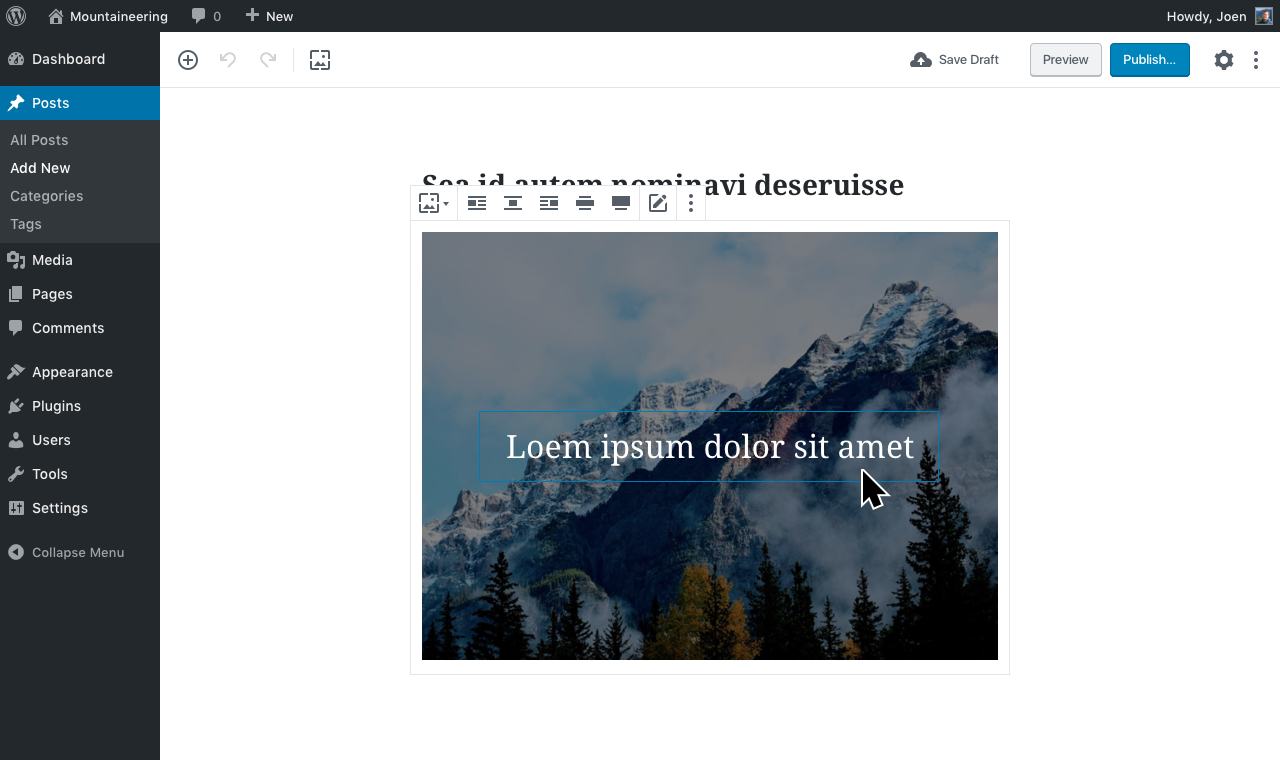
The first improvement we could make, could be breadcrumbs. In the top toolbar we'd always show the selected block, or the selected block and its parent:

☝️ Note: This mockup assumes the blockquote becomes a container for inner blocks, which it isn't yet. But in this case, it illustrates that we have selected a _Paragraph_ inside a _Quote_ block. You can click the Quote icon to select the quote.
If the block doesn't have any inner blocks, it's just a block type indicator, which has been requested many times.
In order to be an unobtrusive interface, yet still be there when you need it, we'd only ever show _two levels of nesting_ here. For example if you had selected a paragraph inside a quote inside a columns block, we'd only show the quote and the paragraph. Clicking the quote would then change the breadcrumb to show the columns block and the quote block.
Click-through
For more complicated blocks, such as the Columns block, we should look to existing desktop apps and mobile solutions for patterns to emulate. One consistent pattern is to group things together and require you to _drill down into the group_ in order to manipulate contents. This is a pattern you might see in Illustrator or Sketch, where you double-click to enter a group. Or in MacOS where when you enter Overview mode, you see previews of all open apps, but you have to select an app before you can manipulate its contents.
It is also already, in a way, a pattern we employ in Gutenberg, where _the selected block can show additional controls_.
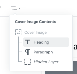
Here is a Cover Image hovered. Note how even though the Heading block inside is hovered, it's the Cover Image block that's highlighted.

Here, the Cover Image is selected. Now inner blocks are made manipulable:
When you select an inner block, it is now selected. The parent block is still shown because both are part of a group.

Complementary Features
This would be two ways to make it easy to select parent and/or child blocks with simplicity and confidence.
The features would be designed to work together. For example we might want to enable the "click-through" by default on all blocks that have inner blocks, but provide an optional "passthrough" property which blocks could declare if they felt they could do without the click-through tools.
For example when the blockquote receives innerblocks, we'd probably want to disable the clickthrough for that block as it's rare that you need to select the quote itself, and when you need to do that, the breadcrumb might be sufficient.
We might also find that the Cover Image used in these mockups works well as is, without the need for a clickthrough. But it is very likely that the clickthrough will make managing the Columns block that much easier — one click to select the columns block and apply an alignment, another click to select an inner block.
Next Steps
Your thoughts are welcome.
We will also want to explore additional features for complex blocks, such as slideshows where an inner block might be out of view depending on the implementation of said block.
But as a start, these two features might make a positive impact. Already today, the "clickthrough" is implemented on mobile, so it would be a matter of refining that, and expanding it beyond that breakpoint.
 jasmussen
All 74 comments
I like the breadcrumbs idea. (Actually, I suggested something pretty similar in #6459 back in April.) What would happen with the breadcrumbs when Unified Toolbar is enabled?
I also think the click-through idea is good too, and it is already used on mobile, so it adds consistency. I am not so sure about the passthrough idea, though; I imagine that could cause confusion due to different behaviors across blocks.
 ZebulanStanphill
on 5 Sep 2018
ZebulanStanphill
on 5 Sep 2018
I like the breadcrumbs but I also like the unified toolbar. Can we find another position for the breadcrumb :)
Also, I personally don't like the borders around the parent block. But if we keep them, how do we treat multiselection :). Should we show borders around multiselected blocks' parent?
 youknowriad
on 5 Sep 2018
youknowriad
on 5 Sep 2018
I like the click-through option. This will require some additional work on the 'passthrough' block (so each individual "column" isn't considered a layer to click through, for instance) but I think it makes a lot of sense.
 chrisvanpatten
on 5 Sep 2018
chrisvanpatten
on 5 Sep 2018
What would happen with the breadcrumbs when Unified Toolbar is enabled?
I like the breadcrumbs but I also like the unified toolbar. Can we find another position for the breadcrumb :)
Good question. Quick and dirty mockup:

Yep, I see the challenge of the duplicate icon for the switcher. I think it's good to keep thinking about this. Also note how this design omits the document outline, which is blocked on #4287.
Also, I personally don't like the borders around the parent block. But if we keep them, how do we treat multiselection :). Should we show borders around multiselected blocks' parent?
I think it's important to show them as indicating the inner blocks are part of the parent group. They _anchor_ the inner blocks.
Right now this is how multi selection works:
And this is what happens when you just select two child blocks:

In other words, in master we sort of have the parent border already, _and_ we hide it when multiselecting child blocks. I actually think showing the parent border always, even in multi selection, makes sense _when you're only selecting child blocks_. But perhaps we should make multiselection different when the _parent_ block is multiselected. So instead of highlighting every child block with additive layer effects, we _only_ highlight the parent block. Would that work?
jasmussen
on 6 Sep 2018
I like the click-through option. This will require some additional work on the 'passthrough' block (so each individual "column" isn't considered a layer to click through, for instance) but I think it makes a lot of sense.
Yes, right now the _column_ child block is presenting a few UI challenges. For example you can't insert a block before it, so why can you select it? It's a tremendously difficult technical challenge though, and I understand the challenges it involves. So I'm not suggesting this is easy.
jasmussen
on 6 Sep 2018
As I was working on https://github.com/WordPress/gutenberg/pull/9653, I realized that the arrowkey navigation we already have present for navigating the hierarchy (use the arrow key up when a column is selected to select the parent, i.e. the columns block) is working really well. So well in fact, that perhaps simply surfacing this feature as an "up" button, similar to "go to parent folder" in the Windows file explorer, could be sufficient instead of full-on breadcrumbs.
Here's how that could look. Top toolbar:

Block toolbar:

CC: @youknowriad
jasmussen
on 25 Sep 2018
Some thoughts
Breadcrumbs
I like the breadcrumb solution, but it suffers from ambiguity, an icon only interface can be problematic and I can see myself hovering over icons to see what they are, or confusing the breadcrumbs for a toolbar of options rather than breadcrumbs.
So perhaps the top toolbar is not the best place to show it, and perhaps some cues from breadcrumbs elsewhere would help. For example, the hierarchy toolbar in PHPStorm that shows the file -> class -> method/function you're currently in, or the folder toolbar in MacOS Finder and Windows Explorer?

Click Through
Click through would be a hidden UI, I can see lots of misunderstandings and confusion as people expect to select an image block only to find the containing column block is selected. Usually click through UI in Adobe software is confusing as it introduces modes, and it's difficult to tell where you are and how to exit it, especially if there's nesting. E.g. if you double click to enter a child block, how do you get back to the parent block and how does the UI indicate that you're inside a block?
There's a lot of research and guidelines out there about modes, and something shouldn't be considered good because it's present in Illustrator or Photoshop, a lot more work needs to go into it than just click through before it becomes a suitable solution.
https://medium.com/interaction-reimagined/dangers-of-modal-user-interfaces-316828de8161
http://www.azarask.in/blog/post/is_visual_feedback_enough_why_modes_kill/
This is ignoring all accessibility factors this messes with too.
The Up button
The up button idea is nice. My concern would be that it implies that if you press it, a down button will appear and the block will move upwards, it's ambiguous and suffers the same problems the breadcrumbs block did
The Reusable Blocks Pattern
Right now reusable blocks already have a UI pattern that adds chrome to the block interface that isn't visible on the frontend. Could columns not do the same?

Or a super rubbish mockup of what I mean

Thus, the chrome of the columns block would be what gets used to select it, and it provides something that's visual to aim the mouse at.
 tomjn
on 2 Oct 2018
tomjn
on 2 Oct 2018
One potential UX pattern we could use here that would fit with our toolbar model is the OS X folder traversal button: https://cld.wthms.co/avtQLO
I would note that I think users will expect to be able to select child / parent blocks visually through clicking and selection, but obviously there is a lot of complexity in getting that right. The traversal pattern above could be a good first step and we could dive deeper on developing a more elegant solution in phase 2.
 alexislloyd
on 11 Oct 2018
alexislloyd
on 11 Oct 2018
I _adore_ that concept Alexis, notably for the more complex blocks as you mention. I love it so much I immediately ran with it and remixed a few of the mockups to illustrate your idea.
No selection:

Block selected:

Nested block inside selected:

The folder traversal button popout open:

☝️ I am kind of in love with that concept, it feels like it melts together all the ideas and feedback shared on this thread, making for a _solid_ baseline to iterate from. Thanks so much for bringing that fresh perspective!
jasmussen
on 11 Oct 2018
I love the dropdown with the visual tree, part of me thinks seeing the entire document in this format would also be helpful, and even provide a useful way to reorder things.
However on further thinking, I was reminded that we already have a selection mechanism like this, and a document outline in the info panel:
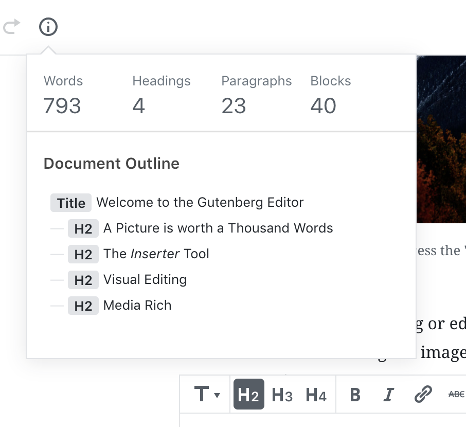
This could be enhanced with the styling in your mockup, and serve as an additional selection signifier. At the moment it only shows titles, but a version with a full block tree, and a selection indicator would be very useful
My only qualm is with the toolbar icon itself. it's yet another mystery icon with an arrow, and it's a button that isn't in Finder on MacOS by default unless you customize the toolbar. For those of us who are icon blind and unable to distinguish between icons easily, it's problematic
With the text label it's clearer, but without it most wouldn't know what it did without clicking on it:

tomjn
on 11 Oct 2018
Looking good :) Can we try simplifying the icon a little for better legibility? Maybe 3 lines with a bit more spacing instead of 4?
alexislloyd
on 11 Oct 2018
With the text label it's clearer, but without it most wouldn't know what it did without clicking on it.
There will be a tooltip as well.
 mtias
on 11 Oct 2018
mtias
on 11 Oct 2018
In re: @tomjn's comment, I also think it would be worth exploring if this could be integrated into the overall document tree rather than creating a separate place. The challenge there is maintaining the simplicity and scannability of the tree while accommodating a lot more levels of stuff. But maybe that can become more like the layers panel in Sketch or Photoshop (in functionality, not design!), where it's the single source of truth for the whole page structure. Challenging to do well, but maybe worth exploring?
Again, this is likely to be something we iterate on, so what's the most useful MVP that can grow into something more sophisticated?
alexislloyd
on 11 Oct 2018
There will be a tooltip as well.
I don't think that's enough, but I think this is a separate discussion and a feature request, I'll open a new ticket
tomjn
on 11 Oct 2018
Can we try simplifying the icon a little for better legibility? Maybe 3 lines with a bit more spacing instead of 4?
I like that:
However on further thinking, I was reminded that we already have a selection mechanism like this, and a document outline in the info panel:
I also think it would be worth exploring if this could be integrated into the overall document tree rather than creating a separate place.
I think that could work. I've previously suggested that item could be rewritten as a plugin so it shows up on the right (see #4287). But I'm a fan of repurposing this for the document tree.
Regarding a label, I like labels, but the option to dock the block toolbar to the top needs to be considered in that light.
This discussion reminds me of #9053 (CC: @westonruter) — I think you might like Alexis' proposal as shown in https://github.com/WordPress/gutenberg/issues/9628#issuecomment-429012989.
jasmussen
on 11 Oct 2018
Great to see this moving on and thanks for the concept @alexislloyd. @jasmussen I really like these mocks and think we do really have a great point we can iterate from.
 karmatosed
on 11 Oct 2018
karmatosed
on 11 Oct 2018
so what's the most useful MVP that can grow into something more sophisticated?
I'd say building this as a simpler traversal control, and looking later to see if it makes sense to combine with the document content box based on selection.
mtias
on 12 Oct 2018
As per the discussion in #10767, reopening this to iterate.
karmatosed
on 21 Nov 2018
See also additional ideas being suggested in #11159.
One additional idea for making it easier to work with complex blocks, is to remember that _the unselected block is a preview_, and the _selected block can show additional editing controls_.
We can leverage that idea to make it easier to select the elements of a columns block. For example when a columns block, or any child thereof, is selected, the padding on the container animates in to make room to select child elements. This would also make the side UI accessible. We'd want to show a border around the parent block — the one with expanded padding — for example a dashed line.
This seems like it would be relatively trivial to implement, if we restored the .is-selected class on the top level block even when a child is selected. We did this using a hasSelectedInnerBlocks prop a while back.
jasmussen
on 21 Nov 2018
This is what we see when hovering over a cell in a column block:


Hovering over a cell in the Media & Text block.

One sees the inner block and the outer block.
Such as Column -> Paragraph. Column -> YouTube. Media &Text -> YouTube
It would be good to make the breadcrumbs info (inner and outer blocks) in the hover info clickable. Click Column to select parent or click Paragraph to select child.
 paaljoachim
on 25 Nov 2018
paaljoachim
on 25 Nov 2018
Trying this out just now, one thing I noticed is that the simplest way to select a parent column block is to utilize the extra invisible hit area we offer to the right/left of the parent block:

This additional hit area is not available on the top and bottom of the block, which makes it a lot more difficult to select that way.
One additional idea for making it easier to work with complex blocks, is to remember that the unselected block is a preview, and the selected block can show additional editing controls
We can leverage that idea to make it easier to select the elements of a columns block. For example when a columns block, or any child thereof, is selected, the padding on the container animates in to make room to select child elements. This would also make the side UI accessible. We'd want to show a border around the parent block — the one with expanded padding — for example a dashed line.
I'm not 100% sure if this is what @jasmussen is suggesting above, but adding some padding + a visual indicator of the parent block while in editing mode could be a major help here. That way, there's a clear indication of where you should click if you want to select the parent:

When someone exits the block, that extra padding can disappear to show a more accurate representation of the block.
 kjellr
on 21 Jan 2019
kjellr
on 21 Jan 2019
This additional hit area is not available on the top and bottom of the block, which makes it a lot more difficult to select that way.
I could SWEAR there was a ticket around this issue, that's related to how the sibling inserter works too. I can't find it right now, but I believe this issue should be fixable. @aduth ring any bells, I could swear you were in the comments?
I'm not 100% sure if this is what @jasmussen is suggesting above, but adding some padding + a visual indicator of the parent block while in editing mode could be a major help here. That way, there's a clear indication of where you should click if you want to select the parent:
That is more or less exactly what I meant, only more beautifully visualized than I could.
Here's an additional crayon sketch to illustrate what I mean. Columns block:

Essentially what you have, Kjell — perhaps with the dashed line being slightly darker. Also, depending on how further development of the columns block goes, remember that there are also _column_ blocks. I.e. the hierarchy currently is _Columns → Column → Image_. We're using fierce CSS wizardry to make the 2nd level more or less invisible, but in case you want to select that in the future to, say, apply a CSS class to it or whatever other options we might need for individual columns, that's worth considering.
Slideshow block:

To be clear: no slideshow block is planned. This is purely doodled ot illustrate a point that the preview and edit modes of a block can be _widely_ different. It is so easy and surprisingly non-disruptive to switch between the two modes by simply selecting and deselecting the blocks, that we should allow ourselves to lean into it and be creative about the opportunities.
In case of a slideshow block, almost by definition, content will be invisible outside of the screen/block. But it doesn't have to be when you're editing it. Just select the block to see thumbnails with editable captions. Then deselect the block to preview the result.
jasmussen
on 22 Jan 2019
I could SWEAR there was a ticket around this issue, that's related to how the sibling inserter works too. I can't find it right now, but I believe this issue should be fixable. @aduth ring any bells, I could swear you were in the comments?
I think the closest thing might be one of #8883, #8881, #5180 ?
 aduth
on 22 Jan 2019
aduth
on 22 Jan 2019
While the document tree is helpful, it still requires me to change focus from what I'm trying to manipulate. I'd really like a better way to click through the actual blocks and nested blocks directly. I think the click-through method outlined above by @jasmussen is worth exploring more.
Here's the problem I commonly experience:

As a user, I will fight with this for at least a minute before finding another solution located somewhere else on the screen. 😉
*_when I added this comment, a bunch other comments appeared. It may not be as relevant now, but I'm keeping it here to document the struggle._
 mapk
on 22 Jan 2019
mapk
on 22 Jan 2019
but adding some padding + a visual indicator of the parent block while in editing mode could be a major help here. That way, there's a clear indication of where you should click if you want to select the parent:
My concern with this solution is how the padding works in relation to surrounding blocks:
Is the padding in the parent block reflected on the front-end? Or just more padding in the editor?
Does the padding get dynamically added when the block is selected, like this?

- Or maybe the padded parent appears above the surrounding blocks, like this?

Just trying to dig further into this concept. Would love some thoughts on it.
mapk
on 23 Jan 2019
Thank you @aduth, you made me find at least a ticket that goes in the right direction. The GIF in #9229 explains the problem: the yellow area in that GIF is "reserved" for the sibling inserter. That is what's preventing you from selecting the block by clicking the padding above or below the block. That's the answer to @kjellr's comment:
This additional hit area is not available on the top and bottom of the block, which makes it a lot more difficult to select that way.
To further clarify, that yellow area is there only to make the sibling inserter button VISIBLE. So all we need to intercept, really, is the _hover_ action. It would be nice if a click could still propagate through that yellow bar and let you select the block below.
jasmussen
on 23 Jan 2019
While the document tree is helpful, it still requires me to change focus from what I'm trying to manipulate. I'd really like a better way to click through the actual blocks and nested blocks directly. I think the click-through method outlined above by @jasmussen is worth exploring more.
You can actually test this right now, even if the current implementation is slightly half-baked.
- Run Gutenberg, any version.
- Insert a columns block with content.
- Resize the window to below the 600px breakpoint, then select.
This is implemented for mobile, in other words, to let you select the parent block more easily.
GIF:

The problem with the implementation right now is that the "state" is reset once you've drilled down to the deepest level. So so it's Columns > Column > Paragraph, Columns > Column > Paragraph, even if you're just selecting the same paragraph twice. The obvious solution to that problem to try is to make it so that once you've "drilled down" to your desired level, you _stay_ at that level until you deselect the block again. I.e. Columns > Column > Paragraph, Paragraph, Paragraph, deselect, rewind, etc.
I also believe that for _some_ blocks, this click through method is going to be critically important. Especially as we start to look at page templates which might include all sorts of nested content.
The inspiration for how click-through could work when it's amazing, can also be tried in Keynote. Insert a few shapes and you can click them directly. As soon as you _group_ two shapes, they become a new shape that's easy to move around. But to edit the content of the group, you have to double-click.
jasmussen
on 23 Jan 2019
To answer your good questions in https://github.com/WordPress/gutenberg/issues/9628#issuecomment-456637172:
Is the padding in the parent block reflected on the front-end? Or just more padding in the editor?
No, this padding is only in the editor and only when the _block is selected_. This is based on the the block is the interface principle, which states that in the editor:
- an unselected block is a preview. It should look as much as the frontend as possible
- a selected block is essentially "block edit mode", and the block can output additional controls and even look totally different, in this state.
This is what I tried highlighting with the example Slideshow block doodle above: when the slideshow block is unselected, it's a slideshow. When it is selected, you are in _slideshow editing mode_ and see a thumbnail grid of every slide, so you can easily edit captions, rearrange, etc.
Does the padding get dynamically added when the block is selected, like this?
Yes, more or less.
I think this might be worth prototyping to better explain and get a feel for it.
Ultimately this feature should probably be a prop on the block itself, something a block can opt in to using. A blockquote with nested paragraphs, for example, should probably not use this interface — but when editing columns, it might be kind of perfect.
jasmussen
on 23 Jan 2019
Here's a quick codepen prototype: https://codepen.io/joen/pen/exmMQv?editors=1100
It's kinda static, but it hopefully gets the point across.
jasmussen
on 23 Jan 2019
Here's a quick codepen prototype: https://codepen.io/joen/pen/exmMQv?editors=1100
It's kinda static, but it hopefully gets the point across.
That really helps get the point across. I made a slight edit, so we can see how those dashed borders might appear on click:
kjellr
on 23 Jan 2019
This is perfect, thank you Kjell! That is exactly what I mean. I believe we'll probably want to tune some of the aspects in implementation, and address how it looks when the immediate parent (singular column) is the one that gets padding. But this is cool! I think it can work.
jasmussen
on 23 Jan 2019
I really like this.
Should we move to creating a PR for testing with more blocks and content?
Do we need to identify which blocks this will effect?
mapk
on 24 Jan 2019
I dig it too.
We can probably prototype this on the Columns block for now, but for it to land we'd probably need for this _method_ to be both generic, so other blocks (as you say) can use this, but also a prop so a block can choose to opt into this. It will likely be disruptive for the Quote block to have this, once that receives nested blocks.
@gziolo any thoughts? Notably on the approach doodled by Kjell in https://github.com/WordPress/gutenberg/issues/9628#issuecomment-456811415
jasmussen
on 24 Jan 2019
@gziolo any thoughts? Notably on the approach doodled by Kjell in #9628 (comment)
Looks great. It would make it finally possible to easily select the parent block when needed. My only question is how would you feel about making the width of the column closer to the original size at the cost of making other columns narrower. At the moment all columns get shrunk when one of them gets selected which might be suboptimal experience when having 3+ columns. @jasmussen do you have any other questions, I should answer?
 gziolo
on 24 Jan 2019
gziolo
on 24 Jan 2019
My only question is how would you feel about making the width of the column closer to the original size at the cost of making other columns narrower.
I would tend to agree that this is something we should fine tune and balance, probably in implementation. We can also look at expanding the width/height of the parent, to not reduce the size of the child, though that's probably technically more challenging.
do you have any other questions, I should answer?
Basically the interface we're discussing here is: add padding to the parent block when the child block is selected, to make it easier to select. This _feels_ good in Kjell's prototype for the Columns block. It will probably be very welcome in other blocks, such as Section blocks, or many other blocks where the child content is likely to fill all available space inside. But it would probably not be that nice for something like the Quote block, which admittedly doesn't use nesting yet but is likely to do so in the future.
So it would be nice to build this select-the-parent interface in a way that was _generic_ to all blocks, _off by default_, but something a block could opt into using a prop.
Do you have any suggestions for how to best approach that?
jasmussen
on 24 Jan 2019
All blocks which contain nested blocks (Columns, Media & Text at the moment) render this InnerBlocks component which renders .editor-inner-blocks class:
https://github.com/WordPress/gutenberg/blob/16a718a4bf359c53f0fb9c3626b08e2434a6fd7d/packages/editor/src/components/inner-blocks/index.js#L103
This might help to come up with a general solution which would work with all nested blocks. However, it might be tricky as .is-selected gets applied in one of the descendant elements.
Edit: If it doesn't work with CSS exclusively. We can always find a way to update the state of the parent to expose there the information that one of the nested blocks is selected. @jorgefilipecosta and @aduth might have more insights about that as they spent lots of time with nested blocks :)
gziolo
on 24 Jan 2019
So it would be nice to build this select-the-parent interface in a way that was generic to all blocks, off by default, but something a block could opt into using a prop.
Which blocks do you consider for this approach which don't use nesting? This made me think why aren't they using nesting in the first place? Imagine we convert Gallery to a container with nested Image blocks. We would get this behavior for free but also sorting as a bonus.
gziolo
on 24 Jan 2019
Which blocks do you consider for this approach which don't use nesting?
The gallery is an interesting one.
Honestly I'm mostly thinking of more advanced layout blocks, such as Grid layout blocks, or Tabgroup blocks, or other similar "page-buildery" blocks. Anything content-specific should probably not use this interface.
jasmussen
on 24 Jan 2019
Honestly I'm mostly thinking of more advanced layout blocks, such as Grid layout blocks, or Tabgroup blocks, or other similar "page-buildery" blocks. Anything content-specific should probably not use this interface.
I anticipate all of them fit under container blocks category, which means they should be using InnerBlocks as implementation detail thus should fit this category. We can still offer opt-out similar to how we do it for other features with supports group in the block definition.
gziolo
on 24 Jan 2019
I anticipate all of them fit under container blocks category, which means they should be using InnerBlocks as implementation detail thus should fit this category
But wouldn't the Quote block also use inner-blocks if/when it received nesting features?
jasmussen
on 24 Jan 2019
But wouldn't the Quote block also use inner-blocks if/when it received nesting features?
Yes, Quote, List, Cover - those 3 were considered to be transformed into nested blocks in the past.
gziolo
on 24 Jan 2019
One concern (that shouldn't block experimentation, but is just worth noting!) is that there are already some issues with columns blocks in terms of how narrow they can be and how that impacts edit mode tools. This proposal will effectively make columns even _narrower_ during editing interactions, which could resurface those narrowness problems.
It also pushes further from a 1-to-1 edit/view parity, which may or may not be a concern. Admittedly I already do something similar to this (extra padding on selection) on a custom block with InnerBlocks, and it works nicely — but means the edit view isn't quite accurate.
chrisvanpatten
on 24 Jan 2019
So it would be nice to build this select-the-parent interface in a way that was generic to all blocks, off by default, but something a block could opt into using a prop.
Being able to opt-in for something like this would have been great when building the Jetpack Form block.
mapk
on 25 Jan 2019
It also pushes further from a 1-to-1 edit/view parity, which may or may not be a concern.
I think this is okay to have some changes between the selected and unselected states, especially if it's making the UX better... although this can be argued in regards to the inner blocks now.
Also what happens when I have blocks nested 3 deep? Does the padding option extend to the second level if the second level is a parent block too?
mapk
on 25 Jan 2019
@mapk
Also what happens when I have blocks nested 3 deep? Does the padding option extend to the second level if the second level is a parent block too?
The padding of all levels of nestings being affected sounds like it may end up causing some big size increases and decreases when selecting deeply nested blocks, e.g. a paragraph in a quote in a column in a row in a section. Ideally, selecting a block shouldn't drastically alter the appearance of every other block, so just changing the spacing of its immediate parent seems like enough to me.
As long as you can select the immediate parent, then you will be able to work your way up the hierarchy, since selecting the parent will cause its parent to become easily selectable, and so on. The Block Navigation menu could be used for quicker access, and as some have suggested before, it could be made into a pinnable sidebar so it can quickly be accessed. (See #11408 and #11688.)
ZebulanStanphill
on 7 Feb 2019
I would suggest at any one time the padding change should ONLY affect the selected block and direct descendants.
jasmussen
on 8 Feb 2019
Just in case this impacts this work, please can I quickly surface that the work I'm hoping to land to add Vertical Alignment to the Columns Block makes the _individual_ Columns selectable (previously they weren't selectable)
 getdave
on 27 Feb 2019
getdave
on 27 Feb 2019
the work I'm hoping to land to add Vertical Alignment to the Columns Block makes the _individual_ Columns selectable (previously they weren't selectable)
Thanks for noting that here. That's all the more reason to get this interaction tidied up sooner rather than later.
kjellr
on 27 Feb 2019
Just wanted to share something I discussed with @jasmussen earlier today, regarding block borders.
This comes across a little in some of the mockups above, but it's worth mentioning explicitly: In addition to the added padding we're discussing here, I think inner block navigation + selection will be much easier if we are clear about the structure of the blocks in general. To that end, I think adopting a couple levels of border hierarchy would be excellent. For example:

In this example, I'm using a dark border for the focused state. If the block is a parent or child block, I've included a dotted light border (as well as some additional padding) around the other related items. This helps users clearly visualize where they are in the block hierarchy, while also giving them a clear sense of where they can click to select other nested blocks.
kjellr
on 28 Feb 2019
@kjellr I really like that. That makes it super clear what the structure is.
However… I think we'd again run into an issue with contrast on the dotted line. I can't say with certainty but my suspicion is that introducing the dotted line means it needs to follow accessibility criteria. And I think making it much higher contrast is probably going to cause some visual heaviness that might negate the benefits…
Just thinking out loud a bit. Really like the look as a well-sighted user, but would be curious to hear a11y feedback as my liking it isn't enough :)
chrisvanpatten
on 28 Feb 2019
On my screen, I didn't even see the dotted line at first. It appears practically invisible if my screen is tilted just a little bit.
ZebulanStanphill
on 28 Feb 2019
There's no need to lower contrast that much if that would make it less accessible. As long as its a _little_ lighter and uses a different border-style I think it would work fine.
 hacknug
on 28 Feb 2019
hacknug
on 28 Feb 2019
Sorry — should've been more clear in my original comment: I created that mockup in just a few minutes while talking to Joen. I think I just randomly color-picked from some grays that were on my screen at the time. 😄 The exact shades aren't meant to convey a final solution, just a general approach.
kjellr
on 28 Feb 2019
In response to concerns about adding padding to the parent block causing the inner blocks to become inconsistent with the frontend (#14148 #14169 ), I've worked another idea.
This will require more development to make happen, but might be a good option.
Basically, when clicking into the parent block, it expands (grows bigger than normal blocks) to provide the padding necessary for easy child/parent selections. This keeps the inner blocks visual consistent with the frontend.
Screencast

InVision Prototype
https://wp.invisionapp.com/share/EGQRWRC8MFT
PROS
- The inner blocks remain the proper width.
- The inner blocks stay visually consistent with the frontend.
- A selected block changing size is a pattern already used.
CONS
- Expanding the block selection (width) beyond the normal block selections is a new pattern.
- I'm not sure how this will work when blocks are set to full width.
mapk
on 1 Mar 2019
Basically, when clicking into the parent block, it expands (grows bigger than normal blocks) to provide the padding necessary for easy child/parent selections. This keeps the inner blocks visual consistent with the frontend.
Dig that. I'd love for the block toolbar to stay flush with the left border, but that's an implementation detail.
It'll be a challenge on smaller screens when it can't actually grow bigger, but this also feels like something solvable.
Notably it feels like that approach can scale to _any_ block that has inner blocks, even the Quote block which is such a basic text block that selection should be as unhindered as possible.
jasmussen
on 1 Mar 2019
Really, really dig your work, Kjell — not only could it work invisibly with Mark's idea, but it helps highlight the structure of the document, _when you need it_, but not break the flow when you just want to write. It feels like a solid direction, and what we need is a strong developer on this next.
On an implementation note — the dashed parent _could_ theoretically have the same color as the selected block, but by virtue of being dashed it would appear secondary still. When hovering the parent, the outline could become solid, and we could even make the _child_ (what you have selected as you're hovering) become dashed, to help indicate what's about to happen when you click.
jasmussen
on 1 Mar 2019
On an implementation note — the dashed parent _could_ theoretically have the same color as the selected block, but by virtue of being dashed it would appear secondary still. When hovering the parent, the outline could become solid, and we could even make the _child_ (what you have selected as you're hovering) become dashed, to help indicate what's about to happen when you click.
Yes! I think that could totally work too. Let's see where #14145 nets out, and then figure out a treatment from there. 👍
kjellr
on 1 Mar 2019
I also tinkered with borders when i made single columns selectable but removed as out of scope of my PR. Definetely felt like a UX improvement. Loving the way this is heading!
getdave
on 1 Mar 2019
Just a heads up: I'm spinning the idea above out into a separate, concise issue for exploration. Follow along here:
https://github.com/WordPress/gutenberg/issues/14935
If anyone can pitch in to add a has-child-selected class to parent blocks when their child is selected, that's the only blocker to getting that started.
kjellr
on 11 Apr 2019
A related issue I found then testing newly introduced Group block:
What it's confusing at the moment is that when you insert Group block, what you actually see is Paragraph block:
Can we at least do something like:
or what @mtias suggested in our private chat with reusing the bits of Block Navigation feature:
_Those aren't final design proposals by any means 😃_


 gziolo
on 12 Apr 2019
gziolo
on 12 Apr 2019
@gziolo that issue is meant to be solved by #14241. I agree with you, btw, so would be lovely to ship that one soon :)
jasmussen
on 12 Apr 2019
@gziolo that issue is meant to be solved by #14241. I agree with you, btw, so would be lovely to ship that one soon :)
Well, I would say partially. When you insert paragraph using this new custom inserter, we are back to square one 🤷♂️
I think that #14935 will help here as well. We should also explore some options in the sidebar to have more ways to ensuring that the currently selected block is nested.
gziolo
on 12 Apr 2019
Ah yes. I've been thinking about resurrecting the breadcrumbs in the sidebar, like we had here:
https://github.com/WordPress/gutenberg/issues/13309#issuecomment-458452168
Simple and relatively elegant, and would help this issue (9628) as well.
jasmussen
on 12 Apr 2019
Tossing out an iteration on some of the ideas above:
What if we moved the block transforms/styles into their own dedicated item, and made the block icon into its own "Block Tree" panel?

I think that might increase visibility of the block transforms/styles, while also helping folks navigate to other nested blocks a little more clearly. Here's a mockup of a more complicated example:

(Both comps also use the outlines/padding from #14961)
kjellr
on 18 Jul 2019
That looks very interesting Kjell! It would then tie in with the Block Navigation area creating consistency between them. As one learns to use the Block Navigation the same learning can continue to selecting nested blocks.
paaljoachim
on 18 Jul 2019
I really like the mockup at a conceptual level, but something about the execution feels a bit dense. I don't know that I have a better idea necessarily, but I do wonder if there's a way to make this feel a bit lighter?
chrisvanpatten
on 18 Jul 2019
I know I've struggled with trying to find a quick outline of my block structure, so this concept is a great idea to solve this.
My concern here mimics @chrisvanpatten's. While It's well thought out, it does feel like a lot.
- On some blocks in certain contexts, there exists various ways to show dropdowns.

I think adding another chevron to the mix (although it's gray and right-facing) might add more difficulty to parse.
- The other concern is that the toolbar is getting longer. Maybe this isn't a big deal, but it can be when we include labels for the icons https://github.com/WordPress/gutenberg/issues/10524 and https://github.com/WordPress/gutenberg/issues/15311.
Just some thoughts to ponder while exploring this. This may be the simplest approach that communicates what's going on.
mapk
on 18 Jul 2019
I do wonder if there's a way to make this feel a bit lighter?
Yeah, I think it has something to do with the lack of hierarchy there. The first toolbar item should feel a bit more like the grounding element, and the others should feel like secondary options for the block. Some kind of separation is needed. This is not the right solution, but just for the sake of conversation, I think this helps just a little bit:

On some blocks in certain contexts, there exists various ways to show dropdowns. I think adding another chevron to the mix (although it's gray and right-facing) might add more difficulty to parse.
That may be. There's probably another way to represent this that I'm not thinking of as well. Honestly, it could even be a more straightforward extra "block tree" icon in the toolbar, automatically added for any parent or child elements:

The other concern is that the toolbar is getting longer. Maybe this isn't a big deal, but it can be when we include labels for the icons #10524 and #15311.
Agreed. Whether or not this is the direction, we'll need to sort out a solution for extra-long toolbars anyway. I think efforts like https://github.com/WordPress/gutenberg/pull/16557 help with this a little bit, as do more comprehensive rethinks of the toolbar hierarchy like https://github.com/WordPress/gutenberg/issues/15096.
kjellr
on 18 Jul 2019
One thing that strikes me about the idea of a block tree as a toolbar button is that it is sort of unique in being a block toolbar item that doesn't refer to anything intrinsic about the block itself, and rather about how the block relates to the rest of the document.
That's more of a musing than anything else, but to use an analogy from graphics apps, this type of "layering" and "grouping" UI would typically (I'm sure there are examples that prove me wrong) exist only at a _document_ level rather than being accessible at the block level.
I know there are various accessibility issues around the "gap" between the block and the document-level tools, and having it at the block level may make navigation easier.
This is more of a musing than anything… something about this tool feels appreciably different from the other tools available in the toolbar in terms of how it relates the block to other contexts.
chrisvanpatten
on 18 Jul 2019
This is more of a musing than anything… something about this tool feels appreciably different from the other tools available in the toolbar in terms of how it relates the block to other contexts.
Yeah, I have the same feeling.
We've got that control in the top toolbar right now, which seems too far removed from the block itself. Maybe the sidebar is actually the best place for it? The control almost seems like it should be associated with the block, but as its own separate toolbar, but we definitely don't want to add another one of those. 😄
kjellr
on 18 Jul 2019
We've got that control in the top toolbar right now, which seems too far removed from the block itself.
I'd also add that this is only true in the default settings of Gutenberg. If someone were to select the Top Toolbar option to move all block toolbars to the top toolbar, this definitely isn't the case. But that being said, I doubt the majority of users change that setting.
On another note, I really would like to see how people would react to the Top Toolbar setting being the default setting in Gutenberg. It would align better with the Classic editor providing more familiarity for new Gutenberg users.
mapk
on 24 Jul 2019
This toolbar setting has been explored a lot and the best default was settled on after a fair bit of testing. You can read more about explorations here: https://github.com/WordPress/gutenberg/issues/2983.
I doubt the majority of users change that setting.
It turns out the position of a toolbar is an incredibly personal setting. It came down to during phase one in testing that those starting to use WordPress preferred by the block, those experienced on top. The toolbar has defaulted in both places and this what we have now are the best options. Also, this is probably why it feels more aligned to the classic editor. I would personally recommend we don't change the default.
karmatosed
on 26 Jul 2019
@jasmussen Should we close this in favor of #17088
youknowriad
on 19 Aug 2019
Yes I think we can. This ticket explored divergently, whereas the other now refines on some of the ideas. This ticket will still be findable if you follow the reference on the new ticket Thanks Riad.
jasmussen
on 19 Aug 2019
Related issues
 spocke
·
3Comments
spocke
·
3Comments
 franz-josef-kaiser
·
3Comments
youknowriad
·
3Comments
franz-josef-kaiser
·
3Comments
youknowriad
·
3Comments
 maddisondesigns
·
3Comments
maddisondesigns
·
3Comments
 JohnPixle
·
3Comments
JohnPixle
·
3Comments
Most helpful comment
I _adore_ that concept Alexis, notably for the more complex blocks as you mention. I love it so much I immediately ran with it and remixed a few of the mockups to illustrate your idea.
No selection:
Block selected:
Nested block inside selected:
The folder traversal button popout open:
☝️ I am kind of in love with that concept, it feels like it melts together all the ideas and feedback shared on this thread, making for a _solid_ baseline to iterate from. Thanks so much for bringing that fresh perspective!