Gutenberg: Widget-block Screen in wp-admin
As noted in the Phase 2 post:
The first step for phase 2 will involve upgrading the widgets UI to incorporate a modern block editor that is consistent with how you edit pages and posts in Gutenberg to create a clear, consistent editing experience across different areas of your site.
widgets.phpwould become something more like this, which is an early sketch, but you can see that all of these widgets are represented as blocks.
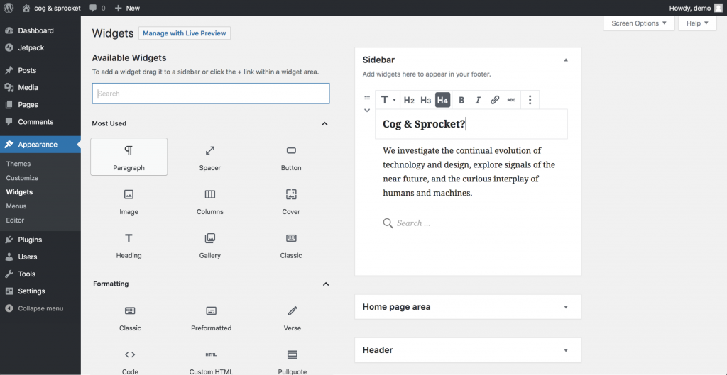
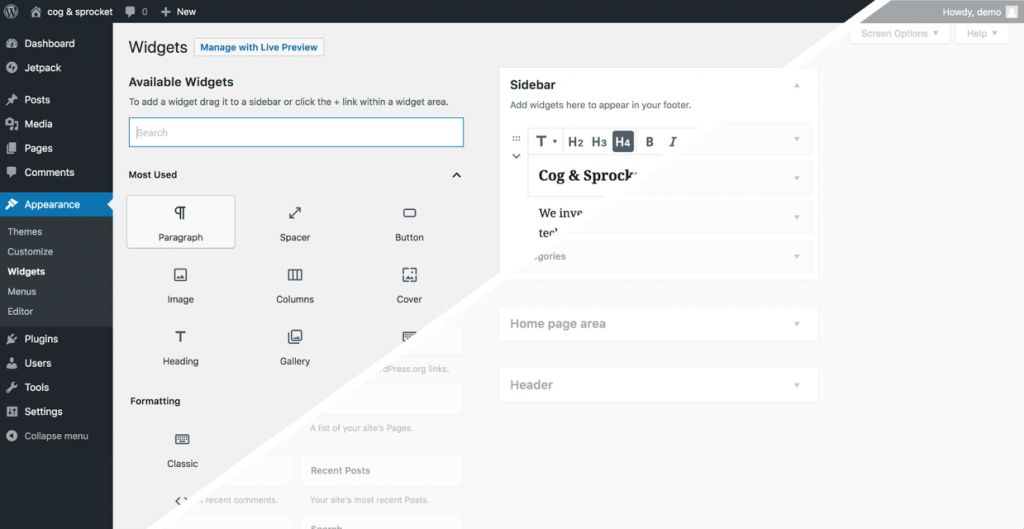
and split screen of changes:
We'll need to determine if these mockups are the right solution. Let's dig in!
 mapk
mapk
All 80 comments
The current widgets view was definitely designed with sidebars in mind, but widget areas (now block areas) could also be footers, headers, etc. I think that is one thing that should be taken into account when updating this page.
Having all the widget/block areas editable on a single page feels weird. I think this screen should work more like the widget area editor in the Customizer. Notably, one advantage of the current wp-admin Widgets page is that you can drag-and-drop a widget from one widget area to another. I'm not sure how you would replicate this functionality if the Widgets screen became more like the Customizer. Perhaps the widget areas would be shown as tabs in a top bar or sidebar, and dragging a block over these tabs would switch the view over to that block area... kind of like how you can drag text/images from one tab to another in a web browser or from one app to another in most OSes.
And don't forget about the inactive widgets area... how does that fit into all of this? I understand its purpose, but it feels like a weird thing to have in the context of a Gutenberg-ified Widgets screen.
Additionally, the block selection on the left seems a bit odd. I think it should change to be a mix of the block inserter in the post editor and the Customizer widget inserter. Speaking of which, this seems like a good opportunity to add drag-and-drop insertion to the block inserter. The current widget area editors in both wp-admin and the Customizer have drag-and-drop insertion, but the block inserter in the post editor currently does not. See #1511.
Also, this mockup does not seem to take into account the block inspector. That should probably appear on the right side of the screen like in the post editor.
Just in general, the Widgets page in wp-admin feels weird, and it feels even weirder in the current mockup.
 ZebulanStanphill
on 5 Jan 2019
ZebulanStanphill
on 5 Jan 2019
Are we going to mix widgets and blocks or are we essentially deprecating widgets?
 nicholasio
on 12 Jan 2019
nicholasio
on 12 Jan 2019
I think they want to replace widgets with "widgets blocks" - something between a block and a widget.
And maybe themes to be replaced with a gutenberg pagebuilder tool, time will tell...
 alexvornoffice
on 12 Jan 2019
alexvornoffice
on 12 Jan 2019
@nicholasio I think the current plan is that widget areas will become block areas, and there will be a "Legacy Widget" block that lets you embed any old widget into a block area. (Presumably, you could use the "Legacy Widget" block anywhere, meaning you could actually use widgets in posts and pages... something not possible before.) Most, if not all, of the core WordPress widgets will be deprecated and replaced by new block equivalents.
ZebulanStanphill
on 12 Jan 2019
So essentially, widgets are being deprecated, but you will still be able to use them alongside blocks.
ZebulanStanphill
on 12 Jan 2019
The current widgets view was definitely designed with sidebars in mind, but widget areas (now block areas) could also be footers, headers, etc.
I wonder if we can explore how those "areas" are displayed on the page itself. ie. if it's a sidebar areas, it shows as it does now, but if it's a footer or header, those are displayed where a header/footer would be. So it becomes a rough layout of the page itself. I'll mock something up.
Additionally, the block selection on the left seems a bit odd.
As an accordion, this would most likely be collapsed down and wouldn't be so overwhelming.
Also, this mockup does not seem to take into account the block inspector. That should probably appear on the right side of the screen like in the post editor.
I think you're right here. I'll get some mockups up to get more conversations going.
mapk
on 17 Jan 2019
Additionally, the block selection on the left seems a bit odd.
As an accordion, this would most likely be collapsed down and wouldn't be so overwhelming.
What bothers me is that it doesn't look like the inserter in the post editor. Why should the inserter be an always-visible sidebar on the Widgets page but be a pop-up in the post editor? On the other hand, perhaps the post editor should be dockable to the side like the widgets library sidebar? Whatever the case, I think there needs to be consistency with how the block inserter appears in different contexts.
It is also important to note that the widget/block library design does not work very well on mobile compared to the inserter style of the post editor. Perhaps docked sidebar inserters should turn into pop-up inserters on mobile?
ZebulanStanphill
on 17 Jan 2019
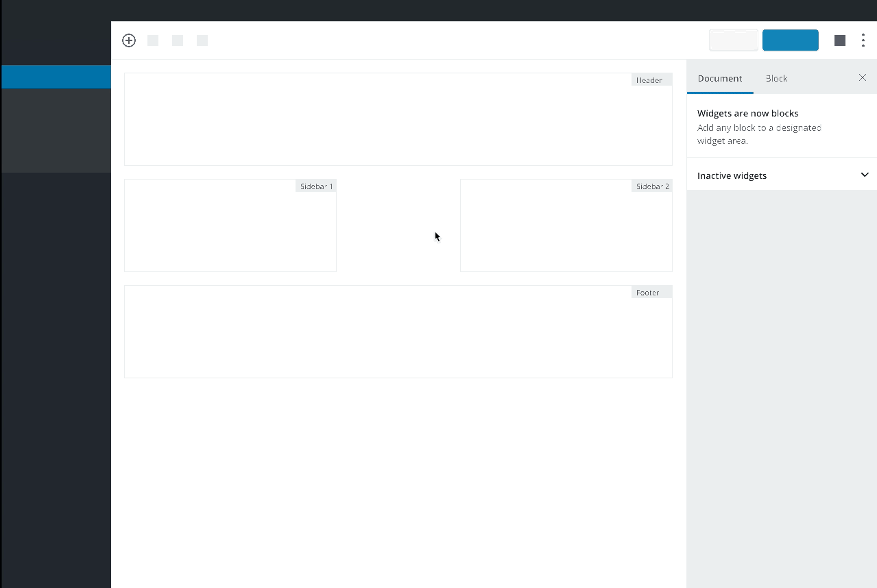
I attempted to use Figma for some prototyping. Here's a concept I put together. I wanted to see if there was another way we could contextually display the "widget-areas" instead of stacking them on top of one another. This would replace the /widgets.php in the wp-admin.
Prototype
Video
Thoughts?
mapk
on 18 Jan 2019
@mapk I'm not sure how that mockup would be implemented in practice. A widget area could appear in different locations depending on the page template, and of course some widget areas would only appear in certain page templates. Trying to fit all the widget areas onto a single screen in a way that makes sense would be difficult to implement, unless you were only trying to show the layout of one page template at a time (with the ability to switch between them).
ZebulanStanphill
on 18 Jan 2019
It seems like it would be more productive to heed the advice of the "Manage with Live Preview" button on the widgets screen. That link was the first step in deprecating the admin screen in favor of the customizer version with live preview. The widgets admin screen has a fundamental disconnect with the way that widget areas actually work - with different areas showing in different parts of the screen and potentially on different parts of the site.
It will be very difficult to clearly reflect the frontend page structure on this screen in a way that users will be able to understand. Experimenting with contextual approaches to this experience in the customizer offers numerous opportunities for this fundamental problem to be solved. Starting with the visible edit shortcuts that are already in core, revamped widgets could be edited directly on the frontend (of the customize preview) or in an overlay that is more directly related to the display on a particular screen. The ability to navigate to different parts of the site within the customize preview solves a problem that this screen will never be able to address.
I suggest abandoning this proposal and closing this issue in favor of #13205.
 celloexpressions
on 18 Jan 2019
celloexpressions
on 18 Jan 2019
Trying to fit all the widget areas onto a single screen in a way that makes sense would be difficult to implement
Agreed. I think the prototype, for me, was a way of distilling it more.
The widgets admin screen has a fundamental disconnect with the way that widget areas actually work
This is true, and the reason for the exploration above. I totally agree!
I suggest abandoning this proposal and closing this issue in favor of #13205.
This screen is a focus area of Phase 2, so I don't think this will happen. I believe the purpose behind changing it over to "blocks" is to help users understand the paradigm shift of everything becoming a block.
While this screen will eventually be deprecated in the future, especially as more of the site is built in Gutenberg, it's a necessary "baby step" to get us all there together. Maybe the best thing is to keep the existing layout, but just allow the use of all blocks within the accordion content areas? This will keep our resources and investment minimal on this particular piece with just a few suggested tweaks to the mockup in the initial post. It will also allow us to move to the Customizer more quickly.
mapk
on 18 Jan 2019
I suggest abandoning this proposal and closing this issue in favor of #13205.
Same consideration already made for the Menus screen, see https://github.com/WordPress/gutenberg/issues/13206#issuecomment-455452477. The customizer is not fully accessible. The admin widgets screen is the only place where persons with accessibility needs have a chance to manage widgets without having to face big accessibility barriers.
I'd also like to remind everyone the Widgets screen has an alternative "accessibility mode" (just click on the link in the top right). I'd be totally in favor of removing the accessibility mode if the new admin screen is built with accessibility in mind from the beginning. Which means, as a start: no fancy things, keep it as simple as possible.
A good way to start addressing accessibility _before any visual mockup_ is designing the information architecture first. Think at this screen as a blank document where information needs to be organized with headings to identify the main sections and tasks, grouping together logically related controls, and making sure the perceived information makes sense when navigating content in a linearized way.
 afercia
on 19 Jan 2019
afercia
on 19 Jan 2019
Re: the blocks selection on the left:
As an accordion, this would most likely be collapsed down and wouldn't be so overwhelming.
Is there a real need for the whole section on the left? I'd tend to think consistency with the design proposed in #13206 for the Menus screen is important. Maybe I'm missing something but having only the Widget areas with an inserter would greatly simplify the user interface. It will also allow to get rid of the drag and drop between the left and right sections, which will be an accessibility win.
That said, to my understanding all the core widgets will be blocks. However, what happens to custom widgets added by plugins and themes? Not all of them will be readily updated to blocks. Is there the need for some backwards compatibility mechanism like in the case of meta boxes? /Cc @youknowriad
afercia
on 19 Jan 2019
That said, to my understanding all the core widgets will be blocks. However, what happens to custom widgets added by plugins and themes?
The idea is to build a classic widget block capable of rendering the edit and preview of any widget (like now) https://github.com/WordPress/gutenberg/issues/4770
It will also allow to get rid of the drag and drop between the left and right sections, which will be an accessibility win.
Technically speaking, it will also be easier/quicker to not support drag and drop as right now, we can't have a single inserter targeting multiple editors.
 youknowriad
on 21 Jan 2019
youknowriad
on 21 Jan 2019
The idea is to build a classic widget block capable of rendering the edit and preview of any widget (like now) #4770
+100
This is exactly what we need also. Thank you for having this in mind already!
 deckerweb
on 21 Jan 2019
deckerweb
on 21 Jan 2019
What about also experimenting with ways to display widgets differently on different parts of the site? I mentioned some search use cases on https://make.wordpress.org/core/2018/12/08/gutenberg-phase-2/#comment-35058
This post also shows some use cases where there are different layouts depending on what type of page the user is on: home page, a single page, or a single post. I think archive pages, 404s, etc are also all important cases.
 gibrown
on 23 Jan 2019
gibrown
on 23 Jan 2019
Having all the widget/block areas editable on a single page feels weird.
This is one of its biggest advantages over the Customizer. You can see all the widgets assigned to all the areas at once. For me, the Customizer is very limiting.
one advantage of the current wp-admin Widgets page is that you can drag-and-drop a widget from one widget area to another.
I don't want to lose this ability! I use it a lot, and a theme I wrote is based on the ease of doing this. This includes the inactive widgets. If you use an accordion or hide some widget areas, you are limiting the adjustability, as in the Customizer.
And don't forget about the inactive widgets area
Please don't get rid of this. It is important for theme switches, which may happen programmatically. But also important for being able to retrieve info that might have been entered when using a different theme. Having no access to the inactive widgets is the biggest problem with using the Customizer for widgets.
Why do widgets have to change to blocks? Aren't they already a type of block, and the new blocks are just now catching up with them? Why get rid of an API that is already so entrenched? Why switch to defining "content areas" when we already have widget areas and content? Why redo everything for the "new kid" when the new kid could just fit in with the existing easily?
 joyously
on 25 Jan 2019
joyously
on 25 Jan 2019
Why do widgets have to change to blocks? Aren't they already a type of block, and the new blocks are just now catching up with them?
You're correct, @joyously. Widgets are already kind of like blocks. However they cannot be added easily anywhere on the page, especially in Gutenberg. Converting them to blocks solves this. Widgets-blocks are now treated equally with other blocks and can be added anywhere within Gutenberg. The widget screen in wp-admin is changing to reflect this and help everyone understand the paradigm of blocks.
mapk
on 25 Jan 2019
Here's a prototype of what this screen can be. Please chime in with feedback.
- Changing words from "Widgets" to "Widget-blocks" to help communicate the shift.
- Keeps the functionality of the current widget screen.
- Uses the Gutenberg block-inserter in a blown out panel. I kept this white so that it was an obvious change and also mimicked the Gutenberg block-inserter.
- The Widget-block areas are still displayed as they normally are, but reflect _blocks_ similarly to Gutenberg editor. In fact, they are like mini-Gutenbergs. 😉
- I am missing the Inspector (Gutenberg sidebar) from these which should probably be thought through more. If the widget screen is going to include everything that Gutenberg does to interact with blocks (toolbar, inserter, inspector) than maybe this becomes a larger Gutenberg screen that allows for all this.
Prototype:
https://wp.invisionapp.com/share/VYQ6PWPWTH3
Video of prototype:

Accessibility
I'd like an a11y review of these thoughts. Does the block-inserter of Gutenberg meet a11y needs? If so, do this prototype work in respect to a11y? A user should be able to insert a block directly from the widget area now which is new.
mapk
on 26 Jan 2019
Why to mix widget-blocks with blocks?
They should be separated I think...
Like Paragraph or Heading - are not widgets-blocks...
Why not to make instead a Text Editor or Gutenberg Editor widget-block that will have all these blocks inside it...?
alexvornoffice
on 26 Jan 2019
Why to mix widget-blocks with blocks?
That's the great thing here! As more of WordPress becomes editable within a Gutenberg interface, you'll be able to add blocks anywhere you want. I'm using the wording "widget-blocks" just to help make a transition toward this. Eventually, the term "widgets" won't be used at all b/c everything will be a block. That's a ways out yet though.
But perhaps wording it like this might causing more confusion?
Why not to make instead a Text Editor or Gutenberg Editor widget-block that will have all these blocks inside it...?
I'm not sure I follow, but there is a Classic Widget block being developed (#4770) that will act like a block (can be added anywhere within a Gutenberg interface), but contain widgets that haven't yet converted to blocks.
mapk
on 26 Jan 2019
What is the context of your mockup? (Since there's no preview, I'll assume it's the admin page.) On the admin page currently, widgets that don't need configuration are immediately viewable on the front end. Is that what is happening in your mockup? If not, where is the Save button? Currently, there is a Save button for each widget.
Where are the Inactive Widgets? Can you move a widget from one area to another?
Where are the descriptions that can be defined for widgets?
Why does the block go to the first widget area when you click on it in the left column? There are two widget areas open, how do you tell where it will go? Is the + only for the GB blocks? Or is it for all the ones you have on the left?
joyously
on 26 Jan 2019
where is the Save button? Currently, there is a Save button for each widget.
This would auto save similarly to Gutenberg. I realize widgets have save buttons, but keep in mind these aren't widgets anymore, they're blocks and would work the same as blocks do now in Gutenberg.
Where are the Inactive Widgets? Can you move a widget from one area to another?
Good catch. Inactive widgets is something that still needs thinking. How do we want to display these widgets, and any other widget that hasn't been converted to blocks? Maybe there's a section that includes this?
Where are the descriptions that can be defined for widgets?
While these are blocks, not widgets, the description would probably be defined in the inspector as they are now in Gutenberg. I mentioned the inspector in #5 here.
Why does the block go to the first widget area when you click on it in the left column? There are two widget areas open, how do you tell where it will go?
I didn't know how to create a drag n drop interface within the prototype software. So I just used the "click" reference to try and communicate the action. It's not perfect, but I was really hoping everyone can meet me half way when I mentioned "Keeps the functionality of the current widget screen." and understand that would be a drag and drop action.
Is the + only for the GB blocks? Or is it for all the ones you have on the left?
Everything on the left IS a block. As mentioned, one of the focuses for Phase 2 is converting widgets into blocks.
I hope that explanation helps.
mapk
on 26 Jan 2019
I have the deep urge to drag and drop when watching that GIF, additionally, it's not clear which sidebar a block will be added to when it's clicked on. I do like how the left hand side is full height though
 tomjn
on 26 Jan 2019
tomjn
on 26 Jan 2019
The initial description is:
The first step for phase 2 will involve upgrading the widgets UI to incorporate a modern block editor that is consistent with how you edit pages and posts in Gutenberg
I think this is misguided. First, it is confusing to have everything look the same when the task is very different. And widgets are not the same thing as editing a post or page. It should look different, more like it does already.
Second, you have not addressed the underlying architecture. If you wanted to change how widgets are done, are you changing how they are stored? Are you changing how they are written? Are you changing how themes output them?
Core widgets have already become blocks. Blocks do not have to become widgets.
What is the real goal here? If you just want to make the widget page look like an editor page, I think that's a bad idea. If you want to rearrange things just to have it different, I don't think that is a good use of resources. If Phase 2 is really more about the Customizer, then perhaps this widget page should just be left alone, and the design of the new interface in the Customizer should be the goal...but it begs the same questions.
joyously
on 28 Jan 2019
Does the block-inserter of Gutenberg meet a11y needs?
Sort of. The Gutenberg UI is the result of a lot of trade-offs that didn't lead to great accessibility.
If the widget areas are going to use the inserter, I'm not sure I understand why the whole left column should still be there. To me, it seems a duplicated UI.
I'd also suggest to consider to not blindly reuse some of the patterns used in Gutenberg, as they're not particularly good for accessibility. In Gutenberg there are many trade-offs, mainly because of the very limited space in some parts of the UI.
Instead, in this screen there are no limitations due to lack of space. Specifically, as initial considerations:
- buttons that use only icons are problematic: there's no reason to use the "+" button in this screen, there's enough space to use a button with text
- if the left column stays: in the search field, the placeholder should not be used as replacement for a visible label this is a highly controversial pattern and designers need to be aware it creates accessibility barriers
Aside: the "Manage with Live Preview" at the top always hurted my feelings 🙂 maybe this would be a good opportunity to re-think it.
afercia
on 28 Jan 2019
Spent a few minutes this morning thinking through this, and I wanted to share another hybrid mockup for more discussion:
GIF

_Here's the Figma link in case anyone wants to expand on this idea._
- It keeps Gutenberg's the top toolbar and sidebar present, so adding and editing blocks is familiar. We can also include the usual Gutenberg auto-save indication, etc.
- While the editing frame is very Gutenberg-ey, you're editing in the little widget containers like everyone's used to.
- Rather than use the standard, tiny block inserter button, I've included a larger, more obvious
[ + Add block ]button inside of each container (inspired by the Add button in image galleries). - It includes an inactive widgets area as well.
 kjellr
on 28 Jan 2019
kjellr
on 28 Jan 2019
@kjellr I think that mockup is pretty good. Here are some things I would add/change:
What exactly would the "Widget Areas" part of the inspector be used for? If anything, I might expect a "Widget Area" tab, rather than a tab for all the widget areas at once.
Tying into what I just pointed out, I would prefer if each widget/block area was edited separately. That way, the content width could be adjusted to match each block area, thus providing a more WYSIWYG experience. The block flow direction (vertical for sidebars vs. horizontal for headers and footers) could also be customized.
The inactive blocks could still be shown at the bottom, similar to how metaboxes are shown at the bottom of the post editor. I question the usefulness of the inactive widgets/blocks feature in a Gutenberg context, however. The Reusable Blocks system can already act as a sort of storage for pre-configured blocks, so perhaps the whole inactive widgets idea should be reevaluated.
I think it would be neat if you could dock the inserter to the side on desktop as a full-height sidebar, and use it similar to the widget library in the current Widgets screen. (This docking ability should exist in the post editor as well, of course.)
Additionally, as @afercia mentioned, the search bar in the inserter (regardless of whether it is dockable, always a sidebar, or always a pop-up), should really use a label instead of a placeholder. Perhaps the label could be styled to look like a placeholder initially, but when the search bar is focused, it moves up above the input area, like how the input fields in Google's login UI work?
The "Add a block" placeholder/button-thingy is too big in my opinion. The "Add a block" could be shortened to "Add block" and moved to the right of the icon. Actually, I think that the non-Paragraph block appender in the post editor should share the same design as the appender design that ends up being used in the new Widgets UI.
In the top bar, the inserter icon (not shown in the mockup but would presumably be there) should have a label next to it. In fact, all the buttons up there should have labels, with an option in the Options modal to show/hide the labels. (This should exist for the post editor as well, of course.)
ZebulanStanphill
on 28 Jan 2019
Additionally, as @afercia mentioned, the search bar in the inserter (regardless of whether it is dockable, always a sidebar, or always a pop-up), should really use a label instead of a placeholder. Perhaps the label could be styled to look like a placeholder initially, but when the search bar is focused, it moves up above the input area, like how the input fields in Google's login UI work?
Is there an issue for this? Sounds like something we need to tackle on a global level, not here.
In the top bar, the inserter icon (not shown in the mockup but would presumably be there) should have a label next to it. In fact, all the buttons up there should have labels, with an option in the Options modal to show/hide the labels. (This should exist for the post editor as well, of course.)
Same question.
 melchoyce
on 28 Jan 2019
melchoyce
on 28 Jan 2019
What exactly would the "Widget Areas" part of the inspector be used for? If anything, I might expect a "Widget Area" tab, rather than a tab for all the widget areas at once.
I'm not totally sure! Maybe just a clickable list of all widget areas (in case they don't fit on the screen). My main reason for including it at this point was to mirror the hierarchy we use in the post/page editor: Document/Block.
The "Add a block" placeholder/button-thingy is too big in my opinion. The "Add a block" could be shortened to "Add block" and moved to the right of the icon. Actually, I think that the non-Paragraph block appender in the post editor should share the same design as the appender design that ends up being used in the new Widgets UI.
This would definitely be iterated on. The general idea is just to have a non-text-based inserter, since (I'm inferring) that people would be more likely to add different types of content here.
In any case, if we do use a different type of inserter here, we'll need to have a solid reason, and we'll need to come up with clear guidelines for using one or the other to prevent misuse.
kjellr
on 28 Jan 2019
Perhaps the label could be styled to look like a placeholder initially, but when the search bar is focused, it moves up above the input area, like how the input fields in Google's login UI work?
I'd recommend against it. The "floating labels" animation is disorientating and unexpected, particularly for users with accessibility needs. Also, this pattern doesn't save any vertical space: there's still the need to reserve some space on top of the field. It basically defeats its main purpose.
A few resources (for and against):
- https://medium.com/simple-human/floating-labels-are-a-bad-idea-82edb64220f6
- https://medium.com/@mds/are-float-labels-really-that-problematic-after-all-da7ffe7d5417
- https://joshuawinn.com/ux-input-placeholders-are-not-labels/
- https://feedbackguru.com/articles/form-without-labels-dont-use-placeholder-text/
As per the usage of real, visible, <label> elements instead of placeholders, please refer to the resources linked on the related Trac ticket https://core.trac.wordpress.org/ticket/40331
afercia
on 28 Jan 2019
Can we keep the discussion focused on the goal of the issue please. @kjellr seems like a good step in the right direction.
youknowriad
on 28 Jan 2019
Really love the mockups, @kjellr! Thanks for thinking this through.
- I like the Gutenberg interface and am willing to make this jump on this screen because it includes the Inspector (sidebar) cohesively. It's a necessary move.
- Keeping the widget areas stacked similarly to how they are used today retains that level of familiarity which I also think is needed for existing users right now.
- Let's drop the word "widgets" from the top bar, and maybe for now, the Inspector is just a "block" inspector. So we drop the "widget areas" from there. At this point we're making a solid transition to blocks in a visual way.
- Does the wp-admin navigation still retain the "Widgets" naming convention? I lean toward, "yes" right now.
- I like the block inserter. My only suggestion there is that the inserter in the gallery block uses Sentence case, not Title case. Maybe, this one should mimic it? "Add a block"
mapk
on 28 Jan 2019
@mapk
Let's drop the word "widgets" from the top bar, and maybe for now, the Inspector is just a "block" inspector. So we drop the "widget areas" from there. At this point we're making a solid transition to blocks in a visual way.
Agreed.
Does the wp-admin navigation still retain the "Widgets" naming convention? I lean toward, "yes" right now.
I guess in the long term this page should be renamed to "Block Areas" or something? Maybe even call it "Block Areas (Widgets)" in the navigation initially.
ZebulanStanphill
on 28 Jan 2019
Let's drop the word "widgets" from the top bar, and maybe for now, the Inspector is just a "block" inspector. So we drop the "widget areas" from there. At this point we're making a solid transition to blocks in a visual way.
My main reason for adding that label up at the top was to include some sort of page title or H1 here. I suppose we could place that elsewhere though. Maybe either above the "Widget areas", or in the sidebar.
I like the block inserter. My only suggestion there is that the inserter in the gallery block uses Sentence case, not Title case. Maybe, this one should mimic it? "Add a block"
Yep. Updated this in the Figma file/prototype. 👍
kjellr
on 28 Jan 2019
It keeps Gutenberg's the top toolbar and sidebar present
As pointed out in the accessibility team report on Gutenberg, the layout with 1) the top bar 2) the content area 3) the sidebar is one of the main accessibility barriers because it makes keyboard navigation extremely difficult.
Why there's the need for a top bar in the first place? What should be there?
In the initial phase of the Gutenberg development there was a lengthy discussion on the placement of the Save / Publish button. Placing it on top is not ideal for accessibility. There was no consensus about it but, alas, it passed. I'm not sure repeating in this page a less than ideal pattern is the best path forward.
Content linearization is the base principle for a good information architecture.
Many users perceive content in a linearized way, following the order in the DOM. That's true for all keyboard users and screen reader users. Organizing the information in a way that makes sense when linearized is paramount for good accessibility.
The natural, most obvious, logical flow is usually:
- do things, fill fields and so on, set settings etc.
- and _then_ save
Not even sure there's the need for a "Save" button but if there is, the button and any other "global" control should be at the end of the linearized navigation experience: at the bottom of the page.
Worth noting content linearization is also the principle that governs mobile UIs, where the user hands are at the bottom of the device 🙂
Sidebar: not sure there's the need for it.
What controls or settings should be in the "Widget Areas" tab?
What controls in the "Block" tab? There have been previous discussions about the block settings in the sidebar: it's terribly difficult to keep a block in a "selected" state and then jump to the sidebar to operate on the block settings placed there. This should be avoided at all costs.
Lastly: headings. They're still the main mechanism used to find information in a page. Headings allow assistive technologies users to jump to different sections in a page. Depending on the final design, headings need to be used to identify the main sections of the page.
afercia
on 28 Jan 2019
I think all this exploration has made it clear that the post editor needs to be revised anyway. Most of the issues with changing the Widgets page to be like the post editor are issues with the Gutenberg editor in any context... not just widget/block areas.
I think we should take this opportunity to kill two birds with one stone and revise the current Gutenberg editor so it can properly replace the current Widgets screen and also be better suited for post/page editing by being more usable/accessible in general.
Whatever the case, I am with @afercia in that I don't want to see the same issues with the post editor get duplicated into the Widgets page.
ZebulanStanphill
on 28 Jan 2019
In my mind, all suggestions have just broken a perfectly usable page, with no benefit.
joyously
on 28 Jan 2019
Some minor edits to the direction above. Mostly just renaming items and proving a tiny bit more detail.
Prototype:
GIF:

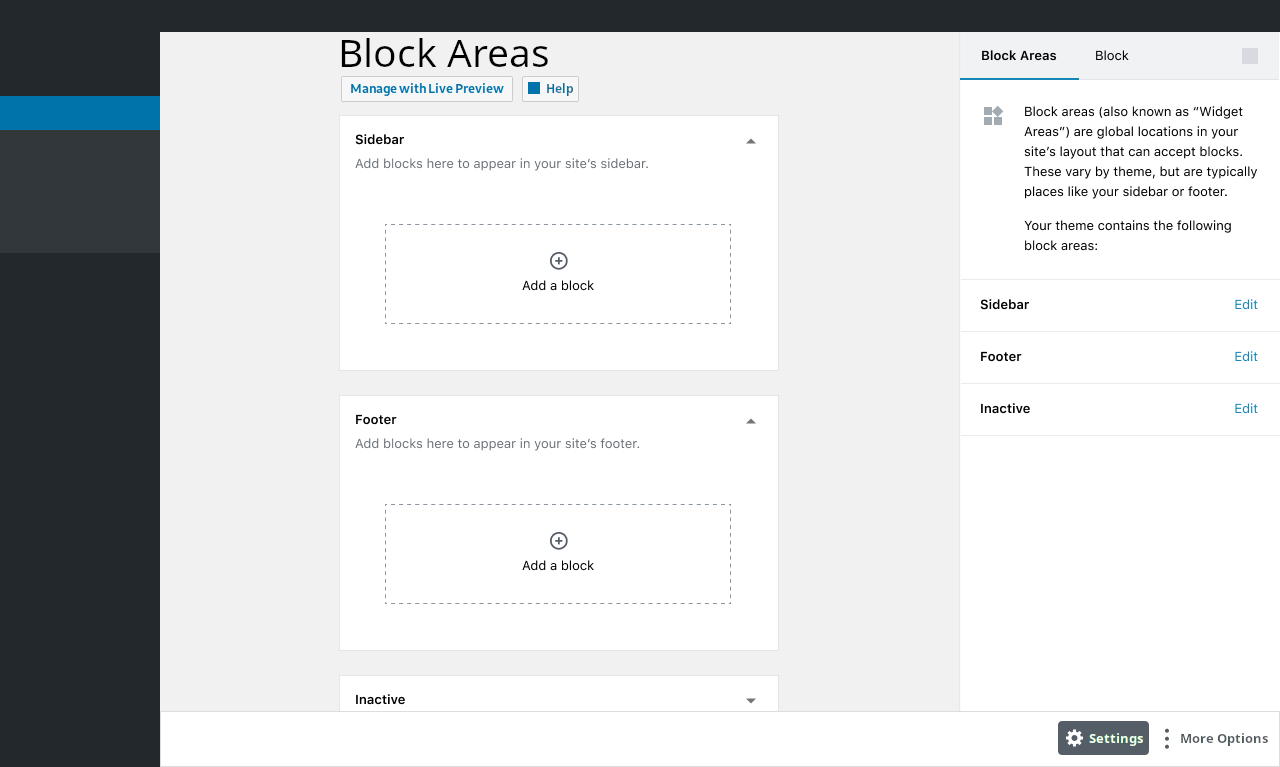
- Renamed "Widget Areas" to "Block Areas" as per @mapk's notes.
- I moved the page title down into the content area.
- I kept a global sidebar for "Block Areas" to explain what they are, and also to provide quick links to edit each one (in case they scrolled off the screen, as shown later in the prototype).
- Adopted @jasmussen's alternate block appender treatment from #8589.
kjellr
on 29 Jan 2019
^ Aside, I could see this translating to nav-menus.php pretty easily.
melchoyce
on 29 Jan 2019
Nice mockup, @kjellr; I think it looks pretty close to what the new Block Areas page might look like if it was based off the current post editor UI. However, as stated before, I think the Gutenberg editor should be made more accessible before replacing the current Widgets page.
In particular, I think the following should definitely be addressed prior to a Widgets page overhaul:
- #3976
- #10519
- #10524
- #11581
- #12254
- #13309
Also, the description in the "Block Areas" part of the sidebar should probably read
(previously "Widget Areas")
to clarify that they are no longer called widget areas.
Also... maybe we should call them "Global Block Areas" instead of just "Block Areas"? Technically every instance of post_content is a "block area", so the term "global" may help make it clear what is being referred to.
Actually, now that I think about it... aren't global block areas nearly the same as reusable blocks? Picture this: in the future you could build page templates in Gutenberg using reusable blocks for the header, footer, and sidebars.
This actually ties into #13519, doesn't it? In the future, (global) block areas could become nothing more than reusable blocks, and there wouldn't be a "Block Areas" page at all, but just a page containing a list of reusable blocks, as well as a page containing the list of page templates... all of which could be edited with Gutenberg.
So long-term, I don't think the "(Global) Block Areas" page will even exist, but @kjellr's mockup is probably close to what will happen in the short-term, since page template creation/editing is still far in the future.
ZebulanStanphill
on 29 Jan 2019
I'd agree with @ZebulanStanphill I'd like to see other issues considered first of any visual mockup, especially the plan for keyboard accessibility outlined in #11581. Those suggestions were made thinking at Gutenberg but some points apply here too.
However, before any special keyboard shortcuts or special mechanism, please consider to keep things as simple as possible. Please take into consideration content linearization as explained in a previous comment.
I really appreciate the effort and explorations put here, but I'm still not convinced about the top bar and the sidebar which are the main accessibility concern. I'd like to remind everyone this page will be the only place where _all users_ can manage widgets, as the Customizer isn't fully accessible.
As this page will be the only chance to manage widgets for users with accessibility needs, there shouldn't be accessibility regressions compared to the current page. Instead, we should strive to make it better 🙂
Headings
The main h1 needs to be the first thing in the main content, before anything else in the page. I don't see this in the prototypes above.
Saving
Still not clear to me if the new block-widgets will auto-save or not. The current widgets need to be saved one by one, which implies some Save button should be placed somewhere and for accessibility reasons it should be _after_ the blocks. Instead, if there will be some auto-save mechanism, there's no need for any Save button and I guess not even for the top bar.
Aside
Has anyone considered the content of the current Help panel in this page? There's some important information there. Worth evaluating which parts need to stay instead of removing everything.
If I can suggest something from a design perspective: don't be afraid to put some text in the page 🙂 Typography is beautiful when well crafted and some textual information within the page could greatly help.
afercia
on 29 Jan 2019
@afercia
I'm still not convinced about the top bar and the sidebar which are the main accessibility concern.
The top bar could be put at the bottom and given button labels by default, but how would you handle the inspector settings for blocks without the sidebar? Do you have any ideas for an alternative UI for block inspector settings?
I'd like to remind everyone this page will be the only place where all users can manage widgets, as the Customizer isn't fully accessible.
I'm curious: which parts of the Customizer are not properly accessible?
As this page will be the only chance to manage widgets for users with accessibility needs, there shouldn't be accessibility regressions compared to the current page. Instead, we should strive to make it better slightly_smiling_face
This a hundred times. My biggest problem with how WordPress 5.0 was handled was that several things that worked fine in the classic editor regressed in Gutenberg when they didn't have to. I really do not want to see the same mistake happen again.
Still not clear to me if the new block-widgets will auto-save or not. The current widgets need to be saved one by one, which implies some Save button should be placed somewhere and for accessibility reasons it should be after the blocks. Instead, if there will be some auto-save mechanism, there's no need for any Save button and I guess not even for the top bar.
I think it would be really nice if block areas could have undo/redo like posts and pages. But if that's out-of-scope for right now, then I think a Save button is unnecessary. Actually, is a save button even necessary when you have undo/redo? Why does the post editor have a "Save Draft" button?
One of the issues with the current mockups is that the post editor is designed to edit a single post at a time... not several. Undo/redo buttons are in the bar, but in the context of the current mockups, they would have to be keeping track of every change made to any block area on the page rather than just one block area. This is one of the reasons why I would prefer if each block area was edited separately like (or literally as) a reusable block accessed from the reusable blocks list page.
If we go with all block areas on one page for now, then I think it would make most sense for any save and/or undo/redo buttons to go at the bottom of each block area accordion.
Has anyone considered the content of the current Help panel in this page? There's some important information there. Worth evaluating which parts need to stay instead of removing everything.
I agree. I do wonder where exactly it should go, though. Would it be accessed from a "Help" button in the top-except-it-should-be-on-the-bottom bar? Or would there be a "Help" button beside or below the page title? Would the information be shown in a sidebar-thing or a pop-up?
ZebulanStanphill
on 30 Jan 2019
I'm sorry this thread is going to become very long and almost unmanageable. Maybe we should try to stay shorter but at this point I'd tend to think a dedicated meeting about the design process would be valuable, to try to avoid the same mistakes made during phase 1.
Some things (e.g. information architecture, linearization of content) need to be addressed before any visual prototype, otherwise I'm afraid there won't be much progress compared to phase 1 results.
@youknowriad et all: please let me know your thoughts, when you have a chance.
That said:
Top toolbar
What the content of the Top toolbar is supposed to be? I see the last prototype placed some not-so-defined-yet buttons there. Comparing with the edit post page:
- an "Add block" button wouldn't make much sense because there's the need to select a widget area first
- "Undo" and "Redo" can't be "global" like in the edit post, they need to be per-widget. As @ZebulanStanphill pointed out: "the post editor is designed to edit a single post at a time... not several"
- would "Content structure" and "Block navigation" make sense in this page? I guess no
- Save / Publish: still unclear (see previous comment)
- I guess there's no need for a "Settings" button to toggle the Sidebar
- ellipsis "more" button: not sure if there will be "tools and options" for this page
The last prototype misses a main h1 heading at the top of the page, plus other headings in the page. Some of the previous prototypes were better in this regard.
Sidebar:
how would you handle the inspector settings for blocks without the sidebar
I'd say it should be made clear which widgets need settings first, and what these settings will be.
If it's going to be like for the widget-blocks in the editor, see for example #1464, #1792, #7941,
then we're repeating the same mistakes made during phase 1. Important settings shouldn't be placed in the sidebar, for the reasons explained in the previous comment and in the accessibility team report.
I'm curious: which parts of the Customizer are not properly accessible?
All of them? :) Starting with the document structure, in the Customizer UI everything is a list, headings are all h3. Sliding panels are a terrible experience for screen reader users. Keyboard interaction is often unexpected and forces to tab backwards. Abundance of icon-only controls. Many other things.
The Customizer wasn't really designed with accessibility in mind. Over time, we (accessibility team) have tried to patch the most important accessibility barriers but there's still a long way to make the Customizer accessible. This is definitely out of the scope of this issue though.
Saving:
I'd lean towards widgets to auto-save because it would make UI and interaction simpler. But that should be made very clear with visible and audible feedback. One of the inconsistencies across the whole WordPress admin is that you're never sure what is already saved and what needs a manual save action.
afercia
on 30 Jan 2019
Good thoughts in this thread.
Let's step back here for a moment and look at the big picture. When reviewing a feature in isolation, it tends to ignore the _destination_. Both the step to the destination, and the destination itself are important, but the latter should inform the former.
In this case, one of the goals of phase 2 is to expand where blocks can be used. The unifying principle from phase 1 remains: the fewer interfaces you have to learn, the better, and block can unify multiple interfaces into one. This applies to the editor too. As the editor continues to evolve, it is likely that blocks could subsume the role that widgets have played; a widget area could map to a block area, and a widget could map to a block.
In that vein, using the editor for the Widget screen (as Kjell has explored), would allow us to improve the a single interface, instead of splitting our efforts into supporting two screens with completely different layouts.
Whatever problems there are with the editor, let's fix those for the editor and improve two screens instead of spread ourselves thin. Additionally, as we continue to explore showing additional block areas directly in the editor, these two interfaces will likely converge further, allowing someone comfortable in the editor to feel at home in both.
 jasmussen
on 30 Jan 2019
jasmussen
on 30 Jan 2019
@jasmussen thanks, I really appreciate your suggestion to look at the big picture.
Whatever problems there are with the editor, let's fix those for the editor and improve two screens
However, seems you're not realizing the editor general layout has fundamental accessibility issues that would require some good re-thinking to be solved. This has been well explained in the accessibility team report on _October_. There are no tricks, no special keyboard shortcuts or other tools that can replace a good document structure and information architecture.
I'm afraid an accessibility regression in the Widgets page wouldn't be acceptable for the reasons explained above. If this page is going to adopt the editor layout as it is now, there will be regressions.
One of the goals of phase 2, as announced at the State of the Word, is also to make the various teams across WordPress working together better. Design, accessibility, etc. are all elements that should be integrated from day one.
In that vein, I'd like to see the accessibility team recommendations being considered since the beginning of a new feature design process. There are things that need to be designed before any design 🙂
I'd definitely agree on improving both screens. This would need everyone to keep their mind open and not assume what we have now can't be changed. The _destination_, as you said, includes also a design process able to address accessibility since the beginning.
I'm not sure continuing this general discussion here is the most appropriate place, that's why I've proposed a dedicated meeting.
afercia
on 30 Jan 2019
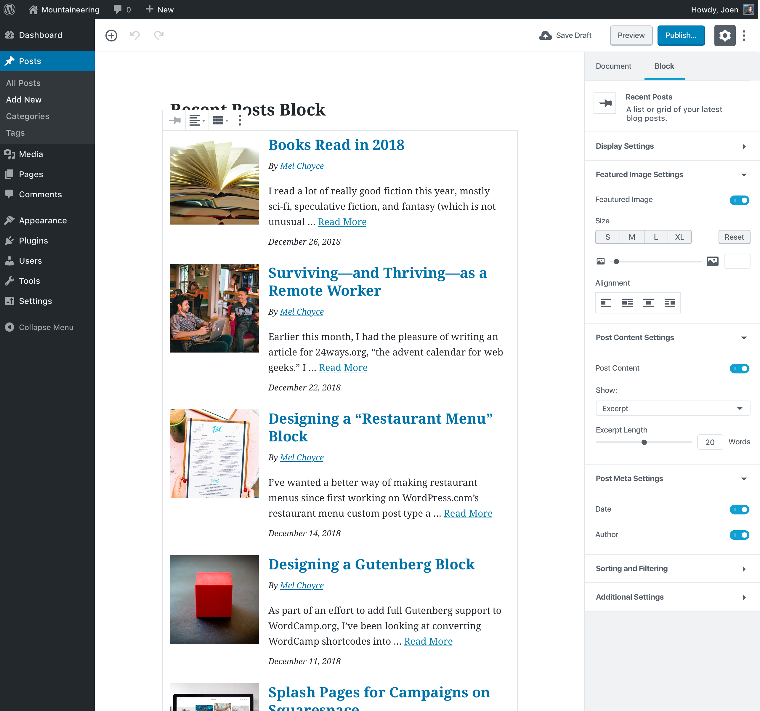
Question: assuming the widget settings will be in the Sidebar as done in the Editor (note: IMHO it wouldn't be a good idea as explained above), for example:
screenshot of the Recent Posts block from #1594 (lots of settings there...)
screenshot of the current Latest Comments block:

then: where all these settings would live in the Customizer? There's no settings sidebar there, and I'd really hope to not see an additional "sliding sidebar". Screenshot from the related issue #13205

I'd strongly suggest to consider to make the widget-blocks have a limited amount of settings "in place": within the widget.
afercia
on 30 Jan 2019
I'm sorry this thread is going to become very long and almost unmanageable. Maybe we should try to stay shorter
I agree wholeheartedly here. One of the things that can help is to keep all comments directly related to the issue.
I'm still not convinced about the top bar and the sidebar which are the main accessibility concern.
Maybe the solution here is to drop the top bar completely from this screen? Is the top bar necessary for the purpose of this screen? The main reason I see for its purpose is for autosaving. Can that be handled in the Inspector instead? And maybe on a block per block basis for now? I'm not sure this is a pattern we want to introduce, but worth exploring especially to help a11y.
I'd say it should be made clear which widgets need settings first, and what these settings will be.
I would disagree here. This screen is about integrating blocks into former-widget content areas. ALL blocks will be accessed through this interface, so settings are naturally part of it.
Important settings shouldn't be placed in the sidebar, for the reasons explained in the previous comment and in the accessibility team report.
This is a block-specific related comment and should really be delegated to those block-specific issues.
The Customizer wasn't really designed with accessibility in mind.
Any Customizer comments related to widgets/blocks should also be delegated to that specific issue [#13205].
@afercia I don't mean to target your comments, and I really appreciate the concerns you bring up and will make every attempt to find a reasonable solution that A) meets a11y standards or at least gets us on the road there, and B) stays inline with Gutenberg design patterns. Let's just do our best to keep this issue as manageable as possible with comments that deal specifically with the issue.
mapk
on 30 Jan 2019
Riffing off of @kjellr's prototype, I made a few edits.
Cleaned out the top bar so there's only a H1 as desired by a11y and a Save button which saves all widget areas... and indicates auto-save as well.
This is a new top bar pattern, I believe, so I'd love to hear some thoughts. It's still familiar with Gutenberg, but I feel that since this is an intermediate step right now toward a full site editing experience, it's okay.
Figma Prototype

mapk
on 31 Jan 2019
I decided to create some quick mockups to explore the 2 ways I see the block-ification of the Widgets page going...
The first is to show all the block areas on a single page:
I have moved the top bar to the bottom to improve accessibility. It is mostly bare, since most of the buttons it would normally have only make sense in the context of editing a single block area... not multiple.
I have also added labels to the buttons in the bar for better accessibility. Presumably, these labels would only appear on wide screens, and there would be an option to toggle showing them at all, as per #10524.
This mockup also assumes auto-saving for all block areas, hence the lack of a "Publish" button (which also makes less sense when applied to more than one block area).
Presumably, options like Spotlight Mode and Fullscreen Mode would be located in the More Options menu, like in the post editor.
This second mockup is my preference: each block area being edited individually like posts/pages. This would be less familiar to users of the existing Widgets screen, but it would be more familiar to users of the post editor:

Different block areas could be accessed from a block areas list page (essentially a /wp-admin/edit.php?post_type=block_area). Themes would, as usual, control the content width, so headers/footers could appear wide while sidebars appear short.
I have omitted the Document Outline from this mockup as I think that it makes little sense in the context of a global block area, and also should be implemented as a plugin sidebar/modal (and therefore able to be hidden in the "More Options" menu) anyway.
I'm not entirely sure what the "Help" button in both of the mockups would do. I would guess that a pop-up modal would appear, showing the same information as the "Help" button in the current Widgets page.
The "Help" button might also belong in the bar at the bottom (same for the "Manage with Live Preview" button)... I'm not certain about where either belongs.
ZebulanStanphill
on 31 Jan 2019
I see several problems with showing only one widget area at a time.
- It's difficult to move things from one area to another.
- It's difficult to get a sense of what is already on the site when you can only see one at a time.
- It looks too much like editing a page (user confusion).
Is there any need to render the content? I think it's grand to have the site configuration as it currently is on the widget page. I can easily see all the widgets and rearrange them. I don't have to be bothered by their actual content obstructing the view of the configuration. If I want to see how they render, I can use the Custimzer, where my changes are not published until I'm ready, and I'm limited to one widget area at a time, and can't move widgets between areas.
joyously
on 31 Jan 2019
I see several problems with showing only one widget area at a time.
- It's difficult to move things from one area to another.
- It's difficult to get a sense of what is already on the site when you can only see one at a time.
- It looks too much like editing a page (user confusion).
Good points, @joyously. I guess the best way to move forward in the short-term is indeed having all the block areas edited from a single page.
In the future, I think the same thing should still be possible, but not quite in the same way. You should be able to edit multiple block areas that are all shown on the same page template via page template editing... the block areas would be reusable blocks which could be edited right there (or in a standalone instance of the editor if desired), just like how reusable blocks already work. This would solve all of the issues mentioned above, while also keeping the WYSIWYG benefits of the Gutenberg editor. At this point, there would be no need for a page like the current Widgets page. But obviously, we are still far from that point.
Is there any need to render the content? I think it's grand to have the site configuration as it currently is on the widget page. I can easily see all the widgets and rearrange them. I don't have to be bothered by their actual content obstructing the view of the configuration.
One of the design principles of Gutenberg is that unselected blocks show a preview that should look just like the front-end, and selected blocks should be optimized for editing. So ideally, the content should never obstruct the configuration. Unfortunately, the block equivalents of the existing widgets are almost perfect examples of what _not_ to do.
Unlike the Paragraph or Heading block, you don't edit the content of something like the Latest Posts block directly. Unfortunately, this has resulted in most of the important controls being thrown in the inspector, which is designed for secondary/advanced options. I think that blocks like it should be revised to show the important controls in an overlay on top of the content preview when selected, or else the preview should disappear entirely when the block is selected. There's technically nothing stopping the selected, editable form of a block from looking completely different from the unselected form.
Additionally, to make re-ordering blocks easier, I think the Block Navigation menu should be re-implemented as a plugin sidebar and allow drag-and-drop reordering (plus maybe even removal) of blocks from its UI. See #11408.
ZebulanStanphill
on 31 Jan 2019
Maybe the solution here is to drop the top bar completely from this screen?
I can imagine a future where widgets are managed primarily from the editor itself. By keeping the top-bar, we both keep the recognizability of the editor — you learn a single interface — and it forces us to look at any accessibility issues at the root and fix them _holistically_ instead of fix them on a per-screen basis, fragmenting the interface architecture.
jasmussen
on 31 Jan 2019
I really appreciate you adding that mockup, @ZebulanStanphill! Definitely helps me visualize.
One thing I'd note is that we've found in previous user testing (pg. 23) is that people don't notice the publish bar if it's on the bottom of the screen. Even when reminded about it, folks forgot it was there. Some thought it looked like browser chrome. I can see that problem being intensified on mobile web, where bottom-docked ads are prolific.
melchoyce
on 31 Jan 2019
we've found in previous user testing (pg. 23)
Sorry, not willing to argue but it's a fact the user testing didn't include persons with accessibility needs, for example keyboard users, screen reader users, and users with a limited vision field.
The position of the Save button in Gutenberg was already discussed months ago, with no consensus. I realize that _visually_ some users prefer the button at the top. However, in a linearized navigation experience, the current button position is less than ideal because it forces users to tab backwards through the whole interface.
It's a known problem, even before Gutenberg because the same pattern is used in the Customizer.
In a logical flow, in any web application the saving action is at the end of the flow. I'm not saying the publish bar at the bottom is a solution, but this is still a problem that needs a good solution for all users.
afercia
on 31 Jan 2019
By keeping the top-bar, we both keep the recognizability of the editor — you learn a single interface — and it forces us to look at any accessibility issues at the root and fix them holistically instead of fix them on a per-screen basis, fragmenting the interface architecture.
@jasmussen This is fair and I agree with a holistic approach toward a11y. My hopes is that we don't invest a lot of time on this screen which is likely to deprecate in the future. And the a11y around the top bar should definitely have an issue assigned.
I did end up including the top bar in my prototype, but just eliminated a lot of the functions that may not work on this screen. Do you think this was a good solution, or do you feel the other parts that were eliminated are useful here?
mapk
on 31 Jan 2019
I did end up including the top bar in my prototype, but just eliminated a lot of the functions that may not work on this screen. Do you think this was a good solution, or do you feel the other parts that were eliminated are useful here?
We should absolutely remove any buttons there that don't make sense for the widget screen, for sure.
jasmussen
on 1 Feb 2019
@melchoyce
In addition to what @afercia said, I would say that part of the problem with the bottom bar in the Crazyhorse Demo is that it _really does_ look like a pop-up or browser chrome:

It is using a background color that clashes with the rest of the editor, and it overlays even the navigation on the left. Both imply that it is not part of the editor at all, and therefore not relevant. It is also definitely too tall. Contrast this with the current top bar in Gutenberg, which definitely feels connected to the rest of the editor.
I can see that problem being intensified on mobile web, where bottom-docked ads are prolific.
I really don't see this being a problem. Lots of apps put controls in a bar at the bottom of the screen, e.g. Spotify, Twitter, and Instagram. Even Gutenberg Mobile already puts several of its controls at the bottom:

Given the vast differences between the Crazyhorse Demo and Gutenberg, I'd say the two are hardly even comparable. But thanks for pointing out that old user testing anyway; I was not aware of its existence before.
@mapk
...I agree with a holistic approach toward a11y. My hopes is that we don't invest a lot of time on this screen which is likely to deprecate in the future.
This is the big issue. We can't drop blocks into the existing Widgets page design. We shouldn't make a separate UI design just for the new Block Areas page. But since the post editor still has some major flaws, we can't just re-use it either. So ultimately, the Widgets page overhaul is blocked by the post editor needing to be improved.
And the a11y around the top bar should definitely have an issue assigned.
I agree.
@jasmussen
We should absolutely remove any buttons there that don't make sense for the widget screen, for sure.
For a page that shows multiple block areas at once, most of the controls in the top bar no longer make sense. Only the Settings sidebar and More Options menu would still make sense. Additionally, plugins like Yoast SEO may no longer work when applied to a screen with multiple block areas, so perhaps plugins will have to opt-in to support the Block Areas page?
If we updated block areas to support drafts, scheduled updates, and undo/redo, then "Undo", "Redo", "Save as Draft", and "Update" buttons could appear below each block area. But given that in the long-term, the Block Areas page will probably cease to exist entirely when page templates come around, I'm not sure it is worth implementing that extra functionality.
Additionally, I think that the ability to edit block areas individually should be added anyway, in order to allow for a fallback way to edit block areas, where plugins like Yoast SEO that only make sense in a single block area editor could be used if desired.
ZebulanStanphill
on 1 Feb 2019
This is the big issue. We can't drop blocks into the existing Widgets page design. We shouldn't make a separate UI design just for the new Block Areas page. But since the post editor still has some major flaws, we can't just re-use it either. So ultimately, the Widgets page overhaul is blocked by the post editor needing to be improved.
I understand the concern and agree with just about everything here. However, as we work further to improve the a11y in the topbar and Inspector, I believe we can still move forward with the prototype laid out in this comment simultaneously:
https://github.com/WordPress/gutenberg/issues/13204#issuecomment-459175233
@youknowriad, do you think we can begin dev work around this?
mapk
on 5 Feb 2019
Not quite yet, this PR #13088 is a requirement here and we'll begin explorations as soon as it lands.
youknowriad
on 5 Feb 2019
Also wanted to note that an issue has been created [#13663] to work on the a11y issues discussed here.
mapk
on 5 Feb 2019
One major concern I have is the single save button and single draft/publish functionality. Widget areas are spread across the site on many different pages, and have many different concerns. It seems much more logical to be able to deploy changes to them individually.
This re-imagining of widget areas would be a great time to properly isolate them enough that users could schedule changes to each widget area separately.
 gschoppe
on 6 Feb 2019
gschoppe
on 6 Feb 2019
I was just answering a question in the support forum about how to better move Inactive widgets to sidebars after a theme switch (using an iPad), and I realized that this Widgets page has a Screen Option of an accessibility mode. Using that, it shows only one widget at a time, but gives the choice of which sidebar to put it in, similar to what you get when you click on a new widget without accessibility mode.
I wanted to make sure others were aware of this, so it doesn't get lost in the redesign.
joyously
on 7 Feb 2019
How about to open block settings in modal box, the same modal code used in Gutenberg ?
Would it complicate to much for accessibility.
Personaly I think you would make huge mistake if you try to replicate design and look of pure Post edit screen, for widgets. You would make much problems for yourself in the future.
 StaggerLeee
on 23 Feb 2019
StaggerLeee
on 23 Feb 2019
For reference, is this the UI I should be shmushing into Frontenberg during phase 2? :)
tomjn
on 6 Mar 2019
Yes, @tomjn, this is the UI: https://github.com/WordPress/gutenberg/issues/13204#issuecomment-459175233 but I fully expect bits to change as we go into development, especially in relation to the saving of individual widgets-blocks.
mapk
on 6 Mar 2019
that's ok, just make sure that the admin page itself is nice and modular so that it's not a nightmare to get running on the frontend, that way you can do as you please without it being rewritten every version
tomjn
on 7 Mar 2019
Adding a note here that a trac ticket was raised pointing out an issue when different users concurrently edit widgets, proposing a locking system:
https://core.trac.wordpress.org/ticket/12722
It might be preferable to make sure the new widget screen supports a locking solution.
 talldan
on 13 Mar 2019
talldan
on 13 Mar 2019
Adding a note here that a trac ticket was raised pointing out an issue when different users concurrently edit widgets, proposing a locking system:
Worth noting that although the following ticket is about collaborative editing using WebRTC, the a lot of ideation and design has gone into the process, and the concept is the same: locking a block to the user editing it. Might therefore be worth looking at that UI for reference ideas:
https://github.com/WordPress/gutenberg/issues/1930#issuecomment-333455412
jasmussen
on 13 Mar 2019
I'm sharing a simple comment that summarises the PR's of the main remaining tasks to get block editor for widget areas:
- Highest priority PR: Implementation of rest endpoints that abstract widget area as blocks. https://github.com/WordPress/gutenberg/pull/15015
--(in progress) Some updates to a very recent review are pending, but the PR can still benefit from reviews. - Second PR with the highest priority: Connect the widget endpoints to the block editor in the widgets screen.
https://github.com/WordPress/gutenberg/pull/15074
-- Depends on https://github.com/WordPress/gutenberg/pull/15015.
--(in progress) Reviews are pending. - Render widget areas that reference a post_id in the website frontend.
-- https://github.com/WordPress/gutenberg/pull/15074.
--(in progress) Reviews are pending.
Merging the 3 PR's that reference each other in a chain allows us to have an end to end demo of the block editor for the widgets screen.
In Parallel we need other improvements to make blocks work as expected in the widgets screen.
Remove wordpress/editor usages from the core blocks (wordpress/editor is not available in the widgets screen).
- https://github.com/WordPress/gutenberg/pull/15635
- https://github.com/WordPress/gutenberg/pull/15572
- https://github.com/WordPress/gutenberg/pull/15521
Fix UI problems that make the screen not work as expected or that make the screen have a suboptimal experience.
Other UI problems are affecting the widgets screen, for which a solution is not yet implemented. The major problems are:
- the block popover is not appearing in the right positions.
- The block inspector is still not available.
- We don't have something equivalent to the global inserter, we can only insert blocks using the sibling inserter, and "/" autocomplete inserter. Maybe we should have a global inserter per widget area?
 jorgefilipecosta
on 15 May 2019
jorgefilipecosta
on 15 May 2019
Given that some time passed since the last widgets work update I'm going to share a new one containing the developments since the last update.
The PR's that connect the widgets endpoint with the widget screen were merged and the PR that renders block in the front widget area of a website was also merged.
The screen still provides a suboptimal experience and many enhancements are in progress.
Merged PR's (related to the main screen work): https://github.com/WordPress/gutenberg/pull/15015, https://github.com/WordPress/gutenberg/pull/15074, https://github.com/WordPress/gutenberg/pull/15651
A PR that allows the legacy widget block to reference an existing widget was proposed https://github.com/WordPress/gutenberg/pull/15801.
Legacy widgets still don't work as expected on the widget screen for that we need to make sure we can land user server-side render component on that screen https://github.com/WordPress/gutenberg/pull/15635 and we need PR previous referenced https://github.com/WordPress/gutenberg/pull/15801. Both PR's are pending a review/re-review.
Regarding the work to remove wordpress/editor usages from the core blocks:
https://github.com/WordPress/gutenberg/pull/15572 was merged. https://github.com/WordPress/gutenberg/pull/15635 is pending a re-review and I will soon update https://github.com/WordPress/gutenberg/pull/15521 to address the reviews.
Regarding the work to Fix UI problems that make the screen not work as expected or that make the screen have a suboptimal experience: https://github.com/WordPress/gutenberg/pull/15472 was closed because we updated code in other PR that fixes the root cause of the problem.
https://github.com/WordPress/gutenberg/pull/15470 is in discussions and is pending a decision.
jorgefilipecosta
on 29 May 2019
One major concern I have is the single save button and single draft/publish functionality.
This is definitely a rising concern. I'll explore this more and look at moving this button to be Block Area specific (mockups soon to come). I don't think it's necessary to move to actual blocks.
mapk
on 29 May 2019
Another update.
The short term project board is available at https://github.com/WordPress/gutenberg/projects/27.
We merged another two important PR's https://github.com/WordPress/gutenberg/pull/15521, https://github.com/WordPress/gutenberg/pull/15396
PR's that need reviews
The next PR with higher Priority is
https://github.com/WordPress/gutenberg/pull/15801 which when merged will allow legacy widgets to be used in the widgets screen.
https://github.com/WordPress/gutenberg/pull/15548 is practically ready and needs final approval.
https://github.com/WordPress/gutenberg/pull/15948 was updated and needs final approval too.
Some problems /potential enhancements were found in the PHP code, and two PR's were submitted. It would be some additional eyes on them:
https://github.com/WordPress/gutenberg/pull/15981
https://github.com/WordPress/gutenberg/pull/15983
Props to @TimothyBJacobs for doing an initial review to one of these PR's.
Pending updates/discussion
https://github.com/WordPress/gutenberg/pull/15635 was discussed, and it seems we arrived at a possible solution. I liked the suggestion provided by @gziolo of having a ServerSideRenderProvider; I'm going to implement it in the next hours.
https://github.com/WordPress/gutenberg/pull/15470 @aduth provide an alternative idea exposing a new component that includes the BlockEditorProvider but also some artifacts expected from a block editor, e.g., the writing flow. I guess if no one was any concern regarding that approach the best path is implementing that component and update https://github.com/WordPress/gutenberg/pull/15470 to use it.
Other updates
https://github.com/WordPress/gutenberg/pull/15988 proposed by @aduth will unblock the popover positions problem on the widget screen I will review it in the next few hours.
jorgefilipecosta
on 5 Jun 2019
This issue hasn't been active in a year. Is there another overview issue for the widget screen?
 ellatrix
on 16 Jun 2020
ellatrix
on 16 Jun 2020
I don't think so, @ellatrix. If you'd like to close this, we do have the Project Board that has a list of issues as well.
mapk
on 17 Jun 2020
It would be nice to keep this old issue open as it also links to the Project Board. It can also be updated when someone has the time to go back to this issue again.
 paaljoachim
on 18 Jun 2020
paaljoachim
on 18 Jun 2020
Ok, since there's no movement on the project board and no movement on this issue, I'll remove it from the WP 5.5 board.
ellatrix
on 21 Jun 2020
@ellatrix I'm unclear on the status of this feature. Is there still plans to convert over the widget sidebar stuff to using Gutenberg blocks?
 jcklpe
on 22 Jun 2020
jcklpe
on 22 Jun 2020
All the PRs Jorge mentioned here: https://github.com/WordPress/gutenberg/issues/13204#issuecomment-499078467
Have been merged.
Hey Aslan. @jcklpe
The status of the feature is that no one has worked on the Widgets screen in wp-admin for a long time, so it is removed from the WP 5.5 project board. It does not mean it will not be worked on, only that it is not a priority for 5.5.
paaljoachim
on 22 Jun 2020
I will close this big issue as today it only stands for historic documentation.
 draganescu
on 14 Oct 2020
draganescu
on 14 Oct 2020
Related issues
 aduth
·
3Comments
aduth
·
3Comments
 maddisondesigns
·
3Comments
maddisondesigns
·
3Comments
 nylen
·
3Comments
jasmussen
·
3Comments
nylen
·
3Comments
jasmussen
·
3Comments
 pfefferle
·
3Comments
pfefferle
·
3Comments
Most helpful comment
Spent a few minutes this morning thinking through this, and I wanted to share another hybrid mockup for more discussion:
Prototype
https://www.figma.com/proto/WdbvnvIHDFbgVDWwkyNCqFA7/Gutenberg-Widgets-Admin-Screen?node-id=14%3A297&viewport=-818%2C1575%2C0.5&scaling=min-zoom
GIF

_Here's the Figma link in case anyone wants to expand on this idea._
[ + Add block ]button inside of each container (inspired by the Add button in image galleries).