Gutenberg: Block-specific responsive controls
Problem
Many blocks need to adjust responsively depending on the screen size. Right now block developers are baking in these controls into the block inspector. Let's make sure we provide a unified way to achieve this action.
Solution
Think through ways in which we might implement responsive controls for specific blocks.
Questions
- Which should be the default setting for blocks? Desktop, mobile, tablet?
- Is it necessary to hide/show blocks based on device width?
- Where should the controls go?
- Does the theme, the block templates, or the content have precedence when designing mobile styles?
Related to #13203
Issue #13203 is about an overall responsive layout option. This particular issue is focused more on individual block responsive controls.
 mapk
mapk
All 84 comments
I'll share some initial explorations arount this topic.
The block that's most urgently in need of responsive controls at this point is the column block. Currently, columns stack automatically on small screens, without any indication that's going to happen. The Media & Text block also can stack on mobile, but it includes a toggle switch to turn that behavior on or off. This is a great baseline for responsive controls:

For many users, this toggle offers more than enough control: it's reasonable to assume that a modern website builder can handle this all automatically if we ask it to. But we should offer some level of fine-tuned control for those users who will want to specify how many columns should appear at various breakpoints.
With that in mind, I built my exploration up around a couple core ideas:
- Responsive controls should live in the “Advanced” panel. This panel is currently very under-utilized, but seems like a reasonable home for responsive settings. We should set good defaults, and in most cases the user will never even visit this panel.
- Allow for 3 different options:
A. Our smart default: Stack columns on mobile.
B. Use the same number of columns everywhere.
C. Specify column counts for mobile, tablet, and desktop screen sizes.
With those in mind, I built a couple prototypes:
Desktop Prototype (Figma)
Mobile Prototype (Figma)
_Screenshots for reference:_
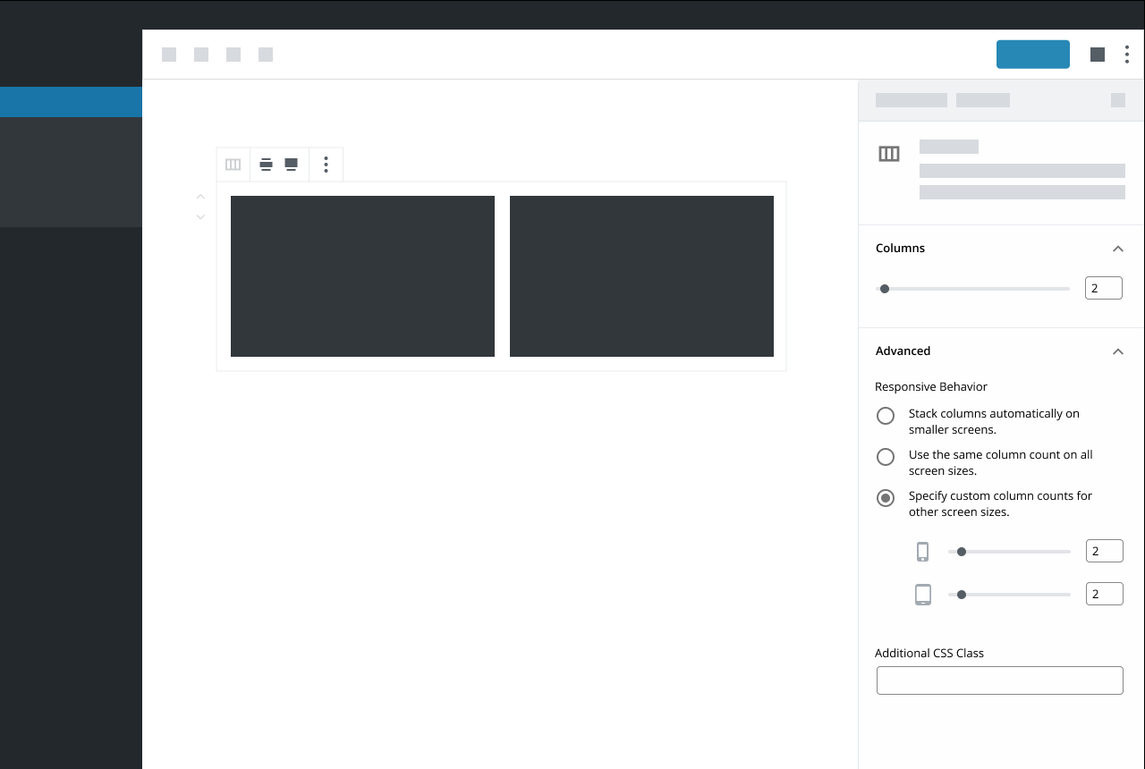

As you’ll notice when you click through: when you have option (C) selected, the only device options shown in the “Devices” panel are the devices you’re _not_ using. If you’re on a phone, the default slider under “Columns” will control the number of columns you’d see on a mobile device. If you keep option (C) selected and access this block from a desktop machine, the default slider will control the number of columns you’d see on a desktop view. This prevents duplicating controls that do the same thing, but I'm not totally sure whether it’s intuitive or confusing. An alternative would be to show all devices down there, and disable the default slider when option (C) is selected, but that seemed weird to me.
I'm Interested in some feedback! I'm also curious how these sorts of controls might extend to other types of settings: What other blocks would benefit for responsive controls like this?
 kjellr
on 21 Jan 2019
kjellr
on 21 Jan 2019
I've been building a rather large theme recently for a work project launching in the next couple of weeks. I thought I should probably shared some of my thoughts. The following panel is what I've implemented for handling stacked columns on various devices. Each Device can have it set explicitly and also have the order reversed. (Using flex for columns css).

The top portion (margin / padding) is also available on all blocks. Allowing us to create some pretty fantastic layouts entirely from the editor.
What I would love to see is desktop/tablet/mobile buttons available at the top of the editor to switch the editor into the respective modes without resizing the window. This would allow for very rapid building for all response levels. While those three modes work for my purposes, potentially a range of response levels could be configured in the theme allowing you to switch between any of them.
As we no longer have an iframe based editor, this is clearly going to take a bit more trickery to pull off. Having thought a bit about how I could accomplish something similar, I would imagine that the editor could not use media queries, and instead css would need to be developed specifically for the editor for every block. I'm currently doing this anyway for my own theme. If the "editor-styles-wrapper" div had the current response added to the class, you could easily substitute media queries for class based responses.
eg: .editor-styles-wrapper--mobile { }
 mattbolt
on 22 Jan 2019
mattbolt
on 22 Jan 2019
What I would love to see is desktop/tablet/mobile buttons available at the top of the editor to switch the editor into the respective modes without resizing the window. This would allow for very rapid building for all response levels. While those three modes work for my purposes, potentially a range of response levels could be configured in the theme allowing you to switch between any of them.
Thanks for sharing, @mattbolt. In case you haven't seen it, we're discussing that exact sort of thing right over here: #13203
As for the responsive margin/padding rules: I'd _love_ to see more fine-tuned controls for margin + padding. But for the majority of users, I imagine those would be more beneficial on a global level. That's why I left them out of my explorations above. I do think we should definitely include margin/padding controls _somewhere_, but per-block seems a little too granular to me (at least for core).
kjellr
on 22 Jan 2019
heya @mapk @kjellr - I left a comment on #13203, but I think it's worth highlighting a portion of it in this issue as well.
This is the latest prototype we're working on - It's based on feedback we got from our recent usability test that I noted in #13203.

Our blocks have a few different settings, and not all of them should be editable on a device by device basis. As such, we think placing responsive controls in individual settings makes sense. In the example above, the responsive controls for layout can be adjusted, but filtering by category can't. (filtering by a category should always apply to all device sizes) We'd also want to use smart defaults, so folks wouldn't have to go in and adjust the layout for each device size.
The first portion of our test was run using live blocks which didn't feature any responsive layout controls. Many of our participants asked questions along the lines of, "How do I change these layout settings for mobile devices?" It leads me to belive that more people are going to want this kind of granular control than we think.
Putting responsive controls in the advanced settings is another option, however, I belive it would make it more difficult to find... granted that's a bit of a one time problem - once you find it, you know where to look for it the next time. That said, I also think there's something to keeping responsive controls in the context of the setting that a user is adjusting as well.
We haven't had a chance to test this latest version, but we hope to soon.
 LevinMedia
on 23 Jan 2019
LevinMedia
on 23 Jan 2019
@kjellr
I'm Interested in some feedback! I'm also curious how these sorts of controls might extend to other types of settings: What other blocks would benefit for responsive controls like this?
I really like how you took something so complex and simplified it in a usable way for anyone to understand. Another block that could benefit is the Gallery block which already has some rudimentary column adjustment settings.
@mattbolt
The top portion (margin / padding) is also available on all blocks.
Thanks Matt! Your exploration into margins and padding is a good one to share here as well. #11824
@LevinMedia
Many of our participants asked questions along the lines of, "How do I change these layout settings for mobile devices?"
Really interesting!
That said, I also think there's something to keeping responsive controls in the context of the setting that a user is adjusting as well.
This makes sense in context to the Woo block that also allows adjusting the product number as well. Do you think it's necessary when there's only one adjustment (ie. columns) as in @kjellr's mockups?
mapk
on 24 Jan 2019
I'm noticing that most of the mockups so far use icon-only controls. Ideally, for accessibility (and general usability), it would be best if the responsive controls had visible labels. I'm not sure how feasible this is, but I just wanted to point it out, since Gutenberg has struggled with accessibility in various areas, and it would be a good idea to try and avoid adding any more icon-only UI.
 ZebulanStanphill
on 28 Jan 2019
ZebulanStanphill
on 28 Jan 2019
Another thing we'll need to consider is toolbar options that might require responsive settings. For example the block width feature found on the Cover block. You might want narrow width on desktop and full-width on mobile.
 jameskoster
on 28 Jan 2019
jameskoster
on 28 Jan 2019
Heya @mapk
Do you think it's necessary when there's only one adjustment (ie. columns) as in @kjellr's mockups?
I do. Discoverability is a big part of that reason for me. It puts the responsive settings directly in the context of the setting(s) that are being manipulated.
I think there are going to be many cases where a block has multiple responsive settings, and not all of them are going to fit neatly in a single bucket like, layout.
For example, your second question above.
Is it necessary to hide/show blocks based on device width?
In my previous usage of page builders, the answer to that question has been yes. Adding a "Visibility" settings with it's own responsive controls would allow for that.

LevinMedia
on 28 Jan 2019
In hindsight - Visibility might not be the best example in this case, as something like that would probably be better suited as simple list of toggles.
[toggle] Show on desktop
[toggle] Show on tablet
[toggle] Show on mobile
LevinMedia
on 28 Jan 2019
Many of our participants asked questions along the lines of, "How do I change these layout settings for mobile devices?"
@LevinMedia I wanted to followup on this finding: can you share any more details about the pool of users who were part of this test? This finding surprised me a bit, so I'd like to learn more. Thanks!
kjellr
on 28 Jan 2019
I think a key consideration here is our expectation for how much of an impact responsive manipulation will have on the overall authoring experience. Not only now but in the future as well.
Which should be the default setting for blocks? Desktop, mobile, tablet?
That question is top of mind for me right now. I like @kjellr's design a lot for the reasons @mapk mentioned above, but I'm not sure how well it would transition to a "mobile first" experience?
As @LevinMedia said, most participants in our recent usability tests showed a keen interest in mobile settings already and declared it to be "very important" to them. Of course it must be said that there is some bias there as each participant was a WooCommerce user and perhaps more "tech savvy" than other users.
My inclination at the moment is to agree with @LevinMedia - context will be vitally important here. I think it should be very easy for users to find these settings and understand what they do.
On a related note, I personally do not like the "Advanced" section of the settings panel - for almost any use case. It feels arbitrary to me and I've literally no expectation what settings I might find in there when first interacting with a block.
jameskoster
on 28 Jan 2019
That question is top of mind for me right now. I like @kjellr's design a lot for the reasons @mapk mentioned above, but I'm not sure how well it would transition to a "mobile first" experience?
Along these lines, one of the considerations in my approach above is that it's aware of which screen you're editing from. In other words, the device you're on is the one you're designing for "first". If you visit from a mobile phone, the only slider you'd see in the main area is the mobile slider. The rest are down in Advanced. Or, if you visited from a tablet: the tablet would be shown as the default control, and the others would be down below. This could very well end up being confusing: splitting the controls between the regular sidebar panel and Advanced feels a bit off to me, as I mentioned originally in my notes above.
But in general, I do like the general idea of being device-aware. In the mockups @LevinMedia posted, that'd equate to defaulting to selecting the mobile tab when visiting on a mobile device, or to tablet when you're visiting from tablet, etc. (I actually think I saw that in one of your mockups, but I can't find it now.)
kjellr
on 28 Jan 2019
Spent a little bit of time thinking through a slightly different direction for this. One thing that hasn't quite sat right with me from my previous iteration was how I separated out the columns controls between the main sidebar "Columns" panel and the "Advanced" panel.
This exploration simplifies the options a bit and moves everything back into the main "Columns" area:
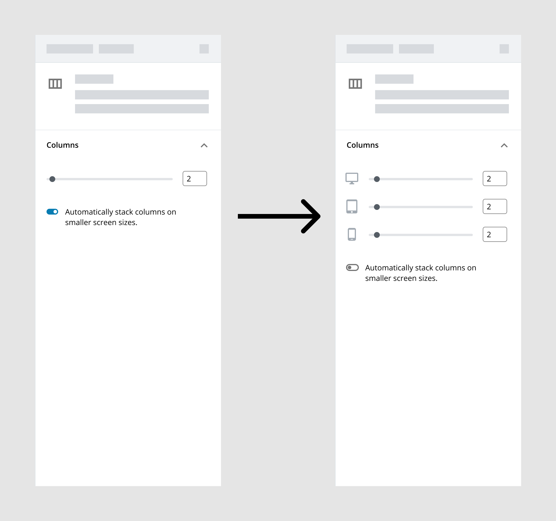
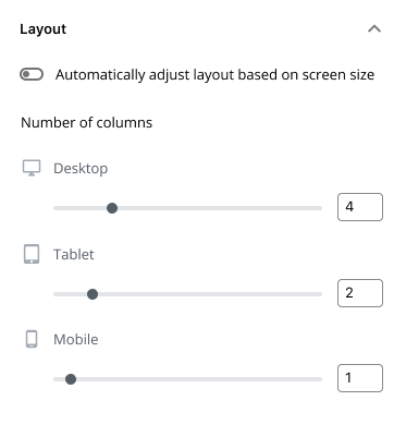
The first frame just adds the "Stack on mobile" toggle we currently have available to the Media & Text block. By default, it's turned on, and everything's handled automatically. This is the best setting for users who do not want to manage these settings. Unlike today, if a user were to toggle that off though, they'd be presented with more fine-tuned controls there instead. From here, they can either leave it alone (it'd default to the same size for each), or adjust to set a different column count for each device type.
Some considerations:
- Generally, this needs better labeling + descriptions.
- This works fine for one option, but it wouldn't scale well if there were multiple settings per breakpoint.
- We don't typically show/hide controls based on toggle switches being turned off. Not sure if that really makes sense here.
- Related to the above: hierarchy-wise, it seems weird to have a toggle switch affect the fields above it. It'd may be more natural to lead with the switch in this case. That _also_ wouldn't feel right though, because the primary thing people will want to do here is adjust the column count not toggle responsive controls.
One question I keep coming back to as I'm exploring and reading through the thoughts here: how simple or complicated should this be _in core?_ Some custom blocks will include certainly include a ton of individual settings for each breakpoint: margin, padding, showing + hiding blocks, etc. That may be what their user base is comfortable with. But we don't necessarily want to include that level of control in the default blocks since it may be overwhelming for a novice user. That said... it's likely beneficial for us to establish design patterns that can scale up to those super-complicated scenarios, so that we can help demonstrate how this should be handled in all cases. How can we define a simple pattern that scales between people who do _not_ want to have to manage responsive settings and those who want to be really specific about these things?
kjellr
on 29 Jan 2019
Nice mockups, @kjellr!
Generally, this needs better labeling + descriptions.
At the very least, the device icons should be moved to labels for each of the sliders, e.g. "🖵 Desktop".
This works fine for one option, but it wouldn't scale well if there were multiple settings per breakpoint.
I think the answer to this lies in the toggle. What if every responsive control had a toggle to enable/disable customizing the responsiveness of the setting? Divi Builder has something pretty similar to this.
Related to the above: hierarchy-wise, it seems weird to have a toggle switch affect the fields above it. It'd may be more natural to lead with the switch in this case. That also wouldn't feel right though, because the primary thing people will want to do here is adjust the column count not toggle responsive controls.
I think I would prefer having the toggle above the sliders, since toggling it affects the sliders.
But we don't necessarily want to include that level of control in the default blocks since it may be overwhelming for a novice user.
I think that a lot of stuff could be hidden behind toggles like the ones in your mockup by default, or by simply keeping them in closed accordions by default. Margin and padding could both be in the same accordion, and you could toggle responsiveness for those controls with toggles like in your mockup. I don't think this would overload the user with options if this accordion is placed below all the more common options and is closed by default.
ZebulanStanphill
on 29 Jan 2019
@kjellr - Following up to Jay's comment. We had a small sample size (eight participants) so as I mentioned before, more testing/research is definitely warranted.
All of the participants came from the WooCommerce Design Feedback Group - As jay mentioned, our participants, and this group of participants in particular skewed heavily towards the more experience builder / Store Assembler profile, rather than a DIY shop owner.
LevinMedia
on 29 Jan 2019
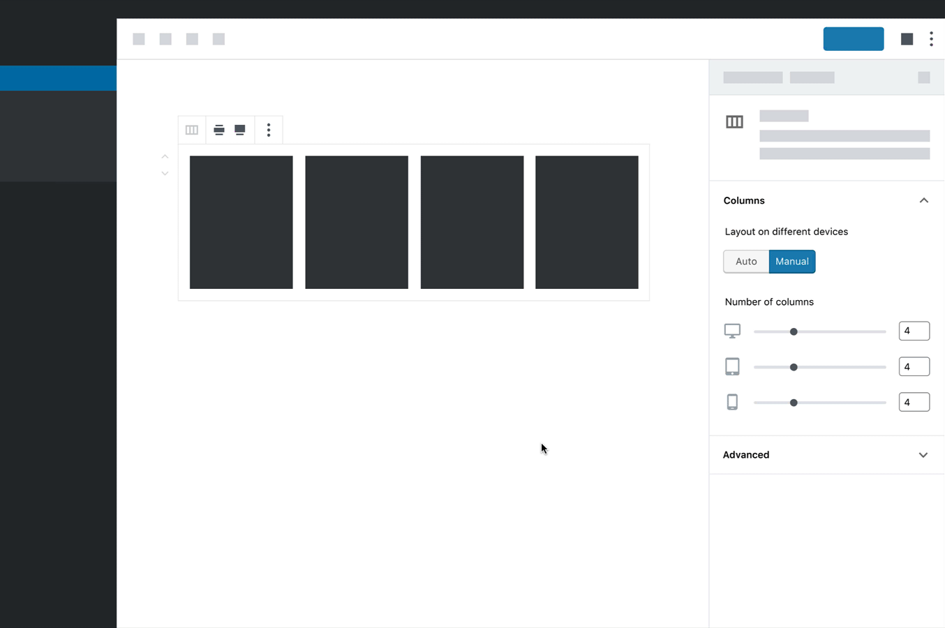
A small followup to the mockup I posted yesterday:

After taking through it with @jasmussen and some other folks, I tried using a ButtonGroup instead of a Toggle, alongside some (hopefully) clearer copy. Changing the formatting and copy this way allows us to more naturally place the control on top of the columns control. That feels a lot more expected hierarchically.
One thing I really like about this approach is that it sets the precedent that, these controls should be handled by the block by default. Block designers will have infinitely more control than users will, since they'll be able to define their own breakpoints. Block designers will also have a lot more experience with responsive design than many users, and should be able to apply best practices here.
Also, if a user switched to manual, made a bunch of adjustments to breakpoint settings, and messed things up, the "Auto" option is a quick escape hatch for them.
There are still some weird things to sort out here (for instance, who chooses these exact breakpoints?). But this seems like the sort of setting that may be able to scale to more complicated setups, and I think we're getting closer.
kjellr
on 30 Jan 2019
Love it, Kjell. It allows a default that is best in most cases, yet granularity for those who want it. It also feels like a pattern that can scale from the columns block, to other blocks, to even third party blocks. Well done.
 jasmussen
on 31 Jan 2019
jasmussen
on 31 Jan 2019
Very nice, @kjellr!
I still think that each of the sliders should have visible textual labels for accessibility and clarity reasons, but other than that, I think we're getting close to being able to actually implement this functionality!
Also, in terms of accessibility, are we sure a button group is more appropriate than a toggle in this context?
ZebulanStanphill
on 31 Jan 2019
I like these concepts and they work well for columns but I see some small issues with both.
The concept with the toggle is my favorite of the two, but it won't be consistent across settings as the label will be different each time. So it won't be immediately obvious that the setting has mobile options. I worry about scalability.
The concept with the segmented control feels a little odd to me because you're asking the author to make a choice of auto vs manual before actually interacting with the column setting. That's not what I'd expect to see when opening a "columns" section in the settings. The labels don't feel particularly clear to me either.
I'm keen to hear more thoughts around the concept @LevinMedia shared earlier. We came to that solution after a round of usability testing and it seems fairly consistent with what other block authors are doing. Is there a reason we're discounting that approach?
jameskoster
on 31 Jan 2019
I'm keen to hear more thoughts around the concept @LevinMedia shared earlier. We came to that solution after a round of usability testing and it seems fairly consistent with what other block authors are doing. Is there a reason we're discounting that approach?
Sure! I don't meant to discount that solution. The key thing I see missing from that direction is the presentation of a "let us handle it" option. While more advanced users will jump right in and edit everything under each of those device icons, that'll be a _lot_ of work for a notice user. Especially when we could just handle it automatically for them.
Aside from that, the crux of that direction is the segmented control for devices:
I think works fairly well and could be a pattern to use here, though if we incorporated a segmented control above it that could get weird.
kjellr
on 31 Jan 2019
The key thing I see missing from that direction is the presentation of a "let us handle it" option.
Gotcha. So the concern is that the tablet / mobile toggles don't feel optional? That makes sense. But I feel the device segmented control would provide a more consistent pattern across different setting types and therefore scale better. Ease of use vs. Consistency and scalability is a hard one!
To stress test these concepts a little more might I suggest adding another option beneath columns, that would also have a responsive component: Rows.
jameskoster
on 31 Jan 2019
To stress test these concepts a little more might I suggest adding another option beneath columns, that would also have a responsive component: Rows.
Yeah, I mocked something like this up quickly to try it out. It technically works, though it does get a bit repetitive + longwinded:

kjellr
on 31 Jan 2019
Logging another concept that @kjellr and I worked on here for additional thoughts:
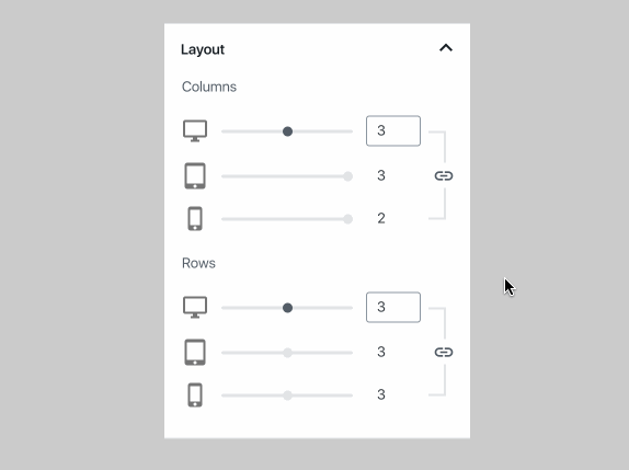
Things I like:
- It means the author only has to adjust a single setting, assuming they want things handled automatically.
- Even in “automatic mode”, they can still see how many columns they’ll get on mobile, there’s no mystery.
- Unlinking the settings for complete control is a single click away.
Things I’m not so keen on:
- It takes up quite a bit of space visually
- There’s no simple “stack columns on mobile” option. Honestly not sure whether that’s a big deal or not though…
jameskoster
on 31 Jan 2019
I think I prefer the standard toggle to the chain-link icon button, because it is easier to give a label. Remember that UI must be designed with accessibility in mind.
I imagine the UI could look like this:
Column count
(ON⚫) Automatically adjust columns for mobile devices.
―――――o― [__4]
Column count
(⚫OFF) Automatically adjust columns for mobile devices.
🖥️Desktop
―――――o― [__4]
⬛Tablet
―――o――― [__3]
📱Phone
―o――――― [__2]
Visibility
(ON⚫) 🖥️Show on desktop
(ON⚫) ⬛Show on tablet
(ON⚫) 📱Show on mobile
ZebulanStanphill
on 1 Feb 2019
Technically the "link" concept is the same thing, the toggle is just in a different location visually. It could still be revealed to screen readers in much the same way and a tooltip could be added as a label (I'm not sure how accessible they are though). There's also has the added benefit of informing the author how many columns will be used on small screens, even in "auto" mode, without forcing them in to a preview. Perhaps that's not all that useful though - it's hard to know without testing.
I do agree that this format wouldn't work as well for the visibility setting though. Linking those options together seems pointless. But to me, that setting doesn't need the auto/manual toggle either. A single visibility toggle per device makes most sense.
jameskoster
on 1 Feb 2019
Technically the "link" concept is the same thing, the toggle is just in a different location visually. It could still be revealed to screen readers in much the same way and a tooltip could be added as a label (I'm not sure how accessible they are though).
Visible labels are always more accessible. It should also be kept in mind that the visual order of controls should match their tab order, and their tab order should follow information architecture... meaning the controls that you would logically use first appear before the ones you would use afterwards, and things like headings come before the paragraphs they head. Pinging @afercia, since he knows a lot more about this than I do.
There's also has the added benefit of informing the author how many columns will be used on small screens, even in "auto" mode, without forcing them in to a preview. Perhaps that's not all that useful though - it's hard to know without testing.
This is definitely a neat benefit, though I'm not sure if showing a bunch of disabled controls by default fits with trying to prevent the UI from feeling overwhelming. I wouldn't personally be bothered by it, but some people might.
ZebulanStanphill
on 1 Feb 2019
Love this idea and discussion!
Looks like so far the focus of the discussion has been on the admin UX, as it should be.
I'd like to, however, offer some food for thought on the front-end, content first, and the modern web.
You really can't beat the 3 device paradigm when it comes to getting regular users to grasp "responsive design". The thing is 3 designs for 3 devices isn't actually responsive design. It's Adaptive design. It's the pipe dream of pixel perfect, which doesn't exist with the modern web. It's rigid, fragile, not future proof and doesn't always produce what the user expects.
New CSS features are being released all the time to steer us away from adaptive design and toward responsive. rem, vw, flex, grid.
Responsive design is about letting the content inform the design rather than letting the design dictate and compromise the content.
Here's a column view from TwentyNineteen

If my site design called for 6 columns of text, I would prefer that design be compromised a bit before the paragraph width got less than say 150px.
Flexbox can make this fairly automatic. Try it out.
.wp-block-columns {
    display: flex;
    flex-wrap: wrap;
}

.wp-block-column {
    flex: auto;
    width: 100%;
    margin: 0 1rem 1rem;
}

.has-4-columns .wp-block-column {
    width: calc(100% / 4 - 2rem);
}

.has-6-columns .wp-block-column {
    width: calc(100% / 6 - 2rem);
}

.wp-block-column {
    min-width: 100px
}
While what's been discussed so far is great from a UX perspective:
Allow for 3 different options:
A. Our smart default: Stack columns on mobile.
B. Use the same number of columns everywhere.
C. Specify column counts for mobile, tablet, and desktop screen sizes.
I'd like to throw this out there from a content first perspective:
Maybe these 3 options?
A. Smart default: minimum column width of 200px(ish).
B. Specify number of columns.
C. Tweak the minimum column width at which a column will be pushed to the next line.
 m-e-h
on 1 Feb 2019
m-e-h
on 1 Feb 2019
Thanks for bringing this up, @m-e-h. You're absolutely right about much of this — it's definitely been on my mind, too.
The most important piece to me is this bit: nothing beats the device paradigm to get folks to grasp responsive design. They see the icons, and they get it immediately. Settings like "tweak the minimum column width at which a column will be pushed to the next line" make sense to us, but they're a lot more abstract, and will take users a lot more brainpower to figure out. Many professionals struggle with understanding true responsive design, so we need to look for the simplest way to communicate this to users.
True responsive design is very reliant on context and content. While 3 options like the ones you proposed may work well for the columns block, the settings for a product or author bio block may be totally different. One of the key goals for the ticket is to find a solution that can work across many different contexts, and create a common pattern for block designers/developers to follow. That's actually a key reason I moved away from those 3 options in the first comps I posted above.
As you note, designers + developers have largely shifted to setting breakpoints at spots where content requires a layout to break, rather than at arbitrary device measurements. We're good at doing that (mostly 😄). I picture each block's "smart defaults" to be the best place for us to tackle that. Block designers/developers (generally) know the sort of content their block will likely contain, and ideally they shouldn't need to adhere to these device breakpoints for the default state. If a user decides they'd like to manage these themselves, we can drop whatever super-specific responsive rules the developer has built in, and provide a more standardized, easy-to-understand alternative for the user to edit.
That's all totally up for debate, but that's been my thinking on this topic at least. 🙂
kjellr
on 1 Feb 2019
Yep, I understand and agree 💯 with reasons to explore the device driven solution. Just wanted to stick this bug in the ear while it's being planned out.
I think there can be a compromise. Mostly how the CSS handles the choices and values passed to it.
m-e-h
on 1 Feb 2019
Just sharing some minor updates on this direction from last week.
First, I thought through some alternate labels for the toggle option:

I'm leaning towards either of the ones on the right: I think they're clearer than what I put in there initially and from a quick on-the-spot test with a non-techy friend, she seemed to understand what those ones meant more clearly than the others. For the actual ButtonGroup labels, I think swapping out "Custom" for "Manual" might make a little sense? Though I don't have a strong preference.
I also think it'd be helpful to include an optional line of secondary text so blocks could provide a little added context for the default behavior. In the case of the columns block, this might be something like:

I also spent a bit of time re-evaluating the exploration around more complicated setups. I wonder if allowing plugins to group multiple controls under a single device type would be helpful or not:

Another thing that came up while chatting about this problem with others is the link between making a setting for another device, and previewing that change. Perhaps there's somewhere we can include a link to a device-specific preview in this area (in the vein of #13203).
kjellr
on 5 Feb 2019
Note about process: an issue discussing the introduction of new UI controls should have the "Accessibility" label if we really aim to improve collaboration across teams and build a better product. Properly labelling and encouraging participation would be greatly appreciated 🙂
Re: the latest prototype with "Auto" and "Custom" options: what are the underlying native HTML elements these controls should be based upon?
- buttons: the text "Auto" and "Custom" read out of context by assistive technologies wouldn't make much sense
- radio buttons: the "Device-specific layout" text above could be used for a fieldset legend which would give context to the radio buttons.
At this point: what is the argumentation to not use native radio buttons, which are the proper elements to be used for a single-choice option?
 afercia
on 5 Feb 2019
afercia
on 5 Feb 2019
@kjellr @afercia
I see no reason to not just use a toggle labeled "Use custom device-specific layout" or something like that that is disabled by default. Additional text describing the current state could be shown below the toggle, similar to some existing toggle controls in Gutenberg. But if radio buttons are used, I agree that "Custom" works better than "Manual".
ZebulanStanphill
on 5 Feb 2019
I see no reason to not just use a toggle labeled "Use custom device-specific layout" or something like that that is disabled by default. Additional text describing the current state could be shown below the toggle, similar to some existing toggle controls in Gutenberg.
I'm going to +1 this.
My main gripe with the Segmented Control is that it looks like two options, which increases perceived complexity 100% vs a single toggle. The author has to understand _two_ settings rather than _one_.
As the toggle can have a more detailed label that makes it even easier to understand. It's seems a case of one setting with a very clear explanation vs two settings with a more ambiguous explanation. There's a clear winner there imo.
However, I would consider that the toggle be _on_ by default and set the label to something like "Automatically configure layout for other screen sizes". My reason being that this is something we're presenting as a "smart default" that is _enabled_ by default. To me it feels like something you opt out of. Like removing training wheels or disabling ABS.
jameskoster
on 6 Feb 2019
I'm really impressed with your process, here, Kjell — you are positive and open-minded about this, a model productive contributor ❤️, and you leverage existing patterns and UI controls.
I recall seeing you (I can't recall where, private DM?) creating a toggle-version of this also, and that you explored using the ButtonGroup to actually improve usability and accessibility. Perhaps it would be worth posting that mockup here as well?
I don't personally have a preference for which version we might set out to the tumultuous review sea, but given the recent mentions of toggles, seems like it might be worth showing that as an option also.
The buttongroup works well for the Image dimensions especially because each item in the group are distinctly related:

jasmussen
on 6 Feb 2019
Thanks as always for the feedback. 👏
@afercia
Properly labelling and encouraging participation would be greatly appreciated
Of course! This thread has been so active, I haven't scrolled up to look at the labels in weeks now. Thanks for adding the Accessibility label, and welcome to the discussion.
At this point: what is the argumentation to not use native radio buttons, which are the proper elements to be used for a single-choice option?
I tried that earlier, but didn't share the exploration:

Here's why I passed it over personally:
- The radio controls take up a lot of space, and I don't think they're much clearer. A goal here is to make this appear simple — most people should be able to gloss over this setting and let us handle it.
- Our guidelines for the RadioControl suggest that "To toggle a single setting on or off, use the ToggleControl component." This is a single setting, so some sort of toggle seemed more appropriate.
- I've been looking to Material for patterns to use here. I've been unable to find any examples of radio buttons triggering the showing/hiding of additional controls. I have found some examples of toggles doing that, however.
@jasmussen
I recall seeing you (I can't recall where, private DM?) creating a toggle-version of this also, and that you explored using the ButtonGroup to actually improve usability and accessibility. Perhaps it would be worth posting that mockup here as well?
Yep, I shared that with you in DM while talking through this. Here it is:

I also whipped up a desktop prototype for this approach.
I was torn between these two solutions. Following our own guidelines, a ButtonGroup is used to “group any related buttons together”, and our standard FormToggle “switches a single setting on or off”.
Solely based on those brief descriptions, I thought the FormToggle made more sense. But it was more or less a toss up between the two approaches.
The main thing that the ButtonGroup had going for it was the fact that it allowed us to more clearly label both states (Auto, Manual). The wording for this is really confusing, so that seemed like a plus. I could totally be convinced otherwise, and both are worth testing.
kjellr
on 6 Feb 2019
Oh also, responding to myself from up here:
Another thing that came up while chatting about this problem with others is the link between making a setting for another device, and previewing that change. Perhaps there's somewhere we can include a link to a device-specific preview in this area (in the vein of #13203).
I did a quick exploration of how this might look, thinking about the preview inside of a modal:
This seems kind of fun, but may also be out of the scope of this issue.
I'm also not really into my "only on hover" treatment of the preview icon. I tweaked it a bit when trying this out on mobile:

kjellr
on 6 Feb 2019
Really dig that responsive preview. I've been doodling along the same lines in spare time, with simply replacing the preview button with that:

👆 but that needs more time in the oven, please don't consider it even a proposal. Just a seed of an idea to throw in the mix, to grow into something _actual_.
jasmussen
on 6 Feb 2019
I tweaked one of @kjellr's neat mockups to be more accessibility friendly by adding labels to the device icons and a "Column count" label to the group of sliders. (Is that last one necessary, @afercia?)

One thing I'm not sure of is how the breakpoint widths are defined. Are they provided by the theme or the block? Can a block choose to have just 2 breakpoints instead of 3? What about 4? What about custom breakpoint widths? Whatever the case, I don't think the editor should be providing them.
This kind of ties into what @m-e-h was talking about in this comment. I'm starting to lean towards something similar to what he suggested at the end of that comment. I imagine that responsive controls for columns could be implemented with just 2 sliders:
Minimum column width
―――――o―――― [300] px
Maximum columns per line
―――o―――――――― [__3]
This seems a lot simpler and far more "responsive" to me, without having to resort to hard breakpoints based on average device screen widths.
ZebulanStanphill
on 7 Feb 2019
A goal here is to make this appear simple
@kjellr sure and thanks for the clarification. However, controls should not only _appear_ simple. They also need to be semantically correct to support assistive technologies. For example, they need to be announced in a meaningful way by screen readers. Imagine a screen reader user tabbing through focusable controls: at some point the screen reader would announce:
"Auto"
"Manual"
without any context whatsoever: what "Auto" and "Manual" refer to?
Instead, radio buttons grouped in a fieldset with a legend do give context because the legend is announced.
As a general rule, native form controls already provide what's needed for semantics and accessibility. Instead, custom controls often destroy the expected semantics and interaction.
It's really important for designers and developers to understand that when implementing custom controls, extreme care should be taken to rebuild all the features of the equivalent native control.
In this case, this is a single choice between two options. Buttons are not appropriate. Radio buttons grouped in a fieldset with a legend would be ideal. A toggle could be an acceptable trade-off if we change the _meaning_ of this control from a single choice between two options to an "on/off" switch, which is comparable to a single checkbox (with all the caveats discussed at length about toggles in previous issues).
Re: Material design: I'm not sure it necessarily needs to be a source of inspiration for a project like WordPress that aims to be as accessible as possible 🙂 Many of the Material patterns are largely inspired by mobile user interfaces and there's a long way to go for those patterns to be fully accessible.
afercia
on 9 Feb 2019
Besides Columns, I'm encountering the need for a "stack-on-mobile" option for Image blocks. The legacy website I'm migrating to Wordpress Twenty Nineteen has plenty of left- and right-floated, text-wrapped images that are (and need to remain) 300px or so in width. Dropped into a Paragraph block, these Image blocks work fine on desktop, but on most mobile screens they squeeze the text next to them into illegibility. For each image, I'm having to use the Advanced panel on the Image block to add a CSS class .isom (quicker than typing "is-stacked-on-mobile"!) that expands the image to 100% width for the breakpoint Twenty Nineteen uses. I would think this might be a common problem for many users, and not just migraters (if that's a word).
Just a suggestion, since I'm not familiar enough yet with Gutenberg to proffer a solution.
 oldenwilde
on 11 Feb 2019
oldenwilde
on 11 Feb 2019
Thanks for the continued feedback, everyone!
One thing I'm not sure of is how the breakpoint widths are defined. Are they provided by the theme or the block? Can a block choose to have just 2 breakpoints instead of 3? What about 4? What about custom breakpoint widths? Whatever the case, I don't think the editor should be providing them.
In general, breakpoints would be specified by the block author. I chatted with @jasmussen about this recently, and we agreed that it makes sense for Gutenberg to provide a handful of defaults to start with (perhaps these are mapped to the default breakpoints that Gutenberg uses), but that we should give block authors the option to opt in or out of those, as well as to add more if the specific block requires them.
It seems like people are more or less gathering around using a standard toggle control in this case.
I've done a bit of light cleanup to @ZebulanStanphill's comp above, adjusting spacing and type hierarchy. Since we're already using text weight to differentiate the panel titles from the individual field labels, I've gone with a color adjustment for the individual device labels. The gray for those is $dark-gray-300, which passes AA.
Here's an updated mockup and prototypes:

I've also gone ahead and mocked up some alternate cases:
- A Gallery block
- A more complicated example (I think some of the labeling in the bottommost section here could be consolidated.)
In the interest of moving things along, here's what I'm thinking:
- Get another round of feedback from everyone in the thread. I'd love to hear specifically from an a11y perspective: whether or not this seems like a solid solution.
- Gather some alternate labels. The label for the toggle field is still a bit confusing. We should generate a few more options and then:
- Do some light user testing of the labeling to see which ones properly set expectations for this functionality.
Please let me know any thoughts on this direction, and on those next steps!
kjellr
on 13 Feb 2019
@kjellr
Since we're already using text weight to differentiate the panel titles from the individual field labels, I've gone with a color adjustment for the individual device labels. The gray for those is
$dark-gray-300, which passes AA.
Personally, I would prefer a darker gray, just to be safe. The labels seem a bit weird being that lightly colored.
A more complicated example (I think some of the labeling in the bottommost section here could be consolidated.)
Yeah, there's no reason for the labels above each toggle. The icons could just be put next to the toggles before the toggle label.
Also, this is just a nitpick, but shouldn't those sliders stretch all the way to the left, rather than appearing to be indented from the breakpoint labels?
ZebulanStanphill
on 13 Feb 2019
Personally, I would prefer a darker gray, just to be safe. The labels seem a bit weird being that lightly colored.
Going a little darker is fine. I wouldn't go darker than $dark-gray-500 though (pictured below), otherwise the gray ends up looking very similar to the rest of the text.
Also, this is just a nitpick, but shouldn't those sliders stretch all the way to the left, rather than appearing to be indented from the breakpoint labels?
I indented them to add a bit more hierarchy to the fields. When each field is full-width, it's less clear that these are subordinate to the "Number of columns" label.
kjellr
on 13 Feb 2019
@kjellr
I indented them to add a bit more hierarchy to the fields. When each field is full-width, it's less clear that these are subordinate to the "Number of columns" label.
In that case, wouldn't it make sense to indent the breakpoint labels as well?
ZebulanStanphill
on 13 Feb 2019
In that case, wouldn't it make sense to indent the breakpoint labels as well?
Sort of, but we don't typically indent things. Doing so here looks unintentional/broken to me:

Here's the comp with full-width fields too, for comparison:

As I noted above, that eliminates some of the visual hierarchy and seems less scannable at a glance to me. Indenting just the fields seemed like a good compromise:

kjellr
on 13 Feb 2019
I really like the layout with indenting just the fields. This appears to address the a11y issues, and agree on getting some feedback there.
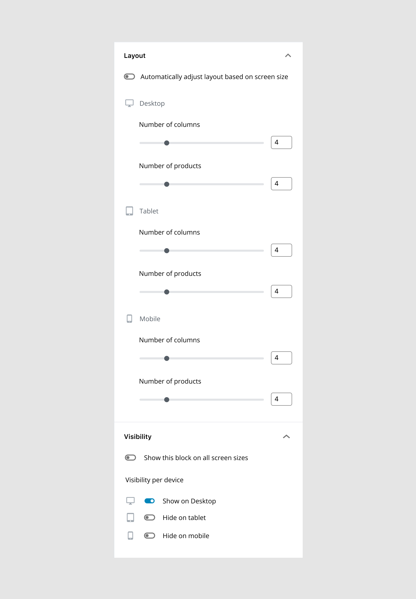
My only real concern is in the "complicated example" shared. This is where I feel the design doesn't work as well. Once there are two things that require responsive controls (ie. columns & number of products), all those icons and labels become a lot for me to parse. On the good side, it's structured well enough that I'm still able to parse it. 😉
mapk
on 14 Feb 2019
My only real concern is in the "complicated example" shared. This is where I feel the design doesn't work as well. Once there are two things that require responsive controls (ie. columns & number of products), all those icons and labels become a lot for me to parse.
I fully agree there. On previous expirations that didn't have labels, I felt that these were still mostly digestible:

... but the new version is pretty hard to scan when it gets complicated. One possible way to improve this would be to adopt adopt the following ideas:
- Recommend consolidating multiple controls under the same device section (as shown in the Layout section below).
- Eliminate device labels when the control's label can state the device name instead (as shown in the Visibility section below).
The first one I feel good about. Not so sure about the second, as I think it'd be hard to nail down best practices around it.
kjellr
on 14 Feb 2019
I'd recommend to think in terms of semantics first, and then design around the required semantics.
Each input needs to be labelled in a meaningful and _unique_ way. Those text label will be <label> elements associated with the sliders and the number fields. As a user of assistive technologies, how am I supposed to distinguish multiple fields all labelled with the same text?
For example:
- as a screen reader user, tabbing to the various number fields I'll hear "Number of columns" for multiple fields without a clue what they refer to (desktop, mobile?)
- as a speech input user, voicing a command "Click Number of columns" will confuse the voice recognition software I'm using, as it won't be able to distinguish between fields with the same name
There are workarounds users can use but forcing them to explore what is around the fields or to use alternative methods to navigate content is less than ideal.
All these labels need to give better context and need to be unique for each field.
This interface is complicated, I'd recommend to explore a way to radically simplify it. For example:
- I'm not sure what is the value added by the sliders, other than their "prettiness": they're difficult to use even with a mouse, they take a lot of space, and there are already input fields
- not sure the device icons are really necessary: removing them could save some space
Glad to see the "Auto" and "Manual" buttons are gone in the last prototype and they've been replaced with toggles (although toggles have their own problems). Thank you.
afercia
on 14 Feb 2019
So the Visibility settings is to hide the entire block for certain devices? Would this be added as an option for every block? Buttons, Paragraphs, Separator , etc?
I'm not a fan of the practice personally but I suppose there are still use cases that can't get around it.
Are there enough use cases though? Or are we assuming that other page builders do it so it must be needed?
m-e-h
on 14 Feb 2019
So the Visibility settings is to hide the entire block for certain devices? Would this be added as an option for every block? Buttons, Paragraphs, Separator , etc?
Oh, sorry for the confusion there: That's just an example of stress-testing this pattern for different circumstances (it was raised in the context of a 3rd party Products block above). We won't be adding that to any core blocks.
kjellr
on 14 Feb 2019
Thanks for the input, @afercia! I appreciate your feedback here.
As a user of assistive technologies, how am I supposed to distinguish multiple fields all labelled with the same text?
My thought was that the parent header for each of those sections (Desktop, Tablet, Mobile, etc) would be the key to telling them apart, but I'd been anticipating that from the perspective of someone tabbing through the controls. If someone were instead using voiceover (for instance) and tapped directly onto one of the child controls, I can see how that'd be confusing.
It sounds like we'd be best served by having each label be distinct and clear. I don't know that this is the right solution, but for illustration purposes, is something like this what you're suggesting from a labels perspective?

- I'm not sure what is the value added by the sliders, other than their "prettiness": they're difficult to use even with a mouse, they take a lot of space, and there are already input fields
In this case, we're just reusing the slider control that's used on the default state of the block. If we were going to remove the slider, I'd imagine we'd want to do so for both the "Auto" responsive settings and for the manual per-device settings. But that seems like it's the start of a larger discussion around the usefulness of sliders in general, and I'm not sure this ticket is the right venue to address that in.
In any case — this is meant to start defining a reusable pattern for responsive block settings, so while removing the slider may help us in this case, there are likely other situations where the slider would still be used.
- not sure the device icons are really necessary: removing them could save some space
I'd prefer to keep the icons in, as I think they're a helpful visual reference point. Especially with the indented fields in my latest comps, the icons stand out as quick visual markers in a sea of text and controls. This benefit will be strengthened even more if we end up adding more text to the labels.
kjellr
on 14 Feb 2019
@afercia
I'd recommend to think in terms of semantics first, and then design around the required semantics.
If the HTML was written accordingly using fieldset, legend and so on, would @kjell's layout work with screenreaders? I believe the fieldset grouping makes sense in this case. This is new to me, so I could be wrong.

mapk
on 15 Feb 2019
It sounds like we'd be best served by having each label be distinct and clear.
@kjellr yes :) I'd consider to have each label giving context as in your example. That's simpler and more understandable. Maybe a slightly shorter wording might help. For example, is "Number of" really needed? I'd say also visually there's a lot to process and maybe simplifying things might help a bit.
@mapk yep, I've considered that. fieldset and legend are the right way to group together a set of controls and give the group a name. It's a matter of actual support though, and would need to be tested. It works pretty well with groups of radio buttons or checkboxes. I don't know if it works well with range and number inputs.
The RangeControl component has one more issue: the same label value is used for both the range and the number inputs. Thus, the range and the number input have the same accessible name. Not ideal. Will propose to discuss later today during the accessibility team meeting (everybody's welcome to join).
afercia
on 15 Feb 2019
same label value is used for both the range and the number inputs
I'm hoping to change that with https://github.com/WordPress/gutenberg/pull/13863 @afercia
m-e-h
on 15 Feb 2019
Thanks @m-e-h! I've quickly commented there.
afercia
on 15 Feb 2019
@kjellr yes :) I'd consider to have each label giving context as in your example. That's simpler and more understandable. Maybe a slightly shorter wording might help. For example, is "Number of" really needed? I'd say also visually there's a lot to process and maybe simplifying things might help a bit.
Thanks, @afercia. Here's a mockup of that:

The "Columns on" part of the field label seems a little repetitive after the "Number of Columns" label to me. But I think it's workable.
yep, I've considered that.
fieldsetandlegendare the right way to group together a set of controls and give the group a name. It's a matter of actual support though, and would need to be tested. It works pretty well with groups of radio buttons or checkboxes. I don't know if it works well withrangeandnumberinputs.
How can we verify whether it works with range and number inputs? If this labeling issue is covered already this way, I'd prefer to keep the individual field labels more concise.
kjellr
on 18 Feb 2019
I think the "Columns", "Items", etc. part is helpful with the device type in each field label, like you have it in that most recent mock-up.
In addition to the voice-over scenario you mentioned earlier, I can imagine it being convenient if, for example, I'm on landscape mobile and the parent heading isn't in view.
Also, the device type names would be all singular or all plural. I know they're mock-ups. Just sayin :smiley:
m-e-h
on 18 Feb 2019
Also, the device type names would be all singular or all plural. I know they're mock-ups. Just sayin 😃
Updated above.
kjellr
on 18 Feb 2019
What about the back-end of this very interesting idea? Has anyone come up with any approach to work with it? Will there be something like objects or even multiple individual properties storing all the values needed?
 rodrigodagostino
on 15 Mar 2019
rodrigodagostino
on 15 Mar 2019
In regards to that last mockup, @kjellr, the accordion title of "Columns" seems redundant with the heading "Number of columns" and the continued reading of "columns on desktops" or "columns on tablets" etc. The word "columns" appears a lot.
Would a11y needs still be met if the heading "Number of columns" was a legend in a fieldset? Then that should indicate that the grouped items in that fieldset all relate back to the "Number of columns" right? So the input labels could just be "Desktop", "Tablet", and "Mobile".
mapk
on 15 Mar 2019
Fieldset and legend: as commented previously, that would need to be tested:
@mapk yep, I've considered that. fieldset and legend are the right way to group together a set of controls and give the group a name. It's a matter of actual support though, and would need to be tested. It works pretty well with groups of radio buttons or checkboxes. I don't know if it works well with range and number inputs.
afercia
on 16 Mar 2019
Based on my comment above, maybe something like below? I've also included the markup. @kjellr, what do you think?

mapk
on 26 Mar 2019
@mapk The sliders should probably be removed since they're not very useful in the context of a coarse control like column count.
ZebulanStanphill
on 26 Mar 2019
I've been thinking the same thing as @ZebulanStanphill
Range inputs work well for things like volume controls or in our image overlay opacity where you get an idea of the result by just looking at the slider. _25%, 50%, 100%_
Because this kind of widget is imprecise, it shouldn't typically be used unless the control's exact value isn't important.
I suppose tickmarks might make it more useful but still, why offer 2 methods for adjusting columns?
m-e-h
on 26 Mar 2019
If using number inputs only, you'd free up some space to use the input and label in context.
[4] columns on desktops
[2] columns on tablets
[1] column on mobile devices
Hi all! With regards to responsive visibility, I have this feature on my EditorsKit plugin ( previously Block Options ). Here's how the features work :
https://www.youtube.com/watch?v=1VuBXAUqTjA

Hope you'll love it! Cheers!
 phpbits
on 27 Apr 2019
phpbits
on 27 Apr 2019
Thanks @phpbits! I appreciate your exploration there, however I think the "on/off" states are too difficult to discern in this case. Something like a toggle control or checkbox in that case might work better?
The sliders should probably be removed since they're not very useful in the context of a coarse control like column count.
Thanks @ZebulanStanphill. @afercia also mentioned this above too. I'm open to another design iteration that explores this. @kjellr any thoughts?
Also let's get this thing past design and begin on a PR for it. I think we can test in the plugin better with actual users.
mapk
on 7 Jun 2019
Thanks @phpbits! I appreciate your exploration there, however I think the "on/off" states are too difficult to discern in this case. Something like a toggle control or checkbox in that case might work better?
@mapk I thought of that too but it takes a lot of space and having these checkboxes below the blocks with plethora options doesn't feel so good. I had that checkboxes on the previous version though. But I think you'll do it better than what I did, having the design team and accessibility checks. I'll just contribute on whatever I can :) Thanks!
phpbits
on 7 Jun 2019
I think the range inputs are nice as they provide a clear(er) visual indication of min/max values.
jameskoster
on 18 Jun 2019
The sliders should probably be removed since they're not very useful in the context of a coarse control like column count.
Thanks @ZebulanStanphill. @afercia also mentioned this above too. I'm open to another design iteration that explores this. @kjellr any thoughts?
This could definitely be changed, but I'm not sure it needs too be done here in this ticket, as those sliders exist whether or not responsive controls become a reality. There's another ticket focused on exploring/auditing sliders. In the meantime, I think it makes sense to just focus this thread on getting a responsive controls solution that works with sliders and without, so that it can expand beyond just the columns block.
kjellr
on 19 Jun 2019
I read almost all comments here, but any one thought about using the device visibility as a function for not loading the content in the front-end and not just using display:none, because i always get some crazy designer that does want to hide many images on the front mobile but does not matter if the images are still loaded anyways... so i do create ACF stuff to prevent that...
 feperrella
on 20 Jun 2019
feperrella
on 20 Jun 2019
In the context of adjusting columns, I personally find the sliders wonderful to use, because they allow me to simply click/drag and quickly see all the result of all the values for that setting. This is based on previous experience with similar controls — obviously this one hasn't been built yet. If the setting was just an input field it would be tedious for me to edit and go evaluate each possible value. For each value, I would have to click into the input, backspace, type number, see result in the editor, and repeat.
Another benefit is that with sliders, if designed well (large thumb, tick marks, etc.), they can visually communicate a relative min/max of values.
I understand that I'm a mouse user, and that for other users sliders might not be ideal either. I hope that we can find a balance that works for as many users as possible.
 davewhitley
on 9 Jul 2019
davewhitley
on 9 Jul 2019
I've now merged:
These lay the foundations for enabling viewport specific controls for a given Block attribute such as padding.
 getdave
on 1 Nov 2019
getdave
on 1 Nov 2019
In #19909 I ticketed an alternative approach to responsive editing, which focuses on potentially making every existing block able to have responsive changes made, without additional code.
jasmussen
on 27 Jan 2020
Hand-in-glove with column width adjustments on mobile would be columnn order on mobile.
For example, on a full screen I set columns 1-2-3-4-5. When this converts responsively, I might want them to appear 5, 4, 3, 2, 1.
or 5-3, 1 (*don't display 2, 4).
Individual column controls _on Responsive_:
- Toggle show/hide
- Control widths
- Drop-down box for reordering
 Dani-Long
on 16 Apr 2020
Dani-Long
on 16 Apr 2020
For what it's worth - this is our latest iteration of custom style controls, first for a single block and then for a custom columns block


mattbolt
on 19 Apr 2020
LOVE IT!!!!!!!!!!!!!!
When? WHEN?!
Thanks for sharing that! I'm pumped!!!!!
Dani-Long
on 19 Apr 2020
This is what I've developed for my own custom blocks responsive controls:

@mattbolt is that a layout iteration is it actually being developed at the moment? If it's latter one, I would love to know how you sorted the media queries obstacle.
rodrigodagostino
on 19 Apr 2020
It's our second visual iteration of these tools. The original we developed in house just after Wordpress 5 was released end 2018 and has been in production use since January 2019 on several sites, but primarily www.minderoo.org.
As for media queries, all our blocks are supported by a server side render component. Before we call $content = apply_filters('the_content', $post->post_content); we flush any current registered styles. Then during the render process, each block registers any uniquely applied styles and receives a unique id it includes in the block's css classes.
After calling the_content, we "render" the unique styles to a variable. This is a function call that generates the 'media queried' css and inserts it into the
get_header() process.
FWIW ... Our blocks are all developed using mobile first ideology.
mattbolt
on 20 Apr 2020
That was a very thorough explanation, @mattbolt Thank you for taking the time to explain it to me :) Sounds a bit beyond my capabilities, but it would be interesting to take a closer look to it and see what's under the hood.
Thank you again, Matt :)
rodrigodagostino
on 20 Apr 2020
This is a buttons block. Look at all the whitespace around it - particularly above and below.

Dani-Long
on 28 Apr 2020
The auto/0 margins for block elements would translate into alignment.
E.g. ´margin-left: auto; margin-right: 0;` would push a block element onto the right side.
How can the block alignment options (as left/right) be reconciled with margin-specific alignment?
 strarsis
on 30 Jul 2020
strarsis
on 30 Jul 2020
Taking a step back, my 2c:
I find the whole Desktop/Tablet/Mobile distinction a bit arbitrary and not future-proof... If history has taught us anything is that devices change fast, and what we consider today as the norm, is fleeting at best.
Why not smartwatch, smart-TV, glasses or whatever other device has access to the web? What constitutes a desktop? What differentiates a 12-inch laptop from a 13-inch tablet? Because if we're talking about screen-resolution, a 7-inch phone can have bigger resolution than a 50-inch TV.
And why 2 breakpoints (mobile/tablet, tablet/desktop) and not just 1 (small/large)?
Instead of building something that strives to be pixel-perfect, should we perhaps shift perspectives a bit and try to build something that is pixel-agnostic?
Instead of having arbitrary breakpoints, should we instead just try to detect when the content inside a column for example stops being readable, and collapse them to something that makes sense?
 aristath
on 17 Aug 2020
aristath
on 17 Aug 2020
While the mockups shown in #19909 are very out of date, the primary goal of that ticket is to explore a _global and extensible_ interface for responsive breakpoint editing. Which, if done right, lets us avoid the situation where you edit mobile properties of a columns block in an editor that looks like a desktop breakpoint. Inversely, by making a connection between the editor view mode and responsive properties, we can do the inverse, allow editing of desktop breakpoints even when on a mobile device, all the while showing a better visual representation of each responsive breakpoint.
jasmussen
on 24 Aug 2020
Related issues
jasmussen
·
3Comments
 pfefferle
·
3Comments
pfefferle
·
3Comments
 youknowriad
·
3Comments
youknowriad
·
3Comments
 hedgefield
·
3Comments
hedgefield
·
3Comments
 spocke
·
3Comments
spocke
·
3Comments
Most helpful comment
A small followup to the mockup I posted yesterday:
🖥 Desktop Prototype
📱 Mobile Prototype
After taking through it with @jasmussen and some other folks, I tried using a ButtonGroup instead of a Toggle, alongside some (hopefully) clearer copy. Changing the formatting and copy this way allows us to more naturally place the control on top of the columns control. That feels a lot more expected hierarchically.
One thing I really like about this approach is that it sets the precedent that, these controls should be handled by the block by default. Block designers will have infinitely more control than users will, since they'll be able to define their own breakpoints. Block designers will also have a lot more experience with responsive design than many users, and should be able to apply best practices here.
Also, if a user switched to manual, made a bunch of adjustments to breakpoint settings, and messed things up, the "Auto" option is a quick escape hatch for them.
There are still some weird things to sort out here (for instance, who chooses these exact breakpoints?). But this seems like the sort of setting that may be able to scale to more complicated setups, and I think we're getting closer.