Microsoft-ui-xaml: A more flexible ScrollViewer
Proposal: ScrollViewer
Summary
tl:dr; Provide a flexible, yet easy-to-use, scrolling and zooming control in XAML that can still be leveraged when targeting downlevel releases of Win10.
The ScrollViewer control plays a critical role in any UI because of how fundamental scrolling is for applications and controls (platform and non-platform alike). The control provides panning and zooming capabilities along with default policies and UX (e.g. conscious scroll bars, focus/keyboard interaction, accessibility, default scroll animation, etc). It must also be flexible enough that it can go from making everyday app scenarios easy to being a key component in scroll-based controls and servicing very advanced use cases. The current control does not provide this level of flexibility.
Rationale
Bringing the ScrollViewer control to the repo in a way that is layered over the core platform's public APIs is an important stepping stone that:
- enables lifting more controls into the repo (increased agility),
- gives developers an easy-to-use control that surfaces the flexibility of the lower-level platform capabilities combined with the benefit of the higher-level framework services (e.g. accessibility), and
- enables newer scrolling-related features in XAML to light up on earlier versions of Win10.
The existing control was authored in Win8 based on the DirectManipulation APIs which 1) are not available to use directly within UWP, 2) do not allow the level of customization that developers have come to expect to create unique scrolling experiences, and 3) are superceded by UWP's newer InteractionTracker APIs.
Extracting the existing ScrollViewer control as-is would be a non-starter. The control must instead be a re-implementation with a near identical API surface based on the newer (and already available) capabilities of InteractionTracker.
High-level Plan
The existing ScrollViewer in the _Windows_.UI.Xaml.Controls namespace will remain untouched (other than fixing critical bugs).
The new ScrollViewer will live in the _Microsoft_.UI.Xaml.Controls namespace. It's API will be mostly identical to the _Windows_ version. We will make targeted adjustments to the control's API where there is clear benefit (simplify a common scenario, introduce new capabilities, etc).
In combination with the new ScrollViewer we will introduce a new type, Scroller, that will live in the Microsoft.UI.Xaml.Controls._Primitives_ namespace. The Scroller will provide the core functionality for scrolling and zooming in XAML based on the capabilities of InteractionTracker.
The initial goal for both controls will be on getting core functionality to ship quality to be part of the next official release. Non-finalized APIs will remain in 'preview' and only be available as part of the pre-release packages.
Functional Requirements
| # | Feature | | Priority |
|:-:|:--|-|:-:|
| 1 | Provides a _non-sealed_, panning and zooming control with a default UX matching the existing ScrollViewer. || Must |
| 2 | Demonstrates platform capabilites by relying solely on public, platform-supported APIs. || Must |
| 3 | Integrates with framework-level XAML services.
For example:
- correctly renders system focus rects
- automatically brings focused elements into view (keyboard, GamePad, screen readers)
- participates in effective viewport changes
- supports scroll anchoring || Must|
| 4 | Able to perform input-driven animations || Must |
| 5 | Can be used in combination with existing scroll-dependent controls already in the repo (i.e. ParallaxView, RefreshContainer, SwipeControl). || Must |
| 6 | Able to control the curve for inertial view changes (i.e. custom animated scrolling or zooming). || Must |
| 7 | Able to change the view based on absolute or relative offsets (e.g. scroll to a point of interest) || Must |
| 8 | Able to change the view based on an impulse / additional velocity (e.g. automatic smooth scrolling during drag-and-drop or multi-select via a mouse selection rectangle) || Must |
| 9 | Able to detect overpan and by how much || Must |
| 10 | Able to observe and react to changes in the state of scrolling || Must |
| 11 | Support for scrolling and zooming snap points. || Should |
| 12 | Able to use a custom "scroll bar" control to drive scrolling (e.g. photos timeline scrubber). || Should |
| 13 | Able to easily configure the control to ignore specific input kinds (e.g. respond to touch or pen, but ignore mouse wheel input). || Should |
| 14 | Able to save and restore the scroll position (e.g. in a virtualizing list) || Should |
| 15 | Support for sticky headers / elements. || Should |
| 16 | Support for accelerated scrolling when a user makes repeated gestures in quick succession. || Should |
| 17 | Provide a default UX to support a mouse middle click and scroll. |  | Should |
| 18 | Support a mode to click and pan via mouse (e.g. moving content inside a PDF viewer). |  | Should |
| 19 | Able to use a custom control to drive zooming (e.g. a zoom slider). || Should |
| 20 | Able to print content contained in the scrollable area. || Should |
| 21 | Support rotation gestures. || Could |
| 22 | Able to synchronize two or more areas with flicker- and jank-free scrolling (e.g. a text diff scenario). || Could |
| 23 | Able to customize the animation curve for input-driven view changes (i.e. define finger down behaviors such as gravity wells). || Could |
| 24 | Support a scroll-to-top or bottom gesture. || Could |
| 25 | Able to disable overpanning. || Could |
| 26 | Able to selectively manipulate content within the ScrollViewer based on a UIElement's ManipulationMode property. || Could |
| 27 | Able to turn off inertia and/or bouncing from inertia. || Could|
| 28 | Able to disable clipping the content (i.e. CanContentRenderOutsideBounds). || Could |
| 29 | Able to determine the completion reason at the end of a view change. || Could |
Terminology
- _Overpan_ is when the user attempts to pan or zoom beyond the size of the content and results in the elastic / rubber band effect.
- _Railing_ is when the scroller automatically locks movement to a "preferred" axis based on the direction of the initial gesture.
- _Chaining_ is when there is a scrollabe surface nested inside another and when the scrolling movement of the inner reaches its extent it is promoted to continue on the outer one.
- _Snap points_ are locations within the scrollable content where the viewport will come to rest at the end of inertial scrolling (i.e. an animated scroll after the user lifted their finger). Snap points are required for a control like FlipView.
- _Scroll anchoring_ is where the viewport automatically shifts to maintain the relative position of visible content. It prevents users from being impacted by sudden shifts in the position or size of the content due to layout (i.e. the user is reading an article and a few moments later everything jumps down because an image/ad at the top of the article finally loaded). Scroll anchoring is a necessity for UI virtualization when dealing with variable-sized content.
- _Gravity wells_ are locations within the scrollable content that affect the scrolling behavior while the user is manipulating the content (i.e. the user's finger is down). For example, gravity wells could be used to alter the perceived friction of scrolling where the movement appears to slow down or speed up as the user actively pans or zooms.
Usage Examples
Foreword
By default the ScrollViewer supports panning over its content when the size of the content is larger than its viewport. The size of the content is determined by XAML's layout system.
The examples here are intended to highlight the main API difference between the current ScrollViewer and the new ScrollViewer.
Vertical Scrolling (No difference)
The width of the content is automatically constrained to be the same as the viewport. The height is unconstrained. If it exceeds the height of the viewport then the user can pan via various input modalities.
<ScrollViewer Width="500" Height="400">
    <ItemsRepeater ItemsSource="{x:Bind ViewModel.Items}" ItemTemplate="{StaticResource MyTemplate}"/>
</ScrollViewer>
Horizontal Scrolling
This is an intentional departure from the existing ScrollViewer which previously required changing the HorizontalScrollBarVisibility. It has confused many developers.
<ScrollViewer Width="500" Height="400" ContentOrientation="Horizontal">
    <StackPanel Orientation="Horizontal">
        <!-- ... -->
    </StackPanel>
</ScrollViewer>
Horizontal-only scrolling is enabled by setting the _ContentOrientation_ property. It determines what constraints are used on the content during layout. A value of Horizontal implies that the content is unconstrained horizontally (allowed infinite size) and vertically constrained to match the viewport. Similarly, Vertical (the default) implies its unconstrained vertically and constrained horizontally.
Scrolling a Large Image
A ContentOrientation of _Both_ implies the content is unconstrained both horizontally and vertically.
<ScrollViewer Width="500" Height="400" ContentOrientation="Both">
    <Image Source="Assets/LargeEiffelTower.png"/>
</ScrollViewer>
Changing the ScrollBar Visibility
This example always hides both scrollbars. The user can still pan the content in either direction.
<ScrollViewer Width="500" Height="400"
              ContentOrientation="Both"
              HorizontalScrollBarVisibility="Hidden"
              VerticalScrollBarVisibility="Hidden">
    <Image Source="Assets/LargeEiffelTower.png"/>
</ScrollViewer>

Turning off built-in support for specific kinds of input
In this example a developer is creating a canvas-based app that will perform custom processing on mouse wheel input and support a lasso selection experience via Pen. It can configure the ScrollViewer to ignore those input kinds while still accepting others such as Touch.
<ScrollViewer IgnoredInputKind="MouseWheel,Pen"
              Width="500" Height="400"
              ContentOrientation="Both" >
    <SwapChainPanel x:Name="swapChainPanel" Width="40000" Height="40000">
        ...
    </SwapChainPanel>
</ScrollViewer>
Customize the animation of a programmatic scroll
The developer listens to a Slider's ValueChanged event and animates a ScrollViewer's VerticalOffset using a custom duration on the default animation.
private void VerticalOffsetSlider_ValueChanged(
    object sender,
    RangeBaseValueChangedEventArgs e)
{
    double verticalOffsetDelta = GetOffsetDelta();
    TimeSpan animationDuration = GetCustomAnimationDuration();

    // Initiate the scroll and enqueue the ScrollInfo we'll use to identify related events
    ScrollInfo scrollInfo = _scrollViewer.ScrollBy(0.0, verticalOffsetDelta);
    _myScrollRequests.Add(new MyScrollRequest(scrollInfo, animationDuration));
}

// Listen to the ScrollViewer's ScrollAnimationStarting event and customize
// the default animation
private void ScrollViewer_ScrollAnimationStarting(
    ScrollViewer scrollViewer,
    ScrollAnimationStartingEventArgs e)
{
    MyScrollRequest myScrollRequest = _myScrollRequests.FindRequest(e.ScrollInfo);
    e.Animation.Duration = myScrollRequest.AnimationDuration;
}

// Dequeue the ScrollInfo once the action completes
private void ScrollViewer_ScrollCompleted(
    ScrollViewer scrollViewer,
    ScrollCompletedEventArgs e)
{
    _myScrollRequests.RemoveRequest(e.ScrollInfo);
}
Detailed Feature Design
High-policy and Low-policy Scrolling
Scroller (low-policy)
The Scroller is a chrome-less, low-level building block that provides all the essential panning and zooming logic. It wraps the platform's even lower-policy InteractionTracker as a XAML markup-friendly element.
In a very literal way the Scroller is "the viewport" for ScrollViewer and takes the place of the ScrollContentPresenter. However, the Scroller, unlike the ScrollContentPresenter, does much more than simply clipping its content.
Scroller provides the flexibility of using InteractionTracker directly along with the following advantages:
- Accessibility support
- Markup-friendly syntax and easy-to-use API
- Integration with XAML's layout system and virtualization capabilities
ScrollViewer (high-policy)
The new ScrollViewer wraps the Scroller and sets its properties to common values. For example, a <ScrollViewer/> configures its Scroller to support both horizontal and vertical scrolling interactions, but constrain the width of its content such that the default user experience appears to be vertical-only scrolling (the common case).
ScrollViewer provides the following advantages over using a Scroller:
- A default UX (e.g. the scroll indicator, conscious scrollbars for mouse, a default animation curve)
- Default support for UI-thread bound input not handled by Scroller/InteractionTracker (i.e. keyboard and GamePad)
- Default focus movement for GamePad (page up/down and automatically set focus in response to the triggers)
- Default awareness of the user's system settings (e.g. automatically hide scroll bars in Windows)
- (Future) Easy configuration options for snap points
- (Future) Support for more mouse panning modes (e.g. click-and-drag content with an open/close hand, mouse panning via mouse wheel / middle button click showing a "compass" cursor)
Which one to use?
The default choice for apps and many control authors should be to use the ScrollViewer. It provides greater ease-of-use and a default UX that is consistent with the platform. The Scroller is appropriate when the default UX / policies are not required - for example, creating an improved FlipView control or a chrome-less scrolling surface.
ScrollViewer-only APIs
HorizontalScrollBarVisibility / VerticalScrollBarVisibility
The default value for both horizontal and vertical scroll bars is _Auto_. They are automatically shown or hidden based on whether the content is wider/taller than the viewport or not.
The 'Disabled' option will not exist in the enum options available for the new ScrollViewer. Instead, configuring the control to respond to user interactions that pan horizontally or vertically will be based solely on the _HorizontalScrollMode_ and _VerticalScrollMode_ properties.
namespace Microsoft.UI.Xaml.Controls
{
    public enum ScrollBarVisibility
    {
        Auto = 0,    // Only visible when the ZoomFactor * content size > viewport
        Visible = 1, // Always visible
        Hidden = 2   // Always hidden
    }
}
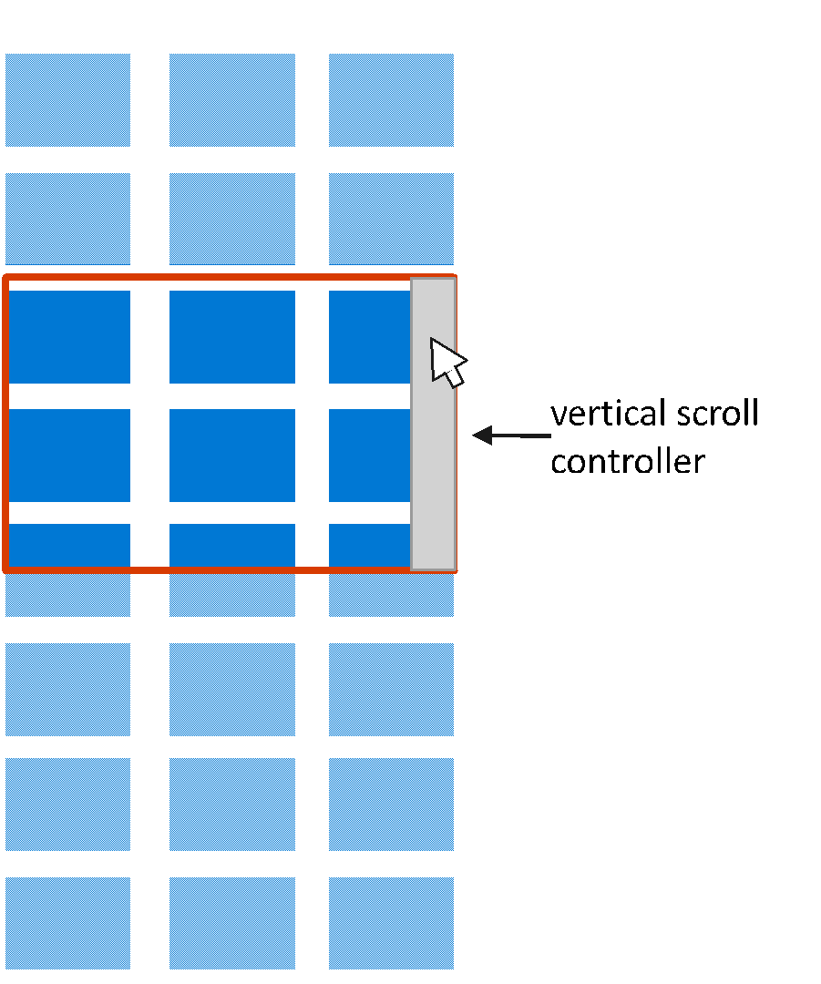
In the picture below the mouse cursor is over the vertical scroll bar. It is the only one visible because the content is the same width as the viewport.
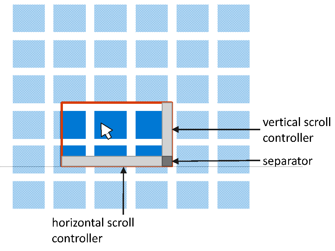
When the content is larger than the viewport in both dimensions then both conscious scroll bars can be seen as well as their separator in the bottom right corner.
Scroller-only APIs
HorizontalScrollController / VerticalScrollController
The Scroller can be connected to an interactive "widget" that controls scrolling by setting its _HorizontalScrollController_ and _VerticalScrollController_ to a type that implements an _IScrollController_ interface. ScrollBars are familiar examples of such widgets. The ScrollViewer supplies its Scroller with two such widgets. For example, a developer could create a custom IScrollController implementation that relies on a Composition.Visual for UI-thread independent input.
_scroller.HorizontalScrollController = new Acme.Slider(orientation: Orientation.Horizontal);
_scroller.VerticalScrollController = new Acme.Slider(orientation: Orientation.Vertical);
Downlevel Limitations of ScrollViewer / Scroller
The framework should have all the necessary hooks exposed to build a custom scrolling control as of the Windows 10 April 2018 Update. When targeting earlier releases there may be limitations:
| Release | Limitation | Reason |
|:-:|:--|:-:|
| Windows 10 Fall Creators Update (Build 16299) and earlier | Elements won't be automatically brought into view upon receiving focus. | UIElement's BringIntoViewRequested event is not available |
| | The control cannot participate in EffectiveViewportChanged events. System-rendered focus rects won't be clipped to the bounds of the viewport. | UIElement's RegisterAsScrollPort is not available |
Proposed API
ScrollViewer
```C#
public class Microsoft.UI.Xaml.Controls.ScrollViewer : Control
{
ScrollViewer();
// Default Value: non-null instance
Windows.UI.Composition.CompositionPropertySet ExpressionAnimationSources { get; }
/*
- Layout-centric Properties
*/
// Default Value: null
UIElement Content { get; set; };
// Default Value: Vertical
Microsoft.UI.Xaml.Controls.ContentOrientation ContentOrientation { get; set; };

// Default Value: 0.0
Double HorizontalOffset { get; };

// Default Value: 0.0
Double VerticalOffset { get; };

// Default Value: 1.0
Single ZoomFactor { get; };

// Default Value: 0.0
Double ExtentWidth { get; };

// Default Value: 0.0
Double ExtentHeight { get; };

// Default Value: 0.0
Double ViewportWidth { get; };

// Default Value: 0.0
Double ViewportHeight { get; };

// Default Value: 0.0
Double ScrollableWidth { get; };

// Default Value: 0.0
Double ScrollableHeight { get; };

// Default Value: Auto
M.UI.Xaml.Controls.ScrollBarVisibility HorizontalScrollBarVisibility {get;set;};

// Default Value: Auto
M.UI.Xaml.Controls.ScrollBarVisibility VerticalScrollBarVisibility {get;set;};

// Default Value: Collapsed
// Used for template binding the Visibility property of the horizontal
// ScrollBar in the control template
Visibility ComputedHorizontalScrollBarVisibility{ get; };

// Default Value: Collapsed
// Used for template binding the Visibility property of the vertical
// ScrollBar in the control template
Visibility ComputedVerticalScrollBarVisibility{ get; };
/*
- User Interaction-centric Properties
*/
// Default Value: Enabled
Microsoft.UI.Xaml.Controls.ScrollMode HorizontalScrollMode { get; set; };
// Default Value: Enabled
Microsoft.UI.Xaml.Controls.ScrollMode VerticalScrollMode { get; set; };

// Default Value: Disabled
Microsoft.UI.Xaml.Controls.ZoomMode ZoomMode { get; set; };

// Default Value: All
Microsoft.UI.Xaml.Controls.InputKind IgnoredInputKind { get; set; };

// Default Value: Idle
Microsoft.UI.Xaml.Controls.InteractionState State { get; };

// Default Value: Auto
Microsoft.UI.Xaml.Controls.ChainingMode HorizontalScrollChainingMode { get; set; };

// Default Value: Auto
Microsoft.UI.Xaml.Controls.ChainingMode VerticalScrollChainingMode { get; set; };

// Default Value: True
boolean IsHorizontalRailEnabled { get; set; };

// Default Value: True
boolean IsVerticalRailEnabled { get; set; };

// Default Value: Auto
Microsoft.UI.Xaml.Controls.ChainingMode ZoomChainingMode { get; set; };

// Default Value: None
M.UI.Xaml.Controls.SnapPointsType HorizontalSnapPointsType { get; set; };

// Default Value: None
M.UI.Xaml.Controls.SnapPointsType VerticalSnapPointsType { get; set; };

// Default Value: Near
M.UI.Xaml.C.Primitives.SnapPointsAlignment HorizontalSnapPointsAlignment { g;s; };

// Default Value: Near
M.UI.Xaml.C.Primitives.SnapPointsAlignment VerticalSnapPointsAlignment { g;s; };

// Default Value: 0.95, 0.95
Windows.Foundation.Numerics.Vector2 ScrollInertiaDecayRate { get; set; };

// Default Value: 0.95
Single ZoomInertiaDecayRate { get; set; };

// Default Value: 0.1
Double MinZoomFactor { get; set; };

// Default Value: 10.0
Double MaxZoomFactor { get; set; };

// Default Value: 0.0
Double HorizontalAnchorRatio { get; set; };

// Default Value: 0.0
Double VerticalAnchorRatio { get; set; };

// Forwarded to inner Scroller’s IScrollAnchorProvider implementation
// Default Value: null
Windows.UI.Xaml.UIElement CurrentAnchor { get; };
/*
- Methods
*/
// Asynchronously scrolls to specified offsets. Allows animation,
// respects snap points. Returns a ScrollInfo struct.
Microsoft.UI.Xaml.Controls.ScrollInfo ScrollTo(
double horizontalOffset,
double verticalOffset);
// Asynchronously scrolls to specified offsets with optional animation,
// with optional snap points respecting. Returns a ScrollInfo struct.
Microsoft.UI.Xaml.Controls.ScrollInfo ScrollTo(
    double horizontalOffset,
    double verticalOffset,
    Microsoft.UI.Xaml.Controls.ScrollOptions options);

// Asynchronously scrolls by the provided delta amount.
// Allows animation, respects snap points. Returns a ScrollInfo struct.
Microsoft.UI.Xaml.Controls.ScrollInfo ScrollBy(
    double horizontalOffsetDelta,
    double verticalOffsetDelta);

// Asynchronously scrolls by the provided delta amount with
// optional animation, with optional snap points respecting.
// Returns a ScrollInfo struct.
Microsoft.UI.Xaml.Controls.ScrollInfo ScrollBy(
    double horizontalOffsetDelta,
    double verticalOffsetDelta,
    Microsoft.UI.Xaml.Controls.ScrollOptions options);

// Asynchronously adds scrolling inertia. Returns a ScrollInfo struct.
Microsoft.UI.Xaml.Controls.ScrollInfo ScrollFrom(
    Vector2 offsetsVelocity,
    Nullable<Vector2> inertiaDecayRate);

// Asynchronously zooms to specified zoom factor. Allows animation
// (respects snap points in v2). Returns a ZoomInfo struct.
Microsoft.UI.Xaml.Controls.ZoomInfo ZoomTo(
    float zoomFactor,
    Nullable<Vector2> centerPoint);

// Asynchronously zooms to specified offsets with optional animation
// (with optional snap points respecting in v2). Returns a ZoomInfo struct.
Microsoft.UI.Xaml.Controls.ZoomInfo ZoomTo(
    float zoomFactor,
    Nullable<Vector2> centerPoint,
    Microsoft.UI.Xaml.Controls.ZoomOptions options);

// Asynchronously zooms by the provided delta amount. Allows animation
// (respects snap points in v2). Returns a ZoomInfo struct.
Microsoft.UI.Xaml.Controls.ZoomInfo ZoomBy(
    float zoomFactorDelta,
    Nullable<Vector2> centerPoint);

// Asynchronously zooms by the provided delta amount with optional animation
// (with optional snap points respecting in v2). Returns an ZoomInfo struct.
Microsoft.UI.Xaml.Controls.ZoomInfo ZoomBy(
    float zoomFactorDelta,
    Nullable<Vector2> centerPoint,
    Microsoft.UI.Xaml.Controls.ZoomOptions options);

// Asynchronously adds zooming inertia. Returns a ZoomInfo struct.
Microsoft.UI.Xaml.Controls.ZoomInfo ZoomFrom(
    float zoomFactorVelocity,
    Nullable<Vector2> centerPoint,
    Nullable<float> inertiaDecayRate);
/*
- Forwarded to inner Scroller’s IScrollAnchorProvider implementation
*/
void RegisterAnchorCandidate(UIElement element);
void UnregisterAnchorCandidate(UIElement element);
/*
- Events
*/
// Raised whenever any of the HorizontalOffset, VerticalOffset and ZoomFactor
// dependency property changed.
event TypedEventHandler
// Raised when any of the ExtentWidth and ExtentHeight dependency property changed.
event TypedEventHandler<ScrollViewer, Object> ExtentChanged;

// Raised when the State dependency property changed.
event TypedEventHandler<ScrollViewer, Object> StateChanged;

// Raised when a ScrollTo or ScrollBy call triggers an animation.
// Allows customization of that animation.
event TypedEventHandler<ScrollViewer, Microsoft.UI.Xaml.Controls.ScrollAnimationStartingEventArgs>
    ScrollAnimationStarting;

// Raised when a ZoomTo or ZoomBy call triggers an animation.
// Allows customization of that animation.
event TypedEventHandler
    <ScrollViewer, Microsoft.UI.Xaml.Controls.ZoomAnimationStartingEventArgs>
    ZoomAnimationStarting;

// Raised at the end of a ScrollTo, ScrollBy, or ScrollFrom asynchronous
// operation. Provides the original ScrollInfo struct.
event TypedEventHandler
    <ScrollViewer, Microsoft.UI.Xaml.Controls.ScrollCompletedEventArgs>
    ScrollCompleted;

// Raised at the end of a ZoomTo, ZoomBy, or ZoomFrom asynchronous operation.
// Provides the original ZoomInfo struct.
event TypedEventHandler
    <ScrollViewer, Microsoft.UI.Xaml.Controls.ZoomCompletedEventArgs>
    ZoomCompleted;

// Raised at the beginning of a bring-into-view-request participation.
// Allows customization of that participation.
event TypedEventHandler
    <ScrollViewer, Microsoft.UI.Xaml.Controls.BringingIntoViewEventArgs>
    BringingIntoView;

// Raised to allow the listener to pick an anchor element, when anchoring
// is turned on.
event TypedEventHandler
    <ScrollViewer, Microsoft.UI.Xaml.Controls.AnchorRequestedEventArgs>
    AnchorRequested;
/*
- Dependency Properties
*/
static DependencyProperty ContentProperty { get; };
static DependencyProperty ContentOrientationProperty { get; };
static DependencyProperty ComputedHorizontalScrollBarVisibilityProperty { get; };
static DependencyProperty ComputedVerticalScrollBarVisibilityProperty { get; };
static DependencyProperty HorizontalScrollBarVisibilityProperty { get; };
static DependencyProperty VerticalScrollBarVisibilityProperty { get; };
static DependencyProperty IgnoredInputKindProperty { get; };
static DependencyProperty HorizontalScrollModeProperty { get; };
static DependencyProperty VerticalScrollModeProperty { get; };
static DependencyProperty ZoomModeProperty { get; };
static DependencyProperty HorizontalScrollChainingModeProperty {g};
static DependencyProperty VerticalScrollChainingModeProperty {g};
static DependencyProperty IsHorizontalRailEnabledProperty {g};
static DependencyProperty IsVerticalRailEnabledProperty {g};
static DependencyProperty ZoomChainingModeProperty { get; };
static DependencyProperty MinZoomFactorProperty { get; };
static DependencyProperty MaxZoomFactorProperty { get; };
static DependencyProperty HorizontalAnchorRatioProperty { get; };
static DependencyProperty VerticalAnchorRatioProperty { get; };
}
```
Open Questions
- Would having a ContentOrientation property (or one by a different name) that affects how layout constraints are applied to the content make things more complicated or easier?
- Should the zooming-related APIs be separated into a derived control (e.g. ZoomViewer) such that ScrollViewer is strictly about scrolling?
 micahl
All 61 comments
In my mind, the need to have content that can be scrolled and content that can be zoomed is very different. I understand that when content is zoomed it often also needs to be scrolled, but I'm curious if there was any consideration to making these separate controls? Possibly with a zoomable control extending from a scrolling one.
My concerns are: 1) the ScrollViewer being made overly complex by adding zooming related functionality which will not be needed by most; 2) it not being obvious to someone looking for a control for zooming into content that the ScrollViewer supports this.
Additionally, within the proposal, I'd like to see the ability to scroll to a specific element within the scroll viewer. In theory, this could be done by a developer by measuring all the items before it and then scrolling to the appropriate offset, but this can be difficult to do with virtualized lists and is (to my mind) a common enough scenario that many apps (and developers) would benefit from this being built-in.
Consider where an item is added to a "list" and the developer wants to ensure that item is visible. Or consider a page with a master/detail view where the page is opened at a detail item way down the list, but the developer wants to ensure the selected item in the master list is displayed, so it provides context for what is shown in the detail view.
Similarly, it would also be useful to be able to ensure that an item stays in the visible area while other items within the scrollable areas are removed from (or added to) the visual tree. I'm not sure what the best way to do this would be, but it's very bad when the selected item within a scrollable area moves because a background (or off-UI thread) action removes or adds other items to the scrollable area.
Having an item move as you go to click/tap on it leads to a terrible usability experience. Having focused/selected items move out of the visible area can also cause issues for accessibility tools and screen readers.
I'm aware there are potential issues with trying to keep an item in the same position while those around it move (especially if that item is deleted from elsewhere) but doing nothing doesn't seem good enough.
 mrlacey
on 19 Dec 2018
mrlacey
on 19 Dec 2018
Thanks @mrlacey. I can see how zooming functionality would be less discoverable in the existing ScrollViewer as well as this proposal. I've added this as an open question for discussion as it would be another point of departure from the existing UWP ScrollViewer (perhaps for the better?).
Virtualization makes things tricky since first the specific element might need to be created and run through the layout system to have a position to which you can then scroll. This is why in the past certain controls (i.e. ListView) have had their own ScrollIntoView method that handles the above to make it easy. Is that the type of method you're envisioning? Alternatively, every UIElement has a StartBringIntoView method that can be used to very easily scroll to an item and has a number of options to provide fine-grained control over where in the viewport it lands when brought into view. The StartBringIntoView approach works even in scenarios with nested scrolling surfaces since it generates a request that bubbles up for each scrolling control to respond. This is essentially what happens when an item receives keyboard/GamePad/Narrator focus. Of course, it requires that you first have a UIElement which you may not in a virtualizing scenario without a way to explicitly trigger an element to be realized. Would it be useful to have a way to explicitly trigger the realization of an element? Among other things you could then use it to trigger a StartBringIntoView.
Re: maintaining the position of an item as other content is added/removed or changes in size... Totally agree that doing nothing isn't good enough. This is exactly why the scroll anchoring feature exists. :) It's a little-known capability that in the past has been built-in to the virtualizing Panels for ListView/GridView. In recent releases we've been making an explicit effort to decouple things like this from only being available in ListView.
micahl
on 19 Dec 2018
If the idea of an expanded ScrollViewer is to be explored, perhaps the Fluent Design teams could advise you about handling parallax and items with z-depth values set by default.
As XAML moves into 3D representations for MR apps, and as Depth and Shadows come to 2D XAML - how the scrolling would move items of different depth values, how the shadows may render above or behind the scroll indicators, and other issues that may crop up in the XAML team's 3D experiments - could be built into what could become the new default, as Windows UI Library slowly becomes the new default.
 mdtauk
on 20 Dec 2018
mdtauk
on 20 Dec 2018
In my mind, the need to have content that can be scrolled and content that can be zoomed is very different.
Except in web browsers, graphics design apps, office apps, PDF viewers..... anything that shows a content document.
 adrientetar
on 20 Dec 2018
adrientetar
on 20 Dec 2018
Agree with @mrlacey that bringing a specific element into view is important as well as specifying where in the view it is displayed (top, center, bottom, etc...). There also needs to be a way to detect if the element is entirely in view or clipped. This way I don't have to scroll the view to show an element if I know the element is already entirely or even partially in view.
 michael-hawker
on 20 Dec 2018
michael-hawker
on 20 Dec 2018
Thanks all! We gathered some telemetry regarding which properties apps tend to set in their markup and the ZoomMode shows up right after the *ScrollMode and *ScrollBarVisibility. Most of the time apps aren't changing any properties. What I've observed when the ScrollMode and ScrollBarVisibility properties are being set is that its often to enable horizontal scrolling on the content. The introduction of the ContentOrientation property is intended to make that easier. After horizontal scrollling, the next most common scenario is zooming.
Rather than introducing a separate (derived) control to address discoverability of zooming I believe the right documentation / samples could be more effective.
micahl
on 11 Jan 2019
What about adding a Behaviour or Context Enum?
ScrollViewer.ScrollBehaviour = ScrollBehaviour.Zoom;
ScrollViewer.ScrollBehaviour = ScrollBehaviour.Scroll;
ScrollViewer.ScrollBehaviour = ScrollBehaviour.ParallaxScroll;
mdtauk
on 12 Jan 2019
ScrollViewer.ScrollBehaviour = ScrollBehaviour.Zoom; is very confusing though. I think ZoomMode should stay as it is.
 JustinXinLiu
on 12 Jan 2019
JustinXinLiu
on 12 Jan 2019
ScrollViewer.ScrollBehaviour = ScrollBehaviour.Zoom;is very confusing though. I thinkZoomModeshould stay as it is.
I probably should have prefaced the suggestion as addressing comments which think there should be a derived control for Zooming content, rather than Scrolling
mdtauk
on 12 Jan 2019
To me it actually makes sense to have zoom functionality built in with ScrollViewer, especially on touch devices. There's currently no easy way to do freestyle panning/zooming/rotating on an image/control in UWP, and many related questions have been asked on StackOverflow and GitHub (e.g. Add draggable content control).
@micahl, I assume with zooming and
Support rotation gestures
this scenario would be supported natively in the future?
JustinXinLiu
on 12 Jan 2019
To me it actually makes sense to have zoom functionality built in with
ScrollViewer, especially on touch devices. There's currently no easy way to do freestyle panning/zooming/rotating on an image/control in UWP, and many related questions have been asked on StackOverflow and GitHub (e.g. Add draggable content control).
If there is a need to have more control on Zooming and Scrolling...
ScrollViewer.ScrollBehaviour = ScrollBehaviour.ZoomAndScroll;
But on touch devices, it feels natural to allow pinching and sliding of fingers. Zooming without touch however would need [ + ] and [ − ] buttons to appear. Or perhaps if it was Zoom only, then the scrollbar thumb dragging would zoom in and out.
If you look at the Microsoft Word UI, there is a Zoom control in the Status Bar. And scrollbars for the document area.
Is mouse zoom support something that should be built into the new ScrollViewer control? So when ZoomMode is on, or a Behaviour Property allows Zoom - then Plus and Minus buttons appear?
mdtauk
on 12 Jan 2019
@JustinXinLiu Supporting rotation gestures would likely require support from InteractionTracker (@likuba).
@mdtauk The new ScrollViewer would support mousewheel zooming via a Ctrl + mousewheel similar to the existing ScrollViewer. It's unclear to me whether the control should have a default plus/minus button when zoom is enabled. My current impression is that the kinds of apps that commonly enable zooming (e.g. a content document app) choose to incorporate those buttons into their app experience in varied ways. For example, a - / + in a status bar that is separated by a slider (i.e. Office) or as just a simple -/+ that appears vertically below other commands (i.e. Maps).
micahl
on 14 Jan 2019
@micahl I don't understand why ScrollFrom is called that way. Isn't it just like ScrollBy but with a velocity parameter?
adrientetar
on 2 Apr 2019
@adrientetar are you asking why not have another overload of ScrollBy with a different set of parameters instead of naming it ScrollFrom?
micahl
on 2 Apr 2019
Yea I guess 😃 but I imagine the concept behind ScrollFrom is to move in a direction with a given velocity? as opposed to ScrollBy which is just move to a given point.
adrientetar
on 2 Apr 2019
That's right. We had 3 situations in mind:
- I don't care what my current position is. I want to scroll/zoom TO a specific destination.
- I care what my current position is and I want to scroll/zoom BY a specific amount relative to that position.
- I don't care what the final destination is. I just want to scroll/zoom FROM my current position.
A scenario for the latter might be something like the mousewheel-click to pan experience. Depending on the position of the cursor relative to when it was clicked, some inertia is inserted scroll from the current position (whatever that is).
micahl
on 2 Apr 2019
Thanks, that clears things up. I think I'm more looking to use ScrollBy for my own mousewheel-click experience, but I can see ScrollFrom being useful in specific cases.
adrientetar
on 2 Apr 2019
In the current ScrollViewer control, it is possible to bind to the ViewportWidth and ViewportHeight properties, but this does not seem currently possible in the new ScrollViewer control. Will this be added?
 lhak
on 4 Apr 2019
lhak
on 4 Apr 2019
@lhak, what would you bind those values to? Adding them wouldn't be a big change. Depending on the context for your scenario there might be a different approach we'd recommend rather than binding. While we want to be sensitive to differences that make it difficult to move from one to the other we also want to promote alternatives if they're better.
micahl
on 4 Apr 2019
@micahl I'm pretty sure I've used those values in the past too for some calculations. Not sure if I've bound to them.
michael-hawker
on 5 Apr 2019
@michael-hawker to be clear, the properties will be available on the ScrollViewer. However, in the proposed API they're exposed as regular properties rather than as DependencyProperties. These same values will be available as part of the ExpressionAnimationSources property for situations where someone is building input-driven animations based on Composition.
micahl
on 5 Apr 2019
I currently use some code similar to the following in my application:
<ScrollViewer x:Name="outputScrollViewer">
  <Viewbox MaxWidth="{x:Bind outputScrollViewer.ViewportWidth, Mode=OneWay}" MaxHeight="{x:Bind outputScrollViewer.ViewportHeight, Mode=OneWay}">
    <TheXamlElement Width=X Height=Y/>
  </Viewbox>
</ScrollViewer>
This makes it possible to scroll/zoom the inner xaml element (which has a fixed size) while keeping its aspect ratio. The behavior is similar to the photos app showing an image, with the exception that the xaml element is never smaller than the viewport of the scrollviewer.
lhak
on 5 Apr 2019
@lhak, good scenario! Thinking out loud on how this scenario might be accommodated in the current proposal... I think we could add another option for the ContentOrientation property. The current options in the proposal:
- None = No preferred orientation. Give the content infinite available size in both directions.
- Horizontal = Give the content infinite available size only horizontally and constrain the height to the viewport during layout.
- Vertical = Transpose of horizontal
A fourth option would be to constrain both the height and width during layout to the size of the viewport. For the moment I'll call this a "Viewport" orientation, although I have mixed reactions about naming it as such.
At least in the (more common?) case of an image I believe it would make the Viewbox and bindings unnecessary as "the right thing" should just happen as part of the layout process.
<ScrollViewer ContentOrientation="Viewport">
  <Image Stretch="Uniform" .../>
</ScrollViewer>
For more complex content you'd be able to wrap it in a Viewbox and still skip the bindings.
<ScrollViewer ContentOrientation="Viewport">
  <Viewbox>
    <TheXamlElement Width=X Height=Y/>
  </Viewbox>
</ScrollViewer>
@micahl Have another question: I would like to change the mouse wheel handling of Scroller to make zoom faster (bigger increments) and remove the smoothing animation. It seems like there's no API to tweak the wheel zooming, do I need to handle mouse wheel event manually?
adrientetar
on 7 Apr 2019
You may have to handle mouse wheel manually, but it would be unfortunate if it turns out that you end up needing to re-implement what the control does. We think there might be a way to achieve what you're after. The gist of it would be to set the ZoomInertiaDecayRate to some value close to 1.0 and then define a repeated zoom snap point. It's something to try once we've added the ZoomInertiaDecayRate property and fixed some issues related to mandatory snap points.
If that doesn't work, then you could fall back to trying to handle it yourself by setting IgnoredInputKind="Mousewheel" and then either sub-classing the Scroller to override the OnPointerWheelChanged, or add an event handler for the PointerWheelChanged event on Scroller.
micahl
on 9 Apr 2019
@micahl Thanks! I'm not sure what scenario you calibrated the mouse wheel behavior against, personally I like the way it is e.g. in Adobe XD: there's a bit of an accelerating animation it seems but it's snappy and has large enough zoom increments. Scroller mouse wheel zoom animation feels a bit sluggish and has really small zoom increments imo.
adrientetar
on 9 Apr 2019
@adrientetar, good feedback. We can look into adjusting it.
micahl
on 9 Apr 2019
Any kind of variable that controls increments and values - could be made into overridable properties
mdtauk
on 9 Apr 2019
Right. One challenge for us here is that on Win10 version 1809 and later the control hands off mouse wheel input to the underlying InteractionTracker to let it be processed off the UI-thread for smoother motion. Those overridable properties would need to first be exposed at the lower-level. For versions of Win10 before 1809 we're adding logic to have the control process mouse wheel input on the UI-thread.
We could consider having some behavior where we expose some overrideable properties and if any are explicitly set then we fall back to having the control process mouse wheel on the UI-thread. If/When those properties exist at the lower level then we could switch to relying on them and kicking it back over to the compositor. Scrolling probably wouldn't be as smooth for mouse-wheel. Perhaps that's OK here?
micahl
on 11 Apr 2019
So the current zooming behavior is baked in to InteractionTracker with no way of overriding it? And I guess now there's no way to change it because it would break backwards-compatibility 🤔 cc @likuba
adrientetar
on 11 Apr 2019
I think there are some options on InteractionTracker that could help here 😊. Specifically, we built features like PointerWheelConfig and DeltaScaleModifier to enable these types of customizations. We're going to sync up and see if using these within the control could enable something to happen here without the problems/risks you mention above.
 likuba
on 11 Apr 2019
likuba
on 11 Apr 2019
@micahl I have an interesting situation on a project I'm working on and I had to write my own scrollviewer for the PoC - but I'd like to know if you have any plans (or if the this control supports this already) for the following scenario :
Say you have a giant canvas, 10000x5000 so to move around it, you encapsulate it in a scrollviewer.
Now on the canvas you have 2 InkCanvases (or more) and you'd like to write on both (or more), with different fingers or with 1 finger and 1 mouse pointer. How would you achieve that (or is it even possible) with this control? :)
What I've seen the default behaviour is as soon as you touch anything else while drawing on one InkCanvas, that particular InkCanvas fires "PointerLost" and that's it - nothing else to do.
Obviously my scrollviewer is far far far from perfect as I wrote it myself - so I'm looking to see if this could be possible with this control?
Thank you kindly !
 stefangavrilasengage
on 18 Jun 2019
stefangavrilasengage
on 18 Jun 2019
Hi @stefangavrilasengage, interesting scenario. :) From your PoC, what's the expected behavior when a finger goes down on an InkCanvas and then starts to move? Does it draw or pan?
micahl
on 19 Jun 2019
Hi there @micahl - thank you for replying ! I assume by now you've guessed it's something like a digital whiteboarding app.
Now I will present what happens currently:
- ScrollViewer (default) : one finger drawing on an InkCanvas is fine. 2nd finger makes the 1st InkCanvas lose input.
- ScrollViewerEx (custom control) : use as many fingers and as many InkCanvases to draw and it works.
Does this help? :)
Thank you !
stefangavrilasengage
on 19 Jun 2019
@stefangavrilasengage I was asking what disambiguates between whether a single touch gesture pans (default behavior for ScrollViewer) or draws ink. There's an inherent conflict there. How do you resolve it? Require two fingers for scroll like a map? Use an edit button to enter/leave an edit mode? Etc...
micahl
on 19 Jun 2019
@micahl My apologies - forgot to mention how I've solved the conflict.
The objects we have on the canvas have their ink inside a Win2D container. Only if you enter an edit mode for each object will an InkCanvas be presented on top for editing (with custom drying).
Therefore in my situation (not sure if this applies to anyone else), if you have an InkCanvas active "drawable", then nothing should go up to the ScrollViewer.
I would be curious to know of a use case where you think this doesn't apply, if any?
Thanks !
stefangavrilasengage
on 19 Jun 2019
Hard to believe this is the first time that @micahl and I have gotten mixed up in a github issue!
 micahgodbolt
on 19 Jun 2019
micahgodbolt
on 19 Jun 2019
Hard to believe this is the first time that @micahl and I have gotten mixed up in a github issue!
Sorry about that ! Edited !
stefangavrilasengage
on 19 Jun 2019
@micahgodbolt it may not be the last. ;)
@stefangavrilasengage thanks! That answers my question. I noticed that swapping out a ScrollViewer with something else like a Border as the parent of a Canvas containing multiple InkCanvas controls doesn't have the same problem. So, I've reached out to some folks internally to understand what may be causing the multi-input / multi-InkCanvas functionality to break down when it happens inside a ScrollViewer.
micahl
on 19 Jun 2019
@stefangavrilasengage, figuring out why it doesn't work will take some time/investigation. Let's track that separately from this proposal. Will you open an issue for it?
micahl
on 20 Jun 2019
@micahl I have an issue with Scroller where scrolling and zooming around my content in OnControlLoaded puts me in a wrong position. If I only scroll, I end up in the right position, but if I zoom right after scrolling I'm in a totally off position, even though I specified centerPoint=null so it defaults to viewport center (from looking at the code because there's no documentation yet afaict). With this code.
adrientetar
on 23 Jun 2019
Thanks for trying things out, @adrientetar! Let's keep this thread focused on the proposal. Can you open a separate issue for what you're seeing? Depending on where we net out on that discussion we may want to return to this thread to discuss if it warrants changes to the proposal.
micahl
on 24 Jun 2019
@micahl Why do ExtentChanged/StateChanged/ViewChanged events have object as their argument and not e.g. StateChangedEventArgs with a State member? Given that InteractionTracker runs on a different thread isn't the message passing pattern (event with an argument) preferred to querying the control property in the event handler?
adrientetar
on 1 Jul 2019
https://github.com/XeorgeXeorge/Extended-Image-Viewer
Not much of a big deal, but the first part of this repo showcases how to implement zooming even when the Horizontal/Vertical Scrollbars are locked(Disabled),
In simpler words:
Allows for panning on a zoomed in content while still force fitting the to
effective Vertical/Horizontal Viewport.
At the time posting this it is mandatory to enable the HorizontalScrollbarVisibility property in a ScrollViewer in order to actually get a functional Zoom operation, and although there might be better ways to go around this, i think the dual scrollviewer solution i scrapped together might be sufficient enough.
 XeorgeXeorge
on 8 Jul 2019
XeorgeXeorge
on 8 Jul 2019
@micahl I see that Scroller does not send StateChanged events when performing a non-animated zoom, is that by design?
I do set my CanvasVirtualControl scaling when Scroller becomes Idle, as you suggested in https://github.com/microsoft/microsoft-ui-xaml/issues/541#issuecomment-488749469, such that the control does not end up rasterizing too large portions of the canvas relative to the zoom factor. But with a non-animated zoom, I need to do that at the time I call the ZoomTo method, even though the zoom change hasn't been realized (afaict).
adrientetar
on 12 Jul 2019
@adrientetar, there's some overhead to creating event args to pass back and forth between the framework and the app. Because the event arg would only be providing a copy of properties exposed by the sender our current design is to not have the event arg.
Yes, the current design is that in a non-animated zoom you invoke programmatically the StateChanged doesn't fire. The ZoomCompleted and ScrollCompleted event would be raised in response to programmatic changes. IIRC they aren't triggered by changes from the user. You could use one of those, perhaps in combination with the StateChanged. As fyi, the ViewChanged event is raised anytime the view changes (user or programmatic) which makes it a very perf sensitive code path and is not what you'd want to use.
We're still listening to feedback so if things seem obtuse let us know.
micahl
on 19 Jul 2019
Yes, the current design is that in a non-animated zoom you invoke programmatically the StateChanged doesn't fire.
Ah okay, I understand now. Maybe the event could fire always and contain an origin parameter, like SetFocus, but maybe there's some overhead to doing that.
The ZoomCompleted and ScrollCompleted event would be raised in response to programmatic changes. IIRC they aren't triggered by changes from the user.
Okay, so for my use-case I have to handle ZoomCompleted and StateChanged iff State == Idle, depending on whether the change is programmatic or not. Isn't that weird? I mean, to have different events with different names for the same thing only triggered a different way 🤔
adrientetar
on 19 Jul 2019
@RBrid and I had a brief chat about introducing a new state "Transitioning" and making some minor renames. Let us know if this would make more sense for your use-case.
The idea discussed was that when a change to the scroll/zoom position is about to be serviced (whether user initiated or programmatic) we'd raise the StateChanged event and report the current state as Transitioning. Here's what the sequence would look like for a programmatic scroll (animated and not animated):
// programmatic request, animated
myScrollInfo = ScrollTo(100, animate=true);
// few ticks
StateChanged raised (Scroller.State == Transitioning)
// few ticks
StateChanged raised (Scroller.State == Animating)
// many ticks
StateChanged raised (Scroller.State == Idling)
// programmatic request, no animation
myScrollInfo = ScrollTo(100, animate=false);
// few ticks
StateChanged raised (Scroller.State == Transitioning)
// few ticks
StateChanged raised (Scroller.State == Idling)
We'd probably want to rename the InteractionState enum to something like ScrollState since it would represent more than just the interactions.
enum ScrollState
{
    Idling = 0,
    Transitioning = 1,
    Interacting = 2,
    Inertial = 3,
    Animating = 4,
};
@micahl Yes, that looks very much like what I would expect! Someone who'd want to only handle animated changes can intercept the Animating state. For the names, I would keep Idle not Idling ("Scroller is idle"/"Scroller is animating"), Transitioning → Stirring? (Transitioning is very confusing, I'd rather we convey that it's at the start of the motion so imo stirring might work better), Inertial could be Drifting 😛 but I guess API Review will chime in as well.
adrientetar
on 20 Jul 2019
Stirring initially made me think of blending. :) API review will want to weigh in when we finalize names and tends to look for precedent. It's always good to have some options. Other alternatives could be Unknown or Pending. There's precedent in existing APIs for both of those along with Idle which means we'd probably not do Idling.
micahl
on 20 Jul 2019
Cool cool. Pending sgtm, imo Unknown is even more confusing than Transitioning.
adrientetar
on 20 Jul 2019
@micahl -- Functional Requirement number 3 includes this subpoint:
participates in effective viewport changes (Must)
That subpoint refers to the preexisting event FrameworkElement.EffectiveViewportChanged. Is that subpoint sufficient to say (indirectly) that async on-demand partial loading of content is also a requirement/priority? I mean, for example, the equivalent of how the ScrollViewer operates when MS Edge displays a zoomed-in page of a PDF document (or SVG or other complex document). When the zoom is 900% (for example), it does not pre-render the entire PDF page at 900% size, because of these 2 reasons:
- This rendering task (at high zoom percentage) requires roughly 3 .. 20 seconds, depending on document complexity (quantity of vector elements, effects, etc), document size, and zoom percentage. This delay is too much for end-users to accept.
- A rendered image (bitmap) of the entire PDF page can consume hundreds of megabytes of RAM when the zoom percentage is high, because it is equivalent to rendering at a very high DPI.
MS Edge renders parts of the zoomed-in PDF page on-demand, meaning when the user scrolls those parts into view. This technique avoids the long delay before the page is displayed. I suggest that the Functional Requirements explicitly mention this scenario, but also with indirect support for async Task. When an unrendered (or otherwise not immediately available) part is scrolled into view, ScrollViewer can temporarily fill that space with a configurable Brush and then trigger an event, and the event handler can start an async Task to render (or otherwise retrieve/load) the part. Later, when the Task completes, the rendered/retrieved/loaded part is displayed in the ScrollViewer, covering up the space that was temporarily filled with the Brush.
This issue is not only about the high cost of rendering at a high zoom. It is also applicable to content that is retrieved on-demand. For example, imagine a map or satellite image displayed in ScrollViewer. Parts of the map are only downloaded from the server when the user scrolls them into view.
Should the zooming-related APIs be separated into a derived control (e.g. ZoomViewer) such that ScrollViewer is strictly about scrolling?
Although I much appreciated the addition of ScrollViewer.ZoomFactor, I was surprised to see that it was directly added to ScrollViewer. I presumed that it would be simpler and more reliable to put zoom in a separate class (not necessarily a derived class). At least 3 ways are possible:
- A class named perhaps
ZoomViewerthat does NOT inheritScrollViewer, but uses aScrollViewerinstance as a child element (in itsControlTemplate). - A class named perhaps
ZoomableScrollViewerthat does inheritScrollViewer. - Directly supporting zoom within
ScrollViewer, if it's not excessively complicated or messy.
17 Provide a default UX to support a mouse middle click and scroll. (Should)
18 Support a mode to click and pan via mouse (e.g. moving content inside a PDF viewer). (Should)
I suggest considering whether to remove support for 17, because 18 works much better than 17, and hardly anybody uses 17 in practice. Admittedly I might be thinking that 17 means something else than your intended meaning (the description of 17 is only one sentence and I'm not 100% certain that it means what I think it means). Isn't it correct to say that 18 is very user-friendly and easy-to-use, whereas 17 is an awkward thing that everybody struggles to use and avoids using?
(This issue changes if 17 is needed for accessibility reasons, but so far I've never heard anybody say that 17 is an accessibility issue.)
4 Able to perform input-driven animations
Number 4 is an accessibility-related issue. I'd like to request that ScrollViewer (and all other Controls in WinUI) respect the accessibility settings:
Windows 10 -> Start -> Settings -> Ease of Access -> Display -> Show animations in Windows (On or Off).
Unfortunately, over the years, I've noticed many examples where Microsoft apps ignore the Windows accessibility settings. Animations are switched off but Microsoft apps display animations anyway. This causes real difficulties for the users who rely upon these accessibility settings. Not everyone has the ability to enjoy animations without suffering negative side-effects. Users who experience no difficulties viewing animations etc can find it difficult to understand the significance of the accessibility settings in Windows.
 verelpode
on 9 Sep 2019
verelpode
on 9 Sep 2019
Hi @verelpode, @predavid will be driving the work around the new ScrollViewer so I'll defer to her.
micahl
on 16 Sep 2019
17 Provide a default UX to support a mouse middle click and scroll. (Should)
18 Support a mode to click and pan via mouse (e.g. moving content inside a PDF viewer). (Should)I suggest considering whether to remove support for 17, because 18 works much better than 17, and hardly anybody uses 17 in practice. Admittedly I might be thinking that 17 means something else than your intended meaning (the description of 17 is only one sentence and I'm not 100% certain that it means what I think it means). Isn't it correct to say that 18 is very user-friendly and easy-to-use, whereas 17 is an awkward thing that everybody struggles to use and avoids using?
(This issue changes if 17 is needed for accessibility reasons, but so far I've never heard anybody say that 17 is an accessibility issue.)
@verelpode I think you understand 17 correctly and I agree that 18 is more important and usually more intuitive than 17. But there can be scenarios where "left click and drag" is already used for other purposes, such as selection, or drag+drop. For such scenarios, it would be good if the app can enable scrolling through middle click (17).
I personally use middle click scrolling in browsers from time to time, where left click + drag causes either text selection or drag+drop of images. A UWP browser would have 18 disabled and 17 enabled. Both should be opt-in via separate properties.
 lukasf
on 7 Oct 2019
lukasf
on 7 Oct 2019
@lukasf
I personally use middle click scrolling in browsers from time to time, where left click + drag causes either text selection or drag+drop of images.
Good point re the need to avoid causing text selection etc to stop working. What do you think of this possible solution: Make middle-click start the mouse-based panning mode (18) instead of starting the awkward 17 mode.
When I look at what other apps do, some apps allow you to start mouse-based panning by holding down the spacebar key while left-clicking in the scrollable content area. This solution allows left-click to operate normally within the scrollable content area because the panning mode only starts via spacebar+click. I find panning via spacebar+click very comfortable and convenient and fast.
However, this spacebar+click solution is easier to implement in apps that don't need to display any editable textboxes within the scrollable content area. If editable textboxes do exist in the scrollable content area, then it'd be a problem the panning feature makes users unable to type spaces in textboxes. Therefore, as you said, this feature should be opt-in via a property. Alternatively, don't use the spacebar, and instead make middle-click start the mouse-based panning mode (18), and this eliminates the problem of users being unable to type spaces in textboxes.
verelpode
on 18 Oct 2019
@verelpode
With all browsers and also a bunch of other applications (Word, Adobe Reader, Outlook,...) supporting mode 17, I'd still think that this should be implemented. Just because you personally find it awkward does not mean that it is not useful to other people. Both modes should be opt-in of course, then devs can decide what shall be used in their app. This would also allow your spacebar+click behavior, if it makes sense for an app: Enable mode 18 on spacebar down, disable it again on spacebar up.
lukasf
on 18 Oct 2019
@lukasf -- OK, sounds good. I thought you meant that if the panning mode (18) wouldn't prevent text selection or drag+drop of images etc, then you would stop using mode 17 and switch to 18, but now I see your preference is actually for both modes to be supported.
verelpode
on 18 Oct 2019
Thank you for your feedback @verelpode and @lukasf, I agree with you that ultimately we will want public knobs on the Scroller control to turn on/off numbers 17 and 18. Let's call them 17=mouse-based constant-velocity-panning and 18=mouse-based panning.
I just sent out a PR https://github.com/microsoft/microsoft-ui-xaml/pull/1472 for adding some investigative work I did. I wanted to see how close I could get to supporting both 17 and 18 using today's Scroller.
Things went pretty well for 18=mouse-based panning, although the solution is 100% UI-thread-bound, unlike the touch-based or mouse-wheel-based experiences. I used the ScrollTo method while listening to the mouse's PointerMoved event. Ultimately we would want the underlying InteractionTracker component to handle mouse moves like it does with finger moves.
Things are much trickier for 17=mouse-based constant-velocity-panning (an experience which I personally dislike). The prototype is far from ideal and I did not try to address all issues, but two in particular are concerning:
- during a constant-velocity-panning (i.e. 0-velocity-decay panning), I don't think there is a way with the current Scroller to stop the movement without jumping back to an older position (with ScrollBy(0, 0)). It's just not reliably possible to know how far the composition thread has gone ahead of the UI-thread. So some new public Scroller API would be required to stop velocity in a glitch-less fashion.
- I was not able to keep the mouse capture after the mouse's PointerReleased event. It seems a new Xaml framework feature would be required to achieve this.
Anyways, this may be another case where we would want the underlying InteractionTracker to handle some of the experience directly.
I will keep these in mind for sure when discussing future Scroller/InteractionTracker features.
 RBrid
on 21 Oct 2019
RBrid
on 21 Oct 2019
@RBrid
Things went pretty well for 18=mouse-based panning, …...
Things are much trickier for 17=mouse-based constant-velocity-panning (an experience which I personally dislike).
Interesting results! In that case, considering the difficulties with 17=constant-velocity, and considering that 18 can be implemented in a way that doesn't prevent normal usage of left-click, then in my personal opinion I think the proposal should probably be updated to abandon 17 and support 18 instead, but admittedly I don't know how many users would complain if 17=constant-velocity is abandoned.
verelpode
on 23 Oct 2019
Thank you @RBrid for these investigations. Great to hear that mode 18 already works! I agree it should ideally be handled by InteractionTracker, to allow smooth operation even during UI thread load.
@verelpode Both modes are set as "Should". So if effort is too high to realize mode 17, it could just be left out (and maybe added later, if required). But maybe someone finds a way to realize it without too many changes.
lukasf
on 24 Oct 2019
I hope the new ScrollViewer has ability to disable or customize Zoom with "Ctrl" key.
 d2phap
on 25 Jun 2020
d2phap
on 25 Jun 2020
Related issues
mrlacey
·
3Comments
adrientetar
·
3Comments
 cosminstirbu
·
3Comments
cosminstirbu
·
3Comments
 jrahma
·
3Comments
jrahma
·
3Comments
 widersky
·
3Comments
widersky
·
3Comments
Most helpful comment
That's right. We had 3 situations in mind:
A scenario for the latter might be something like the mousewheel-click to pan experience. Depending on the position of the cursor relative to when it was clicked, some inertia is inserted scroll from the current position (whatever that is).