Microsoft-ui-xaml: Proposal: Update the corner radii of common controls to be consistent with web and app style direction
Proposal: Update default control styles with rounded corners and make them easy to customize
Corner Radius (aka Rounded Corner) How-To document PR is created.
This will be added to docs.microsoft.com as a documentation.
It will be a new page under https://docs.microsoft.com/en-us/windows/uwp/design/style/.
Ask to community:
I am trying out writing a little more "background explanation (WHY)" that our customers have expressed we provide with our documentation in some of our focus groups. I would like feedback as this does not follow normal documentation pattern.
Are those extra information useful/helpful, not relevant, other info missing, etc.?
Summary
Update default control styles with rounded corners and make them easy to customize. Developers should not have to retemplate the controls to "unround" the corners or round them further.
Rationale
Problems today:
XAML controls are inconsistent with how web and mobile apps are evolving – this highlights the inconsistency across app ecosystem on Windows when these UI are used intermixed with each other.
There are many different levels of corner rounding in the market today but the way XAML controls are architected require those developers who wants to update to retemplate all the controls, locking them to a version of the control that will not be able to take advantage of future updates as easily.
Functional Requirements
| # | Feature | Priority |
|:-:|:--|:-:|
| 1 | When developers use common controls as is, all the controls are consistent with each other. (Update default control style.) | Must |
| 1.1 | Users experience form controls (e.g. button, text box, etc.) with rounded corner. | Must |
| 1.2 | Users experience popup/transient menu type controls (e.g. flyout, CommandBarFlyout, etc.) with rounded corner and they look appropriate with shadow. | Must |
| 1.3 | Users experience "bars" with rounded corners (e.g. selection bar, scrollbar, etc.) | Must |
| 2 | When developers use the controls in a normal use case, there will be no perceived performance issue or slowness in rendering | Must |
| 3 | Developers have flexibility to style values of corner radii without retemplating. (This is tracked by #684.) | Should |
| 4 | Control update feel coherent with the same controls used by Fabric, Edge, and Xbox | Should |
| 5 | Users experience fully circular slider thumb that feels more touch friendly. | Should |
| 6 | Developers are able to round the popup/transient menu type controls' corner further and users do not experience visual glitch | Could |
| 7 | Users experience rounded keyboard focus rectangle | Could |
| 8 | Controls with rounded corners are rendered in performant way when they are used in more stressful/less normal use cases (e.g. 100s of rounded corners are used at once, large surface has rounded corner that is persistent (i.e. not temporary or transient)) | Could |
| 9 | Update controls to render with more performant ninegrid so there are less measurable performant impact (this is measurable by data, but still not perceivable by user as in number 4 above) | Could |
| 10 | Make it possible to round the inner and outer lines of border individually rounded vs. not | Won't |
| 11 | When performance is measured, there is no difference between when the corner is not round vs. round (this is physically impossible) | Won't |
Important Notes
There are three categories of changes being proposed (requirement number 1.1, 1.2, and 1.3) and here are mock up of those.
Here are relevant visual comp files: https://github.com/microsoft/microsoft-ui-xaml-specs/tree/user/chigy/roundedcorner/active/RoundedCorner/ImageFiles
Courtesy of @mrlacey , we have this easier to view version of the above file folder: https://github.com/mrlacey/microsoft-ui-xaml-specs/blob/RoundedCornerVisualizations/active/RoundedCorner/ImageFiles/index.md
Form type controls (req 1.1)
• Button
• CheckBox
• ComboBox
• DropDownButton
• Slider
• SplitButton
• ToggleButton
• ToggleSplitButton
• Flipview
• GridView
• ListView
• TreeView
• ContentDialog
• AutoSuggestBox
• PasswordBox
• RichEditBox
• TextBox
• DatePicker
• CalendarDatePicker
• Tab control
Popup/transient menu type controls (req 1.2)
• CalendarDatePicker
• DatePicker
• TimePicker
• Flyout
• TeachingTip
• ToolTip
• DropDownButton
• SplitButton
• Slider
• AutoSuggestBox
• CommandBarFlyout
• MenuFlyout
• ComboBox
• ColorPicker
• MediaPlayerElement
• ContentDialog
• MenuBar
• ToggleSplitButton
Bars (req 1.3)
• NavigationView
• Pivot
• ScrollIndicator
• ProgressBar
• Slider
• ColorPicker
• MediaPlayerElement
• WebView (not a part of XAML change)
User Feedback
Open Questions
 sravya03
All 145 comments
This should be a wider project than just the rounded corners on buttons etc as used by Fabric.
- Buttons
- Spinners/ProgressRing
- Indeterminate ProgressBar
- Checkboxes & Radio Buttons
- ComboBoxes and TextFields
And so on.
Xbox will continue to have different requirements, but with a new set of Xbox consoles on the way, perhaps the Microsoft Design teams can work together to align everything in time for WinUI 3.0 and Xbox Next.
Fabric seems to be getting a lot of focus at the moment, what with it's cross platform and PWA use cases. So perhaps Fabric becomes the blueprint - at least for the Compact Density, and move from 2px to 4px as a minimum measurement - and then you extrapolate the touch affordances and fill out the missing control states.


The ThemeShadows will need to account for the rounded corners. And Acrylic surfaces should probably include inner and outer borders to ensure they appear elevated from the backgrounds.
 mdtauk
on 14 May 2019
mdtauk
on 14 May 2019
@mdtauk As requirement number 4 states, there's a plan to rationalize this change with Xbox. That said, this specific feature is limited to rounded corner only to keep the work clearly scoped. Please feel free to open separate requests for other design suggestions you have.
BTW, I don't quite understand your feedback on inner and outer borders for Acrylic surfaces? Is it the Xbox design you are mentioning since we currently do not use two borders as you specify.
 chigy
on 28 May 2019
chigy
on 28 May 2019
@chigy Sure with the Xbox, that is its own thing. But the point is the rounded corners need to work on all the relevant controls.
I am not aware of the internal figma design specs the Fluent Team may or may not have agreed on - but it needs to be more than Buttons.
Fluent Web uses a 2px corner radius for its rounded corners, but Fluent XAML has tended to use 4px as a base measurement. Then there is the CompactDensity templates which would probably use the same metrics as FluentWeb?
I made a comparison image of Xbox Fluent and Fabric shared controls, and how different they look. So there is more than the rounded corners that needs to be done whilst these control templates are being looked at.

Ignore the Xbox stuff
mdtauk
on 28 May 2019
@mdtauk , For you to get an impression this is only about button, I must not have speced clearly... Rest assured, it is not. See the requirements number 1 and their sub items. This is about all of the controls.
I have not had chance to publish design file but the corner radius we are planning are indeed 2px (4px for overlay UI). I actually do work very closely with Fabric team (i.e. Fluent Web) and we are evaluating these changes together. That said, making them match exactly the same is not our goal, but we do need to be coherent and feel part of the family when users see them side by side. See requirement number 4.
So there is more than the rounded corners that needs to be done whilst these control templates are being looked at.
It is in the works but we are doing this one by one/case by case basis. We are careful in making changes that makes sense not to change things for the sake of change.
chigy
on 29 May 2019
@chigy Thank you, thank you, thank you!
I would love if you were able to share these designs with the community, not only because we all want to see where the controls and UI are going, but also so when the changes are implemented we can point out inconsistencies, as well as ensure future control proposals will feel at home!
Fabric Web as well as Fluent Web do seem to be ahead of the pack, and XAML as well as WPF and WinForms/Visual Styles should follow!
mdtauk
on 29 May 2019
@chigy @mdtauk See my response here. Just seeing the UI concepts "to know where Fluent Design is going" or to point out inconsistencies in my opinion isn't enough. I elaborate on this point further in the linked issue above, but long story short I want there to be an active back-and-forth between the users and the Fluent Design (FD) team even when it comes to Design proposals.
@mdtauk I keep seeing you raise the point of updating the WPF/WinForms controls to match FD. I'm opposed to that as you will have WinUI if you want to ship a non-UWP app with Win10 native look & feel and the team(s) at MS only have finite resources which are best spent on making UWP/WinUI THE definite Windows Presentation platform.
So, @YuliKl @chigy @pag3: Can you comment on this? Will the default WinForms/WPF controls be updated to have a new FD look or will the WinUI controls be the way to go for the latest-and-greatest design features as I understand it?
 Felix-Dev
on 29 May 2019
Felix-Dev
on 29 May 2019
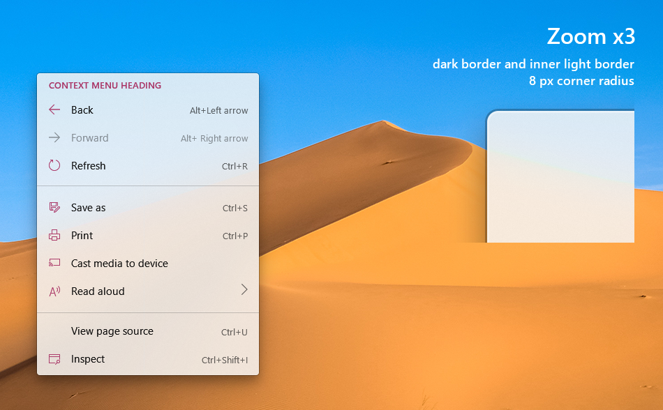
I posted this image in the Numberbox proposal, but it may have some relevance to the TextBox controls being updated.
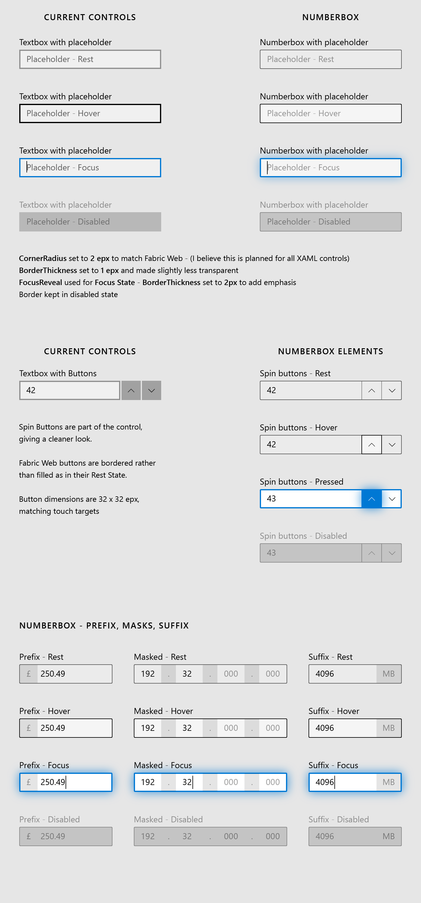
The BorderThickness, FocusReveal on Focused State, Border on Disabled State.
The "Spin buttons" style could apply to the search button, password reveal button, clear text button.
mdtauk
on 30 May 2019
The shadow around the border/control elements in focused state looks way too strong to me. Why do they even need shadows at all? Current version (just border color changing) is totally fine. Shadows might suggest the control (element) is being elevated to the foreground, which might make sense in 3D environments but certainly isn't needed for classic desktop environments and, one could argue, add some distraction.
Felix-Dev
on 30 May 2019
The shadow around the border/control elements in focused state looks way too strong to me. Why do they even need shadows at all? Current version (just border color changing) is totally fine. Shadows might suggest the control (element) is being elevated to the foreground, which might make sense in 3D environments but certainly isn't needed for classic desktop environments and, one could argue, add some distraction.
The Glow around the control when focused, is the FocusVisualKind.Reveal and is controlled by the system. I had to approximate how it looks because I don't have the metrics to match the opacity and size exactly.
Take my use of it as an indication that I think the glow will make it's focus much clearer, than just changing the border colour.

mdtauk
on 30 May 2019
@mdtauk , respectively, could you please limit conversation in this issue to rounded corner? I really would like to get feedback on rounded corner specifically and I am afraid this conversation is getting too confusing for those who might have just come here for that purpose.
That said, what you are showing looks to me like a Reveal Focus behavior. We looked into making the focus state stronger and did some user research and we confirmed they are way too strong just as @Felix-Dev mentions in his response.
https://docs.microsoft.com/en-us/windows/uwp/design/style/reveal-focus
chigy
on 30 May 2019
@chigy If the research shows that Reveal Focus on text control focus is too much, I will accept that. My examples do include the rounded corners, All be it with some slight changes to the border, which fit with the "... consistent with web and app style direction" part of the proposal.
mdtauk
on 30 May 2019
@mdtauk and @Felix-Dev , I've now uploaded visual comps of the changes being proposed.
chigy
on 1 Jun 2019
@chigy is there any possibility of reconsidering the border thickness of the text controls, combo boxes, check and radio controls.
Fabric Web opted for 1 epx thickness and I think this makes the controls more elegant, especially with the new rounded corners. At present they feel a little bulky.
Text boxes in compact mode would greatly benefit. But when focused the border can be thicker
Buttons use the background fill with 20% opacity by default. In Fabric Web, they use a 1 epx border and no fill. I think this may be a better solution, and would also allow buttons in a textbox control to fit nicely.
The NumberBox with spin buttons proposal illustrates this combination of Button and Text Field

Perhaps if the team is unwilling to make this style the new default, then a style/template can be included for it.
mdtauk
on 1 Jun 2019
To aid viewing the visual comps created by @chigy I created this
 mrlacey
on 1 Jun 2019
mrlacey
on 1 Jun 2019
Anecdotal and unprofessional feedback on the topic of rounded corners.
Using both Edge and CrEdge, my number one problem with CrEdge is the rounded feel to the whole UI. It's hideous, and actively makes me dislike using it. If you add rounded corners to things, please add the ability to toggle sharp edge for those of us who don't want something that looks like a kid with safety scissors cut it out.
 Zucce05
on 1 Jun 2019
Zucce05
on 1 Jun 2019
To aid viewing the visual comps created by @chigy I created this
@mrlacey, thank you so much!!
chigy
on 3 Jun 2019
@chigy is there any possibility of reconsidering the border thickness of the text controls, combo boxes, check and radio controls.
@mdtauk , we have a few more visual changes being sorted out right now as to how to bucket the work (we want them to be individually addressable but coherent), one of them is what you are asking so stay tuned.
chigy
on 3 Jun 2019
Anecdotal and unprofessional feedback on the topic of rounded corners.
Using both Edge and CrEdge, my number one problem with CrEdge is the rounded feel to the whole UI. It's hideous, and actively makes me dislike using it. If you add rounded corners to things, please add the ability to toggle sharp edge for those of us who don't want something that looks like a kid with safety scissors cut it out.
@Zucce05 , Yes #684 will address your concern by being able to switch back to not rounded corner easily. That said, as you can see in our comp proposal, the corners are not that round to stay professional look.
chigy
on 3 Jun 2019
@chigy
I'm not a fan of the rounded corners design change as well, so I'm glad to hear there is an option to easily switch back. I don't think there will be a system-wide corner radius option though, will there (similar to setting a system-wide accent color)?
On the topic of the border thickness: I like the current thickness of buttons and the border thickness also feels rather unique to me in the current UI landscape. I rarely, if at all, see this border thickness in UI different from the UWP UI, so it always acts as a nice distinguisher: "The UI I'm currently looking at is UWP." I'd like to see the thickness stay as it currently is.
Looking at your posted visual comps, the only area where I find the border thickness to look weird is in the case of a TreeView with checkboxes. In that case, the thickness of the checkboxes looks too thick to me. It might be a misleading visual effect but it seems to me that standalone checkboxes have a thinner border thickness and it looks good to them. So, I would reduce the border thickness of checkbixes in a TreeView to match the visual effect of the normal checkbox border thickness.
Felix-Dev
on 3 Jun 2019
@mdtauk , we have a few more visual changes being sorted out right now as to how to bucket the work (we want them to be individually addressable but coherent), one of them is what you are asking so stay tuned.
@chigy I have done some visual mock ups to illustrate the changes I mentioned, and brings the controls closer to Fabric Web's controls - but still using the Fluent control metrics.


The shadows added to the hover are used by the Fluent Web controls on the Microsoft Store webviews, but this can be ommitted by default, or the Z Translation can be achieved by a Theme animation which can be removed.
mdtauk
on 3 Jun 2019
Looking at some of the design proposals by @mdtauk above, I clearly prefer the current border thickness of buttons, etc...
I'd also like to note that I'm not a fan of basing Windows Fluent Design on Fabric Web or other Web UI components so much - I want Windows to have a unique look, dictinct from what is going on with the web. Take Internet Browsers for example: Chrome is the most-widely used browser by a mile these days, yet does that mean the Edge Chromium-based browser should look exactly the same or only marginally different? Not in my view. As I said above, current UWP default control styles gives UWP (and thus Windows) a nice unique look. Something I'd love for the Windows Fluent team to consider (i.e. don't just change stuff for the sake of change).
Felix-Dev
on 3 Jun 2019
@Felix-Dev Fabric Web is Microsoft's Web control designs based on Fluent. Chromium Edge is planning to use those control styles by default. But of course web designers can re-design their CSS controls, and devs can also choose their own templates for XAML controls.
I am not sure why Microsoft's control designs need to differ so much from Web to Windows. It just seems like different teams, not talking together. And developers still have the option to override. And these new defaults do not take affect unless the app is recompiled to WinUI 3.0
mdtauk
on 3 Jun 2019
Looking at your posted visual comps, the only area where I find the border thickness to look weird is in the case of a TreeView with checkboxes.
@Felix-Dev, for this particular issue, I think it is just some odd bug of Figma exporting visual with somewhat weird scale. I double checked the actual build and actual Figma file that I exported the PNG from, they look OK.
chigy
on 3 Jun 2019
RE: Popularity of rounded corner
@mdtauk and @Felix-Dev ,
My colleague did an informal query of what the developers (they were mostly LOB/WPF/WinForms devs) think about us updating our controls with rounded corner during their sneak preview and they got applause from the audience with very good reception. We also get people complain about us not rounding corners on Twitter for Windows often.
So while I do respect your feedback (and I hope you have those coming), we have anecdotal data that indicates opposite of what I am hearing here from you. That said, that's why we are considering the way to change it back in case you wish to do so. Design is tricky as they are rather subjective. I cannot force you to wear red shirt if you don't like red, but if that's a "wear a red day," it might be of your interest to wear one not to stand out. If you catch what I mean... :)
chigy
on 3 Jun 2019
Well, in the end it just comes down to personal preferrences. I think the current UWP default control styles look just fine and one big part for me is that they looking unique compared to what you see on the web or in popular apps like the Chrome browser or mobile OSs like Android. It's a nice breath of fresh air.
Now, I can see why MS wants to have different "default" styles for both Windows and Web for their design language. I do, however, get the feeling that the current direction is to make Windows look more like mobile apps/mobile OSes and I'm not really a fan of that (see "XAML controls are inconsistent with how web and mobile apps are evolving" in the issue proposal).
Devs can likely easily modify styles but most important for me is the default style MS will go with, as that styling will be used in all MS-provided apps (i.e. Settings) and thus will be a styling external devs will also base their work on (some more, some less).
@chigy
My colleague did an informal query of what the developers (they were mostly LOB/WPF/WinForms devs) think about us updating our controls with rounded corner during their sneak preview and they got applause from the audience with very good reception.
Isn't that perhaps the wrong audience to ask? What about every-day users? I did see quite a few users complaining about the recent rounded corners push in reddit and discord channels, for example (though you will also always have users who won't care or support that change).
As for the Twitter example: That's an app from a third-party which perhaps wants to have it's own unique brand styling. I'd be fine with that (after all, that's where your team comes in and adds cutomization support for control styles). But I certainly wouldn't use an external app as a reason to overhaul the official Design Language of Windows.
Long story short, it feels like the Windows Design team is set on styling Windows closer to the mobile-/web-world. Now, I only hope those changes won't be too radical and that Windows will still remain a unique look, making it easily distinguishable from other environments.
Felix-Dev
on 3 Jun 2019
@Felix-Dev The Fabric Web controls are unique from other frameworks and the default web controls. They were recently updated to use Fluent Design, compared to the older look which was kind of like the Windows 10 MDL2 controls, and the Windows 8/WinJS controls.
The XAML controls currently still use their MDL2 control designs, some elements like the flyouts and menus use Fluent Design elements and materials.
Text Styles in Fluent and Fabric have been making more use of Bold and Semibold weights. The various Windows 10 concepts have used these too. But the Windows Shell and inbox apps have not all moved to this style yet.
Fabric Web and Fluent Web are the most recent changes to controls from Microsoft since Fluent Design was announced, and so it is natural that we look at those designs to help us find a direction where these UIs will go to. With WinUI 3.0 being a big change for the platform and all the controls given a fresh look to make them feel better, fresher, and more consistent with Microsoft's Fluent Design.
mdtauk
on 3 Jun 2019
RE: Web consistency, Fluent, and being unique to Windows
@Felix-Dev and @mdtauk ,
One of the Windows design team’s goals are “familiarity.” They’ve done a lot of user research with our customers (like you indicate, not our devs but our daily users) and found out that being different for no good reason is not a good thing as you could imagine (I’m super summarizing so this is not the exact test they did, so don’t quote me here). Windows need to attract new types of users whose experience with any technology might be starting out with Mobile or Web. Those users feel a huge gap when they are introduced to Windows and having “different” look and feel doesn’t help it. A small changes like rounded corner makes a huge difference in perception. Office team did a similar study with the similar results, thus we are moving forward with the rounded corner. We are not making this decision lightly or in a vacuum.
That doesn’t mean we make them exactly the same. If there are places where we can improve, we want that. We also want to be unique like Felix mention, but they need to be meaningful, not just difference in opinions. Those are places where we utilize Fluent unique treatments.
As I mentioned earlier in this discussion, I’m working very closely with Office, Windows, and Edge teams. Our design teams are eager to have one design that is coming out of Microsoft/Fluent so they are looking very carefully at differences and tying to eliminate where the differences do not make sense so that we have a starting point where we can evolve together.
It is very interesting, though, many of these changes were being incubated by these teams separately but they often arrived at very similar spots. Thinning of the border is something Office implemented first but Windows has been discussing about that for a while now. And these are all part of Fluent Design direction as Martin suggests.
chigy
on 3 Jun 2019
_RE: Popularity of rounded corner_
@mdtauk and @Felix-Dev ,
My colleague did an informal query of what the developers (they were mostly LOB/WPF/WinForms devs) think about us updating our controls with rounded corner during their sneak preview and they got applause from the audience with very good reception. We also get people complain about us not rounding corners on Twitter for Windows often.So while I do respect your feedback (and I hope you have those coming), we have anecdotal data that indicates opposite of what I am hearing here from you. That said, that's why we are considering the way to change it back in case you wish to do so. Design is tricky as they are rather subjective. I cannot force you to wear red shirt if you don't like red, but if that's a "wear a red day," it might be of your interest to wear one not to stand out. If you catch what I mean... :)
_RE: Web consistency, Fluent, and being unique to Windows_
@Felix-Dev and @mdtauk ,
One of the Windows design team’s goals are “familiarity.” They’ve done a lot of user research with our customers (like you indicate, not our devs but our daily users) and found out that being different for no good reason is not a good thing as you could imagine (I’m super summarizing so this is not the exact test they did, so don’t quote me here). Windows need to attract new types of users whose experience with any technology might be starting out with Mobile or Web. Those users feel a huge gap when they are introduced to Windows and having “different” look and feel doesn’t help it. A small changes like rounded corner makes a huge difference in perception. Office team did a similar study with the similar results, thus we are moving forward with the rounded corner. We are not making this decision lightly or in a vacuum.That doesn’t mean we make them exactly the same. If there are places where we can improve, we want that. We also want to be unique like Felix mention, but they need to be meaningful, not just difference in opinions. Those are places where we utilize Fluent unique treatments.
As I mentioned earlier in this discussion, I’m working very closely with Office, Windows, and Edge teams. Our design teams are eager to have one design that is coming out of Microsoft/Fluent so they are looking very carefully at differences and tying to eliminate where the differences do not make sense so that we have a starting point where we can evolve together.
It is very interesting, though, many of these changes were being incubated by these teams separately but they often arrived at very similar spots. Thinning of the border is something Office implemented first but Windows has been discussing about that for a while now. And these are all part of Fluent Design direction as Martin suggests.
I am all in favour of changing the default controls, and the Fabric Web controls feel more elegant and polished than the current XAML control designs IMO.
But this is more than just changing templates, it is about exposing more properties which allow developers to override these changes easily without needing to re-template the whole control.
The new default CornerRadius values could be ThemeResources, something like
<Thickness x:Name="ControlCornerRadius" Value="2,2,2,2"/>
<Thickness x:Name="FlyoutCornerRadius" Value="4,4,4,4"/>
Then a dev can just override these in App.xaml - or apply CornerRadius="0" onto the controls they want to remain squared off.
Following this, I would also suggest that BorderThickness have it's defaults set to be 1epx instead of 2epx - but all the controls would use ThemeResources, something like:
<Thickness x:Name="ControlBorderThickness" Value="1,1,1,1"
<Thickness x:Name="ControlFocusedBorderThickness" Value="2,2,2,2"
<Thickness x:Name="FlyoutInnerBorderThickness" Value="1,1,1,1"
<Thickness x:Name="FlyoutOuterBorderThickness" Value="1,1,1,1"
So these can be overridden globally in App.xaml, or just in a Style applied to a few controls.
Set a new default, but allow overrides which do not require re-templating.
mdtauk
on 3 Jun 2019
But this is more than just changing templates, it is about exposing more properties which allow developers to override these changes easily without needing to re-template the whole control.
@mdtauk , That's right and as I mentioned, it is tracked by change proposed with #684. Adding @kikisaints to this thread so she sees the good feedback you gave (but not quoting the whole thing as it will be huge. :)
chigy
on 3 Jun 2019
@chigy As I was posting that last response, other things were added, so I had to include the quotes :)
I would love to hear more about the kinds of discussions the Windows UI teams have been having. I have been making control design ideas for the past few years for my own purposes and for twitter conversations, and some of the things now in Fabric Web and Office Xaml were things I had wanted to change. Border thicknesses, certain inconsistencies with Radio Buttons, Check Boxes, drop downs etc.
I am excited to see these changes develop, and am happy to be involved in the discussions going on here!
Thank you for taking my enthusiasm in the constructive way I intended, even if it may come across as pushy or opinionated.
mdtauk
on 3 Jun 2019
I definitely applaud the decision to make customizing controls as simple as setting a property instead of having to re-template the whole control for a single change.
However, in the end, what I most want to see is increased personalization support in the OS: As you know by now, I'm not a fan of the proposed changes (subtle corner radius is one thing, reducing border thickness yet another) and I like the current design. On the other hand, we have users like @mdtauk who are clearly a huge fan of the proposed changes. Windows should make use of the new flexibility in those controls and give options to customize the look system-wide - for cases where it makes sense and also give developers the flexibility to opt-out of following the system settings.
Looking at border thinkness in particular, the proposed system makes poviding a system-wide option for corner radii extremely easy (just as with the accent color today, which is exposed as a resource apps can use). Especially seeing that the proposed corner radii changes are rather small, this might also be feasible design-wise for apps (and if the developer doesn't feel so, can always opt-out).
Felix-Dev
on 3 Jun 2019
I would love to hear more about the kinds of discussions the Windows UI teams have been having.
@mdtauk , it is our intention to bring all the upcoming visual changes via GitHub so expect more of those to come. I also am planning on expanding documentation to include some of these background, but that's something I'm experimenting with so not sure if that's going to be a sure thing...
However, in the end, what I most want to see is increased personalization support in the OS...
Windows should make use of the new flexibility in those controls and give options to customize the look system-wide - for cases where it makes sense and also give developers the flexibility to opt-out of following the system settings.
@Felix-Dev , the type of personalization we currently are looking at for Windows (I'm assuming something user can change from settings?) are things that impact the usability. I am not sure if rounded corner or border thickness are one of them. It is not Windows goal to make it so that user can design the whole entire UI as they wish. We still want to provide Windows design and rounded corner is one of a key design factor that I do not think is something meant for personalization... At least as of right now per the definition of personalization. Thank you for your feedback and I'll look for places where it makes sense to expose as we think of further design changes.
chigy
on 4 Jun 2019
@Felix-Dev With the amount of customisation devs can do to the controls, it would be impossible to be consistent with any OS Settings regarding control design alterations.
@chigy As you bring the design comps for each of the new control designs to GitHub, it would be useful to include information Microsoft has gathered from any research studies as to why the changes will improve things. So rather than "We changed this from a triangle to a hexagon" it would be something like "when conducting a user comfort and familiarity experiment, it was found that when changing this button design from a triangle to a hexagon, more people found it easier to identify it as a button, and when compared to other platform UIs felt an affinity with this design" etc
mdtauk
on 4 Jun 2019
@mdtauk
With the amount of customisation devs can do to the controls, it would be impossible to be consistent with any OS Settings regarding control design alterations.
I'm not talking about how external devs would honor that user setting - they can already style the controls today in any way they want - but about the look of Windows components. That means the Settings app, Clipboard, Snip & Sketch, UI elements in task bar flyouts (like the buttons in the network panel), etc...
I for one am barely using any UWP apps outside of MS provided ones so I don't have any problem with custom styles by external devs. I do interact daily with UWP elements in the Windows system though.
@chigy Correct, I was looking at a setting in the Win 10 Settings app where a user can change - to some extend - the look of the UI. It remains to be seen what would actually make sense and also be viable in terms of added work making UI characteristics changeable by the user. I do feel the smaller the changes being proposed are now (subtle corner radius) the more viable it will be to add an option to return to the previous style (squared controls).
One last thing: Win 10 has 800 million users and counting. Not everyone is so enthusiastic as Martin about the proposed changes and it would be nice if Windows would also try to accommodate those users. As you said, UI is highly subjective and if there is any possibility of adding flexibility into the UI system, MS should at least consider that.
For Internet browsers, for example, there is a whole industry of theming, where not only colors are changed but also the look of UI elements such as tabs or the search bar: https://github.com/muckSponge/MaterialFox (Funny enough, that particular project adds rounded corners to Firefox - and I'm not a fan of rounded corners.)
For the Windows system, however, users can't just create an own theme, so it would be nice if MS could provide UI customization options.
@mdtauk @chigy
Please check out this reddit post to see that it is not just me who is not a fan of rounded corners. We have people disliking the whole move and also many calling for giving users choices for their Windows look so they can revert back to the current look.
Felix-Dev
on 4 Jun 2019
Alright so I was urged by many people to give some feedback to this thread because there is an inquiry to proposed changes in UI, mainly the idea of forcing rounded corners onto literally everything and as someone who is a both a graphic interface designer (mostly concept and design) and has used Windows 10 since it was even in development I am absolutely going to side with everyone who strongly dislikes the proposed change to add rounded corners to the entire OS, and strongly urge for these changes to not be done or either let the user have preference of whether they want rounded corners or sharp corners via a option in personalization.
In lament terms : Just keep them Square or make it optional at user level.
I have more than enough reasons but my biggest are simply the fact that Windows since Windows 8 has had square corners and pretty everything has been designed around this for years, this proposal is very much an attempt to adopt the very same rounded corners from the iOS and Android platforms for whatever reason. The bigger problem is doing this would not only increase the amount of inconsistency system wide but forcing such a "little" UI change that in reality is much bigger than what you realize would also cause inconsistency in the entire app eco-system because you will have developers that do not want to update their app simply because of a simple change like that.
In my opinion this should absolutely NOT be a developer choice, not only for the reasons stated above but, Windows has always been about customization and power, take the Windows 98 aka Classic theme for an example. When Windows XP came around many people still used Classic because it had more customization options than the Luna theme. XP did not force the Luna theme onto everyone at all, you still had the option to use Classic. This proposed change does NOT give you the option to retain square corners anywhere, it is forcing everyone to deal with something they may not like, a very bad thing in my opinion when it comes to letting a user customize the OS to their liking.
I know your probably thinking, "such a small change is not something that users would be interested in" or "letting the user customize too many things would confuse them" but I'm pretty sure any user would be able to understand what toggling between round and sharp corners or even a theme would do given the proper description and context. I will also add many people are definitely interested in having the option for this instead of having something else forced onto them against their will, see the Reddit post @Felix-Dev posted if you need any more proof of people not liking the idea of rounded corners everywhere.
Many people highly dislike even the proposal for rounded corners and many consider it a step backwards, even check the comments in several videos of the upcoming Hololens UI being rounded, majority of the comments once again are about strongly disliking all the rounded corners and there's even comments saying variations of "Microsoft throwing in the towel in the UI department and copying either Apple or Google", even though its not the first time Microsoft used rounded corners people now see it as a negative thing.
Again this should just really be a option or even a theme, its not even a new concept since Windows has had themes for years in previous versions, if anything this should be a message asking for the return of robust theming, instead of again forcing something onto everyone and reducing options.
 Neptune-mk2
on 4 Jun 2019
Neptune-mk2
on 4 Jun 2019
I created a reddit post linking to this proposal so we can gather more feedback. Looking through the comments so far, I can say that many people appreciate the subtle approach with the rounded corners.
People are also calling out UI inconsistencies - even in official Win 10 MS apps, see Settings app and Security app (NavigationView extending into titlebar) - and also the differences between win32 system components and the newer UWP elements. As @SavoySchuler mentioned, this will hopefully be addressed with WinUI 3.0. It's not a specific point regarding this proposal but more of an "overarching" desire among many of us Windows users. Not so much about corners being round or not but consistency in the Windows system.
Felix-Dev
on 4 Jun 2019
Consistency is the key here, and had been my main concern.
WinUI 3.0 is about changes to the XAML controls which affect inbox apps and Windows UI.
Fabric Web is it's own team, but all teams are communication together, and basing their decisions on Fluent Design, so my assumption is that Fabric Web's design is the latest thinking from Microsoft, and so consistency should prevail.
Xbox Next, Windows Lite and Windows Core OS will come with new shells, so that must be a consideration for the teams also - with Windows 10 for legacy support
mdtauk
on 4 Jun 2019
What @chigy said is exactly what I and many others have just been asking for, a more subtle change that would also allow people at user level instead of developer level to simply decide whether they want to see Sharp corners or Rounded Corners, similar to how Windows themes used to work.
Neptune-mk2
on 4 Jun 2019
Basing on what @Nepxune said above, it would perhaps be cool to give users a select range of values they could choose from for a system-wide corner radius. At least for small values in the range of 0 - 2 I think there wouldn't be any negative impact on meticulously designed UI. After all, these are very subtle changes and thus should still preserve the UI identity of Windows.
I do see though that even if UI customization will get added to Windows, there have to be limits, both in the number of elements changeable by the user and also the set of values a user can choose from. Otherwise, there is a risk of impacting existing UI negatively and also stray away too much from the desired Windows look by the Design Team.
Felix-Dev
on 4 Jun 2019
I have a sort of a different perspective on this.
Earlier in the thread I saw discussion about bringing Fabric UI (Web) and Windows (UWP) styles closer together, and this worries me a bit.
Here's some context: I have been a user of Microsoft Edge for years, and one of my favorite things about it was its UWP-inspired look and feel. When Edge Insider was revealed, I was very disappointed to see it used modified Chrome and Web UI design instead of its predecessor's UWP styling. While the round corners shown are very minimal, to the point where I have no problem with them, this thread is giving me the same sense of disappointment. I don't want to see Windows lose its unique (and superior!) look and feel in favor of matching ill-designed "web standards." In fact, I'd rather see aspects of Fluent UWP design make their way to Fabric!
 19lmyers
on 4 Jun 2019
19lmyers
on 4 Jun 2019
I believe the plan for Edge is to eventually bring back Acrylic, and move the UI more towards a Windows/Fluent Design style.
But Windows is also moving slightly forward to hopefully bridge the divide.
It is not impossible to bring about a Setting in the OS to choose between rounded and non-rounded controls, it is impossible to impose it on all apps, and works in a totally different way to the XP era Visual Styles.
Also WinUI 3.0 is about separating the app platform and controls from the OS, and so it may not be a good decision to tie more of it together.
Of course as an app dev, you have the option to set the CornerRadius value on your controls to 0 to bring back the squared off controls.
mdtauk
on 4 Jun 2019
I support this push for small rounded corners, but I prefer the current vertical-handle slider control to the circle-handle slider control. The vertical handle feels more precise and is easier to figure out where it is at a glance. At least that's how I view it. Keep up the good work tho!
 Elttob
on 4 Jun 2019
Elttob
on 4 Jun 2019
Is there a reason why the MediaTransport Scrub Bar Thumb is round with an outline, where as the proposed new Slider Thumb is a filled in circle?
I think the circle thumb is much more pleasing than the awkward lozenge/pill shape which doesn't fit any of the other controls.
mdtauk
on 5 Jun 2019
I don't know if you guys remember it but even making the people tile in rounded corners were a big problem for a lot of Windows fans back in the day and that was just some minor change. For me having rounded corners everywhere would mean Windows would loose it distinctive look it has ever since the introduction of the metro design language and fluent design. Tbh the design language was always a big key for me what made uwp development attractive for me. It would be really sad to see it go and become generic.
 Tourniquet88
on 5 Jun 2019
Tourniquet88
on 5 Jun 2019
Along with the TextBox and NumberBox design concepts I have done - here are some for the ComboBox and the EditableComboBox

mdtauk
on 5 Jun 2019
Nice job!
I have a couple suggestions about the flyout menus. With the shadows demarcating the menu, do we really need the border? And IMO the selection highlight could cover the entire width of the flyout surface, without leaving gaps.
I appreciate the thinner unfocused borders, and the focus reveal glow should make it easier to see which element is focused while tabbing through the UI using a keyboard (I'd actually prefer it to be slightly stronger than above).
 quantumfrost
on 5 Jun 2019
quantumfrost
on 5 Jun 2019
Nice job!
I have a couple suggestions about the flyout menus. With the shadows demarcating the menu, do we really need the border? And IMO the selection highlight could cover the entire width of the flyout surface, without leaving gaps.The selection highlight does cover the entire width, but I have placed a lighter inner border to the flyouts, which will help it lift from the surface along with the Acrylic effect and shadow - the inner border could be made more subtle however if its too strong - its more an idea than a fully final design proposal.
mdtauk
on 5 Jun 2019
@mdtauk
It is not impossible to bring about a Setting in the OS to choose between rounded and non-rounded controls, it is impossible to impose it on all apps, and works in a totally different way to the XP era Visual Styles.
That's why I said making it optional for devs. Honestly, nothing really would change. Third-party apps already can ship with any look they want. If a company wants to ship their app with a rounded UI (Circle buttons,...) they are free to do so.
Also WinUI 3.0 is about separating the app platform and controls from the OS, and so it may not be a good decision to tie more of it together.
As I said above, I picture it similar to how the Accent Color (which the user can set in the settings) is handled today. Expose it as a resource controls can bind their corner radius to, that way, corner radius changes will be reflected in the app with no additional work for the devs.
Felix-Dev
on 5 Jun 2019
Just leaving my feedback from reddit here from a users perspective: “I love the clean rounded corner look from the proposal. Like everyone else though(on reddit), the consistency around the whole OS still needs a lot of love.”
 zag2me
on 5 Jun 2019
zag2me
on 5 Jun 2019
Is there a reason why the MediaTransport Scrub Bar Thumb is round with an outline, where as the proposed new Slider Thumb is a filled in circle?
@mdtauk , as a matter of fact, that's something we are looking at, but that doesn't mean we will make the change so I am not setting expectations...
chigy
on 5 Jun 2019
I have a couple suggestions about the flyout menus. With the shadows demarcating the menu, do we really need the border? And IMO the selection highlight could cover the entire width of the flyout surface, without leaving gaps.
@quantumfrost , Yes, as a matter of fact, we do. Shadow is smart. So when the system is on low power mode or some other situation where we turn off the shadow, the border will come into the play. We designed the border in such a way that it is subtle. We did evaluate several different options but this is what was most robust.
chigy
on 5 Jun 2019
@nepxune, @mdtauk
Thank you for your feedback.
Let me respond to a few of the points you make above.
The option to provide user setting to have corner rounding something user can choose from is an interesting one. However it also has a lot to do with this feedback over other important features that we have to weigh against in Windows system as a whole.
As application developers, I hope you all are keenly aware of the need to prioritize and do what's right for your customer. For Windows case, the customer is the users who uses the OS. Of course, developers who create apps on this OS are also important customers, and I believe by providing the ease of switching corner radii, we are able to address the main issue that this change would have introduced.
As to the users who use the OS, we heard from our customers that Windows are too intimidating. Both Windows and Office team did user study where they ended up concluding (independently) that even as subtle as a rounded corner makes a difference in making the product feel familiar and approachable.
So I know many people on GitHub and other forum mention that we are following iOS and Android, but it is not so. We are arriving at this decision from understanding our users. Yes, the fact they use rounded corner adds to the familiarity aspect, but we are not blindly following what the industry is doing.
chigy
on 5 Jun 2019
I have a sort of a different perspective on this.
Earlier in the thread I saw discussion about bringing Fabric UI (Web) and Windows (UWP) styles closer together, and this worries me a bit.Here's some context: I have been a user of Microsoft Edge for years, and one of my favorite things about it was its UWP-inspired look and feel. When Edge Insider was revealed, I was very disappointed to see it used modified Chrome and Web UI design instead of its predecessor's UWP styling. While the round corners shown are very minimal, to the point where I have no problem with them, this thread is giving me the same sense of disappointment. I don't want to see Windows lose its unique (and superior!) look and feel in favor of matching ill-designed "web standards." In fact, I'd rather see aspects of Fluent UWP design make their way to Fabric!
@19lmyers
Thank you for your feedback about your worry about Windows loosing its own unique (and even superior) look. As mentioned in above comment, our users do not necessarily appreciate Windows being too different because they are not familiar to them, so this is a balancing act.
Under Fluent Design System, design teams across the company are discussing many differences and trying to eliminate unnecessary differences introduced thus far. Just as the comment I made about iOS and Android above, those design that we are proposing are not because we are copying Fabric, but our Windows designers arrived at them based on re-evaluating their own UI system. They often result in the similar design, interestingly enough... That said, I really appreciate many people's enthusiasm for keeping Windows unique.
chigy
on 5 Jun 2019
Welcome to our repo, @zag2me! We're excited to have you joining the discussions here. I agree and its the right place to draw attention to the issues that matter to you! You can find our Feature Request form here: https://github.com/microsoft/microsoft-ui-xaml/issues/new/choose
 SavoySchuler
on 5 Jun 2019
SavoySchuler
on 5 Jun 2019
@chigy
The option to provide user setting to have corner rounding something user can choose from is an interesting one. However it also has a lot to do with this feedback over other important features that we have to weigh against in Windows system as a whole.
As to the users who use the OS, we heard from our customers that Windows are too intimidating. Both Windows and Office team did user study where they ended up concluding (independently) that even as subtle as a rounded corner makes a difference in making the product feel familiar and approachable.
We are arriving at this decision from understanding our users. Yes, the fact they use rounded corner adds to the familiarity aspect, but we are not blindly following what the industry is doing.
Thank you for your feedback about your worry about Windows loosing its own unique (and even superior) look. As mentioned in above comment, our users do not necessarily appreciate Windows being too different because they are not familiar to them, so this is a balancing act.
And here is the problem I have with that: You mention "Windows users" but if anything, this thread and other linked reddit threads have shown so far is that there isn't a homogenous group of "Windows users". At the end of the day, a company can always follow the direction the majority of its customers want it to go but even that leaves problems. What if the ratio is rather small (and behind each number woud be a huge absolute number of users)? Based on the feedback here, in reddit and other places I don't get the feeling there is a overwhelming majority for one UI or another.
Which leads us to the proposal a few of us have been floating: Adding more UI customization options to Windows.
As you rightly say so, the given customization options should be meassured carefully, but customization in and of itself shouldn't just be discarded as an option. As you said, and at this point I am starting to repeat myself, the proposed corner radius change is a small change, so any impact of making it a user choice on UI should be negligible or straight out non-existent. I and others have also pointed out limitations for this very example, such as a set of values in the range of 0 - 2 for corner radii, to ensure users can't just customize their Windows in a way which would break the "Windows UI Identity" your team wants to create.
Long story short, carefully meassured customization options on top of these design changes sounds like a great way to address the many different UI preferences among us Windows users and would go a long way in creating a satisfying UI for the entire family of us passionate Windows users.
Felix-Dev
on 5 Jun 2019
@chigy
Most people would agree that 2px would be a good radius. Giving the rest an option to turn it off would be a good ideal.
Most users want Windows to be on the cutting edge of UI and but other legacy users don't want to change.
Don't sacrifice change for the few, just give them the option to turn it off.
 shaheedmalik
on 5 Jun 2019
shaheedmalik
on 5 Jun 2019
@shaheedmalik
There are no "legacy" users here and I also don't see how you arrive at "most users want [rounded corners]" or that the current Windows look isn't "cutting edge".
UI is highly subjective but that doesn't mean we can just gloss over differing opinions as "legacy", "unwilling to change", etc...
Let's not try to just discard what other users say as opinions from "users who don't want to wake up from the past" and keep the current discussion passionate but also respectful as it has been so far.
Felix-Dev
on 5 Jun 2019
@Felix-Dev Legacy users are ones who would've stayed on Windows 7 given the chance, ones who were resistant to changes made in Windows 8, ones who are resistant to the OS UI changes moving forward.
Apple and Google copied features from Windows 8.1, implemented them and users jumped over to those platforms because they were seen as cutting edge. In the meanwhile, Microsoft listening to legacy users, scaled back because of a loud vocal minority.
In this particular, case the majority want rounded corners as linked (https://www.reddit.com/r/Windows10/comments/bwnxne/windows_10_rounded_corners_and_more_ui_changes/)
shaheedmalik
on 5 Jun 2019
The thing is, I'm no legacy user though and it appeared to me you just threw everyone not liking the current rounded corners push (and possible border thickness reduction) into that exact category. I am also not getting your down vote for my post.
About the majority case: I wasn't aware of any design survey by MS about this very topic and based on the reactions of many users one month ago when details about this push first appeared on the Internet many users weren't aware of either (so likely hadn't been asked). If you check this reddit post (which btw has three times as many comments as the reddit thread you linked above so far) you'll notice that from what we know the picture isn't exactly clear-cut. I'm in no position to claim "this position is clearly in the majority" and I'll refrain from doing so in the future too.
If I'm mistaken about your post, then I apologize but from the way I read it, it was clearly dismissive of any voice making the case against this change declaring it to be the voice of a "legacy user who doesn't want change". That is disrespectful to me and all the others would added their voices to this debate.
Felix-Dev
on 5 Jun 2019
@Felix-Dev Let's not try to read any personal opinions into these up/down votes and replies.
The simple answer is that these changes are not being made on a whim, or to copy other platform UI styles - but as a result of consultation, feedback, and an expressed will of users and developers.
We should try to keep the discussions constructive, so not about whether or not the changes should be made, but in what way should they be made.
mdtauk
on 5 Jun 2019
People hated the rounded corners in the original post as they were too round.
This newer post links to this updated GitHub proposal. The newer feedback reflects responses of the updated proposal. Additionally, the original post from a month ago was linked to show users the changes from the original proposal to the revised proposal.
shaheedmalik
on 5 Jun 2019
I agree, we should get back to the proposal and just forget about these last posts.
I think it's pretty clear at this point that these changes will be made and all I'm trying to do is to convince @chigy that there is a case for carefully measured customization, something every participant here might find useful at some point - whether they like the current UI change or not. Just as I and others have said, including @shaheedmalik, adding some sort of corner radius customization could be a good ideal to strive for.
Felix-Dev
on 5 Jun 2019
Right now there is a proposal for making it easy for devs to set their own CornerRadius on every control ( #684 ), which is also enabling the team to add CornerRadii to the controls by default.
Doing it at an OS level is a complicated task, and the research does not quite warrant the engineering time and effort involved in implementing that.
But you have made your views clear @Felix-Dev and if after the new controls are in the hands of a majority of Windows users, the feedback received, could lead to this idea being explored in the future.
mdtauk
on 5 Jun 2019
I've updated spec to remove "AppBarSeparator" from rounding since I confirmed that is 1px line.
chigy
on 5 Jun 2019
I've updated spec to remove "AppBarSeparator" from rounding since I confirmed that is 1px line.
@chigy At 100% scaling it will be 1 epx - but at 200%, 300%, 400% scaling, this may need some attention.
If it really is a line, and not a rectangle - perhaps setting the StrokeStartLineCap and StrokeEndLineCap to PenLineCap.Round
mdtauk
on 5 Jun 2019
@mdtauk
Doing it at an OS level is a complicated task, and the research does not quite warrant the engineering time and effort involved in implementing that.
This proposal already seems to do most of the work, adding a CornerRadius property to controls. Only thing remaining then would be the creation of resource SystemCornerRadius those controls could bind to for their actual corner radius (similar to how today you use a SystemAccentColor resource to color elements of your UI in the accent color the user sets in the Settings app.
As for how much work it would be to create such resource and make it updatable via the Settings app, that remains for MS to comment on. But given the work this proposal is already doing anyway and also the previous work in the form of exposing an AccentColor resource, I don't see how it would be so demanding as you put it to be. The OS level would literally only be providing a corner radius value which can be read from and written to and then use the same system you already have in place for today's accent color resource.
Felix-Dev
on 5 Jun 2019
@mdtauk
Doing it at an OS level is a complicated task, and the research does not quite warrant the engineering time and effort involved in implementing that.
This proposal already seems to do most of the work, adding a CornerRadius property to controls. Only thing remaining then would be the creation of resource SystemCornerRadius those controls could bind to for their actual corner radius (similar to how today you use a SystemAccentColor resource to color elements of your UI in the accent color the user sets in the Settings app.
As for how much work it would be to create such resource and make it updatable via the Settings app, that remains for MS to comment on. But given the work this proposal is already doing anyway and also the previous work in the form of exposing an AccentColor resource, I don't see how it would be so demanding as you put it to be. The OS level would literally only be providing a corner radius value which can be read from and written to and then use the same system you already have in place for today's accent color resource.
Would it be a slider or a toggle?
[X] Rounded corners on controls
There wouldn't just be a single Corner Radius value to set btw. Some elements would only have the rounding on one side, or only the top corners would be rounded. The flyouts and pop over controls will be getting a 4 epx radius, where as other controls will only have 2 epx.
You would be setting many variables as this setting changes in the OS. Then what about testing? Also there would be expectations. How will users react to apps they decide to ignore the user's preference?
How do you communicate with the users which controls get rounded, and which don't? Some controls will have inner border or outer border elements. These would need their CornerRadius values adjusted to ensure the hug the edges of the shapes properly.
In the end, this may be a change that is welcomed without much fuss, and so it could be considered an over-reaction to add yet another option to the OS.
mdtauk
on 5 Jun 2019
@mdtauk @chigy
It certainly would need some planning but the team clearly wants to make it very easy for devs to create squared controls. As such, instead of a corner radius value setting, I'd be fine with a simple UserRoundedCorners boolean switch. In fact, the idea of setting values was just to add even more options whereas the users disagreeing with this move were always about just giving them an option to revert the look of the controls back. So, that won't be an issue at all.
As for the "yet-another option" part: That sounds like there already are too many options available to the user which is an entirely different issue and shouldn't be used as a defining point to not add this simple switch.
Windows and the Design team talks daily (on twitter) how it wants to include users and not exclude them. Here is a chance where I feel it is relatively easy for MS to add a single option to respect the sheer variety in opinions of their users.
How will users react to apps they decide to ignore the user's preference?
I don't think that's a problem as well, as long as essential Windows apps/UI elements would honor it (i.e. Settings app, Security app, Clipboard, taskbar network flyout connect/disconnect buttons....). Third-party apps are free to use a style they want, a simple note in the Settings app saying that third-party apps are not guaranteed to follow this user setting would be fine.
Felix-Dev
on 5 Jun 2019
@mdtauk @chigy
I believe that @Felix-Dev is right on this one, a boolean switch with a simple toggle could be the way to go for customization at user level , I feel a slider for customization of this at user level would be over complicating things, however if its a slider with 3 fixed preset positions things could change.
A slider with 3 fixed options would allow an additional setting that could have a more drastic corner radii change like the one that was originally proposed, so you could have :
Sharp - Sharp corners like they are now
Middle option - The new smaller radii
Rounded - The original proposed radii change or something even more rounded
This option has the potential to satisfy all groups and additionally it is a drastic change enough that you could actually pass this off as a new "Theming" feature in Windows, basically even though this is more a change for developers by branding it as a new "Theming" feature with either the toggle implementation or the 3 preset slider, you could also pass it off as a new feature for consumers.
how would users react to apps that decide to ignore the user's preference?
I feel the user would simply see it the way they currently do with the accent color when it is not available, third party apps should be free to do whatever they want but like @Felix-Dev said Windows apps/UI elements would definitely need to honor the user's variable.
I don't think there is a need to put a note in settings saying third-party apps won't honor the setting, there was no need to put a disclaimer in the accent color section, so believe it is the same for this as well.
Neptune-mk2
on 6 Jun 2019
Doing it at an OS level is a complicated task, and the research does not quite warrant the engineering time and effort involved in implementing that.
But you have made your views clear @Felix-Dev and if after the new controls are in the hands of a majority of Windows users, the feedback received, could lead to this idea being explored in the future.
I feel like I have to point out something here. While I do not feel strongly about the changes proposed either way (I have to work with too many UI Styles over different ecosystems every single day for inconsistencies or changes to bother me anymore), I feel like this mindset is not a good one in order to create a rich user friendly experience.
Please do not release features that are 80% done and might or might not be brought to 100% in the next release.
What would probably happen is that no dev would spend the time to test and develop his apps for both rounded or not rounded borders. And why would they. The system now uses rounded, why should anyone want their app to look slightly different than the OS (otherwise they would go for full theming anyway)
If there was a system wide toggle there would be an incentive to implement it.
But if you are doing things this way around, no need for a toggle will ever arise because no app will see the need to implement it in the first place.
On the original Topic:
I Think the 2px borders look great except the Combo Boxes.
The highlight of the last element should not leave a white border below it (or at least not more than left and right, of course this means that the bottom highlight corners must be rounded, too) and maybe there should not be rounded corners in the expanded state between the box and It's flyout. I feel like it gives this weird disjointed look between them.
Maybe it would be better to make the flyout 2px smaller on each side and let it have no rounded corners on top. This way it would look like a piece of paper being pulled from a dispenser. (I hope you can understand what I mean :D sadly I have no tools available right now to sketch it up)
 Qowy
on 6 Jun 2019
Qowy
on 6 Jun 2019
On the original Topic:
I Think the 2px borders look great except the Combo Boxes.
The highlight of the last element should not leave a white border below it (or at least not more than left and right, of course this means that the bottom highlight corners must be rounded, too) and maybe there should not be rounded corners in the expanded state between the box and It's flyout. I feel like it gives this weird disjointed look between them.
Maybe it would be better to make the flyout 2px smaller on each side and let it have no rounded corners on top. This way it would look like a piece of paper being pulled from a dispenser. (I hope you can understand what I mean :D sadly I have no tools available right now to sketch it up)
I know what you are describing, and I did consider that for my design mock ups. The problem with that is it means ComboBox would get its own flyout template, which would make it different to context menus, menu flyouts, Prefix, Suffix, AutoComplete flyouts, etc.

mdtauk
on 6 Jun 2019
That's what I meant (except that the Box itself could keep the bottom corners rounded)
Yes the different flyouts would be different, but then again there are inherently two types of flyout.
Those that are attached to something an those that aren't. That they now would have to be different is just the cost of doing rounded corners ;)
Furthermore if corner radius would become stylable couldn't it just be set by the Parent control.
My XAML is a bit rusty but a Combobox Template like:
<Combobox FlyoutCorners="GlobalCornerValue,GlobalCornerValue,0,0">
   <GenericFlyout Corners="something something parent property Binding"/>
</Combobox>
That is similar to how you may override styling, but for use in templates you would need separate styles for each orientation.
<Thickness x:Name="FlyoutLooseCornerRadius" Value="4,4,4,4"/>
Orientations:
- Bottom
- BottomEdgeAlignedLeft
- BottomEdgeAlignedRight
- Full
- Left
- LeftEdgeAlignedBottom
- LeftEdgeAlignedTop
- Right
- RightEdgeAlignedBottom
- RightEdgeAlignedTop
- Top
- TopEdgeAlignedLeft
- TopEdgeAlignedRight
The Flyout is embedded inside the ComboBox control. So the control would have a CornerRadius property which would affect the ComboBox only, not the flyout included, that would have the be a ThemeResource being overridden.
<ComboBox CornerRadius="2,2,2,2">
      <x:String>Blue</x:String>
      <x:String>Green</x:String>
      <x:String>Red</x:String>
      <x:String>Yellow</x:String>
</ComboBox>
Following on from adjusting the CornerRadius property on the Flyout when it is aligned and attached to ComboBoxes (and other controls) It may require the addition of TopEdgeAligned and BottomEdgeAligned to the FlyoutPlacementMode enum to achieve the desired result.

_(Updated Image)_
I have also included a closer 800% look at the Flyout styling. The Two borders would ensure the flyouts look elevated in both Light and Dark themes with or without the shadow.
mdtauk
on 6 Jun 2019
That looks very good.
Of course the attached look, looks kind of strange when the item you attach it to is smaller than the flyout, but that is definitely something for the individual app to decide.
The focus highlight of the items in the bottom row should probably not be rounded on the bottom (Since the top isn't for the top row) but that is probably not intentional.
By the way I just noticed that this "attached look" is how the MacOs Top Menu Bar works so this look does not seem to be outlandishly uncommon ;)
Qowy
on 6 Jun 2019
That looks very good.
Of course the attached look, looks kind of strange when the item you attach it to is smaller than the flyout, but that is definitely something for the individual app to decide.
The focus highlight of the items in the bottom row should probably not be rounded on the bottom (Since the top isn't for the top row) but that is probably not intentional.By the way I just noticed that this "attached look" is how the MacOs Top Menu Bar works so this look does not seem to be outlandishly uncommon ;)
I had forgotten the rounding, so I updated the image to fix that, and also add a little more detail with the Zoomed example - oh and included the Hover state
mdtauk
on 6 Jun 2019
I am not sure if I prefer middle items to have a rounded highlight or not, since on the one hand it is more consistent, on the other it leaves those little aggressive looking (Ok now I am just making stuff up :) ) sharp white spaces between highlighted elements and the border.
But that is something I leave up to real designers to decide :D
Qowy
on 6 Jun 2019
I am not sure if I prefer middle items to have a rounded highlight or not, since on the one hand it is more consistent, on the other it leaves those little aggressive looking (Ok now I am just making stuff up :) ) sharp white spaces between highlighted elements and the border.
But that is something I leave up to real designers to decide :D
I agree, I am in two minds about it too. I think I like it straight edged but as the controls summoning the flyout will be rounded, and these are controls within a control, they _should_ be rounded.
And some Context Menus will contain controls that don't span the full width of the flyout, so the rounded selection will work for those

mdtauk
on 6 Jun 2019
I am not sure if I prefer middle items to have a rounded highlight or not, since on the one hand it is more consistent, on the other it leaves those little aggressive looking (Ok now I am just making stuff up :) ) sharp white spaces between highlighted elements and the border.
But that is something I leave up to real designers to decide :D
I feel the same way. If the combo list is the same size as the combo box, then they should stay straight at the point of origin, otherwise the side that doesn't line up should be round.
shaheedmalik
on 6 Jun 2019
@mdtauk @Qowy @shaheedmalik would it be possible for you to create an own issue specific for comboboxes? This thread is about corner radius in general and not some specific cases which could easily spawn an entire new conversation as seen here, and thus overshadow talking points about the general approach.
Please don't misunderstand this, but if we have such specific discussions for many of the controls, this thread will easily lose its general focus.
Much appreciated!
PS: About non-border highlighted elements: The element highlight should definitely be a rectangle. Making it have rounded colors is just weird.
Felix-Dev
on 6 Jun 2019
I'm probably in the minority here with my opinion, but changing the corner radii of the common controls is honestly a terrible idea. Looking at the menu example above from @mdtauk and comparing that to the current Edge menu leaves me a bit disgusted. Things are finally getting settled with Fluent design and everything is finally looking consistent and really good. Now, let's change it all to look like the Web? No...let the Web be the Web and leave Windows (and the Common Controls) alone. If devs want to implement rounded corners using third-party controls in their own apps, so be it. But, to start changing the default look and feel now is just heresy - let Apple be Apple, Google be Google, and the Web be the Web. Y'all just continue to be Microsoft and do your thing - it's working, so let it work. I, for one, actually love the Microsoft Windows 10 look and feel of Fluent design and want my apps to look like Windows - not Apple, Google or the Web. I can't stand the way Chrome looks - Edge is light years better looking and Windows much better in form and function than macOS. And, TBH, bring Windows 10 Mobile back to the phone. Good grief, quit giving up on stuff so quickly and leave Fluent design alone and let it do its thing.
 jkellywilkerson
on 6 Jun 2019
jkellywilkerson
on 6 Jun 2019
@mdtauk
Doing it at an OS level is a complicated task, and the research does not quite warrant the engineering time and effort involved in implementing that.
This proposal already seems to do most of the work, adding a CornerRadius property to controls. Only thing remaining then would be the creation of resource SystemCornerRadius those controls could bind to for their actual corner radius (similar to how today you use a SystemAccentColor resource to color elements of your UI in the accent color the user sets in the Settings app.
As for how much work it would be to create such resource and make it updatable via the Settings app, that remains for MS to comment on. But given the work this proposal is already doing anyway and also the previous work in the form of exposing an AccentColor resource, I don't see how it would be so demanding as you put it to be. The OS level would literally only be providing a corner radius value which can be read from and written to and then use the same system you already have in place for today's accent color resource.Would it be a slider or a toggle?
[X] Rounded corners on controls
There wouldn't just be a single Corner Radius value to set btw. Some elements would only have the rounding on one side, or only the top corners would be rounded. The flyouts and pop over controls will be getting a 4 epx radius, where as other controls will only have 2 epx.
You would be setting many variables as this setting changes in the OS. Then what about testing? Also there would be expectations. How will users react to apps they decide to ignore the user's preference?
How do you communicate with the users which controls get rounded, and which don't? Some controls will have inner border or outer border elements. These would need their CornerRadius values adjusted to ensure the hug the edges of the shapes properly.
In the end, this may be a change that is welcomed without much fuss, and so it could be considered an over-reaction to add yet another option to the OS.
Having a 2epx corner radius here, 4epx corner radius there, and a different in another place because 2 or 4 doesn't look quite right is terrible UX. Leave the Common Controls like they are - Job Done...move on to making something else great.
jkellywilkerson
on 6 Jun 2019
@chigy
So I made a count from the responses in the reddit thread I started a few days ago and here it is (unfortunately, there seems to be no obvious way to easily see the total number of users who participated):
Opinions expressed pro-corner radius (contra current UI): 18
Opinions expressed pro-current UI (and contra corner radius): 12 (+1 if I include me as the reddit poster, also included @shaheedmalik in the pro-corner-radius count)
The rest:
- Asking for MS to provide UI choices
- Fine with both
- Didn't state an opinion on the proposal
- Expressed a general frustration with the inconsistencies in the Windows system (i.e. Win32 programs vs UWP apps)
Especially the last group (frustration) was a good chunk of the people who participated in the thread.
Summarizing the result, we see that we have sizable factions both for rounded corners (the proposal) and for squared corners (current UI). Add to that the group of people who expressed their wish to be able to switch between these two styles in the system.
However, aside from rounded corners or not, the most given response - by a mile - is to finally bring consistency to the Windows system as a whole. WinUI 3.0 and the MS teams will have their work cut to bring all the different Windows system components and UWP apps under a single UI Design Language.
@chigy
With all the talk by the Microsoft Design Team to "include" users instead of "excluding" them, I think this thread and the above reddit thread shows there are good reasons to provide a simple option in the UI to switch between the proposed rounded corner UI and the current UI (sharp corners).
Felix-Dev
on 6 Jun 2019
@Felix-Dev Technically the post I made was about the Flyout control, the ComboBox is just one of the controls which has a flyout component.
I happen to think rounding on all corners makes sense in all circumstances. And the team decided flyouts and dialogs will use 4 epx corners, and other controls will use 2 epx.
mdtauk
on 6 Jun 2019
@mdtauk,
as I said, please don't misunderstand this. I think it's absolutely fine to point out specific control UI in this thread (such as I asked about the weird looking corner thickness for checkbox corner radii in the treeview example).
Just, if there is conversation spanning multiple posts happening regarding a specific UI element (such as flyouts/comboboxes/...), I feel it is best to create a separate issue for this particular. And as you saw, your post about flyouts soon led to a discussion regarding comboboxes. Now just imagine someone then starts a conversation about how focus shadows should look like and we have a whole "mess" (as in multiple specific UI elements being discussed in close proximity) starting where it will be hard to bring the thread back to the general proposal and how to deal with it.
Felix-Dev
on 6 Jun 2019
@mdtauk,
as I said, please don't misunderstand this. I think it's absolutely fine to point out specific control UI in this thread (such as I asked about the weird looking corner thickness for checkbox corner radii in the treeview example).
Just, if there is conversation spanning multiple posts happening regarding a specific UI element (such as flyouts/comboboxes/...), I feel it is best to create a separate issue for this particular. Just imagine someone then starts a conversation about how focus shadows should look like and we have a whole mess starting where it will be hard to bring the thread back to the general proposal and how to deal with it.
I don't intend to make a separate issue just for flyouts, but I was specifically discussing the Corner Radii of that control.
I wonder if @chigy could offer us some kind of estimate when we will be able to see an updated Design Toolkit with all the updated control designs, so the conversation can move to more specifics, than general complaints about the decision to change them to begin with.
mdtauk
on 6 Jun 2019
If you are going to count the posts, you should count the upvotes as well.
shaheedmalik
on 6 Jun 2019
@shaheedmalik
Not explicitely counting the up-counts as I don't know exactly how those up-voters feel about these UI types (for example, they could be fine with either choice but still like the rounded corder proposal just as the current UI). More importantly, they might have upvoted a post because of a certain part in that post, such as pointing out UI inconsistencies. Hence, I only counted the actual posts where you can clearly see an approval for either UI in the author's statement.
FWIW, "2px seems to be the sweet spot." got the most up-votes with 54 points.
There is also a highly-rated post (+21 - 4th place) calling for "end user theming support" though I cannot determine if all those upvotes are for the call-for-customization part or for the part where the author criticizes the missing consistency in the system.
Felix-Dev
on 6 Jun 2019
I wonder if @chigy could offer us some kind of estimate when we will be able to see an updated Design Toolkit with all the updated control designs, so the conversation can move to more specifics, than general complaints about the decision to change them to begin with.
Thank you for asking. I linked to the design comps in the “Important Note” section of the issue, so please make sure to check that out.
In general, I want to make sure we keep the conversation here focused on how we can make rounded corners work in WinUI. I know folks have differing opinions on this idea or even if rounded corners are a good idea in general. So I felt it is worth me mentioning that this is part of the overall Windows design direction that is being driven out of another team at Microsoft. We are just trying to figure out how to make WinUI work with this new design direction, making it easier for developers. We don’t really have the authority to conclude that rounded corners aren’t a “thing” in Windows. In other words, rounded corner is already a plan, and so we wanted to make you aware and consult with our WinUI community to make sure that we implement this capability responsibly. Hope that makes sense.
chigy
on 6 Jun 2019
We don’t really have the authority to conclude that rounded corners aren’t a “thing” in Windows. In other words, rounded corner is already a plan, and so we wanted to make you aware and consult with our WinUI community to make sure that we implement this capability responsibly.
I suspect a lot of people here would like to talk to the people with said authority, because this is the major issue for a lot of us.
19lmyers
on 6 Jun 2019
Thank you for asking. I linked to the design comps in the “Important Note” section of the issue, so please make sure to check that out.
In general, I want to make sure we keep the conversation here focused on how we can make rounded corners work in WinUI. I know folks have differing opinions on this idea or even if rounded corners are a good idea in general. So I felt it is worth me mentioning that this is part of the overall Windows design direction that is being driven out of another team at Microsoft. We are just trying to figure out how to make WinUI work with this new design direction, making it easier for developers. We don’t really have the authority to conclude that rounded corners aren’t a “thing” in Windows. In other words, rounded corner is already a plan, and so we wanted to make you aware and consult with our WinUI community to make sure that we implement this capability responsibly. Hope that makes sense.
You did mention conversations about some things are still ongoing, such as the TextBox border thickness etc - so I assumed those designs were an _initial idea_ rather than a finally final. (I guess I was hoping to still be able to influence things like the TextBox, Buttons, CheckBoxes, etc)
I think I know the answer to this, but I will ask anyway - are there plans to share these Windows UI designs that team have decided on?
Will these changes being planned by Windows, also apply to the Win32 Visual Styles and the Shell window TitleBars etc. If so, WPF should probably also update their default controls when running on those versions of Windows this new style applies to. ( I already suggested that should happen #699 )
mdtauk
on 6 Jun 2019
We don’t really have the authority to conclude that rounded corners aren’t a “thing” in Windows. In other words, rounded corner is already a plan, and so we wanted to make you aware and consult with our WinUI community to make sure that we implement this capability responsibly.
I suspect a lot of people here would like to talk to the people with said authority, because this is the major issue for a lot of us.
I guess this will appear in the Feedback Hub when the design changes go live - That will most likely reach the Windows Team.
mdtauk
on 6 Jun 2019
You did mention conversations about some things are still ongoing, such as the TextBox border thickness etc - so I assumed those designs were an _initial idea_ rather than a finally final. (I guess I was hoping to still be able to influence things like the TextBox, Buttons, CheckBoxes, etc)
I think I know the answer to this, but I will ask anyway - are there plans to share these Windows UI designs that team have decided on?
@mdtauk
Yes, and to be very transparent here... The reality is, sooner this particular issue's conversation slows down, sooner I can get to work on that... :)
chigy
on 6 Jun 2019
@chigy I apologise if I have contributed to the derailing of the conversation and slowing progress. I only ever wanted to help, and ensure WinUI 3.0 looks as good as it can!
mdtauk
on 6 Jun 2019
@chigy
I'm confused now. You are a person working on the Windows Fluent Design Team, WinUI is said to be "[...] highly-optimized native UI platform used to create Windows itself" (quoted from here, section "Benefits of WinUI 3". So, if this isn't the place to influence the Windows 10 Design Language, then what is it?
I don't know how to feel about your reply. You are basically asking us for feedback but it turns out we never had much chance to influence the proposal anyway? If there is no one with actual authority in this post, then all we do here is basically hot air. Even in cases like Martin's one where he is posting his design concepts in the hope they will get implemented by the desgin team. WinUI can't style the controls differently from where the "windows design authority" wants it to go, because as the WinUI team itself said: "WinUI 3.0+ will be THE Windows UI".
@chigy
I and others have invested much time, energy and passion into trying highlight that "Windows users" isn't a homogenous group as some of your comments seemed to have suggested. We showed you there are voices outside of Martin's ones and others who don't like the new UI update and thus wanted to make a case for a carefully measured UI customization.
It also feels like you are ignoring this very demand. You say "We don’t really have the authority to conclude that rounded corners aren’t a “thing” in Windows.". I and others weren't calling for throwing out this UI push in the recent days, but to follow your own design talk on twitter of "including users" and not excluding them. We asked for an option, not a reversal of the move.
Yet, so far, we didn't get much of an acknowledgement outside of "The option to provide user setting to have corner rounding something user can choose from is an interesting one. However it also has a lot to do with this feedback over other important features that we have to weigh against in Windows system as a whole.". I guess that's a start, but where are we now?
You say you don't have belong to the actual team with authority over the Windows design. That means we all have been speaken to the wrong person all along! If we never talked to a member who is in the team actually calling the shots, I wonder why you couldn't have said so sooner.
I'm disappointed, after all the energy invested, to now learn that I never talked with someone with authority to begin with. That basically all the feedback and I others gathered, making the case for UI customization will basically result into nothing (because you aren't even a person whe need to convince).
I'm sorry, I just can't wrap my head around it. A member of the Windows Fluent Design Team on the repository supposedly driving Windoiws UI now tells us after days that we never talked to a person that really mattered.
Sorry if this comes down as a rant, but I'm a bit shocked here. You might not know how much I invested into this particular discussion (and others who wrote passionate replies), but I'd like to ask for clarifications.
Where does our call for UI customization now actually stand? Does this repo really matter any longer for Windows UI discussions?
I'll leave it with:
"[WinUI 3.0] The native UI platform of Windows
WinUI is the highly-optimized native UI platform used to create Windows itself, now made more broadly available for all developers to use to reach Windows. It's a thoroughly tested and proven UI platform that powers the operating system environment and essential experiences of 800+ million Windows 10 PC, XBox One, HoloLens, Surface Hub and other devices."
Felix-Dev
on 6 Jun 2019
@Felix-Dev I hoped to influence, not insist my designs become the actual designs. I am a designer who has been a Windows enthusiast since the Windows Vista/7/Zune/Windows Phone days.
mdtauk
on 6 Jun 2019
@mdtauk
Indeed, although you certainly would have nothing against MS adopting your ideas, right? 😉 After all, you are convinced of them!
Sorry if it came around as you being pushy (and to be fair to me you also said so your proposals could come over like that), but the reply of @chigy was quite a shocker for me. Hope you can understand!
Felix-Dev
on 6 Jun 2019
WinUI team != Windows Dev team.
Windows 10 is the current OS, but Windows Lite and Windows Core OS are the future directions.
@chigy is obviously looking at what the Windows Team is planning to do to the OS Shell, and wants to make sure WinUI 3.0 will look at home there. Windows apps like Calculator, Settings, the Taskbar Flyouts and Shell etc, will probably all use WinUI 3.0 so they will need to be on the same page, design wise.
The Fluent Design team at Microsoft make the rules (colours, font styles and sizes, materials, etc) that other Microsoft teams follow like WinUI, Windows, Xbox, Office, Bing, Teams, Fabric, Fluent Web with their UI design work.
I am sure I will be corrected if I have mis-understood the structure here.
My ideas that I have been contributing to this repo - have been trying to bridge the gap between Fabric Web and WinUI 3.0 - I have also included thoughts I have been mulling over since the Win8 days.
mdtauk
on 6 Jun 2019
Clarification would indeed be nice, because here is how I understood it:
@chigy is a member of the Windows Fluent Design Team and with FD (Fluent Design) being the design language of Windows 10, she will thus be a member of the Windows Design Team.
Then there is WinUI 3.0 which has officially been described as as the platform which drives Windows and is used to create Windows itself. So Windows UI design discussions do feel at home here.
Also based on the above description, it would mean the Windows dev teams will use WinUI to realize both apps and the system UI. Otherwise, it needs to be pointed out explicitely in those UI proposal threads that you won't talk to a person who actually matters and the proposal is really only about feedback on the actual implementations and not about the UI design.
And even if the Windows Fluent Design Team and the WinUI team are not the teams where native Windows UI is designed and realized in, it doesn't chanage the fact that @chigy never informed us that we never talked to someone who actually matters. We invested time and energy (you with your control concepts, me with trying to gather feedback, both us having lively discussions and not to forgoet all the others who participated passionately) when in the end we never talked with an actual Windows UI team member, someone we could actually try to convince of our ideas and beliefs.
Felix-Dev
on 6 Jun 2019
We don’t really have the authority to conclude that rounded corners aren’t a “thing” in Windows. In other words, rounded corner is already a plan, and so we wanted to make you aware and consult with our WinUI community to make sure that we implement this capability responsibly. Hope that makes sense.
Well this is a massive disappointment for me, like others stated its a huge issue for many of us, so if you have no leverage over this may I politely ask @chigy : Who is the person we should be speaking with? If not how can we make our voice heard over this clearly controversial UI change that many of use dislike?
This is very similar to the discourse that happened during Windows 10's development years ago when there was a proposal to make Square profile pictures into Circular ones, many people again disliked this and went to the feedback hub. There were multiple posts in the feedback hub with more that 1000000+ upvotes of support, asking for this not to be done.
The response was essentially just again telling people the change is going to be done regardless of their opinion...
Neptune-mk2
on 6 Jun 2019
I would reword that post to be less condescending and insulting @Felix-Dev
mdtauk
on 6 Jun 2019
@mdtauk
where is my post insulting?
I'm not calling anyone any names, calling WinUI bad words, describing this issue in insulting words. I'm not attacking anyone personally, in fact I'm not attacking anything.
Felix-Dev
on 6 Jun 2019
@mdtauk
where is my post insulting?I'm not calling anyone any names, calling WinUI bad words, describing this issue in insulting words. I'm not attacking anyone personally, in fact I'm not attacking anything.
@chigy is the person responsible for working on the design for WinUI controls. If you mistook his role for one on the Windows or Fluent teams, then you should not say his role doesn't matter, and you shouldn't make it personal.
mdtauk
on 6 Jun 2019
@mdtauk
"Chigusa Sansen is a Principal Program Manager in XAML UI platform team and part of the core members of Fluent Design System" (source: https://mybuild.techcommunity.microsoft.com/speaker/545575?source=sessions)
She also held the FD part related to Windows in that session.
And about the part "a person who actually matters". I don't consider it as insulting because in our case she indeed said she is not on the team which is actually calling the shots for the UI direction chosen for Windows. I didn't attack Miss Chigusa Sansen, nor did I ridicule her or called her names. I simply stated what she told us personally.
Felix-Dev
on 6 Jun 2019
And about the part "a person who actually matters". I don't consider it as insulting because in our case she indeed say she is not on the team which is actually calling the shots for the UI direction chosen for
Windows.Well I consider it insulting. Especially as you seem to have misunderstood the purpose of the discussion, as opposed to you being "misled"
mdtauk
on 6 Jun 2019
@mdtauk
we are on a differnet wave length here and there is no point in me trying to speculate why that might be...
When we started this discussion about the general UI move nowhere was it clearly stated by Miss Chigusa Sansen or other members of the WinUI team that this thread isn't the right place for this discussion. Instead people passionately started discussing, arguing pro-/contra- that move thinking that they were talking to someone who would be in a - for the nature of this discussion - relevant UI position at Microsoft/Windows.
Chigusa even took part in it and you also freely added control images in the hope of influencing the UI direction and with no one from MS stepping up further adding to the sense that this is the place to discuss general UI design. My complaint is, and you seem to have missed that, that @chigy took so long to simply tell us that there really isn't much of a point in having that discussion here, because she apparantly isn't even on the team calling the general shots.
It's not about "misled" or "misunderstood" as you put it but that such an essential info was kept from us for days. This whole discussion could have long moved on already if Miss Chigusa Sansen would have stated that earlier. Which, btw, is what both you and she wants to see.
Felix-Dev
on 6 Jun 2019
@mdtauk
we are on a differnet wave length here and there is no point in me trying to speculate why that might be...When we started this discussion about the general UI move nowhere was it clearly stated by Miss Chigusa Sansen or other members of the WinUI team that this thread isn't the right place for this discussion. Instead people passionately started discussing, arguing pro-/contra- that move thinking that they were talking to someone who would be in an important UI positiong at Microsoft/Windows. Chigusa even took part in it and you also freely added control images in the hope of influencing the UI direction. My complaint is, and you seem to have missed that, that @chigy took so long to simply tell us that there really isn't much of a point in having that discussion here, because she apparantly isn't even on the team calling the general shots.
It's not about "misled" or "missunderstood" as you put it but that such an essential info was kept from us for days. This whole discussion could have long moved on already if Miss Chigusa Sansen would have stated that earlier which is what both you and she wants to see.
@Felix-Dev @Nepxune
Let's remain civil and positive. 😃 Those images that were posted highlight the changes being made to the controls, which involve CornerRadius values. There is another issue where the specific mechanisms for adding CornerRadius to the controls which don't support or respect the value presently, can be made to support them, and in a way where developers can override the value to either square them off, or customise the values to fit their brand and needs. #684
This issue refers to updating Corner Radius on Common Controls, consistent with Web and App style direction.
The ideas I posted were taking the styles used by Fabric Web, and bringing them to the XAML controls - and so I feel they are in scope of this discussion. OS features which control the XAML control ThemeResource is slightly off topic, but related.
The conversations were interesting and pertinent up to the point where some tried to swerve it into a discussion about the merits or lack of, in making the change in the first place - rather than how to successfully make the changes that it has already been decided to make.
I would suggest that if you want to boost a proposal to make the rounding amount an OS setting that the user can toggle or change - then that should be made as a new suggestion.
mdtauk
on 6 Jun 2019
Please refer to the code of conduct and try to be respectful. @chigy was not trying to deceive or mislead.
Martin has it right that we are the platform team responsible for helping to productize the designs to meet the needs of future versions of Windows. We also want to make sure that our platform works well everyone else, including those that bring their own brand and style and don't want to follow the Windows style. All of this feedback is immensely valuable and we'll share it with the Windows design team as well to make sure that they hear the specific feedback that from an OS level people want a knob to customize that.
 jevansaks
on 6 Jun 2019
jevansaks
on 6 Jun 2019
Thank you, @Felix-Dev , @Nepxune , and @mdtauk , for pointing out something I probably was not super clear when I took over this GitHub item. Just so you know, this is our very first design related issue that we are discussing out in the open community so we are learning as we go…
And first of all, I apologize if I mislead anyone in this group that I am a design representative who has the authority to make changes that was not my intention and sorry if you feel like you wasted your time.
Thank you, @jevansaks , for summarizing the role of WinUI in relation to design.
That said, let me clarify about myself since I owe it to this community. I am a program manager from WinUI engineering team. I work very closely with design teams across company to make sure WinUI represents the design truth of Windows design direction as well as that of Fluent. For example, just yesterday, I was sitting with Xbox design team to discuss some of the design changes being proposed here. Making sure they are still as useful to Xbox developers. Inside the WinUI team, I oversee design in more systematic way horizontally as well as overall, making sure we are not releasing an individual feature that introduces incoherence from UI/UX perspective.
I do participate in Fluent design system effort representing Windows as well as trying to be a very strong voice for developer community. Also to clarify, Fluent design system is a collective effort where many teams across Microsoft (design as well as engineering teams) work together to realize coherent system where we can deliver great UX as a company and making that available to developers like yourself. So my being part of it doesn’t mean I can make a call… In my opinion, no one single person in this collective can… It is a collective effort…
@Felix-Dev , just to make you aware that I personally did discuss the concept you proposed about user setting with someone in Windows design org., so to confirm my response (e.g. no feature plan around that or interest in doing something around that request). Your opinion did get discussed. I know it probably is not satisfactory but wanted you to know that I do care about all your opinions and doing my best to be the representative/bridge here.
chigy
on 6 Jun 2019
Everyone, I did not mean to close the issue. I was trying to close the comment and done so accidentally!!
chigy
on 6 Jun 2019
@mdtauk @jevansaks @chigy
I absolutely agree with you that this discussion should remain professional. We are all united in our passion for Windows and in our desire to see Windows becoming as best as possible.
To make it absolutely clear once and for all, never did I accuse Miss Chigusa Sansen of "deceiving" or "misleading" us, nor was that my intention. I can also unequivocally state that I never attacked anyone personally, nor would I.
What this recent conversation also shows, however, is that this Open-Source project is still in its learning phase. There is still work to do to successfully bring together both worlds - the company Microsoft and its passionate users and a clear understanding of how much influence this new Open-Source approach will actually give the community and how the related Windows teams will actually handle community feedback.
Generally, I'm pretty impressed by the current state already. Feedback is issued and is treated seriously by the WinUI team, even if not's feedback related to the actual WinUI product. I appreciate this and you have my respect for that!
This special case here unfortunately probably suffered from some symptoms of being a very young open-source project where all participating parties still have yet to fully learn about each other. I am optimistic that we can use this case to come to a better understanding of the possibilities AND limits of this new approach for all us!
Felix-Dev
on 6 Jun 2019
Hello all!
Thank you SO MUCH for the candid conversation. I’ve learned a lot and I hope you are willing to continue working with us to grow together as an open community!
As some of you pointed out, I was not clear on what WinUI team and I can and cannot do, so let me try to summarize the great points you all raised and the conclusion of that. And if you feel issues are still open, please jump on!
Note that I did not list out all the issues we discussed because I considered some of them resolved during our discussion. Let me know if you think otherwise!!
- Make sure Xbox is being considered (@mdtauk)
o Xbox design is owned by Xbox team.
o But yes, we do work closely with them. I’m confirming that a meeting has occurred where we reviewed this and upcoming design proposals with Xbox design team. - Consider making other control related changes for alignment such as making border lines thinner (@mdtauk)
o Windows design team makes the final call for Windows while coordinating with Fluent Design System collective to try to align across Microsoft design teams.
o WinUI team will make it work better for developers and have a good developer story to switch (or switch back).
o This will be tracked in upcoming GitHub issues. - Community would like a place to voice their opinion directly to Fluent Design Team (@mdtauk, @Felix-Dev, @Nepxune)
o FYI, Fluent team does have a LinkedIn group.
o This is not owned by WinUI team or myself.
o This is being brought up to their attention, but something we cannot commit ourselves if something will happen.
o I will be sure to communicate back to this group if something does materialize. - Do we release Fluent theming for WPF/WinForms? (@Felix-Dev, @mdtauk)
o This is something we haven’t figured out yet.
o This is a bit complicated. I am a person who is looking at design guidance and design support for developers overall for Windows so this fits my area of concern. However, frankly, this is not a priority at the moment as this is not WinUI work. - User setting where user can turn on/off rounded corner and/or make granular value changes up to some point (@Felix-Dev) / Do not like rounded corner, keep it not rounded and give user an option (@Nepxune and people on Reddit)
o Unfortunately, this is not WinUI decisions.
o The best I can recommend right now is to open Feedback Hub issues once this change has propagated to Windows OS and you still do not feel the design meets your needs?
o If any consolation, I did do my best in notifying the Windows team, but there is no plan by their team.
This summarizes our current plan:
- The controls that you get by using WinUI 2.x will update the default visuals to use rounded corners.
o In other words, if you don’t use WinUI 2.x, you will not get this change. - The value of rounded corners are 2px for most controls 4px for flyout type UI. No rounding when the UI intersects with other UI elements
o Visual comp here: https://github.com/mrlacey/microsoft-ui-xaml-specs/blob/RoundedCornerVisualizations/active/RoundedCorner/ImageFiles/index.md
o Short note to @mdtauk , @Qowy , @shaheedmalik who had conversation about this. We will not be rounding inner lines. This is reflected in the visual comp that is in place. Windows design team has looked and evaluated different options and Pros and Cons. - Developers have a way to toggle this back easily (#684).
- There will be no user setting that let users toggle this back/forth, or make granular changes.
chigy
on 7 Jun 2019
@chigy Thank you for the summary you have posted.
I have a few questions about what happens next...
Do those design comps reflect the final designs for all of the controls, or are there more changes being discussed which will be updated or posted later?
How do you suggest we as a community try to influence or make suggestions about some of these design choices coming to WinUI?
When will we be able to see the vision the Windows Design Team has for the Windows UI, so we can have a context for the control designs being worked on?
Will there be an effort to persuade/cajole/enforce consistency between the inbox apps and shell elements using XAML, so everything matches in design?
Will the Xbox modified control designs be included in WinUI, or will they only come on the next Xbox devices (with no way to test these control templates whilst developing on Windows?
mdtauk
on 7 Jun 2019
@mdtauk , oops, I wrote too much but I wanted to make sure I explained myself well...
- Do those design comps reflect the final designs for all of the controls, or are there more changes being discussed which will be updated or posted later?
What you see in the comps are as final as we can get at the moment. That said, as we implement the change in the actual controls, some minor change might occur that causes the design to shift a bit. As you can see, comp doesn't cover every UI occurrences. I don't expect that from this particular effort, however...
- How do you suggest we as a community try to influence or make suggestions about some of these design choices coming to WinUI?
What I would love the community to tell us about is where those design choices fail for applications. Are there places for customization that we are not giving you? Does it completely break your app for some reason or another?
As I mentioned, the design decisions are made by design team, but WinUI is still responsible for providing a solution for developers and making sure that's a sound one. As a result, there could be an opportunity to influence the design output. I won't promise anything would happen, but real examples of how it doesn't work and how it should be fixed works the best in this case...
- When will we be able to see the vision the Windows Design Team has for the Windows UI, so we can have a context for the control designs being worked on?
By vision, do you mean like an overall story that tells you the type of UI changes being introduced to Windows overall? What do you have in mind specifically?
- Will there be an effort to persuade/cajole/enforce consistency between the inbox apps and shell elements using XAML, so everything matches in design?
Below is totally my own opinion based on what I know. Just to be clear... :)
In my mind, the problem is twofold.
First problem is that we currently have the delivery system for new UI that is depended on OS releases. Because of that, a lot of inbox apps could not adopt new styles that Shell was using, etc. because they still needed to support old OS version. We are trying to solve this by delivering the new UI in WinUI so you will be able to adopt these changes regardless of OS version.
Second problem is that it requires a cultural shift. I worked on different UI platforms including Windows Phone where we tried to use many different approaches to bring consistency to products. It's like this... Even if you have a speed limit, not everyone follows it. But how many police do we have to send to enforce? We have to create a culture where speed limit is followed. There is no magic solution here. And this is something I am hopeful that Fluent Design System would help bring. By making design decisions more of a system not a personal opinion.
- Will the Xbox modified control designs be included in WinUI, or will they only come on the next Xbox devices (with no way to test these control templates whilst developing on Windows?
We do not have a plan to modify the controls specifically for Xbox. We have not done so in the past (we did release a documentation) and have not received any strong requests from both Xbox team as well as the community (this is pre-open source).
chigy
on 7 Jun 2019
@chigy Thank you again for being so candid and responding.
I was assuming the next Xbox would also support apps - and with Core OS using XAML for it's shell - that would also mean Xbox would need WinUI 3.0 controls as much as Windows does. So including templates designed for Xbox would simplify the process, and make Xbox app dev more approachable - but that is obviously a decision for other teams. 😄
As for the vision - I mean "Here is what a future Windows Shell and Inbox apps will look like." and "We are taking the opportunity to update our Windows design, here are some of the changes we are making..."
Cue images and or video 😃
mdtauk
on 7 Jun 2019
I also think that Xbox and Windows should match each other. We have apps on Xbox that have been discontinued on Windows but still exist on Xbox (CBS, FOX Sports) or never existed on Windows 10 (Youtube).
If you take away having to do any type of UI changes, it will keep these apps on the platform.
Just my thoughts.
shaheedmalik
on 7 Jun 2019
I also think that Xbox and Windows should match each other. We have apps on Xbox that have been discontinued on Windows but still exist on Xbox (CBS, FOX Sports) or never existed on Windows 10 (Youtube).
If you take away having to do any type of UI changes, it will keep these apps on the platform.
Just my thoughts.
Xbox Apps do require different control styles and behaviours. But those apps should be able to run on Windows by just including some property which allows those apps to run without having to use the Windows control styles. So an Xbox First approach.
mdtauk
on 7 Jun 2019
@shaheedmalik and @mdtauk , I'm a bit confused about the discussion about Xbox and Windows should match and the app should run on each other.
The designs of Xbox shell and Windows shell are different. That's on purpose because they are unique products. But we've designed WinUI controls in such a way that apps that wants to use one style can run with minor work. When we worked with Xbox team a couple of years ago, we looked to make sure our XAML controls (no WinUI then) do appear correctly on TV and also released guidance on it that I mentioned earlier.
UWP app that's created properly will run on both Windows and Xbox. For apps like the ones @shaheedmalik lists, they are very much branded that we often have seen the same brand to come across to and from Xbox and Windows. So one app design often are running across those devices.
Again, this is rounded corner topic, so bringing it back...
Here's what developer would need to do on Xbox once rounded corner releases. If a developer adopts WinUI 2.x that has rounded corner feature, then the dev would need to turn off the rounded corner style IF they want to match the style of the shell. Mind you, a lot of apps on Xbox don't... That's why we release guidance documentation instead for those who care. I'll make sure the 10FT guidance documentation mention about rounded corner when we release.
chigy
on 8 Jun 2019
As for the vision - I mean "Here is what a future Windows Shell and Inbox apps will look like." and "We are taking the opportunity to update our Windows design, here are some of the changes we are making..."
Cue images and or video 😃
@mdtauk , that's something I've asked design team in the past so, we as a platform team, can use that to communicate the design vision for developer audiences. As far as I know, there's no immediate plan but I can check again.
chigy
on 8 Jun 2019
As for the vision - I mean "Here is what a future Windows Shell and Inbox apps will look like." and "We are taking the opportunity to update our Windows design, here are some of the changes we are making..."
Cue images and or video 😃@mdtauk , that's something I've asked design team in the past so, we as a platform team, can use that to communicate the design vision for developer audiences. As far as I know, there's no immediate plan but I can check again.
Thank you. //Build/ would have been the perfect opportunity to share the changes that were being planned, especially if the plan is to have these control templates updated at the end of Summer, along with WinUI 3.0's initial release.
The designs of Xbox shell and Windows shell are different. That's on purpose because they are unique products. But we've designed WinUI controls in such a way that apps that wants to use one style can run with minor work. When we worked with Xbox team a couple of years ago, we looked to make sure our XAML controls (no WinUI then) do appear correctly on TV and also released guidance on it that I mentioned earlier.
Sure the shells will be different to suit the experience. My only comment is that if the next Xbox want's to encourage Apps to be developed, the default WinUI controls should have Templates and ThemeResources included in WinUI so when running on the Xbox, they will match the guidance for control design. And it should be made possible to test how those controls will look, whilst in development. In both Windows and the XAML Designer.
I came across some of the design comps for the Xbox controls, but they were not in the UWP docs.


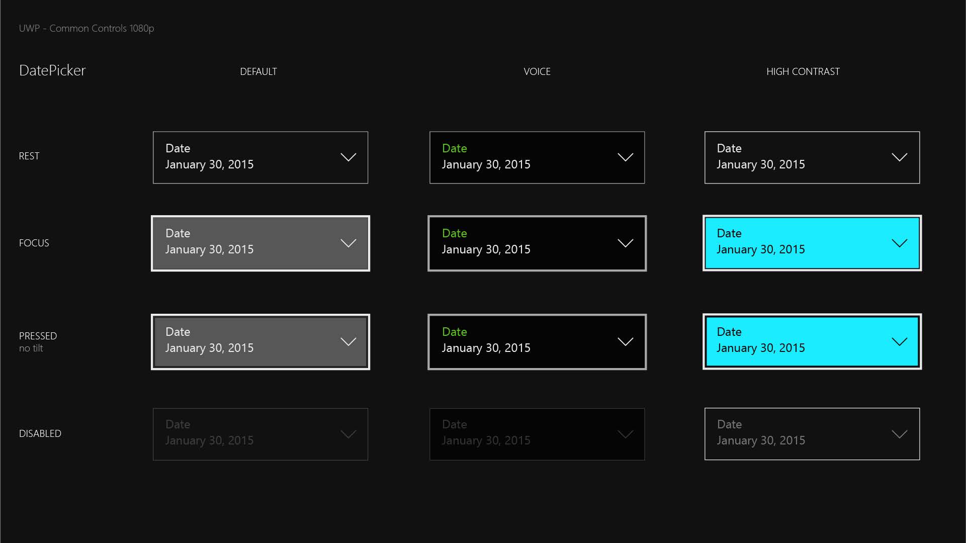
mdtauk
on 8 Jun 2019
@mdtauk , I feel this conversation about Xbox seems better suited with #698? I've pinged someone in Xbox to see if they can comment on the other conversation (no promise :)). That again, this is an open source community, perhaps you could create said resource and propose for us to consume in some way? Just saying...
chigy
on 8 Jun 2019
@chigy That was an issue I submitted, and was about ensuring that any controls the community adds to WinUI should include templates for running on the future Xbox consoles. If developers wanted to use WinUI 3.0+ for their Xbox App - that all the controls should adapt to look correct when running on a TV.
But with the designs pretty much finalised, this issue doesn't have much more purpose - other than to be marked as completed when all the templates are updated.
I have been submitting ideas in the NumberBox control submission, and we wanted to ensure the design of the control matches what is planned for the rest of the controls.
mdtauk
on 8 Jun 2019
If developers wanted to use WinUI 3.0+ for their Xbox App - that all the controls should adapt to look correct when running on a TV.
@mdtauk , as I had mentioned before, this is a fine suggestion but it is not our priority as there has been no requests both coming from Xbox team themselves or community other than yourself.
chigy
on 13 Jun 2019
Updated the fact WebView's ScrollIndicator will not be updated through XAML, but we use web's as is.
chigy
on 13 Jun 2019

Looking at the current Progress Bar in the MUXControlsTestApp - Will the right end of the progress value bar also be rounded, or will it retain it's flat edge?

Will the Slider within the volume flyout also be styled
Will reveal be added to all the controls by default, or will it still have to be added by styles?

Would the Sliders used in the ColourPicker benefit from having an outline style, similar to the MediaPlayer - so it doesn't get lost amongst the darker colours of the Bar?

mdtauk
on 22 Jun 2019
Looking at the current Progress Bar in the MUXControlsTestApp - Will the right end of the progress value bar also be rounded, or will it retain it's flat edge?
By design definition, it should. Please open an issue against MUXControlsTestApp.
Will the Slider within the volume flyout also be styled
Since shell UI uses our common control, it should when the change in our controls occur. However if you don't see this updated, please open FeedbackHub issue. This is a work by shell team and it is not something WinUI team makes the final call on priority and resourcing.
Will reveal be added to all the controls by default, or will it still have to be added by styles?
This is not rounded corner topic.
If you want the reveal be added to all the controls by default, please open a new issue.
Would the Sliders used in the ColourPicker benefit from having an outline style, similar to the MediaPlayer - so it doesn't get lost amongst the darker colours of the Bar?
MediaPlayer is being planned to follow the design of the new slider (#841). So what you are proposing is not in the plan. If you feel it is an usability issue, please open a separate issue.
chigy
on 24 Jun 2019
Woah! There are a lot of comments here.
I think that the persistent sharp corners make Windows 10 look unique. If rounded corners were to be introduced, something would have to be done about the Windows logo, the Microsoft logo and tiles. Once you get rid of metro relics such as tiles, you also need to redo logos such as Office which have a slant. I could go on and on about the effects of introducing rounded corners and consistency but I'll cut it here.
 Poopooracoocoo
on 28 Jun 2019
Poopooracoocoo
on 28 Jun 2019
@Poopooracoocoo the new office icons/logos use rounded corners, as does the new Terminal icon, and the new visual studio icons/logos.
And FWIW, I don't want them to get rid of the tiles, it's bad enough the Windows 10 tablet UI, took a big downgrade, compared to Windows 8.1
mdtauk
on 28 Jun 2019
@Poopooracoocoo , @mdtauk ,
Thank you for your feedback. You are both right that change has to be applied across the board. Thus this effort is starting the alignment with Fabric and other visible UI like Edge. We would like for consistency to happen overnight, but this is a journey. And it starts out from the default value of the UI platform at play here (i.e. WinUI).
chigy
on 28 Jun 2019
Status Update:
Corner Radius (aka Rounded Corner) How-To document PR is created.
This will be added to docs.microsoft.com as a documentation.
It will be a new page under https://docs.microsoft.com/en-us/windows/uwp/design/style/.
Ask to community:
I am trying out writing a little more "background explanation (WHY)" that our customers have expressed we provide with our documentation in some of our focus groups. I would like feedback as this does not follow normal documentation pattern.
Are those extra information useful/helpful, not relevant, other info missing, etc.?
chigy
on 28 Jun 2019
@chigy the only suggestion I have about the document, is that you have not mentioned why the controls will be receiving the rounded corners.
mdtauk
on 28 Jun 2019
@mdtauk , good catch. I had "todo" section (principles) that catches that, but somehow during editing, the context got lost. I'm still working to get that section filled in.
chigy
on 29 Jun 2019
Status Update
Created a separate issue to track work to round the corner of checkbox inside List and GridView (#1096)
chigy
on 24 Jul 2019
Rounded corner changes are checked in now, closing this issue.
 kaiguo
on 22 Aug 2019
kaiguo
on 22 Aug 2019
@mdtauk
And FWIW, I don't want them to get rid of the tiles, it's bad enough the Windows 10 tablet UI, took a big downgrade, compared to Windows 8.1
sorry for only replying now. They really are getting rid of tiles! :(
It's an interesting decision as Android only allows adaptive icons now, in a similar way to iOS while Windows is switching to free-form icons. "Adaptive" icons look better on splash screens because they have a monochrome icon so you don't need to have a blinding white splash screen. On the other hand, free-form icons look a lot better as they give devs more control over the icon and it suits the desktop platform (stuff like the titlebar, taskbar) as well as win32 apps.
The Office icon itself doesn't look like Word or PowerPoint's icons. With these changes, I feel like Microsoft is losing its identity
Poopooracoocoo
on 12 Sep 2019
@Poopooracoocoo I am still holding out hope that there will be an option to use tiles instead of icons, even if icons are the new default in the new shell.
mdtauk
on 12 Sep 2019
@Poopooracoocoo and @mdtauk , please submit feedback on Feedback Hub for tiles discussions since WinUI team has no involvement in tiles nor have any knowledge of the plans.
chigy
on 12 Sep 2019
@Poopooracoocoo and @mdtauk , please submit feedback on Feedback Hub for tiles discussions since WinUI team has no involvement in tiles nor have any knowledge of the plans.
I have submitted feedback about keeping the tiles - there is a collection with lots of upvotes. Feedback Hub is not as good as GitHub as there is little to no feedback or discussion contributions from the Windows Dev teams
mdtauk
on 12 Sep 2019
Hello, how to disable the roundings? It is looking ugly when round button has round tooltip.
 mklemarczyk
on 17 Mar 2020
mklemarczyk
on 17 Mar 2020
@kikisaints @chigy Is there a way to disable the rounded corner for say a specific element like @mklemarczyk is asking for ?
 ranjeshj
on 17 Mar 2020
ranjeshj
on 17 Mar 2020
Hello, how to disable the roundings? It is looking ugly when round button has round tooltip.
@mklemarczyk Have you tried setting the CornerRadius value to 0 in the control's style? You may have to do it in the App.xaml for it to affect all ToolTip controls.
mdtauk
on 17 Mar 2020
@kikisaints @chigy Is there a way to disable the rounded corner for say a specific element like @mklemarczyk is asking for ?
@mklemarczyk , have you seen our guidance doc?
https://docs.microsoft.com/en-us/windows/uwp/design/style/rounded-corner#page-or-app-wide-cornerradius-changes
chigy
on 17 Mar 2020
@mklemarczyk You can use ToolTip.CornerRadius property or the OverlayControlResource as two options to change the corner radius of a tooltip control.
The Control.CornerRadius property is available since Windows 1809 and you can use it like this:
<Application.Resources>
    <Style TargetType="ToolTip">
        <Setter Property="CornerRadius" Value="0" />
    </Style>
</Application.Resources>
This sets corner radius to 0 for every tooltip in the app.
Alternatively, you can use
<Application.Resources>
    <CornerRadius x:Key="OverlayCornerRadius">0</CornerRadius>
</Application.Resources>
Beware that this not only sets the corner radius of tooltip controls app-wide but also all other controls which use this resource (like ContentDialog and controls consuming popups like ComboBox). That is... in theory as overriding the resource does not seem to affect these controls even though it should (ToolTip works).
Felix-Dev
on 17 Mar 2020
There's so much back-and-forth that it is hard to know what was decided with regards to other inputs and corner radius, but very quickly, after migrating a UWP project to use WinUI 3 exclusively I noticed that only buttons had a corner radius applied (along with the other changes like enhanced reveal, etc) but my other input controls (e.g. combobox) were left with the metro look (darker/thicker border and 90° angles). Is this intentional, a WIP, or a bug? Also, to get the combobox to match the buttons I wound up needing to use a corner radius of 3epx although everything I'm seeing online says that the new default corner radius is 4epx?
 mqudsi
on 23 May 2020
mqudsi
on 23 May 2020
There's so much back-and-forth that it is hard to know what was decided with regards to other inputs and corner radius, but very quickly, after migrating a UWP project to use WinUI 3 exclusively I noticed that only buttons had a corner radius applied (along with the other changes like enhanced reveal, etc) but my other input controls (e.g. combobox) were left with the metro look (darker/thicker border and 90° angles). Is this intentional, a WIP, or a bug? Also, to get the combobox to match the buttons I wound up needing to use a corner radius of 3epx although everything I'm seeing online _says_ that the new default corner radius is 4epx?
If you are seeing a difference between WinUI2 and WinUI3 with regards to the styles, can you please open a new issue ? It might be a bug with regard to the merge of styles from WinUI2 into WinUI3.
ranjeshj
on 27 May 2020
Related issues
 jrahma
·
3Comments
mrlacey
·
3Comments
jrahma
·
3Comments
mrlacey
·
3Comments
 ocalvo
·
3Comments
ocalvo
·
3Comments
 MartinZikmund
·
3Comments
MartinZikmund
·
3Comments
 cosminstirbu
·
3Comments
cosminstirbu
·
3Comments
Most helpful comment
I posted this image in the Numberbox proposal, but it may have some relevance to the TextBox controls being updated.
The BorderThickness, FocusReveal on Focused State, Border on Disabled State.
The "Spin buttons" style could apply to the search button, password reveal button, clear text button.