Microsoft-ui-xaml: Proposal: UI for Long-Lived App-Wide Status Messages
Proposal: UI for Long-Lived App-Wide Status Messages
Summary
Add new UI for long-lived app-wide status messages for scenarios such as updates available or errors that may occur which prevent the user from experiencing an app or its features working as intended.
Rationale
- Users should be informed about status changes that occur on an app level (Teaching tips are specifically built for informing users of nonessential options that would improve their experience – there should be a overarching UWP UI element to inform users about essential changes too.)
Scope
| Capability | Priority |
| :---------- | :------- |
| Notification will not block user from effectively continuing to interact with the app while the notification is active. | Must |
| Will make users aware of critical & non-critical messages about app-wide status. | Must |
| Supports custom content and style. | Must |
| Status message able to automatically and programmatically dismissed when status is no longer relevant. | Must |
| Status message can be dismissed by user. | Should |
| If there are multiple status messages, the app should decide how to stack the messages. | Should |
| Responsive to app resize and UI changes. | Should |
| Will act as a system notification. | Won't |
Scenarios
Critical Scenarios:
Non-critical Scenarios:
- Update available.
- Back-up complete.
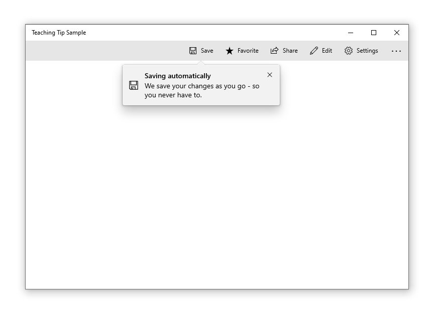
Design mockups:
Status Card
They are similar to Teaching tips but should be used for prompting users about errors or important status changes.

Status Bar
In-app-UI banner similar to what is currently in use by M365:

Your Phone App error message:

VS Designer banner showing 2 separate links:
"Recording started" message in Teams:

InAppNotification
Port from Windows Community Toolkit to appear from the edge of the app window as an overlay UI control.
Open Questions
Scenarios/Requirements for this UI:
- App title
- Scenario description (status message, critical/non-critical, and description of how you would like to present it)
- Screen shot of app screen where error would present (if available)
 sapallie
All 110 comments
@sapallie, could you make the design mockups accessible publicly? Unless they're not to be shared at this point.
 adrientetar
on 21 Jun 2019
adrientetar
on 21 Jun 2019
Currently doing XAML development, and I'd love to see something like this. Or, something like a nice scrolling message control.
From a Microsoft branding standpoint, a standardized error banner seems like it could go horribly wrong. I'd fear end users associating every application error with the Microsoft brand. I just read the proposal, and first thing that came to mind was memelords tweeting about the flashy banner of death.
 EverydayApps
on 21 Jun 2019
EverydayApps
on 21 Jun 2019
@sapallie, could you make the design mockups accessible publicly? Unless they're not to be shared at this point.
Sorry @adrientetar, I can't share them just yet. The designs are Microsoft only for now.
sapallie
on 21 Jun 2019
@sapallie, thank you for this phenomenal feature idea! I am a Program Manager for WinUI and I am excited to pitch this to the team!
I wanted to write a little bit about our process so that you can be in tune with how we'll proceed from here. Starting now, I'll work to refine the high-level scope/requirements of this proposal and the justification for the development. Then I will pitch it to the rest of the WinUI team and we will deliberate on whether it aligns with our Road Map (#717) and if we think we can act on it relatively soon. If so, I'll be approved to figure out the details and begin spec writing so that the feature will be ready for a developer.
Here are few things I already know I need to get a bit more of an idea for...
- Visual behavior
Is your proposal for an edge-to-banner? Or a notification tile like what Windows Notifications do but in the app window such as the in the center, along the bottom edge, or in a corner?
Sorry @adrientetar, I can't share them just yet. The designs are Microsoft only for now.
I don't think I would be able to get this proposal approved without being able to include a public visual of the request as the repo _is_ open source and close-sourcing the visual side of the conversation would entangle the process and experience for our community. Based on responses to the above, I am happy to take a shot at drafting a mock up for the proposal. Would you prefer this or do you have a timeline envisioned for granting your permission to make your design public? I love your mockup and would be eager to have them included in our brainstorming here lest we unnecessarily take the discussion in a divergent direction to your intention. Please let me know! :blush:
The banner will make users aware of errors that prevent them from using an app/a feature
The banner will be dismissable for non-critical errors
Am I correct in reading these statements to mean you also need to have the option for a non-dismissable bannerfor critical errors? If so, could you tell me more about your specific app scenario for recieving one/proceeding from the point of having a non-dismissable banner? Are the users relegated to close the app unless the problem is solved? Or is this where the buttons would come to, say, navigate them to the Network & Internet settings page?
Thanks again and I look forward to refining this idea!
Everyone, please feel encouraged to contribute your needs, designs, and perspectives to this conversation! :blush:
 SavoySchuler
on 26 Jun 2019
SavoySchuler
on 26 Jun 2019
I would like to say, there are a few proposals that all ask for a similar thing. Rather than make this specifically an Error banner - why not just bring in the In App Notification from the Community Toolkit. There could be an icon property added, which would make it show an error icon, or a confirmation icon, etc.
 mdtauk
on 26 Jun 2019
mdtauk
on 26 Jun 2019
@SavoySchuler – good to hear from you. I tried to answer all your questions but please let me know if you need anything else.
Visual behaviour:
Ideally the banner would be similar to a Windows Notification tile and would either be pinned to the top or bottom of the app window. Where it’s pinned depends on the other visual elements in the app and where the focus lies. This decision should be made by a designer.
I think the GIF @mdtauk posted would be a great starting point.
Dismissing:
I think it’d make sense to dig deeper into what I mean with critical vs. non-critical errors:
- Critical errors = app functionality is impaired because of a system-wide problem (e.g. internet connection lost) – these should link to the system settings where the user can maybe fix the problem
- Non-critical errors = some of the functionality is impaired or a single feature doesn’t work but users can still do other things in the app
- It’d also be cool to introduce a purely informational iteration of the banner as well that can be used to let users know that app updates or new features are available.
And I think all of these should be dismissible (I updated that in the proposal description as well)
Example visuals
I did a few changes to the visuals and am able to share them like this:
These examples are an iteration where the entire banner is basically a big button. Users can dismiss it or click on it to go to the system settings (critical error), open a web page with details about feature fixes (warning 1), reload the app page (warning 2) or go to the Microsoft store to update the app (informational).
It’d be possible to expand this concept to add multiple buttons within the banner.
sapallie
on 26 Jun 2019
I really like those visuals for the banner. I would move the text and icon up by 4 px, so they are centred in the white area, rather than the white and coloured bar.
mdtauk
on 26 Jun 2019
Agreed. The posted visuals look quite nice.
 Felix-Dev
on 26 Jun 2019
Felix-Dev
on 26 Jun 2019
I really like those visuals for the banner. I would move the text and icon up by 4 px, so they are centred in the white area, rather than the white and coloured bar.
I haven't counted the pixels but it looks as if these are centered if the space for diacritic marks above the X-height is accounted for.
 mrlacey
on 26 Jun 2019
mrlacey
on 26 Jun 2019
@sapallie Have you made any thought about allowing these controls to be automatically, or programmatically dismissed?
If prompting about being/going offline, it would make sense to programmatically remove such a prompt when online again. (I've seen apps not do this and it can lead to a confusing experience.)
Similarly, having non-essential messages not displayed indefinitely can avoid unnecessary UI clutter and can prevent power users from needing to get out of flow once they've read a message by not forcing them to manually dismiss the notification.
I understand that there are potential extra accessibility considerations around such a control and these behaviors but I believe these ways of dismissing the control are essential.
mrlacey
on 26 Jun 2019
I think it is important to call out that such a control is not intended for general messaging within an app. Unless that really is a desired use case.
mrlacey
on 26 Jun 2019
Should an app be allowed to display multiple banners at once?
If so, how will they be arranged? And is this something that the app can control?
mrlacey
on 26 Jun 2019
This would satisfy those who have asked for an Android Toast style in app notification control, it could also possibly be useful for validation scenarios, to display error text where space in the form is at a premium.
I would also call it something like a StatusTip or StatusNotification so it won't only be associated with negative uses.
I assume the design would adapt by changing the placement on the solid colored bar when it is placed at the bottom of the window?
It should probably have a timeout property, and could even have the ability to show a pending message, like a progress ring and some text like "Logging in now" before switching to a confirmation of error message.
mdtauk
on 27 Jun 2019
I really like those visuals for the banner. I would move the text and icon up by 4 px, so they are centred in the white area, rather than the white and coloured bar.
I haven't counted the pixels but it looks as if these are centered if the space for diacritic marks above the X-height is accounted for.

I think it was more likely that the text was vertically centred in the box without taking into account the coloured bar


Here is how the coloured bar placement could change with the placement of the control
mdtauk
on 27 Jun 2019
@mrlacey yes, programmatic/automatic dismissal for when the banner is not relevant anymore is quite important – I added it to the proposal description.
Status changes and errors: That’s what the banners should be used for. Not general messaging – I agree on that.
And I think multiple banners should work. They should just be stacked.
sapallie
on 27 Jun 2019
@mdtauk I renamed it “Status banner” – thanks for your suggestions.
For the loading state – I don’t believe that should happen in the banner. Loading content should be displayed in the app where the content would actually appear.
And when it comes to changing the placement of the coloured bar – it’d be great to have the flexibility there depending on where the error banner is placed in the app window. 👍
sapallie
on 27 Jun 2019
Issues #622 and #792 could also be covered by this control, if it were to be built.

mdtauk
on 27 Jun 2019
@sapallie Your note on critical error circumstances is interesting with respect to the suggested guidance that status banners point the user to a solution. My intuition is saying that you may also need an API to disable, or at least temporarily dismissability?
I understand that there are potential extra accessibility considerations around such a control and these behaviors but I believe these ways of dismissing the control are essential.
@mrlacey, great callout! Fortunately, I have worked through a significant portion of this during consideration of timed auto-dismiss on TeachingTip, and while some partnering with teams that own accessibility settings would be necessary, I do not believe this feature would be blocked on account of accessibility concerns. +1 on all your other points!
SavoySchuler
on 11 Jul 2019
Could there be the ability to add a HyperlinkButton linking to a solution, or to a settings shortcut, like Networking?
mdtauk
on 11 Jul 2019
Could there be the ability to add a HyperlinkButton linking to a solution, or to a settings shortcut, like Networking?
I was envisioning the subtext containing a hyperlink to an in-app or Settings App (see TeachingTip's Xaml Control's Gallery Code) page. Were you thinking of something more standardized @mdtauk?
SavoySchuler
on 15 Jul 2019
@SavoySchuler Content property instead of MessageText?
mdtauk
on 15 Jul 2019
Your note on critical error circumstances is interesting with respect to the suggested guidance that status banners point the user to a solution. My intuition is saying that you may also need an API to disable, or at least temporarily dismissability?
Yeah, possibly I guess… Definitely doesn’t hurt to add it. It adds flexibility after all and will probably be quite useful for some use cases.
sapallie
on 16 Jul 2019
@mdtauk - Yes, I certainly mean content property!
@sapallie
Your note on critical error circumstances is interesting with respect to the suggested guidance that status banners point the user to a solution. My intuition is saying that you may also need an API to disable, or at least temporarily dismissability?
Yeah, possibly I guess… Definitely doesn’t hurt to add it. It adds flexibility after all and will probably be quite useful for some use cases.
On one-hand you have a non-dismissable pop-up covering the UI (and possibly causing its own scenario-based error in doing so) and on the other you an have app warning/critical error that is non-persistent which also makes my spidey-senses tingle.
Perhaps rather than an over UI + tip-style pop-up, would an in UI + edge-to-edge banner (the likes of which is used by the Office Suite to notify about updates - see below) meet the needs while also being afforded persistent space in your UI?
SavoySchuler
on 17 Jul 2019
@SavoySchuler There could be a behaviour on the control, where it puts the header and content on a single line, if the control width is wide enough.
My earlier suggestion with the different positioning layouts would also work if the control slides out from the edge of another control - not just within the window or panel.
mdtauk
on 17 Jul 2019
Perhaps rather than an over UI + tip-style pop-up, would an in UI + edge-to-edge banner (the likes of which is used by the Office Suite to notify about updates - see below) meet the needs while also being afforded persistent space in your UI?
Yeah, that works too. 👍
sapallie
on 18 Jul 2019
It seems like it would be ideal to have both inline and overlay options as in retrospect the Office Suite is able to rely on all of their apps having a Ribbon. @mdtauk I like your suggestion that's starting to hint at how we think about appearance/disappearance behavior.
@all, can anyone share with me specific scenarios in your real apps where you envision this control being used? Specifically, I am interest in thoughts on visual entrance and the user interaction required to prompt dismissal? Do the requirements here cover the core behaviors you need from this control?
SavoySchuler
on 19 Jul 2019
@SavoySchuler Considering Entrance and Exit, it could slide in from an edge, but also animate in as a floating overlay if the developer chooses. Sliding in from the right edge of the screen at OS level - from the right edge of an app window, or out towards from the edge of a control or UI element.
There is a close button for dismissal, but for touch displays, the ability to slide it in the reverse direction from where it emerged could also work. To ensure consistency, this needs to be built into the control.
Tapping the control should probably trigger an action which the message text would specify.
The exception would be for displaying the progress of an action which would not be dismissable until it times out with an error or successfully completes.
Animated Examples

Enter, Update, Exit - YouTube Link

TeachingTip exists and is a good way to target a specific Control or UI Element, and good for highlighting a new feature in an app. It could technically be used for the same purposes as this StatusBanner, so some thought needs to go into the semantic use of each of these, and identify what makes each unique.
Below are my personal thoughts about the differentiation between Status Banner and Teaching Tip
Status Banner _I believe_ should be encouraged for actual actionable statuses, and so should invoke a single action when tapped.
- Teaching Tip would present actions as a button or hyperlink, typically used for information that can be readily dismissed.
When an app or OS condition changes, that is necessary for the app, then that should trigger a Status Banner to show.
- Teaching Tip would not provide critical information, and once dismissed would not be shown again unless something new is added to be called out.
Status Banner should either persist when showing, unless dismissed with the Close button, or perhaps a swipe when in touch. With the exception for an ongoing progress scenario completing, or OS status resolves (Network is restored).
- Teaching Tip would possibly include a timeout function, would not display randomly while the app is running, mostly displayed on app launch or navigation to a page/screen.
Status Banner should be used in the OS Shell in a consistent way - there could be a set of standard localised banners with content, icons, colours, as an enum.
There could be some OS logic to append Status Banners to app windows.
For instance when an app tries to access the network, and it is unavailable, the OS could show a standard Status Banner within the app window, rather than in screen space, or leaving it to developers to implement.- Teaching Tip would be app specific, and no defined standard content, and for the dev alone to include.
mdtauk
on 19 Jul 2019
@mdtauk, fantastic work on the videos! 🎉 They are beyond helpful in bringing life to these ideas.
The need for persistence is an excellent point and I think the dismiss feature could also be mitigated with Guidelines that suggest making the status notifications persistently available in a notification pane if critical or, _possibly_ resurfacing them at non-invasive intervals if problems persist. These are not definite assertions, just points of consideration to make in ensuring that this solution is appropriately comprehensive in its scenario solution.
The need to distinguish TeachingTip from this feature is spot on and I agree with your points. This control would serve a distinct need that TeachingTip was not designed to solve though there may be opportunity for some shared features or code.
Are there any stakeholders that would not have their needs met by something like what @mdtauk has shared above?
SavoySchuler
on 24 Jul 2019
There seems to be differences between the Status Banners mocked-up in the OP and the full-width notification as seen in Office (images above in earlier comments) or Visual Studio (as below)
The differences between the two mean I wonder if they should be the same control or separate ones.
Here's a quick list of properties that each would need. (names for example, not fixed but intended to infer meaning)
Status Banners
- _Icon_
- Message Text
- Additional Text (second line)
- Type (Critical, Warning, or Information)
- Color
- Location
- Animation Direction
- Tap Event/Command
- Timeout
Full-width Notifications
- _Icon (possibly)_
- Message Text
- Link Style (Button or HyperLink)
- Links (Text and Tap Event/Command - multiple)
- Timeout
Only the properties in bold exist in both. _Icon_ is potentially confusing as different types of icon (in a circle, or outline) are needed for each type.
There would also need to be a property to indicate which style to use.
To me this feels like there is too much difference for a single control and putting all this functionality together would be confusing and complicated.
I think these two concepts:
- a dismissable full-width banner with zero or more actionable sub-elements
- a banner intended to indicate status changes and that operates as a single button
will provide the most value and least confusion as separate controls.
mrlacey
on 25 Jul 2019
How would animated status banners support displaying multiple notifications at once?
Or is this now out of scope?
mrlacey
on 25 Jul 2019
- Status Banner should be used in the OS Shell in a consistent way - there could be a set of standard localised banners with content, icons, colours, as an enum.
- There could be some OS logic to append Status Banners to app windows.
For instance when an app tries to access the network, and it is unavailable, the OS could show a standard Status Banner within the app window, rather than in screen space, or leaving it to developers to implement.
This level of OS integration shows ambition beyond a single control and beyond WinUI.
Would "standard localised banners" be all that's available or would these be in addition to being able to have something fully customizable?
If providing some by default, what will they be?
I would be concerned that only providing a limited set of options would be unnecessarily limiting of the potential of such a control.
Having the OS show banners in the open app for system wide scenarios like loss of network connectivity raises a number of concerns for me.
- The action center already provides a way of providing system wide notifications.
- With multiple windows open, seeing banners displayed in each seems unnecessarily intrusive.
- Having the system display notifications (banners) within an app is something I would expect developers to want to control or disable.
- If an app only occasionally needs a network connection, seeing a prompt about a loss of connection could be disconcerting or distracting for the user if not relevant to what they are currently doing.
- This would tie apps to specific versions of the OS to get updates or desired behavior. A future change in the OS function might break or change an app in undesirable ways.
- Updates and bug fixes would only be available at OS level release schedules. Part of the reason behind the existence of WinUI is to break that coupling with the OS and app functionality.
- One of the goals of such a control as is described here is to make it easy for developers to implement. Removing their ability to control it would cause issues for apps where specific scenarios must be handled in custom ways.
mrlacey
on 25 Jul 2019
Just found this issue from the Twitter post about the animated mock-ups. It does seem to overlap a lot of the work we've done with the InAppNotification control in the toolkit. Including things like how multiple messages are handled.
We've learned that while this appears like a simple control, it's pretty complex. It'd be nice to have a holistic solution that can be built-in to WinUI though to cover all these cases. Then we can deprecate the toolkit control.
 michael-hawker
on 26 Jul 2019
michael-hawker
on 26 Jul 2019
Conferring with @ryandemopoulos, and I want to refactor this initial conversation a little to focus on the problem (need for error UI) before the solution (any specific piece/pieces of error UI).
To this end, my first goal is to lock down the scenarios and requirements for error UI (@sapallie, your "Critical: wifi connectivity lost" scenario is a perfect start). From there, we can work together to decide if the solution includes one piece of error notification UI or set of error UI components. From which, we'll expand @mrlacey's break down of API similarity (thank you for starting this) to decide if there's enough commonality for a derivation approach vs. distinct controls if there are several outputs of this conversation. I don't want to get ahead of myself but @mrlacey's argument for distinct solutions _is_ already looking crisp and that's OK. My focus is on creating the right set of solution pieces for everyone here.
So, for anyone (@sapallie, @adrientetar, @EverydayApps @Felix-Dev, @mdtauk, and @mrlacey) that this control is particularly relevant to, could you provide me the following here or dm @ [email protected]:
- App title
- Scenario description (error, critical/non-critical, and description of how you would like to present it)
- Screen shot of app screen where error would present (if available)
SavoySchuler
on 5 Aug 2019
I have updated the Issue to reflect this problem-focused approach and I have cataloged the requirements, scenarios, and solution possibilities described so far.
@sapallie I tried to be courteous as I could in preserving your initial work. Version history is viewable under the "edited by..." drop down at the top of the issue. Please let me know if I did not capture anything correctly.
SavoySchuler
on 5 Aug 2019
I pitched this to the WinUI team and we believe that the functionality defined here would be capable of serving not just error messages but long-lived app-wide status messages as a whole. This includes "update available" and "back-up complete" kind of status messages in addition to error-specific scenarios.
I have updated the issue to reflect this more holistic approach. I am hoping to finalize requirements and scenarios in the coming weeks so that we may being examining the necessary UI output pieces for displaying these messages.
I will rephrase my request above. @sapallie, @adrientetar, @EverydayApps @Felix-Dev, @mdtauk, and @mrlacey, for status/error messages you wish to display in your applications, could you provide me the following here or at [email protected]:
- App title
- Scenario description (status message, critical/non-critical, and description of how you would like to present it)
- Screen shot of app screen where error would present (if available)
SavoySchuler
on 5 Aug 2019
It's worth noting that, imo, popup dialogs should be avoided if possible. The web is full of popups prompts everywhere and they interrupt the flow trying to catch your eye. For instance, I think empty status (example) should be preferred e.g. if something could not be loaded in a control.
With respect to the visuals @mdtauk posted, do we really need popups displaying from all four edges of the screen/app? The point of WinUI should be to standardize the position and look of such items so all apps would use the same, and in that respect, Android Snackbar is an obvious reference. Another thing to note with Snackbar is does not display errors with a bright red color or anything, it has a sober appearance which I think is again beneficial in not distracting the user too much from what he's doing.
We'll also need guidance on when to use this popup instead of a dialog for instance, otherwise it'll just create fragmentation (different apps using the messaging controls in different ways).
adrientetar
on 6 Aug 2019
Flyouts have a placement concept, this control could do the same thing. Appears from the inner edge of a container control, be it a Page or Tab Content are, etc.
@adrientetar Not every app is the same, so whilst there will be a default for this control, there needs to be a way for developers to change this location, without having to re-template, or re-engineer the control.
Office uses the space below the Ribbon. Edge uses the bottom of the screen. Only Windows itself, would be able to attach it to the Shell or Screen edges, and there is probably a good reason to prevent apps from mimicking system level alerts.
Plus any developer has the ability to restyle their own alert controls, so at this stage, it needs to be as flexible as possible, and then the Shell team will have some say into what restrictions go into the control usage.
mdtauk
on 6 Aug 2019
The Your Phone team have one of these kinds of controls, so maybe you could ask them what issues they came across, and persuade them to move to using the WinUI control when its done and included?
mdtauk
on 9 Aug 2019
Dropbox also using Snackbar in their design system (scroll down, second to last row of images).
adrientetar
on 15 Aug 2019
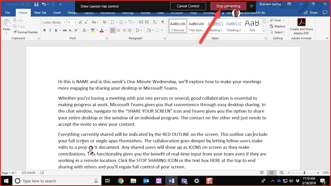
Recently spotted a couple more examples of long-lived, app-wide status messages:
("recording started" message in Teams)
("trying to connect to the game coordinator" in Dota 2)

Sorry these are small--the first picture was snapped from my desktop with an ultrawide monitor. :)
 ryandemopoulos
on 19 Aug 2019
ryandemopoulos
on 19 Aug 2019
Some dropbox snackbars contain a progress bar at bottom. Should this be included here? It can make sense e.g. for stuff like upload, download, update, sync progress. It's not a must-have imo, but maybe could or should?
 lukasf
on 17 Oct 2019
lukasf
on 17 Oct 2019
Should these be rounded? Or no?
 shaheedmalik
on 17 Oct 2019
shaheedmalik
on 17 Oct 2019
Yeah, I think the key differentiation here from Teaching Tip is that apps want to coordinate their messaging space and may have multiple error/status updates to display at the same time (or in succession).
I think ideally, this is one control that the developer configures and places within their app and then pipes messages too (which I'd imagine have some sort of type to denote if it's error, status, warning, or some other general message).
In both the banner and pop-up case, I've seen apps which may have multiple messages. Sometimes they stack the banners which then dominate the UI real-estate, so it'd be nice if this solution avoided that (though nothing would prevent a developer from using multiple instances of the control to re-create that behavior still).
I'm surprised we also haven't called out VS Code, as they have their stacking pop-up notification panels on the bottom-right that also have additional action buttons on them too (to jump to settings for instance).
michael-hawker
on 18 Oct 2019
VS Code Example Screenshot:

They have different types of icons that appear on the top-left, customizable button actions, and the ability to have the 'gear' icon to configure settings about the notifications per extension, in their case.
michael-hawker
on 18 Oct 2019
Just seen this screenshot of Cortana...

mdtauk
on 30 Oct 2019
Office UI Fabric's MessageBar looks great, IMO:

 kmgallahan
on 1 Jan 2020
kmgallahan
on 1 Jan 2020
i've noticed that Samsung Notes for Windows 10 uses notification toasts to explain that a note was discarded because there was nothing in it which is so annoying
 Poopooracoocoo
on 7 Mar 2020
Poopooracoocoo
on 7 Mar 2020
Hi everyone! I'm a Program Manager for WinUI and am picking this proposal back up from @SavoySchuler. There's been a lot of great discussion and idea sharing already in this thread, thank you for all of your suggestions!
As it's been several months since there's been some activity here I wanted to check back in with everyone and re-iterate where we are currently.
As a summary of our current scope at the top of the proposal:
- The notification will be for alerting the user of essential information related to the application as a whole
- Will support custom content and styling
- Will be able to be automatically and programmatically dismissed
- The notification should be able to be dismissed by the user
- Should support multiple notifications that can be stacked according to how the app has specified
- Should be responsive to app resizing and UI changes
- The notification will not be for displaying system-wide notifications
Please feel free to comment and let me know if I've missed anything in my scope summary or if you disagree. I want to be sure we're all on the same page before moving forward 😊
Now that we’ve defined the scope, there are a few specific scenarios and user experiences that still need to be defined. My hope is that defining these experiences will help guide the UI affordances for the control. What are your thoughts for your scenarios?
CC: @sapallie, @adrientetar, @EverydayApps @Felix-Dev, @mdtauk, @mrlacey
The experiences are:
- How the notification leaves the view
- The user manually dismisses the notification
- The notification automatically times out and dismisses itself
- The notification only disappears after the user has made an action that relates to why the notification appeared in the first place
- i.e. After receiving a notification that the internet disconnected, the notification only disappears when the internet is disconnected
- Other?
- How the user will react to the notification
- Immediately take action related to the notification
- Postpone their action related to the notification to a later time
- Ignore and/or dismiss the notification entirely
- Other?
- When the notification will appear
- On app launch
- Programmatically from app status
- After a user makes an action (i.e. choosing to backup their documents)
- Other?
- If it’s possible to have multiple notifications appear at once and why
Thank you again for all of your thoughts and I look forward to bringing this to light!
 gabbybilka
on 5 May 2020
gabbybilka
on 5 May 2020
Glad to see this proposal has not been forgotten @gabbybilka and thank you for taking it on!
If it is at all possible, you could contact those working on first party apps that include these kinds of notification UIs to make a list of requirements, for them to move from their custom solution, to a WinUI native control. Their needs, combined with the community's wants and needs, should cover enough for a V1 of this control.
@chigy would be someone to talk to about final design specs, as she works with the Fluent Design teams.
Microsoft should lead by example with this, if others are to be encouraged to use a consistent WinUI control.
- Cortana
- Groove Music
- Film and TV
- Your Phone
Those are the apps that come to mind.
mdtauk
on 5 May 2020
@gabbybilka we also have the control in the Windows Community Toolkit, so happy to talk about that with you at any time. It'd be really great to have an upgrade path for our users here and migrate it from the Toolkit to WinUI.
I think from your initial summary that has most things covered, but could be good to call out something around having optional, actionable buttons as well? Or would that always just be custom content?
michael-hawker
on 5 May 2020
Following-up from the toolkit with some history of the control from the toolkit (it's been around a while):
- Original Issue
- First PR Review
- GitHub History - not sure how to grab the full list on one page, so scroll down and keep clicking 'Older'
The styles in the toolkit are modeled after the original Microsoft Edge and VS Code notification styles (which have both been updated since then). But as shown, it's flexible and re-template-able and would work for both a top-level status bar Office-style warning OR a general pop-up-style notification.
michael-hawker
on 7 May 2020
Hello again! As an update on this I've recently re-pitched this proposal to the team and received the go ahead to further define this feature.
For the scenarios outlined previously, we're looking to move forward with creating a control currently titled the InformationBar (InfoBar for short) to represent long-lived, app-wide, essential status messages. The initial visual design thinking is inspired by FluentUI's MessageBar and how Teams displays their "Now Recording" and "Internet disconnected" messages.
Specifically, including an icon, title, flexible message area, and dismiss button as the primary, minimum, visual components in a container that defaults to fit the width of the content area it resides in. As scoped previously, the InfoBar will be dismissible via the user or programmatically when the app functionality affecting status is resolved, i.e. internet connectivity is restored, without intro/exit animations.
Teams (now recording)

Office (compatibility mode)

Teams (no internet)

As the API starts to crystallize I'll begin guiding discussion over to the spec. In the meantime please feel free to continue sharing your scenarios where you would use an InfoBar and what functionality you require 😊
Earlier in the discussion @mrlacey and others brought up the potential to have two separate controls that could cover the scenarios mentioned.
I think these two concepts:
- a dismissable full-width banner with zero or more actionable sub-elements
- a banner intended to indicate status changes and that operates as a single button
will provide the most value and least confusion as separate controls.
I recognize that the InfoBar visual style and components may not fit for some of the use-cases previously shared. If your specific app scenarios and functionality require a different visual style, feel free to continue sharing those situations in this thread. If there is enough current interest we can open up another issue for status cards/in-app toasts. My current thinking of some of the most prominent differences are in how animations are handled, desired persistence, and intended user actions after notification.
Thanks again everyone!
gabbybilka
on 2 Jun 2020
The control should be designed to work well with templates and styling - so it can be moulded to fit the needs whilst all the behaviours are properties of the control.
Animate or Don't Animate.
Show Close Button or Hide it.
Position.
Show Icon or not.
etc
mdtauk
on 2 Jun 2020
I recognize that the InfoBar visual style and components may not fit for some of the use-cases previously shared. If your specific app scenarios and functionality require a different visual style, feel free to continue sharing those situations in this thread. If there is enough current interest we can open up another issue for status cards/in-app toasts. My current thinking of some of the most prominent differences are in how animations are handled, desired persistence, and intended user actions after notification.
Thanks again everyone!
It's great it going forward. Those visual style as shown it your leave a lot of the be desired to the point I wouldn't want to use the app.
Designs that @mdtauk posted or the Cortana screenshots above would be way more preferable. The designs of apps need to go forward not be held back by programs.
shaheedmalik
on 2 Jun 2020
Would/could this also act as a dismissible CommandBar like those used while presenting/desktop sharing? E.g.
I know it wouldn't support the overlay over everything, but in terms of fixing it's width and putting it in an overlay layer of an app, I could see the overlap in design/functionality being similar in this direction.
michael-hawker
on 2 Jun 2020
@mdtauk
The control should be designed to work well with templates and styling - so it can be moulded to fit the needs whilst all the behaviours are properties of the control.
Animate or Don't Animate.
Show Close Button or Hide it.
Position.
Show Icon or not.
@shaheedmalik
It's great it going forward. Those visual style as shown it your leave a lot of the be desired to the point I wouldn't want to use the app.
Designs that @mdtauk posted or the Cortana screenshots above would be way more preferable. The designs of apps need to go forward not be held back by programs.
Thanks for your feedback there! I agree that the control should be flexible enough for this basic behavior and customizability in the Fluent Design system. The visuals I shared were mainly references of previously implemented examples.
We'll continue trying to strike the balance between overloading a single control with too much functionality while ensuring its customizable and useful enough for the various long-lived app-wide status message scenarios.
Would/could this also act as a dismissible CommandBar like those used while presenting/desktop sharing? E.g.
@michael-hawker
I think this is an interesting scenario not yet brought up in the thread and could potentially be supported by this control. Thanks for bringing it to our attention! In regards to scoping this seems to be a lower priority scenario but I agree that the design/functionality is similar outside of the overlay prioritization.
gabbybilka
on 5 Jun 2020
Is there any update on this issue? We are currently planning a UI to display the status of file operations in Files UWP, the design we are leaning towards can benefit from such a feature being proposed here.

 yaichenbaum
on 16 Jun 2020
yaichenbaum
on 16 Jun 2020
Hi @yaichenbaum, thanks for checking in! As an update on this proposal I'm happy to share the spec document that we're beginning to draft.
As a summary of what's been defined so far we are choosing to create a single control with two visual modes, "Bar" and "Toast" or "Card". Our current efforts are in defining and prototyping the "Bar" mode. The components of these two modes are the same and are planned to differ only in visual layout. As there will be multiple visual modes, I'm currently deeming this control StatusBanner instead of InformationBar to not restrict to the single "Bar" style, however, feel free to share your ideas for naming 😊
The main components of the StatusBanner from left to right in the layout are:
- Status color
- Icon
- Title
- Message
- Action button
- Close button
These properties are optional and custom content via the "Content" property is still an option.
Additionally, we're planning on defining various BannerTypes that a developer can set which have preset icon and color combinations depending on the status. This can simplify choosing the correct Icon or BannerColor based on criticality of the notification and provide some consistency across applications. Customizing the Icon or BannerColor is also supported.
Paper prototype of the StatusBanner in "Bar" mode without action button or custom close button.

The current design of the StatusBanner bar layouts were heavily inspired by @mdtauk's designs for the status card, thank you!
If you'd like to share feedback in regards to the current state of the spec, feel free to comment in this issue. Our next steps are to solidify the designs and code snippets (and expand to cover more usecases) and define functionality like stacking and message wrapping. Thank you everyone!
gabbybilka
on 17 Jun 2020
@yaichenbaum in the meantime there's the Toolkit's InAppNotification control.
 hawkerm
on 17 Jun 2020
hawkerm
on 17 Jun 2020
@gabbybilka Thanks for the update, an important feature that I will need for my use case is the ability to show multiple status messages at a time, just like @hawkerm shared earlier in this thread. Having the control handle the placement of multiple status messages will be a plus.

@yaichenbaum in the meantime there's the Toolkit's
InAppNotificationcontrol.
@hawkerm I haven't looked much at the InAppNotification but I would rather wait for the WinUI version instead of switching to the new control when it's ready.
yaichenbaum
on 17 Jun 2020
Hello everyone!
Apologies for the lack of time between the last update and now, we've been hard at work defining this control 😊
You might have seen @chenss3's prototype merge in the repo a few weeks ago, we're really excited to see this come to life! At this stage, we are interested in connecting with any consumers of this control who would be interested in prototyping and using this in their applications. Please reach out and share what application you're developing, the scenarios when you are using this control, if you'd need any assistance getting started, and your feedback using the prototype.
As we've started to figure out implementation details for a pop-up version of this control with support for positioning and stacking of multiple notifications we've decided to continue working on an inline version for the near future. We hear your feedback on requiring pop-up functionality for some of your scenarios and will continue to move in that direction! In the meantime, we are developing our next version of the prototype that more closely resembles the mockups below.
Please check out the spec if you'd like to see a few more examples:

Thank you everyone and I look forward to hearing from you!
gabbybilka
on 28 Jul 2020
Is this just available in WinUI 3, or is it going into a WinUI 2 pre-release?
kmgallahan
on 28 Jul 2020
@kmgallahan WinUI 2 pre-release, not quite sure of the exact ship version yet as we want to receive a bit more feedback from the community and customers on the prototype and preview versions.
gabbybilka
on 28 Jul 2020
To maximize early feedback I'd recommend making it as easy as possible to try out prototypes like this. Maybe push them into pre-release builds with disclaimers, or provide dev/beta releases.
Being required to build a dev branch of WinUI to try prototypes provides a good bit of friction, especially if you are mainly a WinUI consumer rather than contributor (to the codebase anyways).
kmgallahan
on 28 Jul 2020
Agreed, once the prototype is in a solid state (looking similar to the mockups shown and with support of different input options) we'd like to put it in 2.5 preview. Would you be able/interested to try it out at that time?
gabbybilka
on 28 Jul 2020
I'm interested in trying it out now, I just prefer to consume from NuGet rather than adding a massive project like WinUI to my build.
For now I'll wait for whatever makes it into a preview.
kmgallahan
on 28 Jul 2020
Hello again! A few updates:
The spec has continued to be reviewed and iterated upon. Please feel free to check it out at this PR and leave comments. A notable change is the addition of a generic ActionButton property that will take in your own content that inherits from ButtonBase.
- An inconsistency in the current mockups I would like to point out is the location of this ActionButton. In the spec, the action button is currently shown to be right-aligned directly left of the close button however the actual location will be directly to the right of the message. The image shown in my previous comment and below is the correct location. Improved mockups will continue to be updated and added to the spec as development continues 😊
@teaP has picked up implementing the native version of this control as it moves towards a WinUI 2.5 prerelease. Thank you!
As before, if you see yourself as a potential user of this control, feel free to comment about the application you're developing and the scenarios in which you'd use the InfoBar. Thank you everyone!

gabbybilka
on 28 Aug 2020
Hello again! Just to highlight, @teaP recently opened pull request #3325 for InfoBar if you'd like to check it out 😊
gabbybilka
on 24 Sep 2020
Why is this called InfoBar? Info is only one small class of information it can contain. It also supports errors and warnings plus actions based on them. Bar is also artificially constraining the 'shape' of the control. There are several other use cases for it besides a bar.
NotificationView or MessageView, etc would be better names in my opinion.
 robloo
on 28 Sep 2020
robloo
on 28 Sep 2020
Why is this called InfoBar? Info is only one small class of information it can contain. It also supports errors and warnings plus actions based on them. Bar is also artificially constraining the 'shape' of the control. There are several other use cases for it besides a bar.
NotificationView or MessageView, etc would be better names in my opinion.
It was originally proposed as a StatusBanner
Then it was changed to InformationBar / InfoBar
The FluentUI version of this control is called MessageBar
mdtauk
on 28 Sep 2020
Thanks for the summary. The name still doesn't make a lot of sense for me. The way the current control is designed is as a notification. More generalized it should be a 'message' so it can support help/teaching scenarios too. Generalizing the various concepts, here is a better design for the controls:
~MessageView~ or Tip: A control to display status, hint or teaching information to the user with an optional action, title, glyph, image and buttons. This can be placed anywhere and is not a popup. It would also support different layouts.
TeachingTip : A flyout/popup hosting a MessageView.
- Hosted Tip
NotificationBar or StatusTip : App-wide notification in a 'bar' format at the top of the application or view.
- Hosted Tip
ToolTip : Will now be able to host the tip as well which will give support for actions and images, etc.
- Hosted Tip
We really need to think in general terms and combine high-level concepts into the same controls. Otherwise we are going to create a lot of very specialized controls with similar but different properties.
Thought of a perfect name for a general 'MessageView' control: Call it a 'Tip'. ToolTip could host it as well. Updated accordingly.
robloo
on 29 Sep 2020
Here is another 'real-world' example of a notification bar at the top of some input fields. The current control would be useful for that scenario:

robloo
on 29 Sep 2020
Here is another 'real-world' example of a notification bar at the top of some input fields. The current control would be useful for that scenario:
TextBoxes will be getting validation states which could cover some of this, but here is how I view the various controls...
- Tooltip for a single element where the user actively wants to identify;
- TeachingTip for a single element the developer wants the user to notice (can also be unattached to an element);
- InfoBar for the entire app/content area where the developer wants to deliver some information;
- Flyout/Dialog for when the developer wants the user to confirm they have read something before dismissing it;
- Content Dialog for when the developer requires the user to make a choice or take an action above all else;
I would also avoid using the word Notification as there is the OS Level notification and the notification centre for these
mdtauk
on 29 Sep 2020
I would also avoid using the word Notification as there is the OS Level notification and the notification centre for these
Well, I think developers would know the difference but it's certainly a fair point.
It's also true we can make lots of separate controls. But there are certainly some high-level concepts around notification/status/messages/hints/teaching that could be combined together. We should at least make an interface out of all this.
Flyout's/Content dialogs are separate concepts as they are generic content controls for the most part.
robloo
on 29 Sep 2020
I thought of a perfect name for a generalized 'message view' type control to host in various scenarios: call it a 'Tip'. I've updated my comment above accordingly: https://github.com/microsoft/microsoft-ui-xaml/issues/913#issuecomment-700307412
robloo
on 29 Sep 2020
I thought of a perfect name for a generalized 'message view' type control to host in various scenarios: call it a 'Tip'. I've updated my comment above accordingly: #913 (comment)
I wouldn't feel comfortable putting an important warning or error message in a Tip...
mdtauk
on 29 Sep 2020
It's also true we can make lots of separate controls. But there are certainly some high-level concepts around notification/status/messages/hints/teaching that could be combined together. We should at least make an interface out of all this.
Flyout's/Content dialogs are separate concepts as they are generic content controls for the most part.
I really like this idea. I think there are commonalities in the icon, title, message, action button APIs that can be consistent across these info controls. With InfoBar, I'm unsure if its something we can implement in this current version but potentially for our next control of this nature.
I thought of a perfect name for a generalized 'message view' type control to host in various scenarios: call it a 'Tip'. I've updated my comment above accordingly: #913 (comment)
I wouldn't feel comfortable putting an important warning or error message in a Tip...
I also agree with this...more exploration to be done.
gabbybilka
on 29 Sep 2020
I thought of a perfect name for a generalized 'message view' type control to host in various scenarios: call it a 'Tip'. I've updated my comment above accordingly: #913 (comment)
I wouldn't feel comfortable putting an important warning or error message in a Tip...
I also agree with this...more exploration to be done.
Think of how well it fits with all existing controls and ideas -- it's perfect in that regard. But yes, it does seem out of place in the context of errors/warnings. I think people would quickly understand it but I can't argue with that logic.
robloo
on 29 Sep 2020
Why is this called InfoBar? Info is only one small class of information it can contain. It also supports errors and warnings plus actions based on them. Bar is also artificially constraining the 'shape' of the control. There are several other use cases for it besides a bar.
NotificationView or MessageView, etc would be better names in my opinion.
I agree with your point that the InfoBar may not always be a bar however I think including "bar" in the name does imply that its intended for app-wide scenarios both visually and conceptually. Searching up for images of "information bar" you find images of similar experiences from IE (not that we're necessarily trying to match IE) and I think it connotates the expected visual and functional layout. I don't see this as a 'View' but I like the focus on message or notification.
gabbybilka
on 29 Sep 2020
@gabbybilka Yes, it's quite similar to the old StatusBar or the newer AppBar... CommandBar... etc. The issue is the usage of the control should be generalized quite a bit to also show hints and messages in arbitrary locations. 'View' also doesn't fit 100% but it's closer to a general name. Really my concern is in unifying the underlying concepts so we don't end up with multiple controls doing variations of the same thing.
Edited for confusing myself with multiple comments in two locations.
robloo
on 29 Sep 2020
Echoing thoughts I posted in one of the other issues...
_Responding to the fact a floating mode for the control is no longer being considered for V2_
I can understand the change in behaviour and form would make you turn towards the TeachingTip as an alternative, but I would suggest the lack of severity, status colour, and the design of the teaching tip itself - would not be compatible with the same kind of messages that the InformationBar control is catering to.
The screen width and differences in UI layouts between a Full Screen WinUI app, a narrow width window, and things like Hololens and Xbox - would not lend themselves to a docked Bar form factor.
So with that in mind, perhaps the InformationBar should be wrapped, along with an InformationCard control into an AppMessage API - so the same properties of Severity, Colour, Title, Message, Action Buttons, etc can be placed into the XAML, or into the app's code - and the way they are presented on screen changes to suit the form factor/device family.
An unattached Teaching Tip could stand in, but it would not support those customisations that are suited for App Status Messages - which is the original intention behind this control.
mdtauk
on 29 Sep 2020
So what if we had a 'Tip' that is really just a message. It has a glyph, images, message text, title.
Then deriving from Tip we have AppMessage which adds severity, actions and things. Tip would then still be usable in TeachingTip and ToolTip as they exist today. it would also be useful in my scenario for inline, contectual hints.
robloo
on 29 Sep 2020
So what if we had a 'Tip' that is really just a message. It has a glyph, images, message text, title.
Then deriving from Tip we have AppMessage which adds severity, actions and things. Tip would then still be usable in TeachingTip and ToolTip as they exist today. it would also be useful in my scenario for inline, contectual hints.
TeachingTip without a Tail seems perfect for your situation...
mdtauk
on 29 Sep 2020
TeachingTip without a Tail seems perfect for your situation...
Didn't know you could do that with TeachingTip. Also, my control has been around a lot longer than TeachingTip so never really investigated upgrading it until now. Either way, if you can do that it's an oversight on my part.
Edit: Nevermind, even without a tail it is still an overlay that is dismissed one way or another. The 'hint' I'm describing is all inline and persists until the user basically creates the first element. It is simply a control that presents information -- not in a popup, flyout or other non-persistent view.
I'm still convinced there is a lot of commonality to break out into interfaces/controls used in multiple places. All of these controls we are discussing have far more similarities than differences. It's only where/how the underlying information is presented that changes. This is all ripe for simplification.
robloo
on 29 Sep 2020
TeachingTip without a Tail seems perfect for your situation...
Didn't know you could do that with TeachingTip. Also, my control has been around a lot longer than TeachingTip so never really investigated upgrading it until now. Either way, if you can do that it's an oversight on my part.
I'm still convinced there is a lot of commonality to break out into interfaces/controls used in multiple places. All of these controls we are discussing have far more similarities than differences. It's only where/how the underlying information is presented that changes. This is all ripe for simplification.
When you break it down, it is only an icon and text, and there is no "context" associated with it. But my suggestion of wrapping it into an AppMessage could include Non Attached TeachingTips as another form of UI I guess.
mdtauk
on 29 Sep 2020
When you break it down, it is only an icon and text, and there is no "context" associated with it. But my suggestion of wrapping it into an AppMessage could include Non Attached TeachingTips as another form of UI I guess.
Sorry, see my edit above. Teaching tip still isn't inline and just floats at the bottom until dismissed. There is also an image and title to consider as well.
robloo
on 29 Sep 2020
When you break it down, it is only an icon and text, and there is no "context" associated with it. But my suggestion of wrapping it into an AppMessage could include Non Attached TeachingTips as another form of UI I guess.
Sorry, see my edit above. Teaching tip still isn't inline and just floats at the bottom until dismissed.
Doesn't have to be at the bottom.
Inline is perhaps an unusual use case for a hint, as it would displace other content around it.
You could suggest that a V2 adds support for an inline/non floating display mode
mdtauk
on 29 Sep 2020
To give @mdtauk's comment a bit more context, here was my initial reply to his question around removing floating mode from the "Intended features for InfoBar V2" section in the spec.
From me:
Hopping in here for the design discussion. Good eye on noticing that V2 intended features change 😉 Right now we're not committing to floating mode for InfoBar in a V2 version for a couple of reasons. I'd like to further explore whether floating mode _should_ be in an InfoBar or whether toast-like notifications should be a different control altogether. While investigating we realized that a basic implementation of floating mode would be incredibly similar to Teaching Tip and that to fully explore toast-like notification scenarios functionality like stacking, positioning, and overlay choices (see WCT InAppNotification's StackMode) are likely needed. This would expand the scope and intention of the InfoBar to be much broader than its initial focus. To note, we haven't fully shut the door on adding floating capabilities to InfoBar but leaning towards no.
For the InformationBar and InformationCard proposal based off of a base AppMessage class I like this idea. You mentioned that "the way they're presented on screen would change to suit the form factor/device family" which I'd want to explore deeper. I think there are scenarios better suited for card UX (esp. transient messages, page-specific error messages, and apps with no dockable surfaces) than bar UX and vice versa.
To me, there are both differences in "when" to use an InfoBar/InfoCard/Teaching Tip (tied to visual and functional needs) as well as the "why" to use (based on end-user perception and experience consistency). Transient messages are a clear highlight for me as something that should be supported by an InfoCard and not supported by an InfoBar. Non-user dismissable messages are an example of the opposite as persistent overlaid content is tricky to support from an accessibility perspective.
gabbybilka
on 29 Sep 2020
Don't get sidetracked though :) All of these various controls are presenting, for the most part, the same type of information -- just in different areas/styles. This needs to be generalized and unified. I think we can unify around one common 'AppMessage' control if you want to call it that. Then just have different containers for presenting that 'AppMessage' in different ways. It could be presented in a TeachingTIp, a ToolTip a NotificationBar, as a card some place, etc. Each container can modify the style to fit it's use case. The underlying properties and types would be unified though.
robloo
on 29 Sep 2020
I wasn't trying to misconstrue any context with @gabbybilka 's reply 😄
mdtauk
on 29 Sep 2020
For the InformationBar and InformationCard proposal based off of a base AppMessage class I like this idea.
This is where naming comes in. I do like "AppMessage" ("Tip" would be awesome though as it would seem like it was the plan all along) but if we go with that it should be "MessageBar" and "MessageCard" hosting it.
To me, there are both differences in "when" to use an InfoBar/InfoCard/Teaching Tip (tied to visual and functional needs) as well as the "why" to use (based on end-user perception and experience consistency).
I definitely agree with these different use cases and presentations. However, they are still presenting a message which can be generalized and standardized. I think we all agree on that concept now :)
robloo
on 29 Sep 2020
Example of a Card Message/Tip

One of the aims I think, should be to encourage inbox and first party apps/Windows Shell to move away from their custom solutions to using a consistent inbox control/API
mdtauk
on 29 Sep 2020
I should probably add that in a UWP app I work on some of these concepts were already unified. The simplified version relevant to this discussion is:
There is a 'Message' class (it is not a control, only a data structure) with the following properties:
        protected MessageDisplayMode _DisplayMode;
        protected List<Message>      _InnerMessages;
        protected MessagePriority    _Priority;
        protected string             _Text;
        protected DateTimeOffset?    _Timestamp;
Priority is basically the same as what you have decided already (it's pretty standardized now days). DisplayMode supports Notification, None and Popup. When a Message is generated by the back-end code it is passed to the front-end that will display it accordingly either as a quick notification in a 'bar' at the top of the app to be dismissed. Or as a blocking popup for more severe messages.
In addition there is a 'MessageView' control that takes a message by itself but adds a glyph and title and presents it as the inline, contextual 'Hint' we've previously talked about.
robloo
on 29 Sep 2020
That's exactly what I would propose: Do the abstraction on the App layer. Have a simple ViewModel class that you can attach to either view. It's simple to do and more flexible. Maybe you also want to do logging with your preferred logging framework, you want to have custom priorities, want to add your own data. All easy to do in your ViewModel.
The intention of the controls you mentioned is to provide a unified way of doing certain scenarios, accross many apps and OS use cases, instead of having each app come with a slightly different UI and behavior. ToolTips and InfoBar/MessageBar are well known concepts, for both developers and end user. Although both present information, they are used for very different things. I do not see much benefit in having a common base class or common concept for these. Why would you want to put a message in a ToolTip, that is already shown in the global app InfoBar (and where would you attach this ToolTip)? It's not like this would lead to much re-use.
There are other areas where common concepts would be much more useful IMO. Think of Button, AppBarButton, MenuItem. All of these show text and an icon, all are used to trigger an action. Often you provide the same commands in both a MenuItem (ContextMenu) and an AppBar/CommandBar. Here, a common concept would be very useful, where you could put your command, text, icon, maybe also a long message (tooltip). But having a common concept for ToolTip and MessageBar? I really don't see the need for this. Sure, if we'd re-write UWP from scratch, we might have come up with a common base class. But I don't think it's neccessary or overly helpful.
lukasf
on 29 Sep 2020
@lukasf Your points make sense; it can be done in the app itself. However, there are a lot of very similar concepts and everyone can benefit from a unification here.
ToolTip was thrown into the discussion because it could benefit having a glyph and title along with a message. Conceptually all these controls are messages of some form too - only where/how they are displayed are different. Even if we don't do a large standardization, a MessageBar and MessageCard would still require many shared properties/types. We don't want to have MessageBarPriority along with MessageCardPriority enems. Thought still needs to be put in to make sure even the base types are future proofed.
Combining all this with existing ideas in the Teaching Tip only seems logical to me. I'm sure which direction to go would make sense with a side-by-side comparison of all mentioned controls and their properties. If i have time ill do the comparison myself.
Your comments about Button/AppBarButton/etc. are a perfect example of the thinking we dont want to proliferate. Microsoft is getting in the habbit of making several similar but different controls without spending the time/effort of making them cohesive. This long term is not good for a framework of any sort for a number of reasons.
robloo
on 29 Sep 2020
I've put together a comparison of the messaging controls. I'll give it away as free consultation since it's so rough as it is :)
This is the kind of high-level comparison and strategy documentation I would expect to be created internally at Microsoft. If it was myself leading the spec/design reviews I would demand these types of analysis or no one can expect to leave with approval. It is absolutely important to:
- Bridge gaps in understanding between team-members
- Overcome the 'silos' that occur in large teams and organizations
- ensure a coherent future direction of the framework so future functionality can be added on top of a good foundation (most important)
Microsoft somehow lost these big-picture principles after WPF and there seems to no longer be any 'higher-level' vision by the leadership in this space. Anyway, I'm not privy to the internal discussions so I hope a lot more planning is occurring internally with some individuals that have a lot of experience and long history of the principles with XAML.
With that said, feel free to tear apart the document below. It's the discussion itself that is most important.
robloo
on 29 Sep 2020
Thanks for the comparison document, very cool to see your thoughts on the info controls holistically! Two main topics I want to continue discussion on are 1. Why _shouldn't_ the Teaching Tip and InfoBar have different APIs/properties/functionality? and 2. What would be the difference between an InfoBar and InfoCard if the InfoCard wasn't a Popup as outlined in the comparison doc?
For the first question I can highlight the design decisions made on the red-texted items and provide a bit more clarity:
- TeachingTip Subtitle vs InfoBar Message: Functionally, yes, they are the same! They are the secondary message with non-bolded text in these controls. In a Teaching Tip, this message will always display below the Title and makes sense named as a Subtitle. For InfoBar, this message will most often be inline and directly to the right of the Title which conceptually doesn't make as sense named as a Subtitle.
- TeachingTip HeroContent vs InfoBar Content: Teaching Tip has both HeroContent and Content while InfoBar only has Content. The HeroContent property is unique to Teaching Tip due to its support of these larger images to help teach. InfoBar doesn't to explicitly support images as it focuses on a horizontal layout. The Content property for both controls is for extra custom content and is below the rest of the UI elements in both.
- Teaching Tip button strategy vs InfoBar button strategy: The main differences here are that InfoBar supports more types of buttons outside of the classic "Button" and it does not encourage customization of the close button to include text.
- A common scenario for InfoBars is to include a hyperlink button. Due to color contrast with the default hyperlink button foreground color and our variously colored background colors we wanted to ensure we could apply our own custom styling to any hyperlink buttons included in the InfoBar so that they would remain accessible.
- We decided to not include close button customization (to text, there is still a CloseButtonStyle property to do some light-weight styling if wanted) to the InfoBar after our design reviews to ensure the focus remains on the included text and single action. Relatedly, like mentioned in the spec, we're thinking about an ActionContentArea in V2 to support more than one action button here and could investigate enabling close button customization again there.
- InfoBar IsClosable & IsIconVisible: Teaching Tip doesn't have IsClosable as a Teaching Tip should always be closable as it is a PopUp and displays non-blocking/urgent information. It also doesn't have IsIconVisible as an icon doesn't appear with its default styling which InfoBar does via the different Severity levels. We wanted to provide a way for a developer to remove the provided icon if they wanted. We tried setting IconSource to null which caused a lot of funky bugs and simplified via the IsIconVisible property.
Do these make sense? I believe there are different purposes for both controls and the differences in functionality reflect that. I hope these explanations and design rationale were helpful!
Edit for formatting issues and typo😊 x2
gabbybilka
on 29 Sep 2020
I would not advocate for harmonization between these controls directly, as there is justification for these controls doing their own thing within their own contexts.
However, creating an In App Messaging API, which acts as a unifying structure, but can adapt for the form factor doesn't need changes on the controls.
There are questions to discuss and answer for this kind of API:
- Should / How you as a developer can specify what type of control a message call displays on screen?
- If not specifying a control type, does the API take the given properties and "choose" the most suitable?
- How would you pass through behavioural choices to the underlying controls?
- Which form factors would override based on the suitability of the platform?
And probably many more I have not thought of lol
Taking Xbox as a platform
Input methods are very different, as is the screen size/scaling.
Full width Information Bars would need to take into consideration overscan on the screen edges, and so for these apps, an Information Card may be more suitable.
But how would you handle dismissing?
No cursor to move over a close button, but do you want the Card to take over the controller inputs? This makes it modal. But then if it is overlaid on top of content, how do you select it and give it focus?
So then does it appear inline and push content down, but not be full width?
Plus Xbox has its own toast like notification system, so would / should this API work with that? Can it work with it, or is it System only?
mdtauk
on 29 Sep 2020
- Why shouldn't the Teaching Tip and InfoBar have different APIs/properties/functionality?
The goal should always be provide common API's for the same things. This whole discussion is about user-facing messages in general and several similarities appeared once that was understood. It's unarguable that the use cases for TeachingTip and a MessageBar-type control are different. Fundamentally, one is presenting a Message and the other a Tip as well. I'm not questioning the overall design choices here. However, there are FAR more similarities than differences with these controls. Just look at the design alone: they all have icon, title, subtitle, content, action button and close button (yet you named them differently and there is a different API surface area). If you don't see why it's a good idea to standardize at least naming and enums here there is nothing more I can say. This is just something fundamental to good architecture.
For buttons, both controls support an action button and a close button. But you did this completely different ways. You explained some reasons above but now we have an 'ugly' API for using buttons in situations like this. Why don't we generalize this now so we have something good for the future? Buttons like this apply to several controls: ContentDialog, TeachingTip, InfoBar and who knows what next. We keep designing thinking about the current control only - bad architecture!

For the text of the message or tip one is called Subtitle and the other Message fundamentally these can be the same, why are different terms used other than different project managers are working on these controls?
Overall, wouldn't it be helpful for developers if the controls just worked in the same way? Yes, of course! Does that mean there will be the same control underneath all of this? Not necessarily, but we should be using the same property names, the same action button concepts and the same types. I'm still hoping we could have a message structure or interface used to tie everything together though. Wouldn't it be great to just set a message to the MessageBar and have it be displayed instead of having to set all these properties manually?
What would be the difference between an InfoBar and InfoCard if the InfoCard wasn't a Popup as outlined in the comparison doc?
My end conclusion of the comparison is that MessageBar/MessageCard should be the same control and also support the use case of my inline hint or tip example through styling customization.
- It is possible to unify MessageBar/MessageCard and Tip into a single control. The only concern is the conceptual difference between 'message' and 'tip'.
- Should be the same underlying control, styling needs to be highly customizable to support both cases though. The only concern is the conceptual difference between 'message' and 'tip'. Design is extremely similar.
Edit: Overall I think my fundamental concern is we somehow went backwards in architectural thinking. Control design is now done as if it was the Windows Forms days. New UWP controls should be based on WPF concepts. Controls are getting highly specialized and I don't see the unifying threads spanning the framework that really 'wowed' developers who first touched WPF. We must get back to the 'big-picture' mentality in my opinion.
robloo
on 29 Sep 2020
I agree 100% with @robloo that property names and enum names for similar things should be aligned (as far as possible) with existing controls. Similar controls should have a similar API surface. If a MessageCard class was to be added at a later point (instead of extending MessageBar, which I might personally prefer), it should at least have a very similar API as MessageBar.
lukasf
on 29 Sep 2020
There are other areas where common concepts would be much more useful IMO. Think of Button, AppBarButton, MenuItem. All of these show text and an icon, all are used to trigger an action. Often you provide the same commands in both a MenuItem (ContextMenu) and an AppBar/CommandBar. Here, a common concept would be very useful, where you could put your command, text, icon, maybe also a long message (tooltip).
@lukasf Are you aware of the XamlUICommand class? That allows you to bundle these properties in one place and then assign them to your Button/MenuItem/.... by just passing your defined XamlUICommand to the Command API of these controls.
Felix-Dev
on 1 Oct 2020
@Felix-Dev Yes you are right. I almost forgot about that. I am not using it since it was not available in WinUI when I tried it last time, but also because it is not a full solution. AppBar and ContextMenu have more than just command links. For a full solution, we would need:
- XamlUICommand
- XamlToggleUICommand
- XamlUICommandSubItem (sub menu / flyout)
- XamlUICommandSeparator
What is also missing it a "Visible" property and/or a property "HideIfDisabled".
Then we'd need an ItemsSource on MenuFlyout and AppBar/CommandBar and similar controls. The top level control would then create the corresponding sub controls for each command item.
Only when all this was in place, we could have one collection of commands in our app, and bind them to MenuBar, ContextMenu, AppBar, NavigationView. But as it is now, I need to keep a list of custom defined classes, manually implement and use stuff like DataTemplateSelectors and other annoying workarounds, just to get the same command definition working in different places.
XamlUICommand was a good start, but it is not a complete story.
lukasf
on 1 Oct 2020
Apologies for my delay in response here, @robloo thanks for sharing your perspective and the comparison table from a couple of weeks ago. I really appreciate all of the thoughts and considerations going into making WinUI better! 😊
In InfoBar and throughout the platform, my view is that while designing we are striving to find the right balance for controls to be specially designed for specific scenarios as a defined UI pattern – while generic and customizable enough to extend to the scenarios we haven't yet identified. As someone newer to the team I'd love to hear why WinUI controls should go back to WPF concepts. What day-to-day problems are you and other UWP devs facing when similar conceptual controls don't have the same underlying structure? What benefits are there for you so we can understand better why we should dedicate resources towards creating this structure? Are there other controls in WinUI that would benefit from being unified (I see the button conversation above from @lukasf) I think we can also continue this conversation in a new general issue if there's an area where we can modify existing controls/brainstorm approaches for future controls. @SavoySchuler for any input here.
For InfoBar, I still don't foresee any changes as it goes into preview from this conversation. For the Action Button and Close Button APIs in particular if there are specific needs that aren't met please let us know so we can evaluate any potential changes. I could anticipate a common AppMessage base class or interface to be implemented with a v2 in association with an InfoCard control or as a separate DisplayMode to enable the variable layout 'Auto' functionality @mdtauk brought up earlier. Additionally, the WinUI team doesn't yet see the value in further aligning Teaching Tip and InfoBar at this time, however we can continue conversation here to address this if there are usage needs not being met. Once InfoBar goes into preview and can be implemented in applications any specific scenario or usage feedback would be great to hear before the official release.
As a general ask, if you have scenarios that match the intention of an InfoBar and there are aspects of its functionality or visual design that don't meet your needs, please let us know as we go into preview. Thank you again for all of your comments and conversation!
gabbybilka
on 12 Oct 2020
In InfoBar and throughout the platform, my view is that while designing we are striving to find the right balance for controls to be specially designed for specific scenarios as a defined UI pattern – while generic and customizable enough to extend to the scenarios we haven't yet identified. As someone newer to the team I'd love to hear why WinUI controls should go back to WPF concepts. What day-to-day problems are you and other UWP devs facing when similar conceptual controls don't have the same underlying structure? What benefits are there for you so we can understand better why we should dedicate resources towards creating this structure? Are there other controls in WinUI that would benefit from being unified (I see the button conversation above from @lukasf) I think we can also continue this conversation in a new general issue if there's an area where we can modify existing controls/brainstorm approaches for future controls. @SavoySchuler for any input here.
The point of having structure is so programmers can code quicker with less errors in order to have high quality code.
Because much of Microsoft are siloed teams, in many cases there are multiple ways to do something but no unification of said procedures which results in redundancy and trying to fix something that is already fixed.
After WPF was created, Microsoft went into a "it's good enough mind set" this directly is expressed in the quality of the apps even from Microsoft's own teams. If Microsoft's own inbox apps can't get on the same page with high quality uniform consistency in the code & uniformity of apps, how do we expect 3rd party partners to deliver such?
Delivering generic but customizable code results in generic baseline apps. Most developers aren't going to put in the extra effort to make their app look functional and polished, they will only do enough to make their app functional. This level of "do enough to make it functional" is picked up by the end user as "half assing it".
In my opinion, the point of controls is to have high quality code that you can just use, and you can customize it based on if you wish to.
shaheedmalik
on 13 Oct 2020
Giving the developer options, for how they use controls has its positives too, instead of locking them into a single way of managing messaging and notifications.
But ensuring whatever option they pick, looks and behaves in a familiar way, and "belongs" with Fluent Design - has the benefit of consistency.
So if the controls themselves in WinUI don't provide a unified approach, perhaps the Windows Toolkit could create a helper API that manages it.
I would suggest you propose it in that repo, and it can use the WinUI controls to present it in app
mdtauk
on 13 Oct 2020
Hi everyone, as an update the InfoBar control is now in preview 🎉 If you have an application that would benefit from this control please try it out and share your feedback with us.
https://github.com/microsoft/microsoft-ui-xaml/releases/tag/v2.5.0-prerelease.201027002
Thank you for all of your engagement so far for this control!
gabbybilka
on 2 Nov 2020
Here is another example of an Information Bar/Box/Card

mdtauk
on 10 Nov 2020
Edit: I just realized the below issue is already fixed by https://github.com/microsoft/microsoft-ui-xaml/issues/3581. Please disregard the issue below. Thanks for making the control! It looks great in Nightingale :)
@gabbybilka I'm going to use infobar in my Nightingale REST client app. It's perfect for one of my scenarios. In my quick testing, it looks like the icon in the info bar doesn't support light theme? Or maybe I'm doing something wrong in my XAML usage of the control. Here are some screen shots


 dpaulino
on 14 Nov 2020
dpaulino
on 14 Nov 2020
Would you consider to add a "Opened" event to the control? In some cases it's appropriate to auto-close the InfoBar after a few seconds. An "Opened" event handler would be the right place to start the timer.
 XamlBrewer
on 21 Nov 2020
XamlBrewer
on 21 Nov 2020
I think the Success colour, in the Dark Theme should be changed. @YuliKl @anawishnoff @chigy @teaP
The current dark theme colour is #393D1B - which appears to be a yellowy-green colour, almost olive coloured. Where as the light theme uses a clearer green, almost mint like green.

_Top the current colours, below a proposed change_
#1d3d1b
It is not just for the Aesthetic value, but also because the more olive coloured bar is not as distinguishable from the Warning colour


Here is how it would look

mdtauk
on 1 Dec 2020
Related issues
 BrandonKuenzi
·
3Comments
BrandonKuenzi
·
3Comments
 ratishphilip
·
3Comments
ratishphilip
·
3Comments
 cubed-it
·
3Comments
mrlacey
·
3Comments
cubed-it
·
3Comments
mrlacey
·
3Comments
 MuziburRahman
·
3Comments
MuziburRahman
·
3Comments
Most helpful comment
Issues #622 and #792 could also be covered by this control, if it were to be built.