Openlibrary: Design openlibrary.org Swag! tee-shirt + hexagon-stickers
e.g. (it should be simpler and more polished than this)
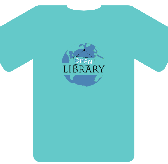
 mekarpeles
All 19 comments
The color of the tee should be different too from the one shown above.
 tabshaikh
on 9 Oct 2018
tabshaikh
on 9 Oct 2018
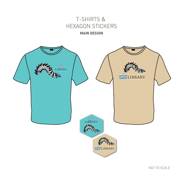
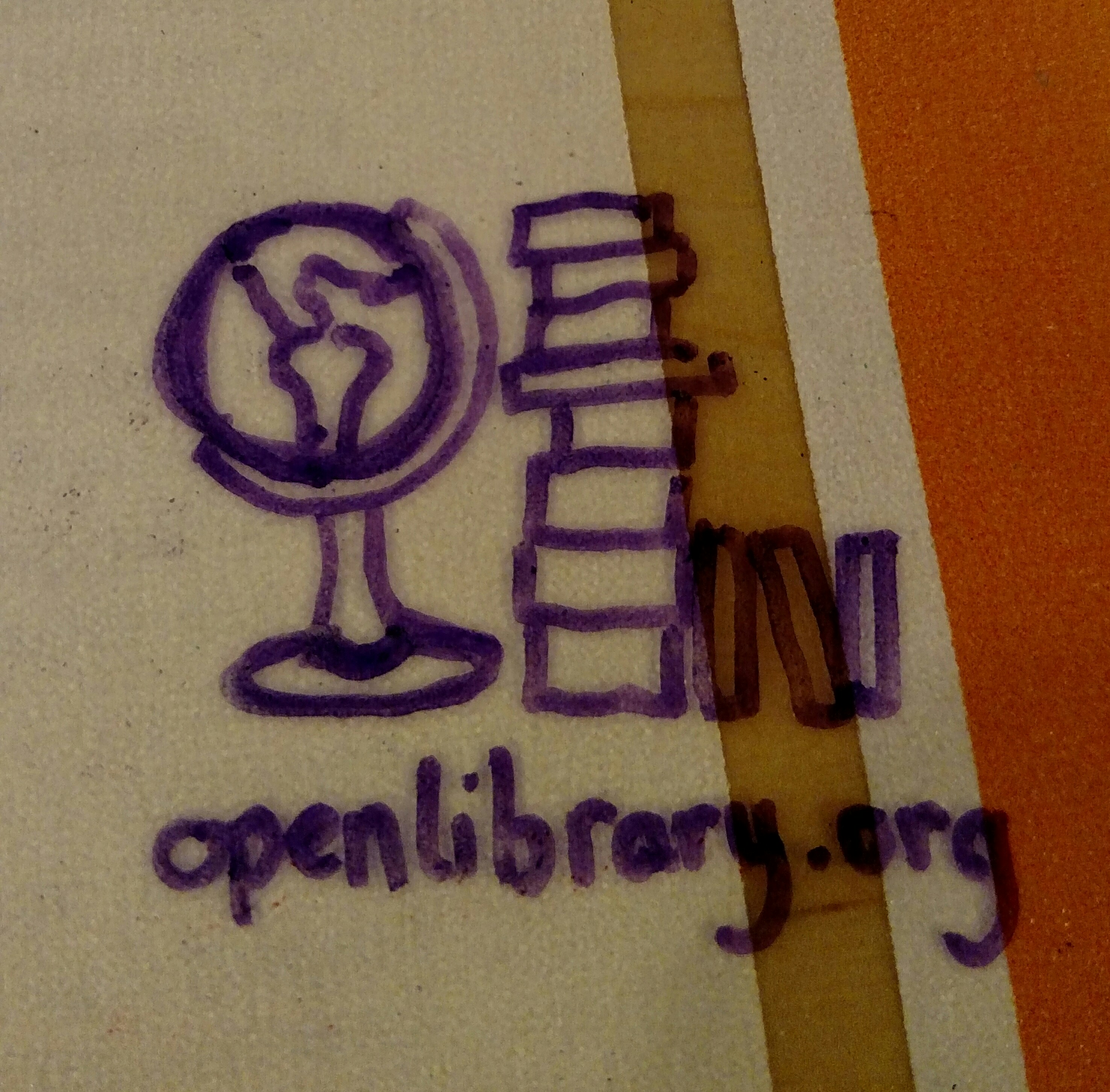
Hey, I really liked your original idea for the shirt so I ran with it and this is what I came up with. Couldn't find a .svg logo anywhere so I remade the logo so it can have multiple color variants. Below are the 3 different looks I thought fit the most.

This one was following the same design principles as your original design with the globe but for the bottom line I thought a book would look more fitting

This variant focuses on single color printing, you can mostly tell from the outline on the sign

variant color example of the same design above
 DanHues
on 9 Oct 2018
DanHues
on 9 Oct 2018
@DanHues
Open library svg
https://github.com/internetarchive/openlibrary/blob/master/static/images/openlibrary-logo-tighter.svg
Some cool things you can add too
https://github.com/internetarchive/openlibrary/blob/master/static/images/stars.png
https://github.com/internetarchive/openlibrary/blob/master/static/images/pantheon.png
On the sleeves maybe these maybe would look good too:
https://github.com/internetarchive/openlibrary/blob/master/static/images/ia-logo.png
https://github.com/internetarchive/openlibrary/blob/master/static/images/button-read-open-library.png
https://github.com/internetarchive/openlibrary/blob/master/static/images/button-borrow-open-library.png
https://github.com/internetarchive/openlibrary/blob/master/static/images/button-checked-out-open-library.png
You can find more images related to open library here:
https://github.com/internetarchive/openlibrary/tree/master/static/images
tabshaikh
on 9 Oct 2018
We should have these printed on non-stretch fabric so wearers don't mess up the kerning or aspect ratio in the logotype and get the brand police after us. ;-)
 tfmorris
on 9 Oct 2018
tfmorris
on 9 Oct 2018
My wife Linzy had some fun designing some t-shirts too! She doesn't have a github account so let me know what you think and I'll pass on any feedback!
Design 1
Linzy says:
This tells what the project is about - i.e Books. But instead of stacking them on the shelves or opening them up, I'm playing with the idea of a domino chain reaction. There is so much work involved in building the Open Library project and although it may be laborious and challenging, everyone is having fun!
Design 2
This design is more of a conversational piece, to highlight the essence of the project: LIBRARY is perpetually OPEN (24/7), We're OPEN-source, We're OPEN-minded, We're OPEN to Share, We're OPEN to Possibilities......
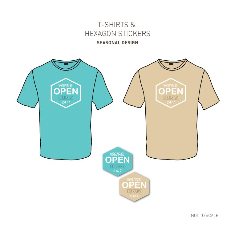
Personally, I really like design 1 (right hand side). I think the books are a lot of fun and I love the emphasis on "open" in the 2nd.
 jdlrobson
on 10 Oct 2018
jdlrobson
on 10 Oct 2018
I think I prefer the logo of Design 1, left side
I like the baige shirt color of Design 1, right side
I like the much larger logo side of Design 1, right side
I like how clean Design 2 is
I like how Design 1, right side has a centered logo
I think I especially like the idea of Design 1 hexagon sticker
- centered, big, vertically stacked OL logo w/ domino books over it on baige background
Of the shirt design so far, there's a lot I'm also liking about the designs @DanHues has posted. Here's a followup of Dan's design w/ a few minor adjustments (blue OPEN logo, book moved down a bit / little less crowded, and the entire graphic moved up along the chest):
This may be my first choice re: shirt so far, though I don't think it works well as a hexagon sticker (too crowded) whereas I think both of Linzy's design concepts could work really well as hexigonals.
Another adapted versions which could work might be if the hexigonal was lined on all 6 sides by books (almost as if each of the 6 borders was a book spine) or if the borders were hundreds of small books.
mekarpeles
on 10 Oct 2018
I like the black background color of @DanHues and the domino of books looks cool maybe a merger of both would look awesome
tabshaikh
on 10 Oct 2018
Who wants to help us vectorize this? I think we should move forward on this design and get some shirts to celebrate 2019 :)
https://github.com/internetarchive/openlibrary/issues/1283#issuecomment-428419631
mekarpeles
on 8 Jan 2019
another random concept:
mekarpeles
on 8 Jan 2019
Some variations to consider:
-Embed image into a QR code as at https://en.wikipedia.org/wiki/QR_code#Error_correction ?
-Hang the OPEN sign from the open book?
I'm not big on the 24/7 markup, as it will mislead some to think of the wrong "Open", similar to the free beer vs. free/libré dichotomy. Sure, we are always open to read, but it is far more important that we are open to change, open to inclusion, open to all readers, etc.
 LeadSongDog
on 8 Jan 2019
LeadSongDog
on 8 Jan 2019
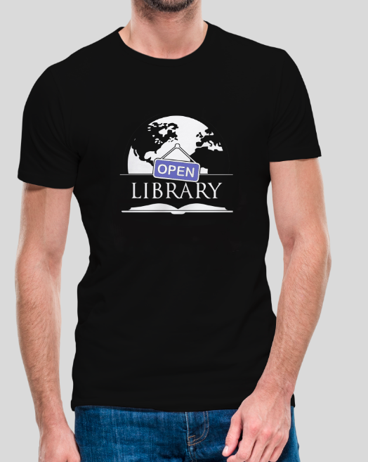
Hey I saw this post and recreated the design I made as a svg. If you need any different designs let me know.
DanHues
on 1 May 2019
@brad2014 don't see it personally
mekarpeles
on 1 May 2019
@mekarpeles when do you plan on producing the shirts? I would love to get one haha
DanHues
on 7 May 2019
When can I buy one
 xayhewalo
on 17 Nov 2019
xayhewalo
on 17 Nov 2019
Is this something that's still desired and just needs someone to 1) vectorize the slightly adjusted design @mekarpeles posted and 2) work on production (choose vendors, figure out order size, get quotes, etc)? If so, you could assign this to me.
 SouthGoingZax
on 13 Oct 2020
SouthGoingZax
on 13 Oct 2020
Sorry for the delay here. Going to followup w/ staff to see how we can take this over the finish line
mekarpeles
on 15 Oct 2020
We're working w/ admin team from Internet Archive to see if we can get the vectorized design into an online store like customink or teespring and then see about discount codes for contributors :)
mekarpeles
on 15 Oct 2020
Sounds good. What else is needed here? Do you need a vectorized image with the minor adjustments you made: "(blue OPEN logo, book moved down a bit / little less crowded, and the entire graphic moved up along the chest)"? What do you want to do for stickers (the places I'm familiar with usually have minimum order sizes that are probably too large for individuals)?
SouthGoingZax
on 15 Oct 2020
@mekarpeles how do you feel about these, in response to your comment above?
open-library.ai.zip
open-library-black.ai.zip
One has a black background so it's easier to see what it would look like on a black shirt, but it's easy to remove.
SouthGoingZax
on 17 Nov 2020
Related issues
LeadSongDog
·
5Comments
 BrittanyBunk
·
4Comments
BrittanyBunk
·
4Comments
BrittanyBunk
·
4Comments
BrittanyBunk
·
4Comments
 nemobis
·
5Comments
nemobis
·
5Comments
 Yashs911
·
5Comments
Yashs911
·
5Comments
Most helpful comment
We should have these printed on non-stretch fabric so wearers don't mess up the kerning or aspect ratio in the logotype and get the brand police after us. ;-)