Feature Request
Summary
Add a combobox component to the library.
Feature Description
We are dealing with a lot of data. Our dt-select does not really work with a large set of options. The search functionality for the dt-select is the same as in the native select. Therefore, a user can only jump to an option that starts with the key the user pressed.
This is really limiting in use cases with large datasets.
A combobox component that can be constructed out of an input with an dt-autocomplete attached can help us there.
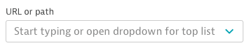
The input needs to show a placeholder text.
The combobox should use the same styles as the dt-select.
Behavior
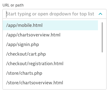
On click the dropdown opens a list of several items for the user to choose from and the cursor is placed in the input field. As soon as users start typing the combobox should emit a debounced event and show a loading indicator inside the input similar to the one we already have in the filter-field.
Once an item is selected, the dropdown closes and the input field is updated accordingly.
For the first version of the combobox, I suggest not worrying about virtual scrolling. We can expect the filtering of the items to be done on the server side. The items populated on the client can be rendered. We can improve the handling of large datasets in a second version.
For the first version i'd suggest using the dt-autocomplete, but we should consider creating a simplified dropdown with a datalist.
- [ ] Write API proposal
- [ ] Create lib and demo
- [ ] Add dropdown and create additional styles to have the caret inside the dtInput.
- [ ] Add debounced input event + loading indicator
- [ ] Add unit tests
- [ ] Add e2e tests
Attachments
 ffriedl89
All 8 comments
As an accessibility reference please consider the best practice recommendation from WAI-ARIA combobox with listbox popup
 tomheller
on 2 Mar 2020
tomheller
on 2 Mar 2020
API Proposal Combobox
Advanced structure
<dt-combobox [value]="initialValue" (valueChanges)="fn($event)" (filterChanges)="fn($event)" [placeholder]="'Type here for filter'">
   <dt-option *ngFor="let option of options">{{ option.value }} </dt-option>
</dt-combobox>
Inputs
| Name | Type | Description |
| ------------- | ------------- | ------------- |
| value | string \| undefined | Initial value for the input |
| placeholder | string \| undefined | Placeholder for the input |
Outputs
| Name | Type | Description |
| ------------- | ------------- | ------------- |
| valueChanges | EventEmitter<string> | Event emitted when a new value has been selected |
| filterChanges | EventEmitter<string> | Event emitted when the filter changes |
Content projection
dt-option
dt-optgroup
Checklist
- [ ] proper keyboard support (arrow: up down)
- [ ] WAI-ARIA
- [ ] consider ngForms compatibility
- [ ] consider validation
 lukett89
on 13 Apr 2020
lukett89
on 13 Apr 2020
Hey @lukett89, thank you for the API proposal. Really great starting point.
I think we would need quite the same inputs as in the dt-select.
I'd add
| Name | Type | Description |
| ------------- | ------------- | ------------- |
| id | string | Id for the select |
| compareWith | (v1: T, v2: T) => boolean | Function to compare the option values with the selected values |
| required | boolean | Whether the input is required |
| panelClass | string | Class added to the combobox dropdown |
We should consider also adding getters for the open state like "opened" and outputs when that state changes.
I think it would be beneficial if we can stick to the closest API to the select as possible to make switching between one or the other as easy as possible.
ffriedl89
on 14 Apr 2020
Thanks for your reply @ffriedl89.
We will take into account all the inputs/outputs you mentioned for the first version of the component.
lukett89
on 14 Apr 2020
Final API Proposal Combobox
Advanced structure
<dt-combobox [value]="initialValue" (valueChanges)="fn($event)" (filterChanges)="fn($event)" [placeholder]="'Type here for filter'">
   <dt-option *ngFor="let option of options">{{ option.value }} </dt-option>
</dt-combobox>
Inputs
| Name | Type | Description |
| ------------- | ------------- | ------------- |
| value | string \| undefined | Initial value for the input |
| placeholder | string \| undefined | Placeholder for the input |
| id | string | Id for the select |
| compareWith | (v1: T, v2: T) => boolean | Function to compare the option values with the selected values |
| required | boolean | Whether the input is required |
| panelClass | string | Class added to the combobox dropdown |
Outputs
| Name | Type | Description |
| ------------- | ------------- | ------------- |
| valueChanges | EventEmitter<string> | Event emitted when a new value has been selected |
| filterChanges | EventEmitter<string> | Event emitted when the filter changes |
| openedChange | EventEmitter
Content projection
dt-option
dt-optgroup
Checklist
- [ ] proper keyboard support (arrow: up down)
- [ ] WAI-ARIA
- [ ] consider ngForms compatibility
- [ ] consider validation
lukett89
on 14 Apr 2020
I'd like to take care of implementing this feature within the next 2 weeks. Could you assign the issue to me please?
 heartdisease
on 15 Apr 2020
heartdisease
on 15 Apr 2020
In sync and after discussion with @heartdisease and @lukett89, I have reassigned the issue.
tomheller
on 15 Apr 2020
I propose the addition of two more inputs:
| Name | Type | Default Value | Description |
| --- | --- | --- | --- |
| loading | boolean | false | When set to true, a loading indicator is shown to show to the user that data is currently being loaded/filtered |
| displayWith | (value: T) => string | (value: T) =>${value}`` | A function returning a display name for a given object that represents an option from the combobox |
The displayWith function is relevant for using the combobox with objects and a loading indicator seems warranted for a component that - in most cases - will offload filtering to the server side.
heartdisease
on 15 May 2020
Related issues
tomheller
·
4Comments
 areknow
·
12Comments
areknow
·
12Comments
 b-wohs
·
3Comments
b-wohs
·
3Comments
 bradking1329
·
3Comments
bradking1329
·
3Comments
 Sherif-Elhefnawy
·
7Comments
Sherif-Elhefnawy
·
7Comments
Most helpful comment
I propose the addition of two more inputs:
| Name | Type | Default Value | Description |
| --- | --- | --- | --- |
| loading |
boolean|false| When set to true, a loading indicator is shown to show to the user that data is currently being loaded/filtered || displayWith |
(value: T) => string|(value: T) =>${value}`` | A function returning a display name for a given object that represents an option from the combobox |The displayWith function is relevant for using the combobox with objects and a loading indicator seems warranted for a component that - in most cases - will offload filtering to the server side.