On the comments following the talk by Lars Bergstrom here, it was mentioned that proposals for a servo logo were welcome.
Below is an inception (in two variants). The logotype is in Mozilla's open typeface Fira (extra bold italic, slightly modified for harmonious cohesion between letters). Please keep in mind it is a very rough prototype, without color. Rather than spend hours on it, early feedback is appreciated to steer it to completion collectively. If received positively, it will be worked on in detail. Contributions/suggestions are welcome.

 VAS
VAS
All 73 comments
Complementary proposal for a mascot:

 ema-fox
on 5 Nov 2014
ema-fox
on 5 Nov 2014
@ema-fox That is adorable!
@VAS Thanks for the logo!
We need to brainstorm some more ideas for possible ideas (not just silly ones, like replacing the firefox in the FF logo with doge...) and are very open to other suggestions. We're a little afraid of choosing something too early, as we'll probably have it for many years, but the project _is_ two years old now..
 larsbergstrom
on 6 Nov 2014
larsbergstrom
on 6 Nov 2014
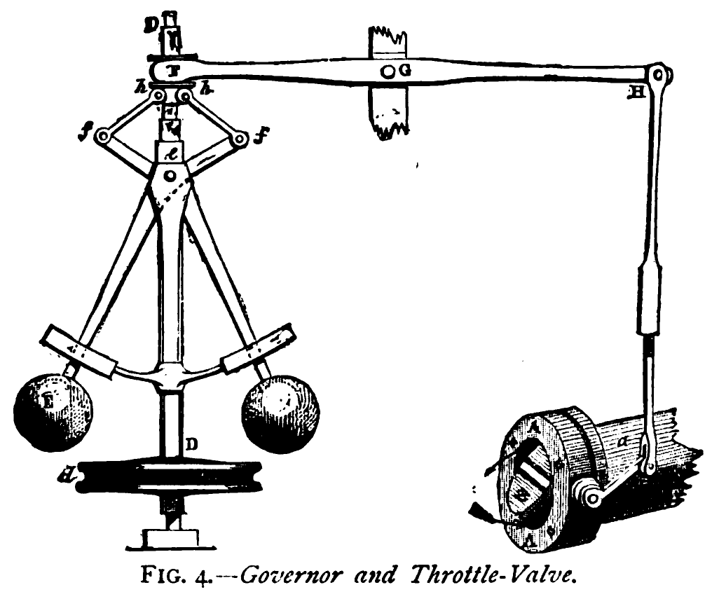
My proposal is a centrifugal governor, because it is an early example of a servomechanism, it fits in with the Rust branding, and it's a simple but distinctive shape that would be easy to turn into an icon or logo.
 mbrubeck
on 7 Nov 2014
mbrubeck
on 7 Nov 2014
(I like the hedgehog too!)
mbrubeck
on 7 Nov 2014
Does no one watch mst3k?
/be
 BrendanEich
on 7 Nov 2014
BrendanEich
on 7 Nov 2014
@BrendanEich We'd definitely be open to a gumball-inspired logo but are a little afraid of just having a picture of Tom Servo himself. You'll be glad to know that mst3k video watching has been provided by @metajack at every Servo workweek to date :-)
larsbergstrom
on 7 Nov 2014
It seems hard to stay true to the name in a logo without infringing on Best Brains IP. Ideas welcome!
 metajack
on 7 Nov 2014
metajack
on 7 Nov 2014
Ask them for a fair use or one-off grant?
/be
BrendanEich
on 7 Nov 2014
How about a stylized view-from-above of the mst3k servo? That way we preserve a "symbolic" logo while referencing tom. Quick attempt:

VAS
on 7 Nov 2014
I like it, it's also reminiscent of the Rust logo.
 Manishearth
on 7 Nov 2014
Manishearth
on 7 Nov 2014
mbrubeck
on 7 Nov 2014
@VAS Great! Tom's hover-skirt in plan is recognizable, along with his little arms!
/be
BrendanEich
on 8 Nov 2014
Servo sounds identically to "cerveau" in french, which means brain. This project tends to use smart techniques to make rendering faster, maybe it should also have a smart logo.
 6D65
on 8 Nov 2014
6D65
on 8 Nov 2014
@VAS I also really like that it evokes the connection/business end of a servomotor at the same time!
larsbergstrom
on 8 Nov 2014
I worked on the construction of the letter “S”.
My aim was to mix the ideas of “rendering” by a technical point of view, to an asynchronous micro-modularity. The font is Mozilla’s Fira Sans, and I think it has to be slightly modified to ensure a singular impact.
Don’t pay attention to details yet, it is a first draft, and depending on the feedback, I will take some time to work on it again.

 raphaelbastide
on 17 Nov 2014
raphaelbastide
on 17 Nov 2014
I like it! However it looks a bit like a stop sign. Perhaps change/rotate the shape?
On 17/nov/2014, at 17:53, Raphaël Bastide [email protected] wrote:
I worked on the construction of the letter “S”.
My aim was to mix the ideas of “rendering” by a technical point of view, to an asynchronous micro-modularity. The font is Mozilla’s Fira Sans, and I think it has to be slightly modified to ensure a singular impact.
Don’t pay attention to details yet, it is a first draft, and depending on the feedback, I will take some time to work on it again.—
Reply to this email directly or view it on GitHub.
VAS
on 17 Nov 2014
Maybe a steering wheel. A servo motor makes steering enjoyable and Servo brings people to interesting places.
 kud1ing
on 18 Nov 2014
kud1ing
on 18 Nov 2014
@VAS Glad you like it! And you are right. The octagon has to be slightly rounded, rotated or replaced by another background shape.
raphaelbastide
on 18 Nov 2014
Hope it's not too aggressive mascot proposal http://www.jukani.co.za/userfiles/content/grp16/servalangry.jpg
 pkondzior
on 24 Nov 2014
pkondzior
on 24 Nov 2014
Another version, avoiding octagonal shape.

raphaelbastide
on 29 Dec 2014
Some more unpolished tests:

raphaelbastide
on 30 Dec 2014
@raphaelbastide I like the round version. It looks like something is spinning fast.
kud1ing
on 12 Feb 2015
A sketch of something speed-blurry http://imgur.com/Ogoc1Ib
kud1ing
on 12 Feb 2015
I really like @raphaelbastide circle logo. Throwing some more ideas out there, maybe something that incorporates the theme of "parallel" into the logo? Since Servo describes its self as a fast parallel browser?
Also were does the origin of the hedge hog come from?
 julianrichen
on 14 Feb 2015
julianrichen
on 14 Feb 2015
It seems like it's just a play on the fox.
Also, it just occurred to me, Whimsycorn makes a fun temporary logo:

(If you've never seen that before, use Firefox's customization feature to remove everything from the panel menu and see what happens)
Manishearth
on 15 Feb 2015
I love @VAS's Tom-Servo-from-above! It's great that it's only an MST3K reference if you know what you're looking for.
 zslayton
on 18 Feb 2015
zslayton
on 18 Feb 2015
Hey all, some really nice ideas in here. I tried to distill them down to what I think is key:
- Represents the parallel nature of the browser - see @FireDart's comment.
- Has some connection to Rust. (I'm not sure of the IP of Rust's logo though)
- Feels like a project logo, rather than finished product logo/icon.
Based on that, I built on ideas above by @raphaelbastide - but tried to do two things. Change the lines to represent the parallel nature of the project, and also position those lines to be in a subtle S shape.
Here's a rough sketch:

 kevincannon
on 6 Mar 2015
kevincannon
on 6 Mar 2015
Hey, as there is an interesting activity on this subject, I am wondering where those graphic researches lead. Are we doing all that for a precise purpose? Does Servo needs a logo, if yes, who will decide and how? Logo design needs real constraints to be efficient and smart. From now we just draw nice images and it can continue like that ∞ . So what next?
raphaelbastide
on 6 Mar 2015
@raphaelbastide We do need a new logo and the contributions in this thread have been awesome (I particularly like the one from @VAS !).
The logo decision will be made by @metajack and myself, in consultation with the team. We do not currently have a timeframe for making this decision, but we'll chat about it at a meeting next week and try to comment soon.
larsbergstrom
on 6 Mar 2015
Bump

raphaelbastide
on 2 May 2015
Messing with the @VAS idea, with the Firefox logo layout and colors.

 notriddle
on 22 Aug 2015
notriddle
on 22 Aug 2015


 geleto
on 3 Sep 2015
geleto
on 3 Sep 2015
@metajack do you still have someone working on a logo, or is it possible to throw my hat into the ring?
 webmaven
on 2 Jul 2016
webmaven
on 2 Jul 2016
I'd be happy to work on a logo as well. I have done some logos for Mozilla in the past:
https://elioqoshi.me/en/mozilla-logos/
 elioqoshi
on 4 Jul 2016
elioqoshi
on 4 Jul 2016
@webmaven We've had a few false starts trying to hire someone to finish this. Our plan is still to do so.
I'm happy for people to continue submitting ideas. We're using them as input into the process, but if someone lands on something great perhaps we'll be finished early.
There are plenty of good ideas in this thread, but of the things posted here so far the work from @VAS has been my personal favorite.
metajack
on 12 Jul 2016
Thinking about @mbrubeck's idea, came up with a "two globes" idea. Looks about like someone's lower face with way-too-big noserings.

notriddle
on 12 Jul 2016
Even more simplified (and I really like symmetrical logos like circles and squares better anyway).

notriddle
on 12 Jul 2016
@notriddle Love the last version! This is what I came up with, with your icon and a lightly muted red (Rust, but not that ugly)

elioqoshi
on 19 Jul 2016
Initially I thought these last few proposals remind me of Apple's app store logo.
 Coder206
on 19 Jul 2016
Coder206
on 19 Jul 2016
That could be rectified by making the straight lines less thick
 fbender
on 19 Jul 2016
fbender
on 19 Jul 2016
@fbender I like your suggestion!
Coder206
on 19 Jul 2016
This doesn't make me think about a browser engine, this makes me think of Git's logo.
 nox
on 21 Jul 2016
nox
on 21 Jul 2016
How about putting mst3k on that nice red color:

Or with black border:

 mmatyas
on 27 Oct 2016
mmatyas
on 27 Oct 2016
@metajack et al,
Will it be important for the servo logo to work with the new Mozilla branding being developed?:
webmaven
on 28 Oct 2016
@webmaven No. Servo is sponsored in part by Mozilla, but is governed as an independent project and does not need to have any shared branding elements with whatever Mozilla decides to go with.
larsbergstrom
on 28 Oct 2016
I like where this is going! Will make a proposal sometime next week
elioqoshi
on 28 Oct 2016
I got a suggestion, why not we base from the firefox logo, combine the above proposal then have a Shibe "hug" the logo
 sr229
on 2 Oct 2017
sr229
on 2 Oct 2017
Firefox designers already did this as a spoof icon for Firefox. http://i.imgur.com/7Ih60Gu.png
We'd like to keep our branding (such as it is) separate from Firefox.
metajack
on 2 Oct 2017
FYI, we use this logo for ServoShell:

 paulrouget
on 3 Oct 2017
paulrouget
on 3 Oct 2017
Not involved with this project but I thought there were some great ideas here. Love the mst3k reference with the red color from @mmatyas and the lowercase font styling used by @raphaelbastide where the shape of the 'v' cuts into the end of the 'r'. Also loved the idea to add a visual effect of motion as noted by @kud1ing.

 dsamarin
on 6 Mar 2018
dsamarin
on 6 Mar 2018
Hi everyone! Building on some of the logo designs that were proposed earlier in this issue (in particular, the motor visual idea), we asked a designer to iterate on a few possibilities. The core team really liked one design in particular that came with a couple different colour palette options:
Palette 1:

Palette 2:

Do you prefer one palette over the other? Is there any cultural reason (either global or internet) to avoid this design? We would hate to settle on a logo that has an unintended meaning to some groups.
 jdm
on 20 Jan 2020
jdm
on 20 Jan 2020
To my eye, the blue/green looks more like a unified letter O and the red/orange/purple looks like a disconnected symbol that's not necessarily a letter. If that's generally true and not just me, then the blue/green would do a better job of conveying the word "servo".
 pshaughn
on 20 Jan 2020
pshaughn
on 20 Jan 2020
I love both design though, the #5101bc color in palette 2 for dark mode might be too close to the black background which might be difficult to see 👀?
 CYBAI
on 20 Jan 2020
CYBAI
on 20 Jan 2020
@pshaughn makes a good point, but I also like that the second palette is similar (or is it the same?) as various Firefox logos:
https://mozilla.design/firefox/logos-usage/

 SimonSapin
on 20 Jan 2020
SimonSapin
on 20 Jan 2020
I like the first one aesthetically but as Simon said the second one does feel more "Firefoxy".
Manishearth
on 21 Jan 2020
I'd discourage from replacing letters with a symbol because of readability issues:
https://www.jessicajonesdesign.com/logos-that-replace-a-letter-with-a-picture/
https://jimanov.com/en/articles/the-principle-of-replacing-letter-in-a-logo/
It's not impossible to make it work, though the 'o' here has a very different style from the rather standard letters in 'serv'.
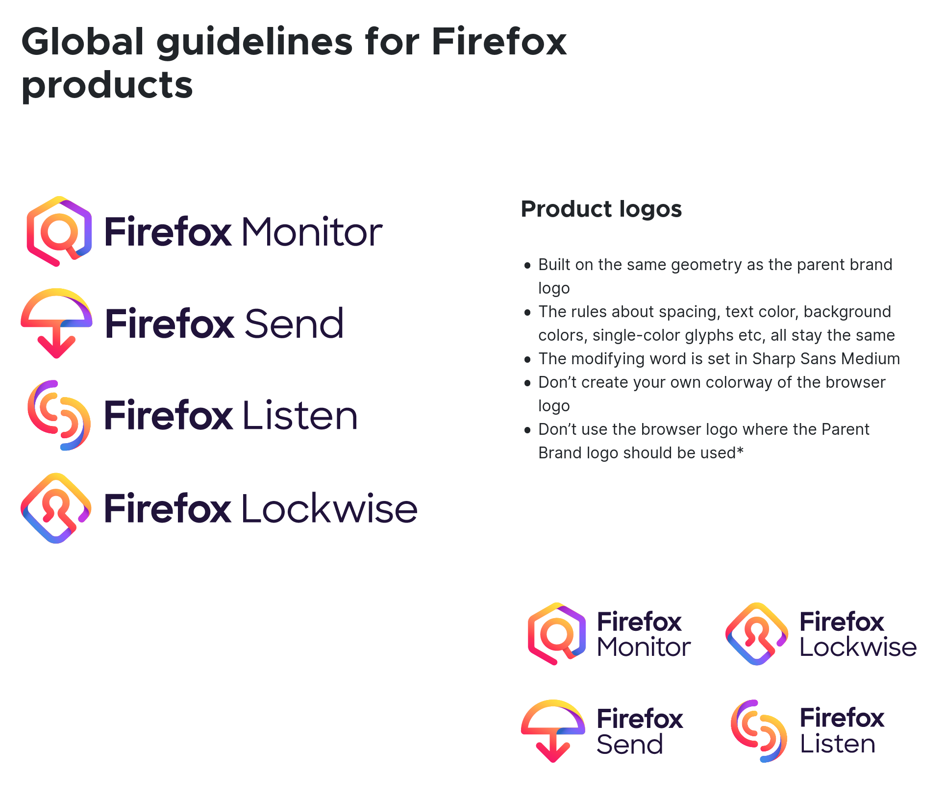
Further, it is very not in the style of Mozilla of doing this replacement strategy of letters so it might be worth refraining from it, unless it should be independent from Mozilla (which makes the 2nd Firefox-y palette a bit paradoxal). It might be worth going a more traditional way of doing the logo lockups similar to new Firefox products ( Firefox Send, Lockwise, Monitor) if it should stay in the spirit of Firefox. This is just my 2 cents as someone who was involved at the Mozilla brand team in the past though.
elioqoshi
on 22 Jan 2020
I do like having the old logo's elements still incorporated in the new logos.
It kinda shows as well how wacky and creative Mozilla can be with logos. We don't need to be overly professional with it as well, since Google's LuCI project is literally just a cute hamster.
sr229
on 22 Jan 2020
Oh, also, the blue-green pallette matches _Edge_ :)
Manishearth
on 22 Jan 2020
FWIW, I'm not personally concerned about adhering to either a Mozilla or non-Mozilla style or color palettes. We should pick what works well for the brand.
I'm also quite fine with keeping around the Doge as the _mascot_, which I love - @zmike made it while he and I were riffing on ideas one evening, and the quest to determine "who has the rights for that Doge and can we use it?" was one of my more epic legal journeys. Unfortunately, as we've been looking to get more partners, investments, and contributors, the current logo tends to make it difficult for people to take the project seriously.
larsbergstrom
on 22 Jan 2020
I like the design, and I prefer the first palette. The second one is also nice, but I'm imagining trying to find the icon alone amongst the multi-color-pieces logos of Google things and Slack and I'll probably have to hunt a bit even if the colors aren't the same primary ones.
@elioqoshi
Further, it is very not in the style of Mozilla of doing this replacement strategy of letters
Mozilla designed a font that replaced the interior ill with ://. That still seems to be the current brand identity.
metajack
on 22 Jan 2020
Would outlining the wheel in the text color make it a better O, or would adding strokes to it make it overdetailed?
pshaughn
on 22 Jan 2020
All of the ideas look great to me. :)
 pcwalton
on 22 Jan 2020
pcwalton
on 22 Jan 2020
FWIW, I'm not personally concerned about adhering to either a Mozilla or non-Mozilla style or color palettes. We should pick what works well for the brand.
I'm also quite fine with keeping around the Doge as the _mascot_, which I love - @zmike made it while he and I were riffing on ideas one evening, and the quest to determine "who has the rights for that Doge and can we use it?" was one of my more epic legal journeys. Unfortunately, as we've been looking to get more partners, investments, and contributors, the current logo tends to make it difficult for people to take the project seriously.
Love your input on this. If Doge would remain our mascot, we should incorporate it to our logo instead of outright replacing it.
After all, while we're aiming for a more professional looking logo, we should keep in mind its not every time we have to make it look overly professional.
I'd prefer a nod to the old logo with the new one if possible.
sr229
on 23 Jan 2020
An idea of a logo that wouldn't dismiss the doge heritage is a vectorised version of just the doge's nose.
nox
on 24 Jan 2020
Since I was summoned, I'll say explicitly that I have no hard feelings about the logo being replaced/modified/whatever, and we should always try to do what's best for the project and community.
 zmike
on 27 Jan 2020
zmike
on 27 Jan 2020
My thoughts on the proposed logo concepts:
I like the designs that were posted by @jdm and would be happy with either of those or some variant of them. I agree with @pshaughn that the blue/green version looks a bit more like a unified image but I think that has more to do with the range of colours used. I think an orange version would be fine with a more cohesive looking colour palette.
I don't mind lighthearted designs or keeping some humour around but I don't think the doge should be used in official branding. I was always under the assumption that was a bit of a goofy placeholder while something official was being finalized. In general I think using outdated internet memes in an official logo is a fundamentally bad idea for a number of reasons.
As an aside, is that Firefox Reality logo that was posted final? I don't think that low poly look is working too well and it doesn't even match the current Firefox branding.
 atouchet
on 29 Jan 2020
atouchet
on 29 Jan 2020
Just my two cents:
- A logo should remain 100% visible in small sizes. In those regards, I really like @raphaelbastide 's circular logo above.
- Flat/material design would probably work best, because it's 2020 and those are pretty.
- I personally much prefer the warm color palette compared to the cool one. In fact, I don't really like the cool color one at all.
Maybe that's because in the realm of browsers, cool colors are most commonly associated with IE and Safari OwO
 lunabunn
on 29 Jan 2020
lunabunn
on 29 Jan 2020
@atouchet re: Firefox Reality, that's the current logo. The low poly work has resonated well with the industry and consumers in the VR/AR space, but agree it's not for everyone! It will eventually be updated again to the new branding scheme, but due to a combination of partner agreements (e.g., putting the logo on product boxes or in booths) and budget constraints (having to remake and revise a huge number of store listings and widespread online presence), I can't afford to change our product logo as often or quickly as other teams can. That would be the third logo change in ~18 months.
larsbergstrom
on 29 Jan 2020
We've had a variety of constructive feedback here, so thanks everyone who contributed!
Since this is a platform logo rather than a full product logo, we're not as tied to the overall brand identity of the Firefox product family as we otherwise might be. Given that fact and the positive feedback around the blue/green logo variant, we're going to move ahead with that one. Keep an eye out for it in various public-facing places in the future!
jdm
on 11 Feb 2020
@jdm could we get the HD non-jpg version of the banner in https://github.com/servo/servo/issues/3893#issuecomment-576283252 ?
paulrouget
on 24 Sep 2020
I'm checking if the original designer still has access to them, since I do not.
jdm
on 24 Sep 2020
Ideally SVG, since this looks extremely vector-friendly.
SimonSapin
on 24 Sep 2020
jdm
on 24 Sep 2020
Related issues
 shinglyu
·
4Comments
shinglyu
·
4Comments
 ayelen912
·
3Comments
ayelen912
·
3Comments
 gterzian
·
4Comments
gterzian
·
4Comments
 Grishy
·
3Comments
Grishy
·
3Comments
 ferjm
·
3Comments
ferjm
·
3Comments
Most helpful comment
Hi everyone! Building on some of the logo designs that were proposed earlier in this issue (in particular, the motor visual idea), we asked a designer to iterate on a few possibilities. The core team really liked one design in particular that came with a couple different colour palette options:
Palette 1:

Palette 2:

Do you prefer one palette over the other? Is there any cultural reason (either global or internet) to avoid this design? We would hate to settle on a logo that has an unintended meaning to some groups.