Ant-design: 😨 Table align broken when cell contains long number or long word after 3.11.3
- [x] I have searched the issues of this repository and believe that this is not a duplicate.
https://github.com/ant-design/ant-design/pull/13774#issuecomment-449723598
不用设置x即可重现
Version
3.11.3 +
Environment
macos 10.14.2 chrome 71
Reproduction link

Steps to reproduce
打开重现链接即可见
What is expected?
y设置后列头对齐
What is actually happening?
对不齐
 yoyo837
All 49 comments
你这个情况加上固定宽度就解决了
const columns = [
{
title: "Name",
dataIndex: "name",
width: 200,
},
{
title: "Address",
dataIndex: "address",
width:200,
}
];
 lidianhao123
on 26 Dec 2018
lidianhao123
on 26 Dec 2018
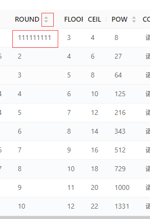
超长连续字段(长数字和长单词) 破坏表格布局的问题(即使你指定了列的宽度也会被挤开),之前组件内默认加过 word-break: break-word; 去纠正此类布局,又会引起 https://github.com/ant-design/ant-design/issues/13624 的问题。(截图)
所以最好的解决方案可能还是不默认 break word,提供一个属性来针对某些列进行断行处理。
columns={[
  ...
  textWrap: 'word-break',
]}
还可以和 https://github.com/ant-design/ant-design/issues/5753 一起做,支持
columns={[
  ...
  ellipsis: true,
]}
注意,在 3.24.0 之前,你需要针对超长字段的列增加折断样式:
columns={[
  ...
  render: (text, record) => (
    <div style={{ wordWrap: 'break-word', wordBreak: 'break-word' }}>
      {text}
    </div>
  ),
]}
已经在 3.24.0 里解决了超长字段破坏列对齐的问题,并增加了省略功能,具体 API 见:https://github.com/ant-design/ant-design/pull/17284
 afc163
on 26 Dec 2018
afc163
on 26 Dec 2018
@lidianhao123 我的表格都有固定宽度,Reproduction link 里的不用写也能重现,就没写。
yoyo837
on 26 Dec 2018
@yoyo837 你这个例子应该写了 width 就能修正了,这种情况确实要写的,好像不是我说的上面的情况。
afc163
on 26 Dec 2018
afc163
on 26 Dec 2018
给出写了 width 也对不齐的 demo 再 reopen 吧。
afc163
on 26 Dec 2018
yoyo837
on 26 Dec 2018
@yoyo837 Bingo! 就是 https://github.com/ant-design/ant-design/issues/13825#issuecomment-449889241 的问题。
afc163
on 26 Dec 2018
同样的问题,请问如何解决?
 a305566804
on 29 Dec 2018
a305566804
on 29 Dec 2018
但是,现在这个改动是不是算breaking change,现在只能回退到3.10.10的版本,不然设置的width都不生效,而原来有大量的页面都是通过设置width来限制宽度的。
 vxzhong
on 10 Jan 2019
vxzhong
on 10 Jan 2019
@vxzhong 只能先自己补
.ant-table-fixed {
table-layout: fixed;
}
.ant-table-tbody > tr > td {
word-wrap: break-word;
word-break: break-all;
}
然后尽量给每个列指定列宽,以及 https://github.com/ant-design/ant-design/issues/17051#issuecomment-501280017 。
正常升级antd, 解决方案合入后再删掉。
yoyo837
on 10 Jan 2019
这个问题还没有解决啊----
 koupeng
on 22 Feb 2019
koupeng
on 22 Feb 2019
还有一种问题,表格创建时 表格单元格内的文本是个枚举值,比如就是 'status' ,此时单元格已经设定好宽度,并且单元格未折行,后面通过请求,渲染为中文 '整体输出状态', 此时单元格折行了,导致这个单元格对应的行高度变高,但是这一行 对应的fixed 的单元格 高度没变,出现表格 错行 的情况,这个和浏览器没关系,ant版本是2.x。求解决啊
 fiveLucky
on 28 Apr 2019
fiveLucky
on 28 Apr 2019
设置table属性 table-layout:fixed; 宽度即生效
 xupengkun
on 28 Apr 2019
xupengkun
on 28 Apr 2019
设置table属性
table-layout:fixed;宽度即生效
fancy, man, fancy!!
 x7zhang
on 30 Apr 2019
x7zhang
on 30 Apr 2019
设置table属性
table-layout:fixed;宽度即生效
ur the best
 zoffyzhang
on 9 May 2019
zoffyzhang
on 9 May 2019
@zoffyzhang Only for fixed width, not responsive width.
yoyo837
on 9 May 2019
设置table属性
table-layout:fixed;宽度即生效
虽然生效,但是固定列的话,文字超长的字段还是会撑开
 wulienen
on 10 May 2019
wulienen
on 10 May 2019
@wulienen 包裹超长字段,overflow : hidden 后即可忽略超出部分
xupengkun
on 10 May 2019
@wulienen 包裹超长字段,
overflow : hidden后即可忽略超出部分
这样列动态拉伸就不能实现省略号展开 。😂
wulienen
on 10 May 2019
@wulienen 包裹超长字段,
overflow : hidden后即可忽略超出部分这样列动态拉伸就不能实现省略号展开 。😂
使用该属性会舍弃掉组件本身的动态宽度,你需要给每一列设置宽度,否则就会平均分配,如果需要文字省略显示则text-overflow: ellipsis;
xupengkun
on 10 May 2019
.ant-table-tbody > tr > td {
white-space: nowrap;
}
.ant-table-thead > tr > th{
white-space: nowrap;
}
 pawoma
on 21 May 2019
pawoma
on 21 May 2019
 ddcatgg
没解决, 多层childern, 有复选框而且文本超长。这个情况。更加解决不了
 heavenlian
on 28 Jun 2019
heavenlian
on 28 Jun 2019
@heavenlian 给可重现 demo 我来帮你改好。
afc163
on 28 Jun 2019
@afc163
解决了,写个循环嵌套,给每个table下面的 tr.ant-table-row-level-${i},计算里面 展开icon偏离大小,再动态设置文本需要的宽度。……
heavenlian
on 29 Jun 2019
I solved it perfectly with css
.ant-table-thead tr {
display: flex;
}
.ant-table-thead th {
flex: 1;
}
.ant-table-row {
display: flex;
}
.ant-table-row td {
flex: 1;
overflow: auto;
}
.ant-table-row td::-webkit-scrollbar {
display: none;
}
.columns {
display: flex;
align-items: center;
width: 0;
}
 ZengTianShengZ
on 29 Jun 2019
ZengTianShengZ
on 29 Jun 2019
@ZengTianShengZ perfect .
heavenlian
on 1 Jul 2019
如何自动显示和隐藏滚动条?
横向和纵向都需要支持
https://codesandbox.io/s/currying-river-6n2r5
 miaozilong
on 5 Jul 2019
miaozilong
on 5 Jul 2019
@ZengTianShengZ Amazing work!
 sstokke
on 19 Jul 2019
sstokke
on 19 Jul 2019
This issue is still present and should really be addressed as part of the main table component, instead of applying CSS hacks. Thanks to all who have helped provide a fix, but the table should render column headers correctly by default
 StallionV
on 10 Aug 2019
StallionV
on 10 Aug 2019
This solution provided by users above works perfectly.
The only issue being you have to specify width for every column.
The way the table should really work is
- Column headers should always align with the body
- Specifying width should not be a hack or mandatory.
- You can specific width in numbers of percentage. Based on that it would be a % of the total table width or fixed width specified in number.
- All other columns to auto adjust themselves based on content from the space remaining after the fixed or % width distribution.
Check http://w2ui.com/web/demos/#!grid/grid-23 as reference.
This is a pretty powerful grid alas for pure JS not react. But it does this all amazingly well.
StallionV
on 10 Aug 2019
.table_nowrap {
table th,
table td {
white-space: nowrap;
}
}
<div className="table_nowrap">
<Table scroll={{ x: true }} ... />
</div>
 xianghongai
on 26 Aug 2019
xianghongai
on 26 Aug 2019
js code:
const columns = [
{
title: 'goodName',
key: 'goodName',
dataIndex: 'goodName',
align: 'center',
width: 150,
fixed: 'left',
render: (item) => (item || item == 0 ? () : (--))
}];
css code:
.textOverflow{
white-space: nowrap!important;
overflow: hidden!important;
text-overflow: ellipsis!important;
}
.maxWidth118{
max-width: 118px;
}
用了笨方法,render里套一个标签,给标签设置样式,过长显示省略号,加上title属性
 smartchong
on 29 Aug 2019
smartchong
on 29 Aug 2019
Pull Request sent: #17284 https://github.com/ant-design/ant-design/pull/18789
afc163
on 3 Sep 2019
.ant-table-thead tr {
display: flex;
}
.ant-table-thead th {
flex: 1;
}
.ant-table-row {
display: flex;
}
.ant-table-row td {
flex: 1;
overflow: auto;
}
.ant-table-row td::-webkit-scrollbar {
display: none;
}
.columns {
display: flex;
align-items: center;
width: 0;
}
That works, but makes all columns with equal width. You would really want width of each column to be dynamic based on content.
StallionV
on 23 Sep 2019
how to set percent width in the Columns Settings, seem doesn't work.
 YuZaiShui
on 26 Sep 2019
YuZaiShui
on 26 Sep 2019
实现固定列,固定的列的宽度支持百分比后表格没办法看啦 什么情况啊,是不支持百分比嘛
 jane-xxx
on 27 Dec 2019
jane-xxx
on 27 Dec 2019
@jane-xxx 支持的,如果有问题可以发一个 codesandbox 来我帮你调好。
afc163
on 27 Dec 2019
width: 150, width 设置number类型。string,没效果。
 PresByter2015
on 31 Mar 2020
PresByter2015
on 31 Mar 2020
HI, I migrated from antd 3 to 4, and I am experiencing issue in table, initially in and 3 the table width was the parent elements width, but now it seems it width is adjusting to the content in the table, I have gone through the doc, I can't find anything to solve my issue. I will attach the image of the table from both version for the reference.
 praburocking
on 7 Apr 2020
praburocking
on 7 Apr 2020
HI, I migrated from antd 3 to 4, and I am experiencing issue in table, initially in and 3 the table width was the parent elements width, but now it seems it width is adjusting to the content in the table, I have gone through the doc, I can't find anything to solve my issue. I will attach the image of the table from both version for the reference.
maybe set tableLayout="fixed" will help
 weapon008
on 14 May 2020
weapon008
on 14 May 2020
超短的内容也会导致宽度的设置失效.~

请教下大佬上述情况怎么处理?
 muzishuiji
on 11 Jun 2020
muzishuiji
on 11 Jun 2020
给出写了 width 也对不齐的 demo 再 reopen 吧。
超短的内容也会导致宽度的设置失效.~
超长连续字段(长数字和长单词) 破坏表格布局的问题(即使你指定了列的宽度也会被挤开),之前组件内默认加过
word-break: break-word;去纠正此类布局,又会引起 #13624 的问题。(截图)所以最好的解决方案可能还是不默认 break word,提供一个属性来针对某些列进行断行处理。
columns={[
  ...
  textWrap: 'word-break',
]}
还可以和 #5753 一起做,支持
columns={[
  ...
  ellipsis: true,
]}
注意,在 3.24.0 之前,你需要针对超长字段的列增加折断样式:
columns={[
  ...
  render: (text, record) => (
    <div style={{ wordWrap: 'break-word', wordBreak: 'break-word' }}>
      {text}
    </div>
  ),
]}
已经在 3.24.0 里解决了超长字段破坏列对齐的问题,并增加了省略功能,具体 API 见:#17284
https://github.com/ant-design/ant-design/issues/13825#issuecomment-642389197
muzishuiji
on 11 Jun 2020
I'm sorry but I'm having a similar issue after migrating from 3.x to 4.x.
My Table looks like this on 4.x:
While it looks fine in 3.x:
I'm still not being able to reproduce the issue in a simplified Codesandbox. But in the meantime, I'd appreciate any help in English.
Thank you!
 empz
on 24 Jun 2020
empz
on 24 Jun 2020
I'm sorry but I'm having a similar issue after migrating from 3.x to 4.x.
My Table looks like this on 4.x:
While it looks fine in 3.x:
I'm still not being able to reproduce the issue in a simplified Codesandbox. But in the meantime, I'd appreciate any help in English.
Thank you!
Did you set column width?
If you have already set column width, please try this. This method works for me
<Table
    // some props...
   scroll={{ x: '100%' }} // this x should set '100%', not 'true'
 />
 codingbycat
on 15 Jul 2020
codingbycat
on 15 Jul 2020
This has been fixed in a recent update.
empz
on 15 Jul 2020
横向拖动有垂直的白色间隙怎么解决
 GhostYDFQ
on 12 Oct 2020
GhostYDFQ
on 12 Oct 2020
横向拖动有垂直的白色间隙怎么解决
留一些非固定列不要定宽,让它自适应
 Oscar19921030
on 5 Nov 2020
Oscar19921030
on 5 Nov 2020
Related issues
 kevyu
·
3Comments
kevyu
·
3Comments
 taikongfeizhu
·
3Comments
taikongfeizhu
·
3Comments
 PeteAndersen
·
3Comments
PeteAndersen
·
3Comments
 drcmda
·
3Comments
drcmda
·
3Comments
 xtznhzxdev
·
3Comments
xtznhzxdev
·
3Comments
Most helpful comment
超长连续字段(长数字和长单词) 破坏表格布局的问题(即使你指定了列的宽度也会被挤开),之前组件内默认加过
word-break: break-word;去纠正此类布局,又会引起 https://github.com/ant-design/ant-design/issues/13624 的问题。(截图)所以最好的解决方案可能还是不默认 break word,提供一个属性来针对某些列进行断行处理。
还可以和 https://github.com/ant-design/ant-design/issues/5753 一起做,支持
注意,在 3.24.0 之前,你需要针对超长字段的列增加折断样式:
已经在 3.24.0 里解决了超长字段破坏列对齐的问题,并增加了省略功能,具体 API 见:https://github.com/ant-design/ant-design/pull/17284