Gutenberg: Consider adding a way to link to a file from the link inserter so someone can upload a PDF file and link it to text
My apologies for the question, but I am posting here because I believe it is a UX issue with Gutenberg that could be improved.
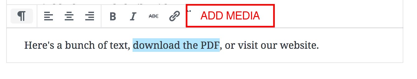
In the classic WordPress editor, the "Add Media" button allowed you to easily upload files to the media library without leaving the page. This allowed for easy uploading of something like a PDF file, which you could then attach to some text like Click here to download this PDF.
I know there are separate/dedicated blocks for this type of thing, but what if I'd prefer to have the text _inside_ a paragraph block type?
I see 2 possibly ways currently, neither of which are very user friendly or obvious:
I can leave the page entirely, navigate to the "Media Library" page, upload the image, copy the URL, navigate back to the Gutenberg editor, select the text in my paragraph block, click the chain icon, and then paste the URL.
I can add a "File" block, upload the PDF, copy the URL, remove the file block, select the text in my paragraph block, click the chain icon, and paste the URL.
Proposal:
Add the "Add Media" button as an option to the paragraph block's controls:
 mintplugins
All 37 comments
Agreed that this is currently something of a sub-optimal experience as it currently stands. I noticed this whilst working on #8295 but I suspect that this sort of thing may be better resolved by inline/nested blocks, once that becomes more of A Thing.
 sarahmonster
on 31 Jul 2018
sarahmonster
on 31 Jul 2018
Another possible solution might be to allow searching media, such as PDFs, as an option in the floating link toolbar. For reference, here is a screenshot showing how search results currently look in that toolbar:

Seen at http://alittletestblog.com/wp-admin/post.php?post=14091&action=edit using Firefox 61.0.1 on macOS 10.13.6.
 designsimply
on 31 Jul 2018
designsimply
on 31 Jul 2018
I think that'd probably be a better solution (than an inline file block, which may not accomplish the same thing), but it'd require some adjustments to the UI to account for it. You'd probably also want to allow for uploads directly, rather than having to switch to the media library to upload the file, then switch back to Gutenberg. (And for parity with the classic editor!)
sarahmonster
on 1 Aug 2018
While a great idea to allow searching of media, it introduces a new UI for browsing media, which duplicates functionality that already exists with the media uploader/browser. It also wouldnt allow you to upload without leaving the gutenberg editor, correct?
mintplugins
on 1 Aug 2018
@designsimply That doesn't resolve the issue of not being able to upload a file. Having the _Add Media_ button on the existing TinyMCE toolbar is considerably more flexible. It's much easier (and more intuitive) adding inline images, than being forced to insert an _Inline Image_ Block. It also allows you to easily upload and link to files such as PDF's or DOCX files, without having to disrupt your editing experience by exiting the editor, going to the media library, uploading the file, and then finally going back into the editor again.
 maddisondesigns
on 7 Aug 2018
maddisondesigns
on 7 Aug 2018
Just noting there was some extra discussion on #10280.
I think this could also be an interesting use case for the richtext formatting API so it's handled in a similar way to inline images.
 chrisvanpatten
on 3 Oct 2018
chrisvanpatten
on 3 Oct 2018
So the way to do this now is to use the file block, or just drag and drop the PDF to upload it. This results in the following:

You can then click the "copy URL" button, and paste the resulting link over text:

This is how it's done today.
But I agree this flow is not ideal, and can be optimized. So labelling it as such.
 jasmussen
on 11 Oct 2018
jasmussen
on 11 Oct 2018
Going to close this since there is a block for Files and you can grab the URL from it. In the future, it'd be nice to expand the "Link" tool to also search for files, media, etc, to link directly.
 mtias
on 12 Oct 2018
mtias
on 12 Oct 2018
@mtias I'm a little bit confused. What does closing this issue mean to you? Does it mean that it's being punted to a future release? Or is the intention that it become lost to the archives of closed issues and forgotten, or that hopefully someone brings it up again in the future? I'm just wondering what the intention of closing this issue is, since you yourself agree that it is a valid issue.
Please note that I spoke about the file block when I opened this issue. The purpose of this issue was to outline usability issues with the current file upload flow, and that the File Block is not sufficient for a user-friendly experience.
mintplugins
on 12 Oct 2018
I agree that closing this issue seems premature. Nothing has been fixed, and the issue still exists.
 JJJ
on 22 Oct 2018
JJJ
on 22 Oct 2018
@mtias can you please reopen this issue? Everyone acknowledges this is a hacky workaround, and you say it would be nice to have a legit fix in the future. This seems like the best place to track this issue for that future since it's well documented here and won't require duplicating efforts to document it again.
 mindctrl
on 2 Nov 2018
mindctrl
on 2 Nov 2018
I've got to agree, this needs a better solution. I actually had to find this thread before I knew how to upload a PDF and link to it.
 karks88
on 8 Nov 2018
karks88
on 8 Nov 2018
I'm going to reopen this and milestone it for 5.1.
Requiring the creation of a temporary block just to copy a file url and paste onto a link is a pretty poor step back from the old editor for what is a very common use case—simply linking to a document inline.
I think if we have enhancements that we know we'd like to address in the future, but just don't know when, then we should keep them open and possibly assign some indeterminate future milestone. This is how we’d handle them on Trac, so I think we should continue that here. Closing issues makes them very difficult to find and surface later.
 earnjam
on 8 Nov 2018
earnjam
on 8 Nov 2018
@mintplugins sorry I missed your ping here before. It sounds good to me to keep this open and assign to a future milestone. If there are other ideas on how to handle this, please share.
mtias
on 12 Nov 2018
A textual search like for pages and post would help, but would maybe not sufficient, because filenames (without preview in the mediathek) are not always really clear AND a future solution should have the same power as the classic one and allow text-linking of ALL filteypes in the mediathek (with preview for selection).
So we need a button solution which leads to the mediathek.
I see 2 options:
a) Toolbar button (like suggested by mintplugins at the beginning)
b) additional button only in the link-enterform (where it belongs)
 burnuser
on 29 Nov 2018
burnuser
on 29 Nov 2018
This is the first issue I've had raised with me by someone using Gutenberg and it took me to find this post to know how you are currently meant to do it, which is an extremely sub-optimal solution.
I think that both suggestions are required. You need to be able to search for an existing media item from the "link" option as well as having the option to upload a new link.
Also, it would be nice to be able to select some text and then drag and drop a file onto the page and it automatically upload that file to the media library and link the selected text, instead of it inserting the file block.
 andrew-dixon
on 11 Jan 2019
andrew-dixon
on 11 Jan 2019
Would it be possible to have a Media Library button within the new Link dialog, whereby if you select a media item rather than embedding it it adds a link to the file, or a link to the attachment page?
 roryashfordbentley
on 11 Jan 2019
roryashfordbentley
on 11 Jan 2019
How about simply expending the link options panel to include options to upload new media or link to existing media? The Upload button could also accept drops.

 EricDu
on 14 Jan 2019
EricDu
on 14 Jan 2019
Starting from @EricDu solution, this could be another (and more compact) possible solution.
The upload button is missing but the UI is more clean and simple. Anyway, users could always upload files while in media modal.

where  icon button will open the media modal popup.
 virgo79
on 26 Jan 2019
virgo79
on 26 Jan 2019
@virgo79, you'd still need the "..." icon to trigger the drop-down (which currently only shows the "Open in New Tab" option but, if open to plugins, could have additional options such as class, id, etc.
I'm not sure how many layers of modals users are willing to accept. And the method should be as similar as possible as other instances where you're adding media.
My preference would be to keep the default view as minimal as possible (paste or type, apply icon, more icon) and put the more rarely used options (target, media, class, id, etc.) in the drop-down.
EricDu
on 26 Jan 2019
@virgo79 and @EricDu I'm not sure just the "media" icon is obvious to "standard" users as to what it means. Most of our normal everyday content loading users, would not understand straight away that the camera/music icon means they can upload a PDF and link it. I think if it is going to be just an icon, it needs to be something more explicit about "upload" or have a clear text button as Eric suggested. The solution needs to balance clean UI with clear UI.
andrew-dixon
on 26 Jan 2019
@EricDu I agree with your considerations.
If we could have more than the single 'open in new tab' option we still need the button '...' that will trigger the dropdown.
But from my point of view the media selector should remain a first level action, and should not be merged with secondary options like target, class, id, etc.
The "create link" popup is really compact here and to live things very clean I can't imagine a better solution than using the media icon to open the media modal.
@andrew-dixon the media icon has been the official representation of the media library for many years. I don't think this would be a real problem for users.
But I agree that the current icon (camera/music) does not represent a "general link to file" nor the Media Library.
This is the updated version of the previous proposed solution:

virgo79
on 27 Jan 2019
A paper-clip is the all-purpose “attachment” icon, that generally encompasses both the verb/action of relative content, and also the noun/item of what the content is.
That said, I think inserting a link and inserting a link to an attachment are subtly unique operations with different end results, and need to be treated separately as such.
JJJ
on 27 Jan 2019
@virgo79, I have no problem making it a primary action. The fact that it is not even an option now, it looks like it was not a priority for everyone involved in development and beta testing. I want the option to be there but I don't really care which icon I have to press to get there.
@JJJ, when I started the layout, I was trying to figure out how to represent Media before I remembered that there as already a Media icon! The icon used here should be consistent with the Media icon used elsewhere in WordPress.
I feel separating this functionality from the link functionality would be more confusing, as users might expect the actual media to be inserted into the page instead of a link to said media.
EricDu
on 27 Jan 2019
@virgo79
official representation of the media library for many years. I don't think this would be a real problem for users.
I understand what you are saying, but from my experience of working with many users who input content and have no other contact with WP, they wouldn't recognise that icon as the way to link to a file like a PDF. You say you don't think it "would be a real problem for users", but believe me, it 100% is. For example, we work with many schools and from time to time someone in the school office has to update content on their website and they would not have a clue that it would be that icon to link to a file, believe me.
andrew-dixon
on 28 Jan 2019
@andrew-dixon, the media icon discussion should really be a separate discussion. The word "media" itself suggests images, sounds and videos, while in practice we are dealing with "uploads".
I don't have stats to back me up, but I bet the vast majority of uploads are images, followed by PDF and other downloadable files, and that video and audio files are embedded from streaming sites without going through the uploads folder.
So we are stuck with a name and icon that were appropriate years ago (when WordPress was just a blogging platform) but do not represent today's usage. Changing the name now could help new users but confuse existing users. However, the icon could be updated.
EricDu
on 28 Jan 2019
@EricDu Agreed that the icon is a separate issue, but the idea of using just an icon is what I was more expressing issue with, your original mock-up was, while less "clean", much clearer from a usability point-of-view.
andrew-dixon
on 28 Jan 2019
@andrew-dixon, I will not argue with you for supporting my initial idea ;-)
To clarify, the way the UI first appears would be exactly the same as it currently is (clean and basic). Only the drop-down would have more options.

There will always be arguments about which features should be front-and-center (making the UI more complex) and which ones should be slightly hidden. This is what the Design feedback discussion is for. I favor keeping it in the dropdown because it keeps the UI simple and takes the exact same amount of clicks to add a link as a separate button would.
EricDu
on 28 Jan 2019
Another potential direction: Using the treatment from the featured image sidebar setting:

This field allows you to: drag & drop something in, or click to open the media library. From there, you can upload or select an existing item.
One question I have though (for all of these options): Once you have an item selected... would we display it here?

 kjellr
on 18 Feb 2019
kjellr
on 18 Feb 2019
Another general thought here (might be out of scope of this change):
Using the ellipsis button here seems a little unexpected. Traditionally, we use the ellipsis button to expand a menu (see the block toolbar and top toolbar for example), not to show/hide a panel. The closest other indicator we have currently is the cog to show/hide the sidebar, but I think that gets a little confusing too.
I wonder if a treatment along these lines makes more sense in this case:
Expand/Collapse Panel (Collapsed by default)

Replacing the ellipsis with a down chevron

kjellr
on 18 Feb 2019
@kjellr These options all are all improvements to the ellipsis, imo – well done! I honestly like both variations, especially like your thinking on the first option because while it takes up more real estate, it's more obvious.
If we were to utilize the second approach for simplicity (considering this option doesn't move the placement, just icon), I would propose that we add a divider between the enter icon and the dropdown/up toggle to add a slight bit of visual separation and consistency with other toolbars. Example:

(might need some padding adjustment, but you get the idea 😄 )
 iamthomasbishop
on 18 Feb 2019
iamthomasbishop
on 18 Feb 2019
Good call, @iamthomasbishop. Updated comp:

kjellr
on 18 Feb 2019
I like it. It has the same functionality as my initial proposal but a bigger drop zone.
For the drop-down button, I would follow what is used elsewhere in Gutenberg (as to not reinvent the wheel). The arrow is more intuitive than the ellipsis.
Finally, there's the naming issue. Do we need to mention the word "media" so users realize we're tying into the media library? There are also people who think "files" means PDF or MS Word docs, and don't realize photos are files too. How much do we need to cater to the lowest common denominator?
Maybe just adding the Media icon before "Linked to a file" is enough to clarify.
EricDu
on 18 Feb 2019
For future reference re: https://core.trac.wordpress.org/ticket/43151, we should make sure the dropzone is a styled button, rather than a clickable div.
 melchoyce
on 19 Feb 2019
melchoyce
on 19 Feb 2019
Looks like we've got a strong direction forward from @kjellr's last mockups. I'm dropping "Needs Design Feedback" and adding "Needs Dev."
 mapk
on 8 Mar 2019
mapk
on 8 Mar 2019
~I'll look into this!~ edit: j/k, I got pulled away onto something else 🙂
Ideally we should use the same component for both _Featured Image_ and _Link to a file_.
 noisysocks
on 11 Jul 2019
mapk
on 21 Oct 2019
noisysocks
on 11 Jul 2019
mapk
on 21 Oct 2019
Related issues
 moorscode
·
3Comments
moorscode
·
3Comments
 mhenrylucero
·
3Comments
mhenrylucero
·
3Comments
 ellatrix
·
3Comments
ellatrix
·
3Comments
 wpalchemist
·
3Comments
jasmussen
·
3Comments
wpalchemist
·
3Comments
jasmussen
·
3Comments
Most helpful comment
I agree that closing this issue seems premature. Nothing has been fixed, and the issue still exists.