Gutenberg: Block Patterns: Add ability for predefined block layouts to be added to a document
Block Patterns are becoming a requested feature. With the advent of Gutenberg, the blank canvas has become a bit more frightening. Rather than just worrying about content, now people also worry about page layout. While it's easy to wrangle with Gutenberg, the blank canvas leaves more questions than answers.
Adding a feature to include Block Patterns would be ideal!
Themes would be able to register block patterns. With this in mind, this feature could potentially eliminate all support questions of _"How do I make it look like the demo?"_ 😱
Questions:
- Should Gutenberg include some default block patterns?
- Which UX flow for this system works best? (a couple examples below)
UX Example – Overlay
UX Example – Sidebar

cc: @epiqueras @youknowriad I'm not sure if this relates to some of the content areas and CPT work you've been doing.
Todo:
- [x] Design a list of default patterns to embed in Gutenberg.
- [x] Build an MVP UI that allows inserting these patterns (potentially just a sidebar plugin).
- [x] Update the block inserter to show both blocks and patterns according to the last designs.
Potentially outside the scope of this issue but still part of the same project
- [ ] Build a way to create, save and edit patterns.
- [ ] Build a block patterns repository on wp.org.
- [ ] Allow installing patterns from the repository.
 mapk
mapk
All 92 comments
These concepts are largely influenced by:
- Atomic blocks
- WordPress.com
- Design Library
I believe standardizing a UX flow for this interaction would benefit Gutenberg & users.
mapk
on 4 Sep 2019
We have support for this, but only per-post-type and the template gets applied on load, with the following logic:
 * Synchronizing a block list with a block template means that we loop over the blocks
 * keep the block as is if it matches the block at the same position in the template
 * (If it has the same name) and if doesn't match, we create a new block based on the template.
 * Extra blocks not present in the template are removed.
I don't see much value in that though and would love to have something like what you just described.
I like the overlay approach more because it has more screen real estate to show off the available patterns.
This feature would be parallel to any block areas work. There could be patterns made for posts and patterns made for templates or any other block area. E.g. a template pattern could be used to quickly change the single post template to a layout with a sidebar.
Gutenberg shouldn't define defaults, but the default themes should definitely ship with them.
 epiqueras
on 4 Sep 2019
epiqueras
on 4 Sep 2019
My initial thought is that this added block pattern would NOT replace any content on the page, but rather just append the blocks to the bottom. This way the block pattern can be added at anytime during the construction/writing of content. This would be a similar flow to Atomic blocks, but I'm hoping without a block that contains all the other blocks as they do it.
mapk
on 5 Sep 2019
Yeah, I like it more that way too, for the same reasons you stated.
epiqueras
on 5 Sep 2019
There might be something interesting to learn from this plugin as well. https://wordpress.org/plugins/full-site-editing/ @obenland is the plugin currently up to date?
mapk
on 27 Sep 2019
It's missing the block preview work that we've been adding in the past few weeks but is functional otherwise.
 obenland
on 27 Sep 2019
obenland
on 27 Sep 2019
This is what the current iteration looks like, using blockPreview for the large, right-hand-side template preview:

obenland
on 27 Sep 2019
@epiqueras wrote:
We have support for this, but only per-post-type and the template gets applied on load, with the following logic:
 * Synchronizing a block list with a block template means that we loop over the blocks
 * keep the block as is if it matches the block at the same position in the template
 * (If it has the same name) and if doesn't match, we create a new block based on the template.
 * Extra blocks not present in the template are removed.
I don't see much value in that though and would love to have something like what you just described.
Just before anyone gets any ideas about this feature replacing block templates, I just want to note that this capability is _extremely_ valuable. It allows developers to specifically define the composition of a given post type. We make extensive use of this functionality at @meredithcorp where many of our content types are strictly organized.
I think this "Block Patterns" feature is an awesome idea, but want to make sure it's considered as an "in addition to", not a full replacement for the current post type block template functionality.
 chrisvanpatten
on 28 Sep 2019
chrisvanpatten
on 28 Sep 2019
Next Steps:
- @melchoyce to communicate her explorations as well.
- Diverge: Explore what wpcom is doing along with other examples in the industry (ie. Squarespace, etc.)
- Converge: Bring together the stronger patterns into one cohesive mockup and UX flow.
- Mockups and Prototype in Figma.
mapk
on 2 Oct 2019
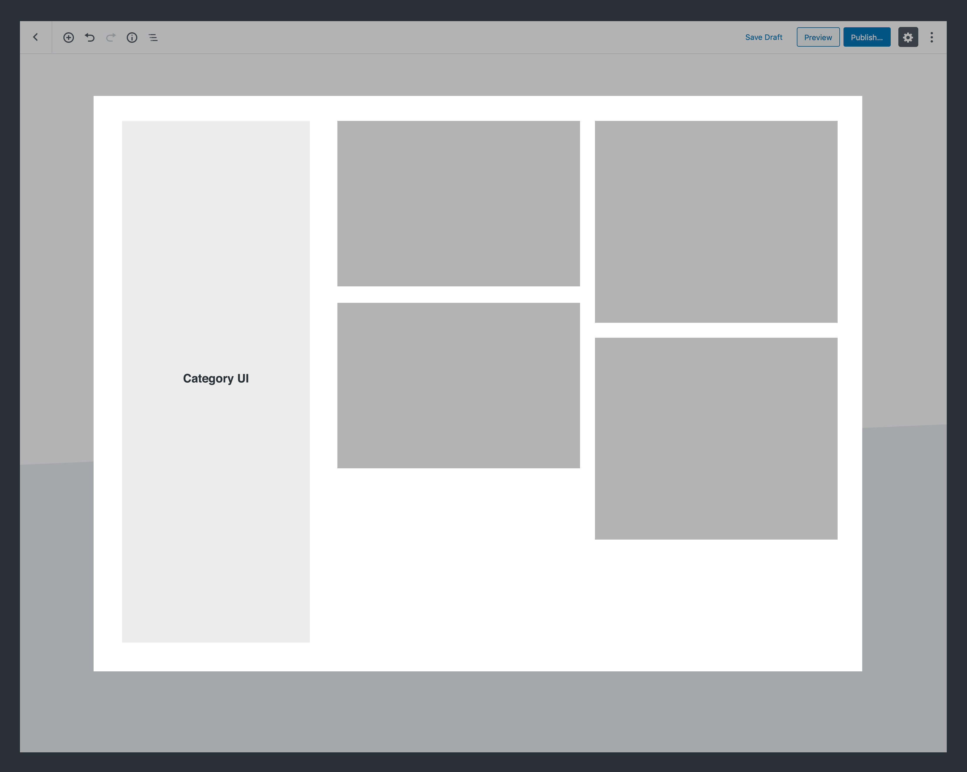
Last year I explored some prototypes for Gutenberg page layouts. My explorations had a couple pieces:
- Extend layouts to work on pages, not just CPTs.
- Create a way for theme authors to “declare” multiple templates.
- Create a way for theme authors to categorize those templates.
- Create the UI for selecting a layout.
Desktop

_Note: this prototype was from an earlier round I tried, and some of the elements are outdated._
Mobile

The breakdown
The layout picker, like everything else in Gutenberg, is a block. It consists of a couple elements:
- Block title / description.
- Tabs for categorizing layout types (styled after the block inserter).
- These are theme-defined.
- When you only have a couple layouts (let’s say, <5), the tabs don’t appear.
- If there aren’t any categorized layouts, the tabs don’t appear.
- A list of available page layouts.
- The layout graphics should be automatically generated based on the blocks included in them.
- Images are grey boxes, text is darker grey lines, buttons are blue, etc. We should abstract out everything into simple shapes.
- Finally, the layout itself.
- In these mockups, you can see theme styles applied to Gutenberg. If theme styles aren’t declared, blocks would fall back to generic Gutenberg styles.
- You might also notice the global elements on the page — in this case, the site logo, navigation, and footer. These exist for presentation, but are not editable in this first version of layouts. They uneditable and displayed at 40% opacity.
Changing Layouts
I worked through what the flow could look like:
The breakdown
So wait, I can have more than one page layout?
Yup! You can stack them and combine them however you’d like.
Won’t that get ridiculous?
Yeah, it could. Probably won’t in most cases, though. Being explicit about either overwriting or appending means that folks are less likely to lose content. Deleting blocks is easy, so if they append and want to get rid of older blocks, it’s just a click or two away.
What if they didn’t mean to overwrite their content?
Let’s please please support “undo.”
What about page-specific elements like Features Images and Page Titles?
If appending layouts, we should convert any page-specific elements to their closest generic equivalent. For example:
- Featured Image → Image
- Page Title → Header
How about duplicate blocks?
If a specific block (like Latest Posts) is duplicated, we should allow that — folks might want to display another block of posts from a different category.
Generic blocks can be duplicated to your heart’s content.
What do we call a layout once you’ve appended another layout onto it?
We should call it “custom layout,” and re-render the preview image based on whatever’s changed.
There's a lot of outdated stuff in these mocks since they're over a year old, but we might be able to reuse some concepts.
 melchoyce
on 2 Oct 2019
melchoyce
on 2 Oct 2019
Great discussion here, thanks for starting it. I feel very strongly that this can help making page layouts even simpler, and I can't wait for it to land.
I also strongly feel that we should not be adding an additional button next to the block library, because:
- it dilutes and fragments the block library as the singular place to insert anything on the page
- it adds additional UI for inserting and to learn, to make accessible and work across mobile and desktop
- it is added in a place that's already crowded and should arguably be reduced rather than added to
- it separates the "pattern" from the "block", effectively creating a different type of content, when it arguably could be the same
_Once you learn the block UI, you learn how to do everything_, was a guiding principle from early on, and although it should be refined still, it has scaled relatively well. Just yesterday we discussed how treating the _site itself_ as a block (#16998) could be beneficial as it re-uses existing UI. If instead of treating a "block pattern" as a new feature, but instead treat it as _just another block that happens to be pre-designed and have child blocks inside_, suddenly it's not a new feature, it's a _refinement to an existing feature_, which seems both pragmatic and sensible, scope-wise.
To me, the Block Library seems the obvious location for this interface. What changes can we make to it, to better accommodate block patterns? It already contains reusable blocks, arguably precursors to patterns like these, and any improvements we make will likely benefit those too. Is there a Block Patterns tab? Is the block library wider — as wide as the block library and the new preview pane together? Do block patterns need a separate preview window or can we leverage the extra space of that preview pane?
Another exercise is to flip the question on its head: what is it about the block library as it exists today that suggests we need a new UI for block patterns?
Another interface, and Mel very elegantly touches on this, is to tap in to the placeholder interface. What if the Site block, by default, let you pick base template?
The following is, as is no doubt evident, not an exceptionally considered idea, but just a quick sketch showing how it would look if we added a "type selector" dropdown to the block library, allowing you to search both blocks and block patterns together:

 jasmussen
on 8 Oct 2019
jasmussen
on 8 Oct 2019
To me, the Block Library seems the obvious location for this interface. What changes can we make to it, to better accommodate block patterns?
Thanks for diving in, @jasmussen! Figuring out that question is key. Recently, Happiness Engineers shared that some users don't even scroll the Block Library to find other blocks outside of what is front-and-center. This is another problem, but something to consider in relation to adding anything else to this very small interface.
what is it about the block library as it exists today that suggests we need a new UI for block patterns?
I'd say it's the very size of the Block Library that makes it difficult to add full page block patterns there. Right now, the user views a block icon and a tiny preview of the block. It works because it's a small area of the page that is focused. Block Patterns work much better when the user can see _most_ of the page and how these blocks exist together. The size of the Library makes this difficult.
The concept of a "Site block" sounds rather interesting. Many blocks have a placeholder, so a Site block might be able to have a placeholder with layout options too. This idea works well for new pages, but not so much for pages that have existing content. But here's a quick mockup around this anyways.
Block Placeholder (for reference):

Site Block Placeholder:

This really jives with @melchoyce's mockups above.
mapk
on 8 Oct 2019
Good thoughts, thank you.
Recently, Happiness Engineers shared that some users don't even scroll the Block Library to find other blocks outside of what is front-and-center.
That's a good insight, and all the more reason to improve the block library together with any improved designs we make for block patterns.
I'd say it's the very size of the Block Library that makes it difficult to add full page block patterns there
That rings true. I took a little time to try and mock up a little bit based on that feedback, but combining this with the idea of a singular block library. Don't put too much weight in the high fidelity of this mockup, partly this is my comfort zone, partly it's a way to make it "feel real". So just because it looks _done_, doesn't mean it can't be rejected based on further feedback:
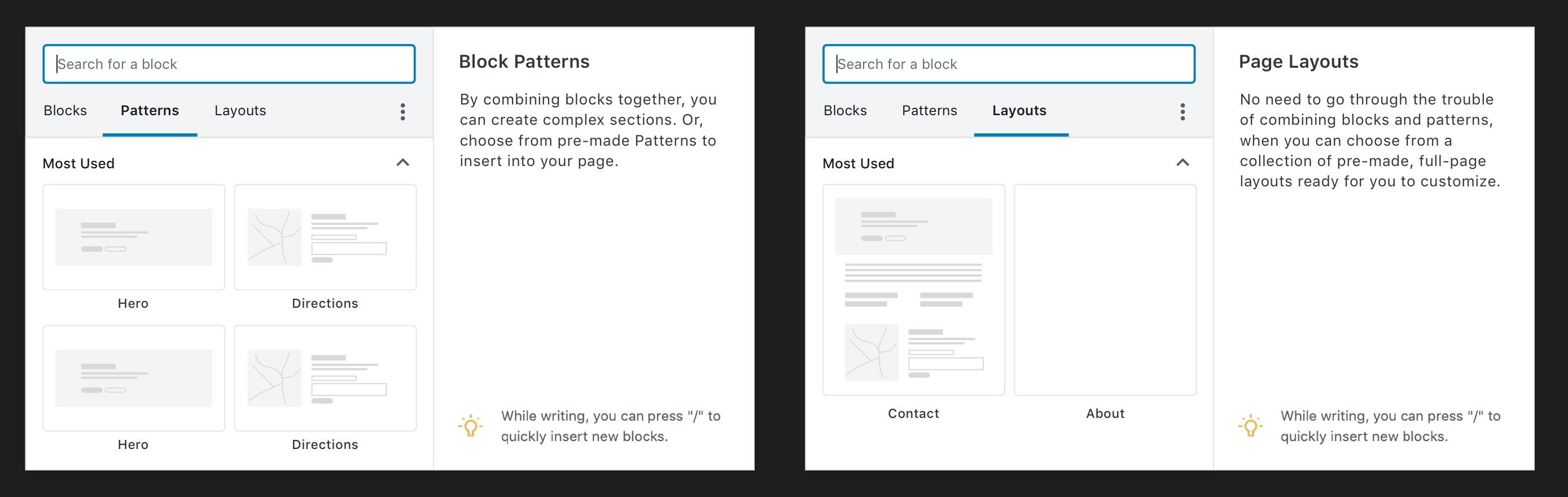
What you see here is the same singular block library that you press the (+) Add Block button. This makes it available in the editor bar, at the end of the document, whenever you make a new paragraph, or if you look for the sibling inserter.
The UI builds on what we have, but adds two tabs in addition to the search field:
- The Blocks tab is default, and the content is what we have today
- The Block Patterns tab sits next to it, and instead of having a separate preview pane, this one shows rendered previews as the block pattern thumbnails itself.
- There's a _category dropdown_, which is a good way for plugins to categorize their offerings.
- Thumbnails have fixed widths (2 columns), but varying heights, masonry-style.
- The entire popout window has been made bigger, and by not showing a preview pane we get even more real estate. We can even explore responsive tricks to size the dropdown according to available screen real estate.
- When you search, you search across both Blocks and Block Patterns.
- Block results are grouped separately, and show up first
- Block pattern results show up below that
Again, while this looks high fidelity it should not be taken as gospel. It is intended to simply further the conversation. I was inspired by some of @shaunandrews work for Full Site Editing, and I'm sure he'll have thoughts to share too.
Hope this helps! Thoughts?
jasmussen
on 9 Oct 2019
Alright, so based on the above explorations, I see us breaking this down into two tasks:
- Previewing and choosing a page layout when you create a new page
- Adding new block patterns afterwards, via the inserter
@jasmussen has some excellent inserter explorations in https://github.com/WordPress/gutenberg/issues/17335#issuecomment-539903480 that we can iterate on for the inserter.
@shaunandrews also shared this idea that he's working on for WordPress.com with me:

When you create a new page, you'd be presented with an option to select a layout. The preview is a nice addition that neither @mapk nor I have explored yet.
One question we should think through: should full page layouts _just_ happen for pages, not posts?
melchoyce
on 9 Oct 2019
should full page layouts just happen for pages, not posts?
One aspect is what we default to, another is the technical distinction. I.e. it's very probably technically trivial since it's the same under the hood, so merely a question of deciding what we _allow_. The benefit of allowing it everywhere is that it's a predictable flow that's the same everywhere. The downside is: we probably don't want you to create a new Post that uses the Blog Homepage template.
Perhaps the template, when it's registered, decides itself which taxonomies it should be allowed on?
jasmussen
on 9 Oct 2019
Perhaps the template, when it's registered, decides itself which taxonomies it should be allowed on?
Good idea — then templates could also be used for categories/tags, and CPTs.
(A template picker on taxonomy pages could be cool!)
melchoyce
on 9 Oct 2019
Tangentially related to block patterns — sections of content — a friend shared some thoughts on the sibling inserter, the plus that appears on hover between blocks, noting that it would be more usable when always visible when the block was selected. The reason this is not the case right now is because that conflicts with just wanting to click text to edit, and with the resize controls present on Spacer and Cover blocks. Key here being that _everything is a block_.
A couple of screenshots of the GoDaddy site builder were shared, where a similar interface exists and is permanently visible on select. The main difference being that this UI differentiates between small blocks (text, images) and bigger sections, and shows this control only on the latter:

As we continue on block patterns, it would be interesting to think about whether this concept opens the doors for further simplification of the base UI at the addition of features to the larger sections.
jasmussen
on 10 Oct 2019
@jasmussen Can I grab your file for https://github.com/WordPress/gutenberg/issues/17335#issuecomment-539903480?
melchoyce
on 11 Oct 2019
Yes of course. I put it quickly together in kind of a messy Figma file, so I copied it here:
https://www.figma.com/file/VaSKQJDS70ov87XY1alOVs/Block-Library-w.-Block-Patterns?node-id=0%3A1
jasmussen
on 11 Oct 2019
Thanks!
melchoyce
on 11 Oct 2019
Been toying with a few ideas:
I started with the idea of a dropdown and tried a single list of blocks:

Along with this I tried both a two columns and a single column for patterns, using thumbnails for the patterns in the list:

I then decided the search was in a confusing spot, and took a step back. I tried adding a dropdown next to the search and tabs below the search:

With the tabs below the search, I also tried showing thumbnails of patterns in both a landscape and portrait orientation.
I do like what @joen did with the more interesting layout of patterns so I also tried a quick mockup with that:

 shaunandrews
on 11 Oct 2019
shaunandrews
on 11 Oct 2019
Great explorations. I think the tabs work a little better as a pattern, because the dropdown next to search makes it look like the two are tied together — like, I can only search within patterns or templates, not change my view by selecting one.
melchoyce
on 11 Oct 2019
I thoroughly enjoyed reading through this issue, the ideas read and look great!
I'd like to flag the related issues #15623 and #17512 which focus on providing the necessary block types and infrastructure respectively for enabling full site editing.
While block patterns as discussed here make sense in both contexts (individual post vs entire template), I think we need to differentiate between two types of templates:
- Template Parts (e.g. to be implemented with a
wp_template_partpost type internally, similar to how the Full Site Editing plugin does it):
- Template parts should be able to be used in various places, and it should be possible to append them to other content (as discussed here before).
- Templates (e.g. to be implemented with a
wp_templatepost type internally, see #17513):
- Templates are supposed to represent _entire_ templates, including all the semantic markup that makes up an HTML document. There need to be some restrictions on how these can be placed, for example full templates do not make sense in individual post content, and also it shouldn't be possible to append a full template to somewhere else - a full template should always override the existing content, and their main use-case would be at the very start of creating a new template with Gutenberg (i.e. "Select your starting point").
- While we still need to figure out how to generally encourage (enforce?) solid semantic markup (via the aforementioned issues), I believe we should also consider this scenario here.
So far this issue seems mostly focused on the template parts, and that makes sense, but it would be great if we could also think about how to expand that to full templates in the future.
 felixarntz
on 12 Oct 2019
felixarntz
on 12 Oct 2019
So far this issue seems mostly focused on the template parts, and that makes sense, but it would be great if we could also think about how to expand that to full templates in the future.
One clarification — the "block patterns" setup is less about template parts (which are structurally meaningful) and more about general design elements made of smaller blocks. Once inserted they are not stored separately. For example, a "Cover" image that combines a few blocks to achieve a specific look that would otherwise take users some work to accomplish. Think of it more as a collection of designs that can be added anywhere without necessarily representing a reusable part of a theme template.
 mtias
on 13 Oct 2019
mtias
on 13 Oct 2019
A quick and dirty exploration, taking @shaunandrews' and @jasmussen's ideas and applying them to a modal instead of a popover:

melchoyce
on 14 Oct 2019
I dig the tabs and search layout, though I must admit I personally _always_ use the search in the block library, so as a data point of one, I would prefer search first.
The modal dialog inserter definitely brings the space. That's good. But it also loses a little bit of the visual context of where your cursor is/where the block or block pattern will be inserted. Additionally it opens up the question of whether this becomes the global behavior for the block inserter, or for example just what you see when you use the sibling inserter or a variant like the "section inserter" suggested above. And if we _do_ fragment the behavior, is that good?
jasmussen
on 15 Oct 2019
Your exploration there, @melchoyce, really helps! Thanks! I have a couple thoughts around this.
In one instance the modal communicates the many blocks available which is something people struggle with exploring right now. But on the other hand, seeing all these blocks like this becomes a bit overwhelming. A modal feels right for the patterns, but not for individual blocks. But the mockup also shows the accordions open, so it may completely change if only showing one open as we do on default.
mapk
on 16 Oct 2019
As much as I like the added space of the dialog version, sleeping on it, it doesn't feel like the right approach to me. It removes all context from the content, and feels overwhelming when you're inserting simple blocks like paragraphs or images. I increasingly feel the same way about premade blocks, or block patterns — they are just collections of blocks and should be inserted the same way.
While https://github.com/WordPress/gutenberg/issues/17335#issuecomment-539903480 isn't necessarily the way to go — the categories start to feel pointless, and there's a lot going on — I do feel that _improving the block library to accommodate complex blocks_ (and avoiding a modal dialog) is the way to go.
jasmussen
on 17 Oct 2019
I do feel that improving the block library to accommodate complex blocks (and avoiding a modal dialog) is the way to go.
Now that we have the Help Panel which provides more space in the library, we can probably work with that a bit. Maybe patterns are another tab to separate from the individual blocks, but the preview area still remains in the Help panel side that can be vertically scrolled if necessary.
mapk
on 18 Oct 2019
I like the idea of "Block Patterns" (maybe it should be changed to "Block Layouts?") but I don't like adding a new block using a dialog box - it's too distracting! (If Block Patterns were to be added this way, I'd be fine with it.)
 Wingo5315
on 20 Oct 2019
Wingo5315
on 20 Oct 2019
I’d suggest that the Block Inserter should remain a small popover (as it sits today) while Block patterns should be a different component altogether - as the context in which each is used _could_ very well be different: one for building pages (patterns) - the other for adding blocks/tweaking those pages.
It _could_ work within the inserter, but we may find that the interface becomes more complicated and confusing - and not to mention, the inserter is quite small. Bringing in tiny previews of patterns may not be the best experience. We need to be able to show more than one pattern (to provide proper context for the user to choose from), but also make the previews big enough to actually see.
Perhaps we tweak how we’re doing things a bit.
Just thinking aloud here, but what if we had the Inserter at the top left, as it’s stands today, and introduce a new UX pattern in-between existing blocks - where folks may add block patterns/layouts (whichever we call them). This would replace the on-hover block inserter (+) that currently resides between blocks, and remain visible (not hide when not hovered).
Here's a screenshot (_with actual Gutenberg content_) on what that could look like:

There’d need to be some thought behind where exactly this would take over. Would it be between every block? I'm not sure.
Opening up the pattern inserter would fire a modal from which the user may select a new pattern to add to their page. Here's an exploration of the modal, using a top-level categorical selection, though I'm not 100% here on what this would look like.
This pattern (or parts of it at least) is seen on GoDaddy's Website + Marketing offering, as well as SquareSpace (and possibly elsewhere). It's worth an exploration.
 richtabor
on 22 Oct 2019
richtabor
on 22 Oct 2019
A block and a layout should be DIFFERENT.
A layout should leverage the css framework it’s using.
Examples of layout:
- Column/row
- Grid
- A slider
- A container
- Tabs, accordions
A block May live inside a layout or not.
A pattern might be a layout + blocks ?
 eduardoarandah
on 27 Oct 2019
eduardoarandah
on 27 Oct 2019
Here's how the Blocs App does this. It uses a much larger Inserter. Just sharing more research.
mapk
on 6 Nov 2019
More looking at what others are doing out there.
Qubely uses a button in the Top Toolbar to open a modal.
mapk
on 6 Nov 2019
Great shares, Mark.
I would note that the Qubely approach is one I would think we should avoid, and it's an approach a number of other block collections take. The approach assumes the user is on a desktop screen and isn't using the "Top Toolbar" option, or even the future "show labels for all icons" option. So if we were to add an actual separate button, we would likely want to add it in direct context of the block inserter, and we should probably look at how we could reduce the other buttons present in that space.
jasmussen
on 7 Nov 2019
And here's a snapshot of how SquareSpace does has a separate interaction for page architecting and content editing, providing context to my earlier comment.
And here's a continued conversation (Slack) that we discussed through yesterdays design meeting:
I've been thinking a lot about a pattern interaction vs. a block interaction. Moving patterns as the top-level "building" interaction, while maintaining blocks as the "adding/tweaking" interaction. Sure one could build "patterns" with blocks obviously, but it's not exactly simple and requires many more interactions to accomplish. So what if there was a distinct different between page architecting and content architecting?

richtabor
on 7 Nov 2019
Thanks for sharing that, Rich. It seems the balance to walk is between making it trivial for users to insert large helpful sections of content to quickly build out pages when they mean to, but have trivially intuitive access to individual blocks when that's what they need.
To me, the key take-away from the Squarespace GIF is that while the duality between two libraries exists, it is tempered by _contextuality_. I wonder if we can do even better, though, so as to avoid two completely different-looking block libraries. For example when you insert a _Navigation Menu_ block, it feels intuitive that the block library becomes a tool to insert only _Menu Items_ inside. Is there a similar way we leverage context in the editing canvas itself?
jasmussen
on 8 Nov 2019
As to how to add a layout, maybe in the Settings area of the Documents tab, there could be a list of layouts with a graphic showing the user what the layout roughly looks like?
Wingo5315
on 8 Nov 2019
We've had a section and layout modal in Atomic Blocks for a while now and I'm happy to share what we've experienced with it so far.
To elaborate on @mapk's questions:
- Yes, the block editor should have a dedicated UI for working with block patterns/sections/layouts or whatever you want to call them. The next logical step after individual blocks is how we combine them to create modern, expressive layouts. Creating a standardized UI for this will allow users and developers to enjoy a cohesive experience and avoid reinventing the wheel a million times (which has already begun). Even though Atomic Blocks and several others have a dedicated UI already, I would still prefer to adopt a standard (but extensible) UI for this.
Whether or not core provides block patterns to populate this UI is another question. Maybe it makes sense that core themes provide opinionated block patterns to compliment and extend their designs.
- Several of the UI's proposed here are a great start. I particularly like what I'm seeing from @shaunandrews and @melchoyce here. I share @richtabor's opinion about the block inserter being too limiting for a feature like this, and I think we will quickly outgrow it. Expressive page building with block patterns deserves more than a 700px x 430px interface.
We've distinguished a difference between sections and layouts in our UI, with sections being parts of a page, and layouts being a full page layout. This is an opinionated decision and makes sense in our current implementation, but this could also be addressed with a category or filtering interface instead.
Atomic Blocks also has a favorites feature to let users easily favorite and revisit their frequently used sections and layouts. This kind of feature will be necessary as the quantity of patterns will quickly grow. Another way to empower the user would be to allow whitelisting and blacklisting patterns to control the output in the pattern UI.
The power of the block editor will be most apparent and validated in features like block templates and block patterns, which fundamentally change the way we build websites in WordPress. We also have the opportunity to corral the wild west of custom WordPress interfaces and start offering a more cohesive and predictable experience with standardization.
 mikemcalister
on 4 Dec 2019
mikemcalister
on 4 Dec 2019
I have some mockups to share today that attempt to address a past idea. To elaborate on the challenge: a user might not care about the difference between a Block, a Pattern, or a Layout, and since either can be inserted in any location, creating different interfaces for each is likely to confuse.
In the following mockup I tried to address that by:
- Creating a single unified library interface, tabbed
- Show this interface as a popover, full-height but not modal, when opened from the Editor Bar
- Show it as a dialog, defaulting to the Patterns tab, when opened from the sibling inserter

_Note that this UI leverages unfinished UI concepts being explored in #18667._
In this configuration, users can insert either a block or a pattern without having to look through different interfaces, yet we acknowledge that you might want more screen-space when looking at inserting the larger patterns.
This interface also leverages the new category phrasings suggested here.
jasmussen
on 5 Dec 2019
- Show it as a dialog, defaulting to the Patterns tab, when opened from the sibling inserter
I think we're onto something here!
richtabor
on 5 Dec 2019
@jasmussen, would patterns show up in / as well, or just blocks?
melchoyce
on 5 Dec 2019
That's an excellent question. Maybe if categorized separately. But maybe the big preview is more necessary for patterns? "2 patterns found" could invoke the dialog?
jasmussen
on 5 Dec 2019
@jasmussen, would patterns show up in
/as well, or just blocks?
Perhaps. Though without previews, I'm not sure how useful having them within the / would be - unless they were very uniquely named (which I doubt will be the case, i.e. "About 1", "About 2") or if users could title them as they see fit (not 100% sure about that as well).
If we implement a "favorites" feature, as @mikemcalister mentions earlier in this thread, perhaps only favorited patterns would show (as long as they were clearly identifiable). And if we do allow them, would patterns need a corresponding icon (similar to blocks)? Or would there be a default "pattern" icon to classify block patterns?
richtabor
on 5 Dec 2019

 lumberman
on 5 Dec 2019
lumberman
on 5 Dec 2019
Hey all, I just wanted to pop my head in and say I love where this is headed. The latest mockups and lines of thinking are wonderful. As I'm thinking about how this would translate to native mobile Gutenberg, I think the last mockup by @lumberman is nicely organized and should be pretty scalable, but I have one concern regarding hierarchy and interaction. Forgive me if I've not got the full historical context, but I think the mobile perspective would be useful in this context.
On Accordions / Nav Hierarchy
One issue I've always had with the inserter is the accordion sections (most used, common blocks, etc). The first section "Most Used" is clear enough because it's always open initially, but it tends to bury the additional sections and hinder findability, especially on mobile.
I'm a fan of how the left sidebar is laid out in your last mockup, @lumberman. Do you think it would make sense to add the sections as list items in the left-sidebar navigation hierarchy? In other words, the items under Sections would be "Most Used", "Headers", "Footers", etc. (or whatever the group naming ends up being)? That might solve the "buried sections" concern and potentially allow us to essentially remove the need for the accordions, but I understand this is a large divergence from the block library historically so others might not like this suggestion 😄
On "Favorites"
One of the concepts being discussed (by @mikemcalister initially I believe) is that of "favorites". This is almost exactly like an idea I explored a while back on native mobile GB, where you'd choose favorite blocks to create "My Library" of blocks during the on-boarding process into GB and from there, the block library would focus on those primarily while still providing an obvious path to the full block library. The main problem with this was discoverability, although if I think there are ways to address that.
On the Block Library, Overwhelm, IA, etc.
There's one thing I keep coming back to regarding the inserter in general, which becomes even clearer as we make it more robust. During mobile-web usability tests, we (the mobile team at Automattic) have heard often that the block library is overwhelming. There are a lot of choices and groupings are not immediately clear. I think the new UI ideas proposed here help because they "breathe" a bit more, but the number of blocks is still overwhelming and will only get worse with the introduction of another grouping (Block Patterns). I think as we scale this up (which I think is the right direction, "favorites" type ability might mitigate that.
 iamthomasbishop
on 6 Dec 2019
iamthomasbishop
on 6 Dec 2019
It is well worth having a look at Mobirise approach to page layouts. They provide a canvas on the left and a vertical panel selection slider on the right segmented into the natural vertical page elements...a few panel choices for top bar, then top menu, then body panels by business function (depending on the theme and page type (e.g. map panel, people panel if this is a About Us page), then footer, then footer bar. You just drag & drop the panels from the right to the left.
WARNING: If you are a contributor to Gutenberg, read the Mobirise terms before deciding to peruse any Mobirise materials...they have a nasty clause in their terms that relates to their products and website:
You represent and warrant that you will not: copy, modify, create derivative works of, adapt, reverse engineer, emulate, migrate to another service, translate, compile, decompile or disassemble Services;
Better yet...don't go to their website at all.
Instead, you may consider just looking at the Mobirise YouTube videos. I am not aware of any term overreach that would extend past the license YouTube requires of content uploaders but Caveat Emptor...I am not a lawyer.
If you believe watching YouTube videos are non-risk to the Gutenberg I.P., the Mobirise Youtube channel is at https://www.youtube.com/channel/UCt_tncVAetpK5JeM8L-8jyw/featured. You can see a theme-specific page building by drag & drop panels in action.

 timhibberd
on 7 Dec 2019
timhibberd
on 7 Dec 2019
@jasmussen, your mockups here look great. 😍 I'd love to see them in a working prototype if possible that might be able to answer some of my questions below.
As indicated by @richtabor, it makes sense to change contexts for when someone is adding a block from the toolbar as opposed to adding a pattern from the sibling inserter. I like that extra space is given in a modal for the patterns!
Next steps
- The term "Premade Blocks" feels a bit awkward. Can we try "Block Patterns" there, or is that feeling equally awkward?
- What does it look like when I click the inserter in the Top Toolbar and then click the "Block Pattern" tab? Does the popover shift to a modal? Does the popover change size but remains a popover in the same position? Does it keep the same size and positon and just shows patterns now?
- What does the interaction look like when clicking the sibling inserter inside the editor, and then clicking the "Blocks" tab? Does the modal change in size or position from here or does it remain a modal?
- Create a prototype that answers these questions. I'm happy to help here if you can link me the file.
@lumberman thanks for your mockups too! I really like how they utilize the existing inserter design, and build on top of it. 👍 Is there a way to reduce the amount of accordions? It feels like a lot of things that can slide open. Right now, usability tests have revealed that people aren't clicking into the accordions we already have.
mapk
on 25 Dec 2019
The term "Premade Blocks" feels a bit awkward. Can we try "Block Patterns" there, or is that feeling equally awkward?
Yes, let's definitely try Block Patterns.
I personally think that term is more awkward, however I am also aware that it's been discussed in the design chats and elsewhere, and the cost of trying it out in the plugin is very small, so no reason not to do that! It might feel perfect, or it might reveal itself as in need of tweaks, and we'll revisit.
What does it look like when I click the inserter in the Top Toolbar and then click the "Block Pattern" tab? Does the popover shift to a modal? Does the popover change size but remains a popover in the same position? Does it keep the same size and positon and just shows patterns now?
No shifting would happen. It would just be the same as the big modal, but in a smaller/tighter space. Perhaps there's only space for a single column of block patterns there.
But I still think it's worth it, having the same UI and both blocks and patterns, available in both locations.
What does the interaction look like when clicking the sibling inserter inside the editor, and then clicking the "Blocks" tab? Does the modal change in size or position from here or does it remain a modal?
A good question a PR/prototype might answer. I imagine zero change, that there's just more space to look at blocks, which some might prefer!
Create a prototype that answers these questions. I'm happy to help here if you can link me the file.
Here's the Figma file: https://www.figma.com/file/fnyj380i05vGzuuH60frLQ/G2-Design?node-id=85%3A6975 — it's a little messy but you can ping me if you need help.
jasmussen
on 6 Jan 2020
Here are some explorations based on the excellent ideas y'all have been sharing. I have on purpose constrained myself to work within the space provided by the current block inserter. I've done this for two reasons:
- It'll make it easier for us to translate this UI to small screens.
- For the average screen size, I feel that the current inserter already takes up enough screen real estate. So I believe that a bigger, centered modal won't provide much benefit.

**The above is a screenshot taken at 1200 x 800.
Given that I have the size constrains of the block inserter, I tried to explore how we could take as much advantage as possible of the available space. While the Help panel works fine for blocks, it does get in the way when we try to display bigger thumbnails for block patterns. So I tried to remove it, without getting rid of its contents. This gives us more space, not only for block patterns, but also for blocks. I also really like how the preview thumbnails looks for block patterns in some of the mockups shared here, and since we are already doing block previews on the Help panel, I though why not give this a try.
It looks something like this:

When you focus/hover a block, the contents of the tips "band" at the bottom change accordingly:

Basically I'm just moving things around:

The block previews really don't take that much more space than what the current buttons do, and we can now show more than 3 per row.
I also tried displaying smaller thumbnails but I feel the previews are harder to read:

With all of the above, the block patterns tab could look something like this:

We can have a familiar UI for both blocks and block patterns that makes the most of the space available in the inserter.
 enriquesanchez
on 18 Jan 2020
enriquesanchez
on 18 Jan 2020
Thanks for working on this Enrique!
I have on purpose constrained myself to work within the space provided by the current block inserter. I've done this for two reasons:
- It'll make it easier for us to translate this UI to small screens.
- For the average screen size, I feel that the current inserter already takes up enough screen real estate. So I believe that a bigger, centered modal won't provide much benefit.
I disagree with this. We have good ways to translate a modal to phones (fullscreen), and we can show one column of patterns instead of two and three.
I say this having explored designs not too dissimilar to your own, so I am also disagreeing with my past self.
What I realized was that if we are to show vast luscious block patterns we need all the space we can get. This was a matter of connecting the dots outlined by Mark and Rich, resulting in these mockups (Figma file).
jasmussen
on 20 Jan 2020
I took a stab at a block library that takes up all available vertical space, removes the help text, and detaches the preview window in #19836. It can serve as a prototype for the overall idea.
jasmussen
on 23 Jan 2020
Enrique I'd love to work with you on bringing some of your finesse to the tall vertical mockups shown earlier on. Here's the Figma file: https://www.figma.com/file/fnyj380i05vGzuuH60frLQ/G2-Design?node-id=85%3A6975 — notably it works well on the desktop breakpoint, but the mobile breakpoints aren't fleshed out yet. I'm always up for a chat also, if that's at all helpful.
jasmussen
on 23 Jan 2020
hey @jasmussen! 👋
Here's a quick mockup combining your tall vertical mockups with some block pattern previews:

I like it. The big previews feel good at this size. One issue I'm having is that I'm not sure that accordion categories work well for navigation and discoverability when the previews are this big.
I spent some time exploring the idea of having the categories on the side instead:

I think this makes it easier to scan the available categories, but it pushes the categories for Block Patterns way down, and I'm not sure I feel this is right.
Let me know what you think.
enriquesanchez
on 29 Jan 2020
Here's a quick mockup combining your tall vertical mockups with some block pattern previews:
This is stellar! Notably seeing patterns in the vertical interface is very enlightening, and works slightly better than I had assumed.
The categories on the side aren't bad either, though I wonder if they are better served as a dropdown when in the top left popover version, but they might work well in the dialog version opened by the sibling inserter?
Thank you for this! I'll let others chime in as well.
jasmussen
on 29 Jan 2020
Here are a couple more explorations iterating on the recent mockups:
1. Tabs for Blocks and Blocks Patterns + list for categories

2. Tabs for Blocks and Blocks Patterns + dropdown for categories

I think 1 feels right. I like how the list of categories is fully visible (better for discoverability), and I think this should scale well.
While 2 feels tidier, I'm concerned that the list of categories is hidden behind a click, and thus affecting discoverability.
@jasmussen @mapk @shaunandrews what do you think?
enriquesanchez
on 6 Feb 2020
I think 1 feels right. I like how the list of categories is fully visible (better for discoverability), and I think this should scale well.
While 2 feels tidier, I'm concerned that the list of categories is hidden behind a click, and thus affecting discoverability.
Looking good @enriquesanchez! Number 1 feels right to be as well.
A few thoughts:
a. We'll need to figure out a mechanism for what happens if there happen to be a loooooong list of categories.
b. How should categories be ordered? Is there a priority via the theme, then plugin? Alphabetical? Or a combination?
c. If the theme registers patterns for different categories, do the patterns appear in the "From theme" category, as well as each pattern's specified category?
richtabor
on 6 Feb 2020
An echo for Rich's comments and questions, wonderful summary. Nice work!
One thing to consider is that per the current thesis, the library shows as a big dialog when opened from the sibling inserter, and conversely is smaller when opened from the top left. We _could_ default to the categories on the side and _collapse them into a dropdown_ when responsive challenges dictate it.
b. How should categories be ordered? Is there a priority via the theme, then plugin? Alphabetical? Or a combination?
Probably will end up being a combination of a few "blessed" ones at the top, and then alphabetical. Until a point where plugins name their categories __Sweet Blocks or 1. Sweet Blocks. It seems like one of those things we can risk overthinking _now_, and since it's easy to adjust down the road, we might as well go with the simplest solution and tweak when necessary.
jasmussen
on 6 Feb 2020
@richtabor @jasmussen thank you for the excellent feedback.
a. We'll need to figure out a mechanism for what happens if there happen to be a loooooong list of categories.
Agreed. I'm not familiar if something similar has been needed for the block library and if we could learn from it.
b. How should categories be ordered? Is there a priority via the theme, then plugin? Alphabetical? Or a combination?
I echo Joen's suggestion. Some initial order needs to be established and look at iterating when/if the system gets broken.
c. If the theme registers patterns for different categories, do the patterns appear in the "From theme" category, as well as each pattern's specified category?
My initial reaction is yes. I expect some patterns will appear under different categories. I think that's OK. The idea of having a "From theme" category is by no means final, but I thought it would be an easy way to help folks have their site "look like the demo".
I'm going to continue iterating on this. I'll work on some prototypes to get a better sense of how the library will look and feel.
enriquesanchez
on 6 Feb 2020
I found the mobirise approach practical in the field. They have two block-panel selection columns...one grouping block-panels thumbnails under the common page categories (Header, Menus, Content, Footer, etc) with an adjacent category index so you can see all the categories and jump directly to a category of interest.

Not pushing this as "THE" solution. I just thought you might find it useful as an example and then translate what you do / don't like about it over to the design you want.
Just a suggestion :-)
timhibberd
on 7 Feb 2020
Thanks for giving it another go, @enriquesanchez!
I'm in favor of number 1 too. Having the list displayed prevents the user from having to jump through a series of clicks to get to their desired result. Having it collapse as Joen suggested for responsive screens sounds very interesting.
I don't know of any mechanism currently in Gutenberg that handles long lists, so that is something that needs to be thought through. Separating the Blocks from the Patterns through the use of tabs helps already. Kudos on that one!
"From theme" feels a bit odd. Maybe "Theme patterns" or just "Theme" or even "Theme: [theme name]". Maybe these should be prioritized at the top? I'm okay with keeping them together under the "theme" category AND exposing them under the relevant categories as well. Maybe this becomes something like a "collection"? https://github.com/WordPress/gutenberg/issues/19873
I noticed in the mockup that even though the "Patterns" tab is highlighted, the search field says you can search blocks and patterns. Is this right? Or should I be limited to block patterns while under the Pattern tab?
mapk
on 7 Feb 2020
Here is a mix of the wireframe Obenland shared:
https://github.com/WordPress/gutenberg/issues/17335#issuecomment-536109796
and Enrique's number 1 wireframe suggestion:
https://github.com/WordPress/gutenberg/issues/17335#issuecomment-582673937
Here is the existing Blocks area plus additional options:

When selecting the Block Variations tab it can change to something like this:

Edit: Using the existing interface but extending it for additional options would keep a consistency in how we select blocks today. One would still go to the same inserter area to select blocks. But this time one can also choose from Blocks (single blocks) -> Block Variations (multiple blocks) -> Page Layouts (templates) -> Site sections (header, footer etc).
 paaljoachim
on 7 Feb 2020
paaljoachim
on 7 Feb 2020
One thing to consider is the placement of the search box, and what that implies. With your latest designs @enriquesanchez the search box would be repeated for each of the top tabs (blocks and patterns), which makes me think that I can only search one group at a time. My initial hopes here was that we could have a single input to allow searching across both blocks _and_ patterns.
Maybe that's a misguided hope, or maybe I'm not understanding how the search input works.
shaunandrews
on 10 Feb 2020
I noticed in the mockup that even though the "Patterns" tab is highlighted, the search field says you can search blocks and patterns. Is this right? Or should I be limited to block patterns while under the Pattern tab?
With your latest designs @enriquesanchez the search box would be repeated for each of the top tabs (blocks and patterns), which makes me think that I can only search one group at a time.
@mapk @shaunandrews Thanks for the feedback! Not sure why but somewhere along the way I moved the search box because I initially had it on top of the tabs (see https://github.com/WordPress/gutenberg/issues/17335#issuecomment-575835877).
I agree with @shaunandrews , I think the search input should be the first element in the inserter (as it currently is). It's the first thing that is focused after I open the inserter, it's efficient and global.
enriquesanchez
on 10 Feb 2020
I think the search input should be the first element in the inserter (as it currently is). It's the first thing that is focused after I open the inserter, it's efficient and global.
Can you also explore what this might look like? When a search query returns results in both block and patterns, how does that look?
mapk
on 11 Feb 2020
I spent some time looking at how blocks will be displayed if we present a bigger modal for the block library, as it has been explored on this issue.
I keep leaning towards having a left-side list for the categories, like the first example on this previous comment.
So what if we followed the same pattern but for blocks? This means we would move away from using accordions like we currently do. This also means that for most categories, there would be A LOT of unused space:

Obviously, this is not ideal.
Another iteration led me to the idea of having a continuous list of all block categories, and have the links on the left-side list to scroll you to the corresponding place. Something like this:

I imagine that if I went ahead and started scrolling (instead of clicking on one of the links), the active state on the left-side list will update accordingly to communicate position.
This solution makes much better use of space, and we keep a few things that I like:
- The list of all categories is always visible, meaning that discoverability and exploration benefit.
- We no longer need to click to open a category accordion, and because the list of all blocks is now scrollable, navigation becomes easier.
What do y'all think?
enriquesanchez
on 12 Feb 2020
@enriquesanchez I love this exploration.
- Would we get rid of the previews in this kind of scenario? (I'm not necessarily opposed to that, just curious)
- What would happen if a category was too long? (Example: https://d.pr/i/DSsHTW). Would it just wrap into a new line? In that case I would just make sure that categories have more space between them so there's no confusion.
- I love the continuous scrolling as opposed to accordions.
 jwold
on 12 Feb 2020
jwold
on 12 Feb 2020
Looking good. Question though. Do we need to clarify "Block" in "Block Patterns"?
richtabor
on 12 Feb 2020
Thanks for the feedback @jwold and @richtabor 👍
Would we get rid of the previews in this kind of scenario?
I'm leaning towards that, but only for blocks. The preview seems to be very useful for patterns. I also like that visual distinction between both: blocks = small icons, patterns = bigger thumbnails
What would happen if a category was too long?
I agree, they would wrap, something like this:

I love the continuous scrolling as opposed to accordions.
🙌
Question though. Do we need to clarify "Block" in "Block Patterns"?
@richtabor That's a good question. So you suggest we use "Blocks" and "Patterns" ?
enriquesanchez
on 13 Feb 2020
Btw I think Patterns have been renamed to Variations.
paaljoachim
on 13 Feb 2020
Btw I think Patterns have been renamed to Variations.
Variations is unrelated to patterns — it is a technical part of building blocks and is not exposed in the UI as a term.
mtias
on 13 Feb 2020
I explored different variations of the block library when invoked from a sibling inserter (somewhere in the middle of the document).
1. Popover
This is very similar to what we currently have, just a bit bigger:

2. Big modal
Should make it easier to navigate patterns. I'm not sure I like the fact that it covers the content behind it.

3. Slide-in panel
Suggested by @mapk. Very similar to https://github.com/WordPress/gutenberg/issues/17335#issuecomment-585425675 in terms of size and placement. Makes me wonder if the slide-in could be the default pattern for both the top-toolbar and sibling inserters 🤔

enriquesanchez
on 15 Feb 2020
Here's a simple click-through Figma prototype that brings it all together.
Try opening the block library from the top toolbar, switching between the block and block patterns tabs, and searching. Finally try opening the block library from the sibling or middle of document inserter.
❗️ _Note: inserting blocks and patterns is not yet available in the prototype._
enriquesanchez
on 15 Feb 2020
Hey Enrique @enriquesanchez
Having a simple Figma prototype really makes a huge difference. As it really gives a feel for how a finished version would feel like.
The Blocks screen really gives a better overview of what exists today. One can easily see available blocks without having to open accordions to see which blocks they contain. There is also more space available.
A Saturday morning eye and mind exercise...:)
The mind/eyes move around noticing the Most used and Common blocks area that contain symmetry and balance.

When the eyes wander over to the left it sees a list going downward starting with Most used and ending with Embeds.

Most used is in blue. Above it is another blue color a line below the Blocks bold text (mind does not know why the blue line is there as it is so far from the Blocks word it seems separate. Logical I know why.). To the right Block Patterns not in bold with no line below it. Below is a Most used text in bold. Further above my mind sees the border outline of a box and the Search text inside it and is able to once again relax.
That means looking at each little element and how they relate to what is close by and the overall area it is in.
paaljoachim
on 15 Feb 2020
Hi.
There has to be room for a text based presentation of the block pattern.
Not all users will be helped by a preview image.
 carolinan
on 16 Feb 2020
carolinan
on 16 Feb 2020
Thanks for the feedback @paaljoachim and @carolinan! 🙏
There has to be room for a text based presentation of the block pattern.
I agree with you. I'll be adding more fidelity to the prototype, including block/pattern descriptions on hover, we need to make sure these descriptions are communicated to AT.
enriquesanchez
on 17 Feb 2020
2. Big modal
Should make it easier to navigate patterns. I'm not sure I like the fact that it covers the content behind it.
For the sibling inserter, this _feels_ the most natural, though a hi-fi mockup may help us decide better. Perhaps doing the core modal dark background will help bring focus to the modal (pictured below).
Provides enough viewing space for the user to properly make out the individual patterns - giving them a clearer idea of what will be added to the page. We could even keep the patterns to two columns wide - ensuring they are properly viewable.

3. Slide-in panel
Suggested by @mapk. Very similar to #17335 (comment) in terms of size and placement. Makes me wonder if the slide-in could be the default pattern for both the top-toolbar and sibling inserters 🤔
This is interesting, though I feel it'll be too disconnected from the sibling inserter. And if we're blocking the view of the content/site behind it anyhow, I'd say going for a full modal makes better use of the space. Our attention should be dedicated to the patterns/inserter at this point.
richtabor
on 19 Feb 2020
Also, these won't be screenshots - but "examples", much like how style variations support examples - correct?
Example of an example:

richtabor
on 19 Feb 2020
@richtabor That's a good question. So you suggest we use "Blocks" and "Patterns" ?
I'd say so.
richtabor
on 19 Feb 2020
I started decomposing this to small iterations and added a todo list to the issue description. This is not an exhaustive list and we'll most likely discover things as we move forward with implementation. Some of these items might not be implemented as part of this issue.
 youknowriad
on 20 Feb 2020
youknowriad
on 20 Feb 2020
For what it's worth, it would be really helpful to edit the original comment to succinctly define
what exactly a block pattern is and how they are different from block templates.
This would be helpful to expedite the process of onboarding potential contributors;
and remind core members who are looking to brush up and getting up to speed on this area; and to make sure that all of the contributors are on the same page (pun intended).
There has been some confusion among existing core members (also read the comments that immediately follow the linked comment) about the conflicting usage of terminology with templates.
From reading the first couple comments, I was unsure how "block patterns" are different than inner templates (that can be reused across multiple post types, are not required to be tied to a specific part of a page).
From what I gathered; block patterns series of blocks that are layout ; but the content inside the blocks has not yet been defined by the user and that the content is the same
and are they intended to replace template.php files?
(it's complicated that a template in WordPress can represent nearly all of the page or it can be abstracted to consistent of 3-4 additional template files (inner templates)
Would a block pattern be solving a use case of "I need a callout block that would consist of multiple blocks: a heading (whose heading level I'd be able to customize based on semantics)
a paragraph block, and a link to register for an event") ?
 skorasaurus
on 21 Feb 2020
skorasaurus
on 21 Feb 2020
Pattern Previews
I saw this the other day. It's an example of how the preview follows the vertical position of the cursor. If we go the way of a detached preview, this might be worth exploring.

mapk
on 5 Mar 2020
an example of how the preview follows the vertical position of the cursor. If we go the way of a detached preview, this might be worth exploring.
I actually think that having the preview in a fixed position might make it easier to _scrub_ items in the list — you can keep your eye in the same space.
shaunandrews
on 7 Mar 2020
Just a question. Will block patterns allow to define locked areas, so users cannot change the basic structure in a block pattern? For example, will we be able to lock the number of feature areas in the attached block pattern, so none can be added or deleted? Are you considering this use case?
 mrleemon
on 13 Mar 2020
mrleemon
on 13 Mar 2020
hi @mrleemon!
We have not considered that scenario. As of right now, block patterns are intended to be sections users can add and edit as necessary. This also means adapting the content to their needs.
Would you mind elaborating a bit more about the use case you shared? When or why would it be useful to have it?
enriquesanchez
on 14 Mar 2020
@enriquesanchez
I'm thinking of a one-page design with a series of group blocks in a specific order allowing users (with the editor role, for example) to modify the content of those blocks, but not delete them or change their order, so the menu anchors at the top of the page continue matching the page structure.
mrleemon
on 14 Mar 2020
Would you mind elaborating a bit more about the use case you shared? When or why would it be useful to have it?
From past client work, I've also heard this request, usually from larger organizations with specific editorial workflows. Usually they want to provide an approved layout for a specific type of content, and then have authors who can edit the content (images, videos, text, etc) within the layout, but not change the layout itself. The reasoning behind this is usually to maintain consistent design and branding for content across the site(s), even when many different people are generating and editing content.
 creativecoder
on 14 Mar 2020
creativecoder
on 14 Mar 2020
have authors who can edit the content (images, videos, text, etc) within the layout, but not change the layout itself
Yes, basically having the ability to lock layout-type blocks (groups, columns, etc.) would be great.
mrleemon
on 15 Mar 2020
I know for a fact this has come up before, and I could swear there was some locking aspect to templates that would let you accomplish this, but it escapes me. In any case, the use case seems legitimate, and interesting to solve.
jasmussen
on 16 Mar 2020
This is definitely available when creating templates. Since it's lower level API, it's not accessible from the pattern creation level yet.
mtias
on 16 Mar 2020
Here is a suggestion based on the newest mockup from Rich's @richtabor
Big modal 2. https://github.com/WordPress/gutenberg/issues/17335#issuecomment-587951100
Big modul vs small modul. There could perhaps be an icon somewhere to make the inserter screen smaller. One clicks the smaller icon and Block inserter becomes small so that one can focus on the one pattern one is thinking about using in relation to the content of the layout.
I have continued Rich's mockup and added Use and Edit and a lock icon.
This means the user can edit a pattern or reusable block.
Edit is not available where the admin has locked the pattern.
User can click Use, Title of pattern or the pattern itself to directly use/insert into the layout. I have also moved the blue underline closer to the selected area.

Alternative.
Use a Settings gir to create a drop down that shows Edit (if object can be edited) then Import and Export etc.

Clicking Edit. Focused area for only editing a pattern/reusable block.

paaljoachim
on 29 Mar 2020
The initial version of this is done. There are still some follow-up tasks here (searching, categories...) I'm going to close this issue though as we have this one #21080 with a good list of follow-ups.
youknowriad
on 28 Apr 2020
Related issues
 cr101
·
3Comments
cr101
·
3Comments
 moorscode
·
3Comments
moorscode
·
3Comments
 nylen
·
3Comments
nylen
·
3Comments
 spocke
·
3Comments
spocke
·
3Comments
 hedgefield
·
3Comments
hedgefield
·
3Comments
Most helpful comment
Last year I explored some prototypes for Gutenberg page layouts. My explorations had a couple pieces:
Desktop
View Prototype
_Note: this prototype was from an earlier round I tried, and some of the elements are outdated._
Mobile
View Prototype
The breakdown
The layout picker, like everything else in Gutenberg, is a block. It consists of a couple elements:
Changing Layouts
I worked through what the flow could look like:
View Prototype
The breakdown
So wait, I can have more than one page layout?
Yup! You can stack them and combine them however you’d like.
Won’t that get ridiculous?
Yeah, it could. Probably won’t in most cases, though. Being explicit about either overwriting or appending means that folks are less likely to lose content. Deleting blocks is easy, so if they append and want to get rid of older blocks, it’s just a click or two away.
What if they didn’t mean to overwrite their content?
Let’s please please support “undo.”
What about page-specific elements like Features Images and Page Titles?
If appending layouts, we should convert any page-specific elements to their closest generic equivalent. For example:
How about duplicate blocks?
If a specific block (like Latest Posts) is duplicated, we should allow that — folks might want to display another block of posts from a different category.
Generic blocks can be duplicated to your heart’s content.
What do we call a layout once you’ve appended another layout onto it?
We should call it “custom layout,” and re-render the preview image based on whatever’s changed.
There's a lot of outdated stuff in these mocks since they're over a year old, but we might be able to reuse some concepts.