Spyder: Fully implement Spyder's new dark theme
Problem Description
This issue serves to track the sub-issues related to fully implementing the dark theme across Spyder's various panes, text and icons, as a number of steps, both internal to Spyder's codebase and external in QDarkStyle, are required.
Blocked by #8020 , the initial implementation. Originally spawned from #2350 , the initial issue and discussion thread.
Places that need to be "darkified":
- [x] #8087: Dark css style for Help and Console panes
- [x] Dialogs:
- Pylint/Profiler
Outputwindow - Dependencies dialog
- Github authentication
- Pylint/Profiler
- [x] Interactive tour and menus:
- Interactive tour
- Online help and interactive tours submenus (of Help menu)
- [x] Help minor things
- Change color of math equations
- Change style of notes
- Theme scroll bar
- Theme table headers
- [x] Undocked windows
- [x]
Non-inline plot dialog (not sure if possible)@ccordoba12: This is not possible because that dialog is created by Matplotlib. - [x]
"Information" icon in file switcher isn't themed(opened as a separate issue to close this one out)
Places that still have black/dark colors:
- [x] Find in files results
- [x] Editor widgets:
- File switcher file list
- Symbol finder results
- [x] Outline Explorer code cell names
- [x] Preferences table columns:
- Keyboard shortcuts pref pane
namescolumn - LSP Manager
Command to Executecolumn
- Keyboard shortcuts pref pane
- [x] DataFrameEditor Index column
- [x] Pylint and Profiler panes' date and rating text
- [x] Icons:
- "Gear"/pane options icon (all panes; dark gray is completely invisible/should be white)
- Regex icon (find in files, find/replace; black/should be white)
- About Spyder "i" icon (Help menu; black/should be white)
- Case sensitivity icon (find in files, find/replace; dark blue is low contrast/try light blue)
Other Spyder Issues/Bugs:
- [x] #8069 : Spyder dark theme overrides background color set in syntax highlighting theme, except behind text
- [x] #8070 : Explanatory text for Greedy Completion preferences option cut off only in dark theme
- [x] #8071 : Centralize remaining theme-related options (like Rstudio does) under a renamed "Themes" pref pane
- [x] #8072 : Consider making internal console respect user's syntax highlighting theme
- [x] #8075 : Toolbar icons are too large particularly in dark theme
- [x] #8080 : Consider making the dark theme (and corresponding Spyder Dark syntax scheme) the default in Spyder 4
- [x] #8192 Fix options icon being very low contrast and sys.path and environment variables aren't themed
- [x] #8284 : Improve Spyder-Dark syntax highlighting theme
- [x] Outlines around sections, fields, etc are invisible in tabbed preference panes
- [x] Fix SymPy equations being having black rather than white FG color with dark BG (new issue was opened about this).
- [x] #9439 :
Right code analysis sidebar does not match scroll bar position(will be deal with separately)
External Issues:
- [x] ColinDuquesnoy/QDarkStyleSheet#111 : Text cut off and background color not full width when using comboboxes with a BG color
- [x] ColinDuquesnoy/QDarkStyleSheet#112 : Extremely difficult to read "disabled"/"grayed-out" text and embedded hyperlinks due to low contrast
- [x] ColinDuquesnoy/QDarkStyleSheet#118 : Tab close buttons for Editor and IPython Console are tiny and very difficult to see and click, and the hitboxes don't match the icons. Tabs are very hard to tell apart from one another, especially when not the active tab or adjacent, and tabbar itself is hard to distinguish from the pane its attached to (and hard to tell which pane)
- [x] Fix toggle icons (regex, case sensitive) being impossible to tell whether they are activated or deactivated (better to be solved in QDarkstyle).
 CAM-Gerlach
All 75 comments
@dalthviz, please continue with the Help plugin. For that I think you need three things:
- Let's leave the background color to be the same as the one of QDarkStyle and the foreground color to be white.
- Please check this theme: https://bootswatch.com/darkly/ for a good set of colors that can go with a dark background.
- You need to change Help's rich CSS when the interface theme changes, not the editor one.
 ccordoba12
on 16 Oct 2018
ccordoba12
on 16 Oct 2018
@dalthviz, please continue with
- Editor widgets:
- File switcher file list
- Symbol finder results
and
- Preferences table columns:
- Keyboard shortcuts pref pane names column
- LSP Manager Command to Execute column
Those are very similar.
ccordoba12
on 28 Oct 2018
And this one too
- Find in files results
All of this in the same PR.
ccordoba12
on 28 Oct 2018
@ccordoba12 @dalthviz I just noticed it now, but the DataFrameEditor's Index column is also not dark themed (making the index invisible), in case that should go into the current batch of work.
CAM-Gerlach
on 28 Oct 2018
@ccordoba12 @CAM-Gerlach another thing to fix is the setting of the style sheet to detached windows of the plugins:
For example with the Editor:

 dalthviz
on 30 Oct 2018
dalthviz
on 30 Oct 2018
@dpizetta, keep up the good work!! Things are looking really nice with QDarkStyle 2.6.1:

ccordoba12
on 2 Nov 2018
It looks pretty neat! Good job for all of you too! I like minimalist icons :)
May I change more thing this week, it will even better :)
Tabs, tool buttons and some details, v2.6.2.
The rounded corners are trick, hauha...there are many things that look weird mixed with flat ones. In version 3 we will have some options to set it flat, rounded and palette changes. I'm looking for the best implementation.
Thanks :)
 dpizetta
on 2 Nov 2018
dpizetta
on 2 Nov 2018
Thanks so much @dpizetta !
CAM-Gerlach
on 2 Nov 2018
@CAM-Gerlach, you know style things is something we can't solve here, so please report them directly in the QDarkStyle repo.
It's really a waste of yours and our time (like the issues you open about the icons size, greedy completion text, etc).
ccordoba12
on 8 Nov 2018
...
I responded to you in private chat.
CAM-Gerlach
on 8 Nov 2018
Reported.
CAM-Gerlach
on 8 Nov 2018
@ccordoba12 Not sure if this is Spyder or QDarkStyle, but on every preferences pane that has tabs at the top, the outlines around the sections, as well as text fields and such, are invisible; meanwhile, those without top tabs look fine. E.g.
CAM-Gerlach
on 21 Nov 2018
That's a QDarkStyle thing. Please report it there.
ccordoba12
on 21 Nov 2018
Can you just confirm if the parenting for those problematic widgets is correct?
(meanwhile, those without top tabs look fine. E.g.)`
Sometimes the style is not applied because of it. If it is ok I can introduce children to style. May is something like the problems you have with the dialogs and pop up windows that not get the style.
dpizetta
on 21 Nov 2018
@dpizetta @ccordoba12 I have the issue queued up over there but let me know if I should still do it.
CAM-Gerlach
on 21 Nov 2018
@dpizetta, the parent of that dialog is the main window, as can be seen here:
(self is the main window here).
ccordoba12
on 21 Nov 2018
@dpizetta @ccordoba12 I have the issue queued up over there but let me know if I should still do it.
I think that is not a good idea insert all those types of sub-widgets into the CSS (like QStackedWidget QLineEdit), because it will complicate the maintenance. The CSS should work in cascading mode but for that, all the parents should be correct.
@dpizetta, the parent of that dialog is the main window, as can be seen here:
This solved the problem with the dialog widget, now the problems are with the QLineEdit inside a QTab or a QStacked. I saw your code and I found lines like these ones:
QLineEdit - may this is the problem
When editing in QtDesigner all widgets have the parent its main one, in a flat style not hierarchy, so if it works it should simplify. So I guess that refering to _self_ in all of them also solve all problems. If you have problems like that, the solution maybe is the same and I think that is the best one. It is similar to #8197 but for sub widgets also.
Could you try that? What do you think?
dpizetta
on 22 Nov 2018
@dpizetta, none of that helped. But I found this in qdarkstyle:
So maybe that's causing the borders not being shown?
ccordoba12
on 24 Nov 2018
I tried but it did not work also. That line is to remove the border of the internal widget of tab. There is a chance of it cause problems. Until Dec. 5th I'll not have time to work in this problem, after that I come back.
dpizetta
on 26 Nov 2018
Ok, thanks a lot @dpizetta!
ccordoba12
on 26 Nov 2018
Added it to the QDarkStyle section above, thanks. Do you still want me to open an issue over there?
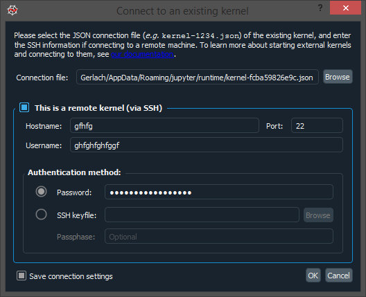
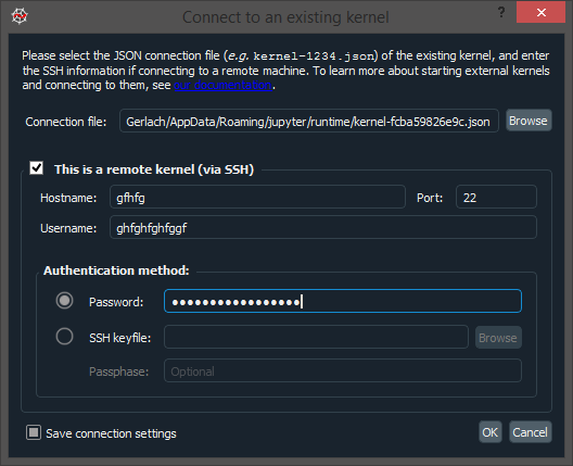
Also, found this issue in the kernel connection dialog (Console --> Connect to existing kernel): When the remote kernel checkbox is focused, it displays properly (with QDarkStyle themeing). When it isn't (the user clicks another fields, focuses on another window or even Alt-Tabs), it reverts back to the normal theme look. perhaps it has to do somehow with being a section title or something, since checkboxes elsewhere don't have this problem, only this particular one. Spyder or QDarkStyle?
vs.
CAM-Gerlach
on 28 Nov 2018
May a qdarstyle problem. I will check.
dpizetta
on 29 Nov 2018
@dpizetta, how can we get the main qdarkstyle colors from the Python package? We need to make several adjustments to match the theme and I noticed we can't use hard-coded colors because the scheme is different in Python 2 (brownish) and 3 (bluish).
ccordoba12
on 29 Nov 2018
Some more dark theme things not listed above, definitely Snyder-related this time:
- Options icon still isn't changed to dark version and is almost invisible
- "Show Environment Variables" and "Show Sys.Path contents" dialogs in the context menu in the Console pane aren't dark themed like other Variable Explorer dialogs
- "Qt Window Style" option in the new Appearance pane has no effect with the dark UI theme; it should be disabled if the currently set theme (manually or automatic) is dark to avoid confusing users as to why it doesn't work.
CAM-Gerlach
on 7 Dec 2018
- Options icon still isn't changed to dark version and is almost invisible
- "Show Environment Variables" and "Show Sys.Path contents" dialogs in the context menu in the Console pane aren't dark themed like other Variable Explorer dialogs
Working on them in PR #8192.
"Qt Window Style" option in the new Appearance pane has no effect with the dark UI theme
That's a good catch, thanks! @dalthviz, please solve this one by disabling this option if the theme is dark (as @CAM-Gerlach mentioned above).
ccordoba12
on 7 Dec 2018
Working on them in PR #8192.
Sorry, I didn't see them in the list above and I don't see anything mentioned about the env variables and syspath viewer in that PR.
CAM-Gerlach
on 7 Dec 2018
Sympy latex print to console currently uses transparent pngs with black for ground text. This quite difficult read with a dark theme:

Change this line:
https://github.com/spyder-ide/spyder/blob/9de287df78d6293a2323236c311d5007b254b300/spyder/plugins/ipythonconsole/widgets/shell.py#L284
Solution 1
To: init_printing(forecolor="White")""" when using a dark theme.
How do we know if we are using a dark theme?
We would have to run init_printing every time the theme changes.
Solution 2
To: init_printing(backcolor="White")"""
This is the simplest solution, but there would be a white box around the text on non-white background themes similar to the way the inline plots currently do.
 bcolsen
on 8 Dec 2018
bcolsen
on 8 Dec 2018
@bcolsen So there's no way to just change the actual SymPy text color to whatever the syntax theme "Normal text" color is set to when that changes?
CAM-Gerlach
on 8 Dec 2018
Sympy uses latex to make the pngs and it seem like defining custom colors needs a preamble definition but at least we could use the normal text colour as guide on whether we need black or white.
bcolsen
on 8 Dec 2018
Ah, yeah I'm aware of how colors work in LaTeX since I use it all the time but I didn't think of the need to define a custom color in this context; good point.
Okay, then we could basically use the logic that Spyder uses to determine whether the UI theme should be "dark" or "light" when set to "Automatic" based on the syntax theme background, i.e. if higher than perceptual middle gray than use the default; if darker use forecolor="White". We'd just need to check and set that whenever the user applies changes to the current syntax theme or selects a different one; that process already takes like ~20+ seconds now on my machine so whatever tiny amount of additional cost shouldn't be noticeable.
CAM-Gerlach
on 8 Dec 2018
@Ticonderoga pointed out that table headers in Help, e.g. in the docs for scipy.optimize, are still unthemed and are white on white making them invisible. Also, I noticed that scroll bars in help are still white and unthemed as well. I've added that and everything else we've discussed recently to the post above. Screenshot:

CAM-Gerlach
on 9 Dec 2018
Just so this gets referenced here, @dalthviz, please solve the issue above.
ccordoba12
on 9 Dec 2018
So, I here again, sorry for being late. I'll work on this week.
So maybe that's causing the borders not being shown?
Here more people are complaining about it, the examples in the issues will help me to find the right place #123
Added it to the QDarkStyle section above, thanks. Do you still want me to open an issue over there?
Also this one.
@dpizetta, how can we get the main qdarkstyle colors from the Python package? We need to make several adjustments to match the theme and I noticed we can't use hard-coded colors because the scheme is different in Python 2 (brownish) and 3 (bluish).
Right now there is no way to programmatically get the colors, this is planned to be in version 3, which includes the possibility to change it. In the first lines of CSS I have a table with the current colors that I need to check if it is up to date.
init_printing(backcolor="White")"""
Including the previous problems, I think it is a good idea to create a way to change those colors or use it from the qdarkstyle functionality in version 3, so as the theme changes the colors will follow. I will work hard to provide this functionality, but I don't know how much time I will spend. Use the first approach as soon as I check the colors...these days. I'll let you know.
dpizetta
on 11 Dec 2018
Thanks @dpizetta !
init_printing(backcolor="White")"""
Actually, what color the syntax highlighting should be depends on the syntax highlighting theme background color (which we can easily get/check), not the UI theme color (I was just proposing we use the same method as the "Automatic" UI theme option does does to determine whether a white or black foreground color should be used for the LaTeX output; ideally, we'd instead just use the normal text color for the LaTeX FG color so it'd match with any arbitrary theme (it already does with Spyder Dark, since that color happens to also be white), but it seems that would add to the complexity a bunch.
CAM-Gerlach
on 11 Dec 2018
Here more people are complaining about it
Great! Good to know there's no problem in our side.
Right now there is no way to programmatically get the colors, this is planned to be in version 3
When do you plan to release version 3?
ccordoba12
on 11 Dec 2018
Actually, what color the syntax highlighting should be depends on the syntax highlighting theme background color (which we can easily get/check), not the UI theme color ...
Oh yeah, I mess up the terms, I agree with you :)
Great! Good to know there's no problem in our side.
HAuhau... it's my turn :)
When do you plan to release version 3?
Mar-Apr/2019
News:
- Fixed borderless widgets inside QTabWidget - v2.6.5
- Group box I still checking.
dpizetta
on 13 Dec 2018
@dpizetta It was reported over on #8470 and I can confirm on Windows 8.1 with Python 3.6.7, QDarkStyle 2.6.5 (pip) and Qt/PyQt 5.9.6/5.9.2 on master that there is no visual feedback when a toolbar button, etc. is actually clicked (as there is on the normal light theme), leaving users no way to confirm an action without immediate visual effect has actually occurred.
Also, perhaps related, for toggle buttons (e.g. most of those in the Find in Files pane in Spyder), there is no indication of what the state of the button is (e.g. case-sensitive, regex on or off, etc) so the user has to resort to guess-and-check, although the button does actually invisibly function.
Is this something you can fix on your end?
CAM-Gerlach
on 22 Dec 2018
in the changelog v4.0 beta has
- Add a dark theme for the entire interface.
but on my Win10 spyder 4.0.0b1 (installed with conda) there is no new setting in the interface section.
Do I need some additional package or something?
 yalov
on 10 Jan 2019
yalov
on 10 Jan 2019
@yalov That's the changelog for 4.0 dev, i.e. the "live" Github version. As you can see from this issue, the roadmap, etc., the initial dark theme implementation and most of the work is done for Beta 2, while a few remaining bits here and final completion of the implementation is pegged for Beta 3. As you can see from the version string, you have Beta 1. Beta 2 should be released within the next couple weeks, or you can try out the dev version from Github if you're brave.
CAM-Gerlach
on 10 Jan 2019
The Qdarkstyle is not applied to EditTabNamePopup for rename console. Because the parent of QLineEdit of EditTabNamePopup is None.
class EditTabNamePopup(QLineEdit):
    """Popup on top of the tab to edit its name."""

    def __init__(self, parent, split_char, split_index):
        """Popup on top of the tab to edit its name."""

        # Variables
        # Parent (main)
        self.main = parent if parent is not None else self.parent()
        self.split_char = split_char
        self.split_index = split_index

        # Track which tab is being edited
        self.tab_index = None

        # Widget setup
        QLineEdit.__init__(self, parent=None)
 ok97465
on 11 Jan 2019
ok97465
on 11 Jan 2019
@ok97465, please submit a PR for that.
ccordoba12
on 11 Jan 2019
@ccordoba12 Thank you. I will submit a PR at night.
ok97465
on 11 Jan 2019
New item: the information icon in the file switcher is not themed, as seen in #8616 .

CAM-Gerlach
on 26 Jan 2019
@dpizetta It was reported over on #8470 and I can confirm on Windows 8.1 with Python 3.6.7, QDarkStyle 2.6.5 (
pip) and Qt/PyQt 5.9.6/5.9.2 onmasterthat there is no visual feedback when a toolbar button, etc. is actually clicked (as there is on the normal light theme), leaving users no way to confirm an action without immediate visual effect has actually occurred.Also, perhaps related, for toggle buttons (e.g. most of those in the Find in Files pane in Spyder), there is no indication of what the state of the button is (e.g. case-sensitive, regex on or off, etc) so the user has to resort to guess-and-check, although the button does actually invisibly function.
Is this something you can fix on your end?
Hi @CAM-Gerlach, I can deal with it in the next days. Tks!
dpizetta
on 13 Feb 2019
Sorry for asking here but how do i add dark theme to my current spyder IDE ?I installed it through anaconda and I am a beginner to pretty much every thing related to coding.I am on linuxmint 19.1.Can some one guide me?
 Rushilotti
on 7 Mar 2019
Rushilotti
on 7 Mar 2019
It is only available on the development version to be released in some months
 goanpeca
on 7 Mar 2019
goanpeca
on 7 Mar 2019
Thanks for the info.
So is there a way to install it in my current spyder version?If not when the new version will be released?
Rushilotti
on 7 Mar 2019
So is there a way to install it in my current spyder version?
No. Like @goanpeca just said, It is only available on the development version
If not when the new version will be released?
Again, if you read @goanpeca 's reply, it will be released in some months.
It will also be available in Spyder 4 Beta 2, which is nearly complete and should be released fairly soon. If you want to try it out right now, you could install a development version yourself; its not that difficult, even for a beginner. However, you are probably better off waiting for the official release of Beta 2 which shouldn't be too far off. Thanks.
CAM-Gerlach
on 7 Mar 2019
Thanks for the info I will wait for the relase :D
Rushilotti
on 7 Mar 2019
I can't wait for this! Thank you so much!
 absalomhr
on 23 Mar 2019
absalomhr
on 23 Mar 2019
@ccordoba12 @dpizetta Probably the biggest remaining issue (that has a major UX impact to the point of severly harming usability of specific Spyder features) is that its almost impossible to tell if toggle buttons (like regex mode and case-sensitive for the Find and Replace widget and the Find in Files pane, etc) are enabled or disabled, and they appear to be reversed from what a user might expect. Example:
Disabled:

Enabled:

Therefore, it would seem prudent to e.g. outline them in a much thicker, brighter white or blue when enabled, or even color the icon blue to indicate the button is toggled on. Is this something that can be fixed on Spyder's side, or need it be done in the theme itself? Thanks!
CAM-Gerlach
on 9 May 2019
Hi @CAM-Gerlach those buttons are like in the toolbar, they are transparent, but when activated they change to the background color, which is your color there. Both colors are the same in this case. I think when the pressing event is occurring they appear blue in the border. I've tried to put some color (lighter) when not activate and the other (darker) when activated, but they made the interface ugly.
There are some changes that can be made to improve (Qdarksytle and/or Spyder):
- Change the background color (whole bar) to the same color of the borders. So it will reproduce the toolbar - I need to know which widget is the background where the buttons are. Since there are many borders I think this is a good option. Needs to try the whole interface to see if it is nice.
Something like this (obs.: the buttons are incorrect)

- I've put the border light when not activated because if there is just text you may think that it is not a button, of course, the problem appears when activated. Your suggestion is nice, we can use a lighter line when not activated, and a darker when activated. We can try the colors from the pushbuttons.


In normal style, they are identical to the push buttons.

Ideas? @ccordoba12 @goanpeca @CAM-Gerlach Tks
dpizetta
on 9 May 2019
Talking about transparent button here reminded me that I found this the other day in the editor's tab arrows (on Linux):

To reproduce you need more tabs open than fit in the bar. Does anyone else get this?
bcolsen
on 10 May 2019
@bcolsen I can confirm that's what I see on Windows as well. (Qt 5.9.7).
CAM-Gerlach
on 10 May 2019
About tabs, it should have been fixed in the latest version 2.6.8. What qdarkstyle versions are you using?

dpizetta
on 10 May 2019
I back @CAM-Gerlach concern regarding the toolbar buttons. I think they need to change in a more visible/obious way than just the outline. I find it not clear enough (even if some other tools like VSCode do this)


(I don't think this is clear enough, I want to know I can click on something without having to move the mouse pointer there)
@dpizetta I believe we should start using the power of SASS to add lighter and darker shades besides the basic 9 color palette to address these small tweaks.
https://sass-lang.com/documentation/functions
goanpeca
on 10 May 2019
I find it not clear enough (even if some other tools like VSCode do this)
I agree, although even VSCode's look would be clearer than what we have right now, which is virtually impossible to tell and looks "backwards". Ideally, though, we want the whole button to be a different, ideally darker color to make clear its depressed (which could require lightning the toolbars).
CAM-Gerlach
on 10 May 2019
2.6.7 is the latest on spyder-ide, but uninstalling that and installing 2.6.8 from pip indeed resolves the arrow problem. @ccordoba12 can we get 2.6.8 on spyder-ide and require that for Beta 2?
CAM-Gerlach
on 10 May 2019
You mean add that in conda forge :-p ?
goanpeca
on 10 May 2019
@goanpeca No, its already on 2.6.8 there.
CAM-Gerlach
on 10 May 2019
can we get 2.6.8 on spyder-ide
Done.
ccordoba12
on 11 May 2019
Another issue I've noticed for a while: The right sidebar that shows error/warning/etc. markers throughout the document is not offset to match the scrollbar, so the latter is not usable as an indicator of which should be visible. Compare the light theme:

With the dark theme:

Presumably, the warning bar needs to be offset by a distance equal to the scroll arrow widget on the top and bottom on the dark theme to avoid this problem.
@dpizetta @ccordoba12 @goanpeca Ideas/opinions on how to handle the toggle icons being impossible to tell if activated? This is probably the most important item on this list to fix, since it has major usability impacts for Find/Replace and Find in FIles.
CAM-Gerlach
on 27 May 2019
The right sidebar that shows error/warning/etc. markers throughout the document is not offset to match the scrollbar, so the latter is not usable as an indicator of which should be visible
This has nothing to do with the dark theme. Please open a new issue about it.
ccordoba12
on 27 May 2019
@ccordoba12 I opened a new issue, but I am rather confused. Could you explain how a UI problem that occurs only under the dark UI theme has nothing to do with the dark theme?
CAM-Gerlach
on 27 May 2019
Because it happens when the editor background is dark, irregardless of the theme, as your screenshot above shows.
ccordoba12
on 27 May 2019
Ups, sorry, I didn't read your comment completely. I thought both themes have the problem. In any case. we'll close this bug after we fix the foreground color of Sympy output, so it's better to open new issues.
ccordoba12
on 27 May 2019
Ups, sorry, I didn't read your comment completely
No problem, we all miss things. I just wasn't sure if it was me this time.
In any case. we'll close this bug after we fix the foreground color of Sympy output, so it's better to open new issues
Okay, I'd been avoiding that before since you'd told me not to do so. So should also I open new issues for
- [ ] "Information" icon in file switcher isn't themed
and, if its determined that the best course of action is to fix it in Spyder, since @dpizetta said it could be solved in either as I understand,
- [ ] Fix toggle icons (regex, case sensitive) being impossible to tell whether they are activated or deactivated (Spyder or QDarkstyle)
?
CAM-Gerlach
on 27 May 2019
I already edited the description to cover those cases, Please see above.
ccordoba12
on 27 May 2019
@ccordoba12 Okay, thanks. I couldn't see that it had been updated while I was editing it myself to similar effect, heh. I already had posted a screenshot here, so I'll just copy that to a new issue.
@dpizetta Do you want me to open an issue over on QDarkStyle for the toggle icons issue with the content from over here, or are you already handling that? Thanks!
CAM-Gerlach
on 27 May 2019
@dpizetta Do you want me to open an issue over on QDarkStyle for the toggle icons issue with the content from over here, or are you already handling that? Thanks!
Please, @CAM-Gerlach, I'm already working on this. The reasonable option, for now, keeping the border highlighted when checked like the lastest version of vscode. We (@goanpeca) can try other options with scss in the future.

dpizetta
on 28 May 2019
@dpizetta Thanks. Per your direct request, I opened an issue there.
CAM-Gerlach
on 28 May 2019
Since the fix for the dark theme will be out with version 4, I thought of a workaround for the current version. The only problem now seems to be the colour of the icons in the window. After going through the source files, I found that the icons for the spyder3 theme are configured in directory_of_spyder/spyder/utils/icon_manager.py. (The directory of spyder is /lib/python3.7/site-packages/ if installed through pip). I changed the variable _qtaargs by adding the parameter colour white wherever necessary. The final result is as shown in the picture below.

The dark mode works perfectly everywhere except some parts of help and Qt documentation. I have attached the modified icon_manager.py file.
icon_manager.py
Cheers!
 Lattitude75
on 10 Jun 2019
Lattitude75
on 10 Jun 2019
I thought of a workaround for the current version
No workarounds will be added for the current version, sorry.
ccordoba12
on 10 Jun 2019
With the exception of issue #9545, we can say this is finished.
Thanks to everyone who contributed to making the dark theme for Spyder a reality!
ccordoba12
on 10 Jun 2019
By the way, if you find more problems about the dark theme, please report them as separate issues.
ccordoba12
on 10 Jun 2019
Related issues
 Khris777
·
78Comments
goanpeca
·
106Comments
Khris777
·
78Comments
goanpeca
·
106Comments
 spyder-bot
·
75Comments
spyder-bot
·
75Comments
 Rojj
·
113Comments
Rojj
·
113Comments
 jdweaver
·
77Comments
jdweaver
·
77Comments
Most helpful comment
Done.