Enterprise: Editor: Configuring heading buttons is not working
Describe the bug
Rich Text Editor seems to ignore editor buttons settings, or the feature is not documented. Editor always shows H3 and H4 while H1 and H2 are missing. Editor also seems ti ignore any settings other that _header1_ and _header2_ which are then displayed as 'H3' and H4'
To Reproduce
Steps to reproduce the behavior:
- Run ids-enteprise-ng project and use this code
    // Customize the buttons on init
    this.editor.buttons = {
      editor: [
        'header1', 'header2', 'header3', 'header4', 'header5', 'header6',
        'separator', 'bold', 'underline', 'strikethrough',
        'separator', 'foreColor',
        'separator', 'justifyLeft', 'justifyCenter', 'justifyRight',
        'separator', 'quote', 'orderedlist', 'unorderedlist',
        'separator', 'anchor',
        'separator', 'clearFormatting',
        'separator', 'source'
      ],
      source: [
        'visual'
      ]
    };
- Click on Rich Text Editor
- See buttons H3 and H4 showing
Expected behavior
Editor should respect settings and create heading buttons accordingly, as per attached code H1, H2, H3, H4, H5, H6
Version
- ids-enterprise-ng: 5.5.2
 Fruko
Fruko
All 31 comments
This can also be reproduced in ids-enterprise. So likely the issue is there.
- Go to http://localhost:4000/components/editor/example-customize-buttons.html
- This code is configured to show h1 and h2 and not h3 and h4 but this is not taking any effect https://github.com/infor-design/enterprise/blob/master/app/views/components/editor/example-customize-buttons.html#L21
Expect you to be able to set the buttons to h1-h6 as you wish (to match the page structure).
 tmcconechy
on 4 Sep 2019
tmcconechy
on 4 Sep 2019
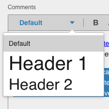
@Fruko @tmcconechy, I think what's in the source code here is a bit of a misnomer.
Looking at the source, header1 and header2 are not necessarily mapped to an H1/H2 tag respectively. They are mapped to H3/H4. The Editor component has been this way forever, and I believe the reasoning was that at an application level, the H1/H2 are not something that is "editable" in the sense that a user using this component would just be able to add one to the content.
Obviously the requirements/needs have changed since our original set of designs, but this issue isn't super straightforward to me. It's a bit of an enhancement/feature addition. Some questions:
- Should we build in support for all header levels?
- How do we gracefully handle the potential breaking changes around this (changing header1/2 to 3/4, actually adding a "true" 3/4).
- We'll need @infor-design/design to generate icons for all 6 header levels in both themes.
 EdwardCoyle
on 18 Nov 2019
EdwardCoyle
on 18 Nov 2019
I think originally i made H2, H3 work, then by setting you can make H4 and H5 work.
You would set this based on your page structure so accessibility works with the headings.
I think to fix this perhaps we can just make a menu button with Heading 1 - heading 6 in it and let the users decide. Or can make that perferencable as to which headings are allowed in it (and text). So we dont need icons (they were kind of ugly anyways)
tmcconechy
on 18 Nov 2019
The user just wants to establish hierarchy while they're typing; how we render that afterwards is another concern altogether.
If we stick with the current design, the buttons should just say H1, H2, and H3.
I do like Tim's suggestion of a dropdown menu; a lot of text editors use that pattern. If we switch to that design we can have options that read: Paragraph, Heading 1, Heading 2, and Heading 3. This approach could even account for custom formats if they are ever needed.
 kentonquatman
on 18 Nov 2019
kentonquatman
on 18 Nov 2019
@EdwardCoyle I agree with @kentonquatman as an user I want to specify the hierarchy of the text with more flexibility than just H3 and H4
Fruko
on 18 Nov 2019
I think i now best like the idea of Paragraph, Heading 1, Heading 2, and Heading 3. as text in a menu button picker. This read less like HTML tags to the end user.
Then underneath we can use class instead of HN tags or whatever we want in the markup. So its just setting hierarchy in the text.
tmcconechy
on 18 Nov 2019
If needed, I can make a ticket for myself to update the design of the RTE toolbar to include a dropdown menu.
kentonquatman
on 18 Nov 2019
Sure and one reason i mentioned menu button instead of dropdown is the those work easier on toolbars. But if you make something up we can have a look.
tmcconechy
on 18 Nov 2019
The implementation described above sounds to me like the way Google Docs does it:
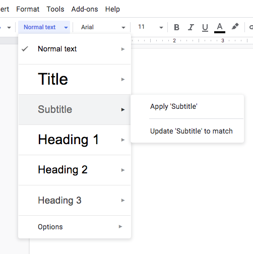
Just speccing out some quick ideas on what the menu button might need, change-wise. Let me know if these are on the right track:
- [x] We can probably make a custom menu button (maybe actually create a "fontpicker"/"stylepicker" component) that can render menu items to display the provided style rules. Might need some rendering pipeline changes to facilitate this.
- [ ] Mimic the current "default" configuration of the font system (h3/h4/paragraph) when building in the defaults for the new picker.
- [ ] Would need to make some backwards compatibility on top of that (fx: if the editor configuration detects the old settings, it should convert them to the new system automatically).
- [ ] Might also be a good time to address #2679 which deals with converting between tags/styles.
EdwardCoyle
on 18 Nov 2019
@tmcconechy Yes, sorry. I did mean menu button.
kentonquatman
on 18 Nov 2019
@EdwardCoyle Yea, it would be cool to show the menu options with the applied styling, like int he example you posted from Google Docs.
kentonquatman
on 18 Nov 2019

kentonquatman
on 5 Dec 2019
Some of the colors on these are subject to change as @elizabethhartley is currently working on refinements to our color palette and themes.
kentonquatman
on 5 Dec 2019
@kentonquatman what about new icons?
 elizabethhartley
on 5 Dec 2019
elizabethhartley
on 5 Dec 2019
@elizabethhartley From what I saw on the IDS website, those haven't been adopted yet: https://design.infor.com/code/ids-enterprise/latest/demo/components/editor/example-index?theme=uplift&variant=light&colors=0563C2
kentonquatman
on 5 Dec 2019
Your screen shot seems to show the "soho" icons? https://design.infor.com/code/ids-enterprise/latest/demo/components/editor/example-index unless im misunderstanding the question?
tmcconechy
on 5 Dec 2019
Sorry, I'm adding confusion. I based the design on what we have currently in IDS, which uses the older system icons. If you look at the vibrant version you'll see what I mean. We should also update those icons.
kentonquatman
on 5 Dec 2019
QA FAILED
1. Browser: IE11
- [ ] Font picker doesn’t work when the text is not selected (i.e. just place the caret somewhere in the text) you have to select the text for it to apply.
2. Browser: Chrome, IE 11, EDGE, Safari
- [ ] Caret disappears after applying header type or using font picker
3. Browser: IE 11, EDGE, Firefox
- [ ] You can combine blockquote and Header type
4. Browser: IE 11 , EDGE
- [ ] When switching header types it removes the font styles of text (e.g. Bold, Italic, Strikethrough)
 jbrcna
on 16 Dec 2019
jbrcna
on 16 Dec 2019
Concerning these points which i have numbered. I do not think any of them are work any additional effort.
- Not worth fixing as IE 11 will soon be not supported and is minor and too difficult (if not impossible) to fix
- Possibly worth fixing of all these three but the cursor will come back once you select so its not an easy one. Lets see if any customers raise similar issues.
- This is not requirement.
- This is probably good that it removed those styles and uses the style of the header.
All of these too minor to spend any time one.
tmcconechy
on 16 Dec 2019
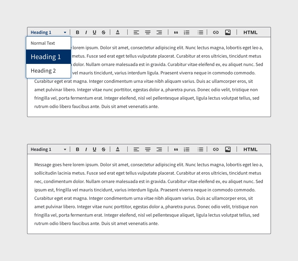
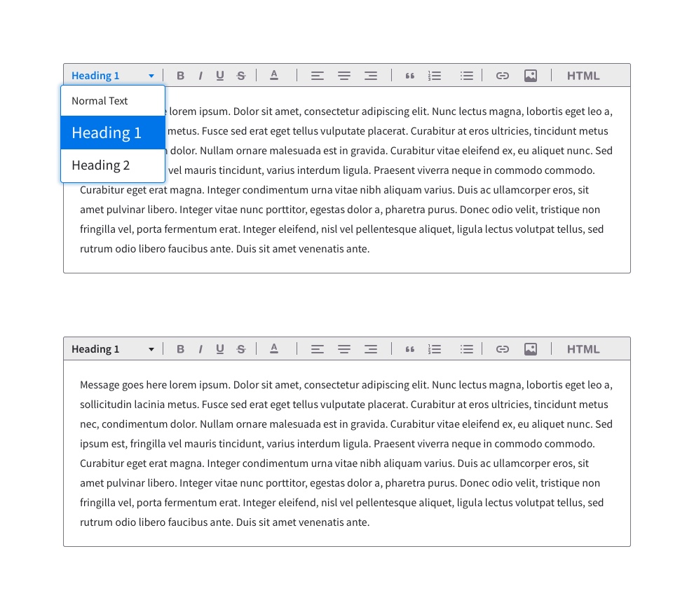
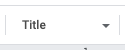
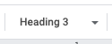
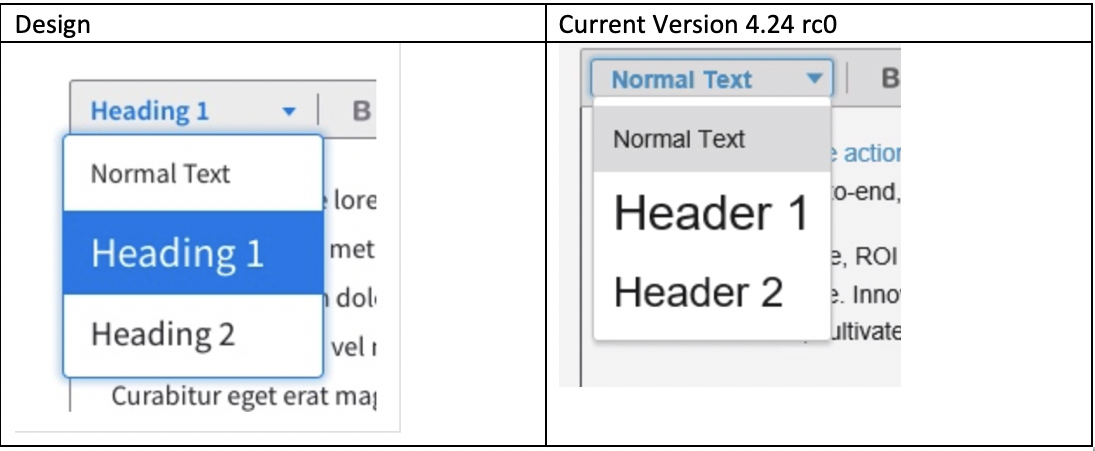
It looks like the styling on this element doesn't match the design.
| Design | Current Version |
| --- | --- |
|  |
|  |
|
It looks like the implementation is just using the standard menubutton component. I'd like to remove the arrow and move the menu closer to the toolbar. Is it possible to include more styling from the design or would we need to update the menubutton component?
kentonquatman
on 16 Dec 2019
Ok, lets reopen and adjust. I wondered about the size of the button. Any reason the design has the arrrow so far from the text? This is a customization on the menubutton so we dont have to change it specifically.
tmcconechy
on 16 Dec 2019
@kentonquatman is the style in the design something that needs to be applied more generally for all menubutton types? Or are we creating a secondary style just for this?
EdwardCoyle
on 16 Dec 2019
@tmcconechy The arrow is at the far right to account for larger words (Header 1 vs. Default), similar to how a dropdown menu would be styled. The button width should always be the same and the arrow should always be in the same place, no matter which style is selected.
@EdwardCoyle I'm not sure if this styling should be applied for every instance of a menu button. I would need to look into that a little more, but my guess would be no.
kentonquatman
on 16 Dec 2019
Its a bit confusing since its a menu button somewhat combined with a dropdown. But my thinking is your just taking up extra toolbar space. The arrow could be just at the end of the text be it 8 vs 7 charcters + 5px with no consequences? Or would could say largest text is Header 6 and use that width. We arent actually showing the style in the button when its selected? Or is that the reasoning why. (Fx Header 1 Shows in big font when selected?)
tmcconechy
on 16 Dec 2019
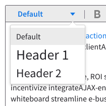
I don't think the arrow should move based on the length of the label. It's better to keep it in the same position; it's the most common treatment for this type of element.
Examples from Google Docs:
| One | Two | Three |
| --- | --- | --- |
|  |
|  |
|  |
|
kentonquatman
on 16 Dec 2019
Ok, The only thing i think confused me is our menu button does move now. One example (a bit messy) http://master-enterprise.demo.design.infor.com/components/menubutton/test-on-toolbar.html . This is important so there isnt a lot of wasted whitespace on the toolbar, so i wouldnt change that but these are right aligned.
But for this editor case i could indeed see fixing the size like google but maybe wouldnt we just make it a little but less so the size of it is the same but closer to the actual set of values? There is maybe 40ish wasted pixels in empty space and it will cause one or two toolbar button to overflow?
This may be because or text is "Default" and "header 1" not "Header Text" / "Heading 3"
which is longer. So maybe we just make it closer based on the values you can pick in our case (so like 10 px plus the max text value)?
tmcconechy
on 16 Dec 2019
@kentonquatman, @tmcconechy, and I came up with this list of next steps to finish this off:
- [x] Switch "Default" to "Normal Text" in the first item
- [x] Build a programmatic detection of the width of the largest item in the list, and set that as the top-level width of the picker's button.
- [x] Overall throughout formatter toolbar, remove arrows from popupmenus, and position the menus slightly over top of their trigger buttons.
- [x] Localize default font sizes.
EdwardCoyle
on 16 Dec 2019
One other thing i just found is that in the Soho theme the picker text is very big. This is sort of correct as thats the style but wonder if its a little bit off putting. Does google actually change the size of the things in the picker like this? Do we think this could be improved on the soho theme at all?
tmcconechy
on 17 Dec 2019
QA Failed
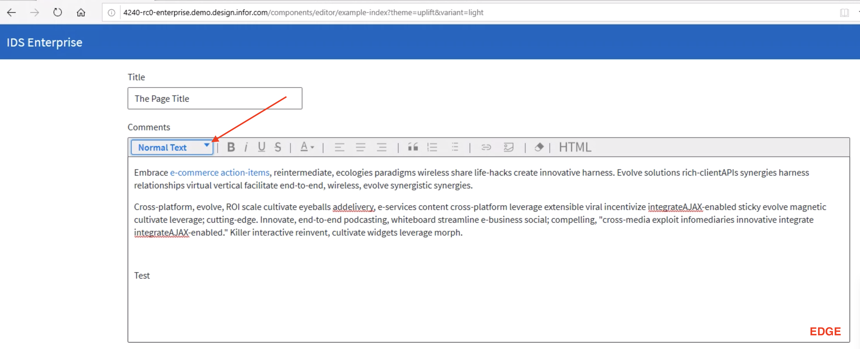
- [ ] The width of the menu is at the same level as the trigger button. The menu should be slightly wider than the trigger button. See screenshot for reference. I'm not sure if this is just a demo app issue
Verified in http://4240-rc0-enterprise.demo.design.infor.com/components/editor/example-index?theme=uplift&variant=light
- [ ] Browser: EDGE
The arrow is not aligned
jbrcna
on 20 Dec 2019
For point 1 - we made a slight variance to make things consistent. Lets leave this as is.
Point 2 - we should fix
tmcconechy
on 20 Dec 2019
- [x] Fix the layout issue noted
- [x] We also found a test failed in NG details:
-  checkout 6.3.x in ng and run:
- `npm run test`
- `npm run testdebug` to debug
- seems like this test page shows the issue http://localhost:4000/components/toolbar-flex/example-more-actions-ajax.html notice that beforeOpen is not being called anymore.
Related issues
 SofiK
·
3Comments
SofiK
·
3Comments
 swetteinfor
·
3Comments
swetteinfor
·
3Comments
 dubde
·
4Comments
dubde
·
4Comments
 janahintal
·
3Comments
janahintal
·
3Comments
 guoliang
·
3Comments
guoliang
·
3Comments
Most helpful comment
I think i now best like the idea of
Paragraph, Heading 1, Heading 2, and Heading 3.as text in a menu button picker. This read less like HTML tags to the end user.Then underneath we can use class instead of HN tags or whatever we want in the markup. So its just setting hierarchy in the text.