Milligram: grid elements: full width on small screens, small width on large screens?
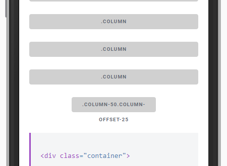
Just checking out Milligram for the first time. Maybe I'm missing something, but how do I have a grid column be 100% on small screens and then switch to 50% on large screens? Is that built into the CSS with a class that I'm not seeing or do I have to override that in my project?
 mikeriley131
All 8 comments
Thanks for bringing this to my attention @mikeriley131 . I was about to start using Milligram on a project but that's a big missing feature. It's not too hard to manually add it, but isn't the purpose of a css framework that you don't need to do this by hand :-).
 guillaumemolter
on 20 Jan 2017
guillaumemolter
on 20 Jan 2017
Hi guys @mikeriley131 @guillaumemolter
Currently Milligram does not support this functionality but I liked the idea. Initially Milligram was built with the purpose of being the simplest framework, defining only the minimum of possible styles. So it does not have so many features easily found in large frameworks.
I'll think of something but if you have any idea how we could implement this functionality and want to submit a PR, feel free.
Thank you for sharing your thoughts with us.
 cjpatoilo
on 28 Jan 2017
cjpatoilo
on 28 Jan 2017
@cjpatoilo I hear you and I agree that's exactly what I liked about Milligram...just the bare minimum...but for me this a basic and essential responsive design feature.
guillaumemolter
on 28 Jan 2017
OK, thanks @cjpatoilo. Happy to create a PR, just wanted to make sure I wasn't missing something first.
mikeriley131
on 30 Jan 2017
@mikeriley131 happy to help, review PR, etc...
guillaumemolter
on 30 Jan 2017
Created pull request 155 to add the responsive grid feature: https://github.com/milligram/milligram/pull/155
 CSuttie
on 8 Mar 2017
CSuttie
on 8 Mar 2017
I played around with a media query, bear with me. I'm a guy who likes back-end stuff and plays around with Linux most of my time so take my front-end development with a grain of salt. Also I haven't done anything in any css pre-processor.
@media (min-width: 495px) and (max-width:800px) {
    .row .column[class*=" column-"] {
        max-width: 100%;
    }
}
It matches a .row with a .column in the child or grand-child(why would you want even want an element in between of .row and .column?) which is followed by a .column-* where the * is a wild-card.
What do you think?
remarks : 495 pixels is the limit because that's the minimal resized amount chrome allowed me. 800px has no significant remark.
 Lilja
on 2 Apr 2017
Lilja
on 2 Apr 2017
@cjpatoilo oi!
I think @Lilja code snippet is a must have in milligram, my suggestion would be to place a .responsive class in the columns we want to be full width in mobile, although they are set to some %.
@media (max-width: 40rem) {
    .row .column.responsive[class*=" column-"] {
        margin-left: 0;
        max-width: 100%;
    }
}
So in mobile screens, this:
would become this:

 promatik
on 14 Sep 2018
promatik
on 14 Sep 2018
Related issues
 kresogalic8
·
5Comments
kresogalic8
·
5Comments
 dnohr
·
7Comments
dnohr
·
7Comments
 davedele
·
5Comments
davedele
·
5Comments
 garretwilson
·
18Comments
garretwilson
·
18Comments
 roryprimrose
·
7Comments
roryprimrose
·
7Comments
Most helpful comment
@cjpatoilo I hear you and I agree that's exactly what I liked about Milligram...just the bare minimum...but for me this a basic and essential responsive design feature.