Vscode: Directory tree indent guides in File Explorer
It's hard to navigate through project with complex directory structure.
Much better to look at something like this:
├─ app
|  └─ main.js
├─ src
|  ├─ main.ts
|  └─ tsconfig.json
└─ package.json
Instead of this:
    main.js
  src
    main.ts
    tsconfig.json
  package.json
 Avol-V
All 124 comments
I agree with this. I especially find that the indenting is hard to interpret. And is even worse when file icons are enabled in explorer.
 cosmoKenney
on 24 Jan 2017
cosmoKenney
on 24 Jan 2017
I also agree! +1
 misantronic
on 5 Feb 2017
misantronic
on 5 Feb 2017
Another thing that would be nice in that regard is customizing the indent distance of the next level of hierarchy.
While I would also love some guidelines, I think having i.e. twice the distance and thus having clearer separation would already help a lot.
 Aides359
on 23 Mar 2017
Aides359
on 23 Mar 2017
@Aides359 I agree. Everyone's eyes are different. Just look at tabs. Some people like 2 space tabs in their code. Some like 8. Other 4.
I'm a little dyslexic, so I really have a hard time with the indention in VS Code,
Though it does seem to have gotten a little better. But it's still bad on my laptop screen, for instance, whereas on my large monitors at work, it's more noticeably indented.
cosmoKenney
on 1 Apr 2017
Yes! Please tree lines as an option. It'd be especially helpful when editor is open at a far corner on a large monitor.
Tying the toggle to mouse-over in Explorer Pane would help in keeping the clean look.
 chentel
on 23 Apr 2017
chentel
on 23 Apr 2017
Really useful on big projects.
Any update on this? Or where I could start looking in the source?
 edmundo096
on 22 Jun 2017
edmundo096
on 22 Jun 2017
@edmundo096 this was closed as a dup of #21295, which is also closed. So I guess this is going nowhere.
cosmoKenney
on 22 Jun 2017
@cosmoKenney This issue isn't closed...
 roblourens
on 22 Jun 2017
roblourens
on 22 Jun 2017
@cosmoKenney, nope, this is the original post and it isn't resolved. #21295 was the duplicate.
I couldn't find a configuration to enable this indentation guides on the Sidebar Explorer yet.
edmundo096
on 22 Jun 2017

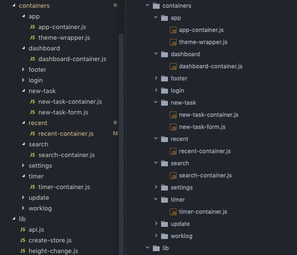
So yup... my eyes are bleeding. I'm like what is index.js of Expression folder... I know you're there!.
I think it should have quite high priority. Modern web apps quite often have deep nested files structure. see this example
 pie6k
on 24 Jun 2017
pie6k
on 24 Jun 2017

and here's the approximate look without Magnifier. not so bad... if you've got the vision of a fighter pilot
chentel
on 7 Jul 2017
I would like this as well, it's quite easy to get lost in larger projects.
 goudcode
on 11 Jul 2017
goudcode
on 11 Jul 2017
I also agree this should be considered, even when you start a tiny project and know every file by heart, it's kind of annoying to find them when you want to use the explorer, and not the "Quick File Opener"...
 jens1o
on 11 Jul 2017
jens1o
on 11 Jul 2017
I agree! I've been trying to look for a setting or extension that does this over the last two days but nothing T_T. I really struggle to navigate using the explorer (very helpful when you're navigating a new project).
Indent lines would be amazing!
 Winston-Guess
on 13 Jul 2017
Winston-Guess
on 13 Jul 2017
Do we have any indication if this is in the roadmap?
 purefan
on 11 Aug 2017
purefan
on 11 Aug 2017
+1
 exectails
on 19 Aug 2017
exectails
on 19 Aug 2017
+1 this is an enormous pain for me on my large monitor.
 bclarkbasly
on 21 Aug 2017
bclarkbasly
on 21 Aug 2017
++1
 Livshitz
on 11 Sep 2017
Livshitz
on 11 Sep 2017
+1, one reason I might go back to Atom
 kylehorn
on 12 Sep 2017
kylehorn
on 12 Sep 2017
+1
 phamduong
on 18 Sep 2017
phamduong
on 18 Sep 2017
+1 Microsoft please!
 petyrek
on 18 Sep 2017
petyrek
on 18 Sep 2017
+1 for this.
In the meantime, I've found a bit of a hack to solve it for now:
Find your VSCode install (mine was C:/Program Files/Microsoft VS Code) and go to resources/app/out/vs/workbench and open workbench.main.css.
Add these lines to the end of the file:
.monaco-tree-row[aria-level="1"]  { padding-left:   0px !important; }
.monaco-tree-row[aria-level="2"]  { padding-left:  20px !important; }
.monaco-tree-row[aria-level="3"]  { padding-left:  40px !important; }
.monaco-tree-row[aria-level="4"]  { padding-left:  60px !important; }
.monaco-tree-row[aria-level="5"]  { padding-left:  80px !important; }
.monaco-tree-row[aria-level="6"]  { padding-left: 100px !important; }
.monaco-tree-row[aria-level="7"]  { padding-left: 120px !important; }
.monaco-tree-row[aria-level="8"]  { padding-left: 140px !important; }
.monaco-tree-row[aria-level="9"]  { padding-left: 160px !important; }
.monaco-tree-row[aria-level="10"] { padding-left: 180px !important; }
.monaco-tree-row[aria-level="11"] { padding-left: 200px !important; }
.monaco-tree-row[aria-level="12"] { padding-left: 220px !important; }
.monaco-tree-row[aria-level="13"] { padding-left: 240px !important; }
.monaco-tree-row[aria-level="14"] { padding-left: 260px !important; }
.monaco-tree-row[aria-level="15"] { padding-left: 280px !important; }
Done!
That code indents each level a further 20px, starting from 0px (the !important overrides the default values), but of course you can change that from 20px to as much as you want, just change the values. I've also only gone 15 levels deep, which you can expand too, but if your project is deeper than 15 levels, I'd suggest you re-evaluate your directory structure. ;)
 jakewtaylor
on 21 Sep 2017
jakewtaylor
on 21 Sep 2017
@jakewtaylor this worked great for me, the only issue is that you will receive a 'corrupted installation' notification after doing the changes (..more info here).
 swordf1zh
on 21 Sep 2017
swordf1zh
on 21 Sep 2017
@jakewtaylor @swordf1zh could you provide some screenshot with this 'hack'?
Inspired with your idea, I've created styles like:
.monaco-tree .monaco-tree-rows>.monaco-tree-row {
    position: relative;
}

.monaco-tree .monaco-tree-rows>.monaco-tree-row:before {
    content: '';
    top: 0px;
    bottom: 0px;
    position: absolute;
    border-left: 1px dotted rgba(255, 255, 255, 0.4);
    border-bottom: 1px dotted rgba(255, 255, 255, 0.4);
    width: 15px;
    border-radius: 1px;
}
It's far from solid indent guide, but it's some step forward:

pie6k
on 21 Sep 2017
@swordf1zh yes, I got that too but only once. Haven't seen it since.
@pie6k that's looks good. Your addition has given me an idea to slightly improve it, I'll give it a go when I'm in the office later.
jakewtaylor
on 22 Sep 2017
@pie6k Your hack would be a perfect temporary solution except that it hasn't worked quite as well for me for some reason T_T (see pic below)

@jakewtaylor Can't wait 😄
Winston-Guess
on 22 Sep 2017
I've got something that works pretty well. Like you said, far from perfect but makes the file tree much nicer looking, IMO.
I've put the instructions in this Gist as the CSS is much longer now.
Looks like this:

Hope it works for you!
jakewtaylor
on 22 Sep 2017
That's working very well.
Thank you.
You saved my eyes and my mind.
 UrzaUrza
on 22 Sep 2017
UrzaUrza
on 22 Sep 2017
Nice improvement. I changed the alpha from 0.4 to 0.1 and it looks great, but is just a personal preference. If you can make an extension out of this, it would be one of the top25 for sure:

swordf1zh
on 22 Sep 2017
I think I'll do that, I'll have to look into it. 😃
Update: Looks like editing the UI with extensions isn't possible for the mean time, you'll have to just use the instructions from the Gist.
jakewtaylor
on 22 Sep 2017
@Winston-Guess forgot to tell you need position: relative on .monaco-tree .monaco-tree-rows>.monaco-tree-row itself.
@jakewtaylor @swordf1zh - looks amazing 🎉 🕺 ! Lol finally!
pie6k
on 22 Sep 2017
Oh my freaking god. I searched for this 4 days now. Took me a while to understand that the sidebar's name isn't Monaco. Please implement this with different variations.
This 'lineless-style' is really driving me nuts seeing no lines or anything other to guide my eyes.
+1 On everybody who made a solution to this.
 edenprojectde
on 22 Sep 2017
edenprojectde
on 22 Sep 2017
oh my goodness, this is the best. where do I send a donation!?
bclarkbasly
on 22 Sep 2017
@edenprojectde What do you mean by "the sidebar's name isn't Moncao"? Do you have different class names on your install? I can easily put in some notes in the Gist to help people in the future.
jakewtaylor
on 23 Sep 2017
@jakewtaylor No i just mean all Css i looked up in the gui had the name monaco in it, but no indication of "sidebar". I just changed to VS Code so i didnt/don't know how the config of the gui works, its not obvious as it was in atom.
Just to get the point across:


No indication of the name sidebar in these classnames.
I suppose its because its part of the framework nothing VS Code itself should worry about it's rather my lack of understanding the GUI itself.
edenprojectde
on 25 Sep 2017
I see, I only worked out by using the inspector 😛
jakewtaylor
on 26 Sep 2017
Step by step instruction (for macOS)
- Install https://marketplace.visualstudio.com/items?itemName=be5invis.vscode-custom-css and restart VS Code
- Save contents of this gist into some file, in my example it's
/Users/semenov/.vscode/css/tree.css - Open Preferences > Settings, and add this setting:
    "vscode_custom_css.imports": [
        "file:///Users/semenov/.vscode/css/tree.css"
    ]
- Cmd-P, ">Enable custom CSS and JS", restart VS Code
- Dismiss "Your VS Code is corrupted" message
After upgrading VS Code, repeat steps 4 and 5.
 IlyaSemenov
on 14 Oct 2017
IlyaSemenov
on 14 Oct 2017
@IlyaSemenov for some reason your method isn't working for me in either the normal and insiders versions. I saw in the extension's instructions that step 4 requires admin privileges but that didn't help me either 😕
Winston-Guess
on 18 Oct 2017
The extension and custom CSS seems to work for me, but the line colors are oriented towards the darker themes. See the screen shot...

...suggestions?
cosmoKenney
on 25 Oct 2017
@cosmoKenney Yeah, just change the CSS in the gist.
The current colour is rgba(255, 255, 255, 0.4), which is white at 40% opacity - change all occurrences of that to the colour you want.
rgba(0, 0, 0, 0.4) might work well for light backgrounds (black at 40% opacity)
jakewtaylor
on 26 Oct 2017
@jakewtaylor:
Thanks Jake. Works well.
Now I just have to figure out how to lighten up the vertical indent guides in the source pane. ;-)
cosmoKenney
on 26 Oct 2017
+1 👍
 jbdk
on 5 Nov 2017
jbdk
on 5 Nov 2017
@IlyaSemenov thanx for the hack 👍
btw does anyone know a solution to increase the vertical space between the list items ?
 ctf0
on 14 Jan 2018
ctf0
on 14 Jan 2018
This is very useful so I wonder why nobody has ever made an extension out of it? It would be my favorite.
 Hexodus
on 8 Feb 2018
Hexodus
on 8 Feb 2018
C'mon Microsoft, you had it figured out in '95

pie6k
on 9 Feb 2018
This definitely needs to be a built-in option soon. Please :)
 geeseyj
on 27 Feb 2018
geeseyj
on 27 Feb 2018
Expanding on the ideas from @chentel and @swordf1zh
Tying the toggle to mouse-over in Explorer Pane would help in keeping the clean look.
I changed the alpha from 0.4 to 0.1 and it looks great
I've forked @jakewtaylor's gist to make it easier to navigate. => https://gist.github.com/samdenty/b96f4df576d05cb123248f8ebfa899b6
- The last tree item gets the bottom line removed
- Folders and files are distinguishable by line width
- Lines are almost transparent normally, but increase in opacity on hover
Before vs after

:root {
  /** Width of the lines **/
  --tree-width: 14px;
  /** Opacity of the lines whilst not hovered **/
  --tree-opacity: 0.05;
  /** Opacity of the lines on hover **/
  --tree-opacity-hover: 0.2;
  /** Color of the lines **/
  --tree-color: rgb(255, 255, 255);
}
 samdenty
on 3 Mar 2018
samdenty
on 3 Mar 2018
That is what I am looking for.
 Martwu
on 9 Apr 2018
Martwu
on 9 Apr 2018
+1
any plans to implement this much needed feature ?
 silv3rm00n
on 16 Apr 2018
silv3rm00n
on 16 Apr 2018
In my opinion, this should be by default, and with a built-in option to disable it 😬
 miguelkashir
on 6 May 2018
miguelkashir
on 6 May 2018
@miguelkashir I agree, and I think the number of responses to this thread speak volumes to the need for this as a built-in feature?
cosmoKenney
on 7 May 2018
Agree. Whilst I appreciate the efforts of people who have provided CSS workarounds, this should be in the product. The Explorer becomes extremely hard to use on a large project with large monitors as it is at the moment. Come on Microsoft - please fix!
 bartread
on 12 May 2018
bartread
on 12 May 2018
Bumping up as a wanted request
 guoliang
on 14 May 2018
guoliang
on 14 May 2018
+1
 orestarod
on 15 May 2018
orestarod
on 15 May 2018
If someone is not seeing any changes after creating a custom CSS file and referencing it in the "vscode_custom_css.imports", you can make it work much simpler and without installing vscode-custom-css - just add the CSS to the end of the workbench.main.css and you're good to go!
 Funghorn
on 17 May 2018
Funghorn
on 17 May 2018
@Funghorn Exactly like in my gist 😛
jakewtaylor
on 17 May 2018
@jakewtaylor yeah, but I figured some people would use the "patched" version of @samdenty99 and custom CSS file is not working for everyone ¯_(ツ)_/¯
Funghorn
on 17 May 2018
+1
 mattvox
on 25 May 2018
mattvox
on 25 May 2018
+1
 quentinsf
on 28 May 2018
quentinsf
on 28 May 2018
Guys, please stop commenting +1. It's annoying for people subscribed waiting on solutions, just 👍 react the initial post. 😋
jakewtaylor
on 30 May 2018
Is there an option for this in the Code - Insiders build? The new settings was referenced here "Provide GUI for settings #3355" so that's why I ask
 fillipvt
on 7 Jun 2018
fillipvt
on 7 Jun 2018
@fillipvt The issue you've linked regards a GUI for settings, this issue is about the appearance of the file explorer. I don't think they're related? (unless I missed something...?)
jakewtaylor
on 8 Jun 2018
Some tier 4 manager at Microsoft:
"Remove the lines, it looks way cooler whatever it is you do all day without those ugly lines."
+1
 jsarasin
on 14 Jun 2018
jsarasin
on 14 Jun 2018
+1
2 subdirectories and I already feel the pain
 mlgarchery
on 27 Jun 2018
mlgarchery
on 27 Jun 2018
Yes, the explorer is a mess right now with anything more than 1 layer of folders. Has anyone done a PR with any of the proposals here? I saw some really great looking modded explorers in this thread
 onionhammer
on 29 Aug 2018
onionhammer
on 29 Aug 2018
+1
 alastrange
on 12 Sep 2018
alastrange
on 12 Sep 2018
Please we need more control in this area of the editor! Thank you! (Without the hacky solution)
 lordliquid
on 25 Sep 2018
lordliquid
on 25 Sep 2018
+1
 otonielguajardo
on 1 Oct 2018
otonielguajardo
on 1 Oct 2018
@samdenty I can't access your gist. Has it been moved or deleted?
 designbyadrian
on 2 Nov 2018
designbyadrian
on 2 Nov 2018
I made a fork of @jakewtaylor's gist. It looks the same as samdenty's.
https://gist.github.com/thepixture/72f5090e7fab8edae3d1dc1fb59f9f5c

For me i changed the level to 10.
Also there is a small issue i don't know how to fix it. I don't know if samdenty had the same issue. His gist is no more.

 thepixture
on 7 Nov 2018
thepixture
on 7 Nov 2018
@thepixture That issue is sadly a side-effect of the hacky way it works - it simply repeats the vertical line several times. Personal opinion here, but em is safer than px (my local one has been changed ;-) ).
 Rycochet
on 7 Nov 2018
Rycochet
on 7 Nov 2018
@designbyadrian changed my username, updated link https://gist.github.com/samdenty/b96f4df576d05cb123248f8ebfa899b6
samdenty
on 7 Nov 2018
+1
silv3rm00n
on 1 Feb 2019
In v1.31, a new tree widget was introduced. Would rendering indent guides be easier with that new widget? @isidorn
 dubeg
on 6 Feb 2019
dubeg
on 6 Feb 2019
For anyone using the custom CSS extension, I've fixed it to work with the new Jan 2019 update
There were 3 main fixes I added,
- The tree row class was updated from
monaco-tree-rowtomonaco-list-row - In the custom css file, line 21, the
monica-tree-rowhad aposition: relativerule, which caused vertical spacing issues - The
.monaco-tl-twistiediv had an inlinemargin-left: 40pxrule, which I had to override (line 15)
https://gist.github.com/Lightfire228/39dc2cf403237a190e79a000912691b2
Edit: I used @samdenty 's gist as a base, but you may have to tweak it to get it to look 'right'
Edit 2: I fixed an issue with the lines disappearing when hovering or selecting a folder more than 3 deep
Edit 3: If you play with this, you can comment out the monaco-tl-twistie rule (lines 15-17). I didn't know that setting existed when I fixed the css (and with the indentation guides, I prefer a tighter indentation than setting that to 0)
 Lightfire228
on 7 Feb 2019
Lightfire228
on 7 Feb 2019
Thanks @Lightfire228
 akmeghdad
on 7 Feb 2019
akmeghdad
on 7 Feb 2019
Stopped working with the new update. Plus now there's an annoying [unsupported] warning in the title bar. Waiting for MS to update the explorer.
 technolingo
on 8 Feb 2019
technolingo
on 8 Feb 2019
+1
I'm echoing the same sentiments as everyone else; the tree structure's indention is far too small to effectively delineate substructures.
Please give us some options to change this.
 genereese
on 9 Feb 2019
akmeghdad
on 9 Feb 2019
genereese
on 9 Feb 2019
akmeghdad
on 9 Feb 2019
So this is a part of vscode settings now, but why is it limited to max 20?
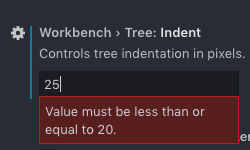
I come from Sublime and am used to a much deeper indent, is there good reason not to allow a deeper indent?
vscode max 20 Tree Indent left vs sublime text 3 right
 alexcroox
on 12 Feb 2019
alexcroox
on 12 Feb 2019
@alexcroox Read this: https://github.com/Microsoft/vscode/issues/67576
 sguillia
on 12 Feb 2019
sguillia
on 12 Feb 2019
I've pretty much given up on VS Code. It's just too hard for me to see the files. And since I've got a Visual Studio Subscription, it's pretty much a no-brainer to use VS 2017. Once you get it setup it's much better than Code.
cosmoKenney
on 12 Feb 2019
Ah, thanks, @sguilla - being able to change the indent size fixes most of the issues for me!
quentinsf
on 12 Feb 2019
I just started using VS Code a few weeks ago and like everyone else I find that it's really hard to quickly tell which directories certain files are in.
I just set the Tree Indent option to the maximum of 20 but ideally I'd want to set it even higher.
It's still too hard to navigate folders without directory tree indent lines as the original post recommends.
I see this issue is from 2016; it's been 3 years, please add some tree lines.
This is kind of a deal breaker and I may have to switch back to another editor in the meantime.
 GeoffLedak
on 15 Feb 2019
GeoffLedak
on 15 Feb 2019
For everyone who hasn't done so, please "thumbs up" the starting comment.
For open issues, sorted by thumbs up (is:issue is:open sort:reactions-+1-desc), we are currently only 18th place!
Thanks.
 fshafique
on 18 Feb 2019
fshafique
on 18 Feb 2019
I've increased the tree indent spacing to 20px, but for some reason when I "reload" VS Code and/or close and reopen it the spacing reverts to the original 8px spacing. You can visually see the spacing jump from my 20px setting back to 8px.
I too am using the Material Icon Theme. When I disable the theme, the problem still persists.
 ryanaltvater
on 18 Feb 2019
ryanaltvater
on 18 Feb 2019
Just wondering if someone could create a VS Code extension for this. Sadly, I dont have experience in creating VS Code extensions (...yet)
 joshuaquek
on 1 Mar 2019
joshuaquek
on 1 Mar 2019
My latest insiders now has 40px max. Still missing the tree itself tough 🤷♂️
edenprojectde
on 1 Mar 2019
Just wondering if someone could create a VS Code extension for this. Sadly, I dont have experience in creating VS Code extensions (...yet)
There is one, custom CSS extension, as described in above comments. But this is banned by MicroSoft, you will get a [unsupported] warning in the title bar and it will stop working every time VS code updates. Waiting for an official solution.
technolingo
on 3 Mar 2019
+1
this looks much more readable then default:

 RUSshy
on 3 Mar 2019
RUSshy
on 3 Mar 2019
To fix [Unsupported] when you modified the original styles use https://github.com/lehni/vscode-fix-checksums
_[Unsupported] warning is displayed when core files are modified (and their checksum differs from original)._
 Njke
on 3 Mar 2019
Njke
on 3 Mar 2019
This feature is so important that is should be supported officially, not just some hackaround that has to be re-configured on every update.
technolingo
on 4 Mar 2019
It's funny, I tried using VSCode a few years back and was really impressed, but even then the sidebar indentation & style impacted readability too much and I dumped it for another IDE. Coming back to it now (it's still good!) I'm extremely surprised this is still an issue and clearly I'm not alone on this. The tree indent guides would really improve readability: please support this customization officially!
 benkeen
on 10 Mar 2019
benkeen
on 10 Mar 2019
Thanks for this feature request. I thought I was the only one.
For me the worst part is that the arrows are not aligned with other elements at the same level:

This is feature is currently at #12 ( when ordered by thumb ups)
 montoyaaguirre
on 11 Mar 2019
montoyaaguirre
on 11 Mar 2019
This has been here for 2 years...
 ghost
on 13 Mar 2019
ghost
on 13 Mar 2019
+1, please fix this, setting the Workbench > Tree: Indent to 19 has helped me, but man! talk about getting lost in a massive tree, it might work ok on default with 1 folder but... You will even notice that in VS2017 they added the tree lines to the if statements so that you can figure out where you are at on the level of {} indents. where is the headache icon!
 Omzig
on 13 Mar 2019
Omzig
on 13 Mar 2019
Also a problem for me! I need lines in order to better focus on writing code; not struggle to find the right files everytime
ghost
on 4 Apr 2019
I found another thread where they showed that this has been addressed (by adjusting tree.indent in Settings)
https://github.com/Microsoft/vscode/issues/35447#issuecomment-455461013
 divinentd
on 6 Apr 2019
divinentd
on 6 Apr 2019
@divinentd The solution you're referring to isn't quite the same thing. This feature is still open and relates to having tree lines so that you can discern the nesting level within your project's folder structure. The indentation level on the other thread is useful to give your eyes some visual separation but isn't really the same as having visual indentation guides that you can get with tree lines.
Temporary Workarounds
Although I don't think this is a perfect solution, if you do tend to have difficulty visually seeing a file's location to navigate within your project, then you can add the breadcrumbs feature to the top of your editor. You can then click on any level of that to see other files within that nested level and navigate accordingly.
Another way is if you know the name of the file that you would like to open, quickly press F1 and then delete on your keyboard which brings up the files view in your command palette and then start typing the name of the file. Handily, this is also a contains search rather than a starts with. This enables you to see the files available and the folder they sit within. You can set the window.zoomLevel in your settings.json file to make things the size which is optimum for your efficiency.
Additional Idea for the Implementation
As an extension idea for the implementation, I envisage different configurable coloured lines for different levels of the indentation. For example, you could set up the indentation levels using the colours of the rainbow within your settings.json file. Of course, it would be great if the line colour, style and thickness were all configurable options.
- Red - Level 1
-- Orange - Level 2
--- Yellow - Level 3
---- Green - Level 4
----- Blue - Level 5
------ Indigo - Level 6
------- Violet - Level 7
I too would love to see this feature come soon to VS Code and love the direction that the project is moving in. Good work guys!
 WayneLambert
on 6 Apr 2019
WayneLambert
on 6 Apr 2019
Ask and ye shall be ignored
 robchristian
on 16 Apr 2019
robchristian
on 16 Apr 2019
We are still at 12th place, for open issues sorted by 👍 (thumbs up), but we're bridging the gap quickly..
# | Open issue | :+1: | :-1: | :heart:
-- | ---------- | ---- | ---- | -------
1 | Allow for floating windows | 2909 | 40 | 416
2 | Tabs for integrated terminal | 1293 | 16 | 128
3 | vscode.extensions Doesn't Update On Installing / Removing / Disabling Extensions without restarting | 922 | 0 | 47
4 | Allow to change the font size and font of the workbench | 917 | 1 | 123
5 | Refreshing the VS Code product icon | 825 | 18 | 303
6 | Git: Use VS Code as merge editor | 669 | 0 | 105
7 | Support to open a project folder in multiple VS Code windows | 630 | 0 | 72
8 | Auto Indent / Code Formatting / Beautify | 589 | 0 | 45
9 | Macro recording | 586 | 0 | 73
10 | Add option to pin tabs similar to Visual Studio | 553 | 0 | 73
11 | Allow customization of mouse shortcuts | 521 | 0 | 57
12 | 👉 Directory tree indent guides in File Explorer 👈 | 503 | 0 | 84
13 | Provide support to synchronize settings across machines | 429 | 0 | 62
14 | Display search results in a tab instead of the side bar | 423 | 0 | 73
For anyone who hasn't done so, please 👍 (thumbs up) the starting comment.
fshafique
on 16 Apr 2019
I wish you +1 spammers could harass github to allow unsubscribing from comments only, the same way as you are doing here :smile:
sguillia
on 16 Apr 2019
Did you see this post? https://simonholman.blog/visual-studio-code-finally-has-a-tree-indent-setting/
Seems like "Directory tree indent guides in File Explorer" is working now.
In settings search for "tree indent"
setting > workbench > tree indent.
 RoelandJimenez
on 23 Apr 2019
RoelandJimenez
on 23 Apr 2019
@RoelandJimenez Yes, we discuss it above. It's not the same as having lines, but a step in the right direction.
designbyadrian
on 23 Apr 2019
This feature should have every program with a file explorer!
 staxx6
on 3 May 2019
staxx6
on 3 May 2019
Any update?
 Ninroot
on 10 May 2019
Ninroot
on 10 May 2019
@Ninroot Don't pester developers like this. We receive updates when a discussion happens or when the ticket status changes.
designbyadrian
on 10 May 2019
please add this feature!!!!!!!!!!
 hhwangS27
on 16 May 2019
hhwangS27
on 16 May 2019
+1
 shaunmoss
on 21 May 2019
shaunmoss
on 21 May 2019
People, for god sake, please stop spam this ticket. VS Code team know about this request.
If you want to say "+1" , just vote and pick your reaction (emoji hand up). Thats how it works in this repository
 kanlukasz
on 22 May 2019
kanlukasz
on 22 May 2019
+1
@kanlukasz Github recently added a new feature. We can subscribe only for important changes and not for +1 me too pls fix !!!!! 🎉🎉🎉🎉🎉🎉🎉🎉🎉
Dear +1 spammers, you won't have me again.
sguillia
on 27 May 2019
Step by step instruction (for macOS)
- Install https://marketplace.visualstudio.com/items?itemName=be5invis.vscode-custom-css and restart VS Code
- Save contents of this gist into some file, in my example it's
/Users/semenov/.vscode/css/tree.css- Open Preferences > Settings, and add this setting:
    "vscode_custom_css.imports": [
        "file:///Users/semenov/.vscode/css/tree.css"
    ]
- Cmd-P, ">Enable custom CSS and JS", restart VS Code
- Dismiss "Your VS Code is corrupted" message
After upgrading VS Code, repeat steps 4 and 5.
Well, it doesn't seems to make effect.
ghost
on 6 Jun 2019
This is currently on the June 2019 Iteration Plan #75103 as "Add support for indentation guides in trees".
 KamasamaK
on 12 Jun 2019
KamasamaK
on 12 Jun 2019
This has been pushed to master: https://github.com/microsoft/vscode/commit/036278c3ed0ef39274fa68e11e472fbd05f3e9d0 It will be out tomorrow on Insiders! :fireworks:

It comes with a new setting workbench.tree.renderIndentGuides with the following options:
none, just don't render anythingonHover, render non-interesting guides only on hover. Always render interesting guides (selected, focused tree nodes).always, render all guides all the time: both interesting and non interesting.
Remember to give it a spin this week and provide feedback! Again: should come out on tomorrow's Insiders.
 joaomoreno
on 18 Jun 2019
joaomoreno
on 18 Jun 2019
Is there any way to style it like in the first post, as in the line pointing to files/folders?
Also, ability to change the the line style as well: dotted, solid, ...?
├─ app
|  └─ main.js
├─ src
|  ├─ main.ts
|  └─ tsconfig.json
└─ package.json
Is there any way to style it like in the first post, as in the line pointing to files/folders?
Also, ability to change the the line style as well: dotted, solid, ...?
Not for now, no. We're trying to meet both ends: address the challenge of hierarchy perception while keeping a consistent, lightweight visual style. We'll see how that goes.
joaomoreno
on 18 Jun 2019
@joaomoreno it looks cool, but would be great if those guides would a bit more visible

Right now I can barely see it
pie6k
on 24 Jun 2019
Right now I can barely see it
There should be an option to leave them as they are now.
 Bernd-L
on 25 Jun 2019
Bernd-L
on 25 Jun 2019
@joaomoreno There should be settings under workbench.colorCustomizations as the editor indent guides have, which would allow for some of the customizations people are asking for.
KamasamaK
on 25 Jun 2019
@KamasamaK:
    "workbench.colorCustomizations": {
        "tree.indentGuidesStroke": "#ff0000"
    }
So.. wont there be horizontal lines to the files? It's kinda distant to the files. Moving the horizontal line a little bit to the right would also be really helpful to make it more visible/clear. (Im grateful for the lines either way but it would be a nice to have)
edenprojectde
on 27 Jun 2019
I'd love an option between "none" and "onHover" that always shows the interesting guides, but doesn't show the non-interesting ones on hover.
 MichaelVondung
on 5 Jul 2019
MichaelVondung
on 5 Jul 2019
Would be also cool on hover to have all parent folders of hovered file highlighted
pie6k
on 7 Jul 2019
If you want to get a decent alternative for this today:
"workbench.tree.indent": 32

Adjust as needed.
 jcollum
on 14 Jul 2019
jcollum
on 14 Jul 2019
Related issues
 DovydasNavickas
·
3Comments
DovydasNavickas
·
3Comments
 trstringer
·
3Comments
trstringer
·
3Comments
 mrkiley
·
3Comments
mrkiley
·
3Comments
 omidgolparvar
·
3Comments
omidgolparvar
·
3Comments
 chrisdias
·
3Comments
chrisdias
·
3Comments
Most helpful comment
So yup... my eyes are bleeding. I'm like
what is index.js of Expression folder... I know you're there!.I think it should have quite high priority. Modern web apps quite often have deep nested files structure. see this example