Vscode: Inconsistent weight and use of color in iconography throughout UI
See images below of the various different icons across the UI at x2 with some comments. This is by no means exhaustive but contains the major icons:
/cc @bpasero
General comments
Since color is used so sparingly throughout the UI, it draws additional attention to the icons that feature red and green in particular. Clear output should have not have a particularly strong visual presence imo.
Explorer
Why is the folder filled in brown and not white?
- Why does the collapse all button feature a blue
-, why is it a different blue than the one used in the status bar?

Search
- Why is the red
xan inconsistent style with thexused elsewhere? - Why does the clear icon feature a different light gray than the other icons?

- Why is there a dark border around these icons in particular?
Git

- Why is the tick icon a different weight, why isn't it solid?
Debug

- Why is the debug output icon so short?

- Why is the deactivate breakpoints button feature a circle filled with black (vs transparent used elsewhere)

- Why is the close all button filled so it's inconsistent with the collapse all?
- Why does the close all button button have a black border when collapse all doesn't?

Problems

Editor

 Tyriar
All 314 comments
+1, our icon set needs a champion that owns and fixes them. I would add on top that I was never a big fan of the icons we use in the activity bar...
 bpasero
on 23 Jun 2016
bpasero
on 23 Jun 2016
@bpasero what in particular about the activity bar icons; size, style?
Tyriar
on 23 Jun 2016
Yeah, activity bar could be smaller imho for what it provides. Basically all icons we use are pretty much 4 years old I would say, a general face lift might be cool to bring them all in sync.
bpasero
on 23 Jun 2016
It so happens that the we have some new icons in the works that match the new Microsoft Design Language (cleaner and more modern icons that use strokes instead of heavy-weight fills).
 bgashler1
on 23 Jun 2016
bgashler1
on 23 Jun 2016
Great points @Tyriar. I think with our recent discussions around panels, colours etc that we should look at a UI and UX overhaul. We've built up enough UX and UI debt as the product has evolved that we need to address it.
 stevencl
on 23 Jun 2016
stevencl
on 23 Jun 2016
I must also admit that I am not a big fan of the recently introduced icons in the integrated terminal:

They do not seem to fit our other icon set at all. I also find the "Hide" icon questionable as one can easily confuse it with a dropdown menu.
bpasero
on 25 Jun 2016
@bpasero the consistency of the icons will be solved in time as @bgashler1 mentions this is the way we're heading (there may be 1 or 2 releases where they're inconsistent though). @bgashler1 actually came up with some pretty nice looking icons that featured a mini terminal (box around >) and +/- symbols in the top corner, the argument against these was that the most important part of the icons (+/-) was the smallest.
See https://github.com/Microsoft/vscode/issues/8018 for discussion on the new close icon.
Tyriar
on 25 Jun 2016
@bpasero I totally hear you on the consistency issue. What we could do is possibly get these icons ported into our old look (heavier stroke weight) to remain consistent while we await a new icon set.
bgashler1
on 26 Jun 2016
I would be interested to get a look at the icon set when it is available 👍
bpasero
on 26 Jun 2016
@bgashler1 any update on this?
Tyriar
on 21 Sep 2016
I want to get to this, but the priority shifted to some other things first. Also there was a bit of speed bump with this which I can speak more in person about.
bgashler1
on 21 Sep 2016
The dark border looks particularly awkward on a grey background.

https://marketplace.visualstudio.com/items?itemName=rebornix.nova
Tyriar
on 25 Sep 2016
@Tyriar this is a halo, and you are correct that it doesn't belong here. We'll be getting them out eventually.
bgashler1
on 26 Sep 2016
IMHO, aesthetics-wise, the icons are the worst part of the editor, by far. They should really be taken more seriously, this issue is more than 1 year old!
Just look at the icons used for the "Output" panel:

Pretty much everything that could have gone wrong did: inconsistent shades of gray, style and shapes (X icon), the maximize/un-maximize icon doesn't properly illustrate it's function, the "toggle output scroll lock" icon seems taken straight from an iOS password manager or something, I prefer to hide it via some custom CSS than to have it displayed to me.
Also, the whole "enlarge on click" effect is pretty distracting, I cannot think of any other app that uses it. Just look at this and tell me if you find it pleasing to watch:

 fabiospampinato
on 25 Sep 2017
fabiospampinato
on 25 Sep 2017
Thanks for your comments @fabiospampinato. Unfortunately we do not have the capacity right now to address the issues with the icons. At some point we hope to, but as you have quite rightly pointed out, this issue is over a year old.
stevencl
on 26 Sep 2017
/cc @chryw
Tyriar
on 3 Nov 2017
Something we should also do when tackling this is sharing the icon image files across components so we don't have multiple of the same image loaded into memory.
Tyriar
on 3 Nov 2017
Perhaps octicons should be extended with all the needed icons. This way they could also be used by extensions.
One, albeit minor, problem this would solve: I needed a refresh icon for one extension I made, and I wanted to use the same one VSC uses, so I had to find the actual file and embed it with the extension. If that icon ever changes my extension's icon will feel inconsistent. If it could reference to what VSC uses this problem won't happen.
The limitation of this is that all icons would have to be mono-colored, unless they are combined afterwards via CSS.
fabiospampinato
on 3 Nov 2017
The root cause of this mess was icons were brought in as a folder of svg files, then plugged in everywhere as loose files, from very early stage. We should have a more centralized way for serving icons.
I really like @Tyriar 's suggestion that icons should be shared across components. I also like @fabiospampinato brought up octicons and mono-color (+potential css styling if needed).
Right now like @stevencl said, we don't have enough bandwidth to officially address this issue. But personally speaking, I have this rough to-do list in my mind:
- Audit all icons currently being used
- Decide a style
- VS icon style - https://vsicons.azurewebsites.net/
- Microsoft's new icon style - like these

and these https://developer.microsoft.com/en-us/fabric#/styles/icons - Something else
- Decide a format and how to consume icons
- icon font (I image the community won't favor this option. However, it's the easiest way to centralize the assets, and I'm more familiar with this approach)
- svg
- Serve them like Octicons? Not my expertise but devs will love this.
- Anyways, just don't throw svg files everywhere, don't use two svg files for theming.
- Have a gatekeeper from the UX to watch for the "first party" stuff.
@chrisdias for visibility
 chryw
on 3 Nov 2017
chryw
on 3 Nov 2017
@chryw I think you meant @fabiospampinato 😜
 FabianLauer
on 4 Nov 2017
FabianLauer
on 4 Nov 2017
@FabianLauer thanks auto-complete...fixed. Sorry for the noise!
chryw
on 7 Nov 2017
@chryw I like this push on icon consitency. Assigning to me and on-deck milestone to keep this on the radar.
@chrisdias should we discuss this in one of the ux meetings
 isidorn
on 8 Nov 2017
isidorn
on 8 Nov 2017
It was brought up in #45765 that it wasn't clear that the bin icon meant to delete and suggested themes could override the UI icons.
Tyriar
on 15 Mar 2018
These 3 icons seem made by 4 different people:

Has there been any progress in this ~2 years old issue?
Is there a way I could contribute towards the resolution of this issue?
fabiospampinato
on 20 Apr 2018
I'll start working on consolidating our icons to be consistent in size and style.
@fabiospampinato if you have any ideas/suggestion I'd love to hear them 😃
 misolori
on 24 Apr 2018
misolori
on 24 Apr 2018
@misolori sure, I would approach the problem this way:
- Instead of tweaking some icons to be more consistent with the others I would replace all of them with another set of icons, which has been designed to be consistent in style since the beginning. Designing whatever icon is missing.
- @bgashler1 mentioned ~2 years ago that there were some new icons in the making, maybe we could use those?
Use only "minimalistic" icons, no halos, no unnecessary borders, no colors. I assume the aforementioned set of icons would have these properties.
- Btw I think color is also used inconsistently right now, in the dark button below you can clearly see the blue-ish "minus" glyph, the same thing is not true for the light button:

- Also, the icons (actually _some_ icons) for bright themes have a border, the icons for dark themes don't have it.

Extend octicons with all these icons we need. This can currently only be done if monochromatic icons are being used.
- Replace every single icon used in the editor with icons provided by the now extend octions font.
- Replace the "enlarge on click" effect with something else.
- I personally find it distracting.
- I haven't seen this used anywhere else (If anyone can point me to some other apps that use it I'll be genuinely interested in knowing about them).
- Currently some enlarged icons look blurry for me, I guess that's because those are not vector images, if that's the case this won't be a problem with the new icons set.
Possible future developments:
- There could/should be a way for extensions authors to easily use the icons used by VSC itself. Right now this means finding the actual icon file used by VSC and including it in the extension, which is not that straightforward to do and is totally not future-proof. The extended octions font can be leveraged to add this feature easily.
- I think it's fair to assume that chromatic fonts will be available in chrome/electron at some point in the future (https://www.colorfonts.wtf). If multi-color icons are a necessity for some reason we could have them.
- It would be pretty easy to add support for extensions that override all the icons, not just filetype icons. Right now this is impossible to implement properly because extensions authors can't reuse the icons used by VSC, so their icons would look out of place with said hypothetical icons extension.
I think I can help with everything I mentioned, but my designing skills are quite limited so the creation of the missing icons would be better handled by somebody else.
What do you think? 😃
fabiospampinato
on 24 Apr 2018
@fabiospampinato definitely in agreement with all of those proposals, and I believe we should be able to address all of those issues. I'd like to be able to extend octicons and add the missing icons so we have a complete set and make them all monochrome (which will reduce duplicates and help with extensions/theming). That's something that @chryw can help us with 😀
misolori
on 24 Apr 2018
@misolori great!
I'm not sure what the "chain of command" for this is and if we need somebody else's approval for starting working on this (I mean, the last thing I want is allocating some of my time on this only to see the changes never merged). It's also unclear to me what's the state of those icons @bgashler1 mentioned and if they are the best icons set for our purposes. So I guess as soon as you guys figure these things out I'm ready to give you a hand 💪
fabiospampinato
on 24 Apr 2018
@fabiospampinato next steps are I'll discuss with the team at the next sync to get a consensus and go from there. Once we get agreement I'll update this thread with next steps.
In regards to other Microsoft icons, those are the Microsoft Design Language (MDL) icons. They are lighter & modern, but also quite different from the current octicon set. This will also be one of the options I'll discuss with the team. To summarize the options (thanks to @chryw for doing this earlier):
- Visual Studio
- Octicons
- MDL
- Or a complete new set
I'm more in favor of 2 since they're familiar and we already use them.
misolori
on 25 Apr 2018
@misolori Alright, I just want to add that for backward compatibility the icons provided by octicons should still be included in the font, or at least a new icon for each icon provided by octicons should be included in the font, since extensions are using them.
fabiospampinato
on 25 Apr 2018
@fabiospampinato we'll definitely be backward compatible 😄
misolori
on 25 Apr 2018
One thing to keep in mind is that our Octicons were actually added originally so that extension authors can use them (e.g. in the status bar or quick pick). I think we should be careful of just adding new icons to Octicons that are not meant to be part of that set (unrelated, we should ensure our Octicons match the latest versions https://github.com/Microsoft/vscode/issues/36053). So if we go with a font similar to Octicons, I would suggest to come up with a new VSCode font for our icons.
Another thing to keep in mind is that while we spread our icons across the code and you could argue we should have them all in one place, the reality is that our code is organized into independent components (see https://github.com/Microsoft/vscode/wiki/Code-Organization). For example, the integrated terminal is coming in as a contribution to the workbench and so it would not make sense to move all the terminal icons into a basic VSCode font that is sitting somewhere imho. And the standalone editor is a component that can be used independent from VSCode, so it has to have a full set of icons it can ship with that do not contain any workbench icons for example.
And then, today at build time we have a script that inlines icons as data URIs if they are small to improve load time of VS Code (by preventing disk access for each icon). We should preserve that semantic if possible (e.g. by having a font). But then the font maybe needs to be created at build time and our CSS has to be updated to make it work correctly (which probably is not so easy...).
bpasero
on 25 Apr 2018
For example, the integrated terminal is coming in as a contribution to the workbench and so it would not make sense to move all the terminal icons into a basic VSCode font that is sitting somewhere imho.
Good point. I see no obvious solution to this, one way of tackling the problem could be to have a font for each component. At a later time all those fonts could be merged into one and, if necessary, icons could be deduplicated.
But then the font maybe needs to be created at build time and our CSS has to be updated to make it work correctly (which probably is not so easy...).
I have this exact problem in a project of mine, and I'm basically handling it like this (I use SCSS, but I think CSS variables could be used instead):
- Keep a map of
icon_name => ligature/codepoint - Replace all embedded ligatures/codepoints with
iconsMap[icon_name] - Now after rebuilding the font we only need to update the map and recompile the css.
It's working fine for me and it's reasonably easy I think.
Edit: Actually using ligatures instead of codepoints should simplify the process quite a bit.
fabiospampinato
on 25 Apr 2018
What about using the Material Design Icon set? I think it would drastically improve the overall appearance of the workbench. Actually, I feel like it is the only icon set that would integrate well with VSCode if the project doesn't want to design some new icons.
Here are the icons I would have to suggest: https://material.io/tools/icons/?icon=home&style=sharp
Here are some of my issues with the current icons:
1 - Overuse of gear


One of these toggles a regex; two of them open context menus; and one opens a file. We could play a game called "guess that gear" where we ask a random person which gear performs what action.
2 - Clear input

This is pretty large.
3 - Warning signs

This may just be a preference, but I've always considered the middle icon to be too narrow.
4 - Git

 ghost
on 8 Aug 2018
ghost
on 8 Aug 2018
@misolori do you have any updates for us?
fabiospampinato
on 7 Dec 2018
@fabiospampinato this is on this month's iteration plan so we'll be starting this work. This will likely be a multiple-iteration item as there are a lot of icons to go through. I've also started (and nearly finished) the process to update our Octicon version (#65508).
misolori
on 21 Dec 2018
Is there any way this system could support multiple icon styles so users could provide their own iconset if desired? It would be nice to be able to switch between Microsoft Design Language, Material Design, FontAwesome, etc. icons to better match the color theme and OS.
 JamesCoyle
on 9 Jan 2019
JamesCoyle
on 9 Jan 2019
@JamesCoyle right now there is no way to support custom icons, though we are currently discussing this as part of our icon re-work. If we do decide to go with an icon font then this would allow themes and extensions to provide custom icons.
misolori
on 9 Jan 2019
The icon border and background fill helps provide a more contrast for the icon when overlaying certain colors. Maybe the border can be a controllable setting the user or theme can dictate.
 jtlowe
on 9 Jan 2019
jtlowe
on 9 Jan 2019
If you _do_ go with an icon font, how can it be ensured that cross-platform font renderers don't make sharp edges in icons become unnecessarily anti-aliased and "blurry"? This is a common argument _against_ using fonts for icons, versus say SVGs which render generally consistently (assuming the art is drawn and snapped to pixels).
Also, how would any sections of icon colour be handled? I would raise a concern that icons that are all monotone become less distinct, but of course I also understand that everyone has different preferences. Fonts which support colours aren't common, and "hacks" such as multiple fonts overlaid don't seem to be a good solution...
 mikehdt
on 29 Jan 2019
mikehdt
on 29 Jan 2019
@mikehdt we actually just went through the process of creating our own fork of Octicons that uses an icon font (see https://github.com/Microsoft/vscode/pull/65989) and didn't encounter any "blurry" issues (we tested this across win/mac/linux). In terms of icon colors, the intention would be to make all of our icons monochromatic so all of the icons with multiple colors will be updated accordingly.
misolori
on 31 Jan 2019
@misolori are you getting this done this iteration?
 Astrantia
on 22 Feb 2019
Astrantia
on 22 Feb 2019
@Astrantia no, we are still exploring and discussing internally. Once we have an update I'll be posting them here.
misolori
on 22 Feb 2019
@misolori Hopefully this isn't getting postponed again
Astrantia
on 15 Mar 2019
Here's a status update on this item. Over the last few iterations we've been exploring a few different concepts for our iconography re-design. The main goals we are hoping to achieve with these explorations are to:
- Unify our iconography in style, color, and size
- Unify our icon system
- Modernize the UI and make it consistent
With those objectives in mind, here are the latest explorations that we've been discussing internally.
Outline style
This style take a lot of inspiration from the Microsoft Design Language (MDL) icons that is common across various Microsoft products (Windows, Office, Xbox, etc.). There is large pool of icons to choose from, which extensions could potentially leverage, and it also allows the product to become more consistent with Microsoft products.

Solid Style
This style is an evolution of our current style, while still remaining familiar. It uses the same icon metaphor as the previous style, and makes all of the strokes/spacing consistent.

Open Questions
These are all early explorations but we'd love to get feedback from the community as we iterate. We don't currently have a target date to complete this work yet as we don't want to rush to a solution without validating it correctly. We will also be conducting user tests on these explorations to further validate them. Below are a few open questions we will need to answer:
- Do we choose to go with one style or both?
- Do we allow extensions to override our default icons (similar to file icon themes)?
- If we allow icon themes, how do we handle extension icons in the activity bar (this could introduce clashing styles)?
- If we allow icon themes, how are these managed compared to file icon themes (this would introduce a second "icon" theme)?
misolori
on 25 Mar 2019
It would be great if I can have both icon sets as options in Insiders to give them a spin. Without day-to-day usage for a while I can't give much feedback, but the icons look quite consistent for me.
I do like the design of the current Git, Debug and Extension icons better, though. Any chance we can port them over to MDL?
Do we allow extensions to override our default icons?
I'd say no. The built-in functionalities should be tied to consistent visual identities.
 octref
on 25 Mar 2019
octref
on 25 Mar 2019
@misolori I think solid style looks better, but +1 on the explorations. Also, I'm assuming the colour in the icons are getting removed which would be good.
In relation to the Octicons, would these follow the same guidelines as these new icons also although they aren't necessarily part of the MDL?
 beastdestroyer
on 25 Mar 2019
beastdestroyer
on 25 Mar 2019
+1 For the Outline style. I would say that I still feel that the icons are too Baroque, some of them feels too complex. Look at the floppy disk in the "save" icon, it's too detailed, don't you think?
 singuerinc
on 25 Mar 2019
singuerinc
on 25 Mar 2019
I vote for more options personally. The choice of both would be best IMO but either would be much better than the current offering.
The ability to define custom icon sets would be fantastic for people that are already familiar with a certain icon style and can better recognise those icons. I personally used material design icons in Atom and prefer that style as I'm much more familiar with it.
If we allow icon themes, how do we handle extension icons in the activity bar (this could introduce clashing styles)?
Why not introduce a repo for the new icon style and allow users to suggest icons which would be useful? Then custom icon sets just need to keep updated to follow the official icon set.
JamesCoyle
on 25 Mar 2019
Outline style is better. This is a Microsoft product after all, it should act and look like it.
 Studio384
on 25 Mar 2019
Studio384
on 25 Mar 2019
Solid vs. Outline was discussed recently in this article: https://uxmovement.com/mobile/solid-vs-outline-icons-which-are-faster-to-recognize/
tl;dr: Solid is better for recognition; some icons however fare better as Outline; in any case, there are some rules to follow for efficient recognition
If you asked me, Solid icons in the two examples shared above were more recognizable to me. Outline seem messy and there are a lot of parallel lines fighting in a close space, ruining recognition
 jvzr
on 25 Mar 2019
jvzr
on 25 Mar 2019
I also vote for the outline style. And while I'm usually in favor of more customization, I don't think changing the core icons through themes is a good idea.
It won't just add complexity, but I think core stuff like the layout shapes and icons shouldn't be customizable for consistency's sake (that's why i'm also not a fan of "layout" themes in atom).
But I think adding the option to change the style between filled/outline is a good middle solution for customization vs. consistency+complexity.
 HazemAM
on 25 Mar 2019
HazemAM
on 25 Mar 2019
also, i don't know why, but i'm in love with that bug icon haha
especially the outlined one
HazemAM
on 25 Mar 2019
@misolori Great job 👏
Do we choose to go with one style or both?
I'd just go with one style and make those icons customizable via themes.
I'd personally pick the solid style for these reasons:
They are a bit cleaner and easier to "parse", for example the extensions icon is composed of just 4 squares in the solid style, but it would take 8 squares to make the outline version of it.
I think the current icons are closer to the proposed solid-style icons, and therefor they seem more familiar to me.
I think sometimes people choose to "fill" outline icons when they are active, this isn't happening in the shared gif, and I'd be kind of expecting it a bit 🤔
Do we allow extensions to override our default icons (similar to file icon themes)?
Yes, I think some people will eventually come up with some high quality themes that take advantage of customizable icons.
If we allow icon themes, how do we handle extension icons in the activity bar (this could introduce clashing styles)?
That's probably a good reason for picking just one default icon style, so that extensions authors can by default use/create icons with a similar style.
I think the burden of producing alternative icons for alternative icons packs should fall on the theme authors.
If we allow icon themes, how are these managed compared to file icon themes (this would introduce a second "icon" theme)?
Not sure, maybe there could be a "Filetypes" icon theme and an "App" icon theme 🤔
Some more feedback:
Is the enlarge-on-click effect gone for good?
Those icons in the sidebar look a bit too crammed in there, especially the one for reloading the project:

- I'm not sure it's better to keep the shadow 🤔 I guess it may help with contrast though 🤔
fabiospampinato
on 25 Mar 2019
Agree with @fabiospampinato one thing that jumped out to me was the reloading icon. The old icons look much better aligned:

octref
on 25 Mar 2019
Thanks everyone for the feedback so far!
@octref once we have majority of the icons ready I think we can open it up in insiders.
@beastdestroyer for Octicons we will end up replacing those with our own icons (part of the unification), which means we'll have our version of the same icon that fits our new style.
@fabiospampinato good eyes on the icon sizes, we'll address this. Originally the shadows were added to make the icons stand out against other background colors (because the icons were a fixed color), and we're hoping to solve that issue by allow icons to be styled dynamically to increase the contrast.
misolori
on 25 Mar 2019
I personally like the open/light feeling of the outline icons -- especially for the ones with simple strokes (explorer, search, git, etc), but for the more complex ones (gear, extensions a bit, collapse, add folder) I think the icons themselves needs revisiting for something visually simpler. I also really like the airy feel of the activity bar with the outline versions, as they fade into the background more and don't compete with the main view as much.
As for having 1 or 2 (or customizable) styles, I would definitely lean toward 1 style (which imo helps drive the identity of the product). Having more than 1 built-in style, creates a lot of work for extensions having to adapt to multiple styles -- and, to be honest, creating 1 set of icons is hard enough 😄. This would also require new "apis" to allow specifying icons for different styles (we already have to deal with light and dark versions).
 eamodio
on 25 Mar 2019
eamodio
on 25 Mar 2019
I think accessibility and legibility (see the link posted by @jvzr) should be prioritised, far above what "looks" best (which is subjective anyway).
I personally think that many of the proposed icons (both solid and outline) are very busy and too detailed, considering the size they're intended to be viewed at.
 smbkr
on 26 Mar 2019
smbkr
on 26 Mar 2019
@jvzr @smbkr thanks for the feedback. We are definitely considering the legibility of these icons, regardless of style, and are conducting user studies to further validate them.
misolori
on 26 Mar 2019
Agree with @smbkr. I sometimes have difficulty determining the active icon in the Activity Bar, which leads me to unintentionally collapse the sidebar. This probably won't be helped by solid vs. outline icons alone. My vote is for solid icons if the active view will continue to be indicated only by a brighter/whiter icon.
I love the new icons by the way!
jtlowe
on 26 Mar 2019
Please also compare these icons on a Light-colored theme! I don't know what the solid icons would look like in that situation. The current solid icons seem a bit harsh:

 fbartho
on 26 Mar 2019
fbartho
on 26 Mar 2019
Whichever theme you decide to go with, it would be really cool if you could work with other popular extensions (e.g. Azure, GitLens) to provide them with matching icons.
Also: 👍 to making this a setting in Insiders so we can try them out in day-to-day usage!
 ianp
on 26 Mar 2019
ianp
on 26 Mar 2019
I vote for both styles, but if i had to choose only one, i would go with outlined icons.
 TheAndroidGuy
on 27 Mar 2019
TheAndroidGuy
on 27 Mar 2019
Outlined style fits with Microsoft - should be the default. Would be nice to have theme support for them as well.
 bwl
on 27 Mar 2019
bwl
on 27 Mar 2019
It would be great if I can have both icon sets as options in Insiders to give them a spin.
Or at least a before/after GIF.
I prefer the solid; need more contrast since my icons are almost too small on my 4k.
 tomByrer
on 27 Mar 2019
tomByrer
on 27 Mar 2019
Personally I like the solid style more. Both are great, but the solid I think is simpler and better in terms of UX.
Also, the outline style is more "Microsoft" but the reality is that VSCode is used in more OS, and with the solid style it will look better in all the OS.
And finally, I think the solid style will look better with the icons of most extensions.
But I repeat, great both. 😉
 barcia
on 27 Mar 2019
barcia
on 27 Mar 2019
I am for the outline variant of icons over the solid ones. Also, like others have said already, the outline ones go along with the design of other MSFT apps' icons as well.
 anthcool
on 27 Mar 2019
anthcool
on 27 Mar 2019
I feel like the filled icons are much easier to parse and therefore are the better option.
 bramschulting
on 27 Mar 2019
bramschulting
on 27 Mar 2019
Outline for large tab icons, solid for small (collapse etc..) icons.
 3zzy
on 28 Mar 2019
3zzy
on 28 Mar 2019
Just putting it out there @misolori , but I'd love to see a detailed blog post/write up about how you approached this task, the different considerations you've had to keep in mind (accessibility, localisation (i.e the tick mark doesn't exist in Japan), balancing branding with platform look and feel), the process/workflow for the team, etc.
smbkr
on 3 Apr 2019
@misolori I just want to bring it to everyone's notice that if you use MDL there is catch to OSS license use with this.
MDL assets (fonts/icons) are not licensed as MIT. I (and others) have raised this several times with Office UI Fabric repo
I would prefer the Solid one without compromising the OSS licensing (MIT) or If the MDL stuff comes as an extension
Or better, push them to release Font and icons (except brand icons) as OFL/MIT and anyone can use them.
 gautamsi
on 3 Apr 2019
gautamsi
on 3 Apr 2019
@gautamsi yes, we are definitely aware of this and have been working with the MDL owners to see how we can use them with an MIT license. If we’re not able to then we’ll create our own set inspired by MDL.
misolori
on 3 Apr 2019
Love the line icons.
I've been developing a Visual Studio Code extension for some time now. One thing I found tricky was to create something that looked consistent with the overall design of VS-Code as its currently a bit all over the place.
More info about the extension at https://gimli.app/ if anyone is interested.
 JHjertvik
on 3 Apr 2019
JHjertvik
on 3 Apr 2019
I basically like outline icons, but most existing brand logos are "solid", and many would look bad or unfamiliar when outlined. Some cannot be outlined for legal reasons.

Complicated parts like Octocat's right arm and the boxes on the dock are improperly rendered, but I don't think we can modify the path to make it look better. The Dropbox logo is difficult to recognize. Obviously, the mixture of solid and outline icons is horrible. Unlike Windows, MS cannot control everything shown in the activity bar, so I think solid icons are safer.
 smikitky
on 8 Apr 2019
smikitky
on 8 Apr 2019
@smikitky I don't think we'd impose that brands change their style, it would be against most brand guidelines.
misolori
on 8 Apr 2019
@misolori Then our activity bar will end up in the mixture of two different styles. We are trying to solve the visual inconsistency of the icons, aren't we?
EDIT: I'm sorry if I didn't make myself clear, but what I'm saying is that _our_ icons owned by vs code should be solid. Out-of-the-box experience of outline icons is good, but it can become inconsistent once people start installing extensions with (usually solid) brand icons. This is what is happening in my Windows 10 task tray. It is a hodgepodge of outline default icons and solid third-party icons, which I think is not very nice.
smikitky
on 8 Apr 2019
sure, but I think the focus is to make the iconography "owned" by vs code (so to speak) consistent, not to re-create every single brand icon that might ever show up in the app!
 joshsleeper
on 8 Apr 2019
joshsleeper
on 8 Apr 2019
@smikitky yes, we are trying to solve the overall consistency of our icons, but we don't own branding for other products. We can provide guidance for extensions to follow, but it is ultimately up to the brand (some do provide a solid/outline version).
misolori
on 8 Apr 2019
@smikitky Going after every brand is a none-starter. Even if you go with solid icons, the iconography style is still going to be different. You shouldn't pay attention to third party icons when designing your product icons. If that where the case everyone and everything should be using the same icons.
Studio384
on 9 Apr 2019
Please allow extensions to override the default icons. I don't like the new style and would prefer to just fix a few of the current icons.
 diabolicle
on 16 Apr 2019
diabolicle
on 16 Apr 2019
@misolori Can this be pushed to Insiders? What's stopping?
 jared1000
on 11 May 2019
jared1000
on 11 May 2019
@jared1000 we're currently in the process of setting up usability studies for both of the proposed styles. I'm also hoping to have a custom build ready for everyone to try out soon as well, when that's ready I'll mention here.
misolori
on 13 May 2019
@misolori I noticed the exploration build is now using the new icons and I have to say I like them! However, the 'toggle output scroll lock' padlock is incredibly difficult to visually identify as locked or unlocked. I think this could do with some serious improvement.
 dalDevelo
on 20 May 2019
dalDevelo
on 20 May 2019
@misolori I noticed the exploration build is now using the new icons and I have to say I like them! However, the 'toggle output scroll lock' padlock is incredibly difficult to visually identify as locked or unlocked. I think this could do with some serious improvement.
Can you give me the download link? I can't seem to find it
 sneakyvince
on 20 May 2019
sneakyvince
on 20 May 2019
Exploration build available here #61787, don't forget to run the update after you've installed it as the linked file may not be the most up to date build of VSCode exploration.
dalDevelo
on 20 May 2019
Iconography Re-design Build
We've got a build ready for those who want to test out the new icons. We have most of the areas covered, but there are still some areas missing (like the Status bar). We recommend playing with the build for a few days (taking notes along the way) to allow the changes to settle in. We're still iterating on these icons as they're not final and would love get your feedback here.
Change Icon Styles
This build uses the file icon themes, to change your theme go to Preferences > File Icon Theme and select either VS Code Icon Explorations: Outline or VS Code Icon Explorations: Solid. The default is set to Outline.

Send Us Your Feedback
As you explore the build, please let us know what you think. If you find any issues with certain icons, or would like certain areas covered, drop a comment below.
_Tip:_ If you'd like to migrate your settings + extensions, I recommend using the Settings Sync extension.
Download Build
This build is part of our Exploration build that has Electron 4.0.x and you can have this installed alongside Stable and Insiders:
misolori
on 20 May 2019
hey @misolori, I appreciate the update and build!
A few points:
- Overall, I think the sidebar icons are a lot clearer as to what they do. Debug icon and Extensions icons particularly. The shape of the Source Control icon feels a little awkward to me, though it accommodates badging better.
- I prefer the outline-styled sidebar icons, but the solid ones for the rest of the app. The visual weight difference of the sidebar has always struck me as weird in vscode. I would love to see a take where they all have a stroke weight of 1.5pt to see if it feels more cohesive.
- It's a little weird that the "new file" / "new folder" / "collapse all" icons have slightly rounded corners when the 99% of the UI is hard squares

(this also applies to the file icon in sidebar) - Personally, I would prefer having rounded corners and Sentence Case labels on mac since it fits with the platform aesthetic better, but I realize that is a departure from the UI style heretofore. Framer's code editor is based on monaco and I think they do a nice job with their take:

- The files icon is blurry on mac retina

- The weight is inconsistent between these two sets of icons. Maybe it just hasn't been updated yet?

Again, thank you for giving the design some love, and being open to feedback 🥳
 darknoon
on 20 May 2019
darknoon
on 20 May 2019
@darknoon thanks for detailed feedback, keep it coming! We will be addressing the blurry icons, we're still playing around with placing them on/off the grid depending on the curves/diagonals the icon has but this is great to hear that it's noticeable (and not good). I'll take a second look at those icons in the Git explorer, I can see in this context that they look off balanced.
@dalDevelo thanks for the feedback on the lock icons, I did wonder if we needed to have a stronger contrast between the two:

misolori
on 20 May 2019
@misolori the stroke seems thinner on the search icon

Tyriar
on 20 May 2019
The weights of all the terminal icons seem off, + looks disabled (Windows):

Tyriar
on 20 May 2019
@Tyriar is that on a non-retina screen? Some of them might be a little fuzzy because they don't sit entirely on the pixel grid.
misolori
on 21 May 2019
@misolori yes it's my widescreen monitor in the office
Tyriar
on 21 May 2019
I'm a fan of the outline version of the icons, thanks for doing this.
The one thing that it hurting my eyes is the split icon:

The left/right arrow doesn't imply split to me, it implies some sort of movement and since its both left and right i don't know where its going to go :).
Can we get an updated/lighter version of the existing split icon?

 chrisdias
on 21 May 2019
chrisdias
on 21 May 2019
@misolori The number of stars and downloads seem to be a bit higher than the version number:

 jletey
on 21 May 2019
jletey
on 21 May 2019
Updated Build
Thanks for all of the feedback, I've updated the exploration build to address the issues raised here:
- Update the plus (+) icon so it's on the grid and not blurry @ 1x
- Updated the splitting icons so it looks closer to the previous version
- Updated Explorer icon in activity bar so it's not off-grid (blurry)
- Increased the gap of unlocked icon for stronger contrast
- Update close button, dirty state, auto fix lightbulb and fold/unfold icons
- Fixed alignment in the Extension viewlet
- Fixed a bug in the Git viewlet for extension that contributed icons (was showing gray fill)
Note: If you already have the exploration build, it will prompt you to update and you can get the latest through there. Otherwise you can use the download links below:
misolori
on 24 May 2019
@misolori Looking great. Just a couple of issues I've seen:
The search icon still looks too thin compared to the others

The {} feels too blurry/hard to see in both outline and filled -- also the split still feels out of place in the outline style -- its too heavy comparatively

The save all/close all icons in the open editor groups are corrupted?

The editor folding icons for the filled style are imo way to big and heavy (those alone would make me want to not use the filled style). Also not a fan of the ones in the outline style either -- what about trying the folding arrows like in the trees? (Related, it looks like the auto-hide/show on the folding controls is broken -- they are always showing)

I feel like the outline bulb is too subtle and the filled one is too bold (or more like its kind of lost the bulb shape?)


Also I'd, personally, rather the dirty state indicator stay a dot (like the filled style) always -- don't feel like that needs to follow a the outline vs filled style, imo anyway 😄
eamodio
on 24 May 2019
Also any thought to have the checkmarks also get thinner for the outline style?

eamodio
on 24 May 2019
@eamodio thanks so much for the (quick!) detailed feedback, this is very helpful!
- Search icon: let me try this one again, it's hard to make this thicker without going too far and while also not being too pixelated.
{ }+ split: I'll try and tweak these- thanks for catching the broken icons in the group editors
- I like the idea of using the collapse chevrons, I can try this out
- The lighbulb, I'm a little torn on this one. I do prefer the simplicity of the outline but it can also not have enough weight to be noticeable. I'll play around with a few different styles for this.
misolori
on 24 May 2019
The close all/collapse all icon still feel busy to me -- maybe change it to just 2 outlines rather than 3, like the save all?


eamodio
on 24 May 2019
Is the refresh icon actually lighter than the others?

IMO, the big gear looks good, but at this size it feels too busy or maybe just too fuzzy?

OK, I'm done 😉
eamodio
on 24 May 2019
@eamodio there's no such thing as too much feedback 😄
- Close/collapse all - I agree that it does look busy, will try and remove an extra layer
- Refresh: since it's round it's going to be a bit pixelated so it may appear lighter, if we make it wider then it becomes more blurry/too big. Let me try again.
- Gear: it looks like the middle circle is a bit pixelated, I can try to adjust this and/or make it smaller.
misolori
on 24 May 2019
For the refresh icon maybe just increase the brightness slightly to compensate?
eamodio
on 24 May 2019
@misolori The padlock state is much easier to identify as locked or unlocked now 👍🏼
To follow up on what @eamodio mentioned about the search icon being thinner than the others, I think both the search icon and the explorer icons look thinner than the rest, it's easier to see this when the explorer icon isn't selected.
I saw your reply about being harder to make this thicker without going overboard, but perhaps the source control, debug and extensions icons can be made thinner to balance it all out?

dalDevelo
on 24 May 2019
I feel that making icons thinnker would make them less visible
 kowalski7cc
on 26 May 2019
kowalski7cc
on 26 May 2019
Updated Exploration Build
❤️ Thanks to all of the feedback so far, we very much value the time you take to test this, and please keep them coming. I've updated the build with more fixes and we've also been keeping this updated with master so it should contain the latest fixes. Here are the icon fixes:
- Search is now the same the width as the rest of the activity bar icons
- Collapse/close all is simplified
- Split editor is slimmer
- Dirty state is now a filled dot instead of an outline
- Gears/Refresh/Json were resized to improve pixelation
- Fold/unfold are now chevrons (let me know what you think)
- Actions in Grouped editors and error peek views are fixed
Note: If you already have the exploration build, it will prompt you to update and you can get the latest through there. Otherwise you can use the download links below:

misolori
on 30 May 2019
@misolori Looks awesome!!! :shipit: Really love the fold/unfold chevrons!
My only concern left is the lightbulbs -- and I noticed the blue one today and was even harder to see imo

eamodio
on 30 May 2019
Here are a few other nits :smile:
- Open changes icon is quite fuzzy

- Open file icon, because of the up arrow, makes me think I'm uploading the file or something

- The next/previous change icons (above), while I like them, I worry about the similarity to the expand chevrons elsewhere especially with the bottom panel (below) -- or maybe the max/min panel icon should change?

- For the kill terminal command (above), the trash can doesn't feel like the right metaphor (imo) -- maybe more like the close icon or a combo of a terminal and an the close? Maybe like this but with the close [x]? Maybe use a similar for the + terminal too (the terminal with a +)?

- The problems panel still has the 3 part collapse all icon

- The debug views (watch, breakpoints) have the 3 part close icon

- The debug console button feels too much like a terminal icon imo. I think I like the old one better (if it was sized a bit better) -- although I might argue that the button isn't even needed there at all


- I probably just need to get used to it, but the unstage icon just looks like a big dash rather than a minus to me

- The commit checkmark feels too small, especially next to the refresh

- The open preview icon doesn't feel preview-y, and the sizing seems off. Also it seems to have lost its alt-command (which would open the preview in the same editor group)

- Outside of just icons, but is there any way to fix up the dropdown arrow it is off-center and kind of narrow (as you can see in the dropdowns above)
eamodio
on 30 May 2019
Oh and finally the status bar (mainly because of the octicons) doesn't really fit with the outline icons (imo)
eamodio
on 30 May 2019
@eamodio 🙏 thank you as always
- Open changes: will fix this
- Open file icon: I can try pointing the arrow to the right
- We do have another set of next/prev that I can use, I think it's fair that it can be confusing with the collapse/expand
- Collapse all: thanks for catching those (there's so many of them 😝)
- Debug console: I can iterate on this one
- Unstage: I can shorten this one a bit
- Checkmark: I can increase the size
- Preview: I'll iterate on this and make it the same size as the split button and fix the alt-command icon
- Dropdown icon: I believe this is the native dropdown but will see if we can tweak this
- Octicons: these will also be updated when we update everything else (couldn't fit that into this yet)
misolori
on 30 May 2019
Also, in @eamodio's post above, the split pane and trashcan icons don't look correctly aligned (vertically) in the terminal window (3rd image).
dalDevelo
on 30 May 2019
@dalDevelo the split icon is tricky because it needs to be off by 1px to avoid pixelation. I can try to reduce the height of the trash icon so they appear the same (might look a bit weird though).
misolori
on 30 May 2019
@misolori maybe bottom aligning them would help?
As I'm typing this, I have insiders terminal open and looking closely, I can also see that those icons appear top aligned in that build, I guess it's just more noticeable in exploration because the lines are thinner.
Was just an observation really, not a big issue, and one that you were already aware of anyway 😊.
dalDevelo
on 30 May 2019
For the sidebar "search" perhaps consider switching icons, due to the thickness issue. I would think of other metaphors for searching through an entire project (which is what the sidebar icon does), like binoculars or the like. I've had users thinking that the sidebar magnifying glass is "find in page" not even knowing about the other tool for that.
 smlombardi
on 30 May 2019
smlombardi
on 30 May 2019
Unrelated to this thread, but is there any other info on the exploration build? From the icon it looks like a canary version. Will there be a continued build after this issue is done?
 kurtextrem
on 1 Jun 2019
kurtextrem
on 1 Jun 2019
@kurtextrem the exploration build is what we use to test things that we don’t want to push to Insiders yet, so it serves as a testing playground. We often will test a new version of electron (or new icons 😉), but we’ll always have the exploration build around.
misolori
on 1 Jun 2019

Cogwheel here also looks pretty fuzzy, in general I feel like the solid ones look way better!
 Stanzilla
on 3 Jun 2019
Stanzilla
on 3 Jun 2019
Icon explorations are now available on Insiders
We've moved our icon explorations to our Insiders build as we're getting a closer to finalizing them. You can enable this via the workbench.iconExploration.enabled setting, which means you can use your own file icons now 😉. We still don't have these icons in the status bar but those will be coming soon.

Additionally, given the feedback from here and on our user studies, we've found the outline style to have the most positive impact and will be going in that direction for the style.
Also, we won't be updating the exploration build and will be using Insiders from here on out. Please comment here if you see any issue with this. Thank you everyone for the feedback so far, it really is helpful!
misolori
on 6 Jun 2019
See above, cogwheel still a bit fuzzy, also does that mean code will come only the outline style or will both styles be included?
Stanzilla
on 6 Jun 2019
Can the active icon become a little bolder as well? There’s still a lack of contrast that makes it more difficult to differentiate for me.
jtlowe
on 6 Jun 2019
@Stanzilla I'll look into the settings/cog pixelation. Given the feedback we've been receiving via GitHub/Twitter/Reddit and from our user studies, the outline style has had the most positive impact and will be going with that style. And given the complexity of introducing two styles with extensions and the icons they provide, it would be a lot of work on extensions to support this. We'd need to have a better icon system in order for that to happen, but one step at a time 😄
@jtlowe I'll try to improve the contrast of active/inactive activity bar icons.
misolori
on 6 Jun 2019
Noticed another minor issue -- the outline versions of the info/warning/error icons are hard to see:

eamodio
on 6 Jun 2019
The debug icons feel too thin to me -- especially restart

eamodio
on 6 Jun 2019

I still feel that files is thinner.
HiDPI screen 250% 3200 x 1800 13"
kowalski7cc
on 6 Jun 2019
Zoom level 0 on Windows at 100% scale, the explorer is aligned to the grid but the other straight lines aren't (ext, scm):

Tyriar
on 6 Jun 2019
@misolori only with the new icons on in the insiders build, I am seeing a new bug -- the twisties are no longer independently clickable which causes issues for items that both have children and an on-click command.

eamodio
on 7 Jun 2019
@eamodio can you elaborate? I'm able to click on the twisties and other commands
Edit: Nevermind, I see what you mean with the compare branch. There appears to be some weird bug where changing the background-image on a pseudo element renders it invisible, making it un-clickable. Going to have to investigate this a bit more since this doesn't happen anywhere else. Can you point to where this is on the GitLens repo?
misolori
on 7 Jun 2019
@misolori Here's the code that creates that item -- basically it is an item that has a TreeItemCollapsibleState of either Collapsed or Expanded as well as a command
eamodio
on 7 Jun 2019
@misolori Here is the offending code:
https://github.com/Microsoft/vscode/blob/555739fa7383ef69a7871c9c835ebffbcce3ef32/src/vs/base/parts/tree/browser/treeDefaults.ts#L227-L230
Its checking for a background image, which no longer exists
eamodio
on 7 Jun 2019
Also for the twisties, rather than switching between 2 images -- it looks cool with a rotation and a transition 😄
eamodio
on 7 Jun 2019
@eamodio Ok, I think I fixed the issue now (this is only an issue on the icon exploration as I'm using css to override the icons, shouldn't happen in stable):

misolori
on 7 Jun 2019
Here's a summary of all of the updates coming in the next insiders:
- Debug controls have been increased in weight (might encounter pixelation in the pause/stop buttons on non-retina)

- Lightbulbs are now filled


- All Next/Prev arrows are consistent

- Quick outline icon are now aligned

- Debug console icon increased in height

- Activity bar badges are smaller

- Refresh icons are smaller

- Compare changes is slightly bigger

misolori
on 8 Jun 2019
- "Open Changes" for git is very fuzzy, and seems too small
- "Commit" checkmark for git seems too wide

 JMS55
on 8 Jun 2019
JMS55
on 8 Jun 2019
@JMS55 I'll try and tweak the open changes, this one is going to be fuzzy because of the circle angles as those always sit off the pixel grid. The checkmark was previously too small so we bumped it up a size. You seem to have a missing icon in the Git action up top (gray square), are you using a GIt extension?
misolori
on 8 Jun 2019
@misolori yes, git-graph's icon is broken, I assume I'll just file an issue there once 1.36 releases. It's not about the checkmark being too small or thin, can you decrease the angle of the check? More like the current (stable) icon
JMS55
on 8 Jun 2019
@JMS55 I increased the compare changes icon and also fixed the missing icon for git graph (was a bug on my end). Thanks for the feedback!
misolori
on 8 Jun 2019
Just noticed that the conditional References view has a very small icon compared to other views (not updated yet?):

HazemAM
on 10 Jun 2019
The arrow for the next change in the diff view seems broken

The resume button when debugging is broken too

eamodio
on 10 Jun 2019
@HazemAM thanks, will fix that one.
@eamodio yea those two have been fixed (we haven't released a new Insiders yet since Thursday)
misolori
on 10 Jun 2019
- Will the collapse/expand icons be open or filled? (in your most recent screenshot of the explorer, they are filled, which I think I prefer)
- I agree with
@kowalski7ccWRT the explorer icon in the activity bar (the stroke size doesn't match the other icons). - There is a black line on top of the collapse/expand icons (maybe you're already aware of this)
- It's coming from this selector:
.monaco-editor.hc-black .margin-view-overlays .folding.collapsed, .monaco-editor.vs-dark .margin-view-overlays .folding.collapsed
- It's coming from this selector:

 glen-84
on 12 Jun 2019
glen-84
on 12 Jun 2019
@glen-84
- I didn't realize the old twisties/chevrons were showing (can't seem to repro), but the tree expand/collapse icons will be the
>chevrons you've seen around - We're still looking into how to make all of our icons the same stroke width while still being readable
- Good catch, will fix this. Thanks.
misolori
on 12 Jun 2019
where can I download this version to test?
I'm using fedora. I saw url only for debian based distros
 mtxr
on 13 Jun 2019
mtxr
on 13 Jun 2019
@mtxr see here, you can download Insiders and enable via the workbench.iconExploration.enabled setting.
misolori
on 13 Jun 2019
Error icons are hard to read compared to stable. Additionally lots of colors throughout the app seem off.


JMS55
on 15 Jun 2019
what's about material design?!
 SupinePandora43
on 15 Jun 2019
SupinePandora43
on 15 Jun 2019
@SupinePandora43 you mean Fluent Design? This is Microsoft not Google :D
Stanzilla
on 15 Jun 2019
@Stanzilla , yes... but does vscode supports custom UI icons (not file/folder icons)
SupinePandora43
on 16 Jun 2019
The explorer icon is thinner

The
Replace Allbutton is a little complex

The checkboxes are outdated

The angle bracket should be updated? (>)

The keyboard shortcut icons are outdated


 MatiasOlivera
on 17 Jun 2019
MatiasOlivera
on 17 Jun 2019
I've updated the activity bar icons so they are all uniform and match the thickness of the other icons:

A little bit of details: these icons were designed at the original 16x16 and then scaled up so the strokes are the same, which means that they will be off-grid. We did try these to be on-grid at 1px but they ended up looking too thin/small (see below). We also added bevel corners help make the angles more consistent and aligns with the the new Microsoft Design Language (Fluent) icons which Visual Studio will also adopt.

misolori
on 17 Jun 2019
TBH, I prefer the ones on the left (thin), but I don't feel strongly about it 😄
eamodio
on 17 Jun 2019
@eamodio I was originally leaning towards the thinner ones but after seeing them on higher dpi screens the icons became harder to see and harder to tell which one was active.
misolori
on 17 Jun 2019
if that's the case @misolori, would it possibly make sense to just change the "active" presentation from a stronger icon to something else that consistently presents better on high DPI screens?
colored highlight, colored bar along the left/right, or something else maybe?
joshsleeper
on 17 Jun 2019
@joshsleeper the active icon is one part of the equation (tracked here #75435) but the icons still need to be visible by default.
misolori
on 17 Jun 2019
@misolori Good job! Can we expect to have all these icons by default in 1.36.0?
 svipas
on 18 Jun 2019
svipas
on 18 Jun 2019
I don't mind the new thickness, but I think icons with sharp edges looked much cleaner than the new rounded edges.
Is there a reason for the switch?

HazemAM
on 18 Jun 2019
@svipas depends on how far I get this week 😁 There's a good chance that this will get pushed to next month though.
@HazemAM the bevel corners help make the angles more consistent, and it aligns with the the new Microsoft Design Language (Fluent) icons. Visual Studio will also be using the same bevel edges.
misolori
on 18 Jun 2019
@misolori does vscode supports custom ui icons?
SupinePandora43
on 18 Jun 2019
@SupinePandora43 not right now but it's something we've discussed. There's a lot of work that needs to happen first, like having an icon library/system for extensions to use and a way for icon themes to swap these out.
misolori
on 18 Jun 2019
@misolori thanks!
SupinePandora43
on 18 Jun 2019
@misolori Wait, I don't understand. Microsoft's wireframe icons all still use sharp edges, including the documentation page you just linked here.
Studio384
on 18 Jun 2019
@Studio384 they currently use a mixture of bevel and straight edge, below is an example. We're also aligning with the VS family of products as they work on their icons (we're the first to roll them out).

misolori
on 18 Jun 2019
Do you have actual documentation of that? From what I can see the floppy disk icons are the exception based on the current documentation.
JamesCoyle
on 18 Jun 2019
@JamesCoyle no, there isn't any documentation out right now. Currently MDL uses a mixture of bevel and straight edges. After looking at various Microsoft products and VS family, we feel going in this direction future proofs the work. Once we have the new icons released we'll be releasing guidance and best practices for creating icons for VS Code that extensions can follow. I'd also like to create a library of icons that extension authors can use instead of having to re-create the same icons.
misolori
on 18 Jun 2019
this icons can be enabled via "workbench.iconExploration.enabled": true !
// some icons have too small weight ! (like close button)
SupinePandora43
on 19 Jun 2019
Text wrapping icon doesn't seem to be updated.

src\vs\workbench\contrib\codeEditor\browser\WordWrap_16x.svg
 flamott
on 19 Jun 2019
flamott
on 19 Jun 2019
i like material design-style icons, so... i will wait custom ui icon support!
SupinePandora43
on 20 Jun 2019

"Open File" icon - broken
Version: 1.36.0-insider (user setup)
Commit: c3fe2d8acde04e579880413ae4622a1f551efdcc
Date: 2019-06-20T05:18:54.960Z
Electron: 4.2.4
Chrome: 69.0.3497.128
Node.js: 10.11.0
V8: 6.9.427.31-electron.0
OS: Windows_NT ia32 6.1.7601
SupinePandora43
on 20 Jun 2019
@SupinePandora43 pushed a fix for that this morning, thanks!
misolori
on 20 Jun 2019
This thread has gotten too long which makes it so hard to find duplicate reports.
Does anyone has already reported that the Stash All Changes icon is a little bit thicker?

Version: 1.36.0-insider
Commit: c3fe2d8acde04e579880413ae4622a1f551efdcc
Date: 2019-06-20T05:20:10.276Z
Electron: 4.2.4
Chrome: 69.0.3497.128
Node.js: 10.11.0
V8: 6.9.427.31-electron.0
OS: Windows_NT x64 10.0.18362
 yume-chan
on 21 Jun 2019
yume-chan
on 21 Jun 2019
@yume-chan that icon is from GitLens not vscode itself. Once the vscode icons are settled upon I'll hopefully be able to update the GitLens icons to match
eamodio
on 21 Jun 2019
shouldn't the vs code logo at the top left (in windows) be white instead of colored? as it is in visual studio 2019.
 dominik-kuhn
on 21 Jun 2019
dominik-kuhn
on 21 Jun 2019
⚠️ Icon Exploration Will Be Temporarily Disabled
A heads that I'm going to temporarily disable the icon exploration as we're approaching the end of our iteration plan and our endgame starts next week. We were hoping to have this ready for this month's iteration but will have to defer to next month.
Starting on Monday the icon exploration will be disabled and will be re-added after we branch June's update. If all goes well we'll have this on by default and the setting will not be needed. Stay tuned for more updates.
misolori
on 21 Jun 2019
@eamodio The stash all is confusing as circled arrow reads like "un-stash all" (sorry for hijacking the thread)
 innerlee
on 25 Jun 2019
innerlee
on 25 Jun 2019
yesterday i'm upgraded to vscode-insider-1.37.0 with icon exploration and new icon for release notes and welcome page, but today i'm downgraded to vscode-insider-1.36.0 via update.
that's normal?!
SupinePandora43
on 5 Jul 2019
yesterday i'm upgraded to vscode-insider-1.37.0 with icon exploration and new icon for release notes and welcome page, but today i'm downgraded to vscode-insider-1.36.0 via update.
that's normal?!
Same thing happened just now. Don't know ... probably some critical issue and they had to revert.
 lllopo
on 5 Jul 2019
lllopo
on 5 Jul 2019
@SupinePandora43 @lllopo sorry, we've been trying to sort out issues with our builds which is why you saw the rollback. Latest insiders should have the new icons (no setting required now).
misolori
on 5 Jul 2019
@misolori I'm on the latest insiders ... and I've noticed that in the breadcrumb menu, the package icon is a little cutoff:

The icon also looks (to me) a little vertically stretched! Maybe that's why it's getting cutoff?
jletey
on 6 Jul 2019
@johnletey good catch, this is just a CSS bug and just pushed a fix. Thanks!
misolori
on 6 Jul 2019
Wonderful @misolori ... thank you!
and already pushed a fix.
So I will see the changes tomorrow when the insiders updates?
jletey
on 6 Jul 2019
@misolori Is there a reason why the git icon seems bolded? It's almost like different icons have different stroke sizes
jletey
on 6 Jul 2019
@johnletey Insiders will get updated on Monday (we don't push updates over the weekend). And for the icon stroke sizes, they are all actually the same stroke size. Sometimes they can appear to be different depending on the space around it. I'll see if we can tweak this.
misolori
on 6 Jul 2019
The extensions icon seems off axis to the left to me in the latest update ? I actually measured it - it is wider and goes 2 pixels out on the left and one on the right compared to the explorer icon. So, it is actually more of a sizing problem, but maybe not fixable. If so - ignore my comment.
lllopo
on 6 Jul 2019
@lllopo they're all on a 24x24 square, though some are vertically taller than others which is why it may seem like they are off (see below):

misolori
on 6 Jul 2019
@misolori The problem comes from the following : All icons take the full height of the icon square (no matter if it is scaled to 24px by 24px or any other square), so all are centered vertically. That's ok. Some of the icons, like the extensions icon also take the full width of the square, so they are perfectly centered horizontally in the square and that is also ok. BUT others, like the explorer icon do not take the full width of the square and in the same time are off axis. If you scale it to 24x24, the explorer icon has 2 pixels gap on the left and one on the right. So in short - the problem comes from icons that are not full width and in the same time have uneven spacing with the square borders on the sides. Solution - you either make those icons a bit wider or a bit narrower. In the case of the explorer icon on 24x24 scale - the actual graphics should be either 22px or 20px and currently it is the uneven 21px. Far from a big deal, of course, but I thought it worth mentioning.
lllopo
on 6 Jul 2019
Something weird is happening to the SCM icon. It gets bold after file is opened:

Commit: 7e03eb1a1fce3beb6ccea5f3b8f828e01940be61
OS: Windows_NT x64 10.0.18362
 usernamehw
on 6 Jul 2019
usernamehw
on 6 Jul 2019
@usernamehw i got bold scm icon all time :laughing:
SupinePandora43
on 6 Jul 2019
@lllopo oh I see what you mean, I think we can tweak that.
@usernamehw that's very odd, looks like the activity bar item is somehow being duplicated on top. Would you be able to capture repro steps and file an issue?
misolori
on 6 Jul 2019
@misolori Out of sources - it's always bold, so I'll wait for the next Insiders release to see if it's still there.
Hopefully, it won't be bold, though.
usernamehw
on 6 Jul 2019
This is a bit nitpicky, but can we get the previous cog icon back? The new one looks weird, like a mechanical flower 😕.
Old 👍🏼

New 👎🏼

dalDevelo
on 8 Jul 2019
New outline icons are better......
 imranraju
on 8 Jul 2019
imranraju
on 8 Jul 2019
New Icons Now Available on Insiders!

The new icons are now available on Insiders and are enabled by default (no setting required 😉 ). This means that we're planning to ship these in the July (1.37) release 🎉 . We're still listening to the feedback and making tweaks to polish them for the release. If you have any additional feedback please continue to post them here. If you encounter a bug with any of the icons, please file an issue so that we can triage.
NOTE: Though these changes don't include icons from the Octicon set (i.e. icons in the Status bar), we're planning on addressing those next and are tracking that in #76909.
Extension authors
We're actively working on creating icon guidelines so that you can better create icons that match our new style. We're also trying to generate a library of existing icons that you can utilize, we'll announce more when those are closer to being done.
❤️ Big thank you to the community
I wanted to thank the entire community that has provided input early on and continues to do so. Thank you, your feedback continues to be instrumental in our design process and has a huge impact on the product. Please continue to share your feedback, we're always listening.
misolori
on 8 Jul 2019
Overall icons look great 👍 and in most cases feel better that previous.
There are few personal observations:
Closed/open chevrons in tree lists (especially in Debug Console) looks too big and more resemble with
>character. This make them really confusing in Debug Console (especially since they has regular text cursor instead of pointer there) and sticks far from ones that we regularly see in MS Edge DevTools (non-chromium) and Chrome DevTools.
Something like empty triangles might represent expandable tree items better

Maximize Panel Size feels bigger that Restore Panel Size (not sure why) on Window with HDPI display.
Agree with previous comment about previous settings cog version looking better.
Personally I'm not a fan of new SCM icon.

Proportions on similar icon in status bar look much nicer, while icon in Activity Bar feels squished vertically with too bit and bold circles. Making new icon shape closer to one in in status bar and making circles thinner will look better in my opinion.
~Also it make sense to make branch (right stroke) right from bottom circle or right after it.~ _UPD. It already does, however vertical part of right "branch" still looks too short._Debug icon looks funny and great! 👍
Colorful outline icons in Debugger panel look awesome! 🎉
I hope extensions will adopt thin icons outlines too :)
 IllusionMH
on 9 Jul 2019
IllusionMH
on 9 Jul 2019
@misolori There is something strange going on with the icons in the newest insiders:

.vscodefolder collapsed

.vscodefolder expanded
Note: I am using the default seti icon set
jletey
on 9 Jul 2019
@misolori So the package icon looks a lot better!

But now the readme breadcrumbs look weird:

I'm not exactly quite sure what we can do about this
jletey
on 9 Jul 2019
@johnletey thanks for the heads up on the file icon, these are unrelated to my changes but filed #76925 to track it. I'll take a look at the breadcrumb icons though.
misolori
on 9 Jul 2019
Thanks for the quick reply @misolori! Thanks for openning an issue and investigating breadcrumbs!
jletey
on 9 Jul 2019
The icons look good for the most part. My only concern is the numbers (such as on the SCM or files icon) are a bit too small to be read easily. I can make it out, but it appears bold, anti-aliased, or something of the sort.
 jhpratt
on 9 Jul 2019
jhpratt
on 9 Jul 2019
thanks for fixing SCM Bold icon!
SupinePandora43
on 9 Jul 2019
Are there plans to update the icons in the status bar?
Studio384
on 9 Jul 2019
I'm not sure this is the right thread, but since it is partially icons related I'll take a shot. This is a long standing and very annoying problem to me - the icons, text and close buttons in the tabs are very off axis vertically and need to be better centered visually. Check the image below what I mean. Top is current, bottom is what it should be :

lllopo
on 9 Jul 2019
The close icon on the editor is not rendering, yet the button is still there. CLicking it doe swork and the hover hint does show.
 borgdylan
on 9 Jul 2019
borgdylan
on 9 Jul 2019
I'm not sure this is the right thread, but since it is partially icons related I'll take a shot. This is a long standing and very annoying problem to me - the icons, text and close buttons in the tabs are very off axis vertically and need to be better centered visually. Check the image below what I mean. Top is current, bottom is what it should be :
This is what I achieved by tweaking the CSS a bit :

I must say - the same problem goes for the breadcrumbs. Also - the breadcrumbs maybe need to be a bit higher. I understand the need of saving space, but it is maybe too thin. Maybe the breadcrumbs bar may get a few pixels more and partially compensate with thinner tabs. They are too big vertically anyway.
lllopo
on 9 Jul 2019
All the new icons are good. I love the new ones. But Stash All Changes icon seems not updated yet.

 iyashpal
on 9 Jul 2019
iyashpal
on 9 Jul 2019

green - text center,
yellow - python icon center
red - close icon center
blue - split icon center
SupinePandora43
on 9 Jul 2019
@iyashpal looks like this is icon provided by GitLens extension and not part of VS Code icons.
See https://github.com/microsoft/vscode/issues/8017#issuecomment-504295222 and response https://github.com/microsoft/vscode/issues/8017#issuecomment-504300145
IllusionMH
on 9 Jul 2019
@IllusionMH Okay thanks. I thought it is a part of VS Code.
iyashpal
on 9 Jul 2019
@Studio384 the status bar icons are separate and being tracked in #76909
@borgdylan this is a bug being tracked in #76739
@lllopo for breadcrumb alignment see #67342 otherwise please create a separate issue
misolori
on 9 Jul 2019
Agree with @dalDevelo about the cog icon. Definitely what stood out to me the most.
 IAmHopp
on 9 Jul 2019
IAmHopp
on 9 Jul 2019
@misolori for the breadcrumbs (not alignment but spacing):
Insiders:

Stable:

eamodio
on 9 Jul 2019
@eamodio this is an issue with how breadcrumbs are being rendered, icons are all the same size and centered and you can compare it with the Outline view as they're the same icons. That's also being tracked in #67342.
misolori
on 9 Jul 2019
@misolori ah, ok. I looked through that issue and didn't really see much mention to the horizontal spacing -- it seemed to mostly be about vertical alignment.
eamodio
on 9 Jul 2019
@Studio384 the status bar icons are separate and being tracked in #76909
@borgdylan this is a bug being tracked in #76739
@lllopo for breadcrumb alignment see #67342 otherwise please create a separate issue
@misolori How about the tabs icons/text vertical alignment, then ?
lllopo
on 10 Jul 2019
@misolori @iyashpal mentioned in https://github.com/eamodio/vscode-gitlens/issues/784#issuecomment-509941591 that there is still an icon that needs to be updated:

At first, I thought that this was part of gitlens, but then I realized that it's part of the vscode icons!
jletey
on 10 Jul 2019
@johnletey see https://github.com/microsoft/vscode/issues/8017#issuecomment-504300145 and here, this is a GitLens icon.
misolori
on 10 Jul 2019
Thanks @misolori ... I will update that icon (as I'm going through and updating all of the GitLens icons)
jletey
on 11 Jul 2019
The new activity bar icons aren't pixel-fitted any more, which looks ugly and blurry on my standard-DPI display and inconsistent with all other icons. Not everyone has retina!
Has the option to switch to the solid icon variant (new versions, not the original icons) been removed, or has it just been moved somewhere else? Outline icons are very hard to tell apart from each other, and it's the VS Code UI a lot more difficult to use for me.
 TC64music
on 16 Jul 2019
TC64music
on 16 Jul 2019
@ToxicCaves see https://github.com/microsoft/vscode/issues/8017#issuecomment-502809582, we tried to keep the icons at 1px so that they'd be on-grid but they ended up being too thin and 2px was too thick. We then decided to design the icons at 16px (like the rest of the icons) w/ a 1px border and then scaled the icon up so the strokes are proportionally the same.
And we don't have the options to switch icon styles, that was part of the exploration early on. Given the feedback from here and in our user studies we found the outline style to have the most positive impact and it also closer matches the Microsoft Design Language (MDL).
misolori
on 16 Jul 2019
@misolori To give users with non-retina displays a better and more consistent visual experience, changing the size that the activity bar icons display at to 32px instead of 28px may be a good option if you want the line widths to remain consistent.
TC64music
on 17 Jul 2019
New icons are awesome, but the icons in Git are missing for me.

(I use the Horizon theme)
Edit: Issue persists in default theme too
 hbjydev
on 18 Jul 2019
hbjydev
on 18 Jul 2019
@haydennyyy are you using the remote extensions (WSL/SSH)? If you are then it is most likely an issue with those extensions, see https://github.com/microsoft/vscode-remote-release/issues/687.
misolori
on 18 Jul 2019
@misolori Could you please share Solid Style icon set files or point to a commit where they were https://github.com/microsoft/vscode/issues/8017#issuecomment-476044257?
usernamehw
on 20 Jul 2019
@usernamehw , i think it will require UI Icon System (for vscode UI, not for files)
SupinePandora43
on 20 Jul 2019
@SupinePandora43 I just want to pluck icons by using Custom CSS and JS Loader
usernamehw
on 20 Jul 2019
🎉 A BIG thank you to everyone that participated in this work and provided feedback through the various iterations. You were a huge part of this effort and I am happy to announce that the new icons will be shipping in July's release (1.37) and should be available next week!
Thank you for being an amazing community ❤️

misolori
on 2 Aug 2019
cleaner and more modern icons that use strokes instead of heavy-weight fills
Oh, they are supposed to match fluent design. Really great work standardizing them all, but I've always liked the look of solid icons more because they
- Reduce visual clutter (instead of many lines per icon it's 1-2 shapes, more important when you have many icons)
- Make it easier overall to discern meaning at a quick glance
- Scale to smaller sizes better
Overall I'm happy with a consistent icon set, though I think it'd be nice if users had the option to select a solid (based on the same design and shapes as the new icons) or thin style.
 GammaGames
on 8 Aug 2019
GammaGames
on 8 Aug 2019
Just getting the update, I was pretty disappointed seeing those outlined icons. Seeing the solid icons in https://github.com/microsoft/vscode/issues/8017#issuecomment-476044257, I would have liked those better indeed. Hopefully, those icons can be customized in the future.
That said, it is indeed consistent with the new icon styling in Windows 10 and Office 365, but I am not a fan of those either.
 EtienneBourque
on 8 Aug 2019
EtienneBourque
on 8 Aug 2019
oh dear, all the icons are blurry now 😞
 meyer
on 9 Aug 2019
meyer
on 9 Aug 2019
I don't care that much about the icons themselves, but the size of the number in the git change icon is smaller and I can't really read it now. This is bad for accessibility.
 jlafitte
on 9 Aug 2019
jlafitte
on 9 Aug 2019
dislike for angle brackets instead of +/- to collapse the code
what idiot thought of this?
 coaperator
on 9 Aug 2019
coaperator
on 9 Aug 2019
@coaperator Please keep it respectful.
jhpratt
on 9 Aug 2019
Is there some way to get old sidebar icons back? Can't stand those skewed corners on "extensions" icon. Very sloppy job.

 badunius
on 9 Aug 2019
badunius
on 9 Aug 2019
@badunius Apparently, it was intentional as earlier versions had a less sloppy icon but it was changed to make the line width “consistent” with the smaller icons. A filled icons options would probably be better in general, as issues like this (which end up causing sloppier-looking graphics) wouldn’t arise
TC64music
on 9 Aug 2019
If anyone else has doubts about the new collapse icons, please vote here-> https://github.com/microsoft/vscode/issues/78024
 kanlukasz
on 9 Aug 2019
kanlukasz
on 9 Aug 2019
@ToxicCaves I'm fine with consistent lines, I'm fine with subpixel aliasing too, it's that they didn't manage to adjust line joins. On the left side is how they look to me right now, on the right is what any sane person including myself is expecting them to look like.

badunius
on 9 Aug 2019
The text is not in the center of the highlighted circle here.
And somehow the icon is too big compared to text.

Up/down arrow and space toggle in file change is taller than the rest

 simpletrontdip
on 9 Aug 2019
simpletrontdip
on 9 Aug 2019
Is there some way to get old sidebar icons back? Can't stand those skewed corners on "extensions" icon. Very sloppy job.
Whoa, yeah; the new sidebar icons are quite unsightly. The Explorer icon and Search icon are fine, but the rest seem like an oversimplification/downgrade with an unfamiliar art style. I was especially used to the VS icon for extensions. Building blocks don't really scream "extensions" any better either. I don't think I'll ever not be bothered by them until I replace them with an extension. Both styles are much, much worse than the icons prior to the update.
 ErikHumphrey
on 9 Aug 2019
ErikHumphrey
on 9 Aug 2019
The new sidebar icons are too slim for me to view - maybe because my eyes have a middle level of myopia:
With the v1.37.0 of VS Code on Win 10 (DPI=1), if I want to click one icon, I often get myself to look at the icon for quite a while. In the beginning I will notice it's not so clearly, and then I have to tell my brain "don't be distracted by the blurring lines". Finally, I'll beat down my brain and remember that "it's not so clear by design", so I manage to click it in at least 1 second.
I badly need a solution to recover the old icons - or at least customize them manually.
 gdh1995
on 9 Aug 2019
gdh1995
on 9 Aug 2019
It is much, much harder to read these icons at a glance.

 electrovir
on 9 Aug 2019
electrovir
on 9 Aug 2019
The green/red colours of + and − signs in icons shouldn't have been removed. Even the one in the "Clear Search Results" icon. It just needed to be more of a uniform/symmetrical red/pink X, rather than two pen strokes. At least the Start Debugging icon still has colour (but it should really be solid again)! Needs to be have more parity with Visual Studio.
ErikHumphrey
on 9 Aug 2019
I somewhat preferred the old icons, but with color...now it's harder to understand what the icon is without deliberately looking at it and squinting. They need to be bigger and have colour. If not colour, maybe filled in, outlines are terrible for visuals.
 lisa-tong
on 9 Aug 2019
lisa-tong
on 9 Aug 2019
Hmm, I think I'd like to use the old icons set. The new icons in the _new release version 1.37_ are too _thin_ and not make an impression. How can I return to the old icons set optionally? :((
 huynhsamha
on 10 Aug 2019
huynhsamha
on 10 Aug 2019
Hmm, I think I'd like to use the old icons set. The new icons in the _new release version 1.37_ are too _thin_ and not make an impression. How can I return to the old icons set optionally? :((
i agree with u, in preview version the size is good, but in 1.37, r u seriously???
 liesauer
on 10 Aug 2019
liesauer
on 10 Aug 2019

I personally have no problem in terms of recognition, but I still don't like the visual inconsistency between outline VSCode icons and brand icons contributed by various extensions. And I strongly doubt time can solve this. There is no denying that most brand icons are solid, and few products or organizations provide the outline version of their logo (and, their outline version may differ in stroke width, etc.). It's sad to see an attempt to solve visual inconsistency is introducing another type of inconsistency. IMHO default icons provided by an extensible platform like VSCode should be more conservative and unsurprising.
smikitky
on 10 Aug 2019
The new icons are an improvement overall, but I have a few concerns:
- There are still about 200 supported icons (coming from octicons) left to update:
- As a result my status bar now looks pretty different than the rest of the app, when will this get fixed?
- Why was this issue closed, and the new icons shipped, if not all icons have been updated to the new style?
- Are you guys sure picking the outline style over the solid style was the right choice also considering that the app uses potentially hundreds of tiny icons? I'm not sure they are very readable in non-retina screens.
I still would have preferred the solid style version of the icons. As @smikitky beautifully put it above there is going to be some inconsistencies between the built-in outline icons and "regular" solid logos, and I can't really see this inconsistency getting resolved.
fabiospampinato
on 10 Aug 2019
- As a result my status bar now looks pretty different than the rest of the app, when will this get fixed?
@fabiospampinato Check out #76909
jletey
on 10 Aug 2019
Guys, is it possible to switch back somehow to the -/+ icons for code folding/unfolding? It's IDEs standard de facto, and having those brackets makes me fill uncomfortable when switching between different code editing tools.
 Serhii-the-Dev
on 10 Aug 2019
Serhii-the-Dev
on 10 Aug 2019
Had to turn off auto updates at home, alas VSC at work did update. Now I have to find out how to revert last update at work.
badunius
on 10 Aug 2019
If you are on mac and installed via homebrew cask, the following command will downgrade you to the previous version cask:
brew cask reinstall https://raw.githubusercontent.com/caskroom/homebrew-cask/0392663d3ae7ed30f8e1b6482abe26da78dfc9b1/Casks/visual-studio-code.rb
If you didn't install with homebrew originally you can just delete the app and use install instead of reinstall
Just make sure to turn off updates via the settings!
jlafitte
on 10 Aug 2019
Guys, is it possible to switch back somehow to the -/+ icons for code folding/unfolding? It's IDEs standard de facto, and having those brackets makes me fill uncomfortable when switching between different code editing tools.
@Serg-de-Adelantado please vote here-> https://github.com/microsoft/vscode/issues/78024
kanlukasz
on 10 Aug 2019
I am in general fine with the new icon set, except for three things:
- Collapse/Expand toggle switches as >. Those ought to be either triangles, +/- in a box, or the > bracket has to be way thicker than the font and exactly 90°, so that you don't mistake them for text.
- Rectangles with rounded corners (e. g. "Explorer" icon). The distinctive feature about a sheet of paper is that it has perfectly rectangular, especially not-rounded corners. So do view panels. Left is how it looks now, right is what I think it should look like.

- Tiny icons. The "Replace all" icon from search & replace panel for example - the features are all 1 to 4px tall.
 LWChris
on 11 Aug 2019
LWChris
on 11 Aug 2019
I know many have already talked about this but the loss of colors and fills in the icons is making it confusing.
Icons need to be intuitive or else they do more harm than good
The most basic example being - clear search results. Best would be to give a opt-in for older set of icons or provide a way to make a selective change through either a set folder of icons or _settings.json_.
 ShinRai1090
on 11 Aug 2019
ShinRai1090
on 11 Aug 2019
I'm pretty happy with the new icons (not that the old ones were bad anyway), but most of all - I'm very, very happy that the super-ugly expand/collapse triangles of the tree and breadcrumbs got replaced with this nice chevron. Still, I think the sizing is not really right and the icons are too obtrusive where unnecessary. Here a small screenshot of fixes that would make them look better, imo :

Btw., although I'm fine with the chevron on the code folding, I see some people don't dig it, so I must say the +/- were also fine. But, please, please never bring back the triangles on the tree (and breadcrumbs) - they were really ugly and so 90's.
lllopo
on 11 Aug 2019
While I appreciate the desire to increase consistency, I must say, I strongly dislike this change.
It's still not consistent - and never will be, unless you revert to the old style asap.
Not all icons are updated, and more importantly, it's now inconsistent with every single extension out there - and you can't expect all the extensions to be updated, as many of them were made in someones precious free time.The icons in the sidebar are especially bad, as they are big and always visible, constantly showcasing the inconsistency with every extension I have installed.
The icon stroke is way too thin, which I personally think looks absolutely terrible.
The bolder and softer appearance of the old icons was much nicer, and made it much easier to differentiate between text and icons. Now it's all just a stringy mess.The chevrons used in the explorer tree are especially horrible, as they now blend together with the text and make the indentation of each level much less clear. Seriously, I can't find words to describe how much I hate those new chevrons.
The loss of color is not helpful.
While I like icons to be simple and mostly grayscale, small color hints for e.g. destructive actions such as clearing a list or reverting changes really help prevent mistakes.I don't think anyone actually asked for this style change.
This issue started with a desire to increase consistency, but somehow ended up with a complete change of icon style. I actually looked at this issue some time ago and thought it would be a good thing, but had I known this complete style change would be the result, I would have objected rather loudly. This is an unwanted change.
I'm all for increasing consistency, but _please_ revert to an icon style that more closely matches the old style, with softer, bolder icons, and with a few more color hints. And please announce your intention to do so soon, before extensions start updating their icons, creating an even bigger mess.
 thomas-darling
on 11 Aug 2019
thomas-darling
on 11 Aug 2019
I hope that the project considers releasing the sidebar icons as a configurable set. I would very much prefer the older icons to these new ones that look like wireframe stand-ins.
 MarkMcTernan
on 12 Aug 2019
MarkMcTernan
on 12 Aug 2019
It's still not consistent - and never will be, unless you revert to the old style asap.
Not getting this argument. It is still not consistent so why improve, just go back to the old, even more inconsistent set? What is inconsistent anyways, the statusbar icons? These are being tracked in another issue. What else? Which icons did not get updated or have now an inconsistent style compared to the others?
Extensions will follow to match the new style soon enough. That's just a matter of time. Regardless of style change or not, an update to extension icons would have been required for the most of them anyways if they want to follow the same guidelines as the inbox icons. These inconsistencies would just be found in other things than the "bold vs outline"-icon issue you're raising here.
Studio384
on 12 Aug 2019
Hello, everyone
So I opened vscode this morning and I was like wtf happened is this a bug am I on some beta version of vscode? Then I realised the new version and I read "New modern icons across all of the VS Code" now I am like "I am a joke to you?" in which world this new icons are modern? It's really, really disgusting, I am actually downloading the precedent version and hope there will be some option in the future to choose the icons or I will be stuck with the June 2019 update forever. Anyway, this is a downgrade for me and really not expected, usually the vscode team does a great work with the updates and most of the time if you don't like it you have an option to disable it, but it didn't look like so here.... now this is my vision and opinion, I know some of you guys share it with me and some others don't.
 Helion-Prime
on 12 Aug 2019
Helion-Prime
on 12 Aug 2019
upstairs +1. Looks like strangely after the upgrade
 LitileXueZha
on 12 Aug 2019
LitileXueZha
on 12 Aug 2019
This is not a problem of taste. not is it beautiful enough or is it modern or cool.
The new icons are significantly less visible A big problem for people with less-then-perfect eyesight.
A show stopper for me.
 qt1
on 12 Aug 2019
qt1
on 12 Aug 2019
Lines in the new icons do not snap to the screen pixels and are blurry and illegible . It's fine to update the icons, but they need to be readable.
Case in point right here:

The new ones are totally useless. Am I really supposed to be able to read the letters a,b,c in this? really?
Did you ever look at how these would render on a standard 72dpi screen, or did you only review these on the 4K monitor you designed them on?
Also, the color really helped gestalt different parts of the icons.
The line weight is also too thin, but that is MSFT style so I guess thats not changing.
@qt1 is right:
A show stopper for me.
Super frustrating. Yall can do better.
 arniebradfo
on 12 Aug 2019
arniebradfo
on 12 Aug 2019
I absolutely cannot stand the new debug icon in the sidebar. Remember this is also where some users click to launch and run the project, but now we see a horrible bug each time. The old icon was SO much better.
The old extension icon was also much better and iconic. This is more bland and less meaningful.
I can get used to the other new icons, but I do think the line widths are too thin, and feels too childish, and like we lost the sophisticated retro look that made VS so cool.
There is something wrong with the chevrons in the file explorer. Possibly too thin, and not enough spacing.
The new STOP debugging icon and START debugging icon are hollow which is off-putting. Whats wrong with the standard filled in ones that are instantly recognisable?


 dirkesquire
on 12 Aug 2019
dirkesquire
on 12 Aug 2019
I absolutely cannot stand the new debug icon in the sidebar. Remember this is also where some users click to launch and run the project, but now we see a horrible bug each time. The old icon was SO much better.
I don't mind the icon being a bug instead of a "do not bug"/"no bug" icon. but that is one unsightly-looking bug compared to most debugger icons.
Totally agree on all points. New interface isn't very meaningful and looks childish.
ErikHumphrey
on 12 Aug 2019
@dirkesquire Yes, and it is even worse on a light theme..
qt1
on 12 Aug 2019
And it is also not hollow in visual-studio

qt1
on 12 Aug 2019
I appreciate the change of icons. Definitely needed an uplift. All for consistency. But new icons have very thin borders, thin icons are not legible. The new set of chevron icons add needless clutter. What purpose does the chevron icons serve?
Is there any icon guidelines that works for VSCode? Because third party extension developers also need to update their extension icons for the Activity Bar.
Super frustrating. Yall can do better.
totally!
 detj
on 13 Aug 2019
detj
on 13 Aug 2019
Sorry, the new icons are absolutely terrible and look as if drawn by a kid... Whether or not they are "modern" is completely unrelated as long as they look so bad... The old ones were OK for me, the new ones look like a "fallback theme" or graphics error. Please revert, give us an option to use old icons or really improve them this time, but without all this "modern" hype and thin, unintelligible outlines.
 FreddieChopin
on 13 Aug 2019
FreddieChopin
on 13 Aug 2019
@arniebradfo I think I know why this blurring happens.
This is what I saw on another thread:
"all of our icons are the same that are used in Microsoft's iconography (also known as the Microsoft Design Language)."
Looking there is seems like they discourage bitmap icons.
This is like forcing everyone to use an interpenetrater where assembly should be used (more work but totaly different results).
This is an obvious mistake.
Vector graphics is very good for flexibility. But if you know the resolution you can do much better with fine-tuned bitmaps!
Exactly as in your example above.
qt1
on 13 Aug 2019
Please revert back to the old icons and make the column smaller (as it was before). The new ones are not intuitive and the column is way to broad.
I also agree, that the new search and replace icons are way harder to see. (even on high-dpi monitors)
If you really think this new stuff is awesome, then at least add an option for us to revert to the old ones.
 noudAndi
on 13 Aug 2019
noudAndi
on 13 Aug 2019
I support previous commenters. New icons are awful. F.e. old Clear Search Results icon had red color for the cross with good noticeability on the main white color of the icon. The new icon is all covered with the white color, and i was really confused to find it at its place
 NXTaar
on 13 Aug 2019
NXTaar
on 13 Aug 2019
I think the new icons look lovely! Thanks for all the hard work that went into this redesign.
 smably
on 13 Aug 2019
smably
on 13 Aug 2019
@smably its not about taste. Its about visibility. It really does not matter if the beetle-bug has a tail or whatever, its all about icons being visible and distinguishable.
Good icons can be both - beautiful and usable. Not the case here :/
qt1
on 13 Aug 2019
Interestingly, I noticed that despite the gripping visibility issues, the icons actually look better the smaller they are. Maybe because they're too simple? Anything larger than 50x50 (on a standard 1920x1080 display) starts to show flaws (which is quite small).
ErikHumphrey
on 13 Aug 2019
@qt1
Vector graphics is very good for flexibility. But if you know the resolution you can do much better with fine-tuned bitmaps!
Vector icons don't prohibit the icon from pixel snapping. The designer just has to design the icon in a way that it will rasterize legibly on a 72dpi screen.
Most of the post here are just hating on the style/look of the icons. I don't think the "Oh, its different, and I don't like change" argument is a fair one.
However, the icons need to be legible and need to communicate their purpose. They need to be crisp at a low screen resolution, even if that means they aren't 100% on brand. A lot of the icons in this new set fall short of that. My complaint is that many of the new icons are not functional. They are just a blurry mess. I don't want the old ones, I want yall to fix the new ones.
arniebradfo
on 13 Aug 2019
About the "monochrome outlines" approach... I remember Visual Studio has been there already and it was likewise ill-received.
Visual Studio 2010 had the "old" way of icons, i. e. highly detailed icons with color gradients for surfaces.
Visual Studio 2011 Beta had a "modernized" look, which they achieved by chosing a monochrome approach, with anti-aliasing only where absolutely positively necessary.
The request to add the colors back quickly became the most popular request.
And looking at the current state, I think they did a pretty good job of finding a compromise, by keeping the color palette very concise by not using gradients and avoiding anti-aliasing, while still allowing many icons and basic icon-elements (like folders, stars, arrows) to have a distinctive color (yellow folders, blue floppy disks, red crosses, green play buttons, etc.).
I feel VS Code is now repeating the same mistake the Visual Studio designer team made many years ago.
https://www.itwriting.com/blog/5651-developers-dislike-monochrome-visual-studio-11-beta.html
LWChris
on 13 Aug 2019
@arniebradfo
You have posted a blurry set of icons. The reason for that blur is probably not fine-tuning for the specific resolution of the specific buttons. I suspect they did a general button that looked OK one one scale and just rescaled to whatever the size of the icon happened to be on the application. BTW the icons also lost color, not just resolution..
Whatever the reason may be, I totally agree that the end result is a failure to meet "icons need to be legible".
For me it is more a problem of accessibility then of taste.
I hope the team will find a way to let users select the older icons, at least until the new ones get fixed.
qt1
on 13 Aug 2019
Most of the post here are just hating on the style/look of the icons. I don't think the "Oh, its different, and I don't like change" argument is a fair one.
To be fair, icons have a functional aspect - they are meant to convey what a button does without the necessity to write a word that's generally wider and also varying in length depending on the UI language.
But if a "Debug" bug looks like a mixture of a glowing Windows Defender shield and a padlock, or if a chevron folding point looks like it's part of the XML source code it's meant to fold, then the icon is maybe lacking the one element it is supposed to add: clarity of action after just a glimpse.
LWChris
on 13 Aug 2019
Some of these icons look a lot better, but they are sometimes really thin with tiny features that are impossible to read. The use of colors can really help when the icons are small, such as in the search/replace window.
I thought I had good vision, but after this new change I cannot easily read most of these icons. I think I might need to get glasses if they're supposed to be readable. :slightly_frowning_face:
Is there an option to bump the weight/size of all icons somehow?
 Maistho
on 13 Aug 2019
Maistho
on 13 Aug 2019
Not really liking the new look, doesn't really look modern it looks like it was designed for kids.
Some look better like some of the in menu icons but yeah no.
Will we be able to create icon extensions to change these icons as we do with the file icons ?
 Giocapetini
on 13 Aug 2019
Giocapetini
on 13 Aug 2019
Just adding my two cents, some of the icons are great, some of them are too thin or too small reducing legibility/readability.
I think the reason why there are going to be differing opinions on the new icons as a whole are that different developers are going to entirely rely on different icons.
In my personal experience, from a usability standpoint I can no longer control my code folding because the chevrons look too similar in both their closed and open states.
The obvious problem here is that the new icons may not work for some developers and those affected have no control to change the icons to a more suitable iconset. The best case scenario might be to try and "fix" the icons so that they work for everyone but that might not be possible. There will always be a segment of developers who would be better served by an alternative.
I think what we developers as a whole need is a way to have theme-able UI iconsets. It would be a great quality of life improvement to both those who create themes, those who would use a theme for accessibility purposes or those who need a single thing changed for an easy quality of life improvement.
 spartanatreyu
on 14 Aug 2019
spartanatreyu
on 14 Aug 2019
Can I revert back?
 GauravRajSharma
on 14 Aug 2019
GauravRajSharma
on 14 Aug 2019
@GauravRajSharma NOPE!
SupinePandora43
on 14 Aug 2019
Can I revert back?
https://github.com/microsoft/vscode/issues/78024#issuecomment-520546880
 gjsjohnmurray
on 14 Aug 2019
gjsjohnmurray
on 14 Aug 2019
Not really a defense of the new icons, but more a try to break down and some thoughts on the issues mentioned :
- Aesthetics - I actually like the new set, but that doesn't really matter ... well, I actually like all except the debug icon, which I hate with my guts, I love the new debug icons and the chevrons on the tree and breadcrumbs on other hand, so again - this should not matter. I'm trying to say this shouldn't be a point of discussion at all. Many people don't like them, just as much as many others do like them. For example, the fact the on the insiders stage there were no significant complaints, basically means all of the insiders more or less like (or at least accept) them. Overall - there is no one size fits all in terms of aesthetics and the design decisions of the creators should be respected.
- Readability - and by this I mean the ability of a glyph to communicate properly the meaning of the underlying function. On this - I don't really get the complaints. All of the new glyphs are pretty clear. The new extension icon is different, but well - it is one of those words that you can't really draw - once you know what the icon means - you just know and that's it. I really do not see a problem here, honestly. If some icon is a bit weird - It can't be for more than an hour - after that you just get used to it.
- Clarity/blurriness - on this I can join the complaints. The claim that bitmaps would be much better than svg-s is pointless, of course. SVG-s is the way to go, but yet - there is clearly a wrong approach to scaling. If you know that mainly a glyph would be sized at 24px, you do not design it at 16px and scale, as it is clear it won't scale ok. It is simple math - 24/16 is 1.5, so at 16px a line that is one px on 24px would be ... well ... 1.5px - not 1px nor 2px, so it is blurred by design let's say. As of the search and replace icons - they were not readable before either - they are simply too small for the image they try to represent. The bad scaling simply worsens the issue.
lllopo
on 14 Aug 2019
Ow yes - and the issue with the folding chevrons. I can't imagine how they can blend with anything, unless you make your gutter the same color as the code background, but well - this is wrong by default. Why would one do that, I really don't understand. By the same logic I'd say the line numbers would blend with the code in such case too.
lllopo
on 14 Aug 2019
@lllopo For me the readability is the one and only acute issue. Estetics is secondary.
The new icons are thinner-then-air, with less contrast, less diversity in color, weight, form and less separation from background. Especially on light theme.
For me it is becoming an elaborate visual task to use them - which takes concentration from the real purpose or coding and debugging.
Maybe you have a better eyesight than me (good for you). But it is wrong to design icons that will work for some and burden others.
This is a usability / accessibility issue and should be treated accordingly - namely to enable and include all possible users.
qt1
on 14 Aug 2019
@lllopo For me the readability is the one and only acute issue. Estetics is secondary.
The new icons are thinner-then-air, with less contrast, less diversity in color, weight, form and less separation from background. Especially on light theme.
For me it is becoming an elaborate visual task to use them - which takes concentration from the real purpose or coding and debugging.
Maybe you have a better eyesight than me (good for you). But it is wrong to design icons that will work for some and burden others.
This is a usability / accessibility issue and should be treated accordingly - namely to enable and include all possible users.
I somewhat agree with you, but I just think it's matter of proper scaling to make them more readable. And yes - maybe also proper coloring, but isn't this theme dependent ?
lllopo
on 14 Aug 2019
I think the new icons are perfectly fine. Y'all need to chill a bit.
The internet always goes "ch-ch-changes!!" anyways.
 cerib
on 14 Aug 2019
cerib
on 14 Aug 2019
@cerib
Thinking all is fine is one thing. Arguable - but this is your personal opinion and taste.
Telling other people to accept your way (and sneering while you are at it) ? Well, not cool at all.
Try maybe accepting that other people are entitled to other opinions and have limitations you may not have.
And, IMHO, this is the main point here. The new desige is really worse for poeple with certain visual limitations.
qt1
on 14 Aug 2019
This reminds me of the whole Blender 2.79 > 2.8 icon debate.
Comparison
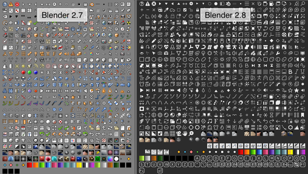
Going from diverse, instantly recognizable and memorable to modern, flat and monotone.
Arguments could be made towards consistency and overall quality, sure. But this is a step in the wrong direction.
 Siccity
on 14 Aug 2019
Siccity
on 14 Aug 2019
Please allow me to configure the expand/collapse icon (currently chevron) back to the little triangle. I prefer it greatly.
 schtauffen
on 14 Aug 2019
schtauffen
on 14 Aug 2019
I think the new icons are perfectly fine. Y'all need to chill a bit.
The internet always goes "ch-ch-changes!!" anyways.
I think most people here are using constructive criticism.
ErikHumphrey
on 14 Aug 2019
Loving the new icons! :heart_eyes:
 Tsabrandon
on 15 Aug 2019
Tsabrandon
on 15 Aug 2019
The new icons are great, do you think you could help the LiveShare team update theirs? https://github.com/MicrosoftDocs/live-share/issues/2601
 mrmckeb
on 15 Aug 2019
mrmckeb
on 15 Aug 2019
Ok, so I appreciate the new design.
But the rounded edges on the Explorer and Extensions icons are not in inline with Microsoft's icon guidelines.
The rounded corners are for corners that are somewhat round in real life like the edges of the shell of the USB drive, but not the actual corners of the metal port.
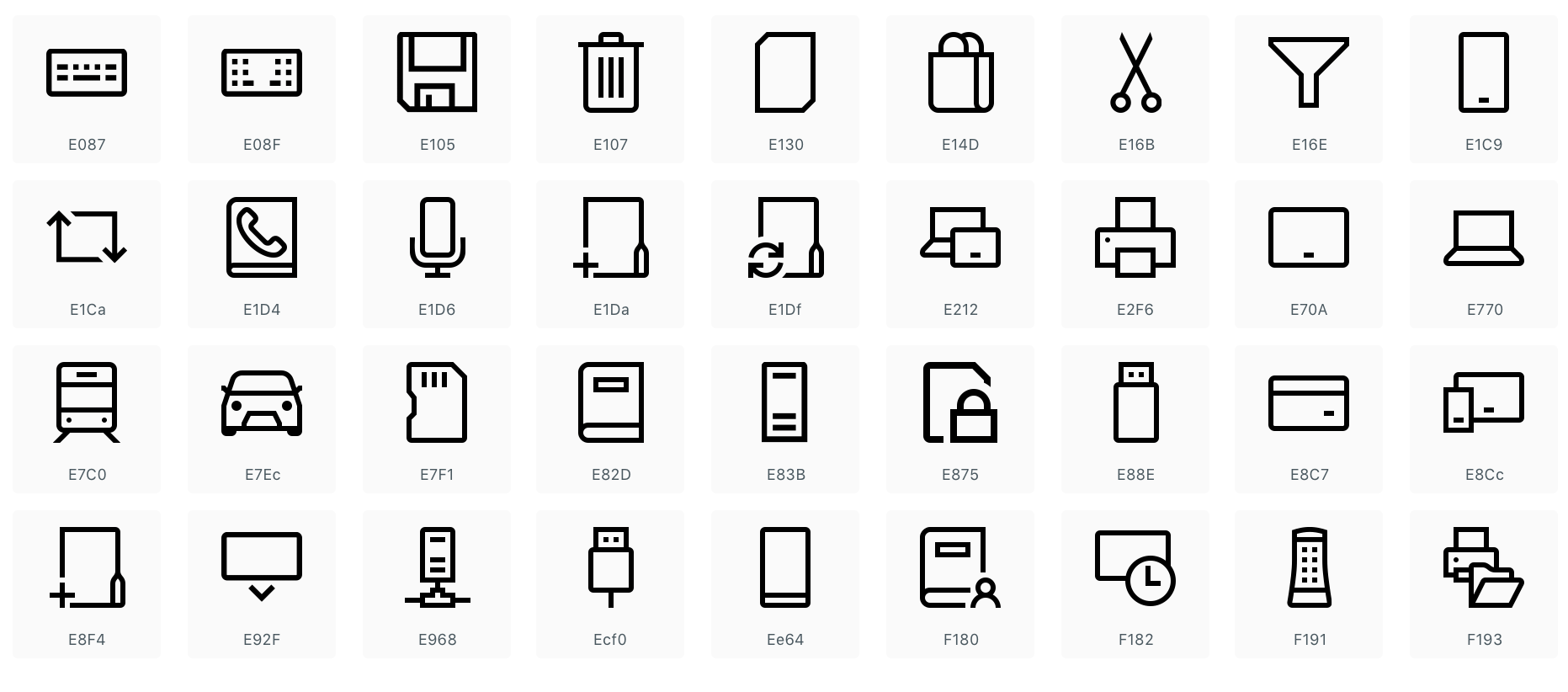
The Explorer icon is 2 sheets of paper, I can't find any of the official Microsoft icons that have sheets of paper in them, to have round corners for the paper.
The Extensions icon, we can debate that, but if it is supposed to represent building blocks, legos have pretty sharp edges.
Plus it will be much easier on the eye.
 tenF
on 15 Aug 2019
tenF
on 15 Aug 2019
They don't follow those guidelines because they're only for UWP apps.
Code isn't UWP, so it doesn't need to follow the standards. Anyway, MS's
brand is changing so at the end of the day the icons are bound to change
too. @10F
On Thu, Aug 15, 2019 at 12:30 PM 10F notifications@github.com wrote:
Ok, so I appreciate the new design.
But the rounded edges on the Explorer and Extensions icons are not in
inline with Microsoft's icon guidelines.
https://docs.microsoft.com/en-us/windows/uwp/design/style/iconsThe rounded corners are for corners that are somewhat round in real life
like the edges of the shell of the USB drive, but not the actual corners of
the metal port.[image: 59722433-844b4680-91d8-11e9-9428-2b36137b0f0a]
https://user-images.githubusercontent.com/18104031/63091392-7c9ce980-bf5e-11e9-846e-191fbfa7cc55.pngThe Explorer icon is 2 sheets of paper, I can't find any of the official
Microsoft icons that have sheets of paper in them, to have round corners
for the paper.The Extensions icon, we can debate that, but if it is supposed to
represent building blocks, legos have pretty sharp edges.Plus it will be much easier on the eye.
—
You are receiving this because you were mentioned.
Reply to this email directly, view it on GitHub
https://github.com/microsoft/vscode/issues/8017?email_source=notifications&email_token=AFKK6BOM5YVVPFHX2O4KHYDQEU44ZA5CNFSM4CHQNTN2YY3PNVWWK3TUL52HS4DFVREXG43VMVBW63LNMVXHJKTDN5WW2ZLOORPWSZGOD4LSESY#issuecomment-521609803,
or mute the thread
https://github.com/notifications/unsubscribe-auth/AFKK6BP2AC7ZTTBDXSW6IB3QEU44ZANCNFSM4CHQNTNQ
.
--
Kind regards,
Hayden Young
[email protected]
hbjydev
on 15 Aug 2019
Apart from my general dislike, here are a couple of minor nitpicks.

- Expand/collapse is no longer consistent with collapse all.
The icon for collapse all was consistent with the old square icon set for expand/collapse, but with the new chevrons their relation is not apparent anymore.
- The folder icon looks more like a tab than a folder. This was previously made clear with the yellowish color that folders commonly have.
Siccity
on 15 Aug 2019
Update
Thank you to everyone who's been providing feedback, we've been listening all week on here and on Twitter so we appreciate you taking the time to comment. There are some issues that have risen out of this and we've been trying to prioritize them so that we can address them soon.
In terms of the feedback about the icons being too thin/hard to see, we've passed this feedback to our icon team that works on the Microsoft Design Language (MDL) icons and they are working to address this.
Below is a list of the issues that have come up that we're actively tracking in case you are wanting to 👍 any (you can also see the full list of icons-product issue):
- Update Octicons to match new icon style #76909
- Provide library of icons for extension authors #74974
- Update extension icons to match new icon style #77411
- New notification icons are not very readable #78857
- Code folding chevron icon is confusing #78024
- Allow configuration of product icons #79130
misolori
on 15 Aug 2019
I know this was already posted earlier, but I'd like to request an option for (or overall switch) a filled in version of the new icons:

[image originally posted by @misolori earlier in the thread]
 Hum4n01d
on 15 Aug 2019
Hum4n01d
on 15 Aug 2019
@Hum4n01d please see my post update right above your comment:
- Allow configuration of product icons #79130
misolori
on 15 Aug 2019
Ah, sorry 😅 I missed that
Hum4n01d
on 15 Aug 2019
Can I revert back to the old icons whilst still getting the new updates?
I personally highly prefer the old ones over the new ones (specifically in the activity bar, others are fine), and the fact that this feature was not made as an opt-in is pretty nerve wracking.
I've seen https://github.com/microsoft/vscode/issues/78748#issuecomment-519795130 and no, I do not want to roll back to a previous version.
https://github.com/microsoft/vscode/issues/78748#issuecomment-519989407
Sorry, we don't have a way for you to use the old icons without rolling back to a previous version.
C'mon people..
Edit:
I see potential in https://github.com/microsoft/vscode/issues/79130#issuecomment-521794152
 kiprasmel
on 16 Aug 2019
kiprasmel
on 16 Aug 2019
Hey guys, thanks for a great, free product but these new icons suck. There's no color in any of them... Why is that?
What exactly is the value of "unifying things" to us and why does unification mean removal of color?
 waynebloss
on 16 Aug 2019
waynebloss
on 16 Aug 2019
Hey guys, thanks for a great, free product but these new icons suck.
I completely agree - MS please stop fixing things that are not broken!
With all that talk about diversity in teams and so on - you now need to unify things..
Please take into account that while it's a Microsoft product - it's also a community effort.
I must admit, that the team responsible for VS code has been listening to the voice of users and contributors so far, and that's part of the reason why vscode is so freakin' awesome!
I hope it will also be the case this time!
I don't want to stop updating this product as I did with macOS or Adroid.
 blundster
on 17 Aug 2019
blundster
on 17 Aug 2019
I love the update. Thanks guys!
 gwardwell
on 17 Aug 2019
gwardwell
on 17 Aug 2019
Changes like this will always leave some people unsatisfied. But I also personally love it! Thanks for the great update!
 guillaumep
on 20 Aug 2019
guillaumep
on 20 Aug 2019
What I don't like about the update is that all of the userland extension icons now don't match the new theme. Also, why are the icons smaller? Anyway, I guess I like the new update after all.
before | now


 ackvf
on 21 Aug 2019
ackvf
on 21 Aug 2019
Reading this PR, I understand why they were introduced, but when you combine rounded-corners with very thin stroke widths, you make the user do a lot of work.
The trash can is blurry and split panel looks like a pillow:
I'm not able to see the + in these first two icons:

I would strongly suggest revising the icons so they render clearly on both regular and retina screens. Look into "pixel-fitting" techniques. Take a look at this fine post from 2012 by @dcurtis — https://dcurt.is/pixel-fitting
 mattwoodnyc
on 21 Aug 2019
mattwoodnyc
on 21 Aug 2019
After getting used to them a bit, most of new icons (sidebar, explorer) seem better overall.
ErikHumphrey
on 21 Aug 2019
I am a big fan of the new outline icons for this simple reason; they are more readable the same way the written character is.
 johnoscott
on 22 Aug 2019
johnoscott
on 22 Aug 2019
new icons are indeed harder to interpret at a glance, didn't have that problem with old ones
 unixcow
on 27 Aug 2019
unixcow
on 27 Aug 2019
I am a big fan of the new outline icons for this simple reason; they are more readable the same way the written character is.
Depends on the screen, the lighting in the room and the person. The very fact that this is comment 309 on this issue (and this is one issue out of a bunch of related issues) should hint how many people are having problems with the new icons.
spartanatreyu
on 27 Aug 2019
I find the new activity bar icons harder to read. They also look pretty blurry for me. I use window zoom level -2 though.
 KodyJKing
on 28 Aug 2019
KodyJKing
on 28 Aug 2019
Not a regular user so I can't speak for all of the icons, but the prominent ones on the sidebar are now cleaner, and with the clutter gone it makes me feel more relaxed working in the editor for long stretches of time. :+1: Thank you!
 akaleeroy
on 29 Aug 2019
akaleeroy
on 29 Aug 2019
"if it works, don't touch it!" - i think this caused tons of comments for "reverting old icons back"
SupinePandora43
on 12 Sep 2019
And here is my humble contribution to this topic. The old git-related icons looked clearer on a low density screens (the current ones are almost as dust particles over the screen). Also inconsistency of icons became worse.

 zzzorgo
on 13 Sep 2019
zzzorgo
on 13 Sep 2019
@zzzorgo The inconsistent icon that is in the screenshot belongs to the GitLens plugin. The GitLens icons have already been updated by @eamodio, and will be released very soon!
jletey
on 13 Sep 2019
Related issues
 curtw
·
3Comments
curtw
·
3Comments
 lukehoban
·
3Comments
lukehoban
·
3Comments
 sirius1024
·
3Comments
sirius1024
·
3Comments
 borekb
·
3Comments
borekb
·
3Comments
 trstringer
·
3Comments
trstringer
·
3Comments
Most helpful comment
Here's a status update on this item. Over the last few iterations we've been exploring a few different concepts for our iconography re-design. The main goals we are hoping to achieve with these explorations are to:
With those objectives in mind, here are the latest explorations that we've been discussing internally.
Outline style
This style take a lot of inspiration from the Microsoft Design Language (MDL) icons that is common across various Microsoft products (Windows, Office, Xbox, etc.). There is large pool of icons to choose from, which extensions could potentially leverage, and it also allows the product to become more consistent with Microsoft products.
Solid Style
This style is an evolution of our current style, while still remaining familiar. It uses the same icon metaphor as the previous style, and makes all of the strokes/spacing consistent.
Open Questions
These are all early explorations but we'd love to get feedback from the community as we iterate. We don't currently have a target date to complete this work yet as we don't want to rush to a solution without validating it correctly. We will also be conducting user tests on these explorations to further validate them. Below are a few open questions we will need to answer: