Enterprise: list-detail pattern (in responsive mode) - need distinct affordances list view for selection showing the details.
Describe the bug
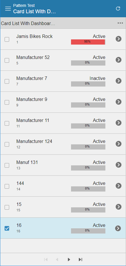
Right now list-detail pattern in responsive mode will navigate to the detail when a selection is made. We need the ability to select for running contextual actions on the list and another way to "show detail".
Suggest a arrow button with a circle around it to distinguish between no circle (which just means you can click the item anywhere) and a circled arrow button (which means you must tap on it for showing detail).
To Reproduce
Steps to reproduce the behavior:
- Go to http://master-enterprise.demo.design.infor.com/patterns/list-detail-paging-indeterminate.html
- Narrow the browser so the list-detail pattern enters phone widths.
- Click on an item in the list
- Notice there is no way to select the list item w/o it hiding the list and showing the detail.
Expected behavior
Need affordance to be able to do either.
Screenshots
Thinking a filled in arrow button (like iphone does) could be useful. This doesn't need to be a fixed thing but just a button we could add in the template and mark as a special tapable/clickable area.
Additional context
Add any other context about the problem here.
 pwpatton
All 8 comments
@theakatz @kayiuho What do you think of this design/icon?
 tmcconechy
on 2 Nov 2018
tmcconechy
on 2 Nov 2018
One idea is, what if we just make the selection checkbox show even if its on single select.
And fix the problem that the when you click checkboxes it drills. (Should skip drill on checkbox click)
tmcconechy
on 2 Nov 2018
I agree with @tmcconechy. We should change the clicks to look more like this to fix the issue of having a clickable child in a clickable parent:
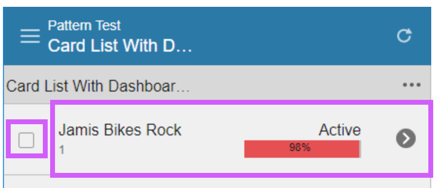
Without the checkbox, the clickable area will expand to the whole row. With the checkbox, it naturally pushes the clickable area over so that you can't "miss" the checkbox and end up clicking the "drill down".
Then @kayiuho instead of using that filled circle carat icon, we can use an existing plain right carat > just as symbolism to show that it "drills down" to the right.
The HTML could look something like:
html
<div>
    <label>
         <input type="checkbox" /> Stuff
    </label>
    <a href="">
        Drill down
        <i class="icon"></i>
        ....other stuff....
    </a>
</div>
 clepore
on 2 Nov 2018
clepore
on 2 Nov 2018
That seem really good as then the arrow button is not required. And keeping the checkbox around wouldn't end up taking any more horizontal space than would be required with the arrow button.
pwpatton
on 2 Nov 2018
I wanted to see if we could do this without introducing another icon. If we're being more intentional about the selection area versus the target area allowed for the drill, do we really need a carat icon? I don't know that a user unintentionally clicks on a checkbox to drill. The question is more around will the user be confused about whether they are able to drill if they don't see an explicit carat icon?
 jamie-norman
on 2 Nov 2018
jamie-norman
on 2 Nov 2018
@jamie-norman , you mean you didn't want to add a new icon, or didn't want to add another icon to the UI? My goal was to use a regular carat (less button-esque) to show they can drill down, as I believe you are right - I do not think they will know it drills down without signage.
clepore
on 2 Nov 2018
Sorry @clepore—that wasn't clear. I would rather not add another icon to the UI. I talked to @kayiuho about it, and she thinks a right carat icon would be helpful. I did see Tim's fix this afternoon, so I think it's still good _without_ adding the carat icon. It's easier to add than to take away 😜
jamie-norman
on 2 Nov 2018
Less work, works for me 👍
clepore
on 2 Nov 2018
Related issues
tmcconechy
·
25Comments
pwpatton
·
22Comments
 claudenbach
·
17Comments
claudenbach
·
17Comments
 Fruko
·
31Comments
pwpatton
·
17Comments
Fruko
·
31Comments
pwpatton
·
17Comments
Most helpful comment
I agree with @tmcconechy. We should change the clicks to look more like this to fix the issue of having a clickable child in a clickable parent:

Without the checkbox, the clickable area will expand to the whole row. With the checkbox, it naturally pushes the clickable area over so that you can't "miss" the checkbox and end up clicking the "drill down".
Then @kayiuho instead of using that filled circle carat icon, we can use an existing plain right carat
>just as symbolism to show that it "drills down" to the right.The HTML could look something like:
html
<div>
    <label>
         <input type="checkbox" /> Stuff
    </label>
    <a href="">
        Drill down
        <i class="icon"></i>
        ....other stuff....
    </a>
</div>